Viewing entries tagged
art

Gallery chronicle (May 2022)

Comment

Gallery chronicle (May 2022)

THE NEW CRITERION, May 2022

Gallery Chronicle

On “The Utopian Avant-Garde: Soviet Film Posters of the 1920s” at Poster House, New York and “Thornton Willis: A Painting Survey, Six Decades, 1967–2017” at David Richard Gallery, Chelsea and Harlem, New York.

Is this bad timing for a show on Russian art and design? “The Utopian Avant-Garde: Soviet Film Posters of the 1920s,” which opened at New York’s Poster House museum in late February, suggests otherwise.1 Here is an eye-opening exhibition of fifty works from a century ago that lays bare Russian aspiration in graphic form. Created during the first flush of enthusiasm for the new Bolshevik state, these innovative posters speak to the progressive spectacle of early Sovietism—and the hundred years of failure that has followed, with its aftershocks in devastating evidence today.

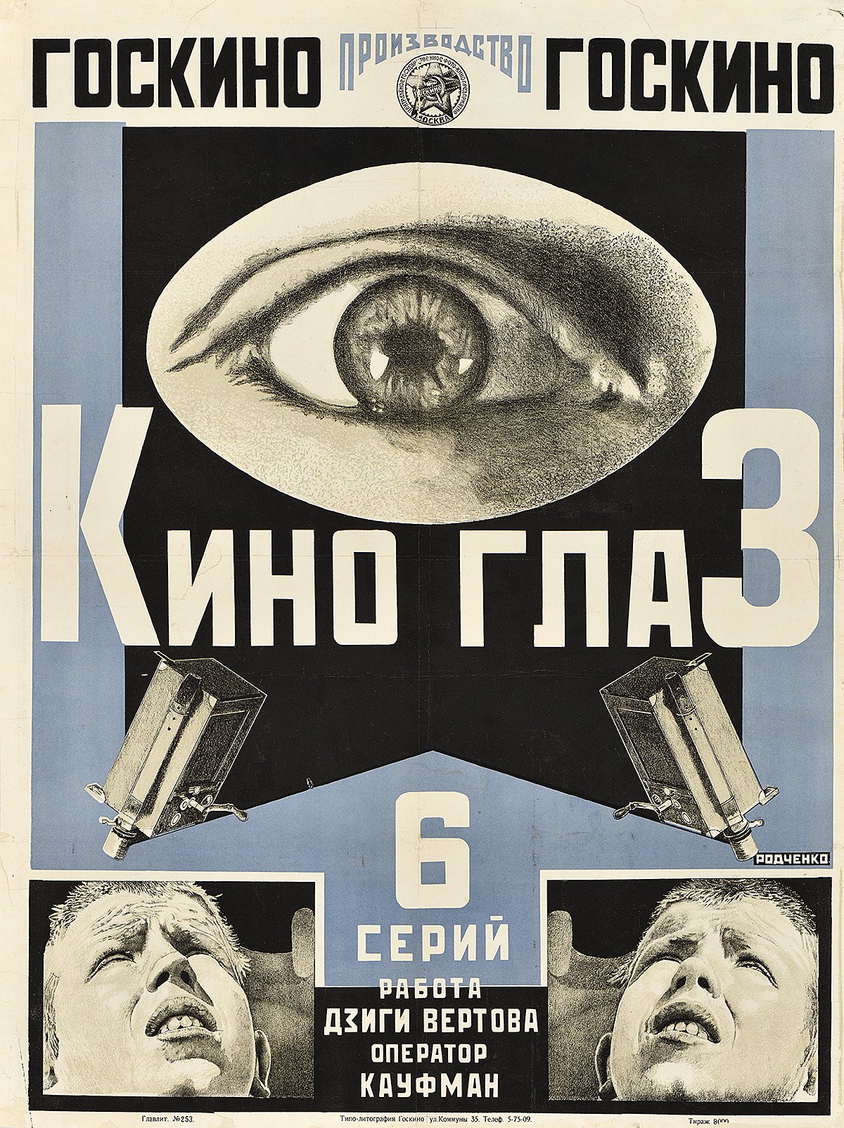
Alexander Rodchenko, Poster for Film-Eye, 1924, The Ralph DeLuca Collection. Photo: Poster House.

These works are also simply dazzling to see. The posters were designed to startle, bringing to the Russian street a taste of such cinematic innovations as montage, unexpected angles, stop-motion animation, and extreme closeups as they vied for popular attention. Informed by a new faith in utopian architecture and engineering, and drawing on tenets of Constructivism, Suprematism, and Productivism, these posters reflect the influence of early Soviet design over much of modern art.

Even before the Russian Revolution, Nicholas II, the modern world’s ill-fated tsar, was quick to grasp the potential of the motion picture. Just five months after their first picture show in Paris on December 28, 1895, the Lumière brothers sent their cameraman Camille Cerf to Saint Petersburg. Cerf filmed Nicholas’s coronation for a ninety-three-minute cinematic feature, among the first documentaries of its kind. Sensing the power of movies to reach his dispersed and largely illiterate population, the tsar ordered the importation of production supplies and initiated a Tsarist Chronicle newsreel series. Major French studios, such as Pathé and Gaumont, established offices in Moscow both to create and distribute film. With a burgeoning domestic appetite for movies, the Russian film industry was soon well underway.

As the First World War upended the supply chain of movies from the West, a domestic Russian cinema grew up around the country’s new movie palaces. The Russian Revolution and Civil War then placed their own extreme pressures on the production and distribution of film—theaters were nationalized, making the sale of raw celluloid illegal, and eventually all cinematic and artistic expression outside the supervision of the Soviet state was criminalized. By the early 1930s, the creative suppression was total. Still, for a brief period in the 1920s—under a more inchoate revolutionary state—Soviet movie culture prospered. Propagandistic domestic films and adulterated “bourgeois” foreign productions competed for screen time. The Russian audience was hungry, including for mass entertainment.

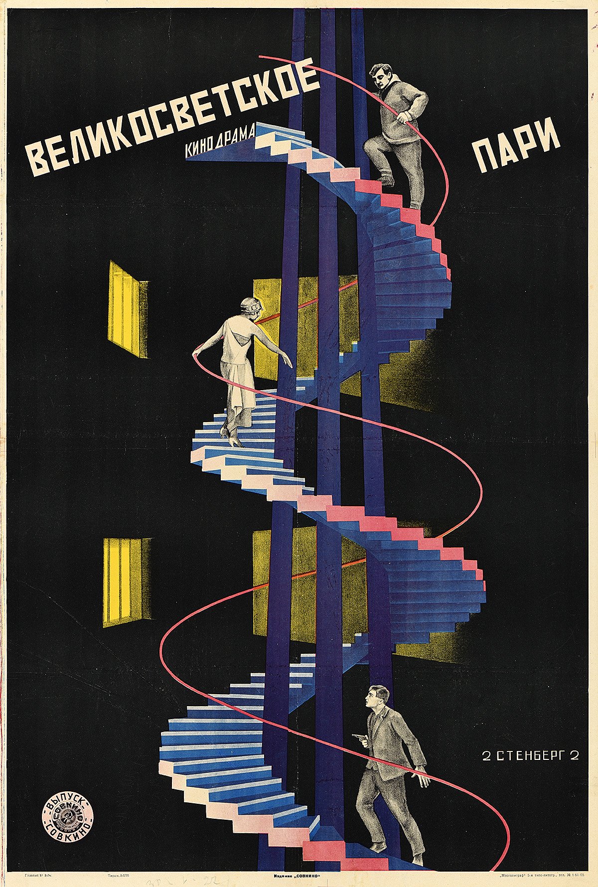
Vladimir Stenberg and Georgii Stenberg, Poster for High Society Wager, 1927, The Ralph DeLuca Collection. Photo: Poster House.

At the leading edge of this strange Soviet quasi-industry, the movie poster became the prime vehicle for selling these films. Fifty of these posters are now on display at Poster House, all on loan from the Ralph DeLuca Collection. It is remarkable that any have survived at all. They were almost all created with limited time, limited resources, and limited knowledge of the movies they were advertising. In the fast-paced climate of 1920s Russian cinema, they were designed, printed, and posted in a day and covered over in a week. Yet from what has remained, it is clear that these pressures combined with the visual idealism of the early Bolshevik state to encourage their graphic innovation. “In this chaos,” writes Angelina Lippert, the chief curator of Poster House, “a vibrant, idealistic group of young artists and intellectuals enjoyed a brief period during which they could use their talents to build a new Russian culture.”

What this exhibition lacks in an independent catalogue, it makes up for with wall labels that well describe the posters on display and the films they depict. If anything, the exhibition should send you home to look up these early Russian films. Out of copyright, they now reside on such YouTube channels as rvision. Be sure to pause on Dziga Vertov’s Man with a Camera, an astonishing silent documentary from 1929 that depicts the kinetic street life of Kyiv, Kharkiv, Moscow, and Odessa. In his opening credits, Vertov bills his film as an “experiment in cinematic communication of real events, without the help of intertitles, without the help of a story, without the help of theater, a truly international language.” Or consider the “Odessa staircase,” Sergei Eisenstein’s famous scene from Battleship Potemkin. Perhaps the finest example of propaganda ever put to celluloid, this famous story of a 1905 mutiny against tsarist overreach calls out for rescreening today. Alexander Rodchenko’s poster for the 1925 film, with Potemkin’s twin guns reaching out like the steel arms of an incipient Soviet man, is a visual highlight of the show.

Alexander Rodchenko, Poster for Battleship Potemkin, 1925, The Ralph DeLuca Collection. Photo: Poster House, New York.

For all of their appreciation by cinephiles today, such early Soviet films were often less popular with Russian audiences than the adulterated Western films from America, England, and Germany that made their way east. This, despite the fact that the West didn’t always send their best. Soviet authorities also changed up Western film plots to conform to the party line, inserting alternative intertitles. They might even include a live political speech or recording, bookending a movie with agitprop to justify the playing of a Western show. “In reality,” writes Lippert, “people—particularly the urban poor—just wanted to be entertained.” That meant that “almost anything of note, from factory openings to seasonal festivals, found its way into Soviet cinema, always accompanied by a dynamic poster.”

As she describes them, many of the films that circulated in 1920s Russia, from both East and West, sounded like they were lifted from an off week of the Moscow TV Guide:

A six-reel satire in which a British aristocrat poses as a butler in order to win affections of an American businessman’s saxophone-playing daughter. (The Business Man, 1929)

The young son of a revolutionary obsessively holds onto a pipe belonging to his father—but this gesture eventually results in his own death. (The Communard’s Pipe, 1929)

The plot follows a young Jewish couple escaping life in a shtetl by becoming actors in a traveling Yiddish theater. (Wandering Stars, 1928)

Based on the groundbreaking sociological work The Sacred Scarab (1909) by feminist writer Else Jerusalem, in which she documents the lives of Vienna’s fifty thousand prostitutes, The Green Alley . . . is reshaped into a tragic love story between a waitress at a brothel and a doctor’s son. (The Green Alley, 1928)

A documentary celebrating the triumphs of modern agricultural practices through mechanized farming. (Giant to the Virgin Soil, 1930)

It was just as well that Soviet poster designers often knew little about the movies they were promoting. Such ignorance gave them license to move away from the character-driven storytelling of Western design and its “bourgeois sentimentality.” Instead they experimented with the broader possibilities, and limitations, of color lithography. One of those limitations was the size to which they could print the image of a film still. Unable to enlarge them to the full size of a poster, they often employed a series of smaller, related images as a montage to animate the storyline, as Anton Lavinsky did for his poster of The Death Ray (1925). Or they might trace out a larger photographic projection in lithographic pencil, as Alexander Rodchenko did for Film-Eye (1924). Or they might resort to graphic abstractions, such as Nikolai Prusakov’s tetrahedron for The Second Exhibition of Film Posters (1926).

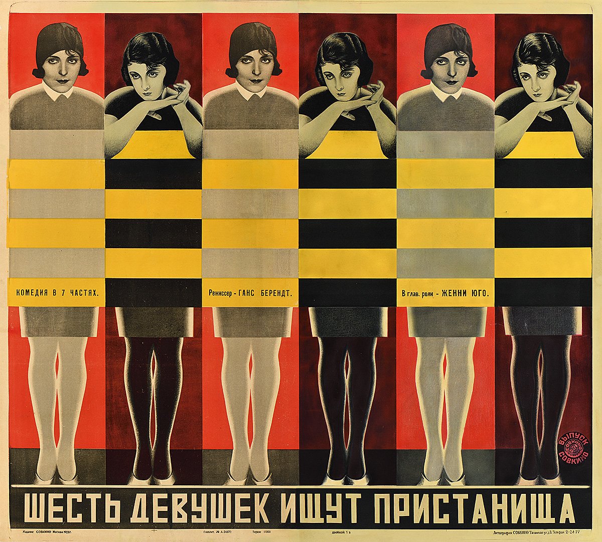
Vladimir Stenberg and Georgii Stenberg, Six Girls Seeking Shelter, 1928, The Ralph DeLuca Collection. Photo: Poster House.

The most successful posters often used a combination of these lithographic techniques. Vladimir and Georgii Stenberg’s High Society Wager (1927) finds its characters running up an abstracted spiral staircase. Semyon Semyonov’s Turksib (1929) grafts the solarized face, hands, and shoes of a shouting worker onto railway signals. The Stenbergs’ Six Girls Seeking Shelter (1928) turns a pattern of alternating rectangles, like the flicker of the movie projector, into a screen that covers the girls’ bodies. For The Great Tragedy of a Small Woman (1929), Nikolai Prusakov dismembers a pair of human figures and an automobile grille to create a visual chaos that even crashes into the typography.

For all of the intelligence throughout this exhibition, its finest movements come at the conclusion, in its explanation of the “death of the avant-garde poster.” In 1930, the directory body Soyuzkino was founded to centralize control of all cinematic production and distribution. Foreign films were banned a year later. In April 1932, the Soviet Central Committee banished independent artistic groups entirely. The golden age of Soviet art, film, and graphic design had lasted less than a decade. “Unlike his immediate predecessors,” writes Lippert, “Stalin did not share the view that art could be used as a means of transforming society. Instead, he believed that its sole purpose was propaganda.” She concludes:

While design historians celebrate the incredible posters in this exhibition, it is important to remember that they were produced during a time of social upheaval and terror. Millions of people were murdered under the Soviet regime; millions more were stripped of their property, separated from their families, and exiled to labor camps for the remainder of their lives. Today, these posters allow access to a period of Russian history in which chaos and political uncertainty were briefly outshone by the progressive idealism of some of the greatest graphic designers of the twentieth century.

A major survey of the paintings of Thornton Willis, now on view at David Richard Gallery across its two New York locations, serves to illustrate the long influence of Russian design, for one, on the history of modern painting.2 This ambitious exhibition also makes a case for the inclusion of Willis in the pantheon of American abstract art. With over twenty major works on view from the artist’s collection, some of them not shown outside the studio for several decades, “Thornton Willis: A Painting Survey, Six Decades, 1967–2017” brings together highlights from each of Willis’s series of abstract compositions. David Richard’s Chelsea location includes a tight arrangement of medium-size paintings, while the gallery’s Harlem venue gathers Willis’s largest works, topping out at over ten feet wide. The survey coincides with “Exploring Thornton Willis,” an exhibition at the Sarah Moody Gallery of Art at the University of Alabama, featuring a selection from Willis’s recent gift of over two dozen paintings to his alma mater.

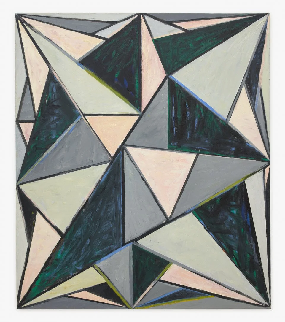
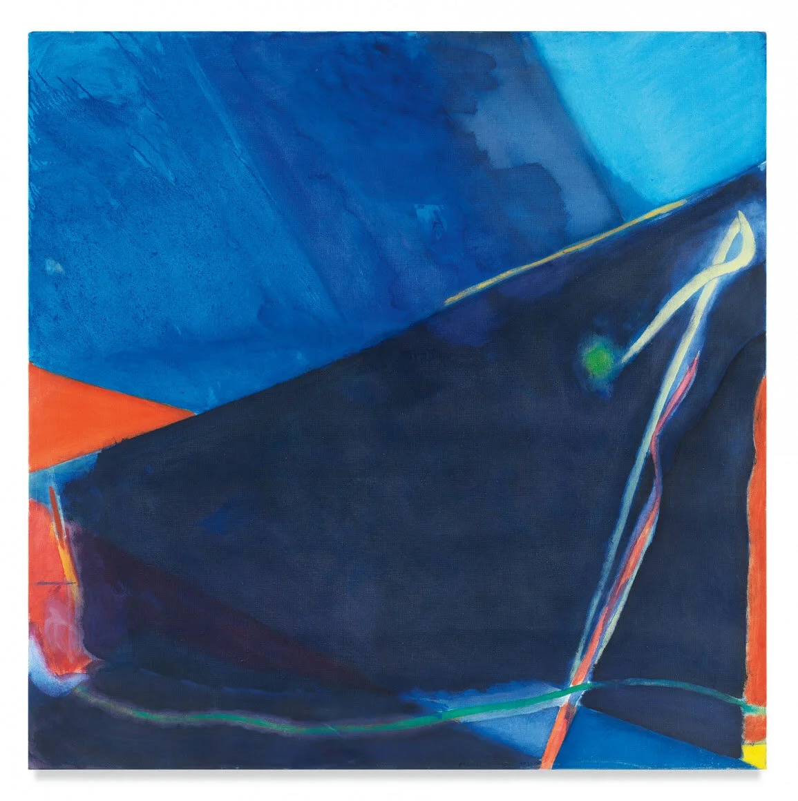
Thornton Willis, Starstrux, 2007, Oil on canvas, David Richard Gallery, New York.

Working across more than six decades, Willis has been consistent in his abstract exploration of the basic tensions between figure and ground, push and pull, color and contrast, and surface and depth—visiting and revisiting his visual language. Observing his work over twenty of those years, I have learned to look to his edges to appreciate how his fields of paint rub against each other to create their dynamic tension.

In their simplicity, Willis’s more basic abstractions, such as his wedges, lattices, and zig-zags, are approached as particular challenges of visual animation. Bold compositional decisions, from paint handling to color contrasts to the placement of a single corner or edge, are what set these works in motion. With Willis’s more complex abstractions, such as his cityscapes and kaleidoscopic prisms, the challenge is not to create tension but to maintain it. Underdrawing, pentimenti, and paint splatter all signal the energy of that final dynamic, of artist and object, as Willis folds his compositions together to await our own unpacking—ensuring his designs do not land too firmly on one thing or another. The suspension of Brooklyn Bridge (1993), the shock of Brown Zinger (1983), the portal of Full House (1981), the mechanics of Locomotive (1999), the radiance of Starstrux (2007)—the full energy of these paintings is now ready to be felt and seen.

  1. “The Utopian Avant-Garde: Soviet Film Posters of the 1920s” opened at Poster House, New York, on February 25 and remains on view through August 21, 2022.

  2. “Thornton Willis: A Painting Survey, Six Decades, 1967–2017” opened, in part, at David Richard Gallery, Chelsea, New York, on March 30 and remains on view through May 13, 2022. The second part of the exhibition opened at David Richard Gallery, Harlem, New York, on April 4 and remains on view through May 13, 2022.

Comment

Gallery Chronicle (March 2021)

Comment

Gallery Chronicle (March 2021)

THE NEW CRITERION, March 2021

Gallery Chronicle

On “Albers and Morandi: Never Finished” at David Zwirner, “Victor Pesce: Still Life” at Elizabeth Harris Gallery, “Emily Mason: Chelsea Paintings” & “Wolf Kahn: The Last Decade 2010–2020” at Miles McEnery Gallery, “Jill Nathanson: Light Phrase” at Berry Campbell, “Jane Freilicher: Parts of a World” at Kasmin Gallery, “Deborah Brown: Things As They Are” at Anna Zorina Gallery, “Tworkov: Towards Nirvana / Works from the 70s” at Van Doren Waxter & “Sharon Butler: Morning in America” at Theodore:Art.

“Albers and Morandi: Never Finished” is one of those sublime, museum-quality exhibitions where sight alone is allowed to inform and delight.1 “Museum-quality” might do a disservice, in fact, as the qualities of our museums are increasingly drawn to the verbal, even the hectoring and didactic, over the pictorial. Now on view at David Zwirner, this exhibition is near perfect in its selection, presentation, and insight. The result is stunning, even dumbfounding, in how it shows painting in its own language, on its own terms, and, at its best, speaking across styles in visual conversation.

Although near exact contemporaries—Josef Albers was born in 1888; Giorgio Morandi in 1890—these two artists seemingly painted worlds apart. Albers was theory. Morandi was practice. The hard edges of Albers looked forward. The soft contours of Morandi looked back. Or so we were told. “Never Finished” finds their shared affinities. They shared, for one, the same absorptive palette. Rather than radiate out, pale blues, airy grays, buttery yellows, and earthy browns pull us in. The two artists also approached composition in complementary ways, exploring their own recurring motifs. Simplex munditiis is the phrase that comes to mind from the recesses of high school Latin—the Horatian line that might translate as “simple in its refinements.” Both Morandi and Albers distilled their paintings to their own bare minimums of essential information, each paying respect, one might even say “homage,” to their chosen forms.

Seen together, Morandi brings out the softness of Albers’s line, while Albers reveals the sharpness of Morandi’s shapes. Up close, Albers is all edge, but back away and his squares, despite their flat brushwork, take on a mysterious glow. From afar, Morandi’s still lifes seem extra still, but get closer and those squares, rectangles, and triangles come alive in their own mysterious ways.

Each artist finds a balance in his compositional energies. Albers looked for the tension between figure and frame. In all of his signature “Homage,” just what, precisely, is the “Square,” and what is the frame around it? Beyond the square forms on masonite, here, in certain works, the frames themselves thicken to become part of the overall compositions.

Albers’s designs seem to tunnel inward, often from light outer forms to darker voids. His innermost squares are both absences and presences, forms floating on top that also sink beneath. Morandi finds a similar tension between subject and object. Just what is the “natura” of his “morta”? Is it the canvas itself, so sensuously brushed, or the vessels depicted therein? Here, rather than forward-facing, Morandi’s frames are allowed to recede, with his canvases now floating in the void. As curated by the gallery’s David Leiber, this exhibition makes the most of its space and light. Each room uses paired works and lines of sight to tunnel from one to the next, through evolving moods and tones, in a painterly conversation that is, indeed, “never finished.”

Installation view of “Victor Pesce: Still Life,” Elizabeth Harris, New York. Photo: Elizabeth Harris.

Installation view of “Victor Pesce: Still Life,” Elizabeth Harris, New York. Photo: Elizabeth Harris.

Just up the block from Zwirner, last month at Elizabeth Harris, that small, serious gallery holding out among the megas of Chelsea, “Victor Pesce: Still Life” revealed the life in the stillness.2 With unmistakable homage to Morandi, and perhaps not a little to Albers, Pesce painted basic forms with complex intensity. Created in the last twelve years of his life—Pesce died in 2010 at the age of seventy-one—the works on view depicted blocks and bags, boxes and vases. Over time, a simplicity of means betrays a strangeness of meaning, as these still lifes dissolve into abstractions of oil and ideations of shape. Just what is that haunting green block of Bridge (2007)? Pesce looked for the bones of form. “In the language of painting,” as John Goodrich writes in his catalogue essay, “he found the means of making them rhythmically, vitally alive—known, as a painter might know them.”

Emily Mason, Ancient Incense, 1981, Oil on canvas. Miles McEnery Gallery, New York.

Emily Mason, Ancient Incense, 1981, Oil on canvas. Miles McEnery Gallery, New York.

Spread across the gallery’s two Chelsea venues, Miles McEnery last month enlightened the dark days of winter with a luminous husband–wife double-header. “Wolf Kahn: The Last Decade 2010–2020” looked to the artist’s late pastel-like landscapes. “Emily Mason: Chelsea Paintings” opened a window onto the sunny compositions the artist developed in her New York loft, in which she had worked since 1979.3 Taken together, the paired exhibitions honored two artists, married for sixty-two years and both recently deceased, who maintained a connection with Tenth Street and, in their enduring work, each other.

In her nearly square canvases, here dating from 1978 to 1988, Mason lit up her compositions with washes of color that appear like dapples of light. As though illuminated by the sunshine from a window, her oils operate more like photo emulsion, seemingly brightened by luminous rays passing over their surfaces. At their best, as in The Green In Go (1983), these passages open up her designs. Streaks of light pull us into her abstractions that might otherwise be too densely color-filled to unpack.

Wolf Kahn, Against a Red Slope (Large Version), 2018, Oil on canvas. Miles McEnery Gallery, New York.

Wolf Kahn, Against a Red Slope (Large Version), 2018, Oil on canvas. Miles McEnery Gallery, New York.

Mason’s abstract dynamics revealed something about her husband’s landscapes a block away. Late in life, Kahn’s woodsy scenes became a thicket of blowing, branching brushstrokes. The feeling of vernal softness, of a verdure perfumed with yellows, oranges, and greens, went right to his surfaces. Yet Kahn left a hint of depth, a spot of color or light, to signal distance. In Redwoods (2019), a bit of sky viewed through the trees brings us into the scene. In Woodland Density (2019), a blue hill, as though cast in shadow, carves out deeper space. Such glimpses, whether of the horizon or a cabin or a woodland stream, offer just the right destination in the abstract wilderness.

Installation view of “Jill Nathanson: Light Phrase,” at Berry Campbell Gallery, New York. Photo: Berry Campbell Gallery.

Installation view of “Jill Nathanson: Light Phrase,” at Berry Campbell Gallery, New York. Photo: Berry Campbell Gallery.

Anyone who has ever mixed intensely chromatic paints will notice that the results are not brighter colors but duller murkiness. That’s Color Theory 101. In her alchemical experiments with pigments and polymers, Jill Nathanson looks for ways to prove color theory wrong. Through abstractions created of translucent layers of acrylic, polymers, and oil, which she pours onto panel, Nathanson tries to find the light of her colorful combinations. In “Light Phrase,” her latest exhibition at Chelsea’s Berry Campbell Gallery, on view last month, Nathanson looked to enlarge and refine these fluid forms.4

Unlike the opaque layering of oil on canvas, Nathanson’s translucent media are far less forgiving in their combinations and permutations. Occasionally the experiments go awry. In Sparkshift (2020), shimmering pools of purples, blues, oranges, and reds risk puddling at one point into a brown. In other compositions, such as Through Another’s (2020), color-rich curves make some abrupt turns that feel overly manipulated. The best forms were those that, despite their complex creation, seemed simple, even natural, in occurrence. Take the upward swirl of Tan Transpose (2020) or the sparkling beach glass of Only a Friend (2020). Here were crystal visions filtered through green-, blue-, yellow-, and rose-colored glasses.

Jane Freilicher, Parts of a World, 1987, Oil on linen, Kasmin Gallery, New York.

Jane Freilicher, Parts of a World, 1987, Oil on linen, Kasmin Gallery, New York.

“Parts of a World” is an apt title for an exhibition of Jane Freilicher’s still lifes. The artist could take on a world of parts and incorporate them into a painted whole. Last month Kasmin Gallery presented fifteen of these still lifes, painted over five decades beginning in the early 1950s.5 In her quotidian visions of fish and flowers, Freilicher often painted the views from her beach-scrub window in Water Mill, Long Island, and her greenhouse-like studio overlooking the rooftops of New York’s East Village. Near and far, inside and out are taken in with equal measure. A single color then connects the disparate parts. What results is a mood, a world of sense and sensation that left me smelling the goldenrod and forsythia and hungry for the oranges and oysters.

Deborah Brown, Melancholia, 2020, Oil on canvas, Anna Zorina Gallery, New York.

Deborah Brown, Melancholia, 2020, Oil on canvas, Anna Zorina Gallery, New York.

It’s been a year for keeping things in house. For the painter Deborah Brown, the household gods of kachina dolls, glass figurines, and pet dogs all become subject matter in her latest, plague-year body of work, on view last month at Anna Zorina Gallery.6 A painter of loose lines and sun-drenched colors, Brown never lost the sense for the light of her Pasadena youth, even when walking her dog Zeus in the industrial business zone of East Williamsburg, Brooklyn. Brown looks for the animism in everyday scenes. Twenty-five years ago, for a mosaic series in the Houston Street subway station, she reimagined the train platforms with sea life swimming among the straphangers. Now skewed perspectives of domestic scenes, starring the bric-à-brac we have all rediscovered, find the humor and warmth of a year of staying in.

Installation view of “Tworkov: Towards Nirvana / Works from the 70s,” at Van Doren Waxter, New York. Photo: Van Doren Waxter.

Installation view of “Tworkov: Towards Nirvana / Works from the 70s,” at Van Doren Waxter, New York. Photo: Van Doren Waxter.

The minimalist 1970s challenged the expressionist 1950s. For Jack Tworkov, at one time a burning young painter of the New York School, the answer was to cool his molten compositions into glass and stone. Now at Van Doren Waxter, “Towards Nirvana / Works from the 70s” collects these prismatic, architectural constructions of black, white, and gray.7 A fine essayist and a chair of Yale’s art department in the 1960s, Tworkov always reflected on art and history and his role within it. This exhibition includes a catalogue essay by the curator Jason Andrew and a sample of Tworkov’s own writing that well represents his broad perspective. It should not have been unexpected that Tworkov, entering the 1970s, would seek a new path. “I am tired of the artist’s agonies,” he remarked in 1974. His answer was to look to systems—the movement of chess pieces or the rules of composition—to distill his abstractions. His wild mark-making became more like hatches, his surfaces like etched planes overlapping and folding in on themselves. The exhibition at Van Doren Waxter reveals the color and heart that still energized these cerebral constructions. A dot of red or dash of yellow electrifies these abstractions far more than some wild expressionist brush.

Installation view of “Sharon Butler: Morning in America,” at Theodore:Art, Brooklyn. Photo: Sharon Butler.

Installation view of “Sharon Butler: Morning in America,” at Theodore:Art, Brooklyn. Photo: Sharon Butler.

Sharon Butler may have identified the “new casualism” of the outer-borough aesthetic, that studied desultoriness of what we might call the Jefferson Street Touch, but her latest paintings evince a new formalist intent. I like all the buttoning up. In her latest exhibition at Theodore:Art, forms and patterns have matured in her compositions.8 The contingent line has developed into the assured mark. The white holes of Pink (Dec 19, 2018) (2020) play between figure and ground. The rectangles of May 29, 2018 (2020) balance like pickup sticks. Meanwhile her brush handling has replaced freshness with maturity. Surfaces have aged. These paintings have a history. It’s been a year for feeling the years.

1 “Albers and Morandi: Never Finished” opened at David Zwirner, New York, on January 7 and remains on view through April 3, 2021.

2 “Victor Pesce: Still Life” was on view at Elizabeth Harris Gallery, New York, from January 7 through February 27, 2021.

3 “Emily Mason: Chelsea Paintings” and “Wolf Kahn: The Last Decade 2010–2020” were on view at Miles McEnery Gallery, New York, from January 7 through February 13, 2021.

4 “Jill Nathanson: Light Phrase” was on view at Berry Campbell, New York, from January 7 through February 6, 2021.

5 “Jane Freilicher: Parts of a World” is on view at Kasmin Gallery, New York, from January 21 through March 13, 2021.

6 “Deborah Brown: Things As They Are” was on view at Anna Zorina Gallery, New York, from January 7 through February 13, 2021.

7 “Tworkov: Towards Nirvana / Works from the 70s” opened at Van Doren Waxter, New York, on January 14 and remains on view through March 20, 2021.

8 “Sharon Butler: Morning in America” opened at Theodore:Art, Brooklyn, on January 15 and remains on view through March 7, 2021.

Comment

Gallery chronicle (February 2020)

Comment

Gallery chronicle (February 2020)

THE NEW CRITERION, February 2020

Gallery Chronicle

On “The Expressionist Legacy” at Galerie St. Etienne; “Depicting Duchamp: Portraits of Marcel Duchamp and/or Rrose Sélavy” at Francis M. Naumann Fine Art; “Gabriele Evertz: Exaltation” at Minus Space; “Rob de Oude: Light of Day” at McKenzie Fine Art; and “Eric Brown: Longhand” at Theodore:Art.

The declining fortunes of all but the biggest New York galleries continue to have a chilling effect on the world of art. By nurturing artists, cultivating collectors, and opening their doors to all, galleries write the first drafts of art history. New York has been spoiled with such an abundance of great galleries, and for so long, that I imagine we thought they would always be around. Now not a month goes by without another closing, or downsizing, or shifting to private sales, or some other form of retreat from the public square.

The reasons put forth for these changes are many—the globalization of the art market, the rise of the auction houses, and the burden of the art fairs are but a few. Yet I suspect the answer goes deeper, to major shifts in our sociological and visual experience. Much as the rise of online shopping has emptied out Main Street, it could be that a virtual world experienced through digital screens, among many other effects, is pushing the real-world galleries off of Fifty-seventh Street. That gamified, toxified, blue-light mirror in our hands, otherwise known as our smartphone, through its dazzling presentism blinds us to the light of history. A day will come when we will look back on these devices, now caressed like idols in the fingers of nearly every man, woman, and child, as we do a pack of cigarettes. Until then, blink before it’s too late.

This past fall, Galerie St. Etienne, the oldest gallery in the United States dedicated to Austrian and German Expressionism, announced its transition from a commercial enterprise to a non-profit foundation. “Either pursue scholarship or commerce,” declared Jane Kallir, the gallery’s director. “The two don’t work in tandem the way they once did.” Founded in New York in 1939 by Otto Kallir, Jane’s grandfather, this institution has roots going back to Vienna, where in 1923 Otto began a gallery for new art called, appropriately, Neue Galerie. If the name sounds familiar, that’s because Ronald Lauder named his New York museum after Kallir’s first influential home of the Vienna Secession.

Egon Schiele, Portrait of Dr. Erwin von Graff, 1910, Oil, gouache, and charcoal on canvas, Private collection, courtesy Neue Galerie, New York.

Egon Schiele, Portrait of Dr. Erwin von Graff, 1910, Oil, gouache, and charcoal on canvas, Private collection, courtesy Neue Galerie, New York.

In exile in New York, over many decades, Otto Kallir built the market for the modern art of pre-war German-speaking Europe. In a city more enamored with the École de Paris than the Wiener Sezession, that wasn’t always an easy sell. “During the gallery’s early years, Austrian artists like Egon Schiele and Gustav Klimt were completely unknown here,” Jane Kallir wrote in these pages in 2011. “We couldn’t give Schiele’s work away.” Alfred H. Barr, Jr., the founding director of the Museum of Modern Art, even turned down the donation of Schiele’s Portrait of an Old Man (Johann Harms) (1916), which Otto Kallir then gave to the Guggenheim Museum.

By the time of Otto Kallir’s death in 1978, the opposite had become true. The reputation of Austrian and German modernism was ascendant. As Hilton Kramer wrote of Galerie St. Etienne in 1981, “Certain aspects of the modern art of Austria are nowadays so much admired—and in some quarters, indeed, so chic—that an entire generation has come of age on this side of the Atlantic with no memory of the obscurity that once surrounded its great achievements.”

Earlier exhibitions tied to the gallery’s eightieth year recognized the role of its directors, in particular Hildegard Bachert, who died last year at age ninety-eight and launched the unexpected late career of Grandma Moses. Now, for its final exhibition, Galerie St. Etienne has mounted a survey on “The Expressionist Legacy,” with a selection of over fifty works by Max Beckmann, Lovis Corinth, Otto Dix, Richard Gerstl, Gustav Klimt, Oskar Kokoschka, Paula Modersohn-Becker, Marie-Louise Motesiczky, and Egon Schiele, befitting the gallery’s history in the establishment of their stateside legacy.1

For the city that gave birth to Abstract Expressionism, the legacy of German Expressionism should be an easy fit. Yet this art remains uneasy, even forbidding, so much so that its manners and mores can still cause a stir. The Neue Galerie’s excellent recent survey of Ernst Ludwig Kirchner, reviewed in these pages last month by Karen Wilkin, attributed Kirchner’s acidic colors, in part, to the rise of artificial illumination. Kirchner’s rotting pinks and gangrenous greens reflected the preternatural arc-lamps and limelights of the Dresden stage and the Berlin street. In contrast, the selection now at St. Etienne reveals what happens to Expressionism when the lights go down and the colors fade away. These anxious paintings and drawings can seem even more ominous in the dark of day than the light of night.

For all of its flesh, the mangled eroticism of Kokoschka’s watercolors ultimately seems desiccated and burned-over. Schiele’s bloody, bony Portrait of Dr. Erwin von Graff (1910) looks flayed of skin, while his dry landscapes maintain the chromatic range of tobacco juice. Corinth, a generation older than Schiele but here represented by his late work following World War I, found expression in his earlier Impressionism. His Garden Terrace on the Walchensee (1923) is an agitated torrent of mud wiped across the painting’s surface. Gerstl’s pen-and-ink self-portraits from 1907 are likewise dripping ghosts nearly sprayed into oblivion. Klimt is also well represented here, with decorated surfaces that subsume their subjects. Uptown from St. Etienne, in Klimt’s bedazzled Portrait of Adele Bloch-Bauer (1907), the painting brought to the Neue Gallerie from Vienna in a famous case of Nazi-era restitution, the “woman in gold” drowns in her opulent splendor. So too for Klimt’s Baby (Cradle) (1917–18), now at St. Etienne, who is storm-tossed in a sea of bunting. That painting is here on loan from Washington’s National Gallery of Art. It was given in 1978 as a gift of Otto and Franciska Kallir—one of the many bequests given to our country by this family gallery.

Arnold Rosenberg, Marcel Duchamp Playing Chess on a Sheet of Glass, 1958.

Arnold Rosenberg, Marcel Duchamp Playing Chess on a Sheet of Glass, 1958.

Just downstairs from St. Etienne at 24 West Fifty-seventh Street, Francis M. Naumann Fine Art has mounted its own final exhibition. A scholar of Duchamp and the gallery’s eponymous owner, Naumann in 1994 wrote the definitive book New York Dada 1915–25. For two decades the exhibition program of his small gallery has gone for substance over style, even (especially) in the case of the often substanceless work of the idea-driven avant-garde of the early twentieth century.

Duchampianism long ago turned into that dead albatross around the neck of contemporary art, cursing us with yet another overpriced banana duct-taped for our sins to the gallery wall. Yet, curiously, Duchamp himself, that old slippery banana, reserved his final pratfalls, withdrawing in his later years to play chess and never benefiting from the spume churned up in his wake. “It is ironic that work by contemporary artists sells for more than work by the artists who inspired them,” Naumann notes, citing Jeff Koons in particular. So even Duchamp, that artist who, for better and worse, saw the future, is left to the dustbin (and urinal) of history. “There are fewer and fewer collectors of twentieth-century art,” says Naumann, “because the younger generation wishes to identify with the art of their times and feels that the art of the past is—by definition—passé.”

For his final show, Naumann has gathered together “Portraits of Marcel Duchamp and/or Rrose Sélavy.”2 Duchamp’s punning, cross-dressing alter ego reveals how this artist foresaw the free-floating identity crisis of our present day. We are (mostly) all Duchampians now.

The many artists gathered for this tribute, some old and some new, capture the shape-shifting artist in oblique and often inventive ways that reveal much about the original Duchampian. Inspired by Duchamp’s Self-Portrait in Profile (1959), a silhouette of negative space made of torn paper on velvet, shadows here illuminate more than light. An ingenious wall sculpture by Larry Kagan, Duchamp Self-Portrait in Profile (2015), turns a steel abstraction, when lit just so, into a shadow of a shadow. Tom Shannon’s Mon Key (2003), which at first resembles nothing more than the key to a filing cabinet, likewise betrays the signature profile when hanging against the wall. The selection of historic photographs of the artist are especially compelling, as they try to uncover something in his Sphinx-like visage. Arnold Rosenberg and Victor Obsatz each used multiple exposures to capture the chimeric artist. In the Oculist Witness (Marcel Duchamp) (1967), Richard Hamilton depicts the artist through a pane of glass on which he has superimposed a collage of silver metallized polyester. Rosenberg’s Marcel Duchamp Playing Chess on a Sheet of Glass (1958) likewise looks at the artist through glass, here mid-move from a perspective below the transparent gameboard. Before his death, Duchamp became a competitive “master” chess player. He was known (as might be expected) for radical opening gambits that kept his endgame deep in the shadows.

Gabriele Evertz, ZimZum, 2019, Acrylic on canvas, Minus Space.

Gabriele Evertz, ZimZum, 2019, Acrylic on canvas, Minus Space.

Despite the closings, many galleries are still thriving, or at the very least mounting exceptional contemporary shows. Gabriele Evertz, a scholar of color, uses contrasting and conflicting stripes of super-saturated pigments to dazzle the eye and accelerate the pulse. Her large works now at Brooklyn’s Minus Space may just be paint on canvas, but their effect in person is dizzying and disorienting as the eye looks up and down for solid ground.3 Colors melt into stripes of gray as surfaces seem to ripple in and out. For this current exhibition, Evertz relies on a combination of formula and improvisation to arrive at her final compositions. I especially enjoyed the lighter ones, where fields of white serve to cool her radiant color temperatures.

Rob de Oude, Feature Focus, 2019, Oil on canvas, McKenzie Fine Art.

Rob de Oude, Feature Focus, 2019, Oil on canvas, McKenzie Fine Art.

On the Lower East Side, the Netherlands-born, Brooklyn-based artist Rob de Oude weaves together strands of paint into textile-like wonders. After years of working in moiré patterns—the effects that emerge from conflicting arrangements of lines—de Oude now uses subtle variations in color and washes of tone to create squared-off compositions that seem anything but linear. Now in his first solo show at McKenzie Fine Art, on New York’s Lower East Side, rather than radiate out, light appears to glow from beneath and illuminate his designs from within.4 Through an intensity of surface rigor, which he achieves by working with the help of a self-made jig, de Oude finds depth in his penetrating kaleidoscopic effects.

Eric Brown, The Mystic, 2019, Oil on canvas, Theodore:Art.

Eric Brown, The Mystic, 2019, Oil on canvas, Theodore:Art.

Meanwhile, in Bushwick, the hard-edge abstractions of Eric Brown have a softer side. Last month, in “Longhand,” his second solo exhibition at Theodore:Art, Brown’s intimate designs on paper and canvas were stitched together in lines of acrylic and oil.5

As the one-time co-owner of Tibor de Nagy Gallery who has left the commercial world to become an artist and seminarian, Brown works by feel. Through a meditative touch, simple patterns belie deeper complexities and find variations across shapes and materials. The handmade quality of these minimalist forms resonate with a casual outer-borough aesthetic. They also bear Brown’s sensitive signature style, now written out in “longhand.”

Against the mesmerizing absorption of our digital world, here are exhibitions that remind us just what analog art can do.

1 “The Expressionist Legacy” opened at Galerie St. Etienne, New York, on October 22, 2019, and remains on view through February 29, 2020.

2 “Depicting Duchamp: Portraits of Marcel Duchamp and/or Rrose Sélavy” opened at Francis M. Naumann Fine Art, New York, on January 10 and remains on view through February 28, 2020.

3 “Gabriele Evertz: Exaltation” opened at Minus Space, Brooklyn, on January 11 and remains on view through February 29, 2020.

4 “Rob de Oude: Light of Day” opened at McKenzie Fine Art, New York, on January 10 and remains on view through February 16, 2020.

5 “Eric Brown: Longhand” was on view at Theodore:Art, Brooklyn, from December 13, 2019, through January 26, 2020.

Comment