Pure Sketch

THE NEW CRITERION, January 2026

Pure Sketch

On “Renoir Drawings,” at the Morgan Library & Museum.

You never get a second chance to make a first impression, so the adman sayeth. Pierre-Auguste Renoir (1841–1919) would beg to differ. The Impressionists were not the spontaneous image-makers they were made out to be. Sold to the public on the immediacy of painting directly from nature, these actualistes still held on to their studies and models to arrive at their finished work. Renoir was arguably the least impressionistic among them. A trained draftsman, he returned to drawing later in life to flesh out his most synthetic compositions. His efforts on paper reveal much of this artistic process. As he created increasingly layered iterations, these drawings came to serve as captivating works in their own right.

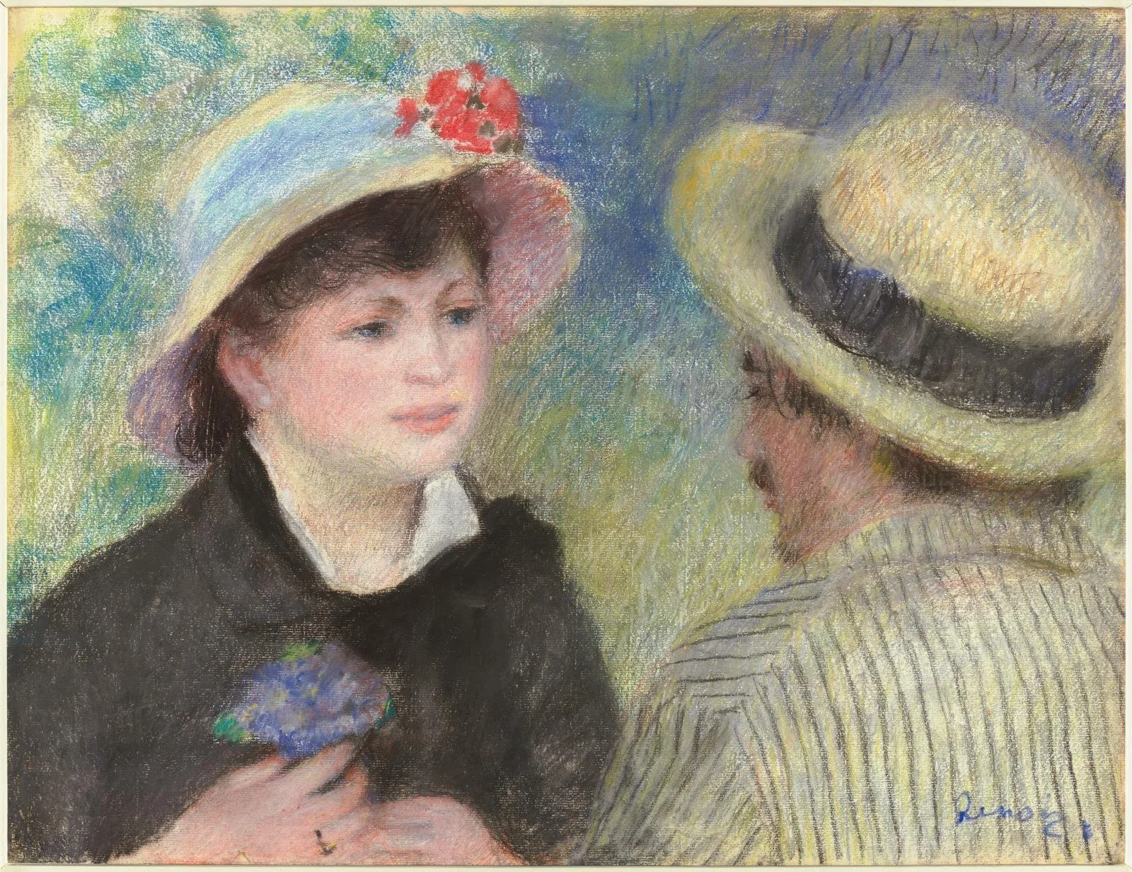
Pierre-Auguste Renoir, Boating Couple, 1880–81, Pastel on paper, Museum of Fine Arts, Boston. On view in “Renoir Drawings,” at the Morgan Library & Museum.

“Renoir Drawings,” now on view at the Morgan Library & Museum in New York, is therefore something of an anti-blockbuster blockbuster.1 Even with its marquee name, the exhibition mostly avoids top-line works and Renoir’s core Impressionist years of the 1870s. Instead, the show digs down, at times way down, into Renoir’s paper record to draw up a newly intimate portrait of the artist across a fifty-year span. With detailed drawings packed into two galleries, the exhibition requires close attention, as displays on paper generally do. Works are small, behind glass, and in lower light (at times, also obstructed by glare). But the rewards of this significant show can leave us with a fresh impression of the Impressionist we thought we knew so well.

To get a sense of the importance that the Morgan, with its dual focus on literature and art on paper, has placed on this exhibition, look no further than its curator, Colin B. Bailey. Working with his research associate Sarah Lees, Bailey has done double duty here as the organizer of the exhibition while serving as the institution’s Katharine J. Rayner Director—the first time, in his decade-long tenure, that he has overseen his own show. “As a director of a museum,” he explained at the preview, “it is unusual, and perhaps not always very wise, to embark on a large exhibition, and we have spent seven years working on it.” In other words, as the first comprehensive exhibition devoted to Renoir’s works on paper in more than a century, this is an ambitious and expensive undertaking.

We are its beneficiaries, as its results combine significant loans with a thoroughly mined archive of works on paper. The exhibition presents one hundred drawings, pastels, watercolors, prints, and paintings from sixty-two lenders, with a plurality of loans from Paris’s Musée d’Orsay, where a version of the exhibition will be on view this spring.

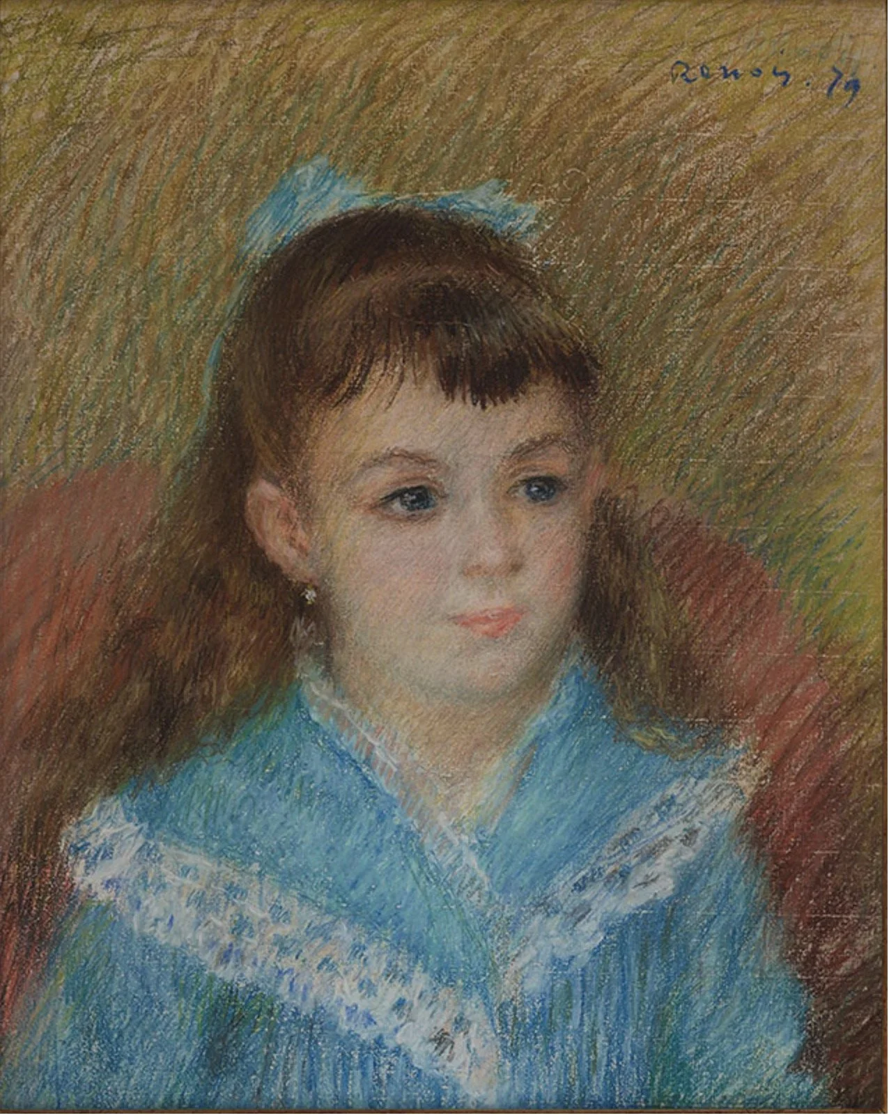
Pierre-Auguste Renoir, Portrait of a Girl (Elisabeth Maître), 1879, Pastel on Ingres paper, The ALBERTINA Museum, Vienna. On view in “Renoir Drawings,” at the Morgan Library & Museum.

Beyond his sketchbooks, Renoir composed some eight hundred independent works on paper. While other artists may settle on preferred subjects and formulas, Renoir employed his drawing widely, composing portraiture, mythological imagery, landscapes, still lifes, and scenes of modern life. Along the way, he worked through an adventurous range of graphic media: pencil, black chalk, red chalk (also called sanguine), white chalk, Conté crayon, charcoal, pen and ink, watercolor, gouache, and pastels, as well as printmaking with etching and lithography. All of the resulting works are fugitive and fragile, susceptible to light and movement. This makes their public exhibition here all the more rare.

A word should also be said for the accompanying exhibition catalogue, which features essays by Bailey, Lees, Flavie Durand-Ruel Mouraux and Paul-Louis Durand-Ruel (scholar-descendants of the Impressionist dealer Paul Durand-Ruel), and Anne Distel and Paul Perrin of the Musée d’Orsay. Published by DelMonico Books and printed in Trento, Italy, on uncoated Munken paper stock, each page feels like its own work on paper, with astonishing image fidelity. Those many other museums now outsourcing their catalogues to China, please take note.

While this exhibition has been seven years in the making, its initial inspiration took shape some two decades ago. That was when Bailey saw Study for The Great Bathers (ca. 1886–87 and 1908), a large work in red and white chalk on wove paper lined to canvas, while paying a visit to the home of Drue Heinz. A specialist in eighteenth-century French art and an authority on Renoir, Bailey saw Heinz’s drawing for what it was: a preparatory work related to Renoir’s masterpiece in the Philadelphia Museum of Art, but one he had never encountered before.

The surprise reveal suggested how much of Renoir’s art beyond his famous paintings (he made some four thousand canvases) was still out there to be discovered. “Renoir’s works on paper form a considerable part of his oeuvre,” Bailey writes in the lead essay of the exhibition catalogue, but

as a corpus they remain somewhat uncharted, and occasionally treacherous, territory. Accuracy in dating and the correct identification of media are often lacking; a comprehensive and well-documented review of his development as a draftsman over six decades has yet to be written.

In life, Drue Heinz was not only a significant collector but also an important patron of the arts. Among her many philanthropies, she was the founding supporter of the New Criterion Poetry Prize. After her death in 2018, her estate offered the Morgan a work from her collection. Bailey requested her Bathers and set about creating this exhibition around the acquisition in her honor. While not a comprehensive catalogue raisonné, the result does much to advance Bailey’s own call for a “well-documented review of [Renoir’s] development as a draftsman.”

Renoir showed graphic talent from an early age. He drew until the end of his life. According to his son Jean, he “never let a day go by without sketching something.” Following his eldest brother, Pierre-Henri, who was an engraver of medals and gems, Renoir found early work in Paris as a designer, decorator, and draftsman for blinds, emblems, and commercial decor. He also apprenticed to be a painter on porcelain for Sèvres. As he moved on to training at the Ecole des Beaux-Arts, he pursued the traditional course of drafting and figuration and received a copyist permit for the Louvre.

The earliest works in “Renoir Drawings” are those from the early 1860s, with rather arid chalk-and-graphite studies on paper of paintings and sculptures. As he turned to Impressionism in the 1870s, his portrait pastels become a highlight. Here his tender 1879 Portrait of a Young Girl (Elisabeth Maître), on loan from the Albertina Museum, Vienna, is a standout. So too Boating Couple (1880–81), on loan from the Museum of Fine Arts, Boston, and The Milliner (ca. 1879), from the Metropolitan Museum of Art.

The exhibition becomes most illuminating as it gathers studies and versions of the same compositions together. Renoir’s Dance in the Country (1883), one of the significant oil-on-canvas loans from the Musée d’Orsay, is accompanied by a suite of paper studies and related prints on loan from other venues. The same for Motherhood (1885), another oil on loan from the Musée d’Orsay.

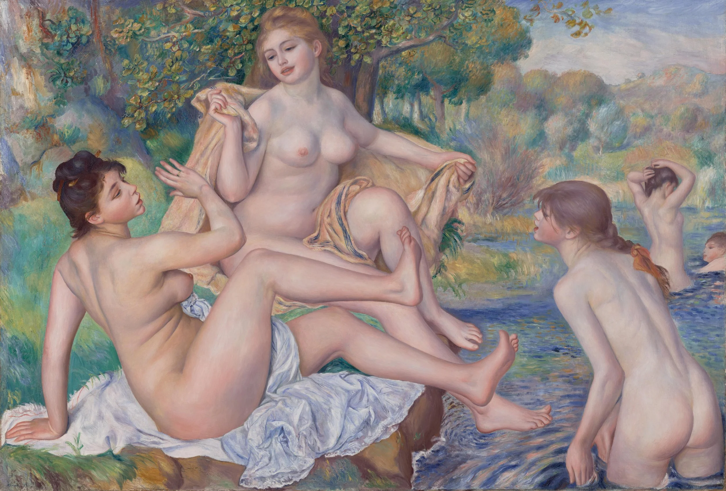
Pierre-Auguste Renoir, The Great Bathers, 1886–87, Oil on canvas, Philadelphia Museum of Art. On view in “Renoir Drawings,” at the Morgan Library & Museum.

A turning point for the artist, and this exhibition, is The Great Bathers (ca. 1886–87). A suite of seven studies, including the Heinz bequest, is centered around the oil on canvas from the Philadelphia Museum of Art (which is only able to travel due to a change in its loan agreement in 2020). Here his drawings are canvas sized, as though he designed to transfer them as one-to-one components, like Renaissance cartoons, to his finished work. The final composition conveys this sense of multipart assembly, with its nude female figures seemingly detached from one another and unreal. Such unreality was no doubt purposeful, as Renoir moved away from the contemporary in favor of an idealized, friezelike antique.

“Around 1883,” the artist recounted to the painter Ambroise Vollard, “I had come to the end of Impressionism, and realized that I knew neither how to paint nor to draw.” Instead he traveled to Italy and took to Raphael. In what is called his rappel à l’ordre, he abandoned being a painter of modern life to focus on the classical nude. The subject matter brought him back to his student days of the 1860s, but now informed by a new Impressionist sensibility for luminosity and color. As he explained to his dealer Durand-Ruel in the fall of 1888, “I have returned . . . to the old style of painting, soft and light. Like Fragonard, but less good.”

Renoir pursued the classical nude into the early decades of the twentieth century. One of the final works here is his Study for “The Judgment of Paris” (ca. 1908) from the Phillips Collection. The related oil, in the Hiroshima Museum of Art, did not travel, but a patinated plaster relief of the composition that Renoir composed with the sculptor Richard Guino is here from the Musée d’Orsay. These final works represent how Renoir carried on even after he became too infirm from arthritis to hold soft media such as pastel and charcoal. (An early film in the museum’s introductory hall shows him at work in old age.)

Throughout his life, friends and critics alike remarked on Renoir’s drafting skills. An early critic for La Liberté called his drawing “neither frigid nor fixed; it is alive, animated, and intelligent. It has infinite delicacy and subtlety.” The decadent novelist Joris-Karl Huysmans compared Renoir to Chardin and said his portraits were even more “captivating, individual, and incisive.” In her journal, the close friend and fellow artist Berthe Morisot called Renoir a “draftsman of the first order” on a studio visit in January 1886, after seeing a suite of drawings in red and white chalk around his Motherhood composition:

He showed me a whole series done from the same model with about the same movement. . . . it would be interesting to show all these preparatory studies for a painting, to the public, which generally imagines that the Impressionists work in a very casual way.

Across Renoir’s span of four thousand paintings, did he make a bad one? He certainly did. Some of his late-career nudes, such as the bumper crop now in Philadelphia’s Barnes Collection, have long been criticized as overdetermined and fleshy. Judging from the selection now at the Morgan, however, the same does not hold true for his drawings. Provisional drafting may have taken Renoir’s paintings away from the precepts of Impressionism. Ranging across multiple styles and media, his drawings meanwhile remained open, experimental—even, we might say, impressionistic.

  1. “Renoir Drawings” opened at the Morgan Library & Museum, New York, on October 17, 2025, and remains on view through February 8, 2026. A version of the exhibition will also be seen at the Musée d’Orsay, Paris (March 17–July 5, 2026). 

Holbein at the Morgan

THE SPECTATOR WORLD EDITION, April 2022

Holbein at the Morgan

Holbein’s heroes have arrived in New York City

There’s a moment in portraiture when people started having a mind of their own. All of a sudden you see it in the faces: the eyes, the brow, the lip. We are no longer looking at a figure for all time — or even a sitter in a moment in time — but at something more like “me time.” The focus is not on outward appearances but inward looking. These people are lost in thought.

That’s just where Hans Holbein the Younger, the great portraitist of the early sixteenth century, found them. The German artist, born into a family of painters around 1497, could conjure the smallest details at his fingertips. He quickly became the most sought-after portraitist in Europe and, by 1536, the court painter of Henry VIII (at a time when Henry himself was courting).

What set Holbein apart was what he saw in his sitters and what he chose not to see. He radically edited down the background of his paintings and removed the trappings of possessions. Instead he captured his sitters, simply put, capturing themselves. Holbein: Capturing Character, an exhibition gathered from twenty lenders of more than thirty paintings and drawings by Holbein, as well as paintings, books and jewelry by his contemporaries, is now on view at New York’s Morgan Library & Museum.

Europe of the early 1500s was having a moment of its own. Technological revolutions, after all, can be even more life-altering than political revolutions. If you think today’s digital revolution has been something, consider the Gutenberg revolution of the later fifteenth century. While Johannes Gutenberg’s Bible came out in 1450, the German metalsmith from Mainz remained largely unknown in his lifetime. He died a financial failure. But his invention of movable type sent shockwaves through much of Europe. Thirty years after his Bible’s first revelatory run, there were 110 printing presses across Europe. Fifty of them were in Venice alone. By 1500, European presses had already produced over twenty million books.

All of a sudden, literature became personal. A new bumper crop of classics in translation brought the wisdom of antiquity to a wider public. Scholasticism and the oral tradition gave way to more direct intellectual engagement. Rather than scribes copying manuscripts generation after generation, book printing made authorship instantaneous and individual. The act of reading also became silent. At the same time, contemporary writers became the world’s first bestsellers as they overturned Europe’s religious and cultural order. Luther distributed 300,000 of his printed tracts. Meanwhile the humanist Erasmus — something of a centrist in a schismatic age — sold 750,000 copies of his books.

A former priest who popularized philosophy and attacked modern superstitions, Desiderius Erasmus of Rotterdam was the Jordan Peterson of his day — at least when it came to his reach and popularity. He was the “prince of the Humanists” for his book In Praise of Folly, written while he was visiting the English statesman Thomas More. He was also a champion of Holbein and sat for several portraits, both large and small, throughout his later life. It was Erasmus who introduced Holbein to More and the inner circle of the English crown. Whenever you think of Henry VIII looking like the King of Hearts, with his head a quarter turned in playing-card profile, recall that it was Holbein who painted that original portrait.

There is no Stout Harry at the Morgan, but Holbein’s More is here, the 1527 painting lent by the Frick Collection as the 70th Street museum undergoes a lamentable “renovation.” Removed from its Frick pairing with Holbein’s portrait of Thomas Cromwell, More now strikes us as, well, even a bit more. The painting is now hung close to eye level. You can just about make out every stubble of More’s five-o’clock shadow. With a mixture of focus and fatigue, England’s future Lord High Chancellor stares over our shoulder into space. A wrinkle of his furrowed brow connects between his eyes on the bridge of his nose. At its corner, his lip turns down in the hint of a frown. A luminous green curtain hangs behind him.

A humanist philosopher, More argued against the reformation of Martin Luther and John Calvin. When it came to acknowledging Henry’s own claim to be the supreme head of the Church of England after the annulment of his marriage to Catherine of Aragon, More also dissented. “I die the King’s good servant, and God’s first,” More said as he was executed for treason just five years after sitting for Holbein’s portrait.

You can already see the weight of history in More’s world-weary face. His expression contrasts with his sumptuous fur collar and the red-velvet sleeves of his doublet shimmering in the light. Holbein rendered the S-shaped links of his gold livery chain, a symbol of More’s royal service, with a jeweler’s detail. Originally trained in miniature, Holbein could decorate his portraits as though he were adorning their very surfaces with precious metalwork. (For those who caught Capturing Character at the Getty Museum, where this exhibition curated by Anne T. Woollett originated, it was the portrait of Cromwell, More’s rival, that got the all-expenses-paid trip from the Frick to Los Angeles.)

Be sure to bring your reading glasses when visiting the Morgan. There is an abundance of small detail here that calls out for close looking: roundel portraits, rings and coins, even a tiny portable portrait still with its original lid. Holbein could add just the right evocative detail, especially to his sensuous portraits of women. Books are never far from the mind in this exhibition. Holbein designed a suite of tiny woodcuts for a book on “The Dance of Death” (c. 1526, published 1538) — a memento mori of dancing skeletons. Figures are also shown reading, or writing, or at the very least holding the book that was occupying their attention until we walked in the room. “Mary, Lady Guildford” (1527) looks like she is about to whack us over the head with the small hardcover now clasped closed in her hands.

Books are not unique to Holbein’s paintings. We can see them in the work of contemporaries exhibited alongside him: Albrecht Dürer, Quentin Matsys and Jan Gossaert. But unlike these windows on the world, all packed with details and distractions, Holbein’s portraits reflect a more direct literary experience — of that inner voice, not just speaking, but reading and dictating thoughts in our heads.

Sometimes these words illuminated the very portraits themselves. “The year 1533, at the age of 39” (ANNO 1533 AETATIS SVAE 39) reads the gold lettering seemingly tooled right into the surface of Holbein’s “A Member of the Wedigh Family.” Or how about the sign tacked to the tree on the portrait of “Bonifacius Amerbach” of 1519: “I am not inferior to the living face; I am instead the counterpart of my master, and distinguished by accurate lines. Just as he completes three intervals each lasting eight years, this work of art diligently renders his true character.” Below, the sign reads: “Jo[hannes] Holbein painting Bon[ifacius] Amerbach on 14 October 1519.”

In other words, Holbein is the painter of the portrait. The young man depicted is the author and master of the twenty-four-year- old life therein. For those sitting for a portrait by Holbein in the turbulent early years of the sixteenth century, it must have seemed like they were all the authors of their fates, probably more than ever before. Henry VIII certainly thought so, as did Erasmus. In the thoughtful depth of his arresting portraits, Holbein painted the dust-jacket images for all their books of life.

Death in Venice, alive in New York

SPECTATOR, October 30, 2018

Death in Venice, alive in New York

Tintoretto looked not up to heaven, but down to the fallen angels of our modern age

Il disegno di Michelangelo e il colorito di Tiziano: The drawing of Michelangelo and the colour of Titian.

With these words, supposedly written on his studio wall, Jacopo Tintoretto staked his claim on cinquecento painting. We are lucky he failed on both counts. Tintoretto was no Michelangelo or Titian, but he could push paint like no one else in La Serenissima. Renaissance means ‘rebirth’, of course. Yet the paintings of Tintoretto can come as deadly shock. His ‘Crucifixion’ of 1565 in Venice’s Scuola Grande di San Rocco strikes like a thunderbolt. The painting is also the single best work of religious art in the Italian Renaissance. With Christ fixed to the cross front and centre, the action of this composition swirls around him like a dark cyclone. Everyone — carpenters, soldiers, a dog — makes up ‘a centrifugal energy that charges the entire picture’, as the late art historian David Rosand wrote. As onlookers gazing up as Christ stares down, we too are swept up in the storm.

With expressive, brooding, and in-your-face energy, Tintoretto never sought the safety of the neo-Platonic shore. In his draftsmanship, he did not trace out the idealised forms of Michelangelo. In his choice of colour, murky at best, he did not seek the fuzzy warmth of Giorgione. Yet with speed and drive, Tintoretto swept through the 16th-century scene by looking, not up to heaven, but down to the fallen angels of our modern age. He went low when Titian and Veronese went high.

As we mark the 500th anniversary of his birth with exhibitions stretching from the Doge’s Palace in Venice to the house of Morgan in New York City, the wild child of the Venetian Renaissance is receiving his due. In New YorkDrawing in Tintoretto’s Venice at the Morgan Library & Museum explores the draftsmanship of this son of a dyer — tintore — in comparison to works by Titian, Veronese, Bassano, and others. Meanwhile at the Metropolitan Museum, Celebrating Tintoretto: Portrait Paintings and Studio Drawings, a focused exhibition in the Robert Lehman Wing, looks to the painter’s quick-fire portrait studies.

Sacco di Noce — ‘bag of nuts’. That’s how Tintoretto’s figuration came to be known, in particular for the dashed-off studies on paper of his later career. What sounds like an insult, in fact, signals an expressive brilliance. Lacking time and inclination, Tintoretto refused to labour over sculptural shading. At the Morgan Library, the torso of his ‘Seated Male Nude’ (c. 1549), on loan from the Louvre and reproduced on the cover of the exhibition catalogue, looks like it ingested some bad shellfish. His ‘Seated Man with Raised Hand’ (c. 1577–78), from nearly two decades later, resembles nothing less than an aquaman pulled from the rippling Grand Canal. The wavy lines of these drawings do not have a sculptural meaning. But they have an expressive feeling — queasy, awkward, very human, very off.

By focusing on works on paper, with seventy drawings by Tintoretto and his circle now on view, the Morgan show makes the case for a ‘drawing school of Venice’. That’s the title of the first chapter of the catalogue, but it ends with a question mark. Ever since their disparagement in Giorgio Vasari’s Lives of the Artists, the idiosyncratic drawings of Venice have been considered a poor imitation of the Florentine school. An opening example here by Titian, ‘Embracing Couple’ (c. 1568-70), should not give Michelangelo or Leonardo cause of concern over the grading average of the drawing school curve. A tangle of marks, with bodily forms barely discernible, Titian’s drawing appears entirely preliminary, a primo pensiero. But more than that, it seems built up and worked over, as if you were applying layers of paint to canvas rather than lines of charcoal to paper. In other words, here is the richest of painters with the poorest sense for basic draftsmanship.

The exhibition follows through with examples by Andrea Schiavone — the ‘Slav’ — who avoided the whole disegno-colorito feud by finding some fusion of the two. His ‘Apostle (St Matthew)’ (c. 1550), and ‘Virgin Annunciate’ (c. 1550-60) of ink, chalk, watercolour, and wash are drawn paintings — or maybe that should be painted drawings. The Venetian Jacopo Bassano went with a similar approach, using coloured chalk to give some heft to his sketchy figures. Meanwhile, practice makes perfect, and Paolo Veronese, ever the dutiful student, drew study after study in pen and brown ink. In ‘SS. Leonard, Mark, and Francis’ (c. 1549-51), he arrived at his own Venetian sense for sharpened form with highlights of white gouache.

Yes, there was a drawing school of Venice. Tintoretto started his own. At the Morgan, there are several examples of the students in his workshop drawing studies of Grimani Vitellius, or at least a fleshy cast of him, all from slightly different angles. There are also numerous attempts by the Tintoretto Workshop at depicting a cast of Michelangelo’s ‘Samson and the Philistines’. Of Tintoretto’s many pupils, Palma Giovane may have been his best. With white paint over brush and brown, he traces the light reflecting off Michelangelo’s bronze like muscles beneath oily skin. Meanwhile Domenico Tintoretto, Jacopo’s son, carries on the family name with drawings that look to the female nude laid bare in a newly naked way, unidealised and full frontal, from the bottom up.

At the Metropolitan Museum, the diminutive scale of the Celebrating Tintoretto exhibition belies the birthday party within. For someone known to go big, Tintoretto painted some of his most arresting portraits small. Collected in a single room in the Lehman Wing, the show looks behind the quickfire brushwork, or prestezza, for a selection of personal portrait studies, some of which informed larger compositions. Along with drawings from the Lehman collection by Domenico, these closely cropped figures appear out of the darkness in a raking light. Like the ‘Crucifixion’ in the Scuola di San Rocco, they also face us head on.

There is nothing idealised, nothing reserved in their poses. Focused on the elders of the Venetian Republic, these are powerful portraits of powerful men, and they glare back from the canvas. Tintoretto may not have had the drawing of Michelangelo or the colour of Titian. But in his stare, he was death in Venice.