Viewing entries in
Art

Comment

Video Games

Screen Shot 2014-10-21 at 1.12.47 PM

BAKU
Fall 2014

Video Games
by James Panero

Loren Munk is New York's guerrilla film-maker supreme.

One day, when art historians take stock of the 2008 Whitney Biennial, the first artist to come to mind won’t be someone who appeared in the exhibition. It will be the artist who was thrown out of the exhibition for recording it with a tiny digital camera and posting it on YouTube. “The ironic part is they can film you with their security cameras, and you don’t give them permission for that, but God forbid you are there getting pictures of the art,” reflects this social media provocateur.

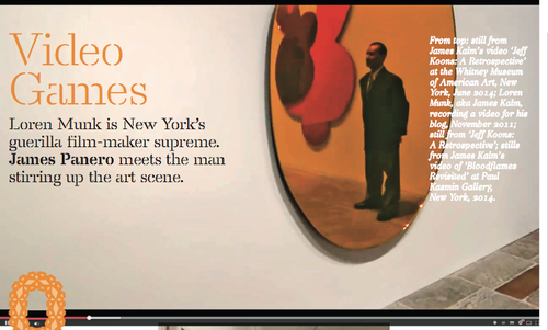
Working under the pseudonym James Kalm, since 2006 Loren Munk has made more than 1,000 videos just like 2008 Whitney Biennial Busted. They all start the same way: a shaky glimpse of a bike locked on a New York street, a pan to a gallery or museum door and a heavy-breathing voice-over announcing, “This is James Kalm, the guy on the bike, welcoming you to another half-assed production.” Then with a cut, or maybe not, we watch in point-of-view style as the camera takes us in, glances around and moves in closer to look at individual works on display. All the while, a wry voice leads us through, giving us first impressions, striking up conversations and sometimes striking out with gallery security. “People told me this is the stupidest thing they’d ever heard of,” Munk says of when he first explained his video project to friends. “I heard that, and I said, ‘Man, I’ve hit a gold mine!’”

The reason art historians of the 2008 Whitney Biennial will one day think of Munk is that, frankly, there is no better record of the exhibition than his half- hour-plus video walkthrough. Munk posts everything he films free on YouTube, either as the ‘James Kalm Report’ or ‘James Kalm Rough Cut’, and if you can’t remember what appeared to the right of the lift on the fifth floor, just tune in. Beyond that, his 2008 reportage has become something of a turning-point for a form of radical art documentation. “If you are showing exciting art that has cultural significance, by discriminating against all those people who can’t see it in person, you are holding back society,” says Munk.

Back in 2008 the Whitney thought otherwise. “Excuse me, sir,” says a guard fve minutes into the clip. “They are telling me right now that you are using that camera. Sir, if you don’t stop now, they are going to come over here and take you out of the building. OK?”

“They are going to take me out of the building?” Munk asks.

“Turn it off, please. The camera. Last time I ask you.”

Next thing we see is Munk’s feet being escorted down the stairs, as he explains to the viewer how he was just threatened with a lawsuit and copyright infringement. “This is James Kalm getting kicked out of the 2008 Whitney Biennial,” he concludes, offering his trademark sign-off: “Thanks, Kate,” a nod to his wife. He later returns to film four more segments, vowing to leave his camera on while declaring it a performance piece called The Camera is Off.

“That ended up being one of the biggest videos up to that point,” Munk says. Far from landing him in court, the Whitney linked to it and soon started posting their own YouTube videos. Today, the Whitney invites Munk to all its press previews and director Adam Weinberg comes over and shakes his hand. “It has gone from something they were throwing me out for six years ago, to something they now view as valid.”

Compared to the polished look of TV news, Munk’s videos take a bit of getting used to, but the art world is coming round to the 62-year-old performance documentarian. His appearance at a gallery opening has become a sign of critical arrival, and gallerists now know who to look for: a tall, paint- splattered balding man wearing an old bike helmet, the only person in the room whispering into a camera.

His videos are equally distinctive. Without ever showing the host’s face, they are less like classic documentary and more like going to an art opening inside the head of a knowledgeable friend. “I want it to be closer to the way someone really experiences the art scene, grabbing the artist, swinging back, zooming in, with their buddy and a couple of beers.”

As part of his practice, rain or shine, Munk bikes nearly everywhere from his 353sq m loft in Red Hook, Brooklyn. The audible breathing, the shakiness, are there because he’s just pedaled miles through busy streets, over the Brooklyn Bridge, and doesn’t wait to catch his breath, always filming in one take. “The immediacy is important,” he says. “It is changing the way people look at video. But people still say, ‘Your shaking is making me nauseous and your commentary is idiotic’.” But as we have grown used to the look of video in the smartphone era, Munk’s work now seems ahead of its time.

As the internet has leveled the field of arts journalism and newspapers have cut back on coverage, a freelancer with an online following can also hold increasing sway. By the last count, more than three million viewers have logged on to see Munk’s YouTube videos. His audience is growing internationally, too. “I’ve got people keeping up with me in the UAE, in Morocco, in China,” says Munk. “I get these letters from artists in Algeria saying, ‘I love your videos, will you look at my website?’” Even a school of Papulankutja aboriginal people in the outback of Australia tunes in. “We are 500 miles from the next big town,” their teacher emailed Munk, “but my kids can feel like they are part of the Williamsburg art scene” – referring to one of the alternative Brooklyn neighborhoods, like Bushwick, that Munk documents as often as he does Chelsea.

25KALM1_SPAN-articleLarge

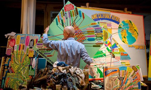
Loren Munk in his studio (Todd Heisler/The New York Times)

Today Munk covers every corner of the New York art scene with tireless energy but never for any financial gain (he turns down offers of online advertising). “Munk’s obsession with art, art history and the New York art world is evidently more than one person can handle. So he created James Kalm,” Roberta Smith, the chief critic of The New York Times, wrote in 2011. She went on to praise him for giving “dizzying visual expression to some of what lures the art-driven to the city: the sense of possibility in the air and of history beneath our feet.”

Anyone can film a gallery opening but Munk’s films are different in that they have attracted a particular community and this has led him to find new artists, curators, critics, collectors and gallerists who have been excited by his work. 

“A key difference for Loren is the community that has formed around his video works,” says Hrag Vartanian, the editor of the Brooklyn-based arts magazine Hyperallergic, who as a curator included Munk in an exhibition of social-media art in 2010. “His generosity in his video work is clear, he doesn't have to be doing this but he does. Though, I do think doing the videos did help him reestablish himself on the art scene. All artists go through ebbs and flows in their career, and while some artists may complain when their careers dip, Loren found new ways to think about art and share his passion through video.”

If there’s a context for Munk’s films, it’s that they share something with the handheld clips coming out of war zones, and something with our culture’s obsessive digital documentation. Other artists have used YouTube but little else matches the breadth of Munk’s work.

So where will his videos end up? Probably not as something sold in a gallery, unlike an earlier generation of video art. “The old model is the opposite,” says Munk of video from the pre-internet age. “They were doing something in response to television, using technology in a hermetic, esoteric way, and you can access it only if you jump through the hoops to see it in a gallery.”

The videos have also reinvigorated Munk’s first passion for painting and have already paid off for him through his paintings, which consist of complex diagrams, maps and flowcharts of the art world. “He’s really synthesized a lot of things in his practice,” says Nick Lawrence, gallerist at Chelsea’s Freight and Volume, who began representing Munk two years ago. “There’s something unjaded and pure about it, and it shows up in his paintings. There’s a certain against-the- grain, countercultural approach in what he covers, how he covers it, in his technique. And his paintings are painted with an obsessive quality. The lines that connect in his paintings are exactly how he zigzags around the room at an opening. They are very spontaneous, very provisional.”

Munk agrees: “Often that’s the best way. I just walk through the doors and say, ‘This is pretty cool,’ and I just turn on the video and let it go.”

expanded from the print edition
Comment

Comment

Gallery Chronicle (October)

From "State of the Art" on view at the Crystal Bridges Museum of American Art: Isabella Kirkland, Emergent, 2011. Oil and alkyd on polyester over panel. 60 x 48 in.

THE NEW CRITERION
October 2014

Gallery Chronicle
by James Panero

On “State of the Art: Discovering American Art Now” at Crystal Bridges Museum of American Art; “Ellen Letcher: Gaslight” at Hansel and Gretel Picture Garden Pocket Utopia; “Amy Feldman: High Sign” at Blackston; “Katherine Taylor: New Sculptures” at Skoto Gallery; and “Robert Otto Epstein: Sleeveless” at 99¢ Plus Gallery.

Everyone knows there is more to contemporary American art than the Whitney Biennial. The Crystal Bridges Museum of American Art, which opened in 2011 in Bentonville, Arkansas, wanted to find out for itself just how much more. Since 2013, the museum president Don Bacigalupi and the curator Chad Alligood logged 100,000 miles visiting nearly a thousand artists’ studios across the country. Their discoveries have now been brought together in “State of the Art: Discovering American Art Now,” the museum’s first of what I hope will be a recurring series of contemporary surveys, and the reason why my art season began with a flight to Fayetteville and a short taxi-ride to Bentonville.1

As opposed to the slick knowingness of big-city surveys (largely populated by coastal artists and the curators’ friends and former students), the Crystal Bridges assembly is a diverse, heterogeneous, and creaky affair. In some cases, especially in the first exhibition room, the squeakiness is audible, as the mechanics below Lalu, a sculpture by the Knoxville-based John Douglas Powers, competes against the more sublime vision, above, of automatic reeds waving against a projected sky.

The entrance to "State of the Art": Andy DuCett, Mom Booth, 2013-14. Interactive installation. Photo: Minneapolis Institute of Arts.

Rather than seek out the hollow and detached, the Crystal Bridges curators went for the uplifting and engaged—at times too uplifting and engaged—as no rhinestone was left unturned in an exhibition that embraces sentimentality and even tackiness (of the unironic kind). The best work here is the meticulous, the realistic, and the strong-willed—art that tends to get overlooked as overwrought and under-intellectualized. I was especially struck by the totemic juju sculptures of Vanessa L. German, the verdant nature scenes of Isabella Kirkland, and the Renaissance revivalism of Jamie Adams. The Brooklyn-based Meg Hitchcock, whose intricate collages of religious texts I featured in this space last season, represents the aspirations of Crystal Bridges at its best.

From "State of the Art": Vanessa L. German, White Naptha Soap or, Contemporary Lessons in Shapeshifting, 2013. Mixed media assemblage. 55 x 15 x 26 in. Courtesy and Photo: Pavel Zoubok Gallery, New York

It is impossible not to walk away from this survey without additional suggestions for the mix: I would like to have seen more of those painters who identify as classical realists, routinely balkanized from the contemporary discussion, as well as the military and civilian illustrators who document the recovery of wounded soldiers and sailors through the Joe Bonham Project. Nevertheless, with “State of the Art” Crystal Bridges has fulfilled a mission to serve as a bridge for the art of the United States, connecting the wide range of the two-million-odd artists working in what I might call America’s outer-outer borough scene.

Installation from Ellen Letcher: Hansel and Gretel Picture Garden Pocket Utopia

The artist Austin Thomas, whose Pocket Utopia was one of the first galleries in Bushwick before its relocation to the Lower East Side, has now made the unexpected jump to Chelsea, pairing with the gallery Hansel and Gretel Picture Garden. She has brought her stable of Bushwick artists with her, promising to deliver some genuinely advanced work to the edges of those blue-chip hedgerows. Her first Chelsea-based exhibition features Ellen Letcher, an artist of the Bushwick old guard, who until recently ran her own pioneering (and imaginatively titled) outer-borough gallery, Famous Accountants.

For years, Letcher’s day job in magazine production gave her easy access to her raw materials—fashion photographs—which she cut up and juxtaposed, pasting, layering, and moving them around on paper using paint as a binder. In her hands the images lost their slick gloss and revealed more sinister underpinnings. Her collages were, in part, inquiries into the image-making of her daylight profession, while also serving as commentaries on larger themes.

Now at Hansel and Gretel Picture Garden Pocket Utopia, Letcher explodes the tidy frames of her works on paper and occupies the space like one large collage.2 The exhibition riffs on the provisional and the transitional, with plastic wrap partially covering at least a couple of sculptures and a handful of paintings spilling out onto the floor. A drop cloth, once used in preparing her collages, forms the basis for one work. A chair covered with paint, and the paint splatterings scraped off the studio floor, form another. In one respect, the installation looks like the artist’s studio, where she has run out in a hurry. In another respect, the presentation brings the violence of her collage-work to the surface. Instead of merely clipping off the head of an image, Letcher decapitates the head of a statue suffocating in plastic, a head that now appears as an independent work for sale. Elsewhere, scratchy messages, such as “We Decided Not To Fight,” have been gathered together and pinned and taped to the wall, part personal sayings, part song lyrics.

The dark tone of this show can be seen as an allusion to world events, albeit a clairvoyant one, since the work came together before the atrocities of late summer. The exhibition opened on the same day, August 20, that ISIS released its snuff film of the journalist James Foley. If artists are the early warning systems of history, Letcher has deployed an advanced installation with ominous long-range sensitivities.

Installation from Amy Feldman: High Sign

Amy Feldman’s paintings are hard to miss. They convey a haunting stillness through a unique economy of means. Her work, in fact, may be the most hauntingly economical paintings around right now. Feldman uses just two tones, gray and white, in her final compositions. The grays do differ slightly painting to painting, ranging from gunmetal to battleship—or, in other words, not much at all. Yet despite these limitations, or more likely because of them, the work almost always captivates.

With several large paintings now encircling the small gallery at Blackston, floor to ceiling, her latest work conveys an added power without giving up its compositional secrets.3 Feldman paints fast, one session per piece, enlarging from sketches into dynamically simple shapes, drips and all. There’s a high-wire quality in the way she makes this happen. The paintings succeed in how she balances the gray and white between figure and ground. While the grays lay on top of the white as a figure, the white also pushes into them, forcing them to ground. The line between the two tones can have an optical quality as this teetering dynamic is played out. The overall effect resembles the flickering, color-deadening sense of space illuminated by an old fluorescent light.

At Blackston, Feldman brings her paintings up to a line of cartoonish legibility, with close-set, similarly styled works interacting like square panels in a comic strip, but with only the most cryptic storyline. Killer Instinct (2014) looks like the face of an angry monkey. Spirit Merit (2014) could be a ghost. Gut Smut (2014) is a puff of smoke. In the side room, the monkey faces return in two animated sets of four smaller paintings. Yet any coherent reading quickly disappears to the margins, just as the gray of Open Omen (2014) migrates to the edges, leaving only a white void.

Katherine Taylor, Bark Feet (2014)

I first met the artist Katherine Taylor almost exactly twenty years ago, hiking the Appalachian Trail between Franconia Notch and Mount Moosilauke, New Hampshire. A year apart from me as an undergraduate at Dartmouth College, she was the sophomore leader on my freshman orientation trip. So perhaps I should claim to be among the first to pay this sculptor a studio visit. Taylor has never stopped working with the woods of New England and Upstate New York in forging a vision between nature and the imaginary world. Now on view at Skoto, her latest show reveals what she has learned in translating her impressions of New Hampshire bark into zoomorphic sculptures of remarkable craft.4

For Bark Feet (2014), what at first seem like outré elephant-foot stools are in fact cast sculptures that are the result of an elaborate process, one that begins with her hiking tubes of silicone caulk into the deep woods to make molds of tree bark. Working in a foundry in the Basque region of Spain, Taylor then multiplies, turns, and folds these impressions into an uncanny semblance of animal skin—even finding ways to mimic the cracked appearance of toenails—which is finally here rendered in aluminum. In other examples, the bark becomes the rind of a sliced fruit or the meat of a nut. Her best work lets these textures speak for themselves, without over-manipulation. In all, Taylor demonstrates the unity of the natural world, with a continuous surface connecting with our own sense of wonder.

Installation form Robert Otto Epstein: Sleeveless

Robert Otto Epstein updates the obsessive craft that defined the Pattern and Decoration movement of the 1970s with the Casualist tendency of the current outer-borough aesthetic. Inventiveness and humor mix with Epstein’s own obsessive abilities, with Bauhaus-quality work inspired by Cosby sweaters and baseball cards. For “Sleeveless” at the Bushwick-based 99¢ Plus Gallery, Epstein showed monochromatic drawings of graphite on hand-gridded paper that referenced patterns from the garment industry: Sleeve for Sweater (2012), Knitting Pattern for Cozy Sweater (2012), and Sleeveless Cardigan (2012).5 In the place of Epstein’s fun sense of color, the work had a quiet melancholy, as though paying homage to the nameless artisans who once made such garments, and to the people, now gone, who once wore them. While this exhibition had a short run, through mid-December Epstein returns for a group exhibition called “Thread Lines” at The Drawing Center that will explore similar themes while “unraveling the distinction between textile and art.”

A final note about an inaugural event called “Exchange Rates: The Bushwick Expo” to take place between October 23 and 26, aligning with Bushwick’s semi-annual “Beatnite” gallery Friday. As I remarked in this space last June, lifestyle culture will increasingly attempt to tap the artistic energy of this outer-borough neighborhood. “Bushwick Takes the Spotlight” read a New York Times headline last month about a new condo development, in an article that began by mentioning “the appearance of a scantily clad, twerking Miley Cyrus at a recent party.”

There is much to be had in twerking with this neighborhood’s artistic reputation even as—or perhaps because—such acts will inevitably will lead to its degradation. Yet “Exchange Rates” looks to be one attempt to expand the cultural conversation from within. Paul D’Agostino of Centotto and Stephanie Theodore of Theodore:Art, two Bushwick stalwarts, have paired with London-based Sluice_ (the underscore isn’t a typo) to place thirty international galleries within twenty Bushwick venues. The four-day collaboration should carry the neighborhood’s DIY approach to an event of broad scope. Whether the mainstream press chooses to note only Miley Cyrus is an open question, although the run promises much to look at and even more to see.

1 “State of the Art: Discovering American Art Now” opened at Crystal Bridges Museum of American Art, Bentonville, Arkansas, on September 13, 2014 and remains on view through January 19, 2015.

2 “Ellen Letcher: Gaslight” opened at Hansel and Gretel Picture Garden Pocket Utopia, New York, on August 20 and remains on view through October 11, 2014.

3 “Amy Feldman: High Sign” opened at Blackston, New York, on September 12 and remains on view through October 26, 2014.

4 “Katherine Taylor: New Sculptures” opened at Skoto Gallery, New York, on September 11 and remains on view through October 18, 2014.

5 “Robert Otto Epstein: Sleeveless” was on view at 99¢ Plus Gallery, Brooklyn, from September 5 through September 14, 2014.

Comment

1 Comment

Grounded Zero


9/11 Memorial north pool and Museum pavilion at night. Photo: Jin Lee

THE NEW CRITERION
September 2014

Grounded Zero
by James Panero

On the recently completed National September 11 Memorial and Museum.

I arrived at the National September 11 Memorial and Museum with frankly low expectations. Like all of the civilized world, I have little affection for the date the museum commemorates and the site it now occupies. It need not be said that the murder of nearly 3,000 innocent people by jihadist terrorists, broadcast to a reported 2 billion viewers worldwide, defined my generation’s darkest day. Even as I watched the ruins of the Trade Center cleared away and new buildings rise, the memory continued to drive me, physically and emotionally, from the site of the attacks.

It hasn’t helped that the subsequent renewal of these blocks of downtown Manhattan has turned tragedy into farce. Caught in a mire of city and state agencies, redevelopment rights, insurance claims, and the supra-governmental ownership of the Port Authority of New York and New Jersey, not to mention the divergent wishes of the families directly affected by the attacks, Ground Zero ground to a halt for years after 2001. Thirteen years on, the area largely remains a construction zone, imprisoned by barbed wire, guarded by a militarized police force, with a folly of new buildings encircling the federally protected footprints of the former Twin Towers.

On one side, punctuated by the sound of acetylene torches, is the overbuilt and overpriced skeleton of Santiago Calatrava’s future rail station, now resembling the flayed carcass of an armadillo. On another is One World Trade Center, the skyscraper formerly known as the Freedom Tower. Saved and crystallized by the architect David Childs from the ambulance-chasing Daniel Libeskind, this monumental headstone was ultimately shortchanged through a scandalous deal between the Port Authority and the Durst Organization, which eliminated the sculptural radome from the building’s forty-story spire and squared off its chamfered base. And at the center is the Memorial itself, a set of inverse fountains by Michael Arad called Reflecting Absence. In concept, they looked to me like an endless replay of the cascading curtain walls of the collapsing towers.

Then there’s the question of how to memorialize brazen acts of terror. The asymmetrical nature of terrorist strategy relies on the spectacle of destruction to make up for deficiencies in force. Most often terrorism turns the peaceful tools of its adversaries into weapons against them: the liberalizing good of commercial air travel; the freedom of the press. Modern terrorism would largely cease to terrorize without the assistance of our broadcast media. One reason why the attacks of 9/11 were so terrifying was that their coordination meant they were captured and broadcast worldwide in real time. Wouldn’t a museum of crushed relics and looped videotape simply further the terrorizing spectacle, putting the trophies of the attackers on permanent display?

And finally there’s the issue of whether any contemporary museum can suitably address a solemn topic on sacred ground. Our cultural establishment has long made a priority out of desacralizing civic institutions. Museumgoers have long been encouraged to check their reverence at the door. No surprise that early reports of the Museum have mostly swirled around the conflicts between the hallowed expectations of the victims’ families and the profane business of what would otherwise be standard museum practice: cocktail fundraisers, photo opportunities, and merchandise sales through a gift shop, all taking place on the site of a mass grave.

Yet, somehow despite all these challenges, I found the 9/11 Memorial and Museum to be profoundly moving, a complex distilled of its own complexity, with the calming grace of renewal emerging from the center of destruction. The fountains themselves went through several changes, as the landscape architect Peter Walker and then-mayor Michael Bloomberg reportedly reined in some of the expense of Arad’s more elaborate proposal. The Memorial, which opened to the public over the tenth anniversary of the attacks, reveals that sometimes design by committee actually works. The fountains are the first features you encounter when visiting the site and, along with the Museum, are administered by the 9/11 Memorial Foundation. They also set the theme for the overall memorial complex: a structure in reverse, an anti-monument of negative space, introverted and underground, affecting in its strangeness.

The fountains are deeper and larger than I imagined. Far from destabilizing, they are wells of contemplation. By overlaying the footprints of the original towers, they restore the first sense of rectilinear order that the terrorists tried to erase. In a smart departure from Arad’s original design, which imagined a subterranean passage behind the falls, the names of the deceased are now etched at plaza level in a slanted table ringing each fountain. Accessible, touchable, and returned to daylight, they have been arranged through a painstaking algorithm of affinities that further restores the individualism of the dead. The names of all the victims of the four-pronged 9/11 attacks are included, including those who lost their lives at the Pentagon and on the field in Pennsylvania, as well as the six individuals who were killed in the 1993 World Trade Center bombing.

Through the sound of the water and the mist of the falls, the fountains distinguish a separate, unenterable space set apart from the noise of the city. They are also technical and aesthetic marvels: The falling water is more orderly and channeled than I first had feared. The pattern of ripples in the basin is mesmerizing, acting less like a reflecting mirror and more like an ethereal portal. And the water laps into a second square void at the center of each fountain with a bottom that is below our line of sight, creating an infinite recession.

In their final design, the fountains accomplish nearly the impossible. Amidst the rush of the commercial city, they restore order through division, each setting aside an acre of downtown space for the spirits. A similar approach is then continued through the Museum itself, which opened on May 21 of this year. The entry-point is a shard-like pavilion, designed by the architecture firm Snøhetta, which cuts into the surface of the plaza beside the two fountains. While the Memorial precinct is free to enter, the Museum requires a $24 ticket, either purchased in advance or at the gatehouse. The high ticket price, the security checkpoint, the food concession, and the gift shop inside have all rankled the public. Certainly they are not ideal. If the operating expenses of the Museum were government- rather than privately-funded, things might be different. Then again, considering the state of construction where the Port Authority and other government agencies have not relinquished control, the Museum would probably not yet exist. And as it stands, the small gift shop, which sells books and Trade Center mementos that help fund the Museum, is set far off from the exhibits. There is no “exit through the gift shop.”

After an initial descent from daylight, the Museum darkens to a receiving floor. On the way down, the escalators pass beneath a trident-shaped piece of the salvaged Trade Center facade, part of the Museum’s gradual introduction of artifacts. A ramp then zigzags deep down to the base of the site. In different hands, this could have been “9/11: The Ride,” but here the Museum has gone a different way, opting for spareness and quiet, with a few key objects, like the Last Column removed from the rubble, rising from the bedrock into the subterranean space of the Museum and visible at points on the walkway down.

After a final descent by escalator, positioned beside the rubble of the Survivors’ Stairs, the Museum reaches bedrock. Designed by the architecture firm Davis Brody Bond, the space here divides between the open void of the overall underground chamber and a tighter area directly beneath the two fountains—the locations of the former Twin Towers. Encouraged by victims’ groups, the Museum has left the square box foundations of the towers’ curtain wall visible in the concrete floor.


9/11 Memorial, Foundation Hall with Last Column. Photo: Jin Lee

Under the stewardship of Alice M. Greenwald, the Museum has wisely divided its layout into distinct precincts, with different feels. The open space called Foundation Hall, outside the ring of the towers, bounded by slurry walls, looks at life outside of the fateful day. Here are items that speak to the heroism of the recovery efforts and the outpouring of worldwide emotion, such as memorial quilts and the Dream Bike restored in honor of the fallen FDNY firefighter Gerard “Biscuits” Baptiste. Here also is a handful of the largest relics of the destruction: a crushed fire truck, a section of the north tower’s radio mast, other pieces of twisted steel. While at first seeming to aestheticize the attacks, like crumbled sculptures by John Chamberlain, these spare items take on a spiritual transference, especially as one notable relic came to resemble a cross, and recovery workers carved another into religious symbols. Not everything worked for me: A large commissioned wall piece by Spencer Finch called Trying to Remember the Color of the Sky on That September Morning, meant to honor the thousands of unidentified remains behind it, merely managed to bring minimalist kitsch below grade.

A section here is also devoted to the history of the towers themselves: the innovation and exhibitionism that went into their construction and the controversies surrounding their design. As the excavations descend to schist, there is comfort in reaching the stability of lowest ground, of seeing sparkling rock. It is reassuring how the Museum looks to tell so many chapters of a long story, with many narrators and varieties of tone, rather than just the one the attackers set out to broadcast.

As a final separation, the Museum divides out the story of the attacks and an exhibition honoring the victims between the two tower footprints. Each is set off by its own entry-point, and guards remind visitors that cameras are not permitted in either space. In one instance, I found the loud admonition more jarring than the offense, although the policy is appropriate, and it sets the tone for these tight inner sanctums.


9/11 Museum, Memorium Exhibition. Photo: Jin Lee

Both of these spaces are affecting, in profoundly different ways. The Memorial Exhibition is spare, small, and solemn, more like a chapel, with simple photographs of each of the victims and an inner projection room that profiles each of them. Although made nowhere apparent in the museum, the reason more of this tower’s footprint is inaccessible is that much of it is still taken up by the commuter rail PATH tracks. As in the original tower design, trains cut through the lowest level of the site—a reminder of the conflicting demands on this real estate.

The Historical Exhibition, beneath the north tower, is harrowing as it replays the 9/11 attacks frame by frame. In contrast to the rest of the Museum, here the information is dense, dizzying, and at times both breathtaking and overwhelming as it looks at a specific event from every available angle. One illustration of the country’s circulating flight patterns, pulsating in the morning, grounded by the evening, speaks to the pall that was cast over the country. The Museum also goes back to the 1990 journals of El Sayyid Nosair, convicted in the 1993 bombing, to reveal the long tail of radicalized Islam. “Destroy the morale of the enemies of Allah,” he wrote. “Exploding . . . Their high . . . Buildings.” Osama bin Laden is also quoted, vowing to “prevail over the Americans and the Jews.”

Telling the story of 9/11 is a minefield. Yet it must be told, and the 9/11 Museum does it better than anyone might expect. Although named after 9/11, the Museum uses its spaces not to broadcast but to encapsulate the spectacle of the terrorizing day. The Museum is “As much about ‘9/12’ as it is about 9/11,” Greenwald explains in an introductory message. While neutralizing the specter of mass murder, the 9/11 Museum leaves little doubt of the fascist virus behind the attacks. It also helps replace swirling memory with a new foundation. It preserves an intimate story of our soldier citizens for the growing ranks of those who did not experience it firsthand, in particular the foreign and the young. Contrary to some reports, almost every visitor I saw behaved with dignity. There is comfort in bearing witness together as we ensure that We Will Never Forget.

1 Comment