Viewing entries in
Art

Gallery Chronicle (June 2019)

Comment

Gallery Chronicle (June 2019)

THE NEW CRITERION, June 2019

Gallery chronicle

On “Picasso’s Women: Fernande to Jacqueline” at Gagosian, “De Kooning: Five Decades” at Mnuchin Gallery, and “Lucian Freud: Monumental” at Acquavella Galleries.

Pablo Picasso once joked that he had an eye at the end of his penis. In his multivolume Life of Picasso, the late John Richardson, Picasso’s ribald biographer, excelled at writing from this point of view. Richardson followed his subject from the studio to the bedroom and back again as the priapic Andalusian cycled through his various models, muses, and mistresses. Now at Gagosian on New York’s Upper East Side, the exhibition “Picasso’s Women: Fernande to Jacqueline” is offered up as tribute to Richardson, who died in March. The show tracks Picasso’s conquests in paint and in bed, beginning with Fernande Olivier and continuing on through his portraits of Olga Khokhlova, Marie-Thérèse Walter, Dora Maar, Françoise Gilot, Sylvette David, and Jacqueline Roque.1

Picasso’s brush ranged as widely as that famous eye. One feature of modern art is the active erosion of divisions: between realism and abstraction; figure and ground; painting and sculpture; and among portraiture, still life, and landscape. Picasso’s protean modes could be as seductive and shape shifting as his Cubist facets, endlessly folding in on their reflected selves in glimmers of recognition.

Spanning some seven decades, the thirty-five works in “Picasso’s Women,” from Cubist to classical and back again, variously drawn, painted, and sculpted, seem to share little more than the common subject of “Picasso’s women.” Without a knowledge of Picasso’s unpredictable stylistic turns, especially his classical phase following World War I, one might mistake this selection for a thematic group show of deliberately diversified talent.

“Fernande to Jacqueline,” the subtitle of the exhibition, adds little to inform the visitor, since Picasso’s women were Picasso’s before they were Women. They were muses to be ground up into his artistic medium. At first they were celebrated as deities, with soft lines and swirling colors. Then, inevitably, they would be cast aside as demons, with distorted eyes, twisted breasts, and mouths cracked open in choruses of vaginae dentatae. Picasso made sure to destroy his women pictorially as well as emotionally. There is little biography here save for Picasso’s own.

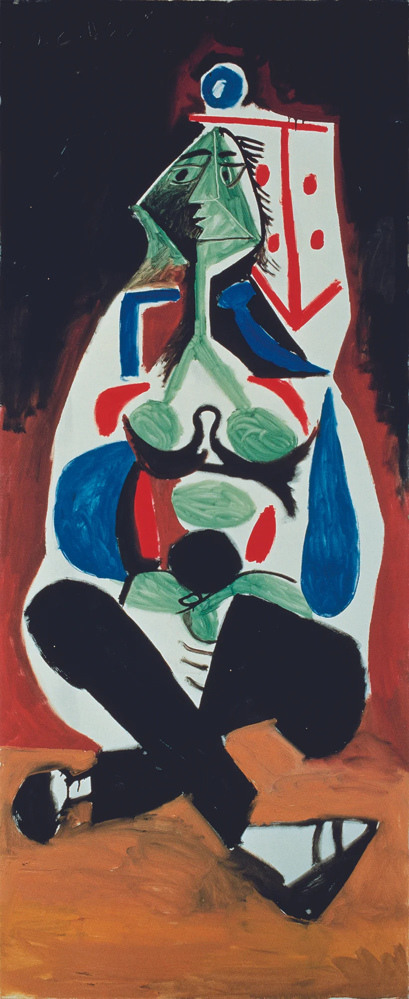
Pablo Picasso, Femme aux jambes croisées, 1955, Oil on canvas, © 2019 Estate of Pablo Picasso / Artist Rights Society (ARS), New York, Courtesy Gagosian.

Pablo Picasso, Femme aux jambes croisées, 1955Oil on canvas© 2019 Estate of Pablo Picasso / Artist Rights Society (ARS)New YorkCourtesy Gagosian.

For better or worse, Picasso never shied away from telling the story of himself through the lives of others, borrowing what he couldn’t steal from the various innovations of fellow artists and making them his own. The exhibition opens with a pair of works that highlight this range of form. Nue endormie, a charcoal on gessoed canvas from 1932, offers a minimum of drawn arabesques of hand, nose, and nipple. Meanwhile a Portrait de femme from 1923, in an unusual media of oil and sand on canvas, could be a Botticelli goddess crossed with a mural from a Greek diner.

There are a handful of sculptures in the mix, several of them quite good, all adding to the formal complexities of the exhibition. One of the revelations of “Picasso Sculpture,” the landmark exhibition that was at the Museum of Modern Art in 2015–16, was that this famous painter who sculpted might better be regarded, in fact, as a sculptor who painted. Whether in his Cubist or classical phases, or somewhere in between, Picasso was a plastic artist by and large who unfolded three-dimensional forms in two dimensions, relying on tonal gradient rather than colored form to build his compositions.

In painted sheet metal or cast bronze, his sculptural work seems to flow effortlessly, informing his paintings in turn. The expression of the painting Tête de femme au chignon (Fernande) (1906) is flash-frozen in the bronze head of the same year, while Cubist Head (Portrait of Fernande) (1909–10) makes more pictorial sense when processed through the matching bronze of 1909. Monochrome paintings such as La Femme-fleur (1946) and Portrait de femme à la queue de cheval, Sylvette(1954) likewise convey the metallic sheen of Tête de femme (1931), on loan from the Nasher Sculpture Center in Dallas, and the rubbed bronze belly of the pregnant Femme enceinte I (1950).

For all of his musing on his muses, Picasso largely took his subjects out of his portraits and rendered them as nameless still lifes. His figures do not come alive on the canvas so much as become hunted, ensnared, starved, and field-dressed in Picassoid symbols and forms. Femme aux jambes croisées (1955) is a woman flayed on the Cubist drying rack. The face of Buste de femme (Dora Maar) (1940) looks like it busted up in the business end of a nutcracker, which may be just the point. Even in such a tender portrait as the famous La Rêve (Marie-Thérèse) (1932), some critics have pointed out that the artist inserted a phallus above the upturned profile.

While merely listed as belonging to a “private collection,” most observers will recognize this last work as the painting purchased by Steven A. Cohen in 2013 for $155 million, then the highest price ever paid for a work of art by an American collector. The transaction occurred even after the former owner Steve Wynn mistakenly knocked his elbow through the canvas, later claiming he suffers from peripheral blindness. What record prices and blind collectors say about the art market, and the enduring value of Picasso, we may only speculate. In any case, this painting is now firmly behind glass, as is Picasso’s titanic reputation.

Willem de Kooning, Woman as Landscape, 1952–53, Oil on canvas, Private collection, Courtesy Mnuchin Gallery, New York. Artwork © 2019 The Willem de Kooning Foundation / Artists Rights Society (ARS), New York.

Willem de Kooning, Woman as Landscape, 1952–53Oil on canvasPrivate collectionCourtesy Mnuchin GalleryNew York. Artwork © 2019 The Willem de Kooning Foundation / Artists Rights Society (ARS)New York.

A clash of the titans rages on the Upper East Side. Now at Mnuchin Gallery, “De Kooning: Five Decades” continues the titanomachy of the twentieth-century art gods—and the mortal women who loved them.2

In our hypersensitive age, de Kooning’s mid-century “women” paintings can seem like windows onto a prehistoric era, when subjects could become objects and artists were not just allowed, but encouraged, to do anything and anyone. De Kooning was himself a genre-bending modernist, a supremely gifted and classically trained draftsman who became a conjurer in paint as well as a philanderer in the sack. As de Kooning said of Picasso, “He’s the guy to beat.” Indeed. While Picasso drowned his women in the depths of abstraction, de Kooning wiped away the abstract froth to reveal the women hidden just below his surfaces.

I have always been partial to that moment just before de Kooning’s seismic revelation, when his figures were active but still sublimated in mysterious forms, such as in moma’s famous black-and-white Painting of 1948 and the Art Institute of Chicago’s Excavation of 1950. The women that came forward in de Kooning’s compositions for a brief, furious period in the 1950s receded just as quickly as they appeared. In the 1960s they were diving deep into the waves of increasingly aqueous abstractions. By the 1980s they had dissolved into the gentle fog of de Kooning’s diminishing mental acuity.

There are several smaller works on paper here, many of them on loan from the Glenstone Museum in Potomac, Maryland, that locate de Kooning’s “woman” breakthrough between 1948 and 1954. They reveal how de Kooning was working through the tension between figuration and abstraction even before he began to extract the breasts and teeth of his women from his abstract forms.

Among the painters of the New York School, de Kooning was especially sensitive to surface treatment. His wet-on-wet application conveys a sensuously felt form. In paintings such as Woman III(1952–53) and Woman as Landscape (1954–55), the apparent manhandling of his crude female forms, up close, can seem like an embrace of color-rich oils and enamels. Once revealed, it may be impossible to see these abstractions any other way.

The waters off Long Island helped de Kooning cool these heated works. Following his move to East Hampton in 1963, both his palette and his paint handling began to chill. Two Women (1964) and Woman and Child (1967) have loosened their grip on de Kooning’s abstract surfaces. The “Untitled” paintings here from the 1970s feel like a refreshing swim in the hot Hampton sun.

Further bending his creative focus, de Kooning produced during this period a suite of watery clay figures, cast in bronze, most famously his Clamdigger (1972). As sculptures that seem to defy solid form, these are powerful works, crude from afar, like those “women,” but supremely tactile up close, imbued with the artist’s hand in their squished and pinched material. These are wet, sun-drenched visions, at the same time intimately felt and distantly perceived across the tidal flats.

For de Kooning, these figures may signal a long withdrawal into the recesses of cognition. A victim of Alzheimer’s who died at age ninety-two in 1997, de Kooning continued to paint into the 1980s, even as his compositions became more simple. There is long debate as to what exactly de Kooning painted himself during this period, and which compositions were driven by assistants. Nevertheless, forms from decades before remain as vestigial visions. Untitled III (1983) reads like a memory of 1950’s Excavation, with its evocations of lips and eyes, while Untitled XLII (1983) is mere ribbons of red and blue paint over light ground. As de Kooning’s forms dissolve into light, all that remains is the whiff of feeling.

Lucian Freud, Naked Man, Back View, 1991–92, Oil on canvas, The Metropolitan Museum of Art, New York. Photo: © The Lucian Freud Archive / Bridgeman Images.

Lucian Freud, Naked Man, Back View, 1991–92Oil on canvasThe Metropolitan Museum of ArtNew York. Photo: © The Lucian Freud Archive / Bridgeman Images.

Not since Rubens has a painter been so focused on the amplitude of the nude as Lucian Freud. The English grandson of Sigmund, Lucian made a fetish out of flesh, surveying the landscapes of his mottled figures through a favorite selection of subjects. Last month at Acquavella, a loan exhibition brought together thirteen of Freud’s major paintings, curated by the artist’s studio assistant, David Dawson.3

There is, of course, a long tradition of English landscape painting, and Lucian Freud is not the only English modernist to treat the figure as another landscape view. The focus of landscape, especially in the English mode, is all-over, taking it all in, with a predilection for Saxon fact over Gallic fancy. Freud was a precocious draftsman. In 1943, just in his early twenties, he made a drawing of Loch Ness from Drumnadrochit that seems to account for every leaf and stone in pen and ink. His landscape drawings remain a high point in their astonishing detail.

As he turned to the figure, Freud applied this same precision, increasingly recording the marshlands and bogs of the flesh with unsentimental determination. By the time we get to the “monumental,” with the well-known portraits painted from the 1990s to Freud’s death at age eighty-eight in 2011, which were on display at Acquavella, this mode has become a manner. Going for the monumental in both the scale of his canvases and the size of his chosen subjects, most notably Leigh Bowery and “Big Sue,” Freud indulged in the landscapes of the flesh and exaggerated their ample vistas in paint. In Leigh Bowery (Seated) (1990), the perspective begins at groin level before turning to survey Bowery’s hills and dales in widening angles of view. There may be truths in these unflattering figures, but photographs reveal how Freud packed on the pounds and roughed up the flesh. In Benefits Supervisor Sleeping (1995), he added his own crags and mudslides to the human landscape for dramatic effect. These paintings may shock, but the results replace English fact with modernist fiction.

1 “Picasso’s Women: Fernande to Jacqueline” opened at Gagosian, New York, on May 3 and remains on view through June 22, 2019.

2 “De Kooning: Five Decades” opened at Mnuchin Gallery, New York, on April 19 and remains on view through June 15, 2019.

3 “Lucian Freud: Monumental” was on view at Acquavella Galleries, New York, from April 5 through May 24, 2019.
Comment

The spirits of the city

Comment

The spirits of the city

THE NEW CRITERION, May 2019

The spirits of the city

On the new Hudson Yards development in New York.

Hudson Yards, the real estate development that opened in March on the far west side of midtown Manhattan, is an astonishing feat of American industry. This is especially true at a time of diminished industrial expectations, when American muscle often lifts little more than the latest app. Yet for all of its impressive mass, its glass, concrete, and steel, the forms that have risen at Hudson Yards are spiritually longing, oddly so, for what should be a display of towering confidence in human enterprise. Even as it stretches to the skyline, the shortcomings of Hudson Yards speak to a loss of faith and an inward turning of urban perspective.

Cut from whole cloth, the $25 billion complex of Hudson Yards, now partially completed, rises above a train yard that continues to operate as the western terminus of the Long Island Railroad, where lines of passenger cars await deployment to the platforms of Pennsylvania Station to the east. Beneath these trains run additional tracks, including the pair of North River Tunnels built by the Pennsylvania Railroad a century ago that still serves as the arterial link of the Northeast Direct service between New York and New Jersey. In total, some three hundred caissons, fourteen thousand cubic yards of concrete, and twenty-five thousand tons of steel have been built around thirty working tracks and four tunnels to form just the first ten-acre eastern platform, on which now sits the largest private real estate venture in American history. A second phase, of residential towers to rise above the rail yard to the west, will soon follow. To construct anything atop this transportation corridor without service interruption or the ability to create basement space is an achievement of engineering and manpower. To do so in a way that attracts worldwide attention while creating commercially viable real estate is a triumph of capitalism.

10 Hudson Yards. Photo: Geoff Butler / Related Oxford.

10 Hudson Yards. Photo: Geoff Butler / Related Oxford.

The popularity of Hudson Yards, apparent in the crowds that already flock to this new nexus of office, retail, and residential offerings, where upscale materials coat every surface of its multifaceted forms, is one reason its critics have been so bilious in their condemnations of the complex. “A shopping mall and a quasi-gated condo community targeted at the 0.1 percent,” is how Michael Kimmelman painted this “vast neoliberal Zion” and “architectural petting zoo” in The New York Times. “A grand gift of urban space to the global elite,” sniffed Justin Davidson in a cover story for New York magazine, which depicted the complex as an Emerald City at the end of the Yellow Brick Road that is the High Line—the astonishingly successful elevated park built a decade ago on an abandoned spur of the New York Central Railroad. “Too clean, too flat, too art-directed,” Davidson continued. “I suppose this apotheosis of blank slate affluence is someone’s fantasy of the twenty-first-century city, but it isn’t mine.”

Having just redirected the river Amazon from establishing a spillway in the borough of Queens, the critics bemoan the industrialists of The Related Companies, the real estate juggernaut founded by Stephen M. Ross, who have made it through their gauntlet of condemnation to create the twenty-eight-acre complex. Sketched out in the aftermath of the attacks of September 11, approved and developed through the economic downturn of 2008, Hudson Yards emerged out of the last innovative period in New York leadership—so distinct from the current era of de Blasios and Ocasio-Cortezes—that understood what cities must do to thrive. When completed, the entire complex will boast new parkland, a new school, and twelve massive office and residential towers containing four-thousand new apartments and space for fifty-five thousand workers.

Legitimate arguments should be made, and have been leveled, against the many zoning dispensations, tax abatements, and regulatory loopholes that brought the development to fruition. The urbanist writer Kriston Capps has noted one egregious example, in which gerrymandering has permitted the developers to soak up foreign investment by offering visas through a program meant to help impoverished areas, all by linking Hudson Yards to low-income housing miles away in Harlem.

Ultimately, such criticism merely draws attention to the stultifying effects of New York’s endless zoning ordinances, taxes, and regulatory hurdles. Hudson Yards reveals the fructifying energy that can flourish when the long shadow of government gives way to the sun of human striving, if only such light could shine across all endeavors rather than a single favored project.

The technical complaints, I suspect, also mask the greater concern for most critics: that this final flowering of Hudson Yards serves as a delayed reminder of a city that was planted and tilled under two decades of Republican supervision. For them, the problem of Hudson Yards is not its failures but its many commercial successes.

And indeed, from what was once a sunken railyard there now emerges a multitude of attractions. Connected to the $2.5 billion extension of the 7 Train on one side and the pedestrian High Line park on the other, Hudson Yards has overnight become a new measure of urban orientation. In the two months since it opened, I have dined on a surprisingly expensive fish called a milokopi in a top-floor restaurant of its 720,000-square-foot shopping mall, attended an inaugural performance in its cross-disciplinary contemporary art venue called The Shed, and walked twice up the spiraling stairs of its open-air sculpture called the Vessel (the first time after its ribbon-cutting ceremony presided over by the television personalities Anderson Cooper and Big Bird).

Like the Mareographic Zero measurement on Venice’s Punta della Salute or the Prime Meridian line that runs through the Royal Observatory in Greenwich, England, Hudson Yards lays claim to its own central marker. This is the Vessel, or at least that’s the temporary name of the bauble dreamed up by the new-age British designer Thomas Heatherwick that rises fifteen stories in the middle of Hudson Yards, looming over its quasi-pedestrian plaza with 154 flights of 2,500 steps and eighty landings. The shiny, copper-colored object was a secret fancy of Ross, who kept the model locked in his office and paid for the Italian fabrication of its elaborate steel latticework.

The Vessel’s designer, Thomas Heatherwick, speaks at its grand opening on March 15, 2019. Photo: Dia Dipasupil / Getty.

The Vessel’s designer, Thomas Heatherwick, speaks at its grand opening on March 15, 2019. Photo: Dia Dipasupil / Getty.

The Vessel is the quintessence of the complex. Meant to reference an Indian stepwell used to walk down to varying levels of well water, here the staircase leads up to dry nowhere. The higher you go, the less fulfilling the experience becomes, at least for the views looking outward. As the Vessel is hemmed in to a greater and greater extent by the surrounding buildings, what mainly comes into focus is the Neiman Marcus sign outside the top floors of the mall. While the surrounding buildings each boast a different architectural pedigree, from above they cross-breed into smoky-glass mutts.

One building known as the Equinox Tower—designed by David Childs of Skidmore, Owings & Merrill—still lays claim to a few distinguishing characteristics. In its limestone pinstripes, we can see the bespoke tailoring you only get from som. And the Shed building, a combined tower and concert hall designed independently of The Related Companies by Diller Scofidio + Renfro, the architects of the High Line, boasts a novel rolling shell developed around an industrial gantry. On the outside, the building resembles a shopping cart return, while the drafty space within could be a zeppelin hangar. The skin of this structure is made of inflated mylar, which reduces its rolling weight and gives its outer surface the sensuous appearance of a quilted handbag or a designer puffer jacket. It remains to be seen if this venue on city land, a Kunsthalle that has put the Halle before the Kunst, will “redeem” Hudson Yards, as many have promised. So far, its anti-elite elitism seems like mere puffery, with the usual high-flying art world suspects, including Hans-Ulrich Obrist, the über-curator hatched in a Swiss free port, and the Park Avenue Armory’s Alex Poots tapped to run the show. “Let’s get away from this crazy high-art, low-art concept,” Poots announced at the opening. “Why do we need to create a false hierarchy?”

15 Hudson Yards and The Shed. Photo: Timothy Schenck / Related Oxford.

15 Hudson Yards and The Shed. Photo: Timothy Schenck / Related Oxford.

If you have to ask, you will never know. The self importance of The Shed, which cost $400 million just to build, not to mention the price of sustaining it, underscores a what-if that I have been asking since the city first set this parcel aside for a cultural venue. What if a world-class museum, namely, New York’s Museum of Modern Art, had moved here? With the Whitney Museum of American Art now anchoring the southern terminus of the High Line, having relocated from the Upper East Side, just think of the genuine cultural corridor that might have been created with moma at its northern end. The museum’s present location, straddling Fifty-third and Fifty-fourth Streets in midtown, is a product of historical circumstance, not strategic planning. It just happened that the Rockefeller family owned their townhouses there, and donated the parcels to become the first kernels of the experimental modern museum. Indeed, there was a time when midtown was residential. No longer. For the past fifty years the museum has been buckling under the pressures of its surrounding real estate, profiting along the way, save for the museum experience that has resulted. It should have been time for a fresh start.

The Shed may surprise everyone and fulfill its many promises, but for now the Vessel remains the main attraction at Hudson Yards, even though as a walkable sculpture it provides lackluster views, at least looking out. Its orientation is, rather, directed in and down to its own emptiness. When Ross unveiled its design two years ago, he declared he wanted the equivalent of the famous Christmas tree at Rockefeller Center, but with an attraction that would stay up all year. Such comparisons between Rockefeller Center and Hudson Yards may be numerous, but they work mostly as comparisons in contrast. Created by John D. Rockefeller, Jr., and designed by Raymond Hood at the height of the Great Depression, that other complex is imbued with spiritual meaning. An Art Deco Roman temple dedicated to American industry, Rockefeller Center reflected the family’s belief in John Wesley’s evangelical economics—to “gain all you can, save all you can, and give all you can.” As an open-air cathedral, that complex terminates in an altar of Paul Manship’s golden Prometheus. Every Christmas season, with the tree, its pagan idolatry is redeemed through a pageant of conversion.

Hudson Yards conveys no such meaning. Its Vessel is an empty basket. Its towers stretch uneasily to nowhere. At street level, its sightlines are also nonexistent. One of the most consequential decisions at Hudson Yards was to obstruct any sense of the street grid. The way the mall turns its back to Tenth Avenue is an affront to the city. The avenues and cross-streets of New York are the open naves of a great urban church, all stretching up and out to the infinite. By deliberately blocking their view, Hudson Yards takes the straight lines of the city and curves them in, with an orientation that is circular and inward, rather than straight and out. The Vessel is the vortex of this overall scheme, one that speaks to themes of regression and surveillance rather than motifs of aspiration and uplift. At its center, instead of inspiring thoughts of others, the Vessel is the Christmas tree to the self.

Hudson Yards. Photo: Timothy Schenck / Related Oxford.

Hudson Yards. Photo: Timothy Schenck / Related Oxford.

Like its Vessel, Hudson Yards will leave you feeling hollow, with an emptiness that will never quite be sated by expensive fish or quilted handbags, despite the many suggestions to the contrary proposed here by its hundred shops and restaurants. Hudson Yards is advertised as a “new way of living,” filled with self-serving and often infantile adult distractions, but the result is unfulfilled and unfulfilling. By having us face ourselves in an infinite reflection of polished metal and darkened glass, Hudson Yards ultimately turns its back to the unbought grace of life in the big city.

Comment

Norman's Conquest

Comment

Norman's Conquest

THE NEW CRITERION, March 2019

Norman’s Conquest

On the expansion of the Norton Museum of Art in West Palm Beach.

You might have expected the $100 million expansion of the Norton Museum of Art, in West Palm Beach, Florida, to go wrong. Just consider the backstory: An ambitious director (Hope Alswang) and an embarrassed trustee (Gil Maurer) come together to lament the state of their outmoded institution. They wonder aloud how their tired facility (a 1941 Art Deco pile encumbered with additions, now resembling a bankrupt shopping mall) could be “expanded and transformed in a dramatic way.” The trustee says to the director: If you could ask any architect to do this expanding and transforming, who would it be? The director gives the name of a starchitect at the center of the celestial firmament (Lord Norman Foster). The trustee responds: That starchitect happens to work in my building (they are meeting on the forty-third floor of New York’s Hearst Tower; Maurer is then the coo of the Hearst Corporation; Foster designed that building in 2006; and Foster + Partners maintains a New York office there). The trustee calls up the firm. An architect (Michael Wurzel, a partner at Foster + Partners) comes down. They begin to “muse about the possibilities.”

A story of museum musings that began on a winter day in New York in 2010 reached its conclusion on a winter day in Florida in 2019, when the Norton Museum of Art reopened to the public. You might have expected it to go wrong—and yet this expansion has gone surprisingly right. How it went right is a triumph for South Florida. It should serve as a lesson for museum planners everywhere. If today’s museums must grow, grow they must. The Norton checks all the boxes of a museum’s new-car mandates (new restaurant, new lounge, new shiny surfaces), yet it stays remarkably sensitive to art and to the history of the institution that has held the art in trust.

On approaching the Norton’s new entrance from the South Dixie Highway, as most everyone in car-centric West Palm now must do, the first growth you notice is not the museum but a tree. This is not just any tree. It is the tree. Known as “the banyan,” but in fact a ficus altissima, the six-story-tall tree is the focal point of the new west-wing façade. Photographs do not do justice to its outsize presence. Foster calls the tree his “protagonist.” Indeed, it drives much of the plot of the new design. Forty-three feet up, elevated on cloud-white blocks, an aluminum canopy extends forty-five feet over a new entrance plaza. The canopy is a sharp horizontal, made of reflective panels like an airplane wing. From afar, the form seems to cut across the middle of the sixty-five foot tree, a slashing antagonist in an architectural drama. Yet the protagonist wins out. The canopy pulls back at just the right places so that the hundred-twenty-foot-wide tree can continue to grow and spread above the new roofline.

Up close, outside the new museum entrance, the sculptural qualities of this massive tree are striking. The banyan is its own work of art, a dizzying abstraction above, a gothic mystery below, with multiple trunks that have grown out of the many “prop roots” sent down over decades by its own bending limbs. And rather than compete with the tree, up close the aluminum roofline works with it to extend the shade of the natural canopy, adding welcome relief from the Florida sun.

The banyan tree along the South Dixie Highway entrance to the Norton Museum of Art. Photo: Nigel Young.

The banyan tree along the South Dixie Highway entrance to the Norton Museum of Art. Photo: Nigel Young.

The symbolism of this thriving tree is well appreciated by Foster. His architectural deference to its living history reveals something about his own approach to imposing new designs on living institutions—as he did successfully with Hearst Tower, which rises out of a 1928 base, and most famously with his additions to the Reichstag and the Great Court of the British Museum, completed in 1999 and 2000.

“The protagonist of the project was planted just before Ralph and Elizabeth Norton planted their seed,” he said at the museum reopening. The flourishing tree represents a flourishing institution in its increasing complexities. Rather than cut it down, the new design frames its growth for us to see. It protects rather than rejects history. It allows an organism to thrive through deep roots and existing branches. The challenge now of caring for the banyan reflects the challenge of caring for the museum. Since the tree’s failure would cause Foster’s design to fail, they are both closely interconnected. This is a fact not lost on the museum’s attentive arborists.

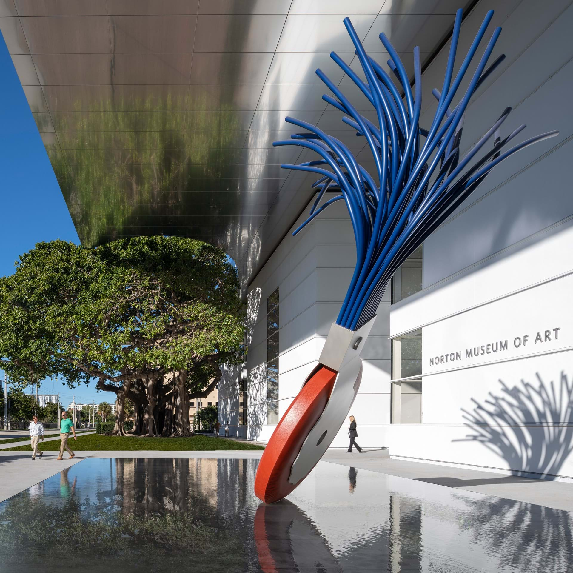
The plaza cleverly features another large sculptural form: Typewriter Eraser, Scale X(1999), by Claes Oldenburg and Coosje van Bruggen. This 2017 donation to the museum by one of its trustees, Ronnie Heyman, was sought out by Foster, and with good reason. With its upturned brush resembling the branches of a tree, the Oldenburg serves as a symbolic pendant to the banyan. While allowing for growth, Foster has had to do some judicious editing of the Norton’s existing structures. The Eraser happens to touch down next to a part of the building that had been one of those loquacious later additions. Edited down, while still providing upstairs gallery space, this wing now fits into Foster’s concise five-paragraph essay of architectural form.

Typewriter Eraser, Scale X(1999) by Claes Oldenburg and Coosje van Bruggen (foreground) and the banyan tree in front of the Norton Museum of Art. Photo: Nigel Young.

Typewriter Eraser, Scale X(1999) by Claes Oldenburg and Coosje van Bruggen (foreground) and the banyan tree in front of the Norton Museum of Art. Photo: Nigel Young.

A convincing seamlessness of old and new, living and man-made, has been achieved through an uncanny awareness of existing ties and a balance of existing structures. “It started with two people, Ralph and Elizabeth Norton, in 1941,” Foster said of the museum. All such projects should begin with an appreciation of an institution’s founders. Too few do. Here such respect for the couple who bequeathed their collection to the public trust, with its particular strengths in American and European modern painting and drawing, as well as Chinese art, ultimately informs the overall design.

Re-established as the center of the institution is the Norton’s original 1941 museum building, which, like the banyan, determines the shape and placement of the new entrance. Designed by Marion Sims Wyeth as an Art Deco pavilion surrounding a central courtyard, the building’s original symmetry and sight lines have been restored by cutting back the infelicitous additions from 1997 and 2003.

As Foster creates his new façade facing the banyan tree to the west, he preserves the original front façade to the east. He also restores the ground floor’s east–west axis after it was disrupted by the earlier expansions that turned the museum entrance to the south. Now someone standing outside the new building can see all the way through to the old front door and on to the shimmering Intracoastal Waterway beyond.

I only wish the acoustics of this new entry plaza were as appealing as its form. On the day I visited, the noise of the South Dixie Highway, combined with the screech of a nearby rail line, was deafening. It might be said that every contemporary building “learned from Las Vegas.” A structure must now not only shelter the individual on foot, but also flag down the passing motorist on the road—functions that are often in conflict. But what happens in Vegas should stay in Vegas. While Foster’s aluminum canopy protects the entrance from the sun, it also acts like a bandshell to concentrate street noise on the exposed plaza. While it might take away from the museum’s billboard qualities, additional screening between the highway and museum is in order.

Perhaps already understanding the need of an added buffer between outside and in, Foster brings the visitor into the new wing slightly off axis. A quick turn to the left after the ticket booth then brings you into a new Great Hall (as it is called) and back into alignment with the original museum. Every great building needs a “great hall”—a place to decompress from the outside and adjust to the expectations within. The Norton has dubbed this space its “living room.” In its tasteful modernist furniture and bleached tones, it might just double as a Knoll showroom. It is indeed a pleasant enough room to linger, if not to live in.

The Norton Museum of Art’s Great Hall. Photo: Foster + Partners.

The Norton Museum of Art’s Great Hall. Photo: Foster + Partners.

At the same time, with its maximum square footage designed for maximum flexibility, the hall lacks intimacy. All that tasteful furniture is easily moveable so that this Great Hall can serve as a flex space for great donor cultivation. A white box with gray accents (someone said that Foster designs in “fifty shades of gray”), the Great Hall is also topped with an oculus that looks squinty. Round skylights call for round rooms, not rectilinear ones. I wish Foster had rolled the dice and gambled on an interior that was more daring than another white cube—one that might also reflect the octagonal shape of the original eastern entrance.

At least by adding this large new space, and fulfilling the museum’s new-car mandate, Foster could then restore and renew the many smaller adjoining galleries from the 1941 building. Of the museum’s 130,000 square feet, it is interesting to note that only about 10,000 of that are truly new. The preservation of older spaces allows for substantial “recycling,” as Foster says. The original 1941 hardwood floor, for example, has been brought back to life after being covered in decades of carpeting. The Art Deco entry also looks wonderfully preserved—although I wish outdoor access to the east were also restored so we could easily see the Norton’s two outdoor commissions by Paul Manship, which flank the original front door.

The preservation of historical space preserves “the memory of time,” Foster says. This is also how a museum overhauled by a world-famous architect can still come in at $100 million, while the price tag for a new wing at the Metropolitan Museum is slated to cost upwards of $600 million. The best spaces here are the ones that have been brought back to life from the original building, where gallery proportions and arrangements were designed to best complement the art on view. I was very glad to see highlights of the Nortons’ bequests of European art arrayed front and center in one of these galleries. Here Monet’s Gardens of the Villa Moreno, Bordighera (1884) and De Chirico’s Sailors’ Barracks (1914) are presented with works by Klee, Soutine, Picasso, Braque, and Brancusi—all donated by the Nortons—and supplemented with bequests by later donors. Other galleries display the Nortons’ gifts of paintings and drawings by the Ashcan painters and first-generation American modernists such as John Marin and Maurice Prendergast, along with Stuart Davis’s 1932 painting New York Mural, purchased through an acquisition fund established by Ralph Norton.

Taken together with the museum’s significant holdings in photography and Chinese art, you start to see that the Norton is not just a museum of art but a museum of significant art with an important core collection. Foster’s elegant and symbolic renovation brings that fact to the fore by allowing the museum to defer to this great art history.

There are already some signs, unfortunately, that the new museum may try to upstage its impressive historical collection with contemporary work. An ability to attract new donors and bigger crowds is the constant seduction of the contemporary Kunsthalle. The Norton could do better than its dopey wall-decal commissions by Pae White and Rob Wynne, for example, or Instagram-optimized art such as the promised gift of Sam Durant’s End White Supremacy (2008), which is better suited for woke selfies at Art Basel Miami Beach.

When everyone else wants art to shout, the Norton should seek art that sings in concert with its core collection and its harmonious building. As the Norton’s director Hope Alswang, who is retiring this month, rightly says of Foster + Partners: “They were not building a piece of sculpture. They were not building a monument. They were building a great art museum.”

It is indeed a great art museum, if you can keep it..

Comment