Viewing entries in
Art

In Claude Monet’s Postmodern Garden

Comment

In Claude Monet’s Postmodern Garden

THE SPECTATOR WORLD EDITION, February 2023

In Claude Monet’s Postmodern Garden

on diving into an “immersive” exhibition

There are few topics that rankle the art critic more than “immersive exhibitions.” They must be second only to “nonfungible tokens,” whatever those are. I speak of the immersive spectacles where images of famous artwork are flashed on the walls and floors of a large white room in which you sit. Certainly, this should be outside the remit of my union card, I might think.

Until now, if you were looking for some opinion on this-or-that out-of-copyright projection venue slash tourist trap, I would simply say not my job. Maybe go see the real thing. Then we can talk.

And yet, with art on the walls, real or imagined, judgment always comes calling. Suddenly we seem to be immersed in immersion. It can be a challenge just to keep your head above the digital waters. This season, passing their subway ads and all sorts of other lures, I counted some half-dozen eye-poppers. There is, of course, The Original Immersive Van Gogh Exhibit, created by Massimiliano Siccardi. Visit the website and you will be invited to “choose your city.” Twenty American destinations are in the offing.

The same outfit, I read, also promotes Immersive Nutcracker and Immersive King Tut. Or there is Immersive Frida Kahlo: Her Life, Her Love, Her Art (nine cities for that one). Or how about Gustav Klimt: Gold in Motion, billed as “the first immersive exhibition at New York’s permanent digital art center” called the “Hall des Lumières.” Note that this exhibition should not be confused with Immersive Klimt Revolution, on view in four other cities.

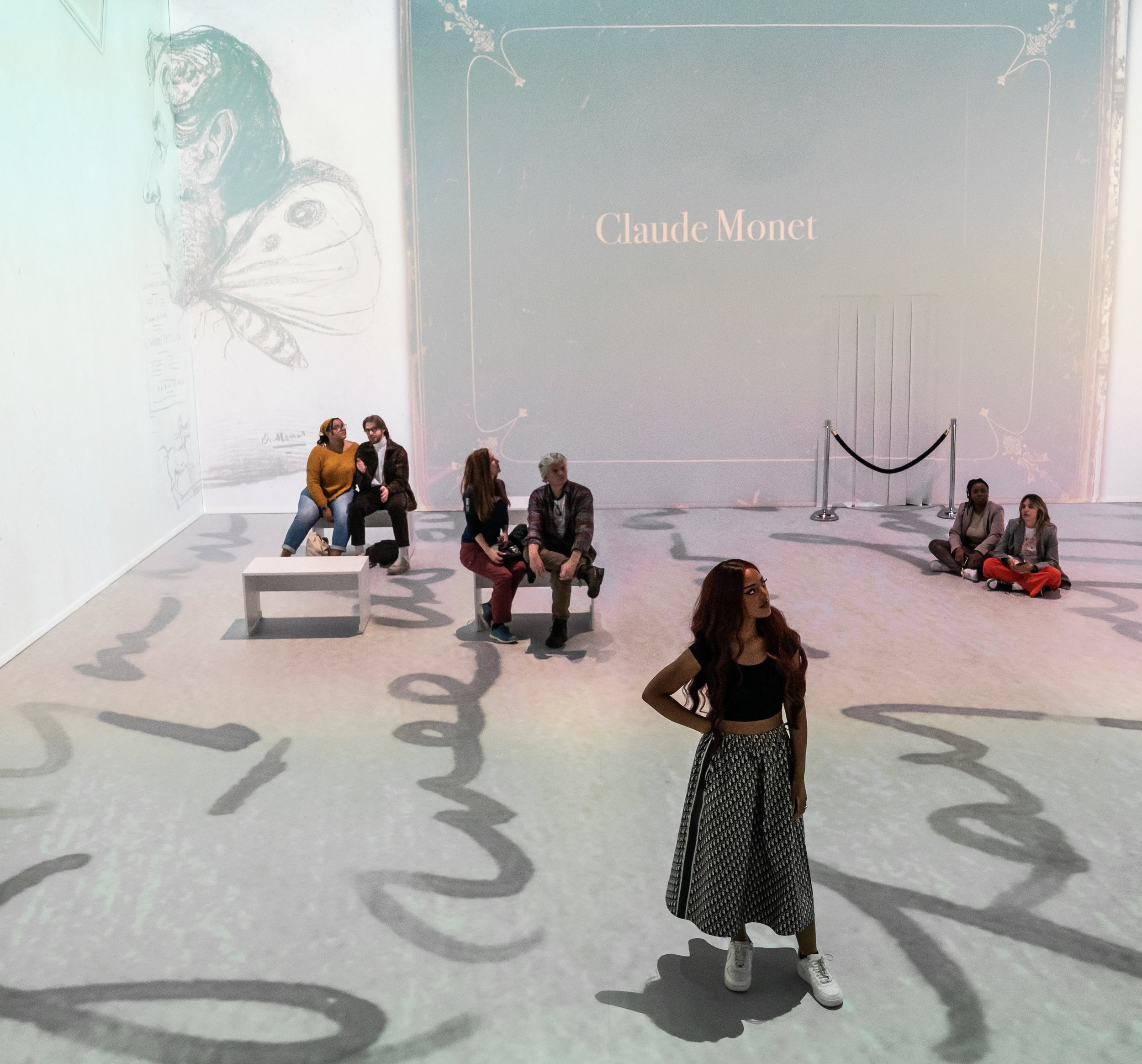
So where to begin? New to these deepening waters, I decided to dip my toes into what was billed as the US premiere of Monet’s Garden: The Immersive Experience. (Kindly do not confuse with Claude Monet: The Immersive Experience, now touring eleven cities.) At Monet’s Garden, I was drawn in by the specter of an “unprecedented range of visual, phonic and olfactory stimuli” that promised a “complete and total immersion into the work and world of Claude Monet (1840-1926).” In particular, Monet’s Garden would be “enhanced by aromas of lavender wafting in the air and the romanticism of classical music to serenade visitors.” Take that, I thought, Museum of Modern Art. If you are going to offer a $47 “VIP FLEX ticket” to see a copy of Monet’s Water Lilies, when the real thing can be yours a few blocks uptown for just $25, at the very least it should smell good.

Monet’s Garden is the work of Immersive Art AG, a “Swiss creative lab,” in cooperation with Alegria Konzert GmbH. Seeing their schedule, it occurred to me that the ability to reproduce immersive shows across many continents simultaneously would make a museum curator shudder as they chase down the next Old Master loan. Maybe Walter Benjamin had it backwards all along. When it comes to the work of art in the age of immersive reproduction, like the taste of a McDonald’s hamburger that remains the same no matter where you go, ubiquity conveys an aura all its own.

The New York venue for Monet’s Garden was an event space at 30 Wall Street, across the street from the New York Stock Exchange. The anonymous environs conveyed the feel of a WeWork in receivership. Immersive shows, like sample-sale outlets and holiday-village markets, must make reliable subtenants for distressed real estate interests. And in fact, the hollowed-out floors of “Monet’s Garden” have a rich history.

In 1823, I discovered, an impressive neoclassical pile was erected here as the Branch Bank of the United States. In the 1850s the building became the US government’s Assay Office, designed to melt and measure the nuggets from the California gold rush. In the 1920s that building was demolished. The site’s last life was as a Seamen’s Bank. All that remains is the long escalator that once brought you to the loan officers on the second floor.

It is here that Monet’s Garden begins. And upon arrival, at first glance it all strikes one as a ridiculous scam. “Welcome to my studio” reads the introductory wall text. Reproduction Monet canvases — “Woman with a Parasol — Madame Monet and Her Son Jean Monet” (1875), from the National Gallery of Art, and “The Lunch in the Garden” (1866), from the Pushkin Museum, both available (I note) in high resolution from Wikimedia Commons — are arranged on easels for our inspection. There are visitor instructions throughout: “Pose,” “Photograph,” “Scan the QR Code,” “Immerse yourself and become part of the painting.”

The walls are covered with synthetic ivy. There is astroturf across the floor. Erik Satie plays. Theatrical lights are everywhere. A bed of fake flowers leads on to an arched Japanese “bridge.” Yes, it is that bridge, but in this case one that merely crosses a video of water projected on the floor. “Please do not jump in the pond,” reads a sign. What pond? For the first-time viewer, it takes more than a moment to understand what this is all for. Meanwhile I observed my fellow visitors — immersive veterans, no doubt — take to it right away.

I doubt these immersive experiences would be so ubiquitous without social media. For here, I came to realize, was the selfie floor — a liminal space presented in advance of the immersive video room. I watched as two millennial visitors, both immaculately kitted out, sought the room’s premier selfie spots. They knew just where to stand for the lights as they passed their iPhones back and forth, taking off their masks, tossing their hair and pouting over their shoulders.

I ended up spending longer here than expected. There were several wall labels featuring a half-decent timeline of Monet’s life. Projections of Monet paintings morphed into swirling pixels, some of which you could control by standing in front of them. Instagram filters were made available for selfie-taking, although I could not get them to work on my phone. But mostly, sitting on a bench, smelling the lavender, taking in the Satie, observing the fake flowers under shifting gradations of LED lights, I began to find the uncanny experience transporting.

Here, in this postmodern garden, I found my peace.

Back down the escalator was the immersive viewing room. I was handed a cushion and took a seat. The video installation cycled for forty-five minutes. I found it held my attention for the duration. The narrative followed the history of Monet through a holo-deck slide show of his paintings. At times, the animators added some motion to the works. The story focused on Monet’s artful construction at Giverny, where he lived for forty-three years from 1883 to 1926, building his famous garden.

The exhibition makes a compelling sensory case that the garden was the original immersive Monet experience. The artist’s opus now in Paris’s Musée de l’Orangerie — his eight monumental panels known as Les Nymphéas arranged in two oval rooms — was the painterly result of this immersive vision. Monet described these panels as “the illusion of an endless whole, of water without horizon and without shore.”

A day after my visit I happened to run across Woman with a Parasol — the real Monet — at Washington’s National Gallery. Did I feel ashamed of my prior day’s digital dalliance? Surprisingly, I did not. Rather, for a moment I sensed we had been immersed in the same nymphean waters. We had shared an “experience” together.

Comment

Carpaccio by the slice

Comment

Carpaccio by the slice

THE NEW CRITERION, February 2023

Carpaccio by the slice

On “Vittore Carpaccio: Master Storyteller of Renaissance Venice” at the National Gallery of Art, Washington, D.C.

It is the contemporary fate of Vittore Carpaccio (ca. 1465–1525), the Venetian painter of the late fifteenth and early sixteenth centuries, now with a major new exhibition at the National Gallery of Art, to share his name with a popular dish of sliced raw beef.1 The joint appellation, as it turns out, is not a coincidence. In 1963 the Palazzo Ducale organized its first ever retrospective of this “master Storyteller of Renaissance Venice,” as the National Gallery dubs its current show. La Serenissima at the time was awash in Carpacciomania, so much so that Giuseppe Cipriani, the owner of Harry’s Bar, named his culinary invention after the reds of the appetizing painter.

The famous restaurateur was not alone in appreciating the taste of this last of the Venetian “Primitives”—one who was sandwiched, as it were, between the coolness of Giovanni Bellini and the maniera moderna warmth of Titian and Giorgione. A little over a century before Cipriani paid his respects, John Ruskin unearthed Carpaccio among his stones of Venice. The painter sent Ruskin into a “reverie” approaching a “delirium of fantasy.” Then as now the artist’s great appeal was his stunning architectural staging, one that sets his mythological, biblical, and historical storytelling in idealized Venetian cityscapes.

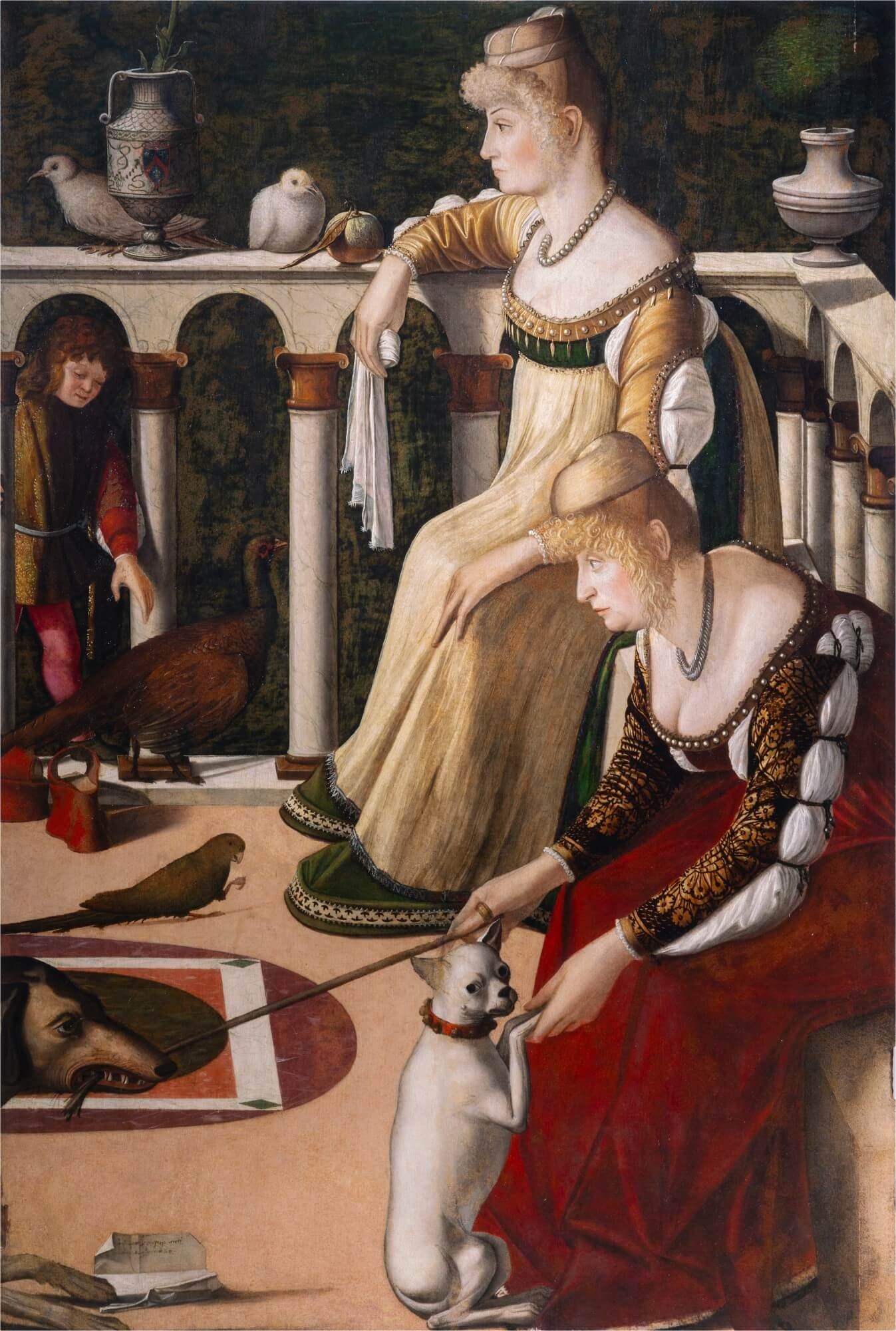
Vittore Carpaccio, Two Women on a Balcony, ca. 1492/1494, Oil on panel, Fondazione Musei Civici di Venezia, Museo Correr, Venice.

In his Guide to the Principal Pictures in the Academy of Fine Arts at Venice of 1877, Ruskin placed Carpaccio at the apex of Venice’s “classic and mythic” age. An honorary member of the Accademia, for weeks Ruskin sat and copied Carpaccio’s monumental cycle of paintings of Saint Ursula, the artist’s most famous set of works, originally created for the Scuola di Sant’Orsola confraternity. “I went crazy about Saint Ursula,” he said of the recently restored works in the Accademia museum. In St. Mark’s Rest, his epilogue to The Stones of Venice, Ruskin even bumped Bellini from his top spot to declare Carpaccio’s Two Women on a Balcony, in the Museo Correr across the Grand Canal, as “The best picture in the world . . . and I know no other picture in the world which can be compared to it.”

In 1882 Henry James set out on his own Venetian tour, Ruskin’s “generous lamp” in hand. In works such as Saint George and the Dragon and Saint Augustine in His Study, James found a “paradise of his own room.” Unlike the “vertical” pull of much of Italian art, James appreciated the “horizontal” window that Carpaccio opened onto the spiritual world, with the terrestrial and the celestial seeming to cohabitate in our own temporal space. Placing him among his favorites Bellini and Tintoretto, James declared that Carpaccio was the “most personal and sociable of artists” for his “care for human life at large.” The anchoring of Carpaccio’s safe harbors seemingly in the actual stones of Venice—with marble paving stones and building façades receding in perspective view—has appealed in many times of rebuilding and renewal: for example during the French Second Empire, through such artists as Gustave Moreau, and following World War I, in the neoclassical fantasies of Giorgio de Chirico.

The times must be right again for another Carpaccio rediscovery. Fortunately the National Gallery (and, undoubtedly, only the National Gallery) has the lending power to mount a major stateside survey of the artist. The first outside of Italy, the display should enkindle our own Carpacciomania. Curated by Peter Humfrey in collaboration with Andrea Bellieni and Gretchen Hirschauer, the exhibition is presented in partnership with the Fondazione Musei Civici di Venezia—which, as with their joint 2018–19 exhibition of Jacopo Tintoretto, will also mount the show at the Palazzo Ducale. In Washington, even without some of his most significant paintings on offer, in particular those from his expansive Saint Ursula cycle, “Vittore Carpaccio: Master Storyteller of Renaissance Venice” features forty-five paintings and thirty drawings. Gathering work from some forty-eight venues, the transporting exhibition leaves us with much to chew on.

Vittore Carpaccio, Saint George and the Dragon, 1516, Oil on canvas, Abbazia di San Giorgio Maggiore, Benedicti Claustra Onlus, Venice. Photo courtesy of Abbazia di San Giorgio Maggiore, Benedicti Claustra Onlus.

While little is known of the young Carpaccio, he clearly became intoxicated by three Bellinis: the brothers Giovanni and Gentile and their father, Jacopo. Together they developed and refined the Venetian understanding of single-point perspective. As an apprentice to the Bellini sons (whether he trained with Giovanni or Gentile or both is not entirely certain), Carpaccio inflated their compositional inventiveness to maximum volumetric effect. Never before had paintings breathed with quite so much fresh air.

Like the brothers Bellini, Carpaccio worked with oil on canvas rather than in fresco, as the new medium was far more resilient in the humid Venetian climate. The availability of printed books and woodcuts added elements of the northern Renaissance to Carpaccio’s cosmopolitan mix, with printed maps and depictions of distant lands informing his visual concatenations.

The results are indeed storytelling at its most masterly. And rather than overwhelming us with such monumental painting cycles as his Saint Ursula, which at nine feet tall by eight to twenty feet wide (and again newly restored) remains in situ at the Gallerie dell’Accademia, “Vittore Carpaccio: Master Storyteller of Renaissance Venice” helps us appreciate the painter on a more intimate scale with smaller works. Assembled here, the altarpieces, private devotional paintings, smaller confraternity commissions, and studies and cartoons that he made in preparation for his larger compositions all speak to the artist’s consummate craft and the particular interests of his Venetian patronage.

Carpaccio was the opposite of groundbreaking. In his compositional structuring, he was fortifying. His imaginative worlds were perfected 3D environments, premium-engineered with all Venetian-made parts. Into his spaces he arranged numerous figures far more occupied with one another than with our own subjective point of view. Unlike the later artists of the Venetian cinquecento, with Carpaccio there is no heavy artistic hand to draw us in. We instead get a self-contained universe, a sim-Serenissima where the activities exhibit the same ordered rules as the compositions’ single-point perspectives.

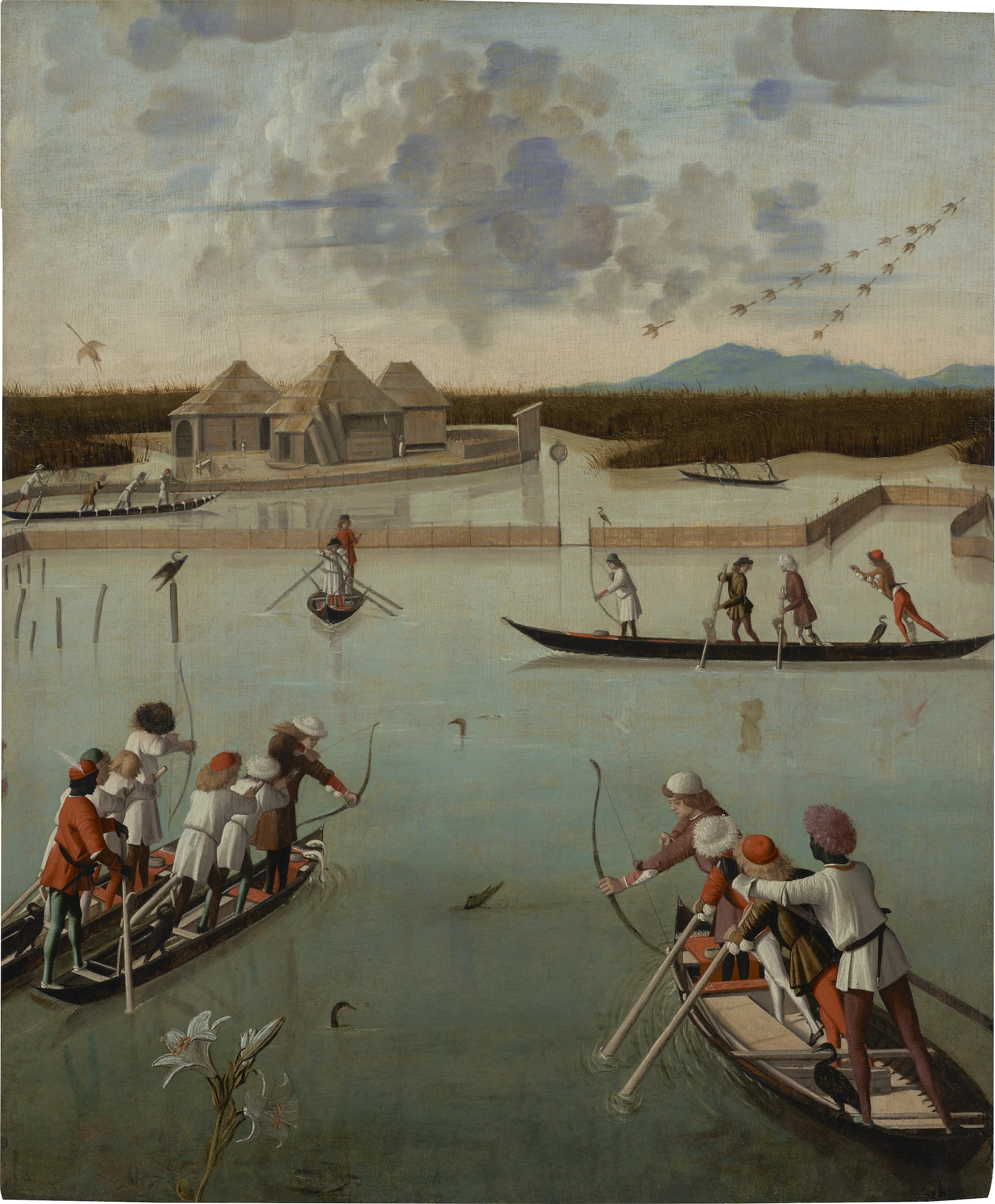
Vittore Carpaccio, Fishing and Fowling on the Lagoon (recto); Letter Rack (verso), ca. 1492/1494, Oil on panel, The J. Paul Getty Museum, Los Angeles. Digital image courtesy of the Getty’s Open Content Program.

The exhibition begins with Ruskin’s “best picture in the world,” the Two Women on a Balcony—but here presented even better than in Ruskin’s day. Sometime in the 1700s this small work, most likely part of a set of folding shutter doors painted for a Venetian palace, was divided from its upper half. The lower portion with the two women eventually went to Venice’s Museo Correr. The upper part, now titled Fishing and Fowling on the Lagoon, ended up at the J. Paul Getty Museum in Los Angeles. The panels, dated together to ca. 1492/94, were only reidentified as being part of the same composition after conservation efforts in the early 1990s. This exhibition now temporarily reunites for only the second time in recent history what was clearly intended to be a single whole—the line of a lily stem even connects the two parts. Their happy reunion begs to remain permanent, if only the Getty and Correr could arrive at a loan agreement to share the works.

In the lower panel, the women gather on a balcony filled with birds and dogs. The scene is busy with domestic activity even if the women (and their dogs) appear somewhat bored by the pet play. The upper panel suggests the reason for their tedium. Above and beyond them, the men have loaded onto their gondola-like boats for a lively hunting and fishing expedition out on the lagoon. The components together reveal the ordering of Venetian society in one view. As both groups contend with their animals, the women in the foreground, who seem little interested in what is happening below the balcony, add humor to the recreation of their husbands beyond. The clever division and animated activity of the entire panel reveal Carpaccio’s great ingenuity with composition, compressing and expanding space to his will to contain his full “care for human life at large,” as Henry James put it. That the scene is clearly cut off to the left would certainly suggest that some additional Carpaccio is still out there waiting to be rediscovered—just look for the matching balustrade and rear end of a brown dog. Adding to this intrigue, the verso of part of the known panel is painted with personal letters appearing to hang from a line in trompe l’oeil. As much as we might appreciate him by the slice, Carpaccio is best enjoyed whole.

The organization of Carpaccio’s compositions was no accident. His studies of faces, architecture, and perspective were exacting. His deliberative process might help explain why we are now left with more of Carpaccio’s preparatory work than almost any other artist of his time. The National Gallery presents thirty of these drawings both to let us appreciate his working methods and to help illustrate his larger paintings that cannot travel. Among these examples, a blue double-sided sheet from the Ashmolean Museum in Oxford is a standout. Titled Head of a Young Woman in Profile (recto) and Head of a Young Woman in Three-Quarter View (verso), the drawings from ca. 1488–89 served as studies for two of the numerous faces in Carpaccio’s Apotheosis of Saint Ursula, one of the paintings in the Accademia cycle. The drawings are not necessarily innovative. They even may have been copies of works by Pietro Perugino and Pinturicchio. Still, through their exquisite modeling created with hatch marks of white and black chalk and washes of brush and brown, they reveal a luminous grace.

Carpaccio’s extensive compositional planning did not necessarily serve him well as his reputation contended with the rise of the modern style of Titian and Giorgione. Even at the time of Ruskin, in 1871, Joseph Archer Crowe and Giovanni Battista Cavalcaselle wrote that Carpaccio was “without any poetry of fancy” in their History of Painting in North Italy. In her current catalogue essay, “Carpaccio as a Draftsman,” Catherine Whistler concurs that he was “overshadowed by the poetic genius of Titian.” Even Peter Humphrey writes that “set against the more heroic and classicizing art, the work of Carpaccio must have appeared staid, quaint, and irrelevant.” At the very least, Humphrey continues, “his narrative paintings and skills as a storyteller may be seen as a vital link in the continuous tradition in Venetian painting from the late Gothic style of the early fifteenth century to the late baroque of the eighteenth.”

But there is more to Carpaccio than merely his role as a historical connection between the painting styles of fifteenth- and sixteenth-century Venice. His appeal is in locating us in spiritual space and infusing this built environment with pious order. We can see why the scuole, those social and charitable organizations of Venice, all commissioned him to paint their lives of Saint George and Saint Stephen and Saint Ursula and the Virgin Mary. The worlds he envisioned were immersive. They could be entered, touched, and breathed. The paradise he creates is indeed “of his own room,” to which he extends a welcoming invitation.

  1.   “Vittore Carpaccio: Master Storyteller of Renaissance Venice” opened at the National Gallery of Art, Washington, D.C., on November 20, 2022, and remains on view through February 12, 2023. The exhibition will next be on view at the Fondazione Musei Civici, Palazzo Ducale, Venice (March 18–June 18, 2023).

Comment

A library by the book

Comment

A library by the book

THE NEW CRITERION, December 2022

A library by the book

On the politicization of the American library.

Adapted for The Wall Street Journal of November 11, 2022

In 2006 the American Library Association issued a button to its members. It read, “radical, militant librarian.” We should have taken the message at its word. The American library, until recently a refuge of neutral quietude, has become a booming battleground in the culture wars.

In 2018 the ALA dropped the name of Laura Ingalls Wilder from its annual children’s literature award. The reason? The supposed “culturally insensitive portrayals” in her landmark Little House on the Prairie series. Three years later, the organization published its “Resolution to Condemn White Supremacy and Fascism as Antithetical to Library Work.” The edict claimed that “libraries have upheld and encouraged white supremacy both actively through discriminatory practices and passively through a misplaced emphasis on neutrality.” The proclamation charged the ALA’s “Working Group on Intellectual Freedom and Social Justice” to “review neutrality rhetoric and identify alternatives.”

The quiet, neutral library was out. Full-throated progressive politics were in. As Emily Drabinski, a self-described “Marxist lesbian” who was recently elected president of the ALA, stated on her campaign website: “So many of us find ourselves at the ends of our worlds. The consequences of decades of unchecked climate change, class war, white supremacy, and imperialism have led us here.”

The condemnation of the history of the American library, by its own gatekeepers, has done more than bring “Drag Queen Story Hour” to every children’s reading room. It has also upended the traditional role of the library as an organization primarily dedicated to the acquisition, preservation, and circulation of books. This is a radical overhaul, and it has been brought to us by some of America’s largest cultural philanthropies.

In October the Mellon Foundation hosted a panel discussion on the American library featuring Mellon president Elizabeth Alexander, the ALA executive director Tracie D. Hall, and the Los Angeles City Librarian John F. Szabo. “Library workers are on the front lines of some of our most pressing social justice issues,” began the discussion. They are “no longer relegated to the reference desk.” What does this all mean? For one, that today’s librarians mock “the shushing part” of the traditional library: “I can’t think of too many contemporary library spaces I’ve been in where the librarian is going to be a shusher,” said Hall. “I probably was the librarian that others might have wanted to shush.” Through sewing classes, coworking spaces, and “incubators,” the panel spoke of “fulfilling the promise of what libraries were meant to be in terms of equity.” “It is our responsibility to ensure that no one is left out of the voting process,” Hall added. “That is one of our core values at the American Library Association.” And by actively appealing to voters on one side of the political spectrum, the library organization helps move election outcomes in a desired direction.

As librarians now champion controversial books such as the graphic novel Flamer, they also call parental attempts to limit what children read as evidence of a “period of unprecedented book banning and censorship”—one that “far eclipses even the McCarthy era.” Meanwhile, truly deplatformed titles, such as When Harry Became Sally, Ryan T. Anderson’s critique of modern transgender theory that Amazon erased from its e-commerce platform, are never mentioned in these one-sided agonies. “This is the third great wave of librarianship and libraries—as a social project,” concluded Hall. What was, until recently, a widely popular American institution has been nearly broken by unrestrained progressive politicization.

“I suspect that the human species—the only species—teeters at the verge of extinction, yet that the Library—enlightened, solitary, infinite, perfectly unmoving, armed with precious volumes, pointless, incorruptible, and secret—will endure.” It is easy to see how Jorge Luis Borges in the early 1940s, in his oft-quoted short story “The Library of Babel,” might have drawn such a conclusion. Yet today it appears that the library, especially the library that is “enlightened, solitary, infinite, perfectly unmoving, armed with precious volumes, pointless, incorruptible, and secret,” is the entity that most teeters at the verge of extinction.

It is a crisis of the Left’s own devising, one designed to turn the library into a scarred landscape. It is also based on a straw-man argument, with rhetoric disconnected from the historical record. Far from upholding “fascism” and “white supremacy,” the American library has been, in fact, one of the country’s most enlightened and democratic institutions.

Through what remains of this legacy, beyond the spurious “banned books” displays and the circulation-desk sermonizing, today’s libraries can still be places of reverie, uplift, and reflection. This effect is due not just to the abundance of books that are—at least for now—still available for perusal. It is also an effect of the library building itself, its history of form, which records the values of an earlier era in bricks and stone.

For its ubiquity and richness, especially in those examples that survive from before the Second World War, the American library building stands as a reflection of the country’s enlightened calling. Over the nineteenth century and into the early decades of the twentieth, library design paired historicized style with the latest innovative solutions for the safe housing and circulation of its collections. The references to the history of art and civilization that these buildings displayed on their faces—and the great expense dedicated to their creation and upkeep by their underwriters—reflected a reverence for the culture of the book contained within.

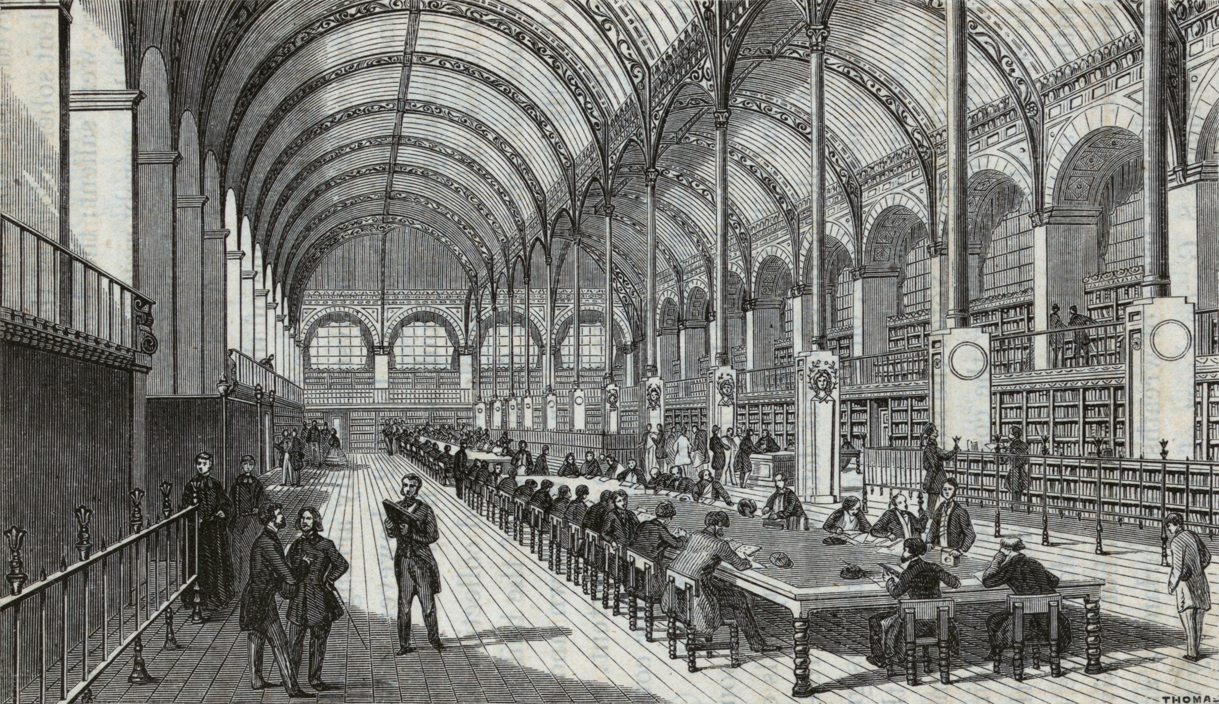
Henri Labrouste, Bibliothèque Ste.-Geneviéve, Paris, 1859, Print, from Memoirs of Libraries, London.

American Libraries: 1730–1950, written by Kenneth Breisch for a series by the Library of Congress and published in 2017, tells this history in a visual and compelling way.1 While the eighteenth century saw the creation of important American private and subscription libraries, only Benjamin Franklin’s Library Company of Philadelphia (founded in 1731) and the New York Society Library (founded in 1754) had buildings dedicated to their collections by the turn of the nineteenth century. America’s interest in library design began in earnest after 1800. Over the following century and into the early years of the twentieth, libraries took the country by storm. Planners found inspiration in the grand mid-nineteenth-century examples of the Bibliothèque Sainte-Geneviève in Paris (designed by Henri Labrouste and constructed between 1844–50) and the Reading Room of the British Museum in London (Sydney Smirke, 1854–57). American library construction took off after the Civil War to reach the pinnacle of the movement as seen in such edifices as the main branch of the Boston Public Library (McKim, Mead & White, 1895), the main branch of the New York Public Library (Carrère & Hastings, 1911), and Yale’s Sterling Memorial Library (James Gamble Rogers, 1931).

Unlike the museum, the library is an ancient form. The Ambrosian Library in Milan (Lelio Buzzi and Francesco Maria Richini, 1603–09) and the Bodleian Library at Oxford (Thomas Holt, 1610–13) provided the “hall model” for early American library construction, one that lined the high walls of the main rooms with books. Centuries later, private showcase collections such as New York’s J. Pierpont Morgan Library (McKim, Mead & White, 1902–06), Rhode Island’s John Carter Brown Library (Shepley, Rutan & Coolidge, 1904), California’s Huntington Library (Myron Hunt, 1920), and Washington’s Folger Shakespeare Library (Paul P. Cret and Alexander B. Trowbridge, 1928–32) continued the tradition of the Renaissance treasure-house design.

As a modification of the hall design, the alcove model, with double-height C-shaped book walls, became the American standard by the mid-nineteenth century. At Harvard, Gore Hall (Richard Bond, 1837–41; demolished in 1913 for the construction of Widener Library) became the university’s first freestanding library and a standard of alcove design. The form was continued in Yale’s Dwight Hall (Henry Austin, 1842–47; converted into the Dwight Memorial Chapel in 1930–31) and the successive buildings of the New York Society Library of 1840 and 1856. Merging the literary and ecclesiastical, both Gore and Dwight Halls drew their inspiration from King’s College Chapel in Cambridge, England.

Two influential manuals of the 1840s—A. F. Schmidt’s Handbuch der Bibliothekswissenschaft (1840) and Léopold Auguste Constantin Hesse’s Bibliothéconomie (1841)—encouraged multistory alcove design. Yet it was the widely emulated work of Henry Hobson Richardson, a onetime Harvard undergraduate who had studied in Gore Hall, that assured the alcove’s popularity, thanks to his library designs for the Massachusetts towns of Woburn, North Easton, Quincy, and Malden (1876–85). With its monumental ashlar masonry supporting fanciful arches and turrets, the Richardsonian Romanesque-revival style can still be seen in libraries throughout New England.

Not everyone was a supporter of Richardson’s alcove system—in particular those librarians who worked with collections housed in these arrangements. Justin Winsor, the superintendent of the Boston Public Library from 1868 to 1877, and William Frederick Poole, the librarian of the Boston Athenaeum from 1856 to 1869, were both critical of multi-story book halls and alcove shelving for their inefficient use of space, the challenge of retrieving the volumes, and the uneven heating of the rooms, which would often cook the books on the higher shelves. Their solution was the more utilitarian stack system, which located books in dedicated spaces on multiple tiers of iron shelves. The British Museum Reading Room employed, in part, such a multi-tiered system.

As American universities began to emulate the research-based German model, library collections grew. A more modular and efficient stack system soon became a necessity. Gore Hall was built in 1841 to house forty-four thousand books—the extent of Harvard’s collection at the time. The building was filled by 1863 and supplemented by a stack annex, the first in America, in 1876. Nevertheless, by 1910 an architectural survey determined that “no amount of tinkering can make it really good.” As with other alcove libraries, Gore was said to be “hopelessly overcrowded” and “intolerably hot in summer.” In 1913 Harvard demolished Gore and replaced the influential nineteenth-century complex with Horace Trumbauer’s Harry E. Widener Memorial Library, with metal stacks capable of storing over 3.5 million volumes. What was lost in bibliographic visualization—with the architectural use of books now replaced by card catalogues—such stack libraries gained in essential storage and efficiency. By the time of the construction of Yale’s Sterling Memorial Library, its Gothic Revival façade concealed a fourteen-story stack tower capable of housing five million volumes.

Thomas Jefferson was a man ahead of his time—in library- as well as nation-building. His legacy is woven into the story of the American library in more ways than one. By the early years of the republic, Jefferson had amassed a personal collection of six to seven thousand volumes. It was the largest and most extensive library in the country at the time. After the British army sacked Washington, D.C., and burned the Capitol in 1814, destroying the congressional library housed within, Jefferson sold his collection to the federal government a year later. Even though a second fire destroyed two-thirds of these volumes in 1851, Jefferson’s collection continues to form the nucleus of the Library of Congress, which has grown to become the largest library collection in the world.

Jefferson Reading Room, Library of Congress. Photo: Carol Highsmith, 2009.

Jefferson’s library influence continued with his designs for his University of Virginia. In 1822, construction began on his Rotunda library. The design departed from the hall model and adopted the shape of the ancient Roman Pantheon to form a focal point for his university’s classically designed Academical Village. When completed in 1828, two years after Jefferson’s death on July 4, 1826, and as the final and most monumental building on the new campus, the two-story Rotunda became the first freestanding academic library in the country.

Half a century later, library designers returned to Jefferson’s classical vernacular and the rotunda form to create some of the greatest monuments of American library architecture. Again Sydney Smirke’s innovative British Museum Reading Room of 1856 provided the model for a domed central rotunda featuring a panoptic administration area at the center with freestanding bookstacks surrounding a core. Smirke’s innovative reading room, the first to use iron stacks, featured twenty-five miles of reference shelving with twenty thousand popular circulating volumes arranged in numbered alcoves a floor below.

When the U.S. government authorized a competition for a new Library of Congress building in 1873, the winning design coalesced around a similar rotunda-and-stack arrangement. Completed twenty-five years later in 1897, what is now known as the loc’s Thomas Jefferson Building spared no expense in its construction and decorative program. Edward Casey, the son of Thomas Lincoln Casey, the engineer who oversaw the library’s construction before his death in 1896, attended to the library’s lavish assembly of sculptures, murals, and mosaics. Illustrations on its walls depict the evolution of the book from the oral tradition through the invention of the printing press. The collar of its central dome features allegories of the world’s civilizations. Surrounding this program are forty-three miles of shelving manufactured by the Snead & Company Iron Works of Louisville, Kentucky, which can accommodate two million volumes.

The Library of Congress’s rich artistic program was arguably surpassed at the Boston Public Library, where Charles McKim tasked Puvis de Chavannes with producing a mural cycle for the library’s grand staircase. Puvis created the work relying on measurements sent by McKim and a sample of the yellow Siena marble to match the tonalities of the staircase enclosure. Using a scale model of the staircase and working on canvas in his French studio, the seventy-two-year-old artist created a cycle of paintings that were then shipped to Boston and adhered by his assistants to the walls. The long cycle atop the entrance to Bates Hall presents “The Muses of Inspiration Hail[ing] the Spirit, the Harbinger of Light.” Surrounding panels depict allegories of Philosophy, Astronomy, History, Chemistry, Physics, and Pastoral, Dramatic, and Epic Poetry. Below, carved lions by Louis Saint-Gaudens guard this grand staircase.

In the years after the completion of the loc’s Jefferson building, American architects revisited the rotunda model in even more impressive distillations of the classical style as taught by the École des Beaux-Arts. In the first decade of the twentieth century, two institutions—New York University and Columbia—developed new uptown campuses that had many parallels. Most notable were the domed rotunda libraries at their core: nyu’s Gould Memorial Library of 1896–1903 and Columbia’s Low Memorial Library of 1909. Both designed by the firm of McKim, Mead & White, each building carries the sensibility of one side of the partnership, with McKim’s restrained, detailed classicism on display at Low and White’s theatrical exuberance at Gould.

Beyond the triumphant designs of America’s turn-of-the-century central libraries, it was the development of the smaller branch library that arguably had the greatest effect on twentieth-century literacy and education. As early as 1885, William Frederick Poole was advocating for smaller circulating libraries, ones that might contain thirty thousand volumes and be easily accessible to the American reader. A supporter of libraries of all sizes, the philanthropist Andrew Carnegie answered this call in the early years of the twentieth century in ways that changed the landscape of the American library. By 1917, Carnegie and his foundation, which he started in 1911, had endowed 1,679 library buildings in the United States. In New York City alone, he spent $5.2 million to construct sixty-seven neighborhood branch libraries. In segregated Tennessee, he funded a Negro Branch library. At the request of Booker T. Washington, he donated $20,000 for the library at Alabama’s Tuskegee Institute. The ubiquitous construction of these Carnegie libraries, mostly classical in style, called for a simple panoptic design where “one librarian can oversee the entire library from a central point,” in the words of James Bertram, Carnegie’s personal secretary.

Through an astonishing combination of municipal underwriting and philanthropic giving (New Hampshire became the first state to authorize taxation for libraries in 1849), today there are 5,400 libraries with a thousand or more books in the United States. What has been lost in this abundance is an understanding of the forces that created it and an appreciation for the styles that formed it. Following the Second World War, library designers turned away from historical models to look to the modern office building and department store for inspiration, with disastrous effects. The Beinecke Rare Book & Manuscript Library at Yale (Gordon Bunshaft, 1963) and the Phillips Exeter Academy Library (Louis Kahn, 1972) are the rare exceptions to this general rule.

Departing from the simple flagstone design of Franklin Roosevelt’s “presidential library” (Louis Simon, 1939–40)—the first such executive initiative—the libraries of Lyndon Johnson (Skidmore, Owings & Merrill, 1967–71) and Bill Clinton (Polshek Partnership, 2000–04) are brutalist and impenetrable. The same goes for the James Madison Memorial Building (De Witt, Poor & Shelton, 1966–81), the much-criticized extension of the Library of Congress built at a cost of $131 million, where the first challenge is finding the monolith’s front door. Even after the government requested a review of the design by the American Institute of Architects in 1967, little changed in its final construction.

Detroit Publishing Company, Main reading room, the New York Public Library, ca. 1910, Dry plate negative, Library of Congress.

Now a radical “third great wave” seeks to wash over the American library to complete its transformation into a “social project.” A decade ago, the leadership of the New York Public Library unveiled a real estate consolidation scheme called the “Central Library Plan.” The aim was to transform the library’s flagship research branch—arguably the finest integration of public spaces and book storage in the country—by gutting its stacks. By removing the “seven floors of outdated bookshelves under the Rose Main Reading Room,” read the announcement, the plan promised to transform the reference library into a newly circulating “people’s palace.” Meanwhile millions of books from the library’s “core research collections” would be moved off-site—undermining the legacy of John Jacob Astor, who left the initial bequest of $400,000 for the foundation and support of a free public reference library in 1848.

An eleventh-hour appeal by the architectural critic Ada Louise Huxtable and others tanked the scheme, but the episode reveals the lengths to which library leaders will now go to destroy America’s great history of literary access for progressive ends. For them the real problem is not “book banning” but the easy availability of books they despise and the history these books represent, which our great library collections offer up neutrally, and impartially, by design. A library of the book, by the book, and for the book is the ultimate defense against their control—and the true democratic legacy of this American institution.

  1. American Libraries: 1730–1950, by Kenneth Breisch; W. W. Norton & Company, 320 pages, $75.

Comment