THE WALL STREET JOURNAL, April 14, 2025
Jack Whitten: The Messenger’ Review: A Creator’s Odyssey at MoMA
The American artist moved from the segregated South to the New York art world and beyond as he forged unique processes of painting and sculpting, the textured, totemic results of which are now on view in a staggering retrospective.
Can a painting also be a sculpture? Find out in “Jack Whitten: The Messenger,” the retrospective of the American abstractionist on view through Aug. 2 at the Museum of Modern Art. Following the survey of Jack Whitten’s free-standing work at the Met Breuer in 2018, we now get the full picture of this innovative and resonant artist, one who found freedom in the movement across fixed definitions.
The circuitous journey of Whitten (1939-2018) from segregated Bessemer, Ala., to the top floor of MoMA—by way of the Tuskegee Institute, Cooper Union, Manhattan’s 10th Street, SoHo and Tribeca, and the Greek island of Crete—was as epic as his compositions. The blood and sweat of his personal odyssey infused his methods and materials. At a time when black American artists might have been expected to address the subject of race through direct representation, Whitten abstracted his identity into layered works, both physically and metaphorically, of totemic power.
Organized by Michelle Kuo, MoMA’s chief curator at large and publisher, and assisted by Helena Klevorn, Dana Liljegren, Eana Kim, David Sledge and Kiko Aebi, the show features over 175 paintings, sculptures (mainly the former), works on paper and studio ephemera.
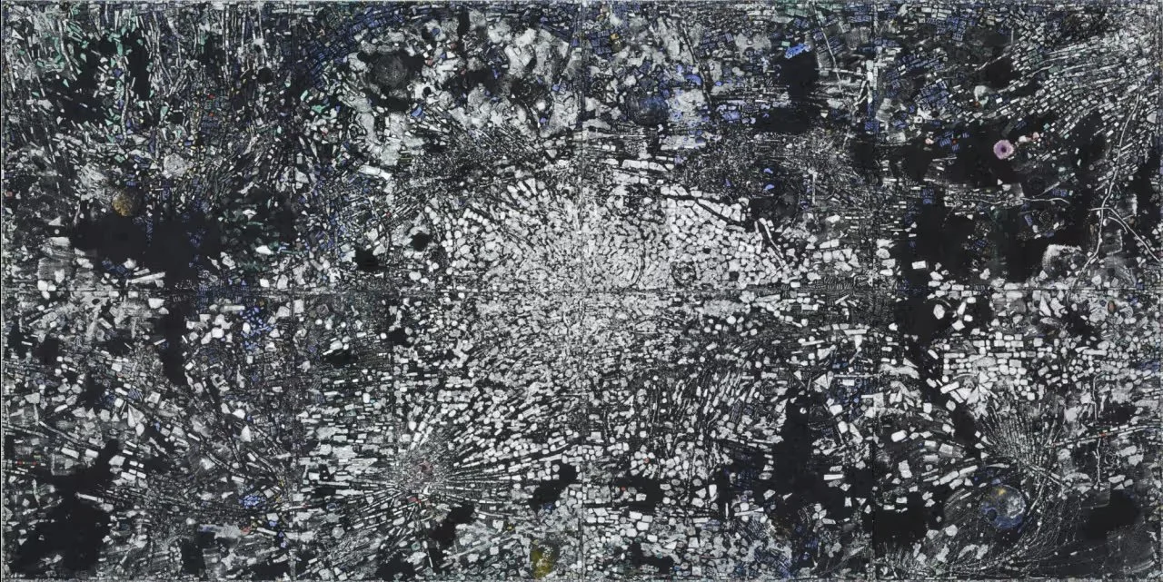
‘Atopolis: For Édouard Glissant’ (2014). The Museum of Modern Art, New York
Across his production, Whitten investigated the tension between the geometric structures of Piet Mondrian and the freewheeling gestures of Jackson Pollock. Along the way, he devised processes to remove the personal touch from his creations, opting to make his canvases as one might assemble sculpture.
“The Messenger (For Art Blakey)” (1990) inspired the title of this sprawling exhibition. Along with “Homecoming: For Miles” (1992), it serves as an introductory statement at the show’s entrance. Seen from afar, both works resemble starry constellations. Upon approach, drips of white paint on black ground come into focus. Come closer still and the true intricacy of Whitten’s process reveals itself.
Beyond mere expressionistic drippings, these compositions are intricate mosaics of handmade tesserae—acrylic chips that Whitten poured, painted, dried, cut and arranged on the surface of each canvas. The result evokes Georges Seurat, Byzantine iconography, even digital imaging.
The exhibition then follows Whitten chronologically for roughly half a century. A suite of early black-and-white compositions, including “Head IV Lynching” (1964), echoes the photographic record of race-based terror. Resembling ghostly faces caught in a flash bulb, these abstractions were produced by pressing white acrylic through a dark fabric mesh.
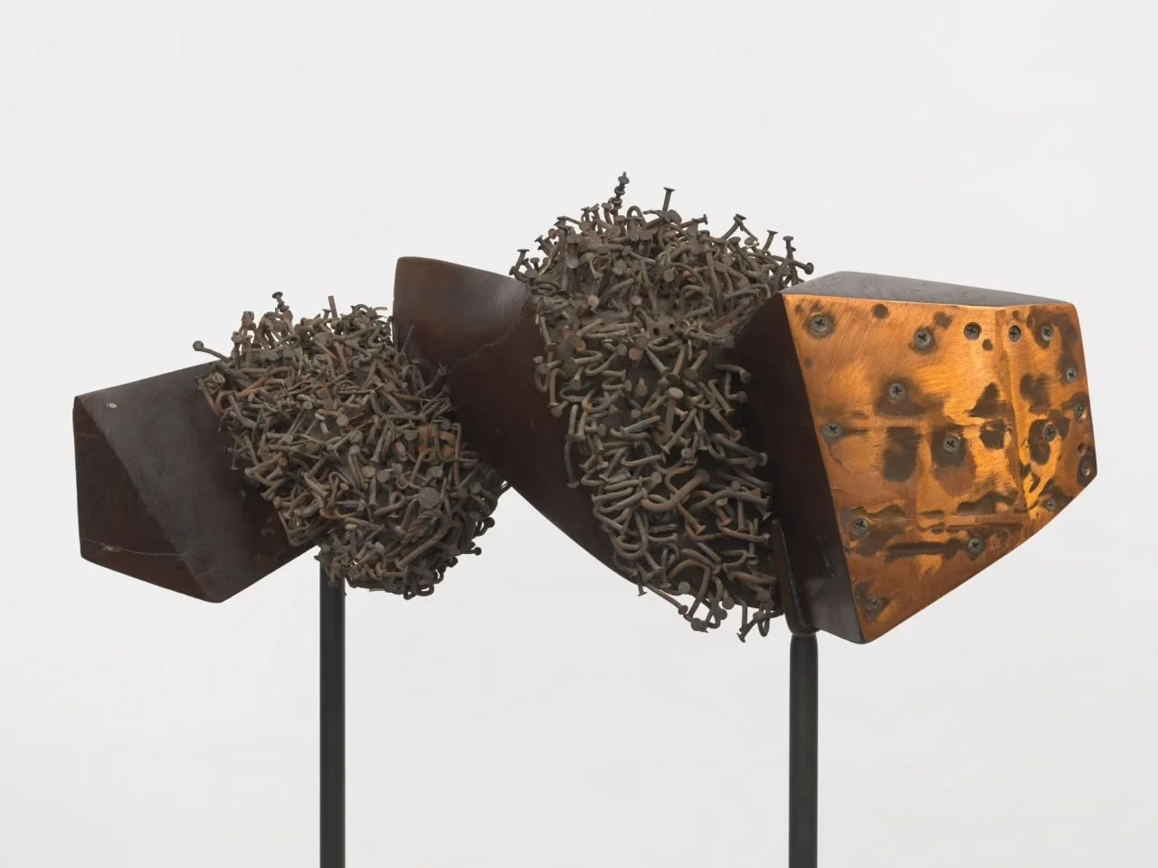
‘The Afro American Thunderbolt’ (1983/1984). Courtesy the Estate and Hauser & Wirth
Nearby, “Homage to Malcolm” (1965) is the first of his assemblages on display. In a piece of American elm that he carved, smoothed, feathered and burned, Whitten embedded nails, chains, keys, pliers, and a toilet handle, which he then coated in black paint and metallic dust. The horizontal object combines the Congolese power figures known as Nkisi N’kondi with the simplified forms of Constantin Brâncuși.
In the 1970s, Whitten constructed tools to “develop” his paintings by scraping them with giant squeegees and combs. He laid his canvases on the studio floor, applied layers of acrylic paint, and pulled his homemade rakes across them in one quick motion. Inspired by photography and xerography, works such as “Mirsinaki Blue” (1974) might call to mind the blurred abstractions of Gerhard Richter, but Whitten created his compositions years before the German arrived at his own squeegee technique.
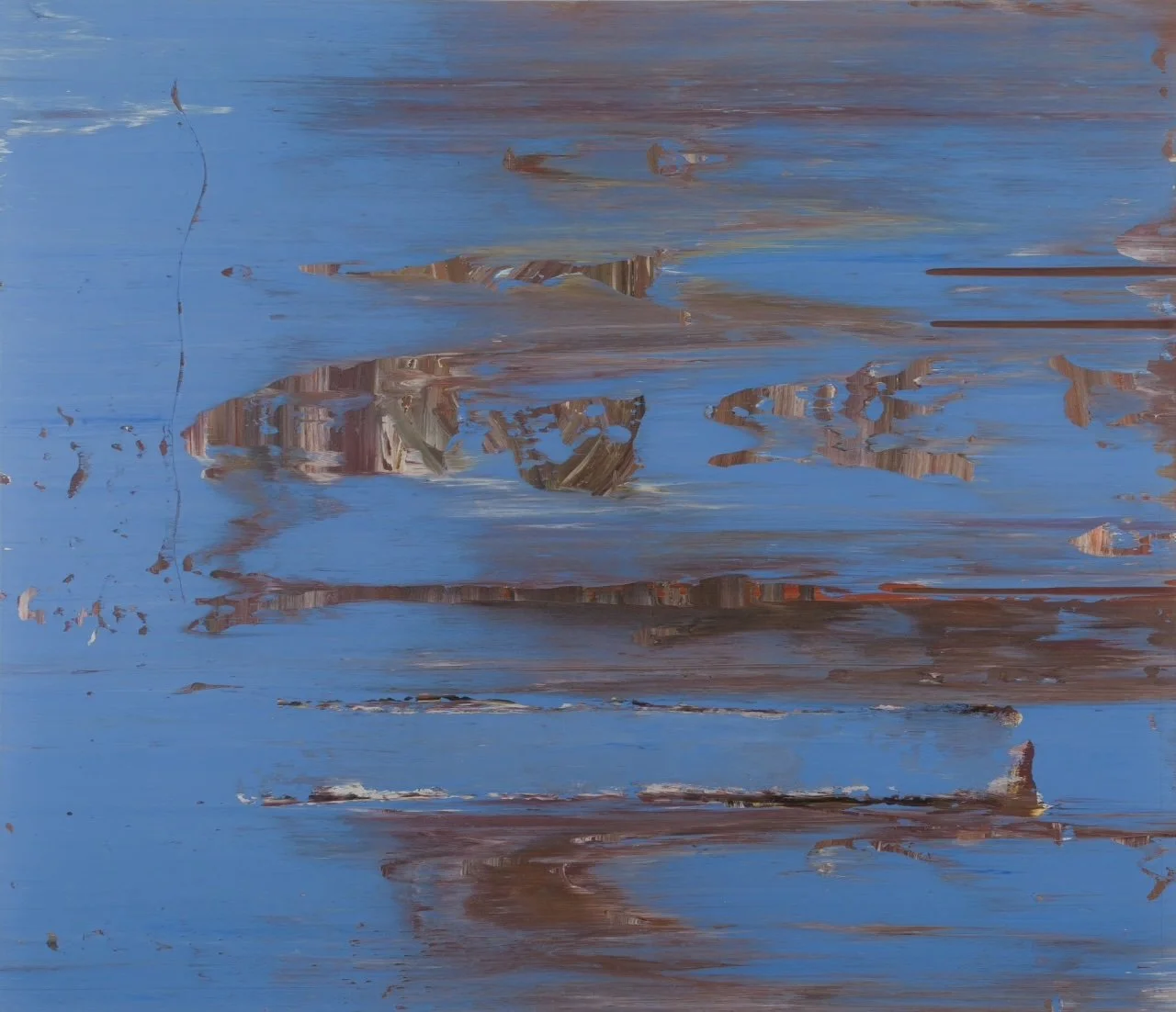
‘Mirsinaki Blue’ (1974). Herbert F. Johnson Museum of Art, Cornell University
When Whitten turned to textured scrapers, including the use of a saw blade, the lines left by these tools produced mesmerizing effects. In a suite of works named after the Greek alphabet, inspired by summers in Crete with his wife Mary Staikos, flickers emanate from the lines of visual static.
By the 1980s, his work tipped into bas-relief, as in “Bessemer Dreamer” (1986), in which built-up circles resemble textured flooring. “Black Monolith I (A Tribute to James Baldwin)” (1988) might seem like a mix of street detritus—metal tread plates adhered to the paint surface. But in fact, Whitten molded these forms in acrylic before applying his casts to canvas.
In the 1990s, Whitten distilled such casts into handmade tiles, as in the two opening works. As he developed this mosaic process, his compositions reached their most ambitious. After Whitten witnessed the World Trade Center attack, over the next five years he made “9.11.01” (2006). At 10 by 20 feet, this composition of a black pyramid on a brick-like ground became his personal wailing wall to the victims of Sept. 11.
Whitten blurred the lines between painting and sculpture in a way that speaks to that larger foment of artists of his generation, those who remained faithful to abstraction when taste otherwise moved on to Pop. As he scraped, combed and recast the history of form, the great sincerity of his work is what ultimately shines through.
Jack Whitten: The Messenger
Museum of Modern Art, through Aug. 2