Viewing entries in
James's Publications

Comment

Not Like Ike

PJ-BY442_IKEMEM_M_20141113000648

Model of the Eisenhower Memorial looking at Independence Ave. GEHRY PARTNERS, LLP

THE WALL STREET JOURNAL
November 13, 2014

Not Like Ike
by James Panero

Plans for the Eisenhower Memorial have turned into another Washington boondoggle.

Imagine if the great Lincoln Memorial had been designed today. No longer would we feature our 16th president enthroned in a Doric temple. No more would we contend with an off-putting set of stairs as we strain to look up at cold, noninteractive marble.

Instead, Lincoln could be brought down to our size. In an immersive multimedia environment, tapping the latest technologies to recall log-cabin life, here we might help Lincoln as a child contend with his humble beginnings. The native vegetation of Kentucky, Indiana and Illinois could be planted on site, part of a LEED-certified green drainage plan. Through the Lincoln E-Memorial app, visitors could test their strength against the famous rail splitter through a game that posts scores directly to Twitter (hashtag: #RailedIt). Just be sure to duck when visiting the “Ford’s Theatre Experience.”

Thankfully, there is little risk of seeing the Lincoln Memorial recast this way. For Marian Anderson, Martin Luther King Jr. and many others, it has served as one of the most famous backdrops of the past century despite its antiquated marble technology. Yet since 1999, Washington’s master planners have been at work on another presidential memorial on the National Mall—for Dwight D. Eisenhower—that will pursue the opposite of the tried and true: a plan that was touted in its 2008 prospectus as a “21st Century memorialization,” using “new avenues” and “the widest possible range of innovative concepts and ideas,” with a “very significant electronic component,” leading to a “new vision for memorialization.”

National memorials have a history of long gestation and partisan controversy. Even the Lincoln Memorial, designed by Henry Bacon with sculpture by Daniel Chester French, completed in 1922, saw its share of criticism. Yet in this classical city, in hindsight, Washington’s traditional monuments have stood the test of time. So why must new mean “new”?

The congressionally authorized Eisenhower Commission certainly believes it got “new” in Frank Gehry, its chosen architect. With a proposal that subverts many of the classically based traditions of memorial design, the core of Gehry’s plan is the periphery: a 447-foot-long metal screen, suspended between 80-foot-tall columns, interwoven with images of trees. “The setting for Eisenhower Square,” reads the Commission website, “will be framed by transparent stainless steel tapestries, which depict the plains of Kansas, representing Eisenhower’s humble beginnings.” This device would serve as the backdrop for the sculptural program playing out in front of it.

In the initial proposal, since amended to include a greater cast of characters, this program centered on a statue of Eisenhower as a barefoot boy. The memorial would also be designed around an app that “will enable visitors to view historical footage, speeches, and events within the context of the physical memorial through augmented reality.”

Should we be surprised that the plan has become more bogged down than the Battle of the Bulge? The design has received widespread criticism—from Justin Shubow of the National Civic Art Society to Sam Roche of the group Right by Ike, not to mention members of Eisenhower’s own family—that has resonated with lawmakers and the general public. The site would also imperil the historic L’Enfant Plan by overlaying Maryland Avenue, between the Air and Space Museum and the Department of Education. In the New Yorker last year, Jeffrey Frank said the design “has managed to achieve something rare in Washington: in true bipartisan spirit, almost everyone hates it.”

This past summer, congressional members of the Committee on Natural Resources issued a 60-page report damning the project as a “five-star folly.” It is easy to see why. Congress has already appropriated $65 million for a project that would cost $100 million or more. Yet without a stone—or screen—in place, $41 million of this funding has already been spent or obligated, including almost $16.4 million for the designer and $13.3 million for administrative support. A $1.4 million fundraising effort slated to generate $35 million in private support has taken in less than $500,000. Meanwhile, the Commission maintains nine full-time employees and six full-and part-time contractors.

Beset by criticism, Congress has rightly halted future funding, some commissioners have resigned and calls have been mounting to scrap the Gehry plan altogether. Bruce Cole, the former head of the National Endowment for the Humanities who was appointed to the Commission a year ago, remains a skeptic. “A great memorial is an exclamation point, not a question mark,” he recently testified.

Yet led by its chairman, Rocco Siciliano, the Commission has dug in. Recent approvals by the National Capital Planning Commission and the U.S. Commission of Fine Arts have been hailed by Gehry defenders as the green light, even if the project has only enough gas to idle at the curb. Of course the bureaucrats behind the wheel still get their salaries. That’s right: Commission staffers will continue to draw down millions of tax dollars regardless of whether anything gets built.

Yet a greater force than self-interest has propelled the memorial to this point: the sometimes blinding mythology of the “new,” where widespread criticism can be mistaken for vindication, and pushback ennobles a self-anointed vanguard. Mr. Siciliano and others may believe they are following the example of the Vietnam Memorial, an unconventional design that overcame initial controversy to win the public over. But criticism alone does not authenticate avant-garde success. An unconventional design may just be bad, and design à la mode risks falling from fashion.

Eisenhower deserves a great national memorial, and it would be wrong to see this battle reduced to a mandate for one style over another. But the critics are right to demand something genuinely revolutionary—a design that is not simply “new,” but new, and that successfully communicates the essence of the man it claims to honor.

After all, here is the Supreme Allied Commander who oversaw the most complex amphibious assault in history. He liberated Europe, went on to become the president of Columbia University and the commander of NATO. As the American president who ended the Korean War, he ushered in a period of peacetime prosperity, connected the country through the Interstate Highway System, created NASA and the agency that would invent the Internet, while pushing civil-rights legislation and sending federal troops to desegregate the schools. When he died in 1969, he was buried, by his request, in his green World War II jacket in an $80 government-issue casket. Does this say “8-story-high, $100 million metal screen” to you?

Comment

Comment

Gallery Chronicle (November)

Chris Martin, Untitled, 2014; Acrylic, oil and glitter on canvas, 88" x 77"

THE NEW CRITERION
November 2014

Gallery Chronicle
by James Panero

On “Chris Martin” at Anton Kern Gallery; “Doppler Shift” at the Visual Arts Center of New Jersey; and “Matthew Miller: Can’t You See It, I Am One” at Hansel and Gretel Picture Garden Pocket Utopia.

If there’s a Godfather to the Bushwick painting scene, it’s Chris Martin. Let me disambiguate this statement by clarifying, first, that I don’t mean Chris Martin, the premier New Zealand cricketer, Chris Martin, the “Play” of the rap duo Kid n’ Play, or Chris Martin, the frontman of the English pop band Coldplay. I mean Chris Martin, the artist born in Washington, D.C. in 1954, who has been a Brooklyn fixture since sharing a studio building with Katherine Bradford in Williamsburg in 1980. This Chris Martin has been around for a while—he dropped out of Yale to move to Soho in the prehistorical year 1976—but his paintings only seem to get younger with age. And the kids love him for it.

Perhaps more than any other Williamsburg painter who moved east to Bushwick, Martin brought an insouciance that has clearly impressed the neighborhood’s younger set. His appearances in Bushwick group shows always seem to be cause for excitement. His exhibition program in Chelsea is celebrated and closely watched. Now, after several years at the gallery Mitchell-Innes & Nash, Martin has arrived at Anton Kern for his first solo show under new representation.1

Martin’s youthfulness is both felt and cultivated. He inherited the boldness of Soho’s 1970s post-minimal painters and processed it through 1980s neo-expressionism (especially the work of the German polyglots Sigmar Polke and Anselm Kiefer) to arrive at an abstract aesthetic that radiates outer-borough otherness—while still appearing big enough for Chelsea. In 2011, the writer and painter Sharon Butler identified the style of abstraction Martin inhabits as a “new casualism,” where a “studied, passive-aggressive incompleteness” and “multiple forms of imperfection” lead to work that is “off-kilter,” “overtly offhand,” and “not-quite-right.” Butler meant this as praise. Other critics have been less flattering. “Crapstraction” has been one label of opprobrium. For this style, “Zombie formalism” is another. Coined by Walter Robinson, popularized by Jerry Saltz, “Zombie” may one day be transformed from insult into the style’s top-shelf brand name, following the trajectory of nearly all enduring terms in modern art.

Good paintings are often the results of bad mistakes. So Martin paints like he knows nothing, and he knows he knows nothing, deliberately fumbling towards the end zone. He says he stashes his many failed canvases in the boiler room while mixing the winners and the best efforts into an oeuvre of quixotic could-have-beens. Of course, you can’t “de-skill” a painting without skill, just as you can’t take the “story” out of art history (or something like that). So it helps that Martin starts with ample reserves of artistic ability and historical awareness. As a boy in Washington, he grew up surrounded by art and artists. In an interview with The Brooklyn Rail (which has long championed his work), he describes growing up in a home featuring a life-size portrait by Sir Thomas Lawrence, which his mother had inherited and displayed in an elaborate wooden frame. Art teachers, artists he encountered along the way, the music of James Brown, and a magic mushroom he swallowed forty years ago, all seem to influence his paintings.

Chris Martin, Installation view at Anton Kern Gallery, New York.

At Kern, Martin’s latest paintings are particularly indebted to the bold figure-ground dynamics of the Soho school. Certain motifs seem to come right out of recent work by Thornton Willis and other masters of the hard edge and the dissolving form. But then Martin funks them up. In a new monograph published to accompany the current exhibition, Martin describes his affection for Bill Jensen, who would leave his paintings outside to “season” them in the snow and rain.

Here Martin takes this literally, not only rough-handling his canvases, dragging them around his place in the Catskills, probably dropping them once or twice, but also dashing them with copious amounts of glitter to season the mix. On several paintings, overlaying the studied edges, he works in whole bands of the sprinkled stuff. Sometimes his glittery forms take on their own sculptural shape, as Martin adds a gradient shadow, recalling Yves Tanguy’s surrealist landscapes and his own recurring mushroom motif. Elsewhere, as in Chameleon (2014), they streak across the compositions like drippy bedazzled brushstrokes. Sometimes he leaves them out, as in Tree(2014), where Martin allows hard-edge acrylic underpainting to stand on its own. In his largest work, Space is the Place (2014), over eleven feet tall by nine feet wide, set in its own gallery, the glitter becomes an all-over rainbow abstraction. And sometimes Martin does something else entirely. One painting here is on aluminum foil. Others mix in images from magazine pages and whatever else happened to stick to them. I especially like one painting that incorporates a diagram of the human gastrointestinal system languishing in Pepto-Bismol pink.

One could see these desultory compositions as an untucked insult to abstract art. But one can also see Martin as celebrating the history of painting like an Uncle Sam juggling on a unicycle. He’s the most patriotic guy at the Fourth of July parade. He’s over the top. He’s having fun. “Sometimes a bad painting is a brave and uncharted investigation beyond one’s own good taste,” he explains in an interview in the Kern monograph, “and sometimes it’s just a really bad painting. Humor is a serious indicator that something interesting is happening.” Similarly, sometimes tackiness is just tacky, sometimes it can be overly tactful, but sometimes it clears out space for other possibilities. Or at least it gives us license to wear polka dots with plaid.

Edgar Diehl, Jupiter Landung IV, 2014.

One heretofore undiscussed avenue of Martin’s painterly trip has been his work in art therapy. After riding the ups and downs of the Eighties art market, Martin went back to school to train as a therapist at the School of Visual Arts. He then worked for fifteen years on the front lines of an AIDS day treatment program with a population that could be homeless, mentally ill, and chemically addicted. The experience clearly affected him. It also wiped him of a great deal of artistic angst while broadening his sense for materials. The process of painting can be its own restorative balm, glitter and all.

More should be said about those who work in this unsung vanguard. I don’t mean the calculated avant-garde of the contemporary salon aesthetic, or some token outreach program that looks just good enough for the Annual Report and an NEA Arts Education grant. What I mean are those artists and institutions that use art to reach people who are genuinely in need and underserved by our rich visual culture.

This thought occurred to me while visiting the Visual Arts Center of New Jersey, an institution that forgoes the glamour of auction-name artists and starchitect build-outs for serious art and serious work. Founded in 1933, inhabiting a building that got the short end of the Brutalist stick (was there a long end?), the Visual Arts Center is nothing to look at. Nor did I find much to see between highway interchanges on my hour-long drive from New York City to the town of Summit. Yet behind its corrugated concrete exterior, as New Jersey’s “largest institution dedicated exclusively to viewing, making, and learning about contemporary art,” the Visual Arts Center is a hive of artistic activity, with teachers giving stand-and-deliver sermons and young artists making and engaging with the art on display. One of the missions of the Center is to “provide quality education programs to underserved audiences, such as the elderly, persons with special needs, and children from low-income families.” Check, check, and check.

Yet the Center also demonstrates a particular respect for its constituency by mounting an exhibition program, curated by Mary Birmingham, that is rigorous, vigorous, and uncompromised by any false sense of cultural relevance and equivalency. Now on view (and a perfect example of this program) is “Doppler Shift,” a smart group show of what might be considered contemporary optical art.2

Gary Petersen, Tilting Points (panorama), Visual Arts Center of New Jersey.

“Doppler Shift” began as a suitcase exhibition that the artist Mel Prest packed through Europe in 2012. A version went on view at Brooklyn’s Parallel Art Space in 2013. With every stop it became enlarged and refined. The current exhibition brings together many of those underappreciated artists who interest me most these days: Steven Baris, Rob de Oude, Gabriele Evertz, Enrico Gomez, Gilbert Hsiao, Stephen Maine, Don Voisine, and (upstairs in a related installation) Gary Petersen. I was dazzled by the well-handled triangles of Joanne Mattera’s Chromatic Geometry 21 (2014), the rippling starburst of Edgar Diehl’s Jupiter Landung IV (2014), and the trompe l’oeil skills of a delicate sculptor whose birth name, she insists, is Gay Outlaw (she was born in Alabama).

The term “optical art” never looked right to me. “Anti-optical” might be better. First used in the mid-1960s, optical or “Op Art” refers to paintings and sculptures that elicit some kind of sensory effect in the viewer. In fact, through particular arrangements of color and line, here is art that is united in cutting against straightforward opticality by challenging how our brains process visual information.

Back in June 2009, in this column, I looked at how “Op,” a term that was coined in the mid-1960s, quickly went from the art world’s next chapter heading—Pop to Op—to an historical footnote. You might say that Op was co-Opted by the design industry, which found its patterns easy to reproduce, and the drug industry, which saw a kindred spirit in its cognitive short-circuiting.

But Op may be our most immediate contemporary style, requiring little prior understanding of what good art is supposed to be. As Dave Hickey wrote for “Optic Nerve,” a 2007 exhibition that brought some depth to the dazzling surfaces of Op (and quoted in the current catalogue by Thomas Micchelli), “Optical art introduces us to an order of experience that is less voluntary and less dependent on education and conscious knowledge than one might wish.” All the more reason to join the broad constituency of the Visual Arts Center in appreciating “Doppler Shift” firsthand.

Matthew Miller, self-portrait at Hansel and Gretel Picture Garden Pocket Utopia.

We live in selfie times. With the advent of the front-facing camera, it should be safe to say that humanity has not seen such a period of self-reflection since the invention of the mirror. The young self-portraitist Matthew Miller has been wrestling with this fact since even before the development of the flip phone. His stunning Old Master abilities are straight out of the Northern (Bushwick) Renaissance. In June 2011 I led this space with a discussion of his blockbuster show that just about blew up the basement of the formative Ridgewood gallery known as Famous Accountants. Now the gallerist Austin Thomas has brought Miller to her new Chelsea outpost Hansel and Gretel Picture Garden Pocket Utopia.3

After the 2011 show, I wondered how Miller would move along from his oddly furrowed self-portraits over oily black background. I am glad to see he never did, instead doubling down on the intensity of his painterly self-analysis, which might see him lay down dozens of thin layers of oil over a single image, microscopically shifting it through every pass. His self-portraits continue to haunt with their skewed glances that track your movements no matter where you go (to answer how he makes this possible, he will be in the gallery for a talk on November 15). I am glad Miller has dispensed with attempting to portray others, which always lacked the same intensity. In some paintings, he has also brought some of his self-making tools into the frame—a paint brush that touches an edge, a carved block of wood. If only he had included an iPhone 6, he might have created the image of the century.

1 “Chris Martin” opened at Anton Kern Gallery, New York, on October 9 and remains on view through November 15, 2014.

2 “Doppler Shift” opened at the Visual Arts Center of New Jersey on September 28, 2014 and remains on view through January 18, 2015.

3 “Matthew Miller: Can’t You See It, I Am One” opened at Hansel and Gretel Picture Garden Pocket Utopia, New York, on October 16 and remains on view through November 22, 2014.

Comment

Comment

Video Games

Screen Shot 2014-10-21 at 1.12.47 PM

BAKU
Fall 2014

Video Games
by James Panero

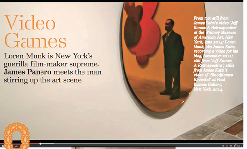
Loren Munk is New York's guerrilla film-maker supreme.

One day, when art historians take stock of the 2008 Whitney Biennial, the first artist to come to mind won’t be someone who appeared in the exhibition. It will be the artist who was thrown out of the exhibition for recording it with a tiny digital camera and posting it on YouTube. “The ironic part is they can film you with their security cameras, and you don’t give them permission for that, but God forbid you are there getting pictures of the art,” reflects this social media provocateur.

Working under the pseudonym James Kalm, since 2006 Loren Munk has made more than 1,000 videos just like 2008 Whitney Biennial Busted. They all start the same way: a shaky glimpse of a bike locked on a New York street, a pan to a gallery or museum door and a heavy-breathing voice-over announcing, “This is James Kalm, the guy on the bike, welcoming you to another half-assed production.” Then with a cut, or maybe not, we watch in point-of-view style as the camera takes us in, glances around and moves in closer to look at individual works on display. All the while, a wry voice leads us through, giving us first impressions, striking up conversations and sometimes striking out with gallery security. “People told me this is the stupidest thing they’d ever heard of,” Munk says of when he first explained his video project to friends. “I heard that, and I said, ‘Man, I’ve hit a gold mine!’”

The reason art historians of the 2008 Whitney Biennial will one day think of Munk is that, frankly, there is no better record of the exhibition than his half- hour-plus video walkthrough. Munk posts everything he films free on YouTube, either as the ‘James Kalm Report’ or ‘James Kalm Rough Cut’, and if you can’t remember what appeared to the right of the lift on the fifth floor, just tune in. Beyond that, his 2008 reportage has become something of a turning-point for a form of radical art documentation. “If you are showing exciting art that has cultural significance, by discriminating against all those people who can’t see it in person, you are holding back society,” says Munk.

Back in 2008 the Whitney thought otherwise. “Excuse me, sir,” says a guard fve minutes into the clip. “They are telling me right now that you are using that camera. Sir, if you don’t stop now, they are going to come over here and take you out of the building. OK?”

“They are going to take me out of the building?” Munk asks.

“Turn it off, please. The camera. Last time I ask you.”

Next thing we see is Munk’s feet being escorted down the stairs, as he explains to the viewer how he was just threatened with a lawsuit and copyright infringement. “This is James Kalm getting kicked out of the 2008 Whitney Biennial,” he concludes, offering his trademark sign-off: “Thanks, Kate,” a nod to his wife. He later returns to film four more segments, vowing to leave his camera on while declaring it a performance piece called The Camera is Off.

“That ended up being one of the biggest videos up to that point,” Munk says. Far from landing him in court, the Whitney linked to it and soon started posting their own YouTube videos. Today, the Whitney invites Munk to all its press previews and director Adam Weinberg comes over and shakes his hand. “It has gone from something they were throwing me out for six years ago, to something they now view as valid.”

Compared to the polished look of TV news, Munk’s videos take a bit of getting used to, but the art world is coming round to the 62-year-old performance documentarian. His appearance at a gallery opening has become a sign of critical arrival, and gallerists now know who to look for: a tall, paint- splattered balding man wearing an old bike helmet, the only person in the room whispering into a camera.

His videos are equally distinctive. Without ever showing the host’s face, they are less like classic documentary and more like going to an art opening inside the head of a knowledgeable friend. “I want it to be closer to the way someone really experiences the art scene, grabbing the artist, swinging back, zooming in, with their buddy and a couple of beers.”

As part of his practice, rain or shine, Munk bikes nearly everywhere from his 353sq m loft in Red Hook, Brooklyn. The audible breathing, the shakiness, are there because he’s just pedaled miles through busy streets, over the Brooklyn Bridge, and doesn’t wait to catch his breath, always filming in one take. “The immediacy is important,” he says. “It is changing the way people look at video. But people still say, ‘Your shaking is making me nauseous and your commentary is idiotic’.” But as we have grown used to the look of video in the smartphone era, Munk’s work now seems ahead of its time.

As the internet has leveled the field of arts journalism and newspapers have cut back on coverage, a freelancer with an online following can also hold increasing sway. By the last count, more than three million viewers have logged on to see Munk’s YouTube videos. His audience is growing internationally, too. “I’ve got people keeping up with me in the UAE, in Morocco, in China,” says Munk. “I get these letters from artists in Algeria saying, ‘I love your videos, will you look at my website?’” Even a school of Papulankutja aboriginal people in the outback of Australia tunes in. “We are 500 miles from the next big town,” their teacher emailed Munk, “but my kids can feel like they are part of the Williamsburg art scene” – referring to one of the alternative Brooklyn neighborhoods, like Bushwick, that Munk documents as often as he does Chelsea.

25KALM1_SPAN-articleLarge

Loren Munk in his studio (Todd Heisler/The New York Times)

Today Munk covers every corner of the New York art scene with tireless energy but never for any financial gain (he turns down offers of online advertising). “Munk’s obsession with art, art history and the New York art world is evidently more than one person can handle. So he created James Kalm,” Roberta Smith, the chief critic of The New York Times, wrote in 2011. She went on to praise him for giving “dizzying visual expression to some of what lures the art-driven to the city: the sense of possibility in the air and of history beneath our feet.”

Anyone can film a gallery opening but Munk’s films are different in that they have attracted a particular community and this has led him to find new artists, curators, critics, collectors and gallerists who have been excited by his work. 

“A key difference for Loren is the community that has formed around his video works,” says Hrag Vartanian, the editor of the Brooklyn-based arts magazine Hyperallergic, who as a curator included Munk in an exhibition of social-media art in 2010. “His generosity in his video work is clear, he doesn't have to be doing this but he does. Though, I do think doing the videos did help him reestablish himself on the art scene. All artists go through ebbs and flows in their career, and while some artists may complain when their careers dip, Loren found new ways to think about art and share his passion through video.”

If there’s a context for Munk’s films, it’s that they share something with the handheld clips coming out of war zones, and something with our culture’s obsessive digital documentation. Other artists have used YouTube but little else matches the breadth of Munk’s work.

So where will his videos end up? Probably not as something sold in a gallery, unlike an earlier generation of video art. “The old model is the opposite,” says Munk of video from the pre-internet age. “They were doing something in response to television, using technology in a hermetic, esoteric way, and you can access it only if you jump through the hoops to see it in a gallery.”

The videos have also reinvigorated Munk’s first passion for painting and have already paid off for him through his paintings, which consist of complex diagrams, maps and flowcharts of the art world. “He’s really synthesized a lot of things in his practice,” says Nick Lawrence, gallerist at Chelsea’s Freight and Volume, who began representing Munk two years ago. “There’s something unjaded and pure about it, and it shows up in his paintings. There’s a certain against-the- grain, countercultural approach in what he covers, how he covers it, in his technique. And his paintings are painted with an obsessive quality. The lines that connect in his paintings are exactly how he zigzags around the room at an opening. They are very spontaneous, very provisional.”

Munk agrees: “Often that’s the best way. I just walk through the doors and say, ‘This is pretty cool,’ and I just turn on the video and let it go.”

expanded from the print edition

Comment