Viewing entries in
James's Publications

With Much Fanfare

Comment

With Much Fanfare

THE NEW CRITERION, February 1, 2023

With much fanfare

On the City Ballet’s premiere of Copland Dance Episodes, choreographed by Justin Peck.

The music of Aaron Copland might as well be the soundtrack of the American century. From Billy the Kid (1938) to Appalachian Spring (1944), Rodeo to Fanfare for the Common Man (both 1942), the compositions are energetic, expansive, hopeful. You envision birds at daybreak, sunlight on the prairie, cowboys dancing with the farmers’ daughters and farmers dancing with the ranchers’ gals. The spiritedness of the works lends itself to the ballet stage. So it’s no surprise that some of Copland’s most recognizable pieces were originally commissioned for choreography: Billy the Kid for Eugene Loring via Lincoln Kirstein, Rodeo for Agnes de Mille, and Appalachian Spring for Martha Graham. In 1959 Copland even returned to ballet with the commission of his Dance Panels for Jerome Robbins and the New York City Ballet.

Copland’s repertoire has become so iconic that it might now seem overly tied to time and place, like some grand old Hollywood Western forever in black and white. Justin Peck, the resident choreographer of the New York City Ballet, has taken on the challenge of introducing new color to these works. In 2015 he choreographed his Rodeo: Four Dance Episodes, inspired by a staging of de Mille’s original ballet at American Ballet Theatre.

This season he returns with Copland Dance Episodes, an ambitious work that premiered at City Ballet on January 26. Staged in twenty-two “episodes,” the seventy-five-minute piece presented without intermission is not only Peck’s first “full evening” work for the company but also NYCB’s first full-fledged plotless ballet since George Balanchine premiered Jewels way back in 1967.

Balanchine, Copland, Graham, de Mille, Robbins—the ancestors weigh heavy on such an undertaking. Peck responds by stripping away the heft of narrative ballet for discursive abstraction, through a tumbling of episodes with sonic and choreographic connections that are at most evanescent and fleeting. A thigh slap here, a head bob there, that’s all we get as the work floats free of the classical narrative of the American story.

With lighting, scenery, and costumes all tuned up to high color, Copland Dance Episodes is at its best in exploring the chromatic vision that weaves together the composer’s uplifting piecework. In the program, the set designer Jeffrey Gibson states that his art “fuses his Choctaw-Cherokee heritage and experience of living in Europe, Asia, and the USA with references that span club culture, queer theory, fashion, politics, literature, and art history.” This boilerplate reads like an application to the John Simon Guggenheim Foundation. Nevertheless Gibson’s colorful painted drop curtain introduces the ballet in Sixties hard-edge abstraction crossed with television test patterns. Ellen Warren picks up on these complementary saturations for her two-toned leotards while Brandon Stirling Baker employs high-index illumination with mostly subtle, and at one time jarring, lighting transitions.

Russell Janzen and Miriam Miller in Justin Peck’s Copland Dance Episodes. Photo: Erin Baiano.

Peck tends to be at his best in ensemble work, as multiple movements on stage coalesce and dissolve. As we hear those epic opening chords of Fanfare, Dance Episodes opens with the full company covered in tulle. A slogan, “The only way out is through,” is written on the drop and also serves as a title for this opening episode. At first the dancers appear frozen like mannequins under plastic wrap, there to be dusted off and reanimated. Then they walk off, leaving only one—the “common man,” no longer elevated, but merely lost in the crowd.

We get some hints at narrative through several such vignettes: racers at the starting line, ticket takers at the turnstyle, a flower in bloom. Fingers left pointing up at the end of one scene are touched ET-style in the next (in an episode called, yes, “Phone Home.”) With titles such as “Etch-a-sketch” and “Kismet,” the episodes are tumbleweeds and rodeos as seen in a Sunday morning cartoon, the past visualized in the light of the screen pixel. 

Peck, now aged thirty-five, conveys all the autistic affectation of his millennial generation. It’s a case of too much FaceTime, not enough facetime. I have written about the shortcomings of his partnerings in the past, with his dancers moving around one another without the necessary emotional engagement. Of course the pandemic has only made things worse, as City Ballet still rehearses masks up, practicing social distancing in an art that should be about profound connection. 

And yet here some of Peck’s pairings proved to be the highlights of the performance. In the episode “Two Birds,” Copland’s birdsong was given new life in the quick flutterings of Miriam Miller and Russell Janzen on the afternoon I attended. The two returned in “The Split.” Likewise for the partnering of Alexa Maxwell and Jovani Furlan, who shined once the company’s overly busy stage commotion moved on.

It should be said that no ballet should have twenty-two episodes and expect us to keep track of them all, especially in a darkened auditorium, and especially with titles like “Alone Together” (Parts 1 through 3). Whatever happened to the simplicity of “Emeralds,” “Rubies,” and “Diamonds”? Anchor points such as “Simple Gifts,” danced by the company, give way to the unexpected abstractions of “Shadowboxer,” with the stage lighting suddenly switched to silhouette. 

Do the twenty two episodes of this non-narrative work come off as too episodic? Yes they do. But Copland’s music mostly sustains the riffs—and stays with you long after. Ultimately this is the achievement of Copland Dance Episodes, a work that should now enter the standard NYCB repertoire. The piece reveals how music so rooted in the twentieth century can still send tingles and shocks into the ballet of the twenty-first.

Comment

In Claude Monet’s Postmodern Garden

Comment

In Claude Monet’s Postmodern Garden

THE SPECTATOR WORLD EDITION, February 2023

In Claude Monet’s Postmodern Garden

on diving into an “immersive” exhibition

There are few topics that rankle the art critic more than “immersive exhibitions.” They must be second only to “nonfungible tokens,” whatever those are. I speak of the immersive spectacles where images of famous artwork are flashed on the walls and floors of a large white room in which you sit. Certainly, this should be outside the remit of my union card, I might think.

Until now, if you were looking for some opinion on this-or-that out-of-copyright projection venue slash tourist trap, I would simply say not my job. Maybe go see the real thing. Then we can talk.

And yet, with art on the walls, real or imagined, judgment always comes calling. Suddenly we seem to be immersed in immersion. It can be a challenge just to keep your head above the digital waters. This season, passing their subway ads and all sorts of other lures, I counted some half-dozen eye-poppers. There is, of course, The Original Immersive Van Gogh Exhibit, created by Massimiliano Siccardi. Visit the website and you will be invited to “choose your city.” Twenty American destinations are in the offing.

The same outfit, I read, also promotes Immersive Nutcracker and Immersive King Tut. Or there is Immersive Frida Kahlo: Her Life, Her Love, Her Art (nine cities for that one). Or how about Gustav Klimt: Gold in Motion, billed as “the first immersive exhibition at New York’s permanent digital art center” called the “Hall des Lumières.” Note that this exhibition should not be confused with Immersive Klimt Revolution, on view in four other cities.

So where to begin? New to these deepening waters, I decided to dip my toes into what was billed as the US premiere of Monet’s Garden: The Immersive Experience. (Kindly do not confuse with Claude Monet: The Immersive Experience, now touring eleven cities.) At Monet’s Garden, I was drawn in by the specter of an “unprecedented range of visual, phonic and olfactory stimuli” that promised a “complete and total immersion into the work and world of Claude Monet (1840-1926).” In particular, Monet’s Garden would be “enhanced by aromas of lavender wafting in the air and the romanticism of classical music to serenade visitors.” Take that, I thought, Museum of Modern Art. If you are going to offer a $47 “VIP FLEX ticket” to see a copy of Monet’s Water Lilies, when the real thing can be yours a few blocks uptown for just $25, at the very least it should smell good.

Monet’s Garden is the work of Immersive Art AG, a “Swiss creative lab,” in cooperation with Alegria Konzert GmbH. Seeing their schedule, it occurred to me that the ability to reproduce immersive shows across many continents simultaneously would make a museum curator shudder as they chase down the next Old Master loan. Maybe Walter Benjamin had it backwards all along. When it comes to the work of art in the age of immersive reproduction, like the taste of a McDonald’s hamburger that remains the same no matter where you go, ubiquity conveys an aura all its own.

The New York venue for Monet’s Garden was an event space at 30 Wall Street, across the street from the New York Stock Exchange. The anonymous environs conveyed the feel of a WeWork in receivership. Immersive shows, like sample-sale outlets and holiday-village markets, must make reliable subtenants for distressed real estate interests. And in fact, the hollowed-out floors of “Monet’s Garden” have a rich history.

In 1823, I discovered, an impressive neoclassical pile was erected here as the Branch Bank of the United States. In the 1850s the building became the US government’s Assay Office, designed to melt and measure the nuggets from the California gold rush. In the 1920s that building was demolished. The site’s last life was as a Seamen’s Bank. All that remains is the long escalator that once brought you to the loan officers on the second floor.

It is here that Monet’s Garden begins. And upon arrival, at first glance it all strikes one as a ridiculous scam. “Welcome to my studio” reads the introductory wall text. Reproduction Monet canvases — “Woman with a Parasol — Madame Monet and Her Son Jean Monet” (1875), from the National Gallery of Art, and “The Lunch in the Garden” (1866), from the Pushkin Museum, both available (I note) in high resolution from Wikimedia Commons — are arranged on easels for our inspection. There are visitor instructions throughout: “Pose,” “Photograph,” “Scan the QR Code,” “Immerse yourself and become part of the painting.”

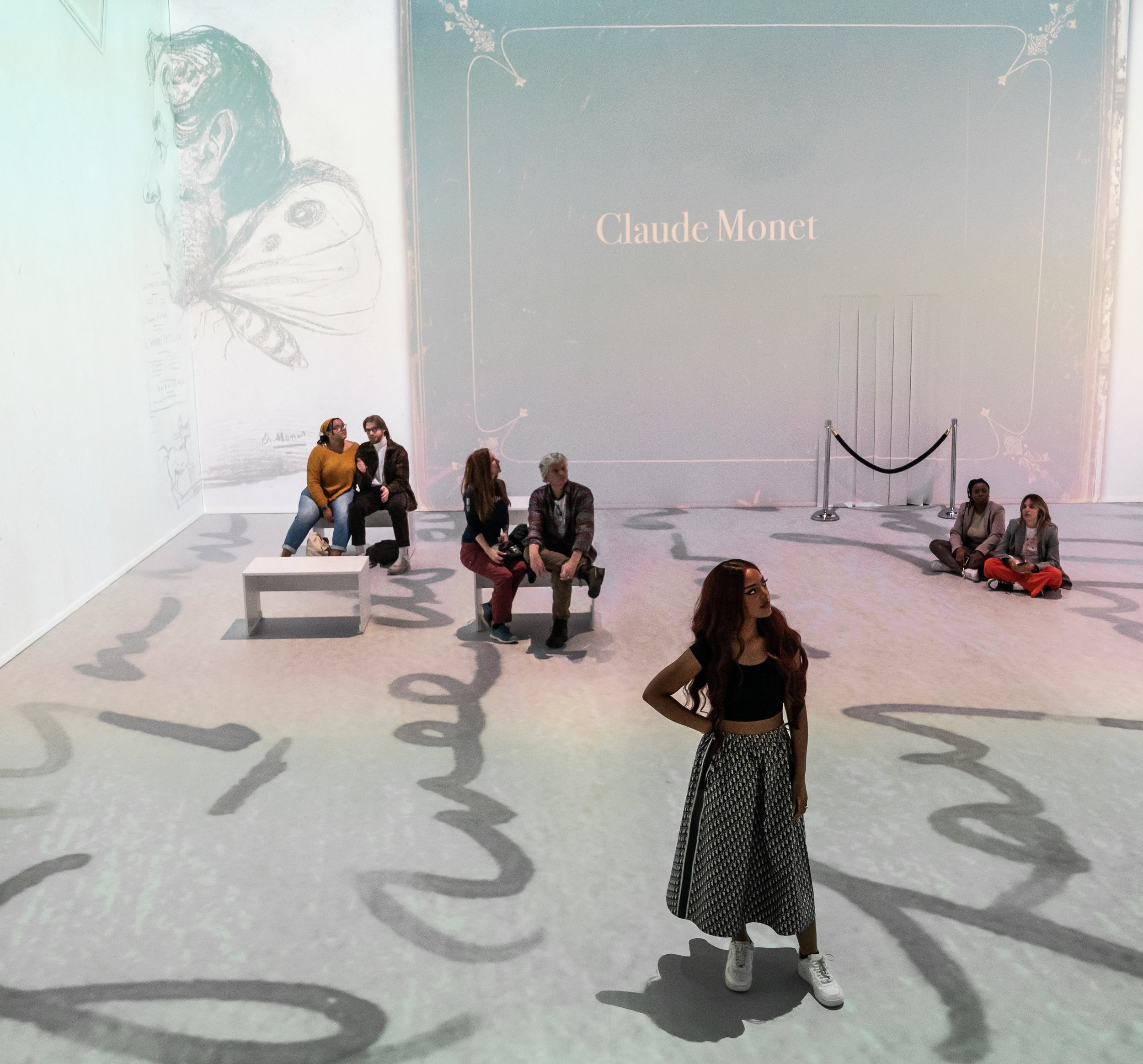
The walls are covered with synthetic ivy. There is astroturf across the floor. Erik Satie plays. Theatrical lights are everywhere. A bed of fake flowers leads on to an arched Japanese “bridge.” Yes, it is that bridge, but in this case one that merely crosses a video of water projected on the floor. “Please do not jump in the pond,” reads a sign. What pond? For the first-time viewer, it takes more than a moment to understand what this is all for. Meanwhile I observed my fellow visitors — immersive veterans, no doubt — take to it right away.

I doubt these immersive experiences would be so ubiquitous without social media. For here, I came to realize, was the selfie floor — a liminal space presented in advance of the immersive video room. I watched as two millennial visitors, both immaculately kitted out, sought the room’s premier selfie spots. They knew just where to stand for the lights as they passed their iPhones back and forth, taking off their masks, tossing their hair and pouting over their shoulders.

I ended up spending longer here than expected. There were several wall labels featuring a half-decent timeline of Monet’s life. Projections of Monet paintings morphed into swirling pixels, some of which you could control by standing in front of them. Instagram filters were made available for selfie-taking, although I could not get them to work on my phone. But mostly, sitting on a bench, smelling the lavender, taking in the Satie, observing the fake flowers under shifting gradations of LED lights, I began to find the uncanny experience transporting.

Here, in this postmodern garden, I found my peace.

Back down the escalator was the immersive viewing room. I was handed a cushion and took a seat. The video installation cycled for forty-five minutes. I found it held my attention for the duration. The narrative followed the history of Monet through a holo-deck slide show of his paintings. At times, the animators added some motion to the works. The story focused on Monet’s artful construction at Giverny, where he lived for forty-three years from 1883 to 1926, building his famous garden.

The exhibition makes a compelling sensory case that the garden was the original immersive Monet experience. The artist’s opus now in Paris’s Musée de l’Orangerie — his eight monumental panels known as Les Nymphéas arranged in two oval rooms — was the painterly result of this immersive vision. Monet described these panels as “the illusion of an endless whole, of water without horizon and without shore.”

A day after my visit I happened to run across Woman with a Parasol — the real Monet — at Washington’s National Gallery. Did I feel ashamed of my prior day’s digital dalliance? Surprisingly, I did not. Rather, for a moment I sensed we had been immersed in the same nymphean waters. We had shared an “experience” together.

Comment

Carpaccio by the slice

Comment

Carpaccio by the slice

THE NEW CRITERION, February 2023

Carpaccio by the slice

On “Vittore Carpaccio: Master Storyteller of Renaissance Venice” at the National Gallery of Art, Washington, D.C.

It is the contemporary fate of Vittore Carpaccio (ca. 1465–1525), the Venetian painter of the late fifteenth and early sixteenth centuries, now with a major new exhibition at the National Gallery of Art, to share his name with a popular dish of sliced raw beef.1 The joint appellation, as it turns out, is not a coincidence. In 1963 the Palazzo Ducale organized its first ever retrospective of this “master Storyteller of Renaissance Venice,” as the National Gallery dubs its current show. La Serenissima at the time was awash in Carpacciomania, so much so that Giuseppe Cipriani, the owner of Harry’s Bar, named his culinary invention after the reds of the appetizing painter.

The famous restaurateur was not alone in appreciating the taste of this last of the Venetian “Primitives”—one who was sandwiched, as it were, between the coolness of Giovanni Bellini and the maniera moderna warmth of Titian and Giorgione. A little over a century before Cipriani paid his respects, John Ruskin unearthed Carpaccio among his stones of Venice. The painter sent Ruskin into a “reverie” approaching a “delirium of fantasy.” Then as now the artist’s great appeal was his stunning architectural staging, one that sets his mythological, biblical, and historical storytelling in idealized Venetian cityscapes.

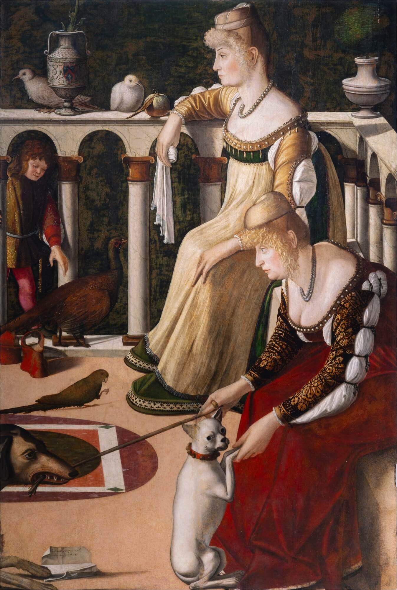
Vittore Carpaccio, Two Women on a Balcony, ca. 1492/1494, Oil on panel, Fondazione Musei Civici di Venezia, Museo Correr, Venice.

In his Guide to the Principal Pictures in the Academy of Fine Arts at Venice of 1877, Ruskin placed Carpaccio at the apex of Venice’s “classic and mythic” age. An honorary member of the Accademia, for weeks Ruskin sat and copied Carpaccio’s monumental cycle of paintings of Saint Ursula, the artist’s most famous set of works, originally created for the Scuola di Sant’Orsola confraternity. “I went crazy about Saint Ursula,” he said of the recently restored works in the Accademia museum. In St. Mark’s Rest, his epilogue to The Stones of Venice, Ruskin even bumped Bellini from his top spot to declare Carpaccio’s Two Women on a Balcony, in the Museo Correr across the Grand Canal, as “The best picture in the world . . . and I know no other picture in the world which can be compared to it.”

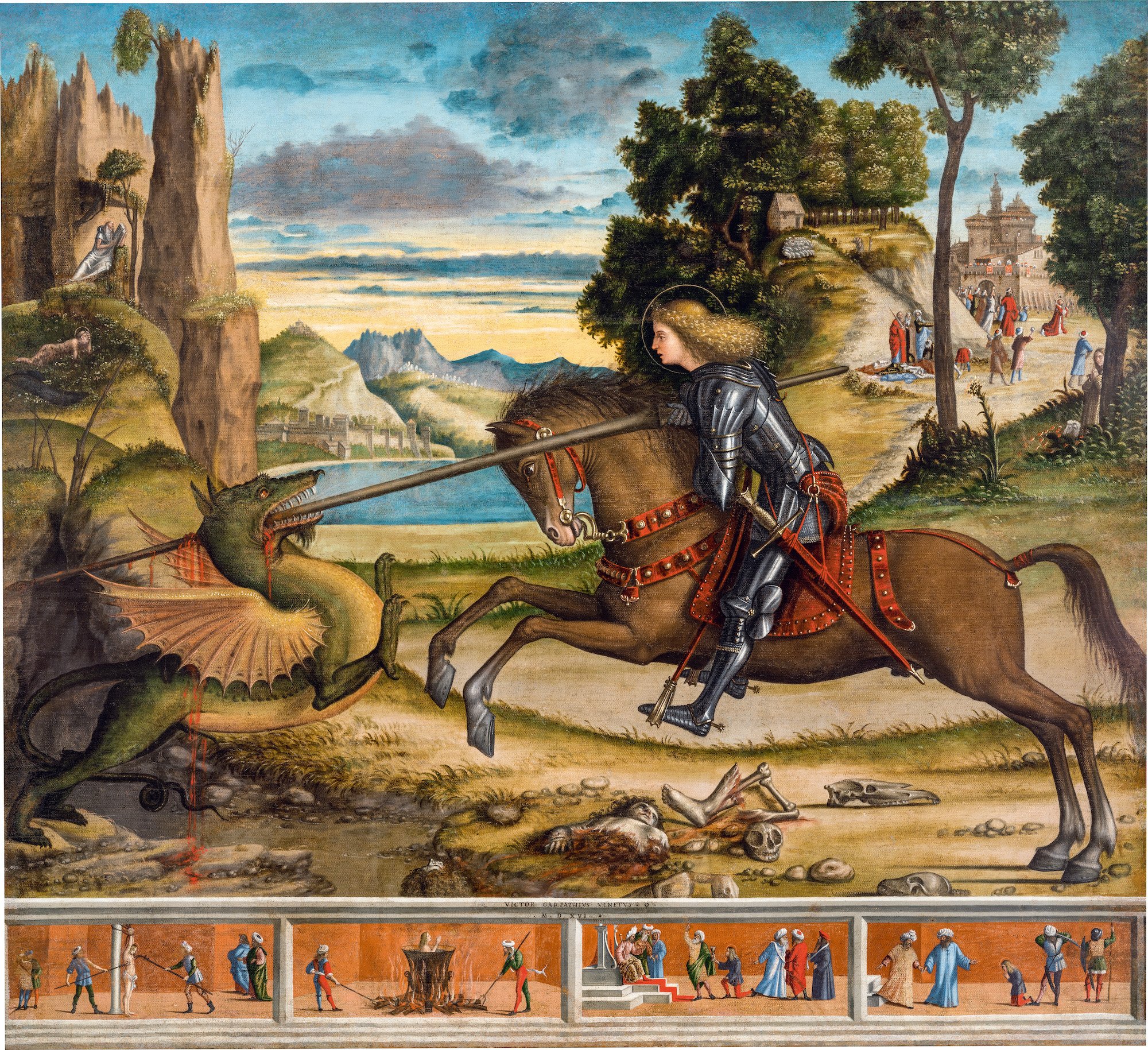
In 1882 Henry James set out on his own Venetian tour, Ruskin’s “generous lamp” in hand. In works such as Saint George and the Dragon and Saint Augustine in His Study, James found a “paradise of his own room.” Unlike the “vertical” pull of much of Italian art, James appreciated the “horizontal” window that Carpaccio opened onto the spiritual world, with the terrestrial and the celestial seeming to cohabitate in our own temporal space. Placing him among his favorites Bellini and Tintoretto, James declared that Carpaccio was the “most personal and sociable of artists” for his “care for human life at large.” The anchoring of Carpaccio’s safe harbors seemingly in the actual stones of Venice—with marble paving stones and building façades receding in perspective view—has appealed in many times of rebuilding and renewal: for example during the French Second Empire, through such artists as Gustave Moreau, and following World War I, in the neoclassical fantasies of Giorgio de Chirico.

The times must be right again for another Carpaccio rediscovery. Fortunately the National Gallery (and, undoubtedly, only the National Gallery) has the lending power to mount a major stateside survey of the artist. The first outside of Italy, the display should enkindle our own Carpacciomania. Curated by Peter Humfrey in collaboration with Andrea Bellieni and Gretchen Hirschauer, the exhibition is presented in partnership with the Fondazione Musei Civici di Venezia—which, as with their joint 2018–19 exhibition of Jacopo Tintoretto, will also mount the show at the Palazzo Ducale. In Washington, even without some of his most significant paintings on offer, in particular those from his expansive Saint Ursula cycle, “Vittore Carpaccio: Master Storyteller of Renaissance Venice” features forty-five paintings and thirty drawings. Gathering work from some forty-eight venues, the transporting exhibition leaves us with much to chew on.

Vittore Carpaccio, Saint George and the Dragon, 1516, Oil on canvas, Abbazia di San Giorgio Maggiore, Benedicti Claustra Onlus, Venice. Photo courtesy of Abbazia di San Giorgio Maggiore, Benedicti Claustra Onlus.

While little is known of the young Carpaccio, he clearly became intoxicated by three Bellinis: the brothers Giovanni and Gentile and their father, Jacopo. Together they developed and refined the Venetian understanding of single-point perspective. As an apprentice to the Bellini sons (whether he trained with Giovanni or Gentile or both is not entirely certain), Carpaccio inflated their compositional inventiveness to maximum volumetric effect. Never before had paintings breathed with quite so much fresh air.

Like the brothers Bellini, Carpaccio worked with oil on canvas rather than in fresco, as the new medium was far more resilient in the humid Venetian climate. The availability of printed books and woodcuts added elements of the northern Renaissance to Carpaccio’s cosmopolitan mix, with printed maps and depictions of distant lands informing his visual concatenations.

The results are indeed storytelling at its most masterly. And rather than overwhelming us with such monumental painting cycles as his Saint Ursula, which at nine feet tall by eight to twenty feet wide (and again newly restored) remains in situ at the Gallerie dell’Accademia, “Vittore Carpaccio: Master Storyteller of Renaissance Venice” helps us appreciate the painter on a more intimate scale with smaller works. Assembled here, the altarpieces, private devotional paintings, smaller confraternity commissions, and studies and cartoons that he made in preparation for his larger compositions all speak to the artist’s consummate craft and the particular interests of his Venetian patronage.

Carpaccio was the opposite of groundbreaking. In his compositional structuring, he was fortifying. His imaginative worlds were perfected 3D environments, premium-engineered with all Venetian-made parts. Into his spaces he arranged numerous figures far more occupied with one another than with our own subjective point of view. Unlike the later artists of the Venetian cinquecento, with Carpaccio there is no heavy artistic hand to draw us in. We instead get a self-contained universe, a sim-Serenissima where the activities exhibit the same ordered rules as the compositions’ single-point perspectives.

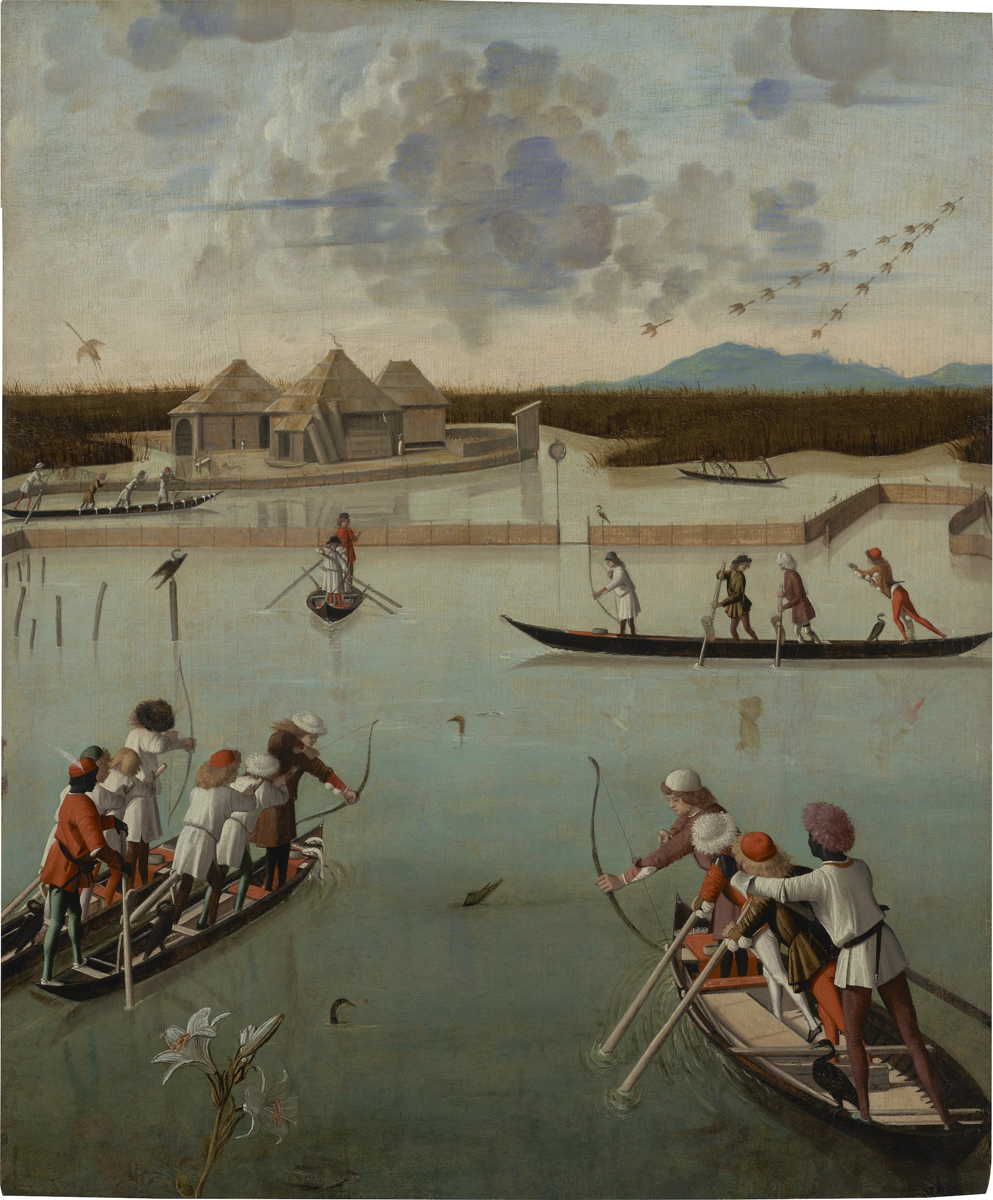
Vittore Carpaccio, Fishing and Fowling on the Lagoon (recto); Letter Rack (verso), ca. 1492/1494, Oil on panel, The J. Paul Getty Museum, Los Angeles. Digital image courtesy of the Getty’s Open Content Program.

The exhibition begins with Ruskin’s “best picture in the world,” the Two Women on a Balcony—but here presented even better than in Ruskin’s day. Sometime in the 1700s this small work, most likely part of a set of folding shutter doors painted for a Venetian palace, was divided from its upper half. The lower portion with the two women eventually went to Venice’s Museo Correr. The upper part, now titled Fishing and Fowling on the Lagoon, ended up at the J. Paul Getty Museum in Los Angeles. The panels, dated together to ca. 1492/94, were only reidentified as being part of the same composition after conservation efforts in the early 1990s. This exhibition now temporarily reunites for only the second time in recent history what was clearly intended to be a single whole—the line of a lily stem even connects the two parts. Their happy reunion begs to remain permanent, if only the Getty and Correr could arrive at a loan agreement to share the works.

In the lower panel, the women gather on a balcony filled with birds and dogs. The scene is busy with domestic activity even if the women (and their dogs) appear somewhat bored by the pet play. The upper panel suggests the reason for their tedium. Above and beyond them, the men have loaded onto their gondola-like boats for a lively hunting and fishing expedition out on the lagoon. The components together reveal the ordering of Venetian society in one view. As both groups contend with their animals, the women in the foreground, who seem little interested in what is happening below the balcony, add humor to the recreation of their husbands beyond. The clever division and animated activity of the entire panel reveal Carpaccio’s great ingenuity with composition, compressing and expanding space to his will to contain his full “care for human life at large,” as Henry James put it. That the scene is clearly cut off to the left would certainly suggest that some additional Carpaccio is still out there waiting to be rediscovered—just look for the matching balustrade and rear end of a brown dog. Adding to this intrigue, the verso of part of the known panel is painted with personal letters appearing to hang from a line in trompe l’oeil. As much as we might appreciate him by the slice, Carpaccio is best enjoyed whole.

The organization of Carpaccio’s compositions was no accident. His studies of faces, architecture, and perspective were exacting. His deliberative process might help explain why we are now left with more of Carpaccio’s preparatory work than almost any other artist of his time. The National Gallery presents thirty of these drawings both to let us appreciate his working methods and to help illustrate his larger paintings that cannot travel. Among these examples, a blue double-sided sheet from the Ashmolean Museum in Oxford is a standout. Titled Head of a Young Woman in Profile (recto) and Head of a Young Woman in Three-Quarter View (verso), the drawings from ca. 1488–89 served as studies for two of the numerous faces in Carpaccio’s Apotheosis of Saint Ursula, one of the paintings in the Accademia cycle. The drawings are not necessarily innovative. They even may have been copies of works by Pietro Perugino and Pinturicchio. Still, through their exquisite modeling created with hatch marks of white and black chalk and washes of brush and brown, they reveal a luminous grace.

Carpaccio’s extensive compositional planning did not necessarily serve him well as his reputation contended with the rise of the modern style of Titian and Giorgione. Even at the time of Ruskin, in 1871, Joseph Archer Crowe and Giovanni Battista Cavalcaselle wrote that Carpaccio was “without any poetry of fancy” in their History of Painting in North Italy. In her current catalogue essay, “Carpaccio as a Draftsman,” Catherine Whistler concurs that he was “overshadowed by the poetic genius of Titian.” Even Peter Humphrey writes that “set against the more heroic and classicizing art, the work of Carpaccio must have appeared staid, quaint, and irrelevant.” At the very least, Humphrey continues, “his narrative paintings and skills as a storyteller may be seen as a vital link in the continuous tradition in Venetian painting from the late Gothic style of the early fifteenth century to the late baroque of the eighteenth.”

But there is more to Carpaccio than merely his role as a historical connection between the painting styles of fifteenth- and sixteenth-century Venice. His appeal is in locating us in spiritual space and infusing this built environment with pious order. We can see why the scuole, those social and charitable organizations of Venice, all commissioned him to paint their lives of Saint George and Saint Stephen and Saint Ursula and the Virgin Mary. The worlds he envisioned were immersive. They could be entered, touched, and breathed. The paradise he creates is indeed “of his own room,” to which he extends a welcoming invitation.

  1.   “Vittore Carpaccio: Master Storyteller of Renaissance Venice” opened at the National Gallery of Art, Washington, D.C., on November 20, 2022, and remains on view through February 12, 2023. The exhibition will next be on view at the Fondazione Musei Civici, Palazzo Ducale, Venice (March 18–June 18, 2023).

Comment