Viewing entries in
New York

1 Comment

Gallery Chronicle (February 2015)

Far-Away (1)

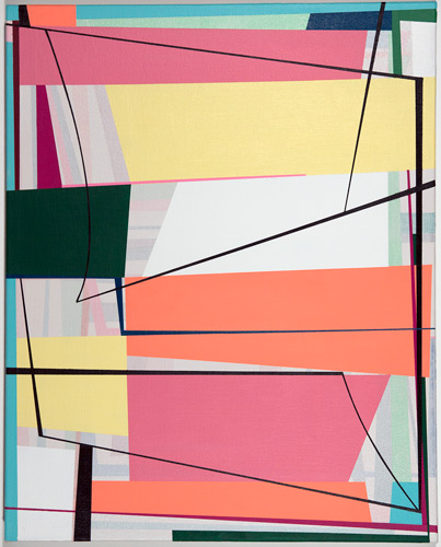
Gary Petersen, Far Away (2014), acrylic on canvas, 20 x 16 inches, Theodore:Art.

THE NEW CRITERION
February 2015

Gallery Chronicle
by James Panero

On “Gary Petersen: Not Now, But Maybe Later” at Theodore:Art, “Philip Taaffe” at Luhring Augustine, “Through the Valley: New Paintings by Devin Powers” at Lesley Heller Workspace, “Fran O’Neill: Painting Her Way Home” at Life on Mars, “Sideshow Nation III: Circle the Wagons” at Sideshow Gallery, and “Paperazzi IV” at Janet Kurnatowski Gallery.

Geometric abstraction is painting at full volume, electrified, supremicized. It’s a manufactured nature, an artificial light, a polished gemstone. It can also be overwrought, and not for everyone, but it’s rarely dull, even if we have come to recognize its terrain of colorful shapes and sharp angles. That modern painting has long employed geometry for its own ends hasn’t taken the dazzle out of these forms. On the contrary, as artists have tapped geometry’s kaleidoscopic potential, the mode has been energized by refracting its own history. Kazimir Malevich could describe his “ascent to the heights of nonobjective art” as a pioneer, watching as “the familiar recedes ever further and further into the background.” Contemporary geometrists can take their inspiration from beside and behind them just as much as they can from far out front.

Writing about “What Abstract Art Achieved” for the New York Times Magazine in 1985, Hilton Kramer observed that, “By rigorously eliminating any trace of a recognizable subject matter in art and giving a radical priority to the most impersonal aspects of pictorial form, the creators of geometric abstraction have redefined the nature of esthetic experience.” As a result of this redefinition, “On the design of everything from the built urban environment to the most mundane objects of commercial and household use, forms deriving from the vocabulary of geometric abstraction have had a powerful and unremitting impact. The contemporary scene is literally unimaginable in isolation from its pervasive influence.”

Today’s geometric painting can therefore be both a vision of Malevich’s pure feeling and a reflection of some form of nostalgia for that sensation. At its best it might be a combination of the two and more. Now with a solo show at Theodore:Art in Bushwick, Gary Petersen mixes the geometries of classical modernism with space-age memories and feel-good color.1

In the days before his opening, Petersen created two site-specific wall paintings, floor to ceiling, that bracketed the view looking into the gallery and served as highway invitations to the show. Painted with a background of bubble-gum-pink acrylic, they each employ forms that will be familiar to those who have followed Petersen through his many recent group exhibitions: tapered lines leading to rectangular vortexes of color. The forms are hard edge, but the colors are cream puff. The baby blues, lime greens, and grape purples have a Drive-Thru palette, while the shapes are TV hypnotic—Josef Albers by way of “Laugh-In.” They are rigorous and fun, lively and controlled, and advertisements for the latest models of smaller Petersens hanging on the showroom walls.

These smaller works on canvas, all from 2014, all of which could fit under your arm, reveal Petersen’s technical control over his sharp angular forms along with his willingness to give them room to develop and transform one to the next. Ovals, triangles, arcs, and rectangles assemble and rest over a secondary scrim of background shapes. The compositions are Piet Mondrian and Fritz Glarner mixed with Eames-era optimism. They give off a sense that our best times are still ahead of us, or at least we remember a time when they still were.

Glyphic_Field_srgb01

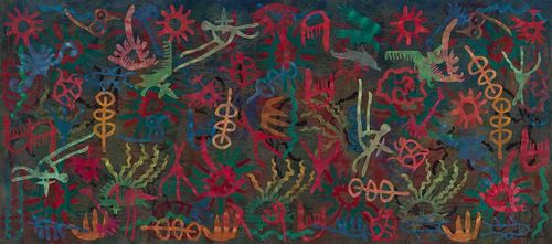
Philip Taaffe, Glyphic Field (2014), mixed media on canvas, 110 3/8 x 249 3/8 inches, Luhring Augustine.

Just a block away at Luhring Augustine’s cavernous Bushwick outlet is Philip Taaffe, a painter who made his name as a pioneer of “Neo Geo,” a 1980s term for a “new geometry” that filtered geometric forms through pop sensibilities.2

To me, Taaffe’s paintings convey more geometric awe than pop irony, even as they employ some cool seriality and sly encoding. At Luhring Augustine, what’s first striking about them is their size and skill. Taaffe uses every possible process imaginable to stamp, stencil, marble, collage, and silkscreen his canvases with colorful symbols that look beyond the recent abstract canon to draw on a worldwide history of geometric form. The work serves as reminder that geometry has been a foundation of all art, from primitive hieroglyphics to single-point perspective, long before modernists like Malevich rediscovered it.

Taaffe seems particularly interested in mining totemic shapes and alchemical images, with each canvas seeming to coalesce around a different set of cultural and historical touchstones, whether it be architectural ornamentation, Renaissance tilework, or fountain design. His largest canvas, Glyphic Field (2014), over nine feet tall and twenty feet wide, is also his most captivating. Its debt to Matisse’s cut-outs is unmistakable. Yet rather than fish up the forms of the Mediterranean, Taaffe excavates the glyph carvings of prehistory. His painterly effects remove them from the dusty past and seem to reanimate them with a certain glowing power. As a reward for close viewing, there are even a few extra surprises that come to the surface of the glyph soup. A modern clip-art image of an eagle? Taaffe isn’t saying what it means. Yet as with all of his forms, we feel it must mean something.

JAMES_Powers

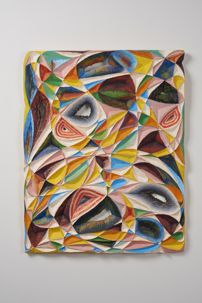
Devin Powers, Woden (2014), oil on carved wood, 30 x 24 inches, Lesley Heller Workspace.

"Breakthrough” might be an overused word, but at Lesley Heller Workspace on the Lower East Side the painter Devin Powers has done just that.3

For his second solo show at the gallery, Powers takes the sharp facets of his geometric compositions, previously rendered in oil and ink for his first exhibition at the gallery, and carves them in wood, creating wild abstract reliefs that sometimes break and burn right through the picture plane. The evolution feels experimental, but also essential when perceived against the topography of his flat designs, where you just want to dig in. Powers is driven by an intuition that quite literally cuts against the mathematical programs of his compositions.

His works rests on the point between control and expression. The precision of his crystalline form is balanced against the rough feel of the carved wood, which he tools by hand. Sometimes his facets get carved out, while other times he leaves them painted and flat. Symmetries and programs work against the free forms and sparkling colors of these reliefs as they break out of the square frame, spiraling out across the wall with an internal energy fed by a crystalline imagination.

At times this energy can be too much—too big, too busy, too much flashing color—as the spiraling patterns get away from us. Best are the examples that settle into some final resolution, such as the muted crystals of Cathedral(2014). Powers may sense this too. My favorite work here is, from what I understand, also his most recent. In Woden (2014), warm taffy twists of color and shape cool into a squared-off whole. It’s a perfect confection that finishes off one exhibition and tempts us for the next.

Fran

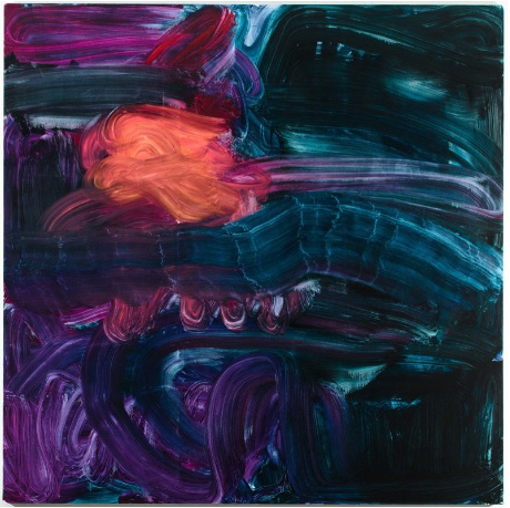
Fran O'Neill, g's sunset (2014), 84” x 84”, oil on canvas, Life on Mars.

At the opening for the painter Fran O’Neill at Life on Mars, another gallery, like Theodore:Art, along the always-rewarding main drag of Bushwick’s 56 Bogart building, I found myself puzzling over an important question with the artist Dee Shapiro and anyone else who would listen in.4

How does she do it? What I meant was, how does Fran O’Neill achieve what I consider to be her signature sweep of color across canvases over six feet square? A sponge? Some kind of squeegee? We had our theories, but none of them seemed quite right, and indeed they weren’t. The textures of her line, especially where they skip a beat, are somehow too natural, too “shimmery” (to take a title from her best work), for any of those tools.

The answer came when the artist arrived and I asked her myself. She pointed to the underside of her arm. After a few moments of mental processing, the gracefulness of O’Neill’s paint handling made much more sense to me. For her big strokes, O’Neill uses nothing more than herself to push oils across canvas. It’s a uniquely physical process, one sized to the canvas and her own frame, and results in something I now see, in part, as a set of movements captured in one long exposure. This is not at all to suggest her work is merely the result of some actionist happening. Her paintings are nothing like Yves Klein’s raunchy “human paintbrush” performances, which would today certainly land him in the court of microaggressions.

A native of Wangaratta, Australia, O’Neill started off as a landscape painter. The turbulent thunderstorms of her former home are never far from her work, helping to explain the title of this exhibition and also her increasingly gestural paint handling, as she finds a way to tap her own physical atmospherics. Sometimes these movements can get messy. Perhaps that’s the idea behind Meeting You, a two-paneled work joined as one from 2014. Best are the works that sweep the mess away with one final flourish.

Sideshow

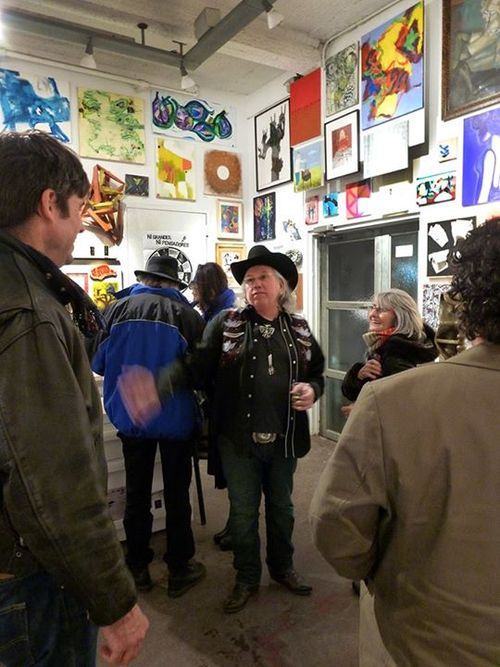
Installation view at “Sideshow Nation III: Circle the Wagons,” Sideshow Gallery. Photo: Vincent Romaniello.

If you could see just one painting show this year, the annual group exhibition at Richard Timperio’s Sideshow Gallery in Williamsburg, Brooklyn should be top of your list.5

I have written about this increasingly adventurous annual blowout just about every year. Yet with over six hundred artists represented from floor to ceiling and in every space in between, the exhibition is a one-stop shop—or a final stand, given the title—for what’s happening now, casting an ever wider net over the greatness of the borough and beyond (um, hello, Brooklyn Museum). This year, in what is a natural synergy, some younger Bushwick painters are mixed in with the older generation of studio artists who came of age in Soho in the Sixties and Seventies and beyond, including some surprisingly big names for an outer borough show.
Kurnatowski
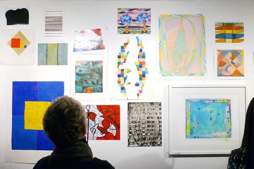
Installation view of “Paperazzi IV,”
 Janet Kurnatowski Gallery. Photo: Vincent Romaniello.

Concurrently, on a smaller scale, and with many of the same names, is the return of “Paperazzi” at Janet Kurnatowski Gallery in nearby Greenpoint—the equivalent omnium gatherum for works on paper.6 With most of the works now directly pinned to the walls rather than spreading out in matted frames, the evenness of this exhibition has never been greater. Taken together, the efforts of these two small independent galleries have accomplished more than any museum department or curatorial committee has done in showing us the energy of the artist’s studio today.

1 “Gary Petersen: Not Now, But Maybe Later” opened at Theodore:Art, Brooklyn on January 10 and remains on view through February 22, 2015.

2 “Philip Taaffe” opened at Luhring Augustine, Brooklyn, on January 17 and remains on view through April 26, 2015.

3 “Through the Valley: New Paintings by Devin Powers” opened at Lesley Heller Workspace, New York on December 14 and remains on view through February 1, 2015.

4 “Fran O’Neill: Painting Her Way Home” opened at Life on Mars, Brooklyn on January 16 and remains on view through February 15, 2015.

5 “Sideshow Nation III: Circle the Wagons” opened at Sideshow Gallery, Brooklyn on January 10 and remains on view through March 15, 2015.

6 “Paperazzi IV” opened at Janet Kurnatowski Gallery, Brooklyn on January 16 and remains on view through February 15, 2015.
1 Comment

Comment

Gallery Chronicle (January 2015)

Fox Gallery installation view with work by Claire Seidl and Kim Uchiyama

THE NEW CRITERION
January 2015

Gallery Chronicle
by James Panero

On “Claire Seidl and Kim Uchiyama: Plain Sight, Selected Paintings, Prints and Photographs” at Fox Gallery, "Eleventh Street Arts: Inaugural Group Show" at the Grand Central Atelier, "Tom Goldenberg: Landscapes” at The Graduate Center, The City University of New York, and “Todd Gordon, Tom Goldenberg” at George Billis Gallery.

An apartment gallery is just what it sounds like: a gallery in an apartment. The concept barely needs explaining, but the obviousness of it only became apparent to me in recent years. Of course, the traditional commercial gallery as we know it—that storefront of art, now almost always stripped down to a white cube—is, in fact, a modern creation. Art has been decorating the places where we live since before the first cave drawings at Lascaux. No doubt someone sometime in the Pleistocene was the first to trade a zigzag clam carving kept beside a stone pillow for entrails from the mammoth hunt. Hence the first apartment gallery sale was made.

But for whatever reason, from perhaps 15,000 years ago until sometime in 2008, apartment galleries have been far too exotic for most of us to pay them much mind. It could be that some prehistoric prohibition exists in mixing commercial transactions with a place of domicile; the art on the walls where you live should reside on the walls where you live and shouldn’t be up for sale. Most municipalities indeed have some regulations against operating a commercial space from home, and presumably this includes an art gallery. I wouldn’t want Gagosian West run out of the apartment across the hall from where I live, either. Yet there have been many famous and wonderful apartment galleries that worked out just fine for everyone. In January 2012, I wrote about the “ ’temporary Museum of Painting (and Drawing)” that the painter Cathy Nan Quinlan ran out of her loft in Williamsburg. These have largely been alternatives to the mainstream; out-there spaces not for everyone (although, in fact, they could be far more inviting than chilly white-box storefronts).

This all changed with the declining fortunes of the art world after 2008. As the economics of all but the largest commercial galleries suffered setbacks, the nimble apartment gallery, often artist-driven, often in unusual locations, took on a new leading role. It might be added that social media, the flattening of information, Google Maps, and a new appreciation for the “sharing economy” all played a role in these developments. Apartment galleries in Bushwick such as Norte Maar and Centotto began rigorous and regular exhibition programs in the wall spaces next to the kitchen and above the bed. But more importantly these changes in venue brought with them a sense of liberation. With gallery costs presumably now covered through other means—the best of them are living spaces first and exhibition spaces second—the lights stay on whether anything sells or not. So apartment gallerists (if we can call them that) have the freedom to show what they want, not what they need to sell.

Another discovery of apartment gallery-going is how interesting it can be to see art in a domestic setting. You can just about put anything in a white-box gallery and it will seem like art as it takes on the artificial aura of the venerated space around it. In a home, art must rise to the occasion. The art that passes this test looks even bigger and better than on a whitebox gallery wall. This is incredibly helpful, of course, in deciding if this is art you want to live with yourself. Apartment galleries also give us a sense for the seller’s own taste, ideas for our own home, and a more direct connection (too direct, for some people) with the creative community we might be buying into.

These thoughts went through my head as I visited Fox Gallery NYC, an apartment gallery run by Annette Fox since 2009. Located in her apartment at 101st Street and West End Avenue on Manhattan’s Upper West Side, and open by appointment, Fox Gallery delights from the street. Just look up at the intricate and now forlorn Art Nouveau façade of one of George & Edward Blum’s signature apartment buildings from a century ago. The faded Gilded Age grandeur continues through the apartments inside, where a hundred years of landlord paint has built up over the picture moldings and French doors.

Watercolors by Kim Uchiyama, Fox Gallery NYC

In Fox’s apartment, this frosty white craquelure only adds to the texture of the space and resonates with the bold abstract paintings now on view by Claire Seidl and Kim Uchiyama.1 Both painters create an enigmatic sense of color, layer, and light—Uchiyama through horizontal bands; Seidl in a scumble of scrapes and lines. As natural light fills much of this classical living space, their work breathes and converses like exotic figures lounging in the living room or sitting with you at the dining room table. The Swing of Things, an aqueous square canvas by Seidl at the end of the entry hallway, invites a deep dive in. A set of matching watercolors by Uchiyama finds her horizontal bands bending and resting against one another and connecting through the panels in the series. Fox effortlessly folds her own excellent collection in this mix while also showing the range of each of these artists’ output: in the hallway, print editions by Uchiyama; in the bedroom, haunting long-exposure black-and-white photographs by Seidl of cabin dinners and lake swimming. This art settles us into a special place, like this gallery, where you just want to linger.

Jacob Collins in his new Grand Central Atelier

When most artists want to learn to paint, they enroll in school. When he couldn’t find a school to teach him, Jacob Collins created his own. For over twenty years, a scion of intellectual New York—he is related to Meyer Schapiro (1904–1996), the Columbia professor and one of America’s most formidable art historians—Collins has developed his own teachers, peer group, and disciples as he seeks to revive the teachings of the Beaux Arts and unlock the secrets of the Old Masters. From Water Street in Brooklyn to his home studio on the Upper East Side to a floor in the General Society and Tradesmen Building just west of Grand Central Terminal, the School of Collins has grown into a movement.

Installation view of GCA's Eleventh Street Arts; landscapes by Jacob Collins

This fall, Collins opened his newest and biggest campus in a converted warehouse in Long Island City, a block from the MOMA satellite PS1, on 11th Street and 46th Avenue. At 12,500 square feet, four times larger than his previous location, Collins’s Grand Central Atelier, as it’s now called, is an art school, an art incubator, and an artist clubhouse for fifty or more painters who have come out of Collins’s intense multi-year program and the hundreds of students who now flock to their classes.


Devin Cecil-Wishing's cast drawing of Saint Jerome and painting of a playing card and egg at Eleventh Street Arts

In the front rooms of the new school is a gallery for their work called Eleventh Street Arts. Through January, open with regular hours on weekends, Collins has mounted an “Inaugural Group Show” for the new space.(2) The venue is less than abundantly marked—the letters “GCA” are unremarkably stenciled on the front door—but the unassuming exterior makes what’s inside seem all the more remarkable. The hundred-odd works here include some of Collins’s own landscapes and demonstrate the intense skills he has promulgated. Many of the names will be familiar to those who have followed Collins through the years, as his best students have gone on to become teachers themselves. This is especially true of Joshua LaRock, a young apprentice when I first met him some years ago who has gone on to paint portraits that could be straight out of the Northern Renaissance. Edward Minoff and Tony Curanaj, former graffiti artists who became some of Collins’s earliest students, now paint singular seascapes and trompe-l’oeil miniatures. Another trompe-l’oeil artist on display is Devin Cecil-Wishing, who displays what might be the finest technique of the whole ensemble in a cast drawing of Saint Jerome that seems to float in space and a painting of a playing card and egg seemingly perched in a shadow box. Anthony Baus was new to me; he creates exquisite drawings of architecture. I also liked Sam Worley’s Study in Yellow (2011) and Patricia Watwood’s Fallen Angel (2012) for bringing their own candor in mixing old and new—Worley with a still life of a yellow soap bottle next to ancient glass, and Watwood with a modern angel smoked out of a blackened urban sky. Like this new school in the heart of industrial Queens, these works of timeless technique fully inhabit the present day.

Sam Worley Study in Yellow (2011) at Eleventh Street Arts

For all we can see on the walls of our museums, there’s much more that rarely makes it onto public view, mainly staying in the storage of permanent collections. This can especially be the case for works on paper. New York has a vast archive of historical material, but most never makes it out of the flat files. It’s true that intimate works on paper don’t lend themselves to the light and space requirements of modern public viewing. Yet what few of us realize (until recently, myself included) is that much of this work, even at our most esteemed museums, can be viewed by appointment in their drawing libraries.

For over a decade the artist Tom Goldenberg has led a peripatetic class called “Drawing on Collections” that has organized small groups to gather and discuss these works behind closed doors. Visiting the drawing library of a different museum or private collection each week, magnifying glass in hand, he and his students call up, pore over, and talk through the lines and marks. As someone who has tagged along for a handful of these workshops, I can report that seeing such works laid out on a table, without the separation of glass, just a few inches from your eye, conveys a unique appreciation of the artist’s touch and left me with an uncanny impression of what I’d been shown.

Tom Goldenberg Digital Trees at The Graduate Center

Back in his studio, Goldenberg has worked through similar impressions in his own landscapes. A display of his drawings is now on view in “Tom Goldenberg: Landscapes” in the Exhibition Hallway of The Graduate Center of The City University of New York.3 At the same time, at George Billis Gallery in Chelsea, Goldenberg is showing the latest selection of his large painted landscapes.4

Occupying a long set of cases in a busy hallway, the exhibition at The Graduate Center demands close viewing. Concentrating on the rural hills, fields, streams, and vegetation of upstate New York, Goldenberg employs a wide range of perspective, materials, and techniques—charcoal, walnut ink, pastels—that clearly draws on those classical collections.

Yet with a background in abstraction, Goldenberg seems to remain just as interested in his mark-making as what he’s made. Many of his best drawings hinge at the point of recognition, where a thicket of lines and a section of empty space come together to reveal the reflections of light in a wooded brook. This impulse is now even more apparent at George Billis, where Goldenberg has stepped back from his verdant realism to test his experiments-on-paper writ large.

Tom Goldenberg, Smithfield at George Billis Gallery

Here George Billis smartly contrasts Goldenberg’s rural intimacy with the hardscrabble cityscapes of Todd Gordon. In Gordon’s work, it is hard not to see the painter Rackstraw Downes, who also employs snaking train tracks and fish-eye realism to give sight to the urban unseen. Yet Gordon stands on his own, especially in a painting such as The Green Barn, a scene of corrugated metal siding and graffiti that has the transporting sense of a modern ruin.

For Goldenberg, his latest paintings are more like drawn canvases, with layered sketches on a pulpy painted ground. Of course, the mechanics of drawing on paper do not automatically translate to oil on canvas. A handful of paintings here feel unfinished, while in others the dashing lines and bold colors may distract from the overall image. But the best, such as Sandro’s Hill, convey both an image and the sense of an image. Here is a perfect layering of impressions, drawn out over time and space.

1 “Claire Seidl and Kim Uchiyama: Plain Sight, Selected Paintings, Prints and Photographs” opened at Fox Gallery NYC on October 22, 2014 and remains on view through January 31, 2015.

2 "Eleventh Street Arts: Inaugural Group Show" opened at the Grand Central Atelier, Queens, on December 5, 2014 and remains on view through January 25, 2015.

3 “Tom Goldenberg: Landscapes” opened at The Graduate Center, The City University of New York, on September 22, 2014 and remains on view through January 18, 2015.

4 “Todd Gordon, Tom Goldenberg” opened at George Billis Gallery, New York, on December 16, 2014 and remains on view through January 24, 2015.

Comment

1 Comment

How Brooklyn Missed Brooklyn

IMAG1213

The best of Brooklyn: Gleich dancers in "The Brooklyn Performance Combine,” produced by Norte Maar in the Beaux-Arts Court of the Brooklyn Museum. Photo: James Panero


THE NEW CRITERION
December 2014

How Brooklyn Missed Brooklyn
by James Panero

For years, the Brooklyn Museum has overlooked the art happening in its own backyard.

“The persons now in this room have it in their power to decide whether in the future intellectual progress of this nation, Brooklyn is to lead or to follow far in the rear.”

—George Brown Goode, “The Museum of the Future” (1889)

On the afternoon of Saturday, November 1, a small U-Haul truck pulled up to the loading dock of the Brooklyn Museum. Behind the delivery was Jason Andrew, the director and curator of Norte Maar, a Bushwick-based nonprofit at the crux of Brooklyn’s artistic renaissance. The Brooklyn Museum’s education department had invited Norte Maar to produce a “performance by sound artists and dancers” for its free “Target First Saturday.” The show, “The Brooklyn Performance Combine,” was a two-hour event Andrew and the choreographer Julia K. Gleich had planned to take place in the museum’s Beaux-Arts Court that evening. Hidden among the cargo that Andrew was expected to deliver in the truck—sound equipment, costumes, and props—were unsolicited canvases and sculptures by Brooklyn artists he planned to sneak into his performance.

The museum brought in the “Combine” to promote “Crossing Brooklyn: Art from Bushwick, Bed-Stuy, and Beyond,” its self-described “major survey” of thirty-five borough artists currently on view. Yet for many observers, this exhibition, which opened in October, continues through January, and had been touted as “reflecting the rich creative diversity of Brooklyn,” turned out to be anything but.

“An exhibition at the Brooklyn Museum billed as a ‘major survey’ of Brooklyn-based artists should be exciting and revelatory,” wrote Ken Johnson in The New York Times. “Disappointingly, it’s not.” Led by extensive wall labels, “Crossing Brooklyn” looked almost exclusively to artists working in what’s known as “relational aesthetics,” the art of context over content, some whimsically, others with heavy social agendas. One artist focused “on the need for nutritious food in economically disadvantaged urban neighborhoods.” Another explored “the culture of mass consumption, overproduction, and waste” along with “the exploitation of workers and natural resources.”

“Evidently counted out from the start,” Johnson observed, “were artists who toil in studios making paintings, sculptures and other sorts of objects intended just to be looked at.” In other words: many of the accomplishments you now see in the borough’s open studios and gallery shows had been excluded from the museum. By zeroing in on a small subset of artistic production (mainly created by artists with tenuous connections to Brooklyn at best), “Crossing Brooklyn” accomplished just the opposite of displaying the borough’s “rich creative diversity.” Johnson’s conclusion reflected the feelings of many: “Brooklyn artists deserve better than this too-small, ideologically blinkered exhibition.”

For “Crossing Brooklyn,” the museum claimed the curators Eugenie Tsai and Rujeko Hockley “drew upon their extensive knowledge of the borough, as well as a wide-ranging network of unofficial advisors composed of artists, colleagues, and other creative professionals.” Yet Andrew, who has curated a decade of local exhibitions and programs through Norte Maar, says that no one from the museum came to observe what he does, despite talking to Tsai. “I don’t think those curators have enough pride in what is happening in Brooklyn. That is reflected in their curation. They can’t keep up with the pace, the spontaneity. But in order to keep the historical relevance, you have to keep up with the art.”

IMAG1221

Brooklyn artists protest the Brooklyn Museum at “The Brooklyn Performance Combine" with painting by Loren Munk. Photo: James Panero

Andrew’s account of the Brooklyn Museum’s indifference to the studios and galleries of contemporary Brooklyn gets repeated across the borough’s artistic communities. “It’s Brooklyn’s time, now,” the painter, videographer, and art historian Loren Munk told me, but “the Brooklyn Museum is so wedded to their petrified state, they are going to miss it. The community has busted their buns for years. Slowly through the work of thousands of people, people started coming out here. Yet the curators are not familiar with the art community. A lot of their direction comes from academia, so they don’t do the hard-ass work, do the legwork, talk to a lot of people, go to a lot of places. These people don’t have the inclination.”

“There should be studio buzz,” Munk told me of the lead-up to “Crossing Brooklyn.” Instead, there was “nothing. None of that. There was zero outreach. We were frustrated. The disengagement. The elitist approach.” A Red Hook-based artist since the 1980s, Munk believes the Brooklyn Museum has been failing its own creative community for years, and in fact “the museum has gotten worse. A lot of significant people have been ignored by the Brooklyn Museum for decades. People having international influence, and the Brooklyn Museum has blown them off.” The Brooklyn Museum could be at the center of the borough’s creative renaissance, Munk concluded, “but it would take work. They need to reach out to the community.”

As the “Brooklyn Performance Combine” took shape in the weeks leading up to its November evening, many of its local artists saw the performance as an opportunity to demonstrate the burgeoning energy of Brooklyn that the museum had long ignored. Although the “Combine,” which was let in through the side door by the education department rather than by the curators of “Crossing Brooklyn,” was billed as a live performance, with art works and art making officially excluded, Andrew stretched the invitation into a “mashup of Brooklyn-based poets, painters, and performers.” Mixed in with his performance equipment, that afternoon he brought the canvases and sculptures of artists that he saw as indicative of Brooklyn’s artistic energy but which had been ignored by the museum: Amy Feldman, Ryan Michael Ford, Rico Gatson, Tamara Gonzales, Susanna Heller, Brooke Moyse, Jessica Weiss, Rachel Beach, Ben Godward, and Jim Osman.

For two hours that evening, in an electrifying synergy that was part celebration, part exorcism, all of these canvases and sculptures became the props for the musicians, dancers, and poets of the “Combine.” Carried out and positioned in the middle of the Beaux-Arts Court, the angular sculpture of Rachel Beach resonated with the vectored choreography of the Gleich dancers and the Brooklyn Ballet Youth Ensemble. The artist Jeff Feld and the cellist Mariel Roberts reflected the performance traditions of Robert Rauschenberg and John Cage. Ben Godward built up a towering abstract sculpture of plastic cups and poured materials, which he then sawed up and distributed to the audience. Sarah Schmerler, with deadpan delivery, read the descriptions and sponsor names of the museum’s own stilted exhibition program, contrasting it with the energy of the room and formative personalities such as Deborah Brown and Richard Timperio who were left out of “Crossing Brooklyn.” Before the event, Loren Munk had put out a call to Brooklyn artists who felt “somehow excluded from ‘Crossing Brooklyn.’ ” During the performance, he watched as his work incorporating nearly one hundred names on a painted map of the borough, covered with an X, was unveiled. Titled RE-CROSSING BROOKLYN, “this is a small reminder to the Brooklyn Museum that they are in the center of one of the greatest art enclaves in the world,” he promised his respondents. “They should open their eyes and engage with this unique community.” During the unveiling, the artist William Powhida joined the stage and delivered a monologue on the painting: “I happen to be on Loren’s list of artists not included in the exhibition. I never had a studio visit. And a lot of the artists on that list never had studio visits. . . . This list is long. Take a look at it and study it.” To which an audience member shouted: THANK YOU! Even if the Brooklyn Museum chose not to feature significant elements of the arts in “Crossing Brooklyn,” Andrew and his performers would not let them go unnoticed. “It is a borough of immense creativity,” Andrew explained to me, “and the Brooklyn Museum has missed the boat.”

Brooklyn-institute-of-arts-sciences-brooklyn-museum-24

Brooklyn Museum's stately original building with its Grand Staircase.

For an institution that has long prided itself as a community center and public accommodation rather than an elitist repository of art, such accusations would seem to cut against the promises of the museum’s progressive leadership. Yet the criticism in fact speaks to the Brooklyn Museum’s deep-seated misapprehension around its own history and what a great museum of art should be.

It wasn’t always so. The Brooklyn Museum was born in 1823, in an era of rising civic confidence in what would become America’s third largest city. The acquisitions of American paintings by the Brooklyn Institute, the museum’s forerunner, reflected this outlook. Francis Guy’s Winter Scene in Brooklyn (ca. 1819–20) entered the institution’s collection in 1846 as an immensely popular view of Brooklyn’s bustling and diverse mercantile port, a reflection of the city’s transformation from old Dutch farmland into a modern metropolis—and one that could now fuel its own civic institutions. Today such an acquisition demonstrates how the Brooklyn Museum was once open to local contemporary art, in an age when other nascent museums were fixated on the Old Masters.

Following the Civil War, as great museums took shape across the East River in Manhattan, the call went up for the city of Brooklyn to build “an Institute of Arts and Sciences worthy of her wealth, her position, her culture and her people.” Situated at the intersection of the grand new parks and parkways designed by Frederick Law Olmsted and Calvert Vaux, and soon to be linked by subways, the museum’s new classical edifice designed by McKim, Mead & White in 1897 reflected the ideals of nineteenth-century Brooklyn. It also spoke to the ambitions of the director Franklin Hooper, who planned an institution some four times larger than the museum we see today. The current Eastern Parkway wing is but one side of what was designed to be a square building and the largest museum in the world.

Plan2

Drawing of the fully realized original plan of the museum.

Yet rather than following through on this grand vision, the Brooklyn Museum has for a century remained one of the world’s great unfinished institutions—with a large parking lot on what was meant to be its footprint. Some of this can be attributed to the changing fortunes of Brooklyn. With Brooklyn’s consolidation into greater New York City in 1898, the once independent city lost much of the energy behind its own civic mandates as it fell into the shadows of twentieth-century Manhattan. But the museum’s leadership is also to blame, especially for a radical shift instituted by its progressive director Philip Newell Youtz in the 1930s.

Believing that the “museum of today must meet contemporary needs,” Youtz attacked the founding mandates of his own institution as a citadel of artistic achievement. He vowed to “turn a useless Renaissance palace into a serviceable modern museum.” Praising the educational practices of museums under the Soviet regime, Youtz undertook the transformation of his museum from a temple of contemplation into a school of instruction, where the arts were put in the service of progressive ends, and funding would derive from the state rather than private philanthropy. Youtz sought to transform his institution into a “socially oriented museum” with, as he stated, “a collection of people surrounded by objects, not a collection of objects surrounded by people.” He hired department store window-dressers to arrange exhibitions and transformed the collection of his composite museum into a parade of teachable moments.

He then turned his programmatic assault into a physical one. Historians question the ultimate motivation behind his demolition of the Brooklyn Museum’s exterior Grand Staircase, which resembled the entrance of the Metropolitan Museum of Art and was meant to elevate the museum-goer from Eastern Parkway into the refined precincts of the museum. What is not in doubt is Youtz’s belief that his iconoclasm, pushing the museum lobby down to street level, “improved” upon the McKim, Mead & White design. Recalling this destruction of the museum’s patrimony, Linda S. Ferber recounts how Youtz intended it “as a socially responsible gesture, eliminating the grand ceremonial entry, which literally elevated the visitor to the level of the arts, in order to facilitate public access directly from the street.” Continuing in this way, Youtz went about mutilating much of the museum’s ornamental interior.

Brooklyn-museum-never-completed

Floorplan detailing what has been built of the original museum plan.

As the director of the Brooklyn Museum since 1997, Arnold Lehman has closely followed Youtz’s lead. He has championed exhibitions with either heavy social components or populist appeal—or both, as in the case of 1999’s “Sensation” show. He has taken the lead in demanding public funds while importing demotic displays on the costumes of STAR WARS, photographs of rock stars, and (currently) “killer heels.” He pumped attendance statistics with free late-night weekends filled with fashion shows, jewelry sales, music, and drinks. He gave ticket-buyers free rein to run through his halls, for example by hosting a regular scavenger hunt—billed as “part scavenger hunt, part obstacle course and ALL Brooklyn Museum”—with contestants “competing for classes at StripXpertease and Babeland.” He destroyed the independence of the museum’s traditional curatorial departments—tasked with maintaining what remained of the collections that the museum hadn’t traded away—in order to centralize exhibitions under his administration. He even made his own mark on the museum’s entrance, pushing Youtz’s populist assault out towards Eastern Parkway with a radiating glass canopy. “I like people to think of [the museum] as their favorite park,” he says.

Yet as with Youtz, Lehman’s approach undermined rather than strengthened the foundations of the museum by mistaking the greatness of art for mere programmatic utility. At the same time, an intelligent public that Lehman had underestimated, far from rallying around their own edification, largely stayed away both as ticket buyers and museum supporters. “Brooklyn Museum’s Populism Hasn’t Lured Crowds,” read a New York Times headline in 2010. Trustees resigned. Lehman even disbanded a community committee of supporters that had dated back to 1948.

This posture helps explain why the Brooklyn Museum has been slow to appreciate Brooklyn art, especially those artists who work without clear didactic agendas. For the museum, their art serves little use beyond fodder for contests, such as the reality television program “Work of Art: The Next Great Artist,” or social experiments, such as “Go: A Community-curated Open Studio Project.” To expect the museum to appreciate local art as a connoisseur, studying, guiding, and elevating the best to public attention, would be an affront to this progressive vision.

Brooklyn_art_museum_night

The once-grand staircase of the Brooklyn Museum has been replaced by a glass atrium.

Yet just as Brooklyn art has flourished, so too has Brooklyn been reborn. The borough has shaken its defensive posture to become once again a leading metropolis, perhaps exceeding its nineteenth-century reach and confidence. This past September, Arnold Lehman announced he will step down in a year, and the search is on for the next leader. Lehman has been a likeable showman, perhaps the only sort of director who could survive in an overshadowed institution of diminishing returns. But the changing fortunes of the borough now call for a director who can draw on Brooklyn’s civic strengths to build the museum into what its founders intended. The time has come for a Brooklyn Museum that is truly “worthy of her wealth, her position, her culture and her people”—and her artists.

1 Comment