Viewing entries in
New York

Up the Riverside

Comment

Up the Riverside

THE NEW CRITERION, March 2023

Up the riverside

On New York’s Riverside Drive & Park.

Walking up New York’s Riverside Drive can be like visiting a lost civilization, like seeing the streets of Ostia Antica or Old Jerusalem. The curve of the drive, a departure from the street grid on the far west side of Manhattan, traces the landscape as it follows the bluffs overlooking the Hudson River. A procession of some two dozen monuments lines the road, memorializing the figures of history in a classical vocabulary. Apartment dwellings of nine to twelve stories in brick, terra-cotta, and stone recall the French, Dutch, and English Renaissance, with punctuations of the Gothic and the Châteauesque. Meanwhile a 370-acre park between the drive and the river offers several miles of recreation and waterfront trails while also accommodating a subterranean railroad and a vehicular parkway.

Riverside is the result of sixty years of urban development that ended abruptly less than a century ago. Yet it now seems as foreign to us as the product of another civilization. Its architectural language has since been largely abandoned. Its legacy of craftsmanship—its terra-cotta moldings and stone carvings and copper cornices—has mostly been lost. Thousands of residents still call it home and live among its relics—I count myself among them—but Riverside Drive could never be recreated today.

Despite its reputation as a “modern” skyscraper city, there are of course many old streets in New York, as well as other historic residential districts. Something of the innocent age of Henry James and Edith Wharton can be found in the townhouses of Greenwich Village. On the Upper East Side, Fifth Avenue and then Park Avenue led the parade of the city’s aristocracy uptown, while Central Park West faced them with some of the finest pre-war “hotel apartment” towers in the city.

The Schwab mansion and its surroundings on Riverside Drive, 1906–45. Photo: Irma and Paul Milstein Division of United States History, Local History and Genealogy, The New York Public Library. 

Still, for its harmony of landscape, function, and design, Riverside is a special achievement. “Heaven on the Hudson” is what the author Stephanie Azzarone calls the neighborhood in her new book on the “Mansions, Monuments, and Marvels of Riverside Park.”1 I would not disagree. “In this part of the city,” she begins,

there is so much that has always been the same and little that is new or modern. On the façades of buildings large and small, intricately carved details above doors and windows speak to character formed a century or more ago.

A full tour of Riverside would begin, as Azzarone’s does, at West Seventy-second Street, its southern border, and head north. At one time the drive extended from here all the way to Dyckman Street in Inwood, at the northernmost tip of Manhattan. Though a northbound section of the Henry Hudson Parkway now interrupts it, today you could still walk the drive some six miles to about 180th Street, to the ramps of the George Washington Bridge. Alternatively you can follow the park’s riverfront esplanade to the “Little Red Lighthouse,” the one confronted with the arrival of the “Great Gray Bridge” in Hildegarde Swift’s famous 1942 children’s book. Azzarone’s tour, complete with photography by Robert F. Rodriguez, ends at the start of the first Riverside Drive extension at West 129th Street, where the topography drops into Manhattan Valley and F. Stuart Williamson’s elegant elevated viaduct of 1898 connects the drive to the heights of 135th Street.

But first, take a detour south from Seventy-second Street to the new construction on Riverside Boulevard, a recent extension of the drive, and consider what we tend to build today. A row of postmodern high-rises leads to a cluster of glass-shard skyscrapers. These final fishbowl condominiums offer the latest in high-gloss finishes and amenities. Their modernist forms are impressive from afar and imperious up close. But of course they would not be built this way if they did not appeal to today’s apartment dwellers. Fully exposed to an elevated highway in front of them, their designs also reveal the two great shortcomings of contemporary development: the open floor-plan and the glass curtain-wall. Both tend to be coveted by the high-end condo buyer. It also happens that these features greatly reduce building costs, as fewer materials and on-site expertise are required to erect prefabricated glass components. As a developer once explained to me, their widespread appeal is the great lie of his trade.

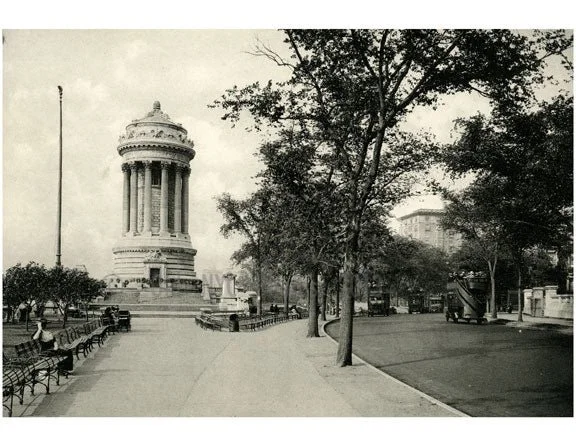
North of Seventy-second Street it’s a different story. Rather than anticipate a future wiped clean of antique residue, Riverside Drive looked to the past to reflect the weight of history in the monumentality of its designs. Bookended by the 1902 Soldiers’ and Sailors’ Monument at Eighty-ninth Street and the General Grant National Memorial of 1897 at 122nd Street (see my “Monumental madness” in The New Criterion of April 2020), there are memorials dedicated to firemen, to women’s health, to Joan of Arc, and to a range of others that all add their own gravitas to the park and drive (see “Gallery chronicle,” January 2016). All are products of the “City Beautiful” movement of the turn of the last century. Stop by Warren & Wetmore’s Robert Ray Hamilton Fountain of 1906 at Seventy-sixth Street, designed for the watering of horses. Or walk to the John Merven Carrère Memorial of 1919 at Ninety-ninth Street, a small terrace dedicated to the architect of the main branch of the New York Public Library—Carrère died in an automobile accident just months before the library’s opening—designed by his partner Thomas Hastings.

The Soldiers’ and Sailors’ Monument, ca. 1910.

Along the way, look up to the blue glazed terra-cotta window treatments of the Peter Stuyvesant Apartments of 1919 at Ninety-eighth Street, a building developed by James T. Lee, the grandfather of Jacqueline Kennedy Onassis. Consider the curving façades of the Colosseum and the Paterno, apartment buildings by the architectural firm of Schwartz & Gross, both completed in 1910, at a bend in the drive at 116th Street. Then look back to 103rd Street to the stepped finial—at one time a glistening copper-clad stupa—of the Master Apartments, originally built for the followers of the guru artist Nicholas Roerich (see “Gallery chronicle,” November 2013). This art-deco tower, one of the last constructed during the drive’s building boom, circumvented the city’s height and fire regulations by foregoing individual apartment kitchens and calling itself a hotel.

In the years after the Civil War, history weighed heavily as New York took on new responsibilities as a global capital. For a century prior, scattered farmhouses, villages, and “country seats” for downtown residents had gone up near the heights above the river. The early landowning families here, the De Lanceys, Apthorps, and Livingstons, still lend their names to modern Manhattan. Edgar Allan Poe wrote “The Raven” while renting the second floor of the Brennan Farmhouse next to what is now West Eighty-fourth Street in 1844. Yet even as the Commissioners’ Plan of 1811 laid down the Manhattan street grid, development was slow on the Upper West Side, where the rocky terrain was difficult to clear. This was especially true between Eleventh and Twelfth Avenues, where the steep and irregular drop from the heights to the river made conforming to the new grid especially challenging for residential development.

In 1866 Andrew Haswell Green proposed an act in the state legislature for the development of a park in the drop-off between these two avenues. Fresh from their successes to the east, the Central Park commissioners set about acquiring the land above Seventy-second Street from the heights to the river—or at least up to the riverfront railroad tracks laid down in 1848 to bring freight to downtown Manhattan (a railyard was located just south of Seventy-second).

In 1873 the commissioners wisely turned to Frederick Law Olmsted to design the project. Eleventh eventually became West End Avenue, while the docklands at Twelfth were absorbed into the park’s jurisdiction in 1894. In between, Olmsted used the contours of the heights to determine the sinuous shape of a new drive to bisect the two, carving out plots for development to the east that could overlook a park sloping down towards the river. His design made the most of the heights’ commanding views of the Hudson and the shoreline beyond. In two sections where the drop-off was too steep to connect his drive to the grid’s side streets, Olmsted split off a narrow carriage road, in the process creating extra “island parks.”

Olmsted “considered the existing grades and contours, the existing plantings and views, and designed a winding drive,” writes the Landmarks Preservation Commission. It was all a

seemingly simple, but for its time, remarkable design concept, which combined into a single unified design a picturesque park taking advantage of the natural attributes of a dramatic site and an urban parkway providing a landscaped environment for a residential community.

Starting in 1880, as the drive and park first opened, some twenty detached mansions went up, but this initial boom of the New York “Four Hundred” proved to be a bust. New York’s aristocracy mostly went to the Upper East Side. By 1902 a majority of the lots still remained vacant. Instead, it was the arrival of the Ninth Avenue Elevated and then the irt subway (now the 1, 2, and 3 lines) in 1904 that brought up from the crush of downtown a new business class eager for the drive’s riverside views. Developers were there to appeal to them, first with speculative row houses and, soon thereafter, with a proliferation of large rental apartments in multi-unit dwellings.

Outside of the overcrowded tenement, the apartment or “French flat” was a new concept for the upper-class New Yorker at the turn of the twentieth century. Beaux-Arts design helped to convey their respectability, as ornate lobbies and building attendants could now offer aesthetics and services surpassing those of a detached single-family home, with less expense.

The limestone façade of 190 Riverside Drive, constructed in 1908, at West Ninety-First Street. Photo: James Panero.

Over the following decades the class appeal of Riverside ebbed and flowed. During the Great Depression many spacious apartments were broken up into much smaller tenements, some even to single-room occupancy (SRO) units. It didn’t help that the open railroad tracks at the far edge of the park blocked the waterfront with an odoriferous cargo destined for the city’s meatpacking district.

It might be said that among developers, Robert Moses is now loathed by the Left nearly as much as Donald Trump. Both unabashedly appealed to the upper-middle-class city, and both focused on the future of Riverside. Moses’s great legacy here was to cover the Riverside tracks in a public-works project that cost nearly five times as much as the Hoover Dam. His 1934 West Side Improvement Plan brought in four million cubic yards of landfill and extended the shoreline 250 feet, doubling its size and turning Riverside into a genuine park while adding a new vehicular parkway. (More recently, even after federal funds had been allocated, a similar effort to bury the highway south of Seventy-second Street was blocked by Congressman Gerald Nadler due to his hatred of Trump, who controlled nearby development rights.)

Riverside’s final salvation came in the co-op conversion plans of the 1970s and ’80s. Hamstrung by the city’s market-killing rent regulations, landlords found ways to unburden their indebted structures onto their tenants. The process created thousands of small homeowners newly invested in the future of the neighborhood. As Riverside adopted a conservancy funding model in 1986 along the same lines as Central Park, neighborhood volunteers spread out every weekend to replant and fix up and tend to the dirt hills then covering the park’s grounds. Their efforts are still a defining characteristic of Riverside today.

Over time,” Azzarone concludes,

there have been multiple Riverside Parks. In the nineteenth century, Olmsted’s version was devoted to the pure enjoyment of nature. At the turn of the twentieth century, the City Beautiful’s park focused on monumental aesthetics. In the 1930s, Moses introduced the Riverside Park of recreation.

Any future for Riverside must still look to the past with reverence. Given present circumstances, such an impulse is the one most in need of renewal.

  1.   Heaven on the Hudson: Mansions, Monuments, and Marvels of Riverside Park, by Stephanie Azzarone; Empire State Editions, 240 pages, $39.95.

Comment

With Much Fanfare

Comment

With Much Fanfare

THE NEW CRITERION, February 1, 2023

With much fanfare

On the City Ballet’s premiere of Copland Dance Episodes, choreographed by Justin Peck.

The music of Aaron Copland might as well be the soundtrack of the American century. From Billy the Kid (1938) to Appalachian Spring (1944), Rodeo to Fanfare for the Common Man (both 1942), the compositions are energetic, expansive, hopeful. You envision birds at daybreak, sunlight on the prairie, cowboys dancing with the farmers’ daughters and farmers dancing with the ranchers’ gals. The spiritedness of the works lends itself to the ballet stage. So it’s no surprise that some of Copland’s most recognizable pieces were originally commissioned for choreography: Billy the Kid for Eugene Loring via Lincoln Kirstein, Rodeo for Agnes de Mille, and Appalachian Spring for Martha Graham. In 1959 Copland even returned to ballet with the commission of his Dance Panels for Jerome Robbins and the New York City Ballet.

Copland’s repertoire has become so iconic that it might now seem overly tied to time and place, like some grand old Hollywood Western forever in black and white. Justin Peck, the resident choreographer of the New York City Ballet, has taken on the challenge of introducing new color to these works. In 2015 he choreographed his Rodeo: Four Dance Episodes, inspired by a staging of de Mille’s original ballet at American Ballet Theatre.

This season he returns with Copland Dance Episodes, an ambitious work that premiered at City Ballet on January 26. Staged in twenty-two “episodes,” the seventy-five-minute piece presented without intermission is not only Peck’s first “full evening” work for the company but also NYCB’s first full-fledged plotless ballet since George Balanchine premiered Jewels way back in 1967.

Balanchine, Copland, Graham, de Mille, Robbins—the ancestors weigh heavy on such an undertaking. Peck responds by stripping away the heft of narrative ballet for discursive abstraction, through a tumbling of episodes with sonic and choreographic connections that are at most evanescent and fleeting. A thigh slap here, a head bob there, that’s all we get as the work floats free of the classical narrative of the American story.

With lighting, scenery, and costumes all tuned up to high color, Copland Dance Episodes is at its best in exploring the chromatic vision that weaves together the composer’s uplifting piecework. In the program, the set designer Jeffrey Gibson states that his art “fuses his Choctaw-Cherokee heritage and experience of living in Europe, Asia, and the USA with references that span club culture, queer theory, fashion, politics, literature, and art history.” This boilerplate reads like an application to the John Simon Guggenheim Foundation. Nevertheless Gibson’s colorful painted drop curtain introduces the ballet in Sixties hard-edge abstraction crossed with television test patterns. Ellen Warren picks up on these complementary saturations for her two-toned leotards while Brandon Stirling Baker employs high-index illumination with mostly subtle, and at one time jarring, lighting transitions.

Russell Janzen and Miriam Miller in Justin Peck’s Copland Dance Episodes. Photo: Erin Baiano.

Peck tends to be at his best in ensemble work, as multiple movements on stage coalesce and dissolve. As we hear those epic opening chords of Fanfare, Dance Episodes opens with the full company covered in tulle. A slogan, “The only way out is through,” is written on the drop and also serves as a title for this opening episode. At first the dancers appear frozen like mannequins under plastic wrap, there to be dusted off and reanimated. Then they walk off, leaving only one—the “common man,” no longer elevated, but merely lost in the crowd.

We get some hints at narrative through several such vignettes: racers at the starting line, ticket takers at the turnstyle, a flower in bloom. Fingers left pointing up at the end of one scene are touched ET-style in the next (in an episode called, yes, “Phone Home.”) With titles such as “Etch-a-sketch” and “Kismet,” the episodes are tumbleweeds and rodeos as seen in a Sunday morning cartoon, the past visualized in the light of the screen pixel. 

Peck, now aged thirty-five, conveys all the autistic affectation of his millennial generation. It’s a case of too much FaceTime, not enough facetime. I have written about the shortcomings of his partnerings in the past, with his dancers moving around one another without the necessary emotional engagement. Of course the pandemic has only made things worse, as City Ballet still rehearses masks up, practicing social distancing in an art that should be about profound connection. 

And yet here some of Peck’s pairings proved to be the highlights of the performance. In the episode “Two Birds,” Copland’s birdsong was given new life in the quick flutterings of Miriam Miller and Russell Janzen on the afternoon I attended. The two returned in “The Split.” Likewise for the partnering of Alexa Maxwell and Jovani Furlan, who shined once the company’s overly busy stage commotion moved on.

It should be said that no ballet should have twenty-two episodes and expect us to keep track of them all, especially in a darkened auditorium, and especially with titles like “Alone Together” (Parts 1 through 3). Whatever happened to the simplicity of “Emeralds,” “Rubies,” and “Diamonds”? Anchor points such as “Simple Gifts,” danced by the company, give way to the unexpected abstractions of “Shadowboxer,” with the stage lighting suddenly switched to silhouette. 

Do the twenty two episodes of this non-narrative work come off as too episodic? Yes they do. But Copland’s music mostly sustains the riffs—and stays with you long after. Ultimately this is the achievement of Copland Dance Episodes, a work that should now enter the standard NYCB repertoire. The piece reveals how music so rooted in the twentieth century can still send tingles and shocks into the ballet of the twenty-first.

Comment

A library by the book

Comment

A library by the book

THE NEW CRITERION, December 2022

A library by the book

On the politicization of the American library.

Adapted for The Wall Street Journal of November 11, 2022

In 2006 the American Library Association issued a button to its members. It read, “radical, militant librarian.” We should have taken the message at its word. The American library, until recently a refuge of neutral quietude, has become a booming battleground in the culture wars.

In 2018 the ALA dropped the name of Laura Ingalls Wilder from its annual children’s literature award. The reason? The supposed “culturally insensitive portrayals” in her landmark Little House on the Prairie series. Three years later, the organization published its “Resolution to Condemn White Supremacy and Fascism as Antithetical to Library Work.” The edict claimed that “libraries have upheld and encouraged white supremacy both actively through discriminatory practices and passively through a misplaced emphasis on neutrality.” The proclamation charged the ALA’s “Working Group on Intellectual Freedom and Social Justice” to “review neutrality rhetoric and identify alternatives.”

The quiet, neutral library was out. Full-throated progressive politics were in. As Emily Drabinski, a self-described “Marxist lesbian” who was recently elected president of the ALA, stated on her campaign website: “So many of us find ourselves at the ends of our worlds. The consequences of decades of unchecked climate change, class war, white supremacy, and imperialism have led us here.”

The condemnation of the history of the American library, by its own gatekeepers, has done more than bring “Drag Queen Story Hour” to every children’s reading room. It has also upended the traditional role of the library as an organization primarily dedicated to the acquisition, preservation, and circulation of books. This is a radical overhaul, and it has been brought to us by some of America’s largest cultural philanthropies.

In October the Mellon Foundation hosted a panel discussion on the American library featuring Mellon president Elizabeth Alexander, the ALA executive director Tracie D. Hall, and the Los Angeles City Librarian John F. Szabo. “Library workers are on the front lines of some of our most pressing social justice issues,” began the discussion. They are “no longer relegated to the reference desk.” What does this all mean? For one, that today’s librarians mock “the shushing part” of the traditional library: “I can’t think of too many contemporary library spaces I’ve been in where the librarian is going to be a shusher,” said Hall. “I probably was the librarian that others might have wanted to shush.” Through sewing classes, coworking spaces, and “incubators,” the panel spoke of “fulfilling the promise of what libraries were meant to be in terms of equity.” “It is our responsibility to ensure that no one is left out of the voting process,” Hall added. “That is one of our core values at the American Library Association.” And by actively appealing to voters on one side of the political spectrum, the library organization helps move election outcomes in a desired direction.

As librarians now champion controversial books such as the graphic novel Flamer, they also call parental attempts to limit what children read as evidence of a “period of unprecedented book banning and censorship”—one that “far eclipses even the McCarthy era.” Meanwhile, truly deplatformed titles, such as When Harry Became Sally, Ryan T. Anderson’s critique of modern transgender theory that Amazon erased from its e-commerce platform, are never mentioned in these one-sided agonies. “This is the third great wave of librarianship and libraries—as a social project,” concluded Hall. What was, until recently, a widely popular American institution has been nearly broken by unrestrained progressive politicization.

“I suspect that the human species—the only species—teeters at the verge of extinction, yet that the Library—enlightened, solitary, infinite, perfectly unmoving, armed with precious volumes, pointless, incorruptible, and secret—will endure.” It is easy to see how Jorge Luis Borges in the early 1940s, in his oft-quoted short story “The Library of Babel,” might have drawn such a conclusion. Yet today it appears that the library, especially the library that is “enlightened, solitary, infinite, perfectly unmoving, armed with precious volumes, pointless, incorruptible, and secret,” is the entity that most teeters at the verge of extinction.

It is a crisis of the Left’s own devising, one designed to turn the library into a scarred landscape. It is also based on a straw-man argument, with rhetoric disconnected from the historical record. Far from upholding “fascism” and “white supremacy,” the American library has been, in fact, one of the country’s most enlightened and democratic institutions.

Through what remains of this legacy, beyond the spurious “banned books” displays and the circulation-desk sermonizing, today’s libraries can still be places of reverie, uplift, and reflection. This effect is due not just to the abundance of books that are—at least for now—still available for perusal. It is also an effect of the library building itself, its history of form, which records the values of an earlier era in bricks and stone.

For its ubiquity and richness, especially in those examples that survive from before the Second World War, the American library building stands as a reflection of the country’s enlightened calling. Over the nineteenth century and into the early decades of the twentieth, library design paired historicized style with the latest innovative solutions for the safe housing and circulation of its collections. The references to the history of art and civilization that these buildings displayed on their faces—and the great expense dedicated to their creation and upkeep by their underwriters—reflected a reverence for the culture of the book contained within.

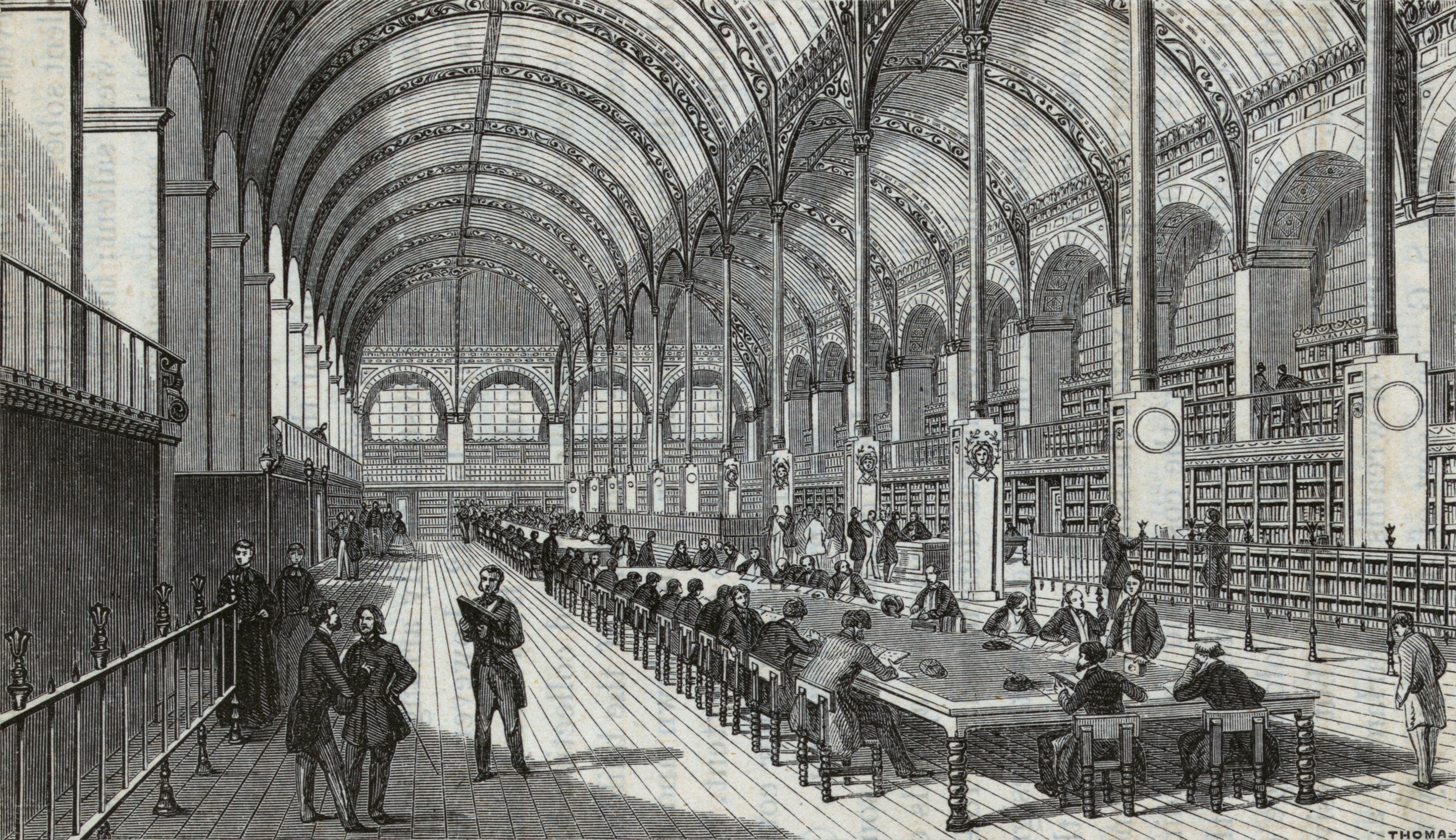
Henri Labrouste, Bibliothèque Ste.-Geneviéve, Paris, 1859, Print, from Memoirs of Libraries, London.

American Libraries: 1730–1950, written by Kenneth Breisch for a series by the Library of Congress and published in 2017, tells this history in a visual and compelling way.1 While the eighteenth century saw the creation of important American private and subscription libraries, only Benjamin Franklin’s Library Company of Philadelphia (founded in 1731) and the New York Society Library (founded in 1754) had buildings dedicated to their collections by the turn of the nineteenth century. America’s interest in library design began in earnest after 1800. Over the following century and into the early years of the twentieth, libraries took the country by storm. Planners found inspiration in the grand mid-nineteenth-century examples of the Bibliothèque Sainte-Geneviève in Paris (designed by Henri Labrouste and constructed between 1844–50) and the Reading Room of the British Museum in London (Sydney Smirke, 1854–57). American library construction took off after the Civil War to reach the pinnacle of the movement as seen in such edifices as the main branch of the Boston Public Library (McKim, Mead & White, 1895), the main branch of the New York Public Library (Carrère & Hastings, 1911), and Yale’s Sterling Memorial Library (James Gamble Rogers, 1931).

Unlike the museum, the library is an ancient form. The Ambrosian Library in Milan (Lelio Buzzi and Francesco Maria Richini, 1603–09) and the Bodleian Library at Oxford (Thomas Holt, 1610–13) provided the “hall model” for early American library construction, one that lined the high walls of the main rooms with books. Centuries later, private showcase collections such as New York’s J. Pierpont Morgan Library (McKim, Mead & White, 1902–06), Rhode Island’s John Carter Brown Library (Shepley, Rutan & Coolidge, 1904), California’s Huntington Library (Myron Hunt, 1920), and Washington’s Folger Shakespeare Library (Paul P. Cret and Alexander B. Trowbridge, 1928–32) continued the tradition of the Renaissance treasure-house design.

As a modification of the hall design, the alcove model, with double-height C-shaped book walls, became the American standard by the mid-nineteenth century. At Harvard, Gore Hall (Richard Bond, 1837–41; demolished in 1913 for the construction of Widener Library) became the university’s first freestanding library and a standard of alcove design. The form was continued in Yale’s Dwight Hall (Henry Austin, 1842–47; converted into the Dwight Memorial Chapel in 1930–31) and the successive buildings of the New York Society Library of 1840 and 1856. Merging the literary and ecclesiastical, both Gore and Dwight Halls drew their inspiration from King’s College Chapel in Cambridge, England.

Two influential manuals of the 1840s—A. F. Schmidt’s Handbuch der Bibliothekswissenschaft (1840) and Léopold Auguste Constantin Hesse’s Bibliothéconomie (1841)—encouraged multistory alcove design. Yet it was the widely emulated work of Henry Hobson Richardson, a onetime Harvard undergraduate who had studied in Gore Hall, that assured the alcove’s popularity, thanks to his library designs for the Massachusetts towns of Woburn, North Easton, Quincy, and Malden (1876–85). With its monumental ashlar masonry supporting fanciful arches and turrets, the Richardsonian Romanesque-revival style can still be seen in libraries throughout New England.

Not everyone was a supporter of Richardson’s alcove system—in particular those librarians who worked with collections housed in these arrangements. Justin Winsor, the superintendent of the Boston Public Library from 1868 to 1877, and William Frederick Poole, the librarian of the Boston Athenaeum from 1856 to 1869, were both critical of multi-story book halls and alcove shelving for their inefficient use of space, the challenge of retrieving the volumes, and the uneven heating of the rooms, which would often cook the books on the higher shelves. Their solution was the more utilitarian stack system, which located books in dedicated spaces on multiple tiers of iron shelves. The British Museum Reading Room employed, in part, such a multi-tiered system.

As American universities began to emulate the research-based German model, library collections grew. A more modular and efficient stack system soon became a necessity. Gore Hall was built in 1841 to house forty-four thousand books—the extent of Harvard’s collection at the time. The building was filled by 1863 and supplemented by a stack annex, the first in America, in 1876. Nevertheless, by 1910 an architectural survey determined that “no amount of tinkering can make it really good.” As with other alcove libraries, Gore was said to be “hopelessly overcrowded” and “intolerably hot in summer.” In 1913 Harvard demolished Gore and replaced the influential nineteenth-century complex with Horace Trumbauer’s Harry E. Widener Memorial Library, with metal stacks capable of storing over 3.5 million volumes. What was lost in bibliographic visualization—with the architectural use of books now replaced by card catalogues—such stack libraries gained in essential storage and efficiency. By the time of the construction of Yale’s Sterling Memorial Library, its Gothic Revival façade concealed a fourteen-story stack tower capable of housing five million volumes.

Thomas Jefferson was a man ahead of his time—in library- as well as nation-building. His legacy is woven into the story of the American library in more ways than one. By the early years of the republic, Jefferson had amassed a personal collection of six to seven thousand volumes. It was the largest and most extensive library in the country at the time. After the British army sacked Washington, D.C., and burned the Capitol in 1814, destroying the congressional library housed within, Jefferson sold his collection to the federal government a year later. Even though a second fire destroyed two-thirds of these volumes in 1851, Jefferson’s collection continues to form the nucleus of the Library of Congress, which has grown to become the largest library collection in the world.

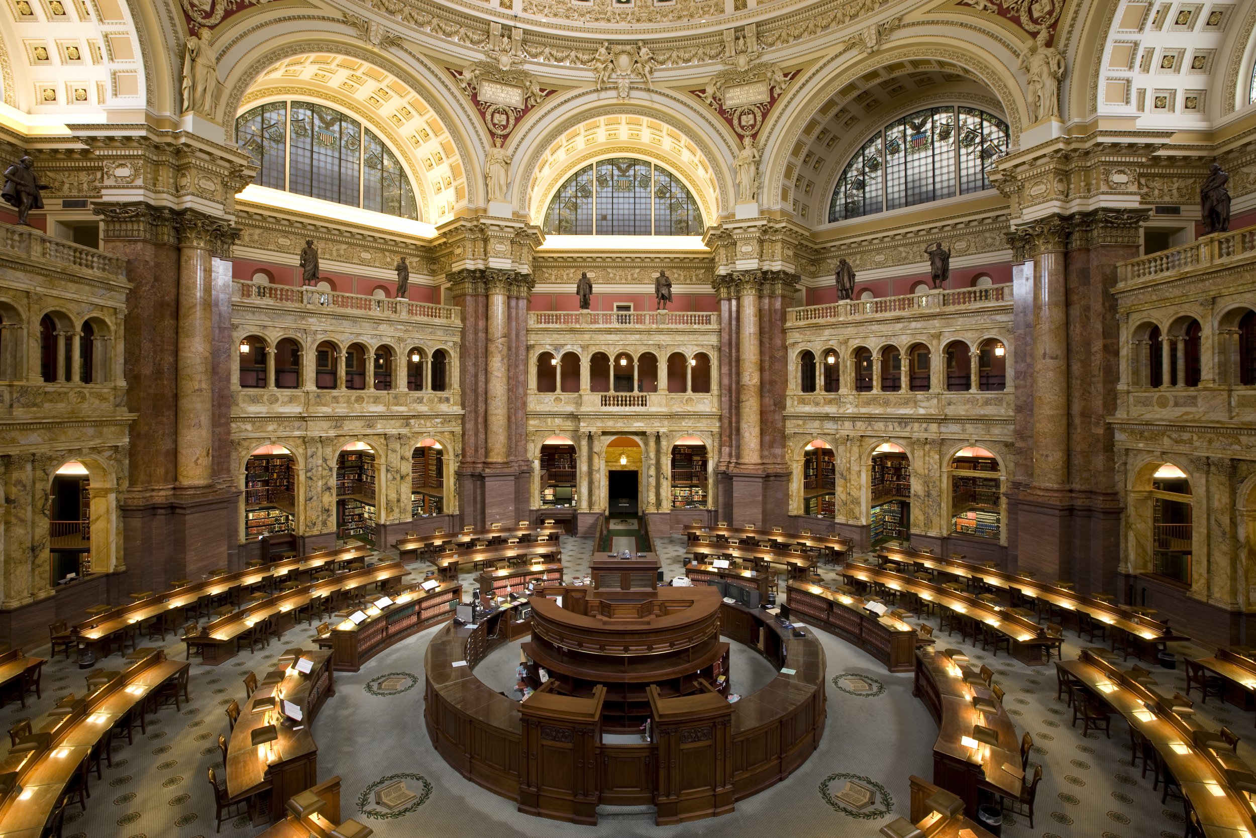
Jefferson Reading Room, Library of Congress. Photo: Carol Highsmith, 2009.

Jefferson’s library influence continued with his designs for his University of Virginia. In 1822, construction began on his Rotunda library. The design departed from the hall model and adopted the shape of the ancient Roman Pantheon to form a focal point for his university’s classically designed Academical Village. When completed in 1828, two years after Jefferson’s death on July 4, 1826, and as the final and most monumental building on the new campus, the two-story Rotunda became the first freestanding academic library in the country.

Half a century later, library designers returned to Jefferson’s classical vernacular and the rotunda form to create some of the greatest monuments of American library architecture. Again Sydney Smirke’s innovative British Museum Reading Room of 1856 provided the model for a domed central rotunda featuring a panoptic administration area at the center with freestanding bookstacks surrounding a core. Smirke’s innovative reading room, the first to use iron stacks, featured twenty-five miles of reference shelving with twenty thousand popular circulating volumes arranged in numbered alcoves a floor below.

When the U.S. government authorized a competition for a new Library of Congress building in 1873, the winning design coalesced around a similar rotunda-and-stack arrangement. Completed twenty-five years later in 1897, what is now known as the loc’s Thomas Jefferson Building spared no expense in its construction and decorative program. Edward Casey, the son of Thomas Lincoln Casey, the engineer who oversaw the library’s construction before his death in 1896, attended to the library’s lavish assembly of sculptures, murals, and mosaics. Illustrations on its walls depict the evolution of the book from the oral tradition through the invention of the printing press. The collar of its central dome features allegories of the world’s civilizations. Surrounding this program are forty-three miles of shelving manufactured by the Snead & Company Iron Works of Louisville, Kentucky, which can accommodate two million volumes.

The Library of Congress’s rich artistic program was arguably surpassed at the Boston Public Library, where Charles McKim tasked Puvis de Chavannes with producing a mural cycle for the library’s grand staircase. Puvis created the work relying on measurements sent by McKim and a sample of the yellow Siena marble to match the tonalities of the staircase enclosure. Using a scale model of the staircase and working on canvas in his French studio, the seventy-two-year-old artist created a cycle of paintings that were then shipped to Boston and adhered by his assistants to the walls. The long cycle atop the entrance to Bates Hall presents “The Muses of Inspiration Hail[ing] the Spirit, the Harbinger of Light.” Surrounding panels depict allegories of Philosophy, Astronomy, History, Chemistry, Physics, and Pastoral, Dramatic, and Epic Poetry. Below, carved lions by Louis Saint-Gaudens guard this grand staircase.

In the years after the completion of the loc’s Jefferson building, American architects revisited the rotunda model in even more impressive distillations of the classical style as taught by the École des Beaux-Arts. In the first decade of the twentieth century, two institutions—New York University and Columbia—developed new uptown campuses that had many parallels. Most notable were the domed rotunda libraries at their core: nyu’s Gould Memorial Library of 1896–1903 and Columbia’s Low Memorial Library of 1909. Both designed by the firm of McKim, Mead & White, each building carries the sensibility of one side of the partnership, with McKim’s restrained, detailed classicism on display at Low and White’s theatrical exuberance at Gould.

Beyond the triumphant designs of America’s turn-of-the-century central libraries, it was the development of the smaller branch library that arguably had the greatest effect on twentieth-century literacy and education. As early as 1885, William Frederick Poole was advocating for smaller circulating libraries, ones that might contain thirty thousand volumes and be easily accessible to the American reader. A supporter of libraries of all sizes, the philanthropist Andrew Carnegie answered this call in the early years of the twentieth century in ways that changed the landscape of the American library. By 1917, Carnegie and his foundation, which he started in 1911, had endowed 1,679 library buildings in the United States. In New York City alone, he spent $5.2 million to construct sixty-seven neighborhood branch libraries. In segregated Tennessee, he funded a Negro Branch library. At the request of Booker T. Washington, he donated $20,000 for the library at Alabama’s Tuskegee Institute. The ubiquitous construction of these Carnegie libraries, mostly classical in style, called for a simple panoptic design where “one librarian can oversee the entire library from a central point,” in the words of James Bertram, Carnegie’s personal secretary.

Through an astonishing combination of municipal underwriting and philanthropic giving (New Hampshire became the first state to authorize taxation for libraries in 1849), today there are 5,400 libraries with a thousand or more books in the United States. What has been lost in this abundance is an understanding of the forces that created it and an appreciation for the styles that formed it. Following the Second World War, library designers turned away from historical models to look to the modern office building and department store for inspiration, with disastrous effects. The Beinecke Rare Book & Manuscript Library at Yale (Gordon Bunshaft, 1963) and the Phillips Exeter Academy Library (Louis Kahn, 1972) are the rare exceptions to this general rule.

Departing from the simple flagstone design of Franklin Roosevelt’s “presidential library” (Louis Simon, 1939–40)—the first such executive initiative—the libraries of Lyndon Johnson (Skidmore, Owings & Merrill, 1967–71) and Bill Clinton (Polshek Partnership, 2000–04) are brutalist and impenetrable. The same goes for the James Madison Memorial Building (De Witt, Poor & Shelton, 1966–81), the much-criticized extension of the Library of Congress built at a cost of $131 million, where the first challenge is finding the monolith’s front door. Even after the government requested a review of the design by the American Institute of Architects in 1967, little changed in its final construction.

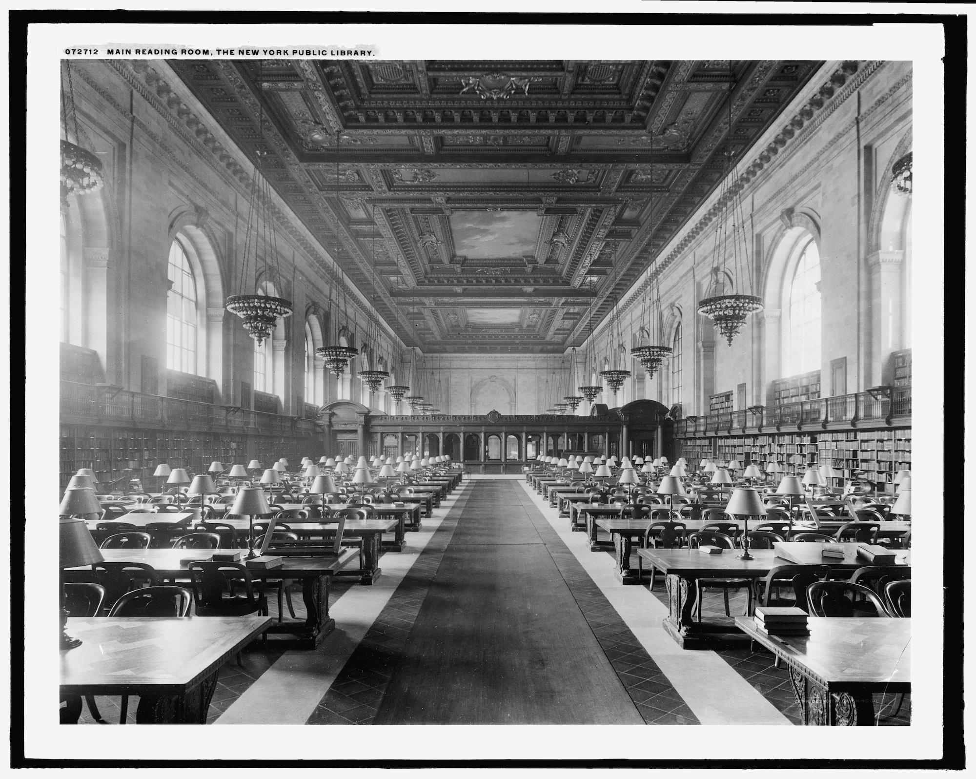
Detroit Publishing Company, Main reading room, the New York Public Library, ca. 1910, Dry plate negative, Library of Congress.

Now a radical “third great wave” seeks to wash over the American library to complete its transformation into a “social project.” A decade ago, the leadership of the New York Public Library unveiled a real estate consolidation scheme called the “Central Library Plan.” The aim was to transform the library’s flagship research branch—arguably the finest integration of public spaces and book storage in the country—by gutting its stacks. By removing the “seven floors of outdated bookshelves under the Rose Main Reading Room,” read the announcement, the plan promised to transform the reference library into a newly circulating “people’s palace.” Meanwhile millions of books from the library’s “core research collections” would be moved off-site—undermining the legacy of John Jacob Astor, who left the initial bequest of $400,000 for the foundation and support of a free public reference library in 1848.

An eleventh-hour appeal by the architectural critic Ada Louise Huxtable and others tanked the scheme, but the episode reveals the lengths to which library leaders will now go to destroy America’s great history of literary access for progressive ends. For them the real problem is not “book banning” but the easy availability of books they despise and the history these books represent, which our great library collections offer up neutrally, and impartially, by design. A library of the book, by the book, and for the book is the ultimate defense against their control—and the true democratic legacy of this American institution.

  1. American Libraries: 1730–1950, by Kenneth Breisch; W. W. Norton & Company, 320 pages, $75.

Comment