Viewing entries in
New York

An Inevitable Rivalry

Comment

An Inevitable Rivalry

THE NEW CRITERION, November 2023

An inevitable rivalry

On “Manet/Degas” at the Metropolitan Museum of Art, New York.

Manet Slash Degas. That’s the title of the double headliner now at the Metropolitan Museum of Art.1 It might as well be a statement. A physical slash runs clear through the middle of the exhibition’s title wall, dividing the names of the two artists. Similar slashes appear in various corners of the show, digging beneath the paintings and even cutting openings into other galleries.

If “Manet/Degas” is a slasher show, another clue is one of the first works on display. Edgar Degas painted Monsieur and Madame Édouard Manet (1868–69, Kitakyushu Municipal Museum of Art) as a gift to his artist friend after one of their weekly salons. The portrait depicts Monsieur Manet reclining on a sofa as he listens to Madame at the piano. But what we see today is only a partial view of the pair. Unhappy with Degas’ depiction of his wife, Manet slashed the right side of the canvas. When Degas discovered the defacement, he took the painting back and returned his own gift from Manet, a small still life of a bowl of fruit, over the insult. Degas then displayed the damaged portrait in his home, eventually next to Manet’s The Ham (ca. 1875–80, Glasgow Life Museums); a carving knife rests prominently in the foreground of that still life. Manet Slash Degas.

Edgar Degas, Monsieur and Madame Édouard Manet, 1868–69, Oil on canvas, Kitakyushu Municipal Museum of Art, Japan.

More evidence can be found in the many prints that inform this extensive, penetrating exhibition on the creative—and cutting—relationship between Édouard Manet (1832–83) and Edgar Degas (1834–1917). Since about half of the one hundred sixty works on display come from the collections of the Metropolitan and the Musée d’Orsay, the two organizing institutions of “Manet/Degas,” the Met’s extensive collection of works on paper helps fill in around Orsay’s blockbuster loans.

Printmaking is itself a slashing art. To make an etching, a needle must dig into a copperplate coated with an acid-resistant ground. When the plate is then submerged in acid, the groove exposes the copper to the bath, incising a line beneath. With drypoint, another intaglio printmaking technique, a needle is directly slashed into the plate, leaving a burr of metal that results in a fuller, fuzzier line when inked and printed on paper. Manet and Degas used both methods, sometimes combining the two in a single print.

Edgar Degas, Monsieur and Madame Édouard Manet, 1868–69, Oil on canvas, Kitakyushu Municipal Museum of Art, Japan.

Manet first met Degas in a gallery of the Louvre as Degas was creating just such a printing plate based on a Portrait of Infanta Margarita Teresa, today attributed to the workshop of Diego Velázquez. Rather than printing from a preparatory study, as was customary, Degas was taking the radical step of drawing with his needle directly from observation, attacking the plate in a riot of zig-zagging lines. “How audacious of you to etch that way, without any preliminary drawing. I would not dare do the same,” Manet supposedly said to Degas.

The Irish novelist George Moore said the relationship between Manet and Degas—equally ambitious Parisian artists, nearly the same age, and from similarly wealthy and cultured backgrounds—was “jarred by an inevitable rivalry.” As they absorbed the history of art by copying in the public galleries of the Louvre, in particular the Spanish and Italian masters, their relationship first played out in print. Degas created drawings and prints of his friend, including a suite of portraits of Manet sitting, leaning, and brooding in two-thirds profile circa 1868. Their relationship on paper continued long after Manet’s untimely death at age fifty-one. As Degas outlived his friend by over thirty years, he became a foremost collector of his work, even amassing a near-complete run of Manet’s prints.

An illuminating arrangement of prints here from 1861–62 includes the very study by Degas of the infanta over which the artists met, with an impression now in the Metropolitan’s collection. Directly facing this print is Manet’s own version after Velázquez, also from the Met. The copperplate of Manet’s etching, on loan from Paris’s Bibliothèque de l’Institut national d’histoire de l’art, is displayed between them. It is telling that the two artists’ versions are reflections of one another, literally and figuratively. Degas’ direct etching process resulted in a mirror image when printed. Manet, who made his prints from studies, maintained the orientation of the original in his impressions.

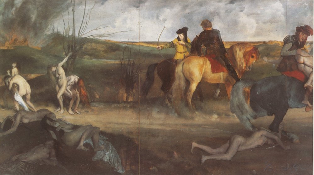
Edgar Degas, Scene of War in the Middle Agesca. 1865, Oil on paper mounted on canvas, Musée d’Orsay, Paris. 

Through much of his career, Manet relied on printmaking to disseminate the images of his bold paintings and drawings. Degas, meanwhile, used the medium more as a space for experimentation. We can see the differences in these two infantas. Manet’s version looks like a reproduction, and a hasty one at that. Degas’ print goes off in its own unexpected direction. The free line of the needle takes on a life of its own. The lace of the infanta has been elaborated with an extra round of drypoint. That the Metropolitan has positioned the infantas on one of those slashed gallery walls underscores the central role of printmaking in the two artists’ relationship.

As the careers of the two artists developed in the 1860s, Degas had more to work through than Manet, who seems to have known what to do from the very start. Stephan Wolohojian, the Metropolitan’s John Pope-Hennessy Curator in Charge of the Department of European Paintings, has co-organized this exhibition’s stateside appearance along with Ashley E. Dunn, the museum’s Associate Curator in the Department of Drawings and Prints. In their joint introduction to the exhibition catalogue, the two call Manet and Degas “friends, rivals, and, at times, antagonists” who “worked in conversation throughout their careers, from the time of their first meeting in the early 1860s.” On the exhibition’s opening morning, Wolohojian downplayed their competition, or at least our inclination to declare a victor of the rivalry, saying,

Many visitors will try to figure out which of these two is the better artist. But this is not a competition between two of the greatest painters of the nineteenth century. There is no game. There are no rules. So there can be no winner.

And yet, out of the gate, Manet is the clear frontrunner. The exhibition’s lavender walls play to his brighter palette, while Degas’ subtleties get lost in the murk. Manet also pulls his paintings right to the surface, with public themes and shocking compositions, while Degas presents an interior world that requires deeper reflection. And Manet often went big when Degas kept it small. In some of the rooms, Manet comes across as having taken up nearly all the wall space, with Degas barely holding on to a corner.

Édouard Manet, Olympia, 1863, Oil on canvas, Musée d’Orsay, Paris.

These differences are most pronounced in the display of their two entries into the Paris Salon of 1865. For Degas, it was Scene of War in the Middle Ages (ca. 1865, Musée d’Orsay), a strange concatenation of nude women, flowing hair, burning towns, and trampling horses. For the figures, Degas made studies of classical anatomy. This work may be an allegory of the American Civil War, in which members of Degas’ extended family fought for the Confederacy. Yet the whole does not equal the sum of its parts. With all the action off to the sides and even cut off by the edges, the composition is downright bizarre—a harbinger of Degas’ experimental inclinations. For the audiences of 1865, just as for those of us at the Metropolitan today, this work could not hope to compete for attention against Manet’s entry in that same salon: Olympia (1863–65).

That painting of a courtesan and her maid was a scandal when presented in 1865. With its fraught dynamics of sex and race, it still causes palpitations in 2023. That the astonishing work has now traveled beyond the walls of the Musée d’Orsay is itself nearly unprecedented; seeing it in person reveals just how much gets lost in reproduction. We can observe how Manet subtly accentuated the contrasts of skin tones, of bedding and background. Olympia’s red hair flows over her left shoulder in a way that tends to disappear into the background of copies. In person the forceful expression of the maid, presenting Olympia with a bouquet of flowers and a sideways glance, also reveals a deep cognizance of the dynamics of the situation. As if there were any doubt of another, unseen figure in the room, the hissing cat with its back arched, staring straight out, makes the viewer the complicit third person in the scene. (A cat’s curving tail, queue in French, is also a slang word for a part of the male anatomy.) Compared to Manet’s Reclining Nude, a preparatory study composed in red chalk (1862–63, Musée d’Orsay), with its figure rotating away, here Olympia is tumbling forward into our own space, practically sliding off her disheveled silk cushions. Her modeled hands are all that holds onto her bright flesh, while her spare jewelry ties her back to the picture plane. The work seems immediate and raw but was, in fact, carefully crafted as an homage to Titian’s Venus of Urbino (the pose, the bedspread, the maid, even the pet is there). Manet set up the scene with models in his studio, with Victorine Meurent as Olympia and Laure as her maid. Both models reappeared in his later compositions.

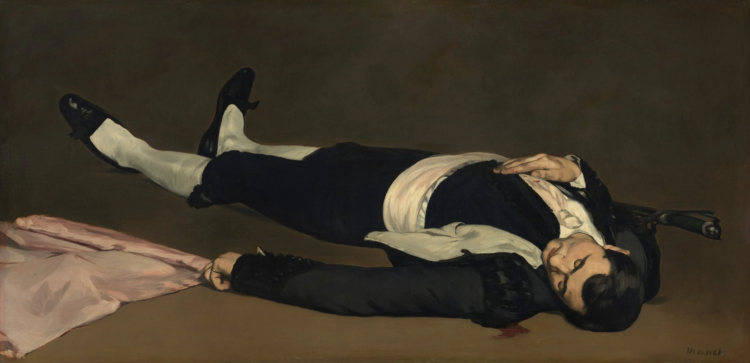
Édouard Manet, The Dead Toreador, 1864, Oil on canvas, National Gallery of Art, Washington, D.C.

Manet’s boldest paintings trafficked in this full-frontal treatment while tying his compositions to the masterpieces of art history. The figure in The Dead Toreador (probably 1864, National Gallery of Art, Washington, D.C.) lies in an abstract foreground, with his blood about to run off the dark canvas. Manet’s portrait of Émile Zola (1868, Musée d’Orsay) is practically collage, with the images on Zola’s wall—including a grisaille of Olympia—applied like stickers to the painting surface. For The Balcony (1868–69, Musée d’Orsay), a four-person portrait that includes Berthe Morisot and was inspired by Francisco Goya’s Majas on a Balcony, a green railing is all that holds the figures back from our own viewing space. Even Manet’s Déjeuner sur l’herbe, which scandalized Paris two years before Olympia (here represented by a copy on loan from The Courtauld Gallery, ca. 1863–68), was based on studies of Giorgione and, in particular, an engraving of the Judgment of Paris by Marcantonio Raimondi after a lost original by Raphael.

And where was Degas during all this time? Making his own studies of Raimondi, for one. He was also creating his own portraits, based off of his studies from the Louvre, but they were often compositionally skewed, such as that of James-Jacques-Joseph Tissot (ca. 1867–68, Metropolitan Museum of Art), who appears to be sinking into the middle of the picture. Degas was also painting false starts—or at least, The False Start (ca. 1869–72, Yale University Art Gallery), one of his many images from the racetrack. As Manet painted the explosive instance, Degas looked to the odd moment. When the artists went to the races, Manet depicted the horses head-on, in The Races at Longchamp (1866, Art Institute of Chicago), while Degas observed them from behind in Racehorses Before the Stands (1866–68, Musée d’Orsay).

Edgar Degas, Cotton Office in New York, 1873, Oil on canvas, Musée des Beaux-Arts de Pau, France.

Manet’s figures tumble out of his compositions, while Degas draws us in. As his choice of subject matter turned from history and allegory to the realities of modern life, Degas’ work also became uniquely absorbing. His Cotton Office in New Orleans (1873) depicts both the dealings of the cotton trade and the family business. A descendant of the French diaspora, Degas was a Louisianian on his maternal side—his mother’s family had left Saint-Domingue after the Haitian Revolution (1791–1804)—while his father’s family owned the De Gas bank of Naples, Italy, having fled from France during the Reign of Terror. The New Orleans cotton office in the painting was his family’s own, observed firsthand when Degas himself left Paris in 1871 following the siege of that city in the Franco-Prussian War. (Both Degas and Manet had manned the artillery in its defense.)

Degas packed his New Orleans composition with a depth of mundane activity, accounting for the many facets of a busy cotton-factoring firm: counting the bales, manning the books, reviewing the operation. Cropped in the foreground, Michel Musson, Degas’ uncle, inspects the cotton’s fibers with his fingers. Meanwhile, sitting in a chair in the middle of the room, Degas’ brother René leans back and reads from The Daily Picayune. Good work if you can get it. It is appropriate that this painting of modern life became the first work by Degas to enter the collection of a French museum, when the Musée des Beaux-Arts in Pau acquired it in 1878. Degas had come into his own. (In an unexpected twist, the first museum to acquire a work by Manet was none other than the Metropolitan Museum of Art, when it accepted Boy with a Sword [1861] and Young Lady in 1866 [1866] as gifts from the American collector Erwin Davis in 1889. At the time, the Metropolitan exhibited these two works as by an “eccentric realist of disputed merit; founder of the school of ‘Impressionistes.’”)

There is no doubt that, between the two, Manet always remained the painter of action. You can just about smell the gunpowder smoke in his maritime painting of The Battle of the “Kearsarge” and the “Alabama” (1864, Philadelphia Museum of Art), of an engagement of the American Civil War that was waged off the coast of Cherbourg, France. The firing of flintlocks still rattles the composition in The Execution of Maximilian (ca. 1867–68, The National Gallery, London). Manet never saw these scenes in person but rather combined eyewitness accounts with the precedents of art history to great effect. In the case of Maximilian, the Habsburg heir installed by Napoleon III to become emperor of Mexico but soon deposed by loyalists to Benito Juárez, Manet directly quoted Francisco Goya’s Third of May 1808.

Édouard Manet, The Battle of the USS “Kearsarge” and the CSS “Alabama,” 1864, Philadelphia Museum of Art, Pennsylvania.

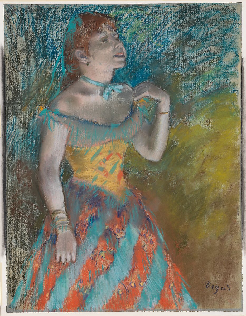
All the while, Degas looked ever deeper to the inside of life—revealing interior spaces along with what seemed to be the inner thoughts of his figures. In The Dancing Class (ca. 1870, Metropolitan Museum of Art), the intimate assembly of young figures appears to interact only with themselves as they become lost in a turnout, fixing a shoe, or bending at the barre in fifth position. As Manet stayed sharp, Degas leaned into a sense of distraction and ill-focus. On the surfaces of his work, he took to pastels and an innovative handling of color and line to give his paintings a new impression, leading the way for the movement that took this name. Many of his most lasting innovations were still to come, including his experiments in wax sculpture and staged photography, which fall outside the timeframe of Manet’s life and are therefore not included in the exhibition. But in such gauzy works as The Singer in Green (ca. 1884), Woman Bathing in a Shallow Tub (1885), and Woman Combing Her Hair (ca. 1888–90), all coming from the Metropolitan’s collection, we see the development of the same wavy line that first appeared in Degas’ print study of the infanta some two decades before.

Edgar Degas, The Singer in Greenca. 1884, Pastel on light blue laid paper, Metropolitan Museum of Art, New York.

This blurred, impressionistic vision gave the works of Degas a new intimacy. In this exhibition’s comparison between those two famous tippling figures, In a Café (The Absinthe Drinker) (1875–76, Musée d’Orsay) by Degas and Plum Brandy (ca. 1877, National Gallery of Art, Washington, D.C.) by Manet, both of which relied on the same artist model, Ellen Andrée, it is the work by Degas that takes top prize. The off-kilter perspective, the drooping eyes, and the distracted male companion all present a sense of isolation that Manet’s more sentimental portrait never could.

Edgar Degas, In a Café (The Absinthe Drinker), 1875–76, Musée d’Orsay, Paris. 

But this is not a competition, as the curator Stephan Wolohojian makes clear. Nor is it really a story of slash and burn. One of the final works here is Manet’s painting of Maximilian from The National Gallery, London. Like that portrait of Monsieur and Madame Édouard Manet at the start of the exhibition, this too is fragmentary. After Manet’s death, the large composition was slashed apart and broken up into smaller works. It was Degas who tracked down the pieces and brought them together again. Much as Degas added a portion of canvas to the damaged right side of Monsieur and Madame Édouard Manet, here he also dedicated himself after Manet’s death to his friend’s reparation. Whatever divide existed between them was also their bond. That slash was ultimately a stitch bringing these two masters ever closer together.

  1.   “Manet/Degas” opened at the Metropolitan Museum of Art, New York, on September 24, 2023, and remains on view through January 7, 2024. The exhibition was previously on view at the Musée d’Orsay, Paris (March 28–July 23, 2023).

Comment

Spanish Lessons

Comment

Spanish Lessons

THE NEW CRITERION, September 2023

Spanish lessons

On “1923–2023 Sorolla / Soto Centennials” & “Jewels in a Gem: Luz Camino at the Hispanic Society Museum” at the Hispanic Museum & Library.

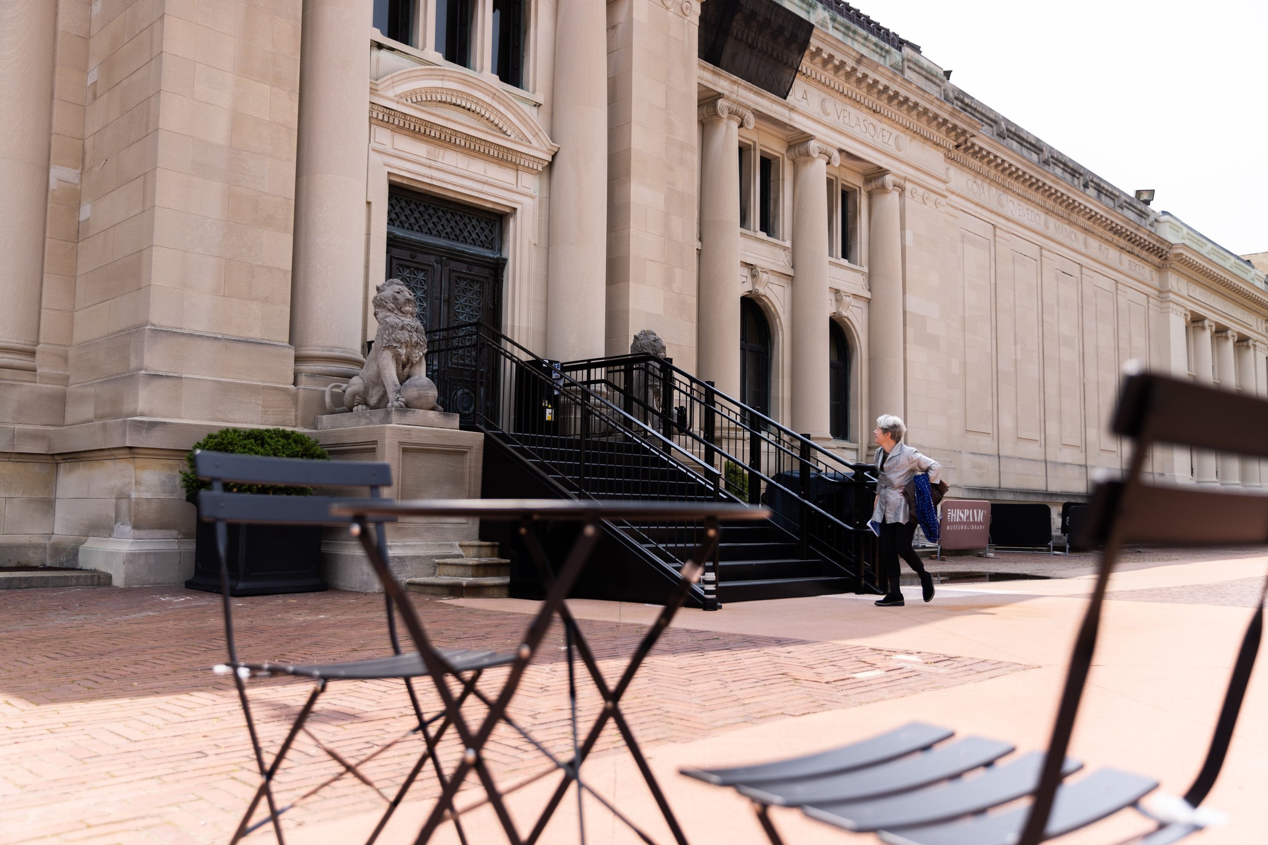
The Hispanic Society of America was founded over a century ago to reflect a gilded vision of Spain and the Iberian peoples. Since 1904, this institution on Broadway and 155th Street has faced much harsher realities. The small independent entity—one of scholarly and artistic significance—has struggled so far removed from the limelight of New York’s Museum Mile. To this day the Hispanic Society remains the greatest New York collection few have ever heard of. Now, after a six-year closure to address its aging infrastructure, the museum and library have partially reopened with a renewed vision for the future. Just how much this vision aligns with the foresight of its remarkable founder, Archer Milton Huntington, is a picture still coming into view.

Archer Huntington was the stepson, and most likely illegitimate offspring, of Collis Huntington, one of the Big Four founders of the western railroad. Even more remarkable was his mother, Arabella, a significant collector of European art and a social outcast whose marriage to Huntington scandalized New York society. Arabella’s sense of independence encouraged her only child in his intense cultural pursuits. In 1882, while embarking on a Grand Tour at age twelve, Archer purchased a copy of The Zincali, George Borrow’s 1841 “Account of the Gypsies of Spain,” in a Liverpool bookshop. The book was one of several famous stories that informed the century’s Romantic affinities for primitive Spain—joining Victor Hugo’s Hernani of 1830, Théophile Gautier’s Voyage en Espagne and Richard Ford’s Handbook for Travellers in Spain, both of 1845, and Georges Bizet’s Carmen of 1875.

View of the entrance to the Hispanic Society Museum & Library. Photo: Alfonso Lozano.

As Huntington continued on to London and Paris, he was already envisioning an art collection along the lines of Sir Richard Wallace’s, paired with a library akin to the National Gallery’s, dedicated to the cultures of Spain and the Spanish diaspora. In 1891, to understand better the history of Al-Andalus, he even hired a tutor to teach him Arabic, at a time when no American institution offered classes in the language. On tours through Spain in 1892, 1896, and 1898, he purchased trunks of Spanish photographs while studying the country’s art and culture (the society now has 175,000 such images). In 1902 he acquired the bibliographic collection of Manuel Pérez de Guzmán y Boza, Marqués de Jerez de los Caballeros, who was his mentor. Soon Huntington had the most important collection of Spanish books and manuscripts outside of Spain, a collection growing to two hundred thousand manuscripts and more than three hundred thousand printed books, including over fifteen thousand volumes from before 1700. He paired this collection with paintings by Spanish masters—Velázquez, Goya, Zurbarán, El Greco—which he was determined to purchase only from the international market, so as not to deplete the country’s own cultural patrimony.

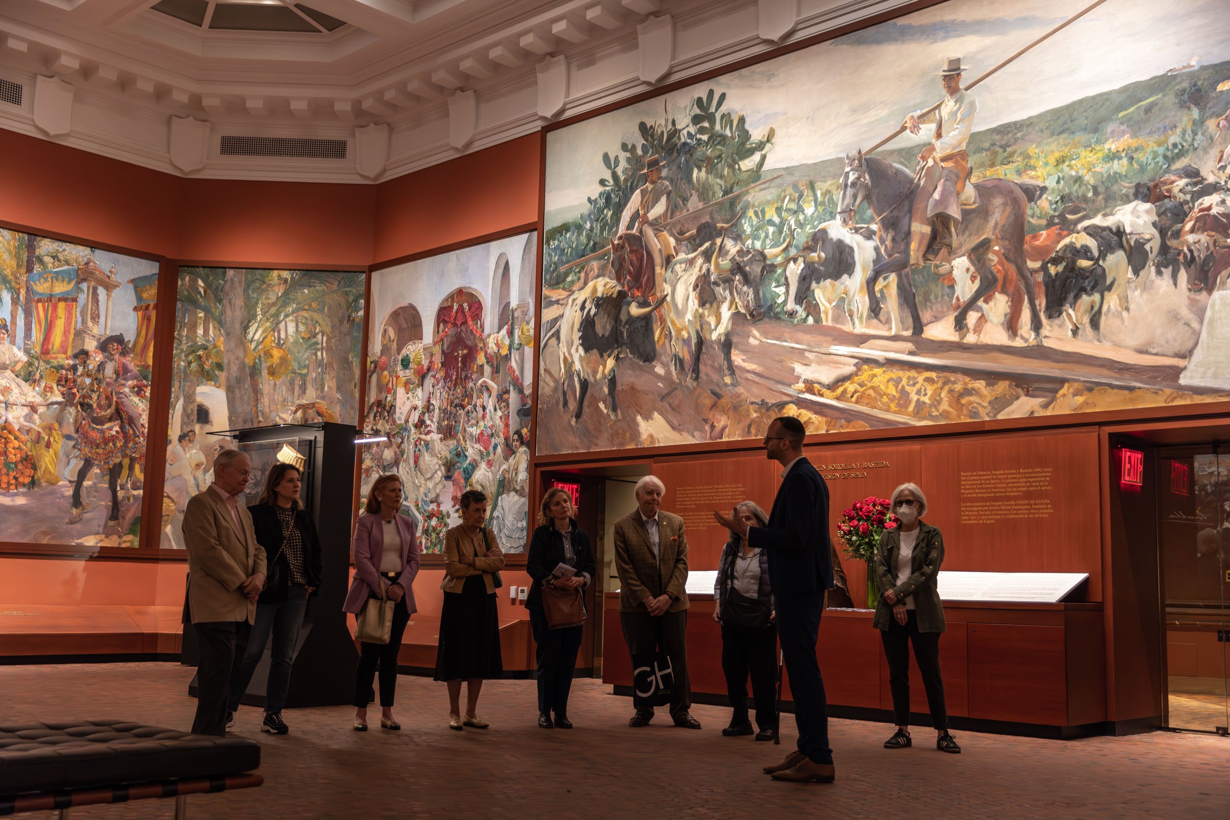
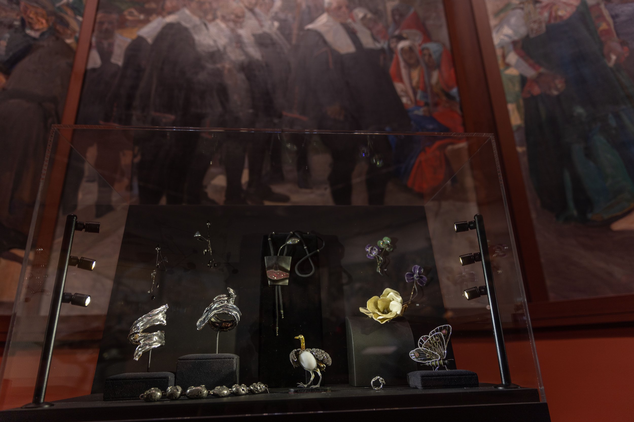
Installation view of “Jewels in a Gem: Luz Camino and Jewelry” with Sorolla’s Visions of Spain (1913–19) above. Photo: Alfonso Lozano.

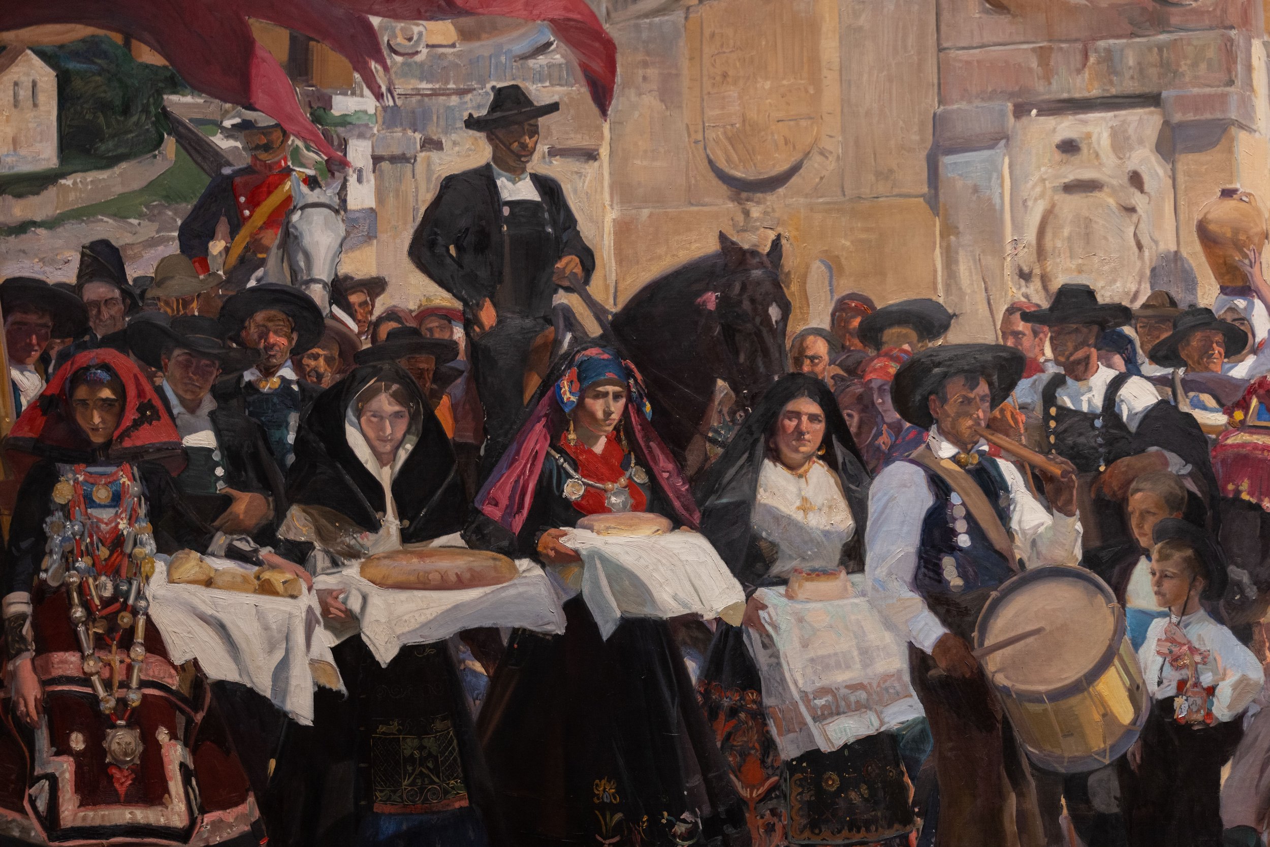
In 1908 Huntington opened his collection to the public in a Beaux-Arts building on Audubon Terrace, so named for being at one time part of John James Audubon’s estate. The building was nearly contemporaneous with Isabella Stewart Gardner’s Venetian vision in Boston’s Back Bay and equally novel, though less flamboyant. As the capstone to the collection, in 1911 Huntington commissioned Joaquín Sorolla to paint a mural of multiple “panneaux” of various Spanish regions, which he installed in its own purpose-built octagon-shaped wing. This impressionistic cyclorama of traditional Spanish culture was called, appropriately, Vision of Spain (1913–19), reflecting Huntington’s own dreamy vision for his new institution.

After Huntington’s death in 1955, there were times when it seemed the lid to his jewel box was bolted shut. When it wasn’t being shouted down as “racista”—as happened to one of its directors in the 1990s while he was chased across Audubon Terrace—the Hispanic Society put little of its energies into its own forward-facing persona. Part of this was an extension of Huntington’s own self-effacing style. “To place one’s name on a donation be it a building or subscription is an artificial and flimsy door to fame,” he once said. “The human race is full of creators, but it is their acts . . . which are interesting.”

Instead, the society continued to focus on scholarship and filling out its permanent collection of books, art, artifacts, and sculpture, in particular from the Spanish New World and Spain’s onetime Pacific colonies. Today the collection has grown to include four-thousand-year-old ceramics from the Bell Beaker culture of the Tagus river estuary, Roman statuary from Seville, Islamic pottery and Alhambra silk, Hebrew manuscripts, a map by Giovanni Vespucci, and Renaissance and Baroque ironwork on up through the Symbolist paintings of Hermenegildo Anglada Camarasa. Last year, as its main building remained shuttered, two temporary exhibitions revealed the great depth of this collection: “Gilded Figures: Wood and Clay Made Flesh,” an exhibition curated by Patrick Lenaghan with his Hispanic Society colleague Hélène Fontoira Marzin, on the history of Spanish polychrome sculpture; and a display at the Grolier Club of highlights from the society’s library, organized by the society’s former director Mitchell A. Codding and the curator John O’Neill. (See “Visions of Spain” in The New Criterion of January 2022.)

Joaquin Sorolla, Detail from Visions of Spain, 1913–19, Oil on canvas, Hispanic Society Museum, New York. Photo: Alfonso Lozano.

By some stroke of historical luck, the venerable but heavy hinges of the Hispanic Society were never forced open against the will of its founder. One could easily imagine the society’s takeover by a larger institution, the breaking of its indenture of trust along the lines of the Barnes Foundation, or, at the very least, a relocation downtown. Many such options were considered at various times in its existence, which in part may account for the deferred maintenance on its Audubon Terrace infrastructure.

Under the leadership of Philippe de Montebello, who was elected chairman of the society’s board in 2015, the institution has instead decided to double down on its Audubon campus. This has first meant upgrading the building’s aging envelope, designed by Charles Pratt Huntington, and bringing its systems, in particular its climate control, up to modern standards. The museum has also developed a strategic plan with Selldorf Architects to renovate the campus with the executive architects Beyer Blinder Belle and the landscape architects Reed Hilderbrand. An adjoining building to the east, originally the headquarters of the Museum of the American Indian, is being incorporated into the Hispanic Society campus, allowing for ada access to the Main Court galleries while introducing a new conservation studio, a wheelchair entrance, and spaces for special exhibitions and education. This longer phase of the project is still tens of millions of dollars and several years away.

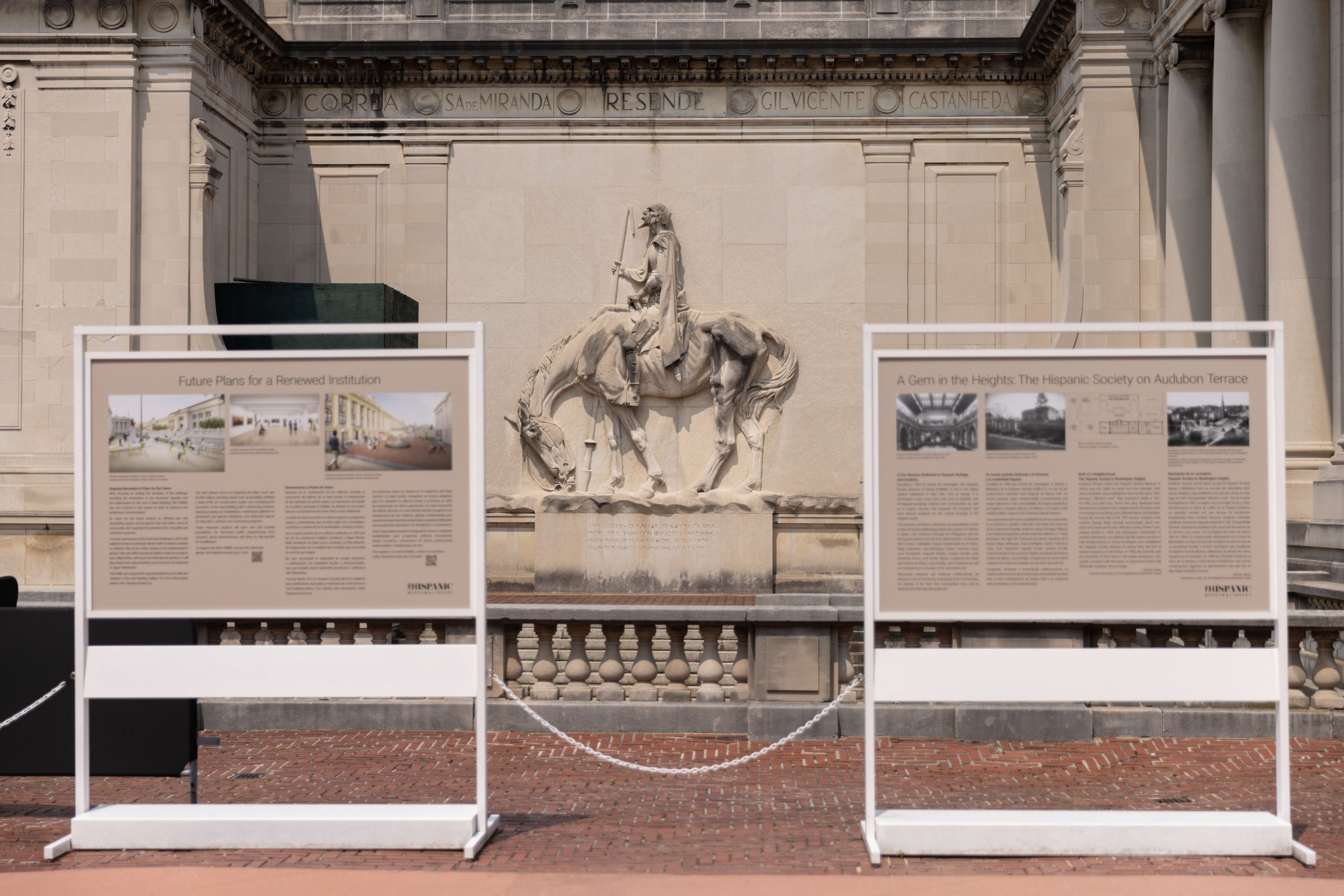
View from Audubon Terrace. Photo: Alfonso Lozano.

Fortunately, even with the introduction of a new entrance in the east building, the society says the door of the Main Court will remain unlocked. Since the society is, and has always been, a free institution, Audubon Terrace is well suited to be an open campus with outdoor seating and concessions—and access to its other remaining cultural institution, the American Academy of Arts and Letters, just up the courtyard. “If you are a regular, and you have a ten-minute lunch break,” says Guillaume Kientz, the society’s new director, “and you want to see the Duchess of Alba, you can do that.” The terrace’s program of Spanish-themed statuary—depictions of Don Quixote and El Cid created by Huntington’s remarkable wife, Anna Hyatt Huntington—is also an integral part of the society’s cultural program and best observed from the Main Court landing.

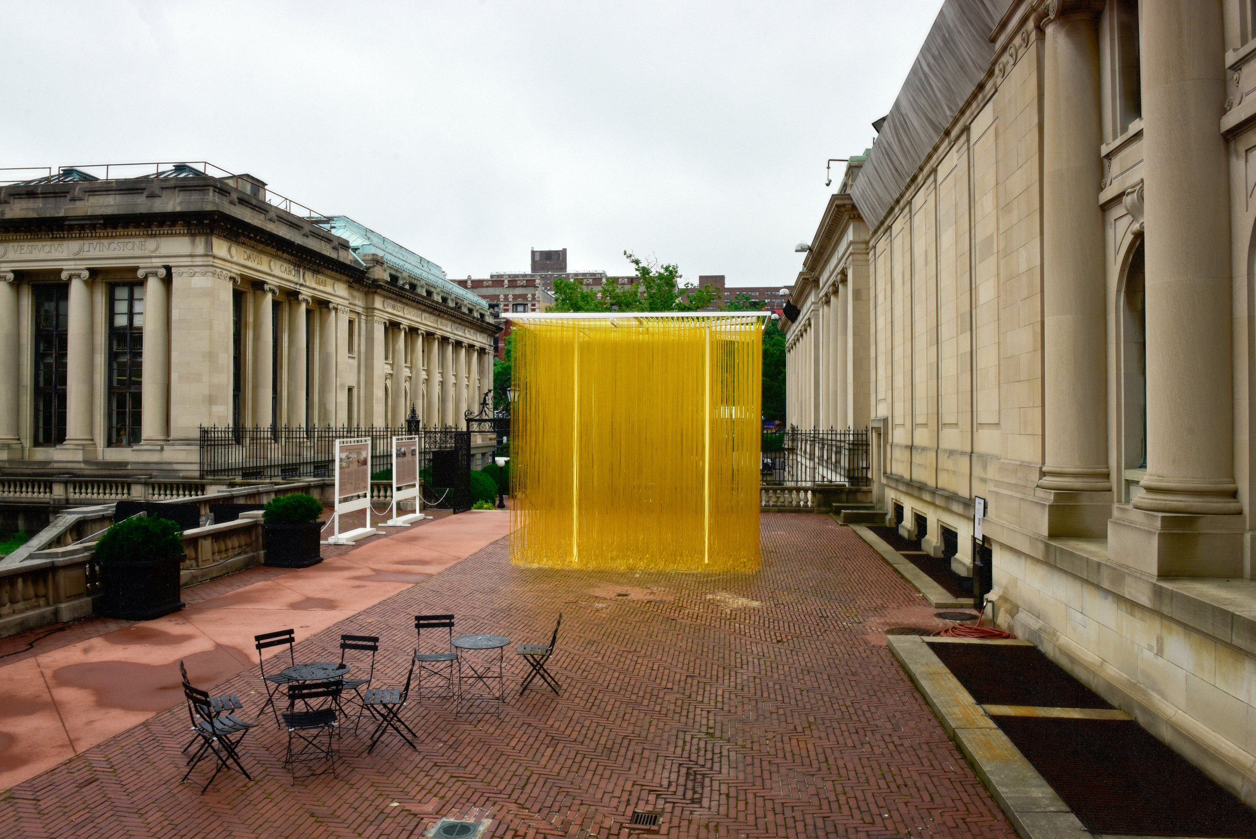
This past summer, the Hispanic Society reopened its Main Court after its six-year restoration, the first phase of the renovation project. While the treasures of its collection are still on tour through the summer, the museum dedicated its main gallery to the centennials of two artists: Sorolla (1863–1923) and the Venezuelan sculptor Jesús Rafael Soto (1923–2005), born in the year of Sorolla’s death.1 Through the fall, visitors to the terrace will continue to encounter Soto’s Penetrable (1990), a large cube of steel, aluminum, and plastic hoses on long-term loan from the Colección Patricia Phelps de Cisneros—a work that trades Soto’s usual optical delicacy for crowd-pleasing interactivity. While Sorolla’s portraits of Spanish life and the genre scenes of his Vision of Spain have little to do with Soto’s kinetic abstractions, the assembly spoke to the breadth of the society’s mandate while also allowing us to open the lid, after a painfully long wait, of the institution.

Jesús Rafael Soto, Penetrable, 1990, Steel, aluminum & plastic hoses, Colección Patricia Phelps de Cisneros. Photo: Courtesy of the Hispanic Society Museum.

Yet those of us expecting a full return to form will have to sit tight. What are described as essential repairs to the roof have now covered over the skylights in the Main Court and Sorolla galleries. The darkened result, interspersed with retina-burning spotlights, is heartbreaking for those of us who recall these formerly dreamy spaces. This is especially true when trying to appreciate the Main Court’s intricate terracotta walls and its imagined sense of a sunlit medieval cloister. While the society maintains that plans are in place to install artificial laylight behind the skylight glass, the remediation could not come soon enough. A public-spirited philanthropist could do worse than to underwrite the improvement of gallery lighting. As the Old Masters were almost all painted under natural light, their happy viewing calls out for equivalent illumination.

Installation view of “1923–2023 Sorolla / Soto Centennials.” Photo: Alfonso Lozano.

The inclusion of modern and contemporary work also suggests something of a change in the priorities of the institution. While it is true that Huntington for a time embraced the contemporary Spanish art of his day—collecting Sorolla, Ramon Casas, Joaquin Mir Trinxet, Santiago Rusiñol, and Ignacio Zuloaga—he came to distance his Hispanic Society from the art of his own time. “Modern art is not our intention to show in exhibitions,” he declared. “That is a dealer’s affair and not, in my opinion, one for museums.”

Starting September 15, the treasures of the society’s collection are finally returning to its walls, but the installation will no longer be a fixed display of highlights as we experienced in the past. Certainly, with a collection of three-quarters of a million objects, there is a lot to show here. Some shuffling around would be welcome and refreshing. Yet as with most every other museum—including the venerable Frick Collection—today there seems to be an urge to put historic collections in “dialogue” with contemporary art. These interventions are often forced and merely there to serve some political or commercial end—a “dealer’s affair,” in Huntington’s choice words.

Installation view of “Jewels in a Gem: Luz Camino and Jewelry.” Photo: Alfonso Lozano.

The society’s summer display of contemporary jewelry by Luz Camino was one such letdown.2 Filled with loans from a Who’s Who of rich collectors, the exhibition was no doubt designed to stimulate the philanthropic glands of the society’s major donors. Even worse, the exhibition’s gaudy displays were all positioned directly in front of the panels of Sorolla’s Vision of Spain. The cases obscured their view and fully blocked their labels. Despite its wide embrace of Spain and Spanish culture, the Hispanic Society shouldn’t need to include Las Vegas in its purview.

Acentury ago, Archer Huntington set out not to record the Spanish world of the present but to preserve a vision of its past, one that was already fast disappearing. His interest may have been based on a Romantic fiction, but there was a time when we could embrace the power of fiction to triumph over everyday fact. “We can only be grateful to the boy who discovered Spain in a Liverpool bookshop,” says the Hispanic Society curator Patrick Lenaghan, “and, thus inspired, created this extraordinary museum and library.” Even today, we should be able to dream the impossible dream that is the Hispanic Society of America.

  1.   “1923–2023 Sorolla / Soto Centennials” was on view at the Hispanic Society of America, New York, from May 25 through July 15, 2023.

  2.   “Jewels in a Gem: Luz Camino at the Hispanic Society Museum” opened at the Hispanic Society of America, New York, on May 25 and remains on view through September 3, 2023.

Comment

The Inside-Out Diorama

Comment

The Inside-Out Diorama

THE NEW CRITERION, June 2023

The inside-out diorama

On the new Richard Gilder Center at the American Museum of Natural History.

Anyone who has walked through the American Museum of Natural History might have sensed something was wrong. Just go through its Hall of Gems and Minerals, or its Hall of South American Peoples, or its Hall of Pacific Peoples. At the end of each of these long rooms, which were only reached through other long rooms, you found nothing less than a dead end. In a way, the reason was by design: the master plan of this museum, founded in 1869 and first envisioned by Calvert Vaux and Jacob Wrey Mould in 1872, has never been fully realized. Much like the Metropolitan Museum of Art, the Brooklyn Museum, and other grand nineteenth-century American edifices, New York’s natural-history museum was laid out on a massive cross-in-square plan, which has only been partially built out over time.

Beyond merely the dead ends, what this means is that, over a century and a half after its founding, the street-facing façades and infill architecture of this museum have been created in a progression of styles that have reflected, for better and worse, the ideals of their times. The museum began on the southern side of its four-block quadrangle bordering Central Park, carved out of the street grid of the then-undeveloped Upper West Side. From 1874 to 1877, Vaux and Mould extended their pastoral vision from Central Park to break ground on the museum’s first wing in the Gothic Revival style; from then until now, this building, which was soon surrounded by future construction, has housed the museum’s Northwest Coast Hall.

An aerial view of the American Museum of Natural History’s campus. Photo: Iwan Baan.

The plan to extend this Gothic language across the four seven-hundred-and-forty-foot sides of the envisioned museum was quickly eclipsed by changing architectural taste. In 1897, a new plan emerged to complete the museum in a Romanesque Revival style. The Seventy-seventh Street façade, designed by Cady, Berg & See and constructed between 1890 and 1900, and the southwest wing, designed by Charles Volz and built between 1906 and 1908, gave the museum its fanciful red turrets and first distinctive appearance.

The need for natural light and air at one time called for four internal open courtyards located within the circulating wings, all radiating out from a domed central tower. In the twentieth century, with advances in artificial light and ventilation, these open spaces began to be modified and built in. Rather than a dome, the central building became the museum’s lecture hall, designed by Cady, Berg & See in 1900. Wings for ocean life and education filled in the southwest and southeast courtyards in 1924 and 1928. A power and service building of 1930–35 infilled the northwest courtyard. Meanwhile the art-deco Hayden Planetarium, designed by Trowbridge & Livingston, was constructed in the northeast courtyard in 1934–35. At the same time, between 1931 and 1936, the museum’s eastern façade fronting Central Park West received John Russell Pope’s Roman Revival grand vision for the Theodore Roosevelt Memorial Rotunda, complete with a triumphal arch, coffered vaulted interiors, and an equestrian statue of our twenty-sixth president mounted at the center of a monumental entry plaza. Then, over half a century later, a year-2000 addition by Polshek Partnership, which replaced the Hayden with the Rose Center for Earth & Space, stayed within this original master plan while again departing in style, this time resulting in a celestial sphere (housing the new planetarium theater) suspended in an illuminated glass cube.

Despite over a century and a half, and the construction of some twenty-five buildings, the museum has still only filled out about two-thirds of its original master-plan footprint. This incompleteness has been most felt on its western side facing Columbus Avenue, where existing wings have ended abruptly, resulting in many of those back-tracking dead ends. A central building that connects these wings, on all four of the museum’s floors, has long been overdue.

The Columbus Avenue entrance to the Richard Gilder Center for Science, Education, and Innovation. Photo: Alvaro Keding / © AMNH.

The Richard Gilder Center for Science, Education, and Innovation, over a decade in the making and opened to the public on May 4, set out to do just that. (For more, see “Old museums, new tricks” in The New Criterion of February 2017.) Filling in a void along the museum’s western edge, the 230,000-square-foot wing creates some thirty new access points to the museum’s twenty-building complex. It also generally continues the massing of the original master plan while extending the museum’s central axis west from the Roosevelt Rotunda, resulting in a new façade that now lines up with Seventy-ninth Street.

Funded by one of New York’s great latter-day philanthropists, the Gilder Center is named for the late Republican financier who once teamed up with none other than George Soros to found the Central Park Conservancy. Among the other New York–based beneficiaries of Richard Gilder’s largesse before his death in 2020 were the Gilder Lehrman Institute of American History, the Manhattan Institute for Policy Research, and the magazine you are now reading.

Early on the Gilder Center was designated to expand the museum’s educational mission, with additional classroom space as well as room to display more of the museum’s permanent collection of objects and scientific specimens, of which only 2–3 percent might ever be on view at any given time. Rising over three stories, these new displays, called the Louis V. Gerstner Jr. Collections Core and the Macaulay Family Foundation Collections Gallery, are among the Gilder Center’s most beneficial new additions. Behind the vitrines we can see the new rolling-stack storage shelves where some 12 percent of the museum’s collection, or four million specimens, has been, or is being, relocated. These displays, by Ralph Appelbaum Associates, reveal the breadth and depth of the museum’s holdings while also, for the first time, giving us a window onto its activities as a working scientific institution.

The development of open storage has been an undersung initiative of recent museum practice, one that in fact revives the object-based focus of the Renaissance Wunderkammer, the precursor of our nineteenth-century museums. At the Gilder Center, touch screens and detailed labels tell us much about these slices of the museum’s varied collection. In one area are displays of antique lantern slides, eastern box turtles, giant extinct mammals, wasp nests and galls, cleared and stained fish, New York rocks, Gaia astronomical data, Korean pottery, Maasai beadwork, and even a selection of Vladimir Nabokov’s butterflies. Another floor contains handmade African toys, bats, insects and spiders, parrots, astronomical instruments, amphibians, field documentation, a hadrosaur footprint, crinoid fossils, and the bones of a giant grouper. Still another houses Pueblo pottery, Maya bricks, Camarasaurus vertebrae, animal horns, drill core samples, trilobite fossils, sea-snail shells, megalodon teeth, ammonite fossils, and a captivating display of corals and echinoderms. Nearby, yet another new storage room and study center, visible through a window, now contains a sizeable percentage of the museum’s 3.1 million specimens of moths and butterflies. The one discordant note in all this is “Housewares of the Mao Era,” a display of Communist agitprop that describes the Cultural Revolution as merely a “sweeping campaign to reshape and reeducate Chinese society.” By sweeping away the death of some thirty million Chinese, the museum might satisfy ccp censors, but the appalling omission should not escape our notice.

The David S. and Ruth L. Gottesman Research Library and Learning Center at the Richard Gilder Center. Photo: Alvaro Keding / © AMNH.

A new library and reading room on the top floor, called the David S. and Ruth L. Gottesman Research Library and Learning Center, continues the spirit of open storage with walls of books and artifacts. The library is another achievement of the Gilder wing, bringing the museum’s extensive bibliographic collection out from a hidden location off of the dinosaur hall into wider and more welcoming public view. A wall of floor-to-ceiling shelves called the “Great Range” contains models of a polar bear from 1912, of a Camarasaurus from circa 1919, and of HMS Beagle from circa 2005. Also here is a crate from the museum’s Congo expedition (ca. 1909–15), a museum flag from its land exhibition of 1941, and a lunar tire prototype from 2011. Nearby, for the first time, the library has an alcove to exhibit a selection of its rare books, objects, and manuscripts, such as a 1705 edition of Maria Sibylla Merian’s Metamorphosis Insectorum Surinamensium.

One of the wing’s new permanent exhibits is the five-thousand-square-foot Susan and Peter J. Solomon Family Insectarium. The ground-floor display makes the best case for our buggy acquaintances, whether they be vectors for our diseases—by a wide margin, the mosquito has been the most lethal animal to human life—or the essential pollinators of our food supply. Here the focus is an elaborate terrarium of live leaf-cutter ants walking across ropes and bridges with their snipped loads. A floor up, the Davis Family Butterfly Vivarium relocates the museum’s live butterfly room from its digs in the Whitney Memorial Hall, with historical dioramas Pacific bird life that will now hopefully be restored and reopened, to a more permanent home.

Life’s interconnectedness is a recurring theme of the Gilder Center. A twelve-minute immersive video called “Invisible Worlds,” designed by Tamschick Media+Space with Boris Micka Associates, is a remarkable feat of interactive projection. Still, I am not sure how much insight can genuinely be gleaned from its ambient soundtrack and ASMR narration—“humans have created digital networks to extend the reach of our ideas. How many texts have you sent today?” asks a breathy female narrator. More thought-provoking are the touch-screen quizzes in the film’s entry hall, asking whether we are more closely related to mold or moss (the answer is mold, by a difference of some five hundred million years) or sea sponges or starfish (starfish, by two hundred million years).

The Invisible Worlds Immersive Experience at the Richard Gilder Center. Photo: Iwan Baan.

The Gilder Center has tucked its many exhibits and displays around a five-story entry atrium designed by Jeanne Gang that is presented as the showpiece of the project. On the building’s exterior, blocks of Milford pink granite—the very same stone used on Pope’s Roosevelt Rotunda—have been cut by computer into sedimentary wave-like patterns. On the interior, shotcrete, a spray-on concrete used primarily for tunnel construction, has been slathered and scraped onto rebar molds to form the walls and ceilings. The architect has described the forms of this space as being inspired by slot caverns, riverbank canyons, melting blocks of ice, and prehistoric cave dwellings. Its construction is presented as ecologically sensitive in every conceivable way; talk of climate change is never far from the sales pitch. The result is a cross between Antoni Gaudí and Fred Flintstone. This is not to suggest the forms are not arresting. The atrium leads onto a grand staircase by way of Castle Grayskull. Pseudo land-bridges connect the upper floors. The shotcrete surfaces, left scraped and raw, have the look of tufted wool from afar and the feel of coarse-grit sandpaper up close. The walls can catch the raking sunlight in a satisfying sculptural way. In contrast, any knee or hand that catches its sharp and crumbly surface will feel most unsatisfied. I can only imagine how this rough aggregate will age once the first cup of coffee spills down its side and gum sticks to its surface. I fear starchitects, especially those bearing eco-pablum.

The staircase in the Kenneth C. Griffin Exploration Atrium of the Richard Gilder Center. Photo: Iwan Baan.

For all of its nature-like forms, this shotcrete architecture is also the most artificial aspect of the new facility. The American Museum of Natural History is known for its historical dioramas. One way to see this design is as a diorama turned inside out, one where we are the specimens on view. It is interesting to note that shotcrete was invented by no less than the naturalist Carl Akeley, the pioneer of the museum’s historical dioramas.

But now the diorama frame is gone. So too is all of the historicized architecture, washed away in the same progressive deluge that recently toppled the Roosevelt statue from the museum’s front stairs. What results is a museum wiped down to the bone. Here is a post-apocalyptic vision where we are no longer the civilized masters of the universe but cave dwellers once again. In our self-obsessed age, perhaps it is appropriate finally to be the subject of this museum’s latest and largest diorama. Just what the five-story display says about the future of humanity is a label yet to be written. If I had my way, to borrow a line popularized by William F. Buckley Jr., I might simply suggest, Don’t immanentize the eschaton. The anthropocene will never kill us, but scientism just might.

Comment