Viewing entries in
Travel

Norman's Conquest

Comment

Norman's Conquest

THE NEW CRITERION, March 2019

Norman’s Conquest

On the expansion of the Norton Museum of Art in West Palm Beach.

You might have expected the $100 million expansion of the Norton Museum of Art, in West Palm Beach, Florida, to go wrong. Just consider the backstory: An ambitious director (Hope Alswang) and an embarrassed trustee (Gil Maurer) come together to lament the state of their outmoded institution. They wonder aloud how their tired facility (a 1941 Art Deco pile encumbered with additions, now resembling a bankrupt shopping mall) could be “expanded and transformed in a dramatic way.” The trustee says to the director: If you could ask any architect to do this expanding and transforming, who would it be? The director gives the name of a starchitect at the center of the celestial firmament (Lord Norman Foster). The trustee responds: That starchitect happens to work in my building (they are meeting on the forty-third floor of New York’s Hearst Tower; Maurer is then the coo of the Hearst Corporation; Foster designed that building in 2006; and Foster + Partners maintains a New York office there). The trustee calls up the firm. An architect (Michael Wurzel, a partner at Foster + Partners) comes down. They begin to “muse about the possibilities.”

A story of museum musings that began on a winter day in New York in 2010 reached its conclusion on a winter day in Florida in 2019, when the Norton Museum of Art reopened to the public. You might have expected it to go wrong—and yet this expansion has gone surprisingly right. How it went right is a triumph for South Florida. It should serve as a lesson for museum planners everywhere. If today’s museums must grow, grow they must. The Norton checks all the boxes of a museum’s new-car mandates (new restaurant, new lounge, new shiny surfaces), yet it stays remarkably sensitive to art and to the history of the institution that has held the art in trust.

On approaching the Norton’s new entrance from the South Dixie Highway, as most everyone in car-centric West Palm now must do, the first growth you notice is not the museum but a tree. This is not just any tree. It is the tree. Known as “the banyan,” but in fact a ficus altissima, the six-story-tall tree is the focal point of the new west-wing façade. Photographs do not do justice to its outsize presence. Foster calls the tree his “protagonist.” Indeed, it drives much of the plot of the new design. Forty-three feet up, elevated on cloud-white blocks, an aluminum canopy extends forty-five feet over a new entrance plaza. The canopy is a sharp horizontal, made of reflective panels like an airplane wing. From afar, the form seems to cut across the middle of the sixty-five foot tree, a slashing antagonist in an architectural drama. Yet the protagonist wins out. The canopy pulls back at just the right places so that the hundred-twenty-foot-wide tree can continue to grow and spread above the new roofline.

Up close, outside the new museum entrance, the sculptural qualities of this massive tree are striking. The banyan is its own work of art, a dizzying abstraction above, a gothic mystery below, with multiple trunks that have grown out of the many “prop roots” sent down over decades by its own bending limbs. And rather than compete with the tree, up close the aluminum roofline works with it to extend the shade of the natural canopy, adding welcome relief from the Florida sun.

The banyan tree along the South Dixie Highway entrance to the Norton Museum of Art. Photo: Nigel Young.

The banyan tree along the South Dixie Highway entrance to the Norton Museum of Art. Photo: Nigel Young.

The symbolism of this thriving tree is well appreciated by Foster. His architectural deference to its living history reveals something about his own approach to imposing new designs on living institutions—as he did successfully with Hearst Tower, which rises out of a 1928 base, and most famously with his additions to the Reichstag and the Great Court of the British Museum, completed in 1999 and 2000.

“The protagonist of the project was planted just before Ralph and Elizabeth Norton planted their seed,” he said at the museum reopening. The flourishing tree represents a flourishing institution in its increasing complexities. Rather than cut it down, the new design frames its growth for us to see. It protects rather than rejects history. It allows an organism to thrive through deep roots and existing branches. The challenge now of caring for the banyan reflects the challenge of caring for the museum. Since the tree’s failure would cause Foster’s design to fail, they are both closely interconnected. This is a fact not lost on the museum’s attentive arborists.

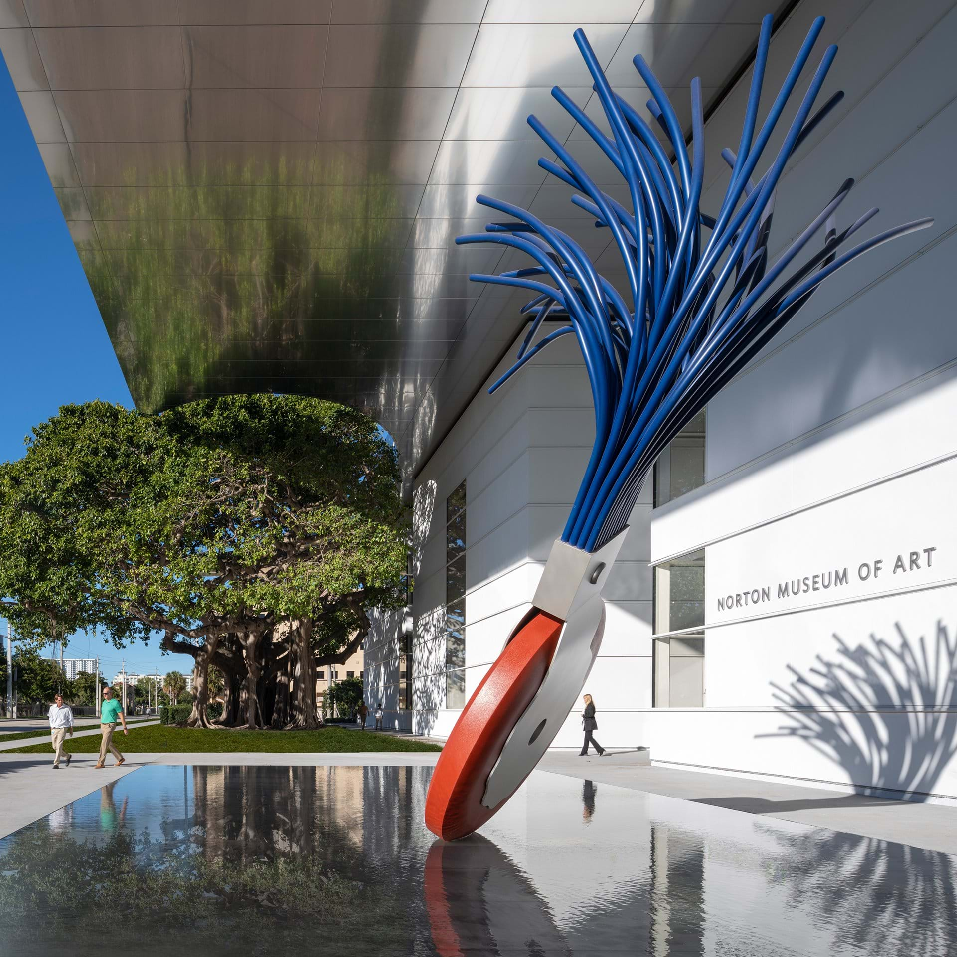
The plaza cleverly features another large sculptural form: Typewriter Eraser, Scale X(1999), by Claes Oldenburg and Coosje van Bruggen. This 2017 donation to the museum by one of its trustees, Ronnie Heyman, was sought out by Foster, and with good reason. With its upturned brush resembling the branches of a tree, the Oldenburg serves as a symbolic pendant to the banyan. While allowing for growth, Foster has had to do some judicious editing of the Norton’s existing structures. The Eraser happens to touch down next to a part of the building that had been one of those loquacious later additions. Edited down, while still providing upstairs gallery space, this wing now fits into Foster’s concise five-paragraph essay of architectural form.

Typewriter Eraser, Scale X(1999) by Claes Oldenburg and Coosje van Bruggen (foreground) and the banyan tree in front of the Norton Museum of Art. Photo: Nigel Young.

Typewriter Eraser, Scale X(1999) by Claes Oldenburg and Coosje van Bruggen (foreground) and the banyan tree in front of the Norton Museum of Art. Photo: Nigel Young.

A convincing seamlessness of old and new, living and man-made, has been achieved through an uncanny awareness of existing ties and a balance of existing structures. “It started with two people, Ralph and Elizabeth Norton, in 1941,” Foster said of the museum. All such projects should begin with an appreciation of an institution’s founders. Too few do. Here such respect for the couple who bequeathed their collection to the public trust, with its particular strengths in American and European modern painting and drawing, as well as Chinese art, ultimately informs the overall design.

Re-established as the center of the institution is the Norton’s original 1941 museum building, which, like the banyan, determines the shape and placement of the new entrance. Designed by Marion Sims Wyeth as an Art Deco pavilion surrounding a central courtyard, the building’s original symmetry and sight lines have been restored by cutting back the infelicitous additions from 1997 and 2003.

As Foster creates his new façade facing the banyan tree to the west, he preserves the original front façade to the east. He also restores the ground floor’s east–west axis after it was disrupted by the earlier expansions that turned the museum entrance to the south. Now someone standing outside the new building can see all the way through to the old front door and on to the shimmering Intracoastal Waterway beyond.

I only wish the acoustics of this new entry plaza were as appealing as its form. On the day I visited, the noise of the South Dixie Highway, combined with the screech of a nearby rail line, was deafening. It might be said that every contemporary building “learned from Las Vegas.” A structure must now not only shelter the individual on foot, but also flag down the passing motorist on the road—functions that are often in conflict. But what happens in Vegas should stay in Vegas. While Foster’s aluminum canopy protects the entrance from the sun, it also acts like a bandshell to concentrate street noise on the exposed plaza. While it might take away from the museum’s billboard qualities, additional screening between the highway and museum is in order.

Perhaps already understanding the need of an added buffer between outside and in, Foster brings the visitor into the new wing slightly off axis. A quick turn to the left after the ticket booth then brings you into a new Great Hall (as it is called) and back into alignment with the original museum. Every great building needs a “great hall”—a place to decompress from the outside and adjust to the expectations within. The Norton has dubbed this space its “living room.” In its tasteful modernist furniture and bleached tones, it might just double as a Knoll showroom. It is indeed a pleasant enough room to linger, if not to live in.

The Norton Museum of Art’s Great Hall. Photo: Foster + Partners.

The Norton Museum of Art’s Great Hall. Photo: Foster + Partners.

At the same time, with its maximum square footage designed for maximum flexibility, the hall lacks intimacy. All that tasteful furniture is easily moveable so that this Great Hall can serve as a flex space for great donor cultivation. A white box with gray accents (someone said that Foster designs in “fifty shades of gray”), the Great Hall is also topped with an oculus that looks squinty. Round skylights call for round rooms, not rectilinear ones. I wish Foster had rolled the dice and gambled on an interior that was more daring than another white cube—one that might also reflect the octagonal shape of the original eastern entrance.

At least by adding this large new space, and fulfilling the museum’s new-car mandate, Foster could then restore and renew the many smaller adjoining galleries from the 1941 building. Of the museum’s 130,000 square feet, it is interesting to note that only about 10,000 of that are truly new. The preservation of older spaces allows for substantial “recycling,” as Foster says. The original 1941 hardwood floor, for example, has been brought back to life after being covered in decades of carpeting. The Art Deco entry also looks wonderfully preserved—although I wish outdoor access to the east were also restored so we could easily see the Norton’s two outdoor commissions by Paul Manship, which flank the original front door.

The preservation of historical space preserves “the memory of time,” Foster says. This is also how a museum overhauled by a world-famous architect can still come in at $100 million, while the price tag for a new wing at the Metropolitan Museum is slated to cost upwards of $600 million. The best spaces here are the ones that have been brought back to life from the original building, where gallery proportions and arrangements were designed to best complement the art on view. I was very glad to see highlights of the Nortons’ bequests of European art arrayed front and center in one of these galleries. Here Monet’s Gardens of the Villa Moreno, Bordighera (1884) and De Chirico’s Sailors’ Barracks (1914) are presented with works by Klee, Soutine, Picasso, Braque, and Brancusi—all donated by the Nortons—and supplemented with bequests by later donors. Other galleries display the Nortons’ gifts of paintings and drawings by the Ashcan painters and first-generation American modernists such as John Marin and Maurice Prendergast, along with Stuart Davis’s 1932 painting New York Mural, purchased through an acquisition fund established by Ralph Norton.

Taken together with the museum’s significant holdings in photography and Chinese art, you start to see that the Norton is not just a museum of art but a museum of significant art with an important core collection. Foster’s elegant and symbolic renovation brings that fact to the fore by allowing the museum to defer to this great art history.

There are already some signs, unfortunately, that the new museum may try to upstage its impressive historical collection with contemporary work. An ability to attract new donors and bigger crowds is the constant seduction of the contemporary Kunsthalle. The Norton could do better than its dopey wall-decal commissions by Pae White and Rob Wynne, for example, or Instagram-optimized art such as the promised gift of Sam Durant’s End White Supremacy (2008), which is better suited for woke selfies at Art Basel Miami Beach.

When everyone else wants art to shout, the Norton should seek art that sings in concert with its core collection and its harmonious building. As the Norton’s director Hope Alswang, who is retiring this month, rightly says of Foster + Partners: “They were not building a piece of sculpture. They were not building a monument. They were building a great art museum.”

It is indeed a great art museum, if you can keep it..

Comment

Death in Venice, alive in New York

Comment

Death in Venice, alive in New York

SPECTATOR, October 30, 2018

Death in Venice, alive in New York

Tintoretto looked not up to heaven, but down to the fallen angels of our modern age

Il disegno di Michelangelo e il colorito di Tiziano: The drawing of Michelangelo and the colour of Titian.

With these words, supposedly written on his studio wall, Jacopo Tintoretto staked his claim on cinquecento painting. We are lucky he failed on both counts. Tintoretto was no Michelangelo or Titian, but he could push paint like no one else in La Serenissima. Renaissance means ‘rebirth’, of course. Yet the paintings of Tintoretto can come as deadly shock. His ‘Crucifixion’ of 1565 in Venice’s Scuola Grande di San Rocco strikes like a thunderbolt. The painting is also the single best work of religious art in the Italian Renaissance. With Christ fixed to the cross front and centre, the action of this composition swirls around him like a dark cyclone. Everyone — carpenters, soldiers, a dog — makes up ‘a centrifugal energy that charges the entire picture’, as the late art historian David Rosand wrote. As onlookers gazing up as Christ stares down, we too are swept up in the storm.

With expressive, brooding, and in-your-face energy, Tintoretto never sought the safety of the neo-Platonic shore. In his draftsmanship, he did not trace out the idealised forms of Michelangelo. In his choice of colour, murky at best, he did not seek the fuzzy warmth of Giorgione. Yet with speed and drive, Tintoretto swept through the 16th-century scene by looking, not up to heaven, but down to the fallen angels of our modern age. He went low when Titian and Veronese went high.

As we mark the 500th anniversary of his birth with exhibitions stretching from the Doge’s Palace in Venice to the house of Morgan in New York City, the wild child of the Venetian Renaissance is receiving his due. In New YorkDrawing in Tintoretto’s Venice at the Morgan Library & Museum explores the draftsmanship of this son of a dyer — tintore — in comparison to works by Titian, Veronese, Bassano, and others. Meanwhile at the Metropolitan Museum, Celebrating Tintoretto: Portrait Paintings and Studio Drawings, a focused exhibition in the Robert Lehman Wing, looks to the painter’s quick-fire portrait studies.

Sacco di Noce — ‘bag of nuts’. That’s how Tintoretto’s figuration came to be known, in particular for the dashed-off studies on paper of his later career. What sounds like an insult, in fact, signals an expressive brilliance. Lacking time and inclination, Tintoretto refused to labour over sculptural shading. At the Morgan Library, the torso of his ‘Seated Male Nude’ (c. 1549), on loan from the Louvre and reproduced on the cover of the exhibition catalogue, looks like it ingested some bad shellfish. His ‘Seated Man with Raised Hand’ (c. 1577–78), from nearly two decades later, resembles nothing less than an aquaman pulled from the rippling Grand Canal. The wavy lines of these drawings do not have a sculptural meaning. But they have an expressive feeling — queasy, awkward, very human, very off.

By focusing on works on paper, with seventy drawings by Tintoretto and his circle now on view, the Morgan show makes the case for a ‘drawing school of Venice’. That’s the title of the first chapter of the catalogue, but it ends with a question mark. Ever since their disparagement in Giorgio Vasari’s Lives of the Artists, the idiosyncratic drawings of Venice have been considered a poor imitation of the Florentine school. An opening example here by Titian, ‘Embracing Couple’ (c. 1568-70), should not give Michelangelo or Leonardo cause of concern over the grading average of the drawing school curve. A tangle of marks, with bodily forms barely discernible, Titian’s drawing appears entirely preliminary, a primo pensiero. But more than that, it seems built up and worked over, as if you were applying layers of paint to canvas rather than lines of charcoal to paper. In other words, here is the richest of painters with the poorest sense for basic draftsmanship.

The exhibition follows through with examples by Andrea Schiavone — the ‘Slav’ — who avoided the whole disegno-colorito feud by finding some fusion of the two. His ‘Apostle (St Matthew)’ (c. 1550), and ‘Virgin Annunciate’ (c. 1550-60) of ink, chalk, watercolour, and wash are drawn paintings — or maybe that should be painted drawings. The Venetian Jacopo Bassano went with a similar approach, using coloured chalk to give some heft to his sketchy figures. Meanwhile, practice makes perfect, and Paolo Veronese, ever the dutiful student, drew study after study in pen and brown ink. In ‘SS. Leonard, Mark, and Francis’ (c. 1549-51), he arrived at his own Venetian sense for sharpened form with highlights of white gouache.

Yes, there was a drawing school of Venice. Tintoretto started his own. At the Morgan, there are several examples of the students in his workshop drawing studies of Grimani Vitellius, or at least a fleshy cast of him, all from slightly different angles. There are also numerous attempts by the Tintoretto Workshop at depicting a cast of Michelangelo’s ‘Samson and the Philistines’. Of Tintoretto’s many pupils, Palma Giovane may have been his best. With white paint over brush and brown, he traces the light reflecting off Michelangelo’s bronze like muscles beneath oily skin. Meanwhile Domenico Tintoretto, Jacopo’s son, carries on the family name with drawings that look to the female nude laid bare in a newly naked way, unidealised and full frontal, from the bottom up.

At the Metropolitan Museum, the diminutive scale of the Celebrating Tintoretto exhibition belies the birthday party within. For someone known to go big, Tintoretto painted some of his most arresting portraits small. Collected in a single room in the Lehman Wing, the show looks behind the quickfire brushwork, or prestezza, for a selection of personal portrait studies, some of which informed larger compositions. Along with drawings from the Lehman collection by Domenico, these closely cropped figures appear out of the darkness in a raking light. Like the ‘Crucifixion’ in the Scuola di San Rocco, they also face us head on.

There is nothing idealised, nothing reserved in their poses. Focused on the elders of the Venetian Republic, these are powerful portraits of powerful men, and they glare back from the canvas. Tintoretto may not have had the drawing of Michelangelo or the colour of Titian. But in his stare, he was death in Venice.

Comment

WSJ: Seeing Her Worldview in a Circle

Comment

WSJ: Seeing Her Worldview in a Circle

Howardena Pindell’s ‘Night Flight’ (2015-16) PHOTO: HOWARDENA PINDELL/GARTH GREENAN GALLERY, NEW YORK

Howardena Pindell’s ‘Night Flight’ (2015-16) PHOTO: HOWARDENA PINDELL/GARTH GREENAN GALLERY, NEW YORK

THE WALL STREET JOURNAL, September 4, 2018

Seeing Her Worldview in a Circle

Howardena Pindell’s long career defies easy categorization, but a recurring motif connects a childhood memory to much of her work. A review of "Howardena Pindell: What Remains to Be Seen" at the Virginia Museum of Fine Arts, Richmond, Va. Through Nov. 25

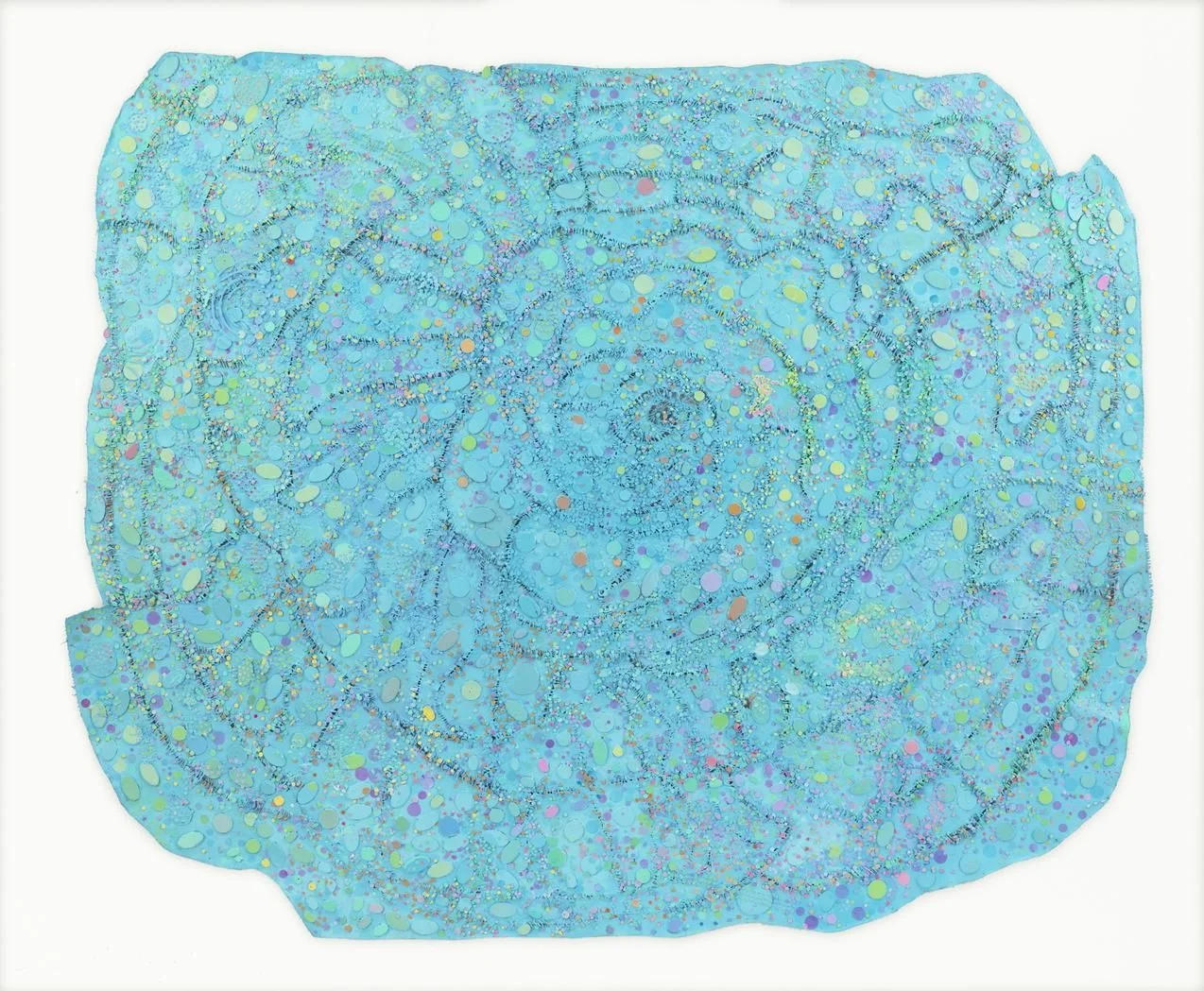
The art of Howardena Pindell comes back around to the circle. In “What Remains to Be Seen,” her 100-work retrospective now on view at the Virginia Museum of Fine Arts, there are brushed circles, sprayed circles, and circles punched out of paper. There are paper disks, thousands of them numbered by hand, and the holes from which they were cut. And there are depictions of stars and planets—in her 40s, Ms. Pindell took up the study of astronomy: Orbs of color and light cluster together in dense, spiraling constellations of collage.

In her life, as in her work, Ms. Pindell resists the easy fit. As a black woman, in 1967, she became a pioneering graduate of the Yale School of Art. While continuing to paint, she joined New York’s Museum of Modern Art as its first black female curator. “We owe our vocation as career curators to the trail blazed by Pindell,” write this exhibition’s organizers, Valerie Cassel Oliver of the VMFA and Naomi Beckwith of the Museum of Contemporary Art Chicago, where the show originated. (On Jan. 24, 2019, the exhibition will open at Brandeis University’s Rose Art Museum in Waltham, Mass.)

With her wide-ranging style and broad use of materials, Ms. Pindell has long been a round peg in a square hole. Enigmatic at times, didactic at others, she is an innovative abstractionist who also works in photography and video.

Howardena Pindell’s ‘Untitled #5B (Krakatoa)’ (2007) PHOTO: HOWARDENA PINDELL/GARTH GREENAN GALLERY, NEW YORK

Howardena Pindell’s ‘Untitled #5B (Krakatoa)’ (2007) PHOTO: HOWARDENA PINDELL/GARTH GREENAN GALLERY, NEW YORK

Ms. Pindell, now age 75, says the recurring motif of the circle, connecting much of her art, goes back to a childhood memory. While traveling with her father—a mathematician who influenced her own interest in statistics—she stopped at a root-beer stand and looked down at the red circle painted on the bottom of her mug. The symbol designated the mugs for use by blacks only. “I see that as the reason I have been obsessed with the circle,” Ms. Pindell recounts in the exhibition catalog, “using it in a way that would be positive instead of negative.”

Howardena Pindell in her ‘Free, White and 21’ (1980) PHOTO: HOWARDENA PINDELL/GARTH GREENAN GALLERY, NEW YORK

Howardena Pindell in her ‘Free, White and 21’ (1980) PHOTO: HOWARDENA PINDELL/GARTH GREENAN GALLERY, NEW YORK

In Richmond, where this exhibition is divided between two sections at opposite ends of the museum, the show opens in a gallery that follows Ms. Pindell’s circular developments on canvas. In her early paintings, such as “Space Frame” (1969), circles appear to orbit in square grids. By the early 1970s—for example in a canvas recently purchased by the VMFA—the circles have become dots, sprayed through the holes of handmade templates, while the hole-punches themselves reappear as dappled chads pasted on the canvas 
surface.

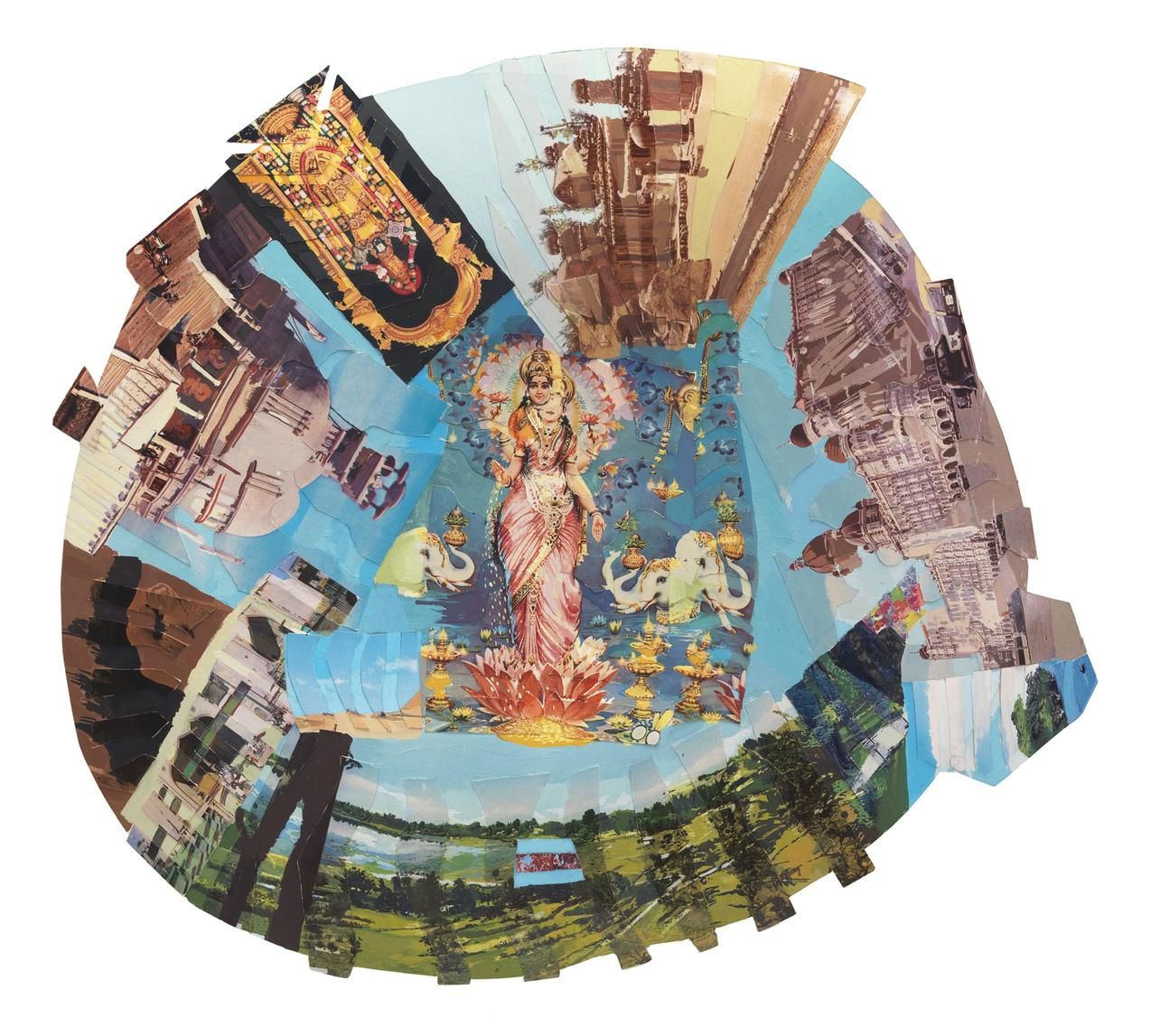
Howardena Pindell’s ‘Autobiography: India (Lakshmi)’ (1984) PHOTO: HOWARDENA PINDELL/GARTH GREENAN GALLERY, NEW YORK

Howardena Pindell’s ‘Autobiography: India (Lakshmi)’ (1984) PHOTO: HOWARDENA PINDELL/GARTH GREENAN GALLERY, NEW YORK

In 1979, Ms. Pindell’s art pivots around two events: her departure from MoMA for a professorship at Stony Brook University, where she continues to teach today, and a serious car crash that affected her memory and sight. Politics, once sublimated in her abstractions, bubbles up to the surface. Words and images appear in her compositions with increasing stridency. Her canvases, now left unstretched, are cut up and stitched back together.

Howardena Pindell’s ‘Untitled #58’ (1974) PHOTO: JK BROWN AND ERIC DIEFENBACH, NEW YORK

Howardena Pindell’s ‘Untitled #58’ (1974) PHOTO: JK BROWN AND ERIC DIEFENBACH, NEW YORK

While the first section of this exhibition displays Ms. Pindell’s range on canvas, the second shows her diversity of media. Here, works on paper are encrusted in shimmering material. Watercolor, gouache, crayon, ink, punched papers, spray adhesive, and thread may appear in a single composition. Collages made out of postcards from her many travels are cut into mesmerizing designs. Meanwhile, a suite of video work demonstrates the range of her art. In the mid-1970s, and again in 1988, Ms. Pindell took photographs of her television set, which she appended with cryptic notations on sheets of acetate adhered through static to the screen. “Free, White and 21,” a harrowing 12-minute video performance piece of 1980, speaks to her work’s confessional turn, as her biography became her subject matter.

Howardena Pindell’s ‘Space Frame’ (1969) PHOTO: HOWARDENA PINDELL/GARTH GREENAN GALLERY, NEW YORK

Howardena Pindell’s ‘Space Frame’ (1969) PHOTO: HOWARDENA PINDELL/GARTH GREENAN GALLERY, NEW YORK

“Things cycle back around in Pindell’s work,” note the co-curators of this exhibition. While it may have complicated her career, her art’s nonlinear progression speaks to her aesthetic independence and suits the divided arrangement of this show. I could have used a trail of chads to connect the two sections, but a walk through the VMFA’s encyclopedic collection hints at the many sources of Ms. Pindell’s elliptical art, from Washington Color School painting to African textiles. As her latest works at one end of the museum—swirling abstractions such as “4C the Planets” (2007) and “Night Flight” (2015-16)—recall her earliest paintings at the other, we see her art come full circle.

Comment