Comment

Gallery Chronicle (April 2015)

James1 copy

Robert Zakanitch, Hanging Gardens Series (By the Sea) (2011-2) at 1285 Avenue of the Americas Art Gallery. 
 

THE NEW CRITERION
April 2015

Gallery Chronicle
by James Panero

On “between a place and candy: new works in pattern + repetition + motif” at 1285 Avenue of the Americas Art Gallery; “Tadasky: Control and Invention, 1964–2008” at D. Wigmore Fine Art & “Breaking Pattern” at Minus Space.

If the genealogy of modern art contains both dominant and recessive traits, the expression of the latter can be rare and rewarding. Such was the case for Pattern and Decoration, a movement of the 1970s. Against the predominant, reductivist urge of Minimalism and Pop, P&D looked to the broader traditions of ornament, craft, and cross-cultural motif. It also engaged the legacy of “women’s work” with an interest in textile, quilting, and other domestic arts.

The dynamic out of which P&D emerged shares much with our cultural landscape today. This goes to explain why we see many of our most enriching artists again exploring decorative themes. As Minimalism and Pop have merged into a hybrid, factory-made consumable to dominate the auctions and art fairs, an alternative, underground scene has developed around work that is often small, hand-made, and dedicated to a devotional and craft-like repetition.

Now on view at 1285 Avenue of the Americas Art Gallery, otherwise known as the lobby of the UBS building on 52nd and Sixth, the curator Jason Andrew of the Bushwick nonprofit Norte Maar has assembled thirty artists offering many of the best examples of these developments in “between a place and candy: new works in pattern + repetition + motif.”1

Andrew’s title comes from a sentence by Gertrude Stein: “In between a place and candy is a narrow foot-path that shows more mounting than anything, so much really that a calling meaning a bolster measured a whole thing with that.” In other words, pace Stein, don’t expect an easy explanation as to what this title means.

“Words to Stein were used like elements of collage,” Andrew said to me, “fragments of meaning that when pieced together sang songs, offered impressions, and relayed ideas. I am a huge fan of Stein’s poetry and relate much of my curatorial approach to her early modernist view—finding a theme and then selecting artists that drive the theme, enhanced by their diverse approaches.”

The title of this exhibition is a puzzle, which may just be the point. Repetition can be beautiful, but it can also be illogical, tedious, and obsessive. The representation of a single thing gives us an answer—a spot to focus on. The repetition of many things poses a question. Why so many when one will do? In this questioning, we may find the comfort of pattern. Lost in the beauty of repetition, we drop the urge to understand.

There is no set beginning or end to the UBS show, which has evolved from an exhibition Andrew put together a year ago at the Matteawan Gallery in Beacon, New York. You can enter from anywhere in the building’s lobby, and in fact the rows of walls in this modernist space add their own pattern to the program, which Andrew has considered as you look down one row to the next. And a word needs to be said about this building’s receptiveness to smart exhibition programing. Andrew’s exhibition “To be a Lady,” reviewed in this column in November 2012, took place here, and the building has a long history of artistic association through the UBS Art Collection. If every midtown office building gave their public space over to arts programing, such corporate “apartment galleries” could provide herd-immunity to the further spread of MOMA-nucleosis.

One place to start when entering the current show is Hanging Gardens Series (By the Sea) (2011–2). This eight-foot-tall gouache and colored pencil on paper by Robert Zakanitch, who was one of the leading artists of Pattern and Decoration, is a new, standout piece and a connection to that earlier movement. With its height, the large lower register is the first to come into focus—an assembly of red dots contained in pulsating blue bursts. Their arrangement has, one might say, an irregular regularity. Shapes are organic and aqueous. Some pick up a yellow halo. Others either turn into stalks of bluebell flowers or cover them over. Looking up, we see that the top of the work contains stylized white swirls. The all-over composition resembles a ceremonial illustration, but the reference is not immediately clear. Are those waves on top washing over blue sea-life, or clouds watering a flowery field? Are the blue shapes water droplets raining down from above, or flowers from below turning up? The exact meaning matters less than the comforting feel conveyed through the patterns.

Natural imagery, flowering patterns, and the channeling of traditional craft recur throughout the exhibition. In Medium (2015), Colin Thomson layers thick lines in meso-American forms. In Bacio (2015), Mary Judge references Renaissance tile-work in a pattern of circles and squares that becomes petals of blue and white shimmering between figure and ground. In Fly-by (1995–2015), Hermine Ford used oil on shaped panel to recall archeological fragments, in particular the pottery sherds and painted ceramics of Italy.

Textile work is also prevalent and often deployed in innovative ways, reflecting a renewed interest in the medium—or what the gallery Outlet Brooklyn recently called “loominosity.” Robin Kang, in Two Birds with Diamonds (2015), uses hand Jacquard-woven cotton and tinsel to illustrate the patterns of microchips and motherboards. John Silvis, in CrashcourseVI (2015), uses thread and felt to depict damaged cars. Tamara Gonzalez, insleep beside me (2015), takes lace and other woven materials as spraypaint stencils. Samantha Bittman uses acrylic on handwoven textile to soften the black-and-white striped moire patterns of hard-edge optical art.

Repetitive, hard-edge abstractions are balanced against the feel of the hand-made. In Massai (P-158) (2012), Joan Witek uses black stripes of oil stick with pencil on white canvas to dazzling effect. The same goes for Libby Hartle, whose collage of graphite dashes on paper resembles the wood grain of a herringbone floor. With his crisscrossing lines, Rob de Oude looks to the shapes that emerge in the intersection of patterns. In her devotional small gouaches on wood panels, Lori Ellison finds the forms that emerge from a pattern’s hand-drawn idiosyncrasies.

Kerry Law, finally, has the last word on Pop seriality. In Empire State Building Series (2013–5), Law depicts the spire on the Empire State Building on foot-square canvases, just as he sees it in the distance on different evenings from his studio in Ridgewood, Queens. I was taken with this series when I caught it at Storefront Bushwick some years ago. The work references “Empire,” Warhol’s tedious eight-hour 1964 film of the building, as well as those ubiquitous silkscreens, but here the hand has been restored to the icon. Law finds infinite nuance in the scene’s changing light and atmosphere, which is often obscured by clouds, all perfectly rendered in the subtleties of paint. The series evokes the passage of time as well as the artist’s personal routine, a pattern of looking out the window every evening and capturing what he sees.

James2 copy

Tadasky, C-200 (Multicolor with White) (1965) at D. Wigmore Fine Art.

Nearby, in the Crown Building, D. Wigmore Fine Art has brought together a comprehensive survey of Tadasuke Kuwayama, the great artist of the circle known to us as Tadasky.2

Born in 1935 in Nagoya, Japan, the youngest of eleven children, Tadasky came to New York to paint some fifty years ago and has been at work ever since. As explained by Joe Houston in his informative catalogue essay, Tadasky’s father was a prominent builder of Shinto shrines, with designs that were marked by symmetry and spareness. When control of the company went to a sibling, Tadasky was free to explore painting, but he never diverged far from his devotional beginnings. His body of work consists almost exclusively of concentric circles composed in a square canvas, which he says he fully envisions in advance before putting oil to canvas.

To make his paintings, all by hand, Tadasky developed a turntable easel that allows him to sit above his compositions and brace his fine Japanese brushes as the canvases rotate beneath him. What’s remarkable is both the precision he can create through this system and the variation he can discover with his circular motif over time. Tadasky describes Josef Albers as an early influence, and it’s possible to see this body of work as one great homage to Homage to the Square, with equally rewarding results.

D. Wigmore has assembled examples of Tadasky’s evolving series through the decades, which he assigns with a letter followed by a number. While the B series from the early 1960s are regular rings of alternating color, the lines of the C series become more multifaceted. In the D series from the later 1960s, Tadasky reduces the color variation but introduces black lines of alternating thickness to produce a gradient, giving his rings a topographical curve. From the E series on, Tadasky has used sprays to produce even finer gradients and textures so his circles come to resemble spheres. Along the way his compositions have become increasingly celestial, so that M-282 (Black Center with White Rings) from 2006 resembles a blue star in eclipse or perhaps the iris of a divine eye.

Here, in Tadasky, we can see the results of a career devoted to a single motif. “I have learned that when you polish something over and over, it shines in its own way,” he recently explained in an interview with the online magazineGeoform. “You are creating your own world. For many years, I have polished the forms that I use to brilliance.”

James3 copy

Gilbert Hsiao, Dual (2008), at Minus Space. Acrylic on shaped panel, 36 x 80 inches.

A gallery that has long been devoted to “reductive abstract art” is Minus Space, founded in 2003 by the artists Matthew Deleget and Rossana Martinez. “Breaking Pattern,” its current exhibition, features Gabriele Evertz, Anoka Faruqee, Gilbert Hsiao, Douglas Melini, and Michael Scott—five New York-area artists focused around “pattern, optical, and perceptual abstract painting.”3

In Hsiao’s Dual (2008), the action in this shaped canvas, something like a skewed lozenge, starts from points on either end. Sharp, symmetrical ripples of white, black, and silver lines radiate to one another, with extra patterns coming forward in the intersections. As they crash together, the effect speaks to the “breaking” of the exhibition’s title. Anoka Faruqee similarly runs a large-toothed trowel over sanded-down canvases to produce twisted taffy lines. Douglas Melini layers free-hand splatters of acrylic over taped patterns. Gabriele Evertz cuts the luminosity of metallic paint against the shifting values of her vertical and diagonal lines. Untitled (#98), the black and white enamel on aluminum by Michael Scott, carries this breakage the furthest. Using tape with a thinned black medium on a bright white polished surface, Scott lets his moire lines seep and run like an Op Art ruin. Even the recent history of modern art has now entered the pattern book, open for artists to copy and repeat in new ways.

1 “between a place and candy: new works in pattern + repetition + motif” opened at 1285 Avenue of the Americas Art Gallery, New York, on March 16 and remains on view through June 12, 2015.

2 “Tadasky: Control and Invention, 1964–2008” opened at D. Wigmore Fine Art, New York, on February 7 and remains on view through April 27, 2015.

3 “Breaking Pattern” opened at Minus Space, Brooklyn, on February 28 and remains on view through April 18, 2015.


Comment

Comment

A Helluva Show

Theater_review_on_the_town

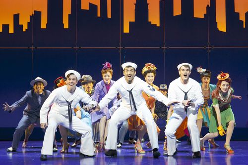
Clyde Alves, Tony Yazbeck, Jay Armstrong Johnson and the cast of On the Town

CITY JOURNAL 

March 26, 2015

A Helluva Show
by James Panero

A new production of On the Town captures the spirit of New York City.

With music by Leonard Bernstein and book and lyrics by Betty Comden and Adolph Green, the original 1944 production of On the Town was a celebration of the freedom and energy that New York City represented in wartime. The musical rightly brought fame to its three wunderkind creators, all in their twenties, who drew their inspiration from the Jerome Robbins ballet Fancy Free.

Now, as the spectacular, must-see revival of On the Town returns to Broadway at 42nd Street’s Lyric Theatre, the musical reflects a city that has itself been revived in a synergy of past and present. Then as now, it’s the right time to see On the Town. After all, could there be a greater paean to urban life? The ultimate love interest in this musical of three American sailors on shore leave is, of course, “New York, New York, a helluva town,” where “The Bronx is up, but the Battery’s down” and “the people ride in a hole in the groun’.” The city captivates and animates the storyline, beginning with that famous opening number. One sailor, Chip (Jay Armstrong Johnson), calls the city “a visitor’s place!” and announces his ambitious touring schedule (“10:30 Bronx Zoo, 10:40 Statue of Liberty”).

The famous places to visit are so many, 
Or so the guidebooks say. 
I promised Daddy I wouldn’t miss on any. 
And we have just one day. 
Got to see the whole town 
From Yonkers on down to the Bay.

Ozzie (Clyde Alves), meanwhile, has other attractions in mind: “Manhattan women are dressed in silk and satin,/ Or so the fellas say;/ There’s just one thing that’s important in Manhattan,/ When you have just one day.” A poster on the subway convinces Gabey (Tony Yazbeck), the shy sailor, to seek out Ivy Smith (Megan Fairchild), the winner of “Miss Turnstiles for the month of June.” The sailors’ 24-hour trek spans Carnegie Hall and the uptown museums to midtown nightclubs and Coney Island. Eventually, they assemble together with their dates—the fizzy anthropologist Claire de Loon (Elizabeth Stanley) with Ozzie, the brassy taxi driver Brunhilde “Hildy” Esterhazy (Alysha Umphress) with Chip, and Ivy Smith with Gabey—only to have to say their goodbyes at the Navy docks just as another three sailors slide down the gangplank, singing the same opening tune.

The team behind this current On the Town—lead producers Howard and Janet Kagan and director John Rando—captured the revival spirit of both the musical and the city with a promotional music video released last summer. The video closely tracks the familiar opening shots of the 1949 movie film version starring Frank Sinatra and Gene Kelly. Rather than running off their ship onto the Brooklyn Navy Yard, though, our three sailors emerge in their starched white suits running down the gangplank of the Intrepid—the sea, air, and space museum in the aircraft carrier docked on the Hudson River. Then these spirits of World War II-era New York are seen singing and dancing around today’s city. Some locations have thankfully changed little since the 1940s—the Brooklyn Bridge, Coney Island, Bethesda Fountain, the Statue of Liberty, the American Museum of Natural History. Yet, for their bike ride through Central Park, the sailors rent Citibikes. And between shots of Chinatown and a carriage ride through the park, they visit the Apple Store on 59th Street and Fifth Avenue. If anything, the city looks far clearer and better than it did on film 60 years ago.

The preternatural and, at times, winking exuberance of this revival gets carried through the musical, which is lavishly staged with a live 28-piece orchestra at the Lyric. The revival is surprisingly faithful to the original Broadway production. Each performance begins with the cast, led by Phillip Boykin, joining the audience in a rendition of “The Star Spangled Banner.” This patriotic feeling continues throughout the show, especially as Stephen DeRosa, on the night I attended, singled out a veteran in the audience for special recognition of his service.

But just like the original musical, this revival is far more red-blooded and grittier than the sanitized Hollywood production. Not only did “helluva town” get changed to “wonderful town” in the 1949 film, but many of the best musical numbers were cut, in particular Hildy’s “I Can Cook Too,” which includes a full serving of double entendre (“I’m a man’s ideal of a perfect meal/ Right down to the demi-tasse./ I’m a pot of joy for a hungry boy,/ Baby, I’m cookin’ with gas.”) A new cast recording of this revival has just been released by PS Classics.

In addition to the possibilities presented by the city (where density and public transportation play a leading role), On the Town also hints at the more desperate side of the urban experience, especially for the women. Ivy Smith, a celebrity in the eyes of Gabey, is being hustled by an alcoholic dance teacher (Jackie Hoffman) who insists that she debase herself working at an after-hours gentlemen’s club on Coney Island to pay for her classes. Claire de Loon cracks in an unhappy marriage, which her fly-by-night relationship with Ozzie finally destroys. Hildy, fired from her job as a taxi driver, lives with a sick roommate in an apartment overlooking a brick wall.

Yet for its lows, the New York of On the Town is ultimately one of great heights, finally reached in the dream dance sequence between Gabey and Ivy. Inspired by the heated choreography of Jerome Robbins, the nine-minute pas de deux, choreographed by Joshua Bergasse, finds the dancers sweating it out in a boxing ring before soaring into one another’s arms. That Ivy is danced by Fairchild, the famous principal dancer of the New York City Ballet, speaks to the talent that only a city can gather. Here is a production that only Broadway can stage and a story that only New York can tell.

Comment

2 Comments

Tobacco Hour

"Tobacco Hour," poems by Dara Mandle, art by Brece Honeycutt, second edition

available for $10

Dara writes:

I have been overwhelmed by the support you've shown for my chapbook of poems, "Tobacco Hour." I am excited to announce the edition is now sold out, and I'm so happy the books are in such good hands! A second, unlimited perfect-bound edition is now available. Thank you to everyone who made it to Luhring Augustine Bushwick for the reading, to those who bought copies and ordered online, to our publisher Jason Andrew of Norte Maar, to my fellow readers John Talbird and Leslie Kerby, to the painter Philip Taaffe, and of course to my artist collaborator Brece Honeycutt


Screen Shot 2015-03-19 at 4.00.51 PM

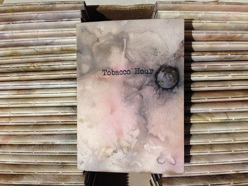
pictured: Brece Honeycutt's ecodyed covers prepare to be hand-bound and stamped for Tobacco Hour. Photo: BH

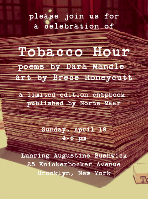
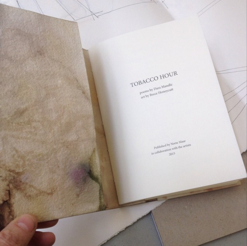
We are delighted to announce the launch of Tobacco Hour, a limited-edition collaborative chapbook of poems by Dara Mandle and art by Brece Honeycutt published by Norte Maar.

Please join us for a celebration and reading of the book on Sunday, April 19, 4-6 pm, at Luhring Augustine Bushwick, 25 Knickerbocker Avenue, Brooklyn, New York.

Tobacco Hour is the product of a three-year collaboration between Dara Mandle and Brece Honeycutt. Published by Norte Maar in an edition of 75, featuring twenty new poems by Dara Mandle, each numbered copy of Tobacco Hour has been hand made by Brece Honeycutt.

Working together, artist and poet have designed Tobacco Hour to be an experimental cross between book printing and art making. Based in an 18th-century colonial farmhouse in Sheffield, Massachusetts, drawing on her impressions of Mandle's poems of devotion and desire, Honeycutt has used flora and found objects to dye and texture the covers of each book individually

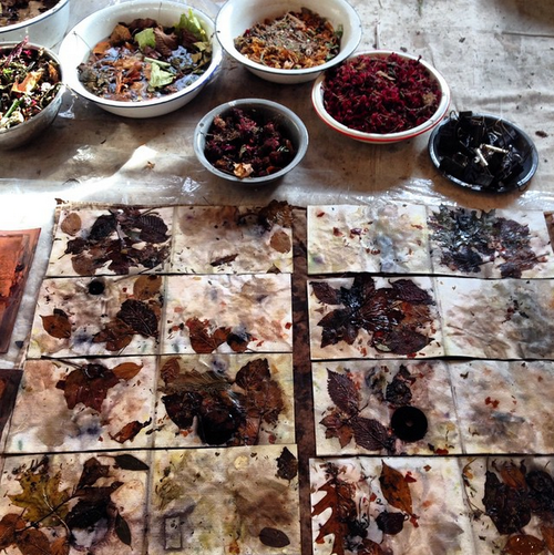
The chapbook is the size of a small prayer book, linking it to the many prayer poems in the text, which Brece has hand-stitched without glue in a special binding. For the covers, barberry, goldenrod, mugwort, rhododendron, and mint, along with metal washers, were interleaved in between white sheets of paper, put between two sheets of copper, and immersed in a dye bath. This process, called eco-dyeing, uses materials from the land that are then returned to the land.

Norte Maar, the Bushwick-based nonprofit dedicated to collaboration in the arts, is publishing the edition as part of its series of artist-writer collaborations, which will also include A Modicum of Mankind, short stories by John Talbird with art by Leslie Kerby. 

The April 19 event for both books is generously hosted by Luhring Augustine Bushwick, where the exhibition Philip Taaffe: New Paintings will be on view. 

Dara Mandle earned her BA in English from Yale University, where she was awarded the Clapp poetry prize, and her MFA in poetry from Columbia University. Her poetry has appeared in the Brooklyn Review, Painted Bride Quarterly, and Harpur Palate, among other journals. For the past nine years she has hosted the Young Poets series at the National Arts Club. She maintains a blog of her work at www.supremefiction.com.

Brece Honeycutt lives and works in Sheffield, MA. She makes history-based drawings, sculptures and installations. She received a B.S. in Art History from Skidmore College and a M.F.A. from Columbia University. Her installations have been placed in exterior locations including university campuses, historic houses, inner city parks and in office buildings, libraries, urban markets and galleries. She collaborates and works with the National Park Service, artists, students, historians, gardeners, non-profit organizations, poets, and dancers. In 2014, Honeycutt exhibited in New York, Massachusetts and Italy. She received two artist fellowships from the D.C.C.A.H. and an anonymous grant for an “artist working in a particular American vein.” She has served on the boards of the Arlington Arts Center, Arlington, VA, as treasurer and the Washington Sculptors Group. www.brecehoneycutt.com


6a00d83456391369e2017ee89efc15970d

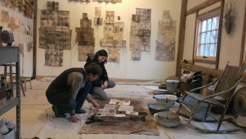
Brece and Dara look over prototype pages in production in the Sheffield studio. Brece's stand-alone paper sculptures hang on the back wall. Photo: JP


6a00d83456391369e2017d412b2033970c

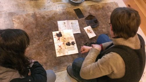
Brece uses found objects as resists as she presses pages together to set overnight. When she opens them up, she discovers how foliage and other elements have left their marks on the paper. Photo: JP


6a00d83456391369e2017c36fbca8d970b

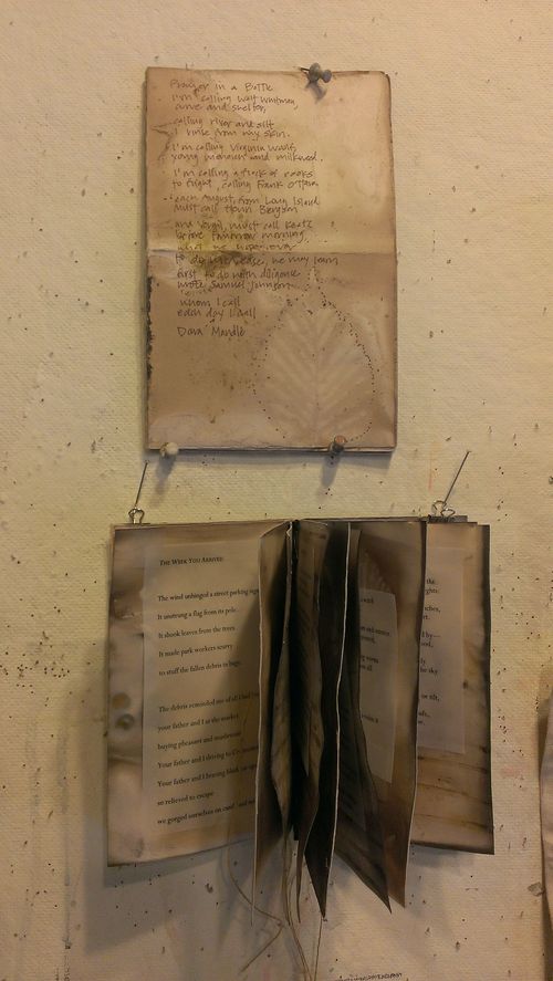
On one wall Brece has pinned prototype pages for the book. Here Brece has written out one of Dara's poems on hand-made paper (above) and hand-stitched the binding of some pages (below). Dara and Brece experimented with different page formats and worked through ideas of how best to translate Brece's handmade book art to multiple production. Photo: JP


Screen Shot 2015-01-30 at 10.33.39 PM

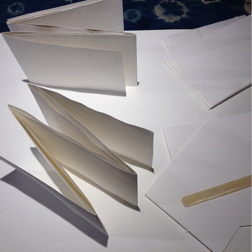
Folded covers for Tobacco Hour awaiting barberry bath. Photo: BH


6a00d83456391369e2017ee89efdc4970d

Goldenrod, drying in the attic, used for book's ecodyes. Photo: JP 


Screen Shot 2015-01-30 at 10.33.24 PM

Ecodyed covers prepared for goldenrod bath. Photo: BH


IMG_2191-768x1024

Cover paper in Brece's press. Photo: BH


IMG_2811-768x1024

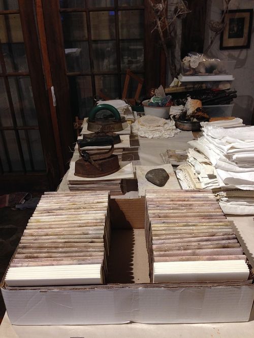
Hand-bound copies of Tobacco Hour ready for release. Photo: BH


IMG_2818-1024x768

A finished copy of Tobacco Hour. Photo: BH


Screen Shot 2015-03-19 at 9.20.19 PM

Tobacco Hour. Photo by Sharon Butler. 

2 Comments