Comment

The Illusive Eye

Arte-2157330h540
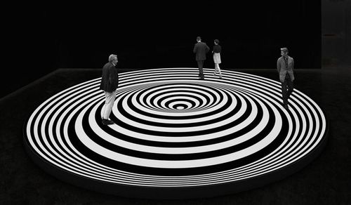
Marina Apollonio, at El Museo del Barrio

James writes:

Few people now remember William Seitz's 1965 MOMA show "The Responsive Eye," but at the time it was one of the original blockbuster museum exhibitions, making Optical Art the style of the moment. It was also far from inclusive. Optical art was truly an international movement, with remarkable work spanning from Latin America through India and Iran. Yet "The Responsive Eye" looked mainly to Anglo-American artists. Now, with hindsight, we can look back to the Optical Art movements of Latin America with fresh eyes thanks to The Illusive Eye, an exhibition on view at El Museo del Barrio through May 21. For more, I spoke with the art critic Juana Libedinsky in Argentina's La Nacion about the new and important perspective "The Illusive Eye" brings to Op. 

Cincuenta años atrás, el MoMA organizó una exposición de arte óptico (Op Art) y cinético titulada The Responsive Eye. Los artistas seleccionados habían abandonado el uso naturalista del óleo sobre la tela. Inspirados en la intensidad de las nuevas pinturas acrílicas, apelaron a líneas contrastantes y colores complementarios para acentuar la biomecánica de la percepción. "Los resultados fueron inmediatos -recuerda James Panero, crítico de arte de The Wall Street Journal y director ejecutivo de The New Criterion-. Aunque estaban basadas en más de un siglo de estudios, las obras centellantes y pulsantes requerían poca explicación; la muestra fue un éxito de audiencia y la sensación del momento."

Translation:

Fifty years ago, the MoMA organized an exhibition of optical art (Op Art) and kinetic art entitled The Responsive Eye. The selected artists had abandoned the naturalism of oil on fabric. Inspired by the intensity of new acrylic paints, they used contrasting lines and complementary colors to accentuate the biomechanics of sight. "The results were immediate" recalls James Panero, art critic of The Wall Street Journal and Executive Editor of The New Criterion. "Although grounded in over a century of study, the flickering, throbbing, pulsating works on view required little explanation. The show set attendance records. It was a sensation."

Catch the full article here. 

Comment

1 Comment

Meet the Met

WALL STREET JOURNAL
February 4, 2016

Meet the Met
by James Panero

Visiting every gallery in the main building of the Metropolitan Museum of Art—a Grand Tour in a single day

I recently celebrated a milestone birthday and wondered how to mark it. Should I get out and see the world? Take on some new physical challenge? Try to figure out a way to turn back time? Then it occurred to me that I could do all three at once: I would visit every gallery in the main building of the Metropolitan Museum of Art. It would be a Grand Tour—in one day.

The Met, of course, is the world’s great encyclopedic museum. Founded in 1870, it set its goal as nothing less than grouping “the masterpieces of different countries and times in such relation and sequence as to illustrate the history of art in the broadest sense.”

I’ve been going there since I was a child. And the more I see it, the less I really know it. So I loved the idea of spending the whole day there, attempting to appreciate it in its entirety rather than piecemeal.

I knew it would be a challenge. There are tens of thousands of objects on display out of more than 1.5 million in the permanent collection, overseen by 2,200 employees and 17 curatorial departments. They are spread across some two million square feet of space occupying two-plus floors, and housed in over 400 galleries, period rooms, and installations—a mind-boggling array. A few weeks earlier, when I asked Thomas P. Campbell, the Met’s director, how long it would take to see every room, he said: “Two years.”

Nonetheless, I was determined. So on a recent Friday, a bit past 10 a.m., I arrived at the main entrance on 82nd and Fifth Avenue, armed with a pen, a notebook and a good pair of sneakers. I bounded up the stairs and into Richard Morris Hunt’s ethereal 1902 Great Hall. I helped myself to a museum map, and made a right for Gallery 100, the beginning of the Egyptian wing and the first in the Met’s numbered sequence of galleries.

In her 1967 children’s novel “From the Mixed-Up Files of Mrs. Basil E. Frankweiler,” E.L. Konigsburg had her two protagonists live as runaways in the Met, hiding their clothes in an Egyptian sarcophagus and bathing in a Roman fountain as they uncovered a Michelangelo.What makes it so compelling is our desire to believe that, at the Met, we can all run away from the outside world, hiding in plain sight among the greatness of art.

One of the most renowned in the world, the Met’s Egyptian collection is also far more extensive than one would gather from simply dashing through it, as I often have on the way to its showpiece Gallery 131, the Temple of Dendur. And it still contains some of the best places for getting lost—just the thing for making unexpected discoveries. Gallery 100, for example, contains the winding corridors of the Tomb of Perneb from about 2381-2323 B.C. And Gallery 102 has the Tomb Chapel of Raemkai, from about 2446-2389 B.C., where relatives once laid down offerings by a door to the afterlife surrounded by figures carved in exquisite relief.

As I began to move from room to room, I started to notice a shift in what was catching my eye, a change in perception that would continue throughout my day. Without a special exhibition to see or a favorite painting to seek out, my attention was drawn to the smaller rooms and often their smaller objects. I was especially taken by the hidden corridor of Gallery 109, Middle Kingdom Objects from Lisht and Thebes, where an open-storage system displays hundreds of objects that might otherwise never make it out of the basement, such as scarab seals and pieces of personal jewelry from about 2000-1550 B.C. Gallery 118, Three Foreign Wives of King Thutmose III, likewise contains amazing sandals of sheet gold, c. 1479-1425 B.C., matched with finger and toe stalls—gold thimbles for the dead that, in their nails and cuticles, display a striking lifelike presence.

Keeping track of the Met’s galleries is easy. Each room carries a three-digit number, indicated on the floor plan and on the walls at its entrance. The numbers flow through the departments as the galleries meander through the museum. I followed the sequence whenever possible. I began to move department to department in a rough chronological manner and filled in with stops through the Met’s extensive non-Western collections. Crisscrossing the first floor, I checked off the rooms as I went. After the 38 galleries of Egyptian Art, it was 23 of Greek and Roman, where in open-storage Galleries 170-172 it was again the smaller things that caught my eye—a little box of Etruscan gold from the fifth through third century B.C., and bits of Roman glass.

After eight of Medieval, 11 of Arms and Armor, and 56 of European Sculpture and Decorative Arts, I reached the nine galleries of the Arts of Africa, Oceania and the Americas. Housed in the Met’s Michael C. Rockefeller Wing, this spectacular but regrettably condensed selection ranges across a wide swath of world culture. Gallery 354, Melanesia, contains a poignant reminder of the power of art in its collection of “bis poles,” memorial sculptures of the Asmat people of southwest New Guinea. In 1961 the young anthropologist for whom this wing is named died by possibly falling victim to the cannibalistic rituals that surrounded these intricately expressive works.

I chose not to share this last observation as I joined my wife for lunch at the nearby Petrie Court Café, content with my progress but mindful that two thirds of the museum remained. It was 1 p.m., and the restaurant is off another favorite space, Gallery 548, European Sculpture, 1700-1900. This dappled, light-filled atrium of large sculptural work preserves what was once the main entrance to the museum, which in the late 1880s faced south into Central Park.

After lunch I restarted with 13 rooms of the Robert Lehman Collection—that odd 1975 appendage to the museum plan that displays some of the late financier’s Old Master collection as it appeared in his New York apartment. Finally it was on to the 74 galleries of the American Wing.

This begins with Gallery 700, the Charles Engelhard Court, the large, glassed-in atrium on the museum’s Central Park side where the museum displays some of its large-scale American sculptures. The collection galleries are fronted by the Neoclassical facade of the Branch Bank of the U.S., at one time on Wall Street.

The period rooms here have always been, for me, among the museum’s most transporting and inviting displays. The Met has 12 in the American Wing, ranging in time from the Colonial era Hart room to a Prairie-style Frank Lloyd Wright living room. They are spread over three levels: the first floor, an intermediary level (2a) between a mezzanine and the second-floor paintings galleries, and a small, third-floor redoubt. A small elevator connects all levels, and it is an indication of the M.C. Escher-like spatial ingenuity required to fit everything that the ascent from mezzanine to level 2a is only about three feet.

Period rooms aside, the American Wing’s greatest diversion was Gallery 774, the Luce Center Visible Storage on the mezzanine, the treasure house’s attic filled with thousands of works of American fine and decorative art. With every piece of Americana you could imagine organized in rows by type, floor to ceiling, the Luce Center is like a fantasy tag sale. I walked down every encased aisle, thinking about all the paintings that didn’t make it onto the gallery walls, and how much fun it must have been arranging the decorative objects by color to create a rainbow display.

After the American Wing’s mezzanine, it was up to the second floor, where my track took me through the wing’s painting galleries, then over to four of Musical Instruments and 53 of Asian Art. Here, since childhood, I have sought out the tranquility of Gallery 217, the Chinese Courtyard in the Style of the Ming Dynasty, also known as the Astor Court. A new discovery was Gallery 219, the Chinese Treasury, one of a small cluster of galleries in a remote third-floor corner of the Asian Art section. The treasury contains intimate works of the late Ming and Qing dynasties in such materials as jade, porcelain, amber, ivory, and rhinoceros horn, including an unforgettable wall of snuff bottles.

Then it was on to the seven galleries of Ancient Near Eastern Art and four more of Greek and Roman Art. After that, there remained the 15 galleries of Islamic Art, 72 of European Paintings, three of Photographs, four of Drawings and Prints, and on out through some 30 of Modern and Contemporary Art.

The second remains the more frequented floor, with the greatest density around the Van Goghs of Gallery 823. Yet for all of the six-million-plus visitors who now pass through this museum every year, there are many quiet oases. This means that Gallery 632, a room of Vermeers that might otherwise be swamped if included elsewhere in some blockbuster exhibition, I could enjoy in near solitude.

I reached my last room at 6 p.m. It was another favorite, Thomas Hart Benton’s 1930-31 mural “America Today,” in Gallery 909. Hung to re-create the original installation in the boardroom of the New School for Social Research in Greenwich Village, Benton’s intense vision of America’s laborers, public life and technologically advanced “instruments of power” felt like a window onto the public works and private virtues that created this unique American institution.

By the end I had walked 20,000 paces, or about 10 miles, seen thousands of artworks, and passed through more than a dozen wings—the various stages of the Met’s growth since its founding.

The journey had taken seven hours—about a minute a room. Was this an ideal way to see the museum? Probably not. But I was amazed at how transporting this approach could be, and at just what drew me in. Despite all my previous visits, so many of the galleries and objects I’d never seen until now. Who knew there was a center for textiles (off of Gallery 599) beneath the Medieval Hall?

What had I learned? First, that more begets more. Any notion I had of fully taking the Met’s measure by visiting every gallery fell to the realization of all the newly discovered objects and galleries that I now wanted to revisit.

More broadly, for all of the different forms of art on view, what becomes apparent is not that they demonstrate an evolution of style or a run of greatest hits. Rather, they collectively reveal what the 19th-century Viennese art historian Alois Riegl called theKunstwollen—a continual “will to art” that cuts across all times, cultures and media.

And finally, for all of its grandeur, the Met still feels like a home away from home and a shelter from the world outside. Here is an art museum named not for a single founder but for the full metropolis that created it—and, therefore, a museum that has always been, from top to bottom, a treasury of the world and a reflection of ourselves.

1 Comment

Comment

Gallery Chronicle (February 2016)

Jamesfeb

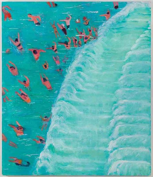
Katherine Bradford, Fear of Waves (2015), Oil on canvas.

THE NEW CRITERION
February 2016

Gallery Chronicle
by James Panero

On “Katherine Bradford: Fear of Waves” & "Elisabeth Kley: Ozymandias" at Canada; “Carolanna Parlato: A Delicate Balance” at Elizabeth Harris Gallery; “Ronnie Landfield: Five Decades” at Stux + Haller; & “Lori Ellison” at McKenzie Fine Art.

Over the last few years, the haunting work of Katherine Bradford has been hard to miss. Her small paintings have popped up in dozens of group exhibitions. Roughly painted images of ships or supermen or space aliens: the iconography may shift, but the mood conveyed is unmistakably her own. Her paintings might be new works, but they feel like old souls, like rediscovered artifacts or shop signs. In their studied distress, her paintings recall the wear that Elie Nadelman might rub into his sculptures, or Albert Pinkham Ryder bake into his ships—objects once tightly held but now forgotten. Bradford’s primitivist paint handling reflects her lost subject matter, fragments of fuller, once glamorous stories that have now been effaced, or even submerged.

The specter of water has been a recurring theme for Bradford, a longtime fixture of New York’s alternative art scene, both in her paintings of ghostly ocean liners and in her faceless divers, traveling down in the opposite direction of her rising supermen. In Bradford’s subtle hand, water has a reactive, mystical, ultimately ominous quality, refracting shapes, oxidizing colors, and overwhelming her subject matter.

Now on view at Canada gallery on the Lower East Side, Bradford has reached a high-water mark with large, ambitious canvases that heighten the mood and raise the anxiety around, as the exhibition puts it, a “fear of waves.”1

In his 1950 book The Enchafèd Flood: or, The Romantic Iconography of the Sea, W. H. Auden writes that “the sea, in fact, is that state of barbaric vagueness and disorder out of which civilization has emerged and into which, unless saved by the effort of gods and men, it is always liable to relapse.” In the modern age, water is sold as a luxury: deluxe ocean passages, summer days at the beach, oceanfront vistas, dips in the pool. But reality still cuts against these leisurely ideals. Floods, sinkings, and drownings pull us under. The dread of disaster is never fully washed away from our primitive consciousness, or our modern view.

Bradford takes the images of water-bound recreation—swimming, diving, playing in the waves—and subsumes them in a mood of uncertainty and peril. In Fear of Waves (2015), one of the larger paintings here and the one that gives its title to the exhibition, a crowd of beachgoers observed far off from an elevated perspective, like the view from a bluff, assembles waist-deep in a pool of light blue. A set of white waves rolls towards them from the right side of the canvas. At first they appear to be relaxing in the surf. On closer inspection, they are revealed to be attempting to swim away from deep water, reaching for an unseen shore as their lips scream out in terror.

A similar sensation comes across in Surfer (2015) and Surf Party (2015). The bottom half of each painting shows figures in the water at play. But the top half conveys something else: the rising spray of an oversized wave, the potential for disaster. The outcome is a mystery. A halo of color predominates each canvas, erasing and blinding us to the particular emotions of the distant figures.

This feeling for the unknown has only increased as Bradford has located her scenes in increasingly ethereal settings. Bradford has long worked through the iconography of cosmic kitsch, with comic-book UFOs, planets, and stars appearing in her work. In her most recent paintings, some of them dated 2016 and seemingly still wet from the studio, Bradford elevates her water-bound figures into the astral plane. These settings make literal Auden’s understanding of the sea as the “symbol for the primordial undifferentiated flux, the substance which became created nature only by having form imposed upon or wedded to it.” Oversized galaxies appear in the black sky ofFloaters (2015). In Swim Team Miami (2015), divers prepare to jump from orbiting planets. Swim Team Outer Space (2015) floats on the curving surface of a purple planet illuminated by a glowing moon. While in Fathers(2016), the largest and most fraught canvas in the exhibition, nude figures face each other around the edge of a circular pool, which itself floats in a starry void.
Jamesfeb2

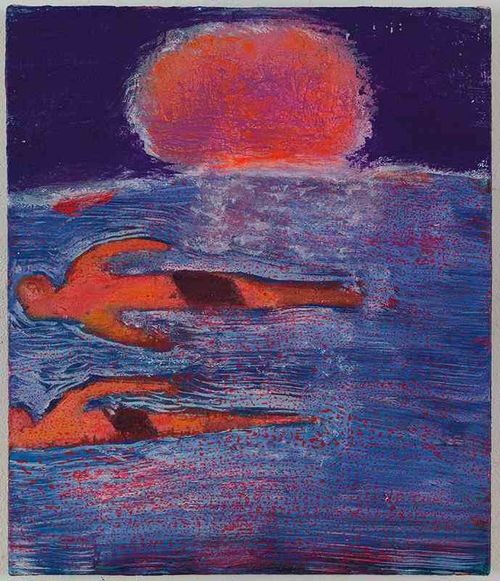
Katherine Bradford, Couples Swim (2015), Acrylic on canvas.

With her sense for mood, Bradford comes across as a latter-day Symbolist. The smaller painting Couples Swim (2015), a favorite of mine that features two figures floating under a midnight sun, recalls nothing less than the work of the Symbolist Edvard Munch. In Symbolism, his 1979 study, Robert Goldwater observed how Munch put “the meaning of his pictures into design and colour, and into the stance and gesture of the whole human body, whose pose and contour flowed and fused with a larger composition that gave direct expression to the mood and substance of the theme.” Bradford shows a similar sensibility, and a similar fearlessness around fearful sentiment.
Jamesfeb3

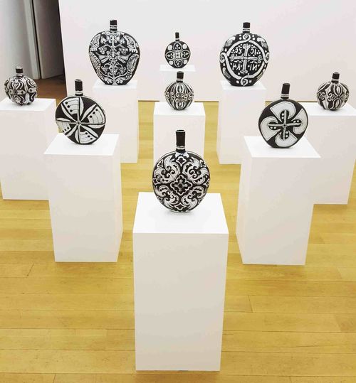
Elisabeth Kley, installation view at Canada.

Meanwhile, in Canada’s second gallery, Elisabeth Kley presents striking black-and-white ceramics that appear pulled up from an unknown deep. Working with “homemade underglazes, with wax resist and sgraffito,” Kley impresses rough designs of unknown ethnographic origin onto her hand-made vessels of flasks and lobed bottles. Abstract trees, crosses, seraphim, eyes, tulips, leaves, axes, and flags decorate these objects in matte black-and-white, and, on the reverse, white-on-black. Prints and wall-painting round out the monochrome space, contrasting with Bradford’s colors next door, with the earthenware objects arranged symmetrically on pedestals in museum formation. In the art world, we are in a ceramic moment. Kley’s clay looks to the future by unearthing the forgotten past.
Jamesfeb4

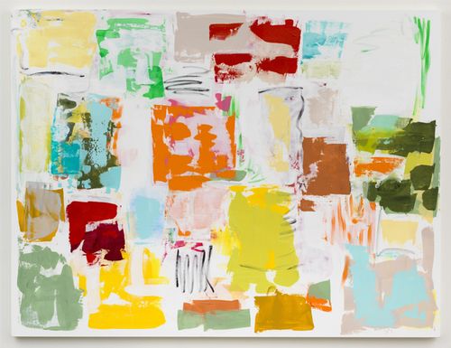
Carolanna Parlato, a delicate balance (2015), Acrylic and molding paste on canvas, 64 x 84”.

Carolanna Parlato knows how to move paint around a canvas. Five years ago, she was pouring acrylic, tipping her stretchers, and allowing her pigments to spread across her canvases, reacting with her medium. Her self-made technique created remarkably accomplished compositions. So I was surprised to see her move beyond this mode into what might be considered more traditional paint handling. But seeing Parlato’s latest exhibition at Elizabeth Harris Gallery, I am glad she did.2

The first sensation I experienced entering “A Delicate Balance” is the smell of paint. I might even say it was the smell of white paint, but that could be the scent of the gallery wall reacting with my perception of this latest work. Parlato now layers splotches of color on white canvas. Her shapes resemble paint tests, the way you might spread out a fresh coat on a white wall. But just like her poured canvases, these shapes congregate not as random marks but rather as well-assembled compositions.

Here “balance” is achieved not just among her colors but even more significantly with her use of white. I have long felt that primed white canvas rarely works when left as unfinished surface in painted compositions. Unlike works on paper, where unfinished white ground forms a transparent and even illuminating surface, bare primed canvas has an invasive presence that usually requires further treatment. Parlato senses this as well. Her latest work is most importantly white-balanced, with scrims of white overlaying both her color blocks and her white ground.

Parlato’s use of thin acrylics is especially well suited for such subtle layering, as the squares and squiggles of a delicate balance (2015) seem to dissolve into her background—an effect I find more convincing than in the smallerBurst (2015), where her colors sit more on the surface. Meanwhile Clouded Memory is another show-stopper, with a more forward composition of red, purple, orange, and yellow surrounding earth tones of greens, browns, and blues. This composition contrasts her shapes, not between figure and ground, but center and frame, as a thin rim of bolder colors compresses subtler shades in, again, a delicate and accomplished balance.
Jamesfeb5

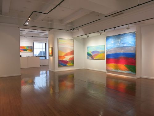
Ronnie Landfield, Installation view at Stux + Haller.

Ronnie Landfield was one of the young painters of the 1960s Soho scene who looked into the emptiness of minimalism and found his own light beyond the darkness of the void. “I realized that [Donald] Judd and his minimalist philosophy was wrong,” Landfield explains in an illuminating interview with Daniella Hansen and Stefan Stux accompanying his current retrospective at Stux + Haller.3 “What he was doing was representing the essence of the void, but that’s just the beginning—it’s just the doorway.”

So Landfield looked deep and began to find landscapes in his designs, part traditional watercolor, part colorfield stain, enlarged to loft-size proportions. It might be hard today to imagine the alarm that Landfield’s illusionistic turn once posed to the supposed direction of modern art. Not only was he abandoning flat abstraction for deep space. He was also drawing his real vision from fictive imagination. Neither a realist not an abstractionist, he was an impure in-between.

With work assembled over five decades, this latest exhibition demonstrates Landfield’s consistency of vision along with his evolution and revisiting of techniques. Landfield’s imagined landscapes have a childlike appeal: colorful, hill-like shapes settle into lakes and dappled valleys beneath a rain-soaked sky. Water feels like a constant presence as his colors mix and bleed into the warp and weft of his canvases, a reflection of his water-based acrylic medium.

The ease of Landfield’s paint handling is masterful. If anything, his likeable visions come too easily. As a nod to his minimalist beginnings, at times Landfield introduced more hard-edged elements into these soft designs. Especially in the early work, I can understand their origin: his color bars form a minimalist frame, the reminders of a more concrete present from which to enter his maximal vision.

In his interview, Landfield reveals that Clement Greenberg disagreed with the imposition of these blocky forms, saying he should paint one way or the other, not both. Clem had a point: these impositions still seem like half steps. Landfield is at his best when he allows our full immersion into his lush found space, from the early Blue Wall (1970) to the more recent The Wind and the Rain (2012)—a drenched composition with colors to touch and space to breathe.
Jamesfeb6

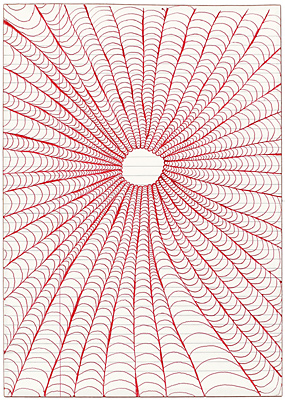
Lori Ellison, Untitled (2014-15), Ink on notebook paper, 11 5/8 x 8 1/4 inches.

A final word about the artist Lori Ellison, a quiet person of outspoken conscience who died last August after a battle with cancer and years of health challenges. Ellison appeared in this column many times. Her obsessive work deployed seemingly simple patterns on provisional materials—often lined notepad paper and ballpoint pens—to dazzling effect. In an age that expects its art to be big, she worked notably small, inviting us into her private world while drawing connections among the artists of the Lower East Side and the outer-borough art scenes. Reflecting her captivating work, she was also an absorbing presence on social media, part aphorist, part provocateur, who wore her heart on her virtual sleeve. “Some ideas are responsible for the people who believe in them,” she posted online in the weeks before her death.

We are fortunate that Ellison could dedicate her energies to the planning of her final exhibition of new work, which went on view this past December and January at McKenzie Fine Art.4 One new chromatic series she developed of gouache on small wood panels took its inspiration from the undersea cutouts of Matisse. But it was her work on paper that, to me, remained her strongest, with intimate thoughts drawn out to their ultimate conclusions.
1 “Katherine Bradford: Fear of Waves” opened at Canada, New York, on January 9 and remains on view through February 14, 2016.

2 “Carolanna Parlato: A Delicate Balance” opened at Elizabeth Harris Gallery, New York, on January 7 and remains on view through February 13, 2016.

3 “Ronnie Landfield: Five Decades” opened at Stux + Haller, New York, on January 13 and remains on view through February 20, 2016.

4 “Lori Ellison” was on view at McKenzie Fine Art, New York, from December 11, 2015 to January 31, 2016.

Comment