Accessory to modernism

1 Comment

Accessory to modernism

THE NEW CRITERION, February 2022

Accessory to modernism

On “Sophie Taeuber-Arp: Living Abstraction” at the Museum of Modern Art, New York.

One of the revelations of “Inventing Abstraction,” the 2012 exhibition at New York’s Museum of Modern Art, was the extent to which painting led the modernist movement from behind. moma has historically positioned its own collection of painting and sculpture at the head of the big parade—banners high and horns blaring—but “Inventing Abstraction” suggested otherwise. The advance of modernism, it turns out, was not quite as straightforward as we once thought. By bringing together “drawings, books, sculptures, films, photographs, sound poems, atonal music, and non-narrative dance,” the 2012 exhibition made the case that many creative modes assembled for modernism’s march. This seemed to have been especially true in the abstract foment of the early decades of the twentieth century. Experiments in the applied arts, in craft, and in performance could be just as important as what was happening with oil on canvas.

Sophie Taeuber-Arp (1889–1943) was one of those artists presented in “Inventing Abstraction.” A needlepointer, costume designer, interior decorator, dancer, puppet-maker, and more, the Swiss artist was an accessorizer at the center of modernism. Yet the centrality of her life and the ephemerality of her work did not help her posthumous reputation. Taeuber-Arp’s legacy was soon eclipsed by the dominance of painting in the post-war years—and, despite his own best efforts, the works of her husband, the artist Jean Arp, who outlived her by more than two decades.

Sophie Taeuber-Arp, Five Extended Figures, 1926, Gouache, metallic paint, and pencil on paper, Stiftung Arp e.V., Berlin. Photo: Alex Delfanne.

“Sophie Taeuber-Arp: Living Abstraction,” the retrospective now on view at the Museum of Modern Art, is the type of sweeping survey meant to inspire reevaluation.1 That an overlooked woman is now up for rediscovery is a part of the pitch. With three hundred objects from over fifty lenders spread out across eight galleries, plus a three-hundred-page catalogue, the museum expects you to depart with more than a casual acquaintance with this “shape-shifting artist you probably don’t know yet,” as moma bills its show.

Taeuber-Arp was indeed wide-ranging in her artistic pursuits, especially in her heady youth, finding the common patterns in art and craft and combining them with her interests in performance, sculpture, and architecture. An early foray into embroidery provided the thread that tied her life and work together. In 1913 she graduated from Munich’s Debschitz School with a focus on textiles and the intention of pursuing furniture design. The disruption of the First World War soon brought her into the orbit of Swiss Dada—and Jean (Hans) Arp, a German from Strasbourg who had moved to Switzerland to escape conscription. The two met in 1915 and married in 1922.

Curated by Anne Umland (moma), Walburga Krupp, Eva Reifert (Tate), and Natalia Sidlina (Kunstmuseum Basel), “Sophie Taeuber-Arp: Living Abstraction” leaves no stitch dangling. The chronological presentation begins with the needlepoint, beadwork, wooden objects, and drawings that Taueber-Arp created in Zurich between 1915 and 1920. Influenced by the Jugendstil, along with William Morris and his belief in the transformative power of the applied arts, Taueber-Arp created textiles that were a mix of abstract patterns and abstracted symbols. “In our complicated times,” she wrote, there is a “deep and primeval urge to make the things we own more beautiful.” The orthogonal matrix of textile provided the structure, literally and figuratively, against which she composed her designs.

Sophie Taeuber-Arp, Cushion panel, 1916, Wool on canvas, Museum für Gestaltung, Zürcher Hochschule der Künste, Zurich, Decorative Arts Collection, Courtesy Museum für Gestaltung Zürich, ZHdK.

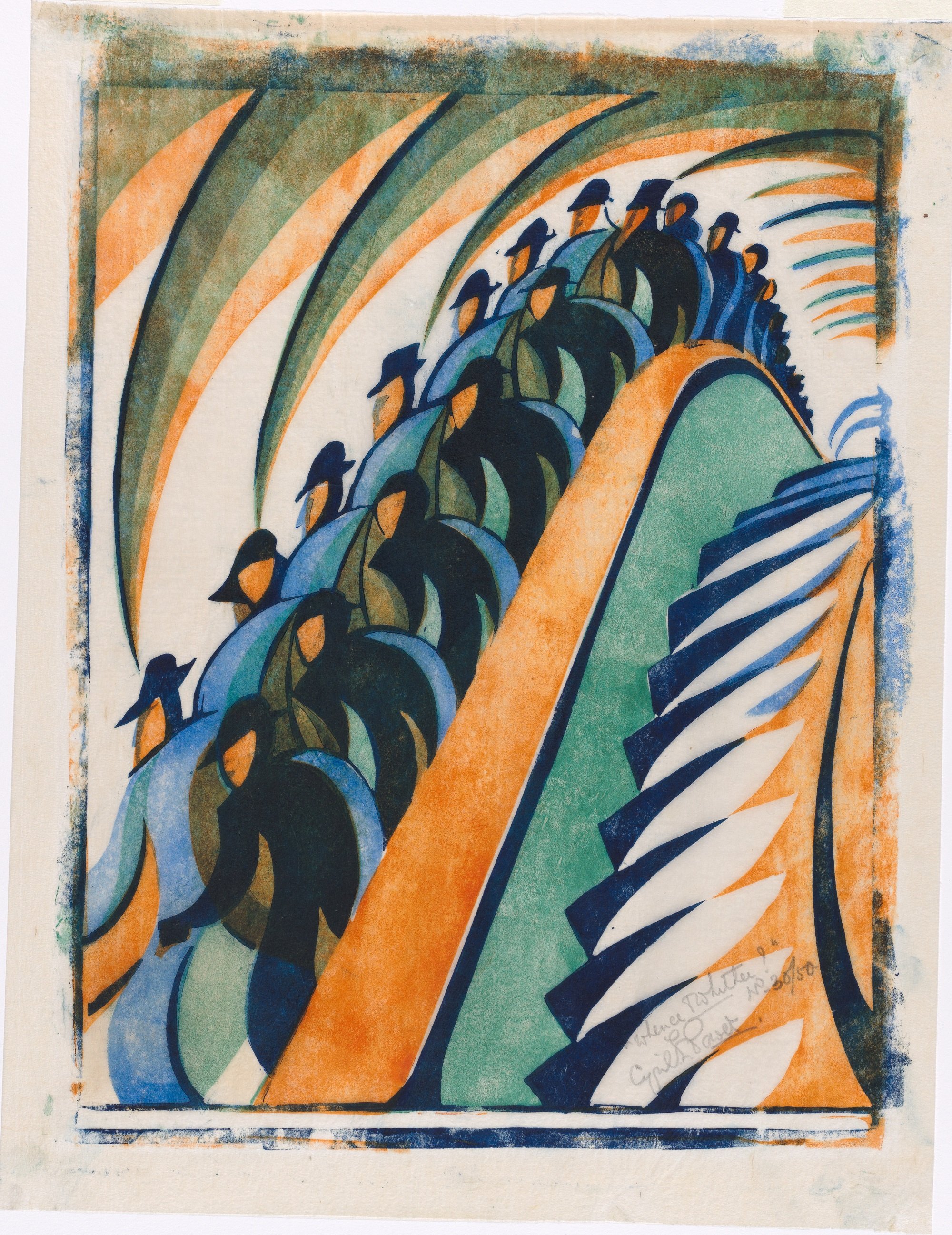
In a work such as Vertical-Horizontal Composition (ca. 1917), a design of wool on canvas, Taeuber-Arp used needlepoint’s rigid architecture both to embed and to disguise iconographic forms. What at first resembles nothing more than a pattern of rectangular shapes might, at varying distances, come into focus as a duck in profile. Taeuber-Arp carried such bitmapped semiotics to her necklaces and purses and other textile crafts. Among its tiles and zig-zags, a CushionPanel from 1916 might be implanted with abstracted flowers in its cross-stitching. An egg-shaped beaded bag from circa 1918 might contain an abstracted forest in addition to its contents.

Taeuber-Arp envisioned such patterns and motifs repeating across media, making furnishings, accessories, and everyday objects “more beautiful.” She also looked to unlock the animation in these abstract forms. As she took her shapes to three dimensions, she used turned and painted wood to create what she called her Dada Cup (1916), Amphora (1917), and Powder Box (ca. 1918)—cool, mysterious objects with anthropomorphic pretension.

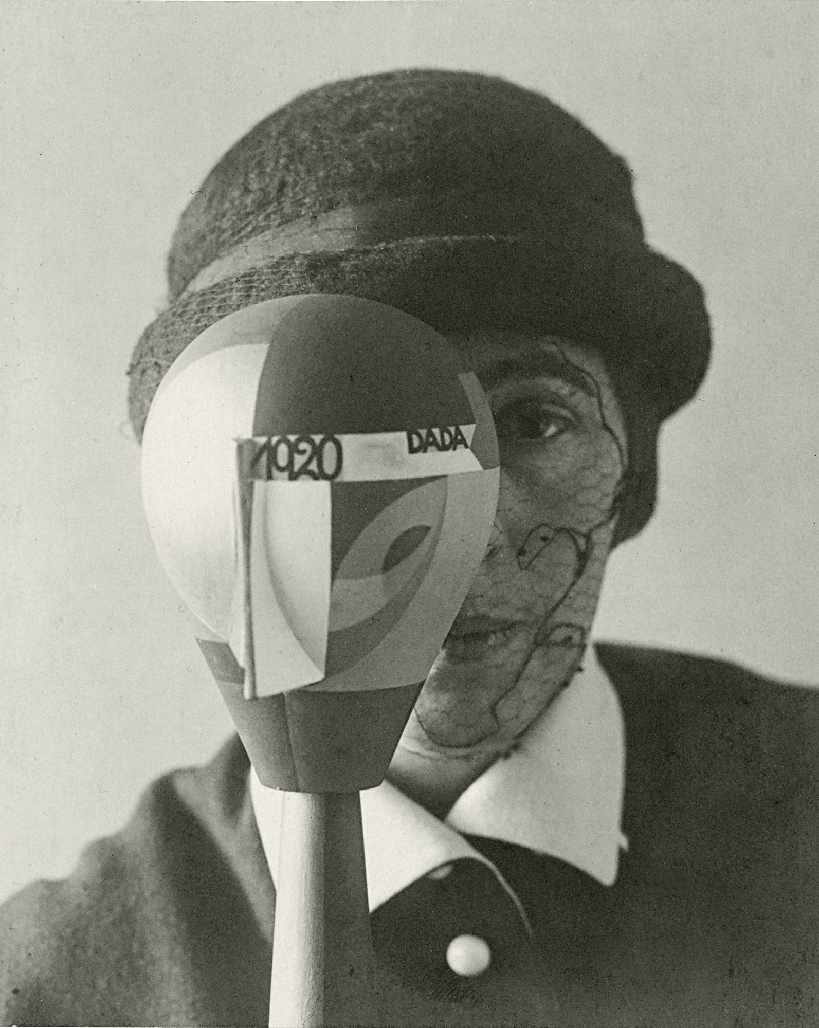
Nic Aluf, Sophie Taeuber with her Dada Head, 1920, Gelatin silver print on board, Stiftung Arp e.V., Berlin. Photo: Wolfgang Morell.

You could easily miss the next room, a side gallery that is a highlight of the exhibition. Here Taeuber-Arp brought form to life through her marionettes. For a Dadaist version of the story of “King Stag,” she designed the scenery and puppets of the absurdist production. The eighteenth-century commedia dell’arte fantasy now included a Freudian subplot and a character named “Dr. Oedipus Complex.” Many of Taeuber-Arp’s scenery drawings and geometric figurines are here, along with a film of a reproduction of the performance. Also here are her photographic portraits of the same period, taken by Nic Aluf at the request of Tristan Tzara, where Taeuber-Arp looks out from behind her turned-wood “Dada heads”—the artist as modernist puppet-master, half-masked and half-revealed.

Later in the 1920s Taeuber-Arp brought her orthogonal matrices to stained glass and interior design. She imparted a sense for the “total work of art” to her floor-to-ceiling designs for the Aubette, an entertainment complex funded by the art collector André Horn and his architect brother, Paul. Taeuber-Arp covered every interior surface with textile patterns—most of them preserved now only in drawings and photographs. Inspired by the severe editing of the Bauhaus, she also looked to industrial design. She created desks for apartments in Paris and modular furniture for her own studio-house in Clamart, the town southwest of Paris where she and Jean settled in 1929 (the land was purchased in part thanks to her professional design income). All followed a similar formal logic, building up and cutting into the grid.

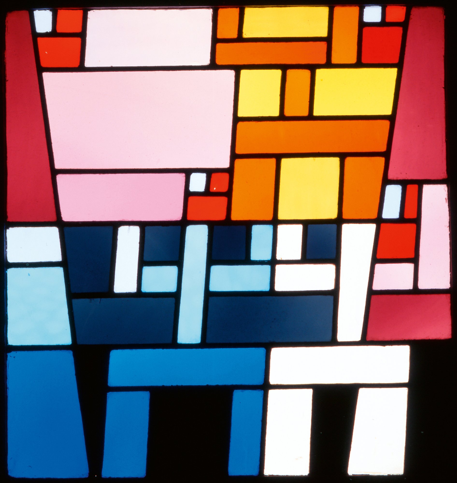
Sophie Taeuber-Arp, Off-Center Abstract Composition (stained-glass window for the apartment of André Horn, Strasbourg, France), 1928, Stained glass, Musée d’Art Moderne et Contemporain de Strasbourg, France. Photo: Musées de Strasbourg.

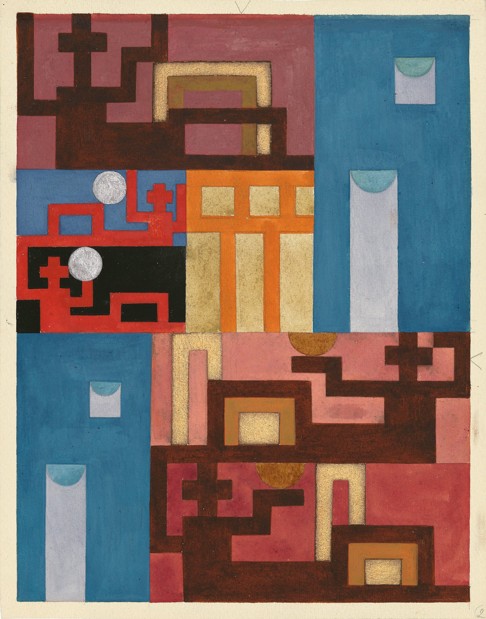
Yet Taeuber-Arp’s work never again reached the same level of abstract life as in her early experimental years from 1916–20, at the conclusion of World War I, working with Swiss Dada. As she then turned to oil on canvas in the late 1920s and into the 1930s, the geometry remained but the dynamics fell more flat. Her imbibing figures in Café (1928), with their circle heads and street-sign bodies, fail to rise above graphic design. She carried such colorform shapes through their many permutations and combinations, but the graphic experiments, treating paint like just more needlepoint, were more smoke than fire. In its division of the canvas, cut through with colorful lines, Six Spaces with Four Small Crosses (1932) reaches for a more nuanced syncopation. Still, it is no “boogie-woogie,” Broadway or otherwise.

There are many such modernist echoes throughout this exhibition: not just of Mondrian, but also of Calder and, of course, her own husband, Jean Arp. A walk through moma’s permanent collection suggests these and many more affinities that “Living Abstraction,” in attempting to elevate Taeuber-Arp, ignores rather than explores. The exhausting comprehensiveness of this singular treatment, filling as many rooms as last year’s revelatory “Cézanne Drawing,” ends up diminishing her achievements by spreading the artist too thin.

The story of the supposedly overlooked creative wife, of the artist-victim in need of our rediscovery and salvation, might make for a compelling contemporary narrative, but it does not necessarily align with actual experience. The exhibition claims that “gender discrimination” is “one of the reasons Sophie Taeuber-Arp remains far from a household name.” It laments the “difficulties faced by women of Taeuber-Arp’s generation, in particular those with well-known spouses, to be considered artists in their own right—as individuals first, rather than as partners.” It also criticizes the posthumous catalogue raisonné her husband published in 1948 as “well-intentioned” but one that “occluded the vibrant, cross-disciplinary versatility that is at the heart of her singular life’s work.”

Photographer unknown, Sophie Taeuber-Arp in costume for a housewarming party organized by artist Walter Helbig, Ascona, Switzerland, August 1925, Fondation Arp, Clamart, France. Photo: © Fondation Arp, Clamart.

And yet, in a time before gender became just another political chip, the world that this artist inhabited, especially the life she lived with her artist husband, seemed determined to encourage her. After her death, in addition to publishing her catalogue raisonné, Jean Arp helped organize, at the Kunstmuseum Bern, the first retrospective of her work. With dozens of blue-chip lenders to the present exhibition, both in Europe and America, one must wonder how overlooked Sophie Taeuber-Arp has ever really been.

Timed to this exhibition, A Life through Art, a new bilingual biography written by Taeuber-Arp’s great-niece Silvia Boadella, translated from the German by the New Criterion contributor Tess Lewis, tells quite a different side of the story of this artist whose life and work confronted two world wars while remaining faithful to the promises and possibilities of modern art.2

The book is a welcome pendant to the exhibition, adding some warmth to the typical chilliness of a moma presentation. Boadella has written evocative vignettes of Taeuber-Arp’s “life through art,” inspired by family stories and the artist’s creative record. She begins with a retelling of Taeuber-Arp’s final night and her untimely demise: “Sophie lies very still, the white duvet pulled up to her chin. The smoke spreads more thickly. The fire in the stove goes out . . . ” As she is accidentally poisoned by carbon monoxide alone in a remote garden house, the book reads like a fever dream from the great beyond.

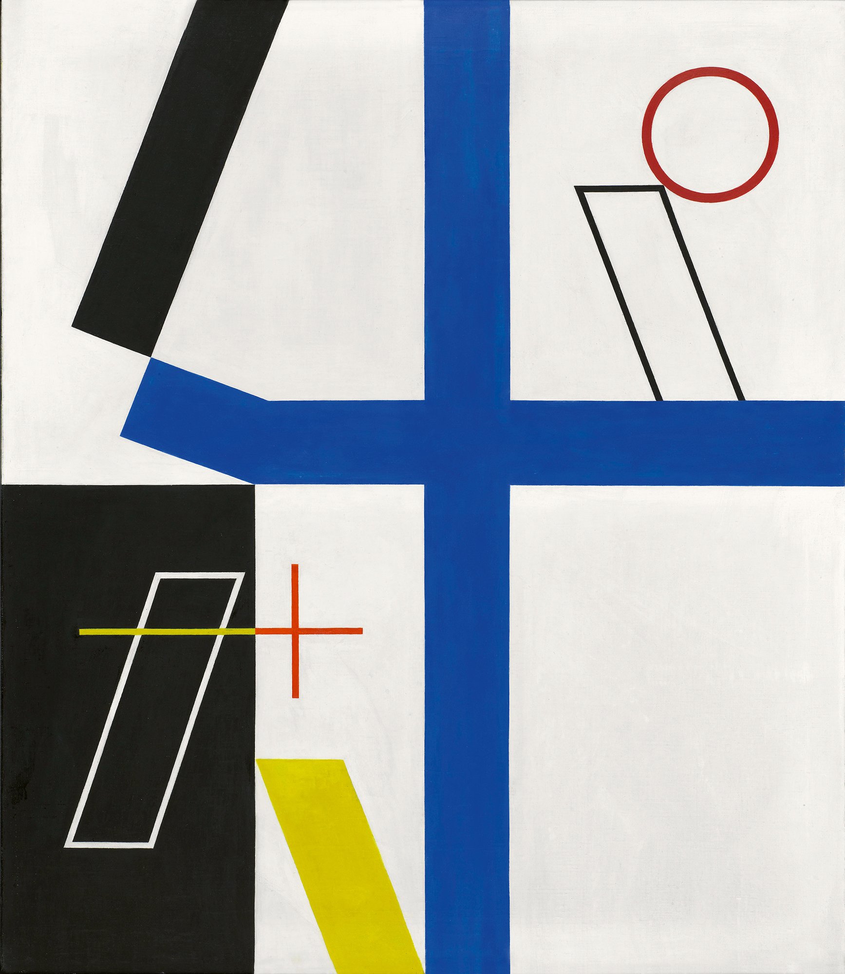
Sophie Taeuber-Arp, Four Spaces with Broken Cross, 1932, Oil on canvas, Musée National d’Art Moderne, Centre Georges Pompidou, Paris © CNAC/MNAM/Dist. RMN-Grand Palais/Art Resource, NY. Photo: Bertrand Prévost.

Indeed, Taeuber-Arp “lived” abstraction through an abbreviated life that was as interesting, in many ways more interesting, than the objects and designs she left behind. After all, she inhabited Europe’s foremost creative circles, traveling with Kurt Schwitters and Hannah Höch to the island of Rügen in Germany and with Hugo Ball and Emmy Hennings to the Amalfi Coast. Interweaving artists such as Alexander Calder, Max Ernst, and Sonia and Robert Delaunay in addition to Taeuber-Arp’s own husband, this book does much to reanimate the excitement of her times and the energy of a life that, in contrast to this exhibition’s heavy-handed editing, included other creative souls.

This is what is ultimately missing from moma’s presentation. Yes, as the exhibition catalogue proposes in its “Directors’ Forward,” this modernist polymath was a “designer of textiles, beadwork, costumes, furniture, and interiors, as well as an applied arts teacher; dancer; architect, painter, sculptor; illustrator; magazine editor; gifted amateur photographer; and champion of abstract art.” We now have evidence of this and then some. Yet in its great effort to single out Sophie Taeuber-Arp—even (as the catalogue admits) “deliberately exclud[ing] the drawings and collages that her grieving widower posthumously identified as ‘duo’ ”—“Living Abstraction” takes the life out of the living. We are left with hundreds of creative fragments but, in the end, a still life in need of its golden thread.

  1. “Sophie Taeuber-Arp: Living Abstraction” opened at the Museum of Modern Art, New York, on November 21, 2021, and remains on view through March 12, 2022. The exhibition was previously on view at the Kunstmuseum Basel (March 19–June 20, 2021) and Tate Modern, London (July 13–October 17, 2021).

  2. Sophie Taeuber-Arp: A Life through Art, by Silvia Boadella, translated by Tess Lewis; Skira Editore, 224 pages, $39.95.

1 Comment

Visions of Spain

Comment

Visions of Spain

THE NEW CRITERION, January 2022

Visions of Spain

On “Gilded Figures: Wood and Clay Made Flesh” at the Hispanic Society Museum & Library, New York, and “Treasures from the Hispanic Society Library” at the Grolier Club, New York.

Spanish art often dwells in that dark hour before the dawn. The lights are down. The heavens have closed. The eyes adjust while you feel around. Forms lurk as colors shift in unstable ways. Other national schools have light and lift and plenty of it. Spanish art pushes down and holds you in its shadowy grip.

The appeal of Spanish art is not always immediate, but, like an acquired taste, it can be that much more rewarding to the palate. A little over a century ago, the philanthropist Archer M. Huntington developed an appetite for the Spanish style. The Hispanic Society of America, his 1904 Beaux-Arts creation on Audubon Terrace at 155th Street and Broadway, in Washington Heights, became New York’s treasure house of Spanish art, literature, and more. Whenever I am asked about my favorite local institution, the society is always at the top of my list. No other collection in the New World, and perhaps even the Old, can rival certain strengths of its holdings. Paintings by El Greco, Velázquez, and Goya, murals by Sorolla, sculpture, pottery, prints, photography, and ironwork, not to mention an unparalleled library of Spanish books, maps, and manuscripts (all still on card catalogue): this free-to-visit institution is counted as a major discovery by anyone who sets foot inside and goes about exploring its many nooks and crannies. The only problem, and it’s a big one, is that the society has been closed to the public since 2017.

Installation view of “Treasures from the Hispanic Society Library” at the Grolier Club, New York. Photo: Charlie Rubin.

That the Hispanic Society remains an undiscovered country has been both a blessing and a curse to the institution. Geographically remote, largely self-contained, the society has been able to carry about its business of preserving, presenting, and even acquiring great works of Spanish culture seemingly beyond the frenetic mandates of today’s museum-industrial complex. At the same time, the society’s aging infrastructure and, historically at least, rather outsider position in the world of philanthropy have kept its future in doubt and its art and objects vulnerable to the exigencies of the moment. In 2017 the society’s main building, which did not even have climate control, was closed for a comprehensive renovation. It remains shuttered today as its reopening schedule seems forever pushed back. We can only hope it reopens soon, and hope that when it does the society will be merely a better version of itself, not a new-normal something else. These days, if something is perfect just the way it is, it almost certainly has to change.

It greatly helps that Philippe de Montebello, director emeritus of the Metropolitan Museum of Art, has taken up the cause of the Hispanic Society by serving as the chairman of the society’s board of trustees. The words “museum” and “library” have been added to its branding, lest you think the society were some kind of social club. And the society has maintained its activities by organizing exhibitions of its collection in the United States and abroad. In 2017 two hundred of its treasures traveled to the Prado in the society’s first international loan exhibition. Major exhibitions have since been mounted in Houston, Cincinnati, Mexico City, and elsewhere.

This past season we have had a chance to consider two of the Hispanic Society’s strengths with concurrent exhibitions in New York: “Gilded Figures: Wood and Clay Made Flesh,” on view at the Audubon Terrace campus in the society’s new East Building Gallery through January 9; and “Treasures from the Hispanic Society Library,” which was on view at the Grolier Club through December 18, 2021.1

Pedro de Mena, Saint Acisclus, ca. 1680, Polychromed and gilded wood, on view at the Hispanic Society Museum & Library. Photo: Hispanic Society Museum & Library.

Polychrome Renaissance and baroque sculpture has been collected by the Hispanic Society since its inception. Huntington first pursued them at a time when the red-blooded religious works were largely overlooked by Anglo-Protestant taste. The society has since supplemented his acquisitions, aided by the fact that only very recently has the market heated up (or, at least, warmed up) for these arresting works. Half of the twenty-two sculptures on view in “Gilded Figures: Wood and Clay Made Flesh” are in fact acquisitions made since the 1990s. These works are now gathered together with the highlights of Huntington’s original collecting and one loan. Patrick Lenaghan, the head curator of prints, photographs, and sculpture at the institution, has organized the exhibition in partnership with his colleague Hélène Fontoira-Marzin, the head of conservation—the person who has been central to the restoration of these delicate objects and the reason we now find them so powerful today.

While polychromy can be found throughout European art, it was the Spanish who took the form to its living, breathing conclusions—merging the crafts of woodworking and clay-sculpting with the skill of painting. The verisimilitude, of “wood and clay made flesh,” went against the ideals of neoclassical statuary, and it can still strike us as unusual today, more mannequin-like than high sculpture. Yet the results give Spanish devotional sculpture a life of its own. The society’s survey of twenty-two of these sculptures follows the work from the Spanish Renaissance through the baroque—and on to the New World, as local craftsmen merged Mesoamerican design with Spanish tradition.

Starting clockwise to the left of the door, in a rather jumbled visual presentation, the exhibition begins with The Resurrection (ca. 1485–1500). This polychromed and gilded pine altarpiece is attributed to the late-Gothic master Gil de Siloé. Here the risen body of Christ is not so much moving up as sliding down the top of his tomb into a space populated by devoted disciples and snoozing soldiers. His chest, his legs, and especially his hands have an uncanny corporeality. The message is to be present. The Resurrection would be one thing you don’t want to sleep through.

Juan de Juni, Saint Mary Magdalene, ca. 1545, Polychrome wood and wax, on view at the Hispanic Society Museum & Library. Photo: Hispanic Society Museum & Library.

Polychromy lent itself to the creation of reliquary objects, with lifelike forms designed to contain the actual forms of life. Juan de Juni’s Saint Martha and Saint Mary Magdalene (both ca. 1545) are busts that were originally animated by the relics placed on wax seals covering their hearts. Here the saints in different modes of contemplation serve as pendants to each other. Their gilded garments are accentuated by an overpaint that is then scored to reveal the gold beneath.

The most astonishing example here must be Pedro de Mena’s bust of Saint Acisclus (ca. 1680). The saint was a third-century Roman in Córdoba who converted to Christianity and refused to apostasize. De Mena captures him in his moment of martyrdom, as his throat is slit. His furrowed brow, his dark glass eyes, his slight build, his tousled hair, and his parted lips revealing ivory teeth all speak to the emotions of the moment. A thin line of blood drips from his neck as he contemplates his final breath. This detail, overpainted with flesh tones in later years, was brought back to bloody life through the society’s restoration work.

Luisa Roldán’s baroque tableaux of Magdalene, Catherine, and the flight from Egypt, all from 1692–1706, reveal the extra level of detail that can be imparted through painting terracotta rather than wood. Practically miniatures, these packed cinematic scenes would have been intended for private devotion and, despite their complexities, were created from single pieces of clay.

Andrea de Mena, Mater dolorosa and Ecce homo, both 1675, Polychromed wood, on view at the Hispanic Society Museum & Library. Photo: Hispanic Society Museum & Library.

Andrea de Mena, the daughter of Pedro, carried on her father’s legacy even after she joined the convent across the street from the family workshop. Her time with the nuns did little to temper her inherited sense for emotion and gore. Andrea’s Ecce homo and Mater dolorosa, both from 1675, incorporate tiny ivory teeth, hair, eyelashes, and at one time a crown of thorns to give these works their extra fleshiness. With the Ecce homo, or “Christ as Man of Sorrows,” the blood gushing from his wounds is made from red glass that has been dripped onto his head. Each work comes with its original seventeenth-century glass case, encapsulating these emotions in gilded three-dimensional frames.

As Spain brought her saints to the New World, she also brought her art. St. James the Moor-slayer, or Santiago Matamoros, was the apostle who was taken up by the Spanish for miraculously appearing at the battle of Clavijo, itself a mythical fight that became a rallying cry for the expulsion of Muslims from Spain. From the Iberian to the Yucatán peninsula, Santiago Matamoros became the patron saint of the conquistadors in their colonization of Mexico. A 1600 relief by an unknown Mexican sculptor features the equestrian saint trampling the Moors under hoof—but it also works Aztec patterns into the saddle and an unusually carved frame. Everything was not conquered after all.

For the many strengths of the Hispanic Society’s art collection, its library of books, arts, and manuscripts is even more rarified. One reason for this was Huntington’s own self-guided collecting practices. So as not to deplete Spain of her artistic patrimony, Huntington generally collected Spanish art abroad, gathering works that had already left the country. For the creation of his library, however, which he started first, he imposed no such self-restrictions. His literary sources were that much more abundant and rich than his potential artistic supply. When it came to the books, he could tap into the main arteries of Spanish heritage.

Installation view of “Treasures from the Hispanic Society Library” at the Grolier Club, New York. Photo: Charlie Rubin.

“Treasures from the Hispanic Society Library,” organized by the society’s former director Mitchell A. Codding and its current curator of manuscripts and rare books, John O’Neill, presented many of the highlights of this aspect of the society’s collection. And what highlights they are: a 1605 copy of Don Quixote, hand-drawn maps of the New World, Torah fragments from Andalusia, and a letter from Charles V to Henry VIII regarding his challenging of Francis I to a duel over the Treaty of Madrid. The standout of the show might have been the small Black Book of Hours, by the circle of Willem Vrelant from around 1458—a haunting work, most likely marking a death, that is written on black vellum. The Grolier Club exhibition supplemented its elegant installation with informative labels giving the backgrounds for each of these objects. When it came to the story of the works, you could hang on every word.

It should be said that for all of these highlights, there is much more in the society’s archive that was not on display. At three by eight feet, Juan Vespucci’s Map of the World, from 1526, may have been too large and delicate to travel. This astonishing chart, a centerpiece of the society’s collection, is by the nephew of Amerigo, the man who can lay claim to giving two of our seven continents their names. Juan (i.e., Giovanni) Vespucci was Amerigo’s successor as chief pilot (“pilato desus ma[jes]ta,” as he wrote on his map) for the House of Trade in Seville.

The Florentine explorer took a rather expansive view of Spain’s global claims and decorated his detailed map with the flora and fauna of its more exotic domains. The last time I saw this map in person, it was in the society’s dusty private library. Having flagged me down in an empty gallery, a friendly guard waved me over and gave the library’s door a gentle knock. The librarian answered and ushered me inside, bringing me past the card catalogue and piles of books that seemed to be overflowing in the small study room—itself just the forward-facing end of the library’s extensive closed network of stacks, which runs beneath the terrace’s public plaza. On one of the walls was a curtain. The librarian pulled a cord. Eso, there was the Vespucci.

The Hispanic Society presents the world through such expansive visions of Spain. I look forward to the time when the map-lines again point the way here. Until then, we are grateful for whatever glimpses and glances we can get of these many sparkling treasures.

1 “Gilded Figures: Wood and Clay Made Flesh” opened at the Hispanic Society Museum and Library, New York, on October 15, 2021, and remains on view through January 9, 2022. “Treasures from the Hispanic Society Library” was on view at the Grolier Club, New York, from September 28 through December 18, 2021.

Comment

Fine Prints

Comment

Fine Prints

THE SPECTATOR WORLD EDITION, December 2021

Fine Prints

Amid the turbulence of modernism, British artists made art for themselves. A review of Modern Times: British Prints, 1913-1939 is on view at the Metropolitan Museum of Art until January 9, 2022. 

The print is a curious category in the world of art. Prints are not singular, of course — not typically at least. They are not ubiquitous, either — at least, again, not typically. They exist somewhere between art objects and art products. Printmakers often use the tools of sculpture to create works on paper. Three-dimensional carved objects become two-dimensional printed products. Think about it and you realize prints are far more curious than they let on.

While art history typically does not know what to do with its curiosities, artists can sometimes make much out of the opportunities of hybrid creation. A century ago, a selection of British artists made the most out of the process at a time when war, strikes, the Depression and modernization were all sapping the opportunities of their generation. Printmaking was theirs for the print-taking. With inexpensive materials, at first wood and later the same linoleum blocks you might find on your kitchen floor, they cut forms in relief with simple sculpting tools and used them to print bold, inexpensive images. Their woodcut and linocut works captured and gave their buyers ownership over the accelerating speeds and abstractions of the times. In simplified line, color and form, the modern British print made sense out of modern British life.

Edward Alexander Wadsworth (British, 1889–1949), Liverpool Shipping, 1918, Woodcut on Japanese paper

Modern Times: British Prints, 1913–1939, a major exhibition of one hundred of these works now on view at the Metropolitan Museum of Art, reveals the senses and sensibilities of Sybil Andrews, Claude Flight, Christopher Richard Wynne Nevinson, Power and Edward Wadsworth, among others — the artists who made British printmaking modern. The exhibition also pays tribute to Leslie and Johanna Garfield, the husband-and-wife collecting team who pursued these rare works over three decades and gathered them together. They lived with them among tens of thousands of other prints in their Upper East Side apartment, tucked away in special drawers and sliding walls, before transferring 700 of them to the Metropolitan in 2019. It was a significant acquisition, instantly making the Met a leading collection for British prints. This is our first chance to see it all together — including for Leslie Garfield himself, as he told me at the opening.

“You go to books on modernism — nothing. You go to books on British modernism — nothing.” That’s what Jennifer Farrell, the exhibition’s curator, suggested to me about the lack of notoriety for these works. Modern art in Britain often gets overlooked for its Continental and American cousins, and unfairly so. In form these British prints could go toe to toe with their Italian Futurist or French Cubist relatives. A generation later, British artists such as Richard Hamilton — another Garfield focus — were manufacturing Pop art before Warhol’s American factory ever cranked out its first soup can. In many cases, British artists’ turn to form over function took on “modern times” in ways that other modernisms rejected. Faced with the true shock of the new, and sometimes battling psychological demons, these artists printed form in order to function in Britain’s twentieth century.

A hundred years later, up against far different challenges, Farrell just about had to unlock the Metropolitan herself to get these acquisitions inventoried and photographed in time for this exhibition, the print department’s first since winter 2020. But I could think of worse ways to spend the pandemic. The dynamism of this work — the colors, the energy, the crowds depicted — speak to what we were all missing.

The selection begins in the early 1910s with Wyndham Lewis, Edward Wadsworth and Vorticism — the short-lived British response to Futurism, so named by Ezra Pound for the vortex “from which, and through which, and into which, ideas are constantly rushing.” “Newcastle,” a tiny print by Wadsworth from 1913 and among the earliest in the show, turns the gears of industry into rotating, gnashing, zig-zagging teeth of black and white. The deadly engine of World War One would soon make that vortex all too real. As artists were called up to camouflage ships at sea, Wadsworth’s “Liverpool Shipping” of 1918 turns an entire image into a dazzle pattern of lines that energize and confound their forms.

Such lines — centrifugal and confounding — followed British printmaking through the interwar years. Now, instead of simply black and white, we see artists use all sorts of stunning colors, printed through an increasingly complex arrangement of blocks. At the Grosvenor School of Modern Art, a London school founded by the engraver Iain Macnab in Pimlico in 1925, Claude Flight practiced, taught and popularized linocut techniques. Flight wanted the price of a print “to be equivalent to that paid by the average man for his daily beer or cinema ticket.”

Such a democratic impulse did not make his students rich, but Sybil Andrews, Cyril Power, Lill Tschudi and other Grosvenor School artists went out to apply Vorticist swirls and jags to the circles of the Tube, the curves of the concert hall and the eddies of the crew oar. Tschudi’s “Underground” (1930) uses forms of color to trace the tunneling curves. Andrews’s “Sledgehammers” (1933) swings and dazzles in clanking colors of green, blue, orange and brown. Meanwhile, Power’s “The Merry-Go-Round” and “Whence & Whither?” (both c. 1930) turn crowds, whether on a carnival or escalator ride, into swirling masses.

Cyril E. Power (British, 1872–1951), Whence & Whither?, ca. 1930, Linocut

Is all this activity enough for Garfield? Surveying the exhibition opening, he admitted to me that he is still collecting. “It’s terrible, I am. I bought something yesterday.” He said he was setting his alarm for six the next morning in order to be up in time for the London sales. “Come,” he says, taking me by the arm.

He brings me over to Robert Gibbings’s “Dublin Under Snow.” This small black-and-white print from 1918 falls outside the purview of Modern Times but was nevertheless included here as a last-minute addition. “Dublin Under Snow” turns the snow-covered rooftops as seen from Gibbings’s barracks into an abstraction of alternating angular forms. Gibbings was a master of printmaking’s negative spaces, with its reversals of carved and inked forms.

Farrell suggests that the work evokes the famous final lines of James Joyce’s “The Dead,” published in Dubliners just a few years before in 1914: “His soul swooned slowly as he heard the snow falling faintly through the universe and faintly falling, like the descent of their last end, upon all the living and the dead.”

Sybil Andrews (Canadian (born England), 1898–1992), Sledgehammers, 1933, Color linocut.

While Leslie was the initial collector of prints — he purchased his first Erich Heckel woodcut in 1954 — it was Johanna who directed their interests to British printmaking and the more colorful works of the Grosvenor School. “If we had different pictures on this wall, our children would be different,” she once told Leslie. Johanna passed away in August, just as the exhibition of her collection was being finalized. While it could not appear in time in the catalog, “Dublin Under Snow” serves as a quiet tribute to her. “This,” Leslie tells me, “is Jo’s favorite.”


Comment