Zabar's is still thriving

Comment

Zabar's is still thriving

THE SPECTATOR WORLD EDITION, June 2022

Zabar’s is still thriving

on “Broadway’s longest running show”

You might expect Zabar’s, the world-famous “appetizing” store on Manhattan’s Upper West Side, to have become a shadow of its former self. This seems to be the case for most of New York’s other independent specialty shops. Fairway, Balducci’s, H&H Bagels, Dean & Deluca: the food purveyors of my youth have gone kaput. They were bought, leveraged, expanded, overextended and oversold. They expired past their sell-by dates.

But somehow Zabar’s survived. For the Upper West Sider, Zabar’s is our Yale College and our Harvard. Like many I make my way down to 80th Street and Broadway most weekends for continuing education. I head to the appetizing counter and take a number. This is the heart of the operation, where it began in 1934 and where things still move at a historical pace. As I wait my turn, I collect my pickled herring and whitefish salad from a nearby refrigerator. Maybe I dart over to the cheese counter for Oma, d’Affinois, and gorgonzola. If I employ some Zabar’s calculus I could even take a number at the delicatessen counter for meats and prepared foods, such as the creamed spinach and truffled mortadella. Each counter comes with its own seasoned attendant, who collects my order in a waxed bag. They might even give me a sample.

My turn comes up at appetizing, the counter that sells the salted and smoked fish. There was a time in Jewish gastronomy when appetizing stores and delicatessens operated separately, because Kosher customers cannot purchase meat and dairy from the same purveyor. Zabar’s has only ever been “Kosher-style,” but the separation remains in house. My order is a quarter-pound “novie” (Nova Scotia-style smoked salmon, a less salty variant of lox), a quarter-pound sable (a tender whitefish that melts in your mouth), maybe a quarter-pound sturgeon (the king of the sea, flaky and pure), and just maybe a jar of the sturgeon’s jewel-like eggs. Behind the counter they are pros. If I am lucky, my namesake James will be the one to do the slicing. Once you see how thinly these Zabar’s guys hand-slice a fish, you cannot go appetizing anywhere else. When I was growing up, my Italian father placed a similar order most Sundays.

Zabar’s is chaotic by design. Food is everywhere, people are everywhere, announcements are frequent. “The lady who was looking for half a pound of chicken liver please come to the front,” I hear over the loudspeaker. While some items are self-service, many are not. You must line up just right. The aisles can barely fit your own small cart, which is a problem as shoppers press in from all sides. “You are out of Seder plate kits?” “Are we out of Seder plate kits?” “I ordered mine days ago.” “They are sold out of brisket!” From a service door, out comes Saul Zabar himself, the patriarch in his white smock pushing a cart. When his father Louis died in 1950, Saul took over Zabar’s at the age of twenty-one and has worked for the family store ever since, partnering with his younger brother Stanley and their relative Murray Klein. Over the years Saul expanded Zabar’s into the best of everything, including introducing New Yorkers to gourmet coffee. At ninety-three years old, he is still the one to wake me up with his “Zabar’s Blend” each morning. The man deserves a monument.

A few years ago, I found myself at dinner sitting next to an unassuming woman named Lori Zabar. Was she related to the famous store? Indeed she was — Stanley’s oldest daughter. How is Zabar’s still thriving? Because the family never sold out and four generations now work for the business. Please make sure that continues, I begged.

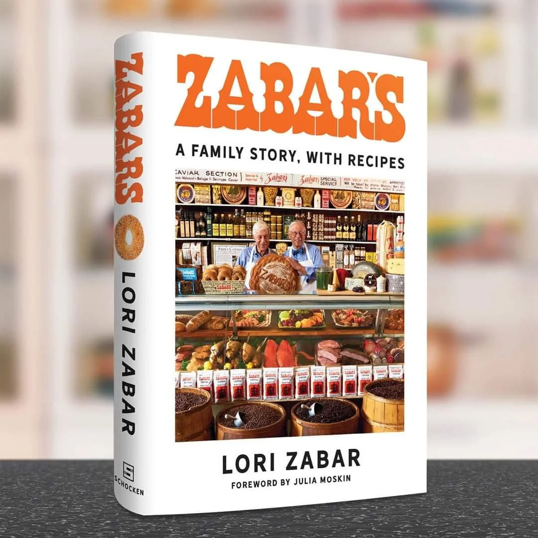
It turned out that Lori, who died in February at age sixty-seven, was well positioned to make the case. The family historian, she cooked up a reserved and at times harrowing new book on her name and the store that bears it. Zabar’s: A Family Story, with Recipes ($28, Shocken) conveys the importance of what her family created.

Drawing on her grandfather’s own testimony taken at the time of his displacement in the early days of the Soviet Union, the beginning was anything but appetizing. In 1920 Cossacks allied with the Red Army were terrorizing the Jewish enclave of Ostropolia, now Ostropol in present-day Ukraine. During the pogrom, a husband tried to defend his wife. The Cossacks stabbed him to death. They shot his wife in the face. They murdered his daughter in front of him in his home. Their surviving son, Mordko Leib Zabarka, then chased the soldiers off with a gun and went into hiding. Two years later, the young man arrived in New York as Louis Zabar.

Louis worked in New York food retail from the bottom up. He married another Ostropolitan exile, Leika Teitelbaum, who became Lilly Zabar. In the Zabar’s origin story, Louis began in fruit and veg but developed an allergic rash to the skins. “As he toiled,” writes Lori, “he noticed that only one thing helped: when he put his hands in a barrel of pickled herring, the brine soothed his rash.”

So Louis became an “appetizing man” and rented a small retail space on Broadway. From this Capitoline Hill between 80th and 81st Street, a food empire was born. At first Louis set out to build a chain of everyday markets. When he died at age forty-nine, it was the vision of the next generation of Zabar partners — Saul, Stanley, and Murray Klein — to consolidate the business and turn it into the gourmet flagship of today. As they watched the gastronomic tide of home cooking rise in the second half of the twentieth century, they floated to the top with the finest fish, the freshest bread and the smoothest coffee.

Lori Zabar serves us a concise history of Jewish food retail. She explains the difference among pickled and matjes and schmaltz herring. She tells of Uncle Eli’s defection to retail on the Upper East Side, where he developed his own appetizing restaurant called E.A.T. and a bakery called Eli’s Bread. She also recalls seeing a carp and a herring swimming in her grandmother Lilly’s Upper West Side bathtub. “They were destined for her delicious Shabbat gefilte fish.”

The joys of watching the “longest running show on Broadway,” as Lori calls her family store, contrast with the sorrows its creators once faced. The Cossacks were but a prelude to the Nazi invasion of Ukraine and the extermination of 1.6 million Jews there in 1941. The terrors of Ostropolia a century ago now seem all too familiar in Ukraine today. In this light Zabar’s becomes a new Garden of Eden. Here on a corner of the Upper West Side, she writes, her family celebrated “personal exodus from religious persecution in the Old World to America — their promised land of freedom and dignity.”

Comment

The obtuse bard

Comment

The obtuse bard

THE NEW CRITERION, June 2022

The obtuse bard

On “Winslow Homer: Crosscurrents” at the Metropolitan Museum of Art, New York.

Winslow Homer (1836–1910) was an artist of few words and much action. His paintings and watercolors depict moments of contemplation often surrounded by turmoil. Man against man, man against nature, and nature against innocence are recurring themes. The beloved Yankee chronicler of the second half of the nineteenth century, largely self-taught, captured the fading light of agrarian New England to elevate his genre scenes into portraits of profound expression. He started as an artist of the Civil War. His first assignments were battlefield dispatches for Harper’s Monthly. Over his prodigious career he edited down his observations into fraught, ambiguous narratives. With daring passages of abstraction, his late seascapes, of waves crashing against rocks around his home in Prouts Neck, Maine, prefigured the twentieth century’s modern turn while remaining true to his regional vision.

Winslow Homer, The Gulf Stream, 1899, Oil on canvas, The Metropolitan Museum of Art, New York.

You can see these achievements in “Winslow Homer: Crosscurrents,” the survey now on view at the Metropolitan Museum of Art.1 Here are many of Homer’s greatest paintings in one place. Beyond over a dozen major works from the Met’s own collection, the exhibition includes such iconic pictures as Crossing the Pasture (1871–72, Amon Carter Museum of American Art, Fort Worth), Breezing Up (A Fair Wind) (1873–76, National Gallery of Art, Washington, D.C.), The Life Line (1884, Philadelphia Museum of Art), and Fox Hunt (1893, Pennsylvania Academy of Fine Arts, Philadelphia).

While containing passages of the specific, the paintings rise above the regional and anecdotal to speak to the broader themes of childhood exploration, interpersonal relations, and natural wonder. Mystery and peril vie against ingenuity and observation. From the stoic industry of The Veteran in a New Field (1865, Metropolitan Museum of Art), to the playful game of Snap the Whip (1872, Metropolitan Museum of Art), to the heroic salvation of Undertow (1886, Clark Art Institute, Williamstown, Massachusetts), we can see the preciousness of life and reminders of our own mortality.

And yet, this major exhibition leaves the artist foundering. Political baggage has been piled high. Much like The Gulf Stream (1899, reworked by 1906, Metropolitan Museum of Art), the masterpiece at the center of the show, the tiller has broken, the mast has snapped, and the cargo will not make it to shore. Contemporary hurricanes have come to churn the waters. Homer has been blown to sea. The unfortunate artist is adrift.

The conceit of “Crosscurrents” is that The Gulf Stream, a highlight of the Metropolitan’s American collection, is singularly central to the artist’s body of work. The powerful painting drew on watercolor studies Homer made over some twenty years during his winter vacations in the Bahamas, Cuba, Florida, and Bermuda. Homer sketched frequently as he escaped the Maine cold. Yet The Gulf Stream as composed back home was an outlier, his only Caribbean seascape in oil and his only one depicting a black sailor. An investigation into the development of this image might make for an interesting focused exhibit. But this is not the case: the lending and collecting powers of the Met and the National Gallery, London, where this exhibition will next be seen, are brought to bear on a full-throated revisionist survey based on a far-fetched academic thesis.

With eighty-eight oils and watercolors, this show is the largest gathering of Homer’s work since Washington’s National Gallery retrospective in 1995. It is also something of a sneering response to that prior exhibition, one that championed Homer as “America’s greatest and most national painter.” Privileging a “traditional modernist trajectory of masculine genius, innovation, and originality,” reads the present exhibition catalogue, the National Gallery show of 1995 blindly “glossed over issues of gender, race, and class in Homer’s life and art.”

Winslow Homer, Breezing Up (A Fair Wind), 1873–76, Oil on canvas, National Gallery of Art, Washington D.C.

The centrality of The Gulf Stream to “Crosscurrents” is built right into the exhibition design. Openings have been cut into the gallery walls so that the painting, situated midstream, can be seen from the introductory hall and other waypoints along the route. Arranged thematically, the survey then swirls like a gyre around this one myopic focus of the show. The point of it all is to dislocate Homer from his rooting as a Yankee artist into something of a diasporic critic of American imperialism, capitalism, racism, and environmental degradation. In this way, the exhibition’s “sociopolitical framework centered on race, politics, and environmentalism aligns with the Museum’s educational mission to share truthful and complex narratives of the past,” writes Max Hollein, the Met’s director, “advancing institutional commitments to racial reckoning and social justice.” It also helps to sell the show as a transatlantic co-production with London’s National Gallery—or, as one catalogue writer puts it, a deracinated reflection on Homer’s “North Atlantic boreal region.” As the exhibition charts a passage into contemporary waters, the heavy-handed helming capsizes the operation more than once.

A charitable understanding of what follows is that the curators of “Crosscurrents,” Stephanie L. Herdrich and Sylvia Yount, both of the Met’s American Wing, must now conform all collection highlights and exhibition programming to the strictures of diversity, equity, and inclusion. Only by “reconsidering Homer’s dramatic pictures” can we appreciate the artist’s “ability to distill challenging issues for diverse audiences, then and now,” reads the introductory wall text. The show promises that a “close study of his art” will reveal Homer’s “persistent concerns with race and the environment.” It also claims that The Gulf Stream “addresses the racial politics of the time and the imperialist ambitions of the United States.”

Winslow Homer, The Veteran in a New Field, 1865, Oil on canvas, The Metropolitan Museum of Art, The Metropolitan Museum of Art, New York.

The catalogue makes even more explicit the turbulence the exhibition seeks to stir up and the magical thinking it aims to engender. Yount invokes the show’s “multivalent title” to draw us away from the traditional “emphasis on Homer’s manly individuality,” which “sat comfortably in the turn-of-the-twentieth-century strenuous age of American imperialism.” Instead we are expected to challenge the “popular conception of him as a parochial ‘Yankee’ realist who painted mostly Northeastern subjects.” One way the show does this is by confusing Homer’s formal evolution, rejecting his powerful late seascapes, for example, as his final statements. Such a challenge, Yount continues, “became more urgent after the racial reckoning fueled by the murder of George Floyd and a reinvigoration of the Black Lives Matter social justice movement during the pandemic summer of 2020.” She concludes:

More Homer scholarship needs to critically interrogate how race and class and their structures of power weave throughout his production, grounded in the afterlives of transatlantic slavery, plantation economies, and cultural dispossession, scarred and defined by violence and survivance.

Interrogate? Survivance? An activist idiom inflects much of the language here and distorts the show’s attempt to frame our observations. Any understanding of Homer’s biography or his formal developments must be extracted from these politically charged semantics. For an understanding of Homer’s paint handling, for example, we must turn to “The Various Colors and Types of Negros: Winslow Homer Learns to Paint Race,” the catalogue essay by Gwendolyn DuBois Shaw. Here we read that Homer at first indulged the “tropes of Black indolence and grotesque musicality”—for example, in painting the black banjo player of Defiance, Inviting a Shot before Petersburg (1864, Detroit Institute of Arts)—with the same pigments that minstrels used for blackface:

In the middle of the nineteenth century, the hands of White performers working in minstrelsy and those of White painters, like Homer, were often stained with the same substances, as pigments like burnt cork and lampblack were mixed with various types of nut or seed oil for easel painting or cocoa butter for stage makeup. Both . . . [sought] to simulate racial Blackness.

In an art history of identity politics, stained hands must be racist. So is the weather: “The weather is the totality of our environments; the weather is the total climate; and that climate is antiblack,” writes Christina Sharpe, a black studies professor at Canada’s York University, of The Gulf Stream, as quoted in the catalogue of “Crosscurrents.” Peter H. Wood, a professor of history at Duke University, similarly imputed that “at the heart of this storm was black disenfranchisement.”

Through the lens of identity politics, how could The Gulf Stream not be freighted with geo-racial commentary? The painting depicts a black man in extremis in the waters of the Middle Passage. Stalks of sugarcane seem to bind him. He has set off at a moment in history when Cuba has been liberated from Spanish oppression. Sharks encircle him in a way that recalls Slave Ship, Turner’s 1840 interpretation of the massacre of the Zong—a painting that Homer saw and admired. A waterspout and a tall ship, both on the horizon, suggest the possibilities of salvation or ruin.And yet, the painting is a concatenation of the same maritime images and themes that Homer explored his entire career. The framing of the ship and the posture of its passenger most recall Breezing Up. The lay of the sharks repeats images from his tropical watercolors of 1885. As Homer reworked the painting between 1899 and 1906, he also added the name “Anna” to the stern of the small catboat and identified its home port as “Key West.” That the ship does not hail from Havana or Nassau but an American island, in fact, pulls this image away from international commentary into a more domestic setting. It also helps locate this sailor in the Florida Straits—in the Gulf Stream, to be precise, which is all Homer said the painting was ever about if he said anything about it at all.

“Do not smell of this, but stand off!” Homer admonished his dealer. In tiny lettering, he even printed a warning into the left-hand corner of The Gulf Stream, “At 12 feet you can see it.” In other words: If you can read this, you are too close.

Homer was vehemently resistant to over-interpretation. In the 1870s, his friends in the Tile Club labeled him the “Obtuse Bard.” “Don’t let the public poke its nose into my picture,” he said. In 1902, when his dealer at M. Knoedler & Co. asked about the meaning of The Gulf Stream, he replied to the “inquisitive schoolma’ms”:

I have crossed the Gulf Stream ten times & I should know something about it. The boat & sharks are outside matters of very little consequence. They have been blown out to sea by a hurricane. You can tell these ladies that the unfortunate negro who now is so dazed & parboiled, will be rescued & returned to his friends and home, & ever after live happily.

Homer was an avid sportsman, hunter, and fisherman. His work reflected the realities of life lived by the current, the wind, and the tide. His simple reply to those “inquisitive schoolma’ms” looking for more might be the same now as it was then: “I regret very much that I have painted a picture that requires any description.”

  1. “Winslow Homer: Crosscurrents” opened at The Metropolitan Museum of Art, New York, on April 11 and remains on view through July 31, 2022. The exhibition will next be seen at The National Gallery, London (September 10, 2022–January 8, 2023).

Comment

Gallery chronicle (May 2022)

Comment

Gallery chronicle (May 2022)

THE NEW CRITERION, May 2022

Gallery Chronicle

On “The Utopian Avant-Garde: Soviet Film Posters of the 1920s” at Poster House, New York and “Thornton Willis: A Painting Survey, Six Decades, 1967–2017” at David Richard Gallery, Chelsea and Harlem, New York.

Is this bad timing for a show on Russian art and design? “The Utopian Avant-Garde: Soviet Film Posters of the 1920s,” which opened at New York’s Poster House museum in late February, suggests otherwise.1 Here is an eye-opening exhibition of fifty works from a century ago that lays bare Russian aspiration in graphic form. Created during the first flush of enthusiasm for the new Bolshevik state, these innovative posters speak to the progressive spectacle of early Sovietism—and the hundred years of failure that has followed, with its aftershocks in devastating evidence today.

Alexander Rodchenko, Poster for Film-Eye, 1924, The Ralph DeLuca Collection. Photo: Poster House.

These works are also simply dazzling to see. The posters were designed to startle, bringing to the Russian street a taste of such cinematic innovations as montage, unexpected angles, stop-motion animation, and extreme closeups as they vied for popular attention. Informed by a new faith in utopian architecture and engineering, and drawing on tenets of Constructivism, Suprematism, and Productivism, these posters reflect the influence of early Soviet design over much of modern art.

Even before the Russian Revolution, Nicholas II, the modern world’s ill-fated tsar, was quick to grasp the potential of the motion picture. Just five months after their first picture show in Paris on December 28, 1895, the Lumière brothers sent their cameraman Camille Cerf to Saint Petersburg. Cerf filmed Nicholas’s coronation for a ninety-three-minute cinematic feature, among the first documentaries of its kind. Sensing the power of movies to reach his dispersed and largely illiterate population, the tsar ordered the importation of production supplies and initiated a Tsarist Chronicle newsreel series. Major French studios, such as Pathé and Gaumont, established offices in Moscow both to create and distribute film. With a burgeoning domestic appetite for movies, the Russian film industry was soon well underway.

As the First World War upended the supply chain of movies from the West, a domestic Russian cinema grew up around the country’s new movie palaces. The Russian Revolution and Civil War then placed their own extreme pressures on the production and distribution of film—theaters were nationalized, making the sale of raw celluloid illegal, and eventually all cinematic and artistic expression outside the supervision of the Soviet state was criminalized. By the early 1930s, the creative suppression was total. Still, for a brief period in the 1920s—under a more inchoate revolutionary state—Soviet movie culture prospered. Propagandistic domestic films and adulterated “bourgeois” foreign productions competed for screen time. The Russian audience was hungry, including for mass entertainment.

Vladimir Stenberg and Georgii Stenberg, Poster for High Society Wager, 1927, The Ralph DeLuca Collection. Photo: Poster House.

At the leading edge of this strange Soviet quasi-industry, the movie poster became the prime vehicle for selling these films. Fifty of these posters are now on display at Poster House, all on loan from the Ralph DeLuca Collection. It is remarkable that any have survived at all. They were almost all created with limited time, limited resources, and limited knowledge of the movies they were advertising. In the fast-paced climate of 1920s Russian cinema, they were designed, printed, and posted in a day and covered over in a week. Yet from what has remained, it is clear that these pressures combined with the visual idealism of the early Bolshevik state to encourage their graphic innovation. “In this chaos,” writes Angelina Lippert, the chief curator of Poster House, “a vibrant, idealistic group of young artists and intellectuals enjoyed a brief period during which they could use their talents to build a new Russian culture.”

What this exhibition lacks in an independent catalogue, it makes up for with wall labels that well describe the posters on display and the films they depict. If anything, the exhibition should send you home to look up these early Russian films. Out of copyright, they now reside on such YouTube channels as rvision. Be sure to pause on Dziga Vertov’s Man with a Camera, an astonishing silent documentary from 1929 that depicts the kinetic street life of Kyiv, Kharkiv, Moscow, and Odessa. In his opening credits, Vertov bills his film as an “experiment in cinematic communication of real events, without the help of intertitles, without the help of a story, without the help of theater, a truly international language.” Or consider the “Odessa staircase,” Sergei Eisenstein’s famous scene from Battleship Potemkin. Perhaps the finest example of propaganda ever put to celluloid, this famous story of a 1905 mutiny against tsarist overreach calls out for rescreening today. Alexander Rodchenko’s poster for the 1925 film, with Potemkin’s twin guns reaching out like the steel arms of an incipient Soviet man, is a visual highlight of the show.

Alexander Rodchenko, Poster for Battleship Potemkin, 1925, The Ralph DeLuca Collection. Photo: Poster House, New York.

For all of their appreciation by cinephiles today, such early Soviet films were often less popular with Russian audiences than the adulterated Western films from America, England, and Germany that made their way east. This, despite the fact that the West didn’t always send their best. Soviet authorities also changed up Western film plots to conform to the party line, inserting alternative intertitles. They might even include a live political speech or recording, bookending a movie with agitprop to justify the playing of a Western show. “In reality,” writes Lippert, “people—particularly the urban poor—just wanted to be entertained.” That meant that “almost anything of note, from factory openings to seasonal festivals, found its way into Soviet cinema, always accompanied by a dynamic poster.”

As she describes them, many of the films that circulated in 1920s Russia, from both East and West, sounded like they were lifted from an off week of the Moscow TV Guide:

A six-reel satire in which a British aristocrat poses as a butler in order to win affections of an American businessman’s saxophone-playing daughter. (The Business Man, 1929)

The young son of a revolutionary obsessively holds onto a pipe belonging to his father—but this gesture eventually results in his own death. (The Communard’s Pipe, 1929)

The plot follows a young Jewish couple escaping life in a shtetl by becoming actors in a traveling Yiddish theater. (Wandering Stars, 1928)

Based on the groundbreaking sociological work The Sacred Scarab (1909) by feminist writer Else Jerusalem, in which she documents the lives of Vienna’s fifty thousand prostitutes, The Green Alley . . . is reshaped into a tragic love story between a waitress at a brothel and a doctor’s son. (The Green Alley, 1928)

A documentary celebrating the triumphs of modern agricultural practices through mechanized farming. (Giant to the Virgin Soil, 1930)

It was just as well that Soviet poster designers often knew little about the movies they were promoting. Such ignorance gave them license to move away from the character-driven storytelling of Western design and its “bourgeois sentimentality.” Instead they experimented with the broader possibilities, and limitations, of color lithography. One of those limitations was the size to which they could print the image of a film still. Unable to enlarge them to the full size of a poster, they often employed a series of smaller, related images as a montage to animate the storyline, as Anton Lavinsky did for his poster of The Death Ray (1925). Or they might trace out a larger photographic projection in lithographic pencil, as Alexander Rodchenko did for Film-Eye (1924). Or they might resort to graphic abstractions, such as Nikolai Prusakov’s tetrahedron for The Second Exhibition of Film Posters (1926).

Vladimir Stenberg and Georgii Stenberg, Six Girls Seeking Shelter, 1928, The Ralph DeLuca Collection. Photo: Poster House.

The most successful posters often used a combination of these lithographic techniques. Vladimir and Georgii Stenberg’s High Society Wager (1927) finds its characters running up an abstracted spiral staircase. Semyon Semyonov’s Turksib (1929) grafts the solarized face, hands, and shoes of a shouting worker onto railway signals. The Stenbergs’ Six Girls Seeking Shelter (1928) turns a pattern of alternating rectangles, like the flicker of the movie projector, into a screen that covers the girls’ bodies. For The Great Tragedy of a Small Woman (1929), Nikolai Prusakov dismembers a pair of human figures and an automobile grille to create a visual chaos that even crashes into the typography.

For all of the intelligence throughout this exhibition, its finest movements come at the conclusion, in its explanation of the “death of the avant-garde poster.” In 1930, the directory body Soyuzkino was founded to centralize control of all cinematic production and distribution. Foreign films were banned a year later. In April 1932, the Soviet Central Committee banished independent artistic groups entirely. The golden age of Soviet art, film, and graphic design had lasted less than a decade. “Unlike his immediate predecessors,” writes Lippert, “Stalin did not share the view that art could be used as a means of transforming society. Instead, he believed that its sole purpose was propaganda.” She concludes:

While design historians celebrate the incredible posters in this exhibition, it is important to remember that they were produced during a time of social upheaval and terror. Millions of people were murdered under the Soviet regime; millions more were stripped of their property, separated from their families, and exiled to labor camps for the remainder of their lives. Today, these posters allow access to a period of Russian history in which chaos and political uncertainty were briefly outshone by the progressive idealism of some of the greatest graphic designers of the twentieth century.

A major survey of the paintings of Thornton Willis, now on view at David Richard Gallery across its two New York locations, serves to illustrate the long influence of Russian design, for one, on the history of modern painting.2 This ambitious exhibition also makes a case for the inclusion of Willis in the pantheon of American abstract art. With over twenty major works on view from the artist’s collection, some of them not shown outside the studio for several decades, “Thornton Willis: A Painting Survey, Six Decades, 1967–2017” brings together highlights from each of Willis’s series of abstract compositions. David Richard’s Chelsea location includes a tight arrangement of medium-size paintings, while the gallery’s Harlem venue gathers Willis’s largest works, topping out at over ten feet wide. The survey coincides with “Exploring Thornton Willis,” an exhibition at the Sarah Moody Gallery of Art at the University of Alabama, featuring a selection from Willis’s recent gift of over two dozen paintings to his alma mater.

Thornton Willis, Starstrux, 2007, Oil on canvas, David Richard Gallery, New York.

Working across more than six decades, Willis has been consistent in his abstract exploration of the basic tensions between figure and ground, push and pull, color and contrast, and surface and depth—visiting and revisiting his visual language. Observing his work over twenty of those years, I have learned to look to his edges to appreciate how his fields of paint rub against each other to create their dynamic tension.

In their simplicity, Willis’s more basic abstractions, such as his wedges, lattices, and zig-zags, are approached as particular challenges of visual animation. Bold compositional decisions, from paint handling to color contrasts to the placement of a single corner or edge, are what set these works in motion. With Willis’s more complex abstractions, such as his cityscapes and kaleidoscopic prisms, the challenge is not to create tension but to maintain it. Underdrawing, pentimenti, and paint splatter all signal the energy of that final dynamic, of artist and object, as Willis folds his compositions together to await our own unpacking—ensuring his designs do not land too firmly on one thing or another. The suspension of Brooklyn Bridge (1993), the shock of Brown Zinger (1983), the portal of Full House (1981), the mechanics of Locomotive (1999), the radiance of Starstrux (2007)—the full energy of these paintings is now ready to be felt and seen.

  1. “The Utopian Avant-Garde: Soviet Film Posters of the 1920s” opened at Poster House, New York, on February 25 and remains on view through August 21, 2022.

  2. “Thornton Willis: A Painting Survey, Six Decades, 1967–2017” opened, in part, at David Richard Gallery, Chelsea, New York, on March 30 and remains on view through May 13, 2022. The second part of the exhibition opened at David Richard Gallery, Harlem, New York, on April 4 and remains on view through May 13, 2022.

Comment