PROTO MAGAZINE
Winter 2011
A Beautiful Mind
by James Panero
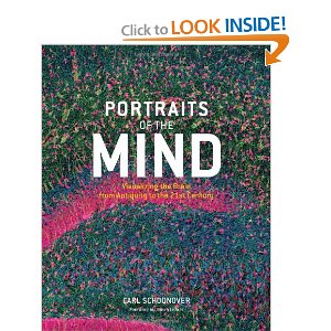
It was the hippocampus as no one had ever seen it, illuminated in radiant hues. The image is called, aptly, a Brainbow, the colors serving a scientific purpose by highlighting specific neural structures. Yet their choice also reflects an artistic bent; scientists display the brain not the way it is (an undifferentiated gray) but the way we want to see it, “painted” with bursts of fluorescent color.
This image, created in 2005, is one of many that Carl Schoonover, a doctoral candidate in neurobiology and behavior at Columbia University, has collected in his recent Portraits of the Mind: Visualizing the Brain From Antiquity to the 21st Century (Abrams). As science has probed the brain’s structure and function, scientists have had to rely on art to translate their discoveries to visual form.
Leonardo da Vinci created a notable example around 1500, borrowing the techniques of statue casting to inject wax into the ventricles of a freshly killed ox. After the wax cooled, he carved the brain away to create an impression of the cavity, then sketched this casting of the void, rendering it from multiple angles.
The arrival of powerful optics during the mid-nineteenth century enabled scientists to penetrate the brain’s microscopic dimensions. Soon another Italian, Camillo Golgi, inaugurated modern neuroscience by successfully staining individual neurons. In his 1875 drawing of a dog’s olfactory bulb, Golgi records his observations while also somewhat imagining the process of smell, with bulbs in the shape of root vegetables penetrating a layer of neural connections, depicted in fanciful wavy lines.
Whereas Golgi mistook the brain for an uninterrupted web of cells, the Spaniard Santiago Ramón y Cajal correctly saw it as a network of discrete neurons. Cajal had an interest in the Eastern practice of composing ink on paper in a way that stressed negative space. Using this spare approach in a 1903 sketch, Cajal took note of synaptic boutons, which are partly responsible for intercellular communication.
Even after micrographs came into use, artistic intervention continued. In portraying the brain’s vascular system, scientists chose minimal white to create an image as haunting as snowbound woods, with detail conveyed through contrast rather than color values.
“Orientation Columns” (2006), meanwhile, is ruled by overlapping primary colors, as in op art. The piece was created by tracking the activity in a monkey’s visual cortex as the primate observed lines at different angles, each color denoting the angle that certain neuron groups “preferred.” The very act of seeing has created a compelling image.
