THE NEW CRITERION, September 2025
On the newly renovated Michael C. Rockefeller Wing at the Metropolitan Museum of Art.
What to make of the Metropolitan Museum of Art’s renovated Michael C. Rockefeller Wing, dedicated to the arts of Africa, Oceania, and ancient America? Astonishing, frightening, and baffling are three words that come to mind—and that’s more a reflection of the curatorial and architectural decisions that have been made here than of the tribal art on display.
Some 1,800 works from five different continents are newly jumbled together across 40,000 square feet in the rebooted galleries, which reopened on May 31 after a four-year closure and $70 million redo. New “diagonal trajector[ies]” have been “designed to foreground ancestral connections and Indigenous temporalities,” according to the Met’s opening announcement. “[N]ew perspectives on Indigenous concepts of the natural world as well as nuanced perceptions of gender roles” have been “newly framed by Indigenous perspectives.” Meanwhile, new cacophonies of “wall text and digital narratives placed throughout the galleries elevate Indigenous voices, foregrounding the latest developments in interdisciplinary scholarship.” Good luck just keeping track of what region a work is from or even what continent you think you are looking at. Devised by the appropriately named WHY Architecture, in collaboration with Beyer, Blinder, Belle and the Met’s design department, these galleries have been positioned to keep you guessing.
The cultural muddle, now arranged in a labyrinth of gleaming white walls and glass screens, is made all the more confusing in a blinding resplendence, illuminated by reglazed windows onto Central Park, that is visually appealing but programmatically suspect. Aztec, Asmat, Asante: sightlines bleed from one culture into the next. Under the curation of Alisa LaGamma (African art), Joanne Pillsbury (ancient Americas), and Maia Nuku (Oceania), what were once separate sections dedicated to distinct regions are now demarcated with barely a line on the floor.

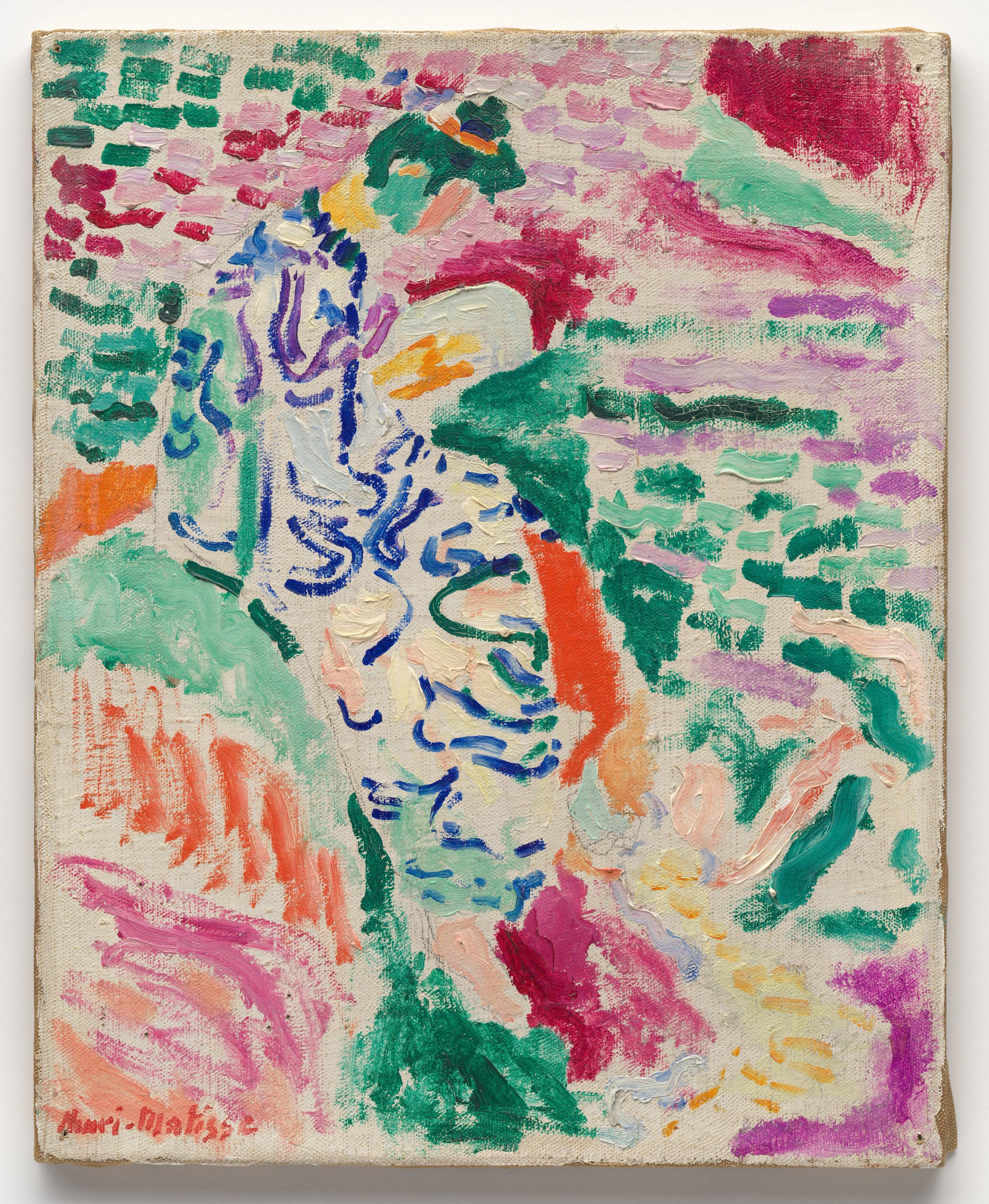
Installation view of the Michael C. Rockefeller Wing at the Metropolitan Museum of Art. Photo: Bridgit Beyer.
This new open-plan design has been proposed to “suggest the unique spatial and relational dynamics of Oceania: horizon lines, the arching dome of the sky, and islands tethered in a vast ocean.” Elsewhere, it’s meant to take “inspiration from ancient American architectural traditions.” Along the ceiling, there are now “horizontal baffles that suggest ribbing to pay homage to one of Africa’s most celebrated structures: the Great Mosque of Jenne in Mali.” Such tossed-off, facile references are the window dressing of an Apple Store aesthetic selling Global South 2.0, with often brutal cultures that were oceans apart from one another—cultures that might as soon have killed, sacrificed, and devoured each other if they could.
With some exceptions, many of these works have been on display at the Met since this wing first opened in 1982. What’s different now are the hundreds of wall labels that surround them, justify them, and defend their continued display. Such justification is not for nothing. Across the park, at the American Museum of Natural History, entire galleries are being boarded up and turned into halls of shame. Generations of schoolchildren may wonder why the AMNH’s models of Eastern Woodland longhouses are suddenly treated as entartete Kunst. As the American Museum of Natural History “embraces new regulations,” reads one explanation plastered onto a hastily erected plywood screen, “these Halls displayed artifacts that may be objects of cultural significance, and the Museum does not have consent to display them.” If a museum can no longer display “objects of cultural significance,” one should wonder what remains beyond the gift shop.

Installation view of the Michael C. Rockefeller Wing at the Metropolitan Museum of Art. Photo: Bridgit Beyer.
Free of the baggage of consensual anthropology, the Metropolitan has faced the opposite conundrum: how to add ethnographic context to its otherwise disconnected displays, often collected merely for their aesthetic attributes (especially as they relate to modern Western art). The resulting pronouncements in the renovated wing make a number of contortions to please contemporary sensibilities, even promoting the violence informing the hall’s artistic expression. Just consider the wall label titled “Generating Vitality in the Asmat World”:
Unlike women who can support life within their own bodies, Asmat men wishing to capture nature’s generative capacities once did so through the act of headhunting. This practice—an important aspect of male ritual prestige before its prohibition in the twentieth century by Dutch colonial authorities—involved pursuing a rival and taking his life. Since the human head contains the most concentrated source of vitality, its capture (and the preservation of the skull in particular) catalyzed future cycles of growth and rebirth for humans, ancestors, and the natural world.
Like the sweetmeats of a carved-up head, there is much to extract from such a statement. In short, before the prohibition of cannibalism in New Guinea by colonial authorities and the arrival of Catholic missionaries, for peoples such as the Asmat, the depth of their creative expression was a direct testament to the ferocity of their bloodlust. Headhunting may indeed have been an “important aspect of male ritual prestige,” but one is left wondering if the victims of the Asmat regret the Dutch arrival in the East Indies. Try justifying anti-colonialism to a shrunken head.
The radical relativism of the ethno-aesthetics on display in the Met’s confounding galleries is the capstone to a long-range project, one that has less to do with prehistoric third-world cultures and more with the obsessions of modern Western taste. Beyond the story of the family of man, these particular galleries are ultimately about the family of Rockefeller.
“Primitive” is a word that has been so thoroughly expunged from any mention in this wing that its absence belies a lingering presence. That’s part of the untold story here, scrubbed from the countless wall labels and disclosures of “provenance”: there would be no Met wing dedicated to the arts of Africa, ancient America, and Oceania without the Rockefellers’ primitivist passions and the tragic intergenerational dynamics that came as a consequence of their zeal.
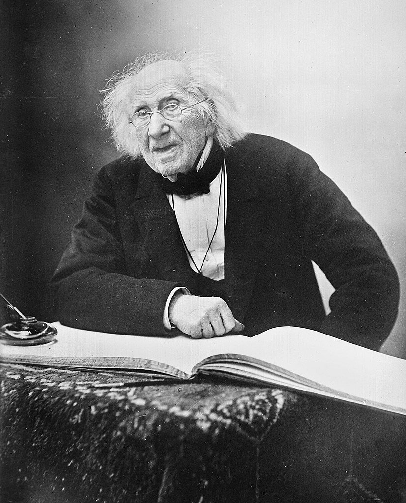
“The more you prefer the primitive,” wrote the art historian E. H. Gombrich, “the less you can become primitive.” In the modern world, simplicity, subjectivity, even crudity can appeal to sophisticated taste as elite culture looks for deeper truths beneath the polish of refinement. The Rockefellers have certainly taken this view to heart. Over successive generations, the family has shown a distinct preference for the primitive in their cultural philanthropy, from their support for American folk art to the primitivist turn of international modernism. Abby Aldrich Rockfeller, the wife of John D. Rockefeller Jr., helped establish both Colonial Williamsburg and New York’s Museum of Modern Art. In 1957, her son, Nelson Aldrich Rockefeller, founded the Museum of Primitive Art in a townhouse on the same block as MOMA as well as their former city residence. Headed up by the wide-ranging art historian Robert Goldwater, inspired by modernism’s primitivist influences and Paris’s Musée du Trocadéro, the Museum of Primitive Art as its name implied sought to elevate the traditional sculpture and textiles of Africa, the Americas, Asia, Europe, and Oceania from artifact to the level of high art.
Beginning in the 1960s, through the intermediation of René d’Harnoncourt, then the director of MOMA, Nelson Rockefeller began transferring these primitive works to the Metropolitan. He not only seeded a collection where none existed but also underwrote the construction of the wing to house it. Even today, some one-third of the works in the Met’s primitive collection passed through Rockefeller hands, including many of its most notable pieces, such as a Dogon blacksmith’s Priest with Raised Arms (1300s–1600s), the Eyema byeri (reliquary guardian figure) (1800s–early 1900s) of an Okak-Fang artist, and the Gwandansu figure (1400s–1600s) by a Bamana numuw (blacksmith). Since the term “primitive” has now become outmoded and even deeply regretted, the Met’s wall labels and provenancial literature identify all of these works as merely having passed through “MPA,” never once explaining that the acronym is short for Museum of Primitive Art.
This is but one of the many sleights of hand in the renovated Michael C. Rockefeller Wing—originally known as the Michael C. Rockefeller Memorial Wing. Far more significant is the disappearance (then and now) of Michael Clark Rockefeller, Nelson’s son, for whom the wing is named. A “memorial” would suggest a death, but the Met has whitewashed the tragedy of his involvement in these galleries, now merely stating that he was
greatly inspired by the cultures and art of the Pacific and pursued new avenues of inquiry into artistic practice during his travels there. Among the wing’s signature works are the striking Asmat sculptures he researched and collected in southwest New Guinea.
What gets left unsaid is that Michael, a year out of college, disappeared while collecting those very sculptures—trading sachets of tobacco for totemic bis poles, adorned with references to shrunken heads, that now dominate the wing named in his honor. As an added tragedy, Michael may have become the victim of the same cannibalistic culture he was intent on discovering and collecting. Departing from the official Harvard-Peabody Expedition that first brought him to study the Ndani people in the Baliem Valley in the Central Highlands of Western New Guinea in early 1961, he pursued the works of the Asmat in a two-man mission, floating along the coast of New Guinea aboard a catamaran jury-rigged from two canoes. On November 18 of that year, his catamaran capsized in the swift crosscurrents of the mouth of the Eilanden, or Betsj, River. He gathered together a knife and compass and tethered up the boat’s gas tanks as a personal flotation device, determined to make for shore. He was last seen swimming away by his crewmate, the Dutch anthropologist René Wassing, who held onto the wreckage and was recovered the following day, along with Michael’s journals.
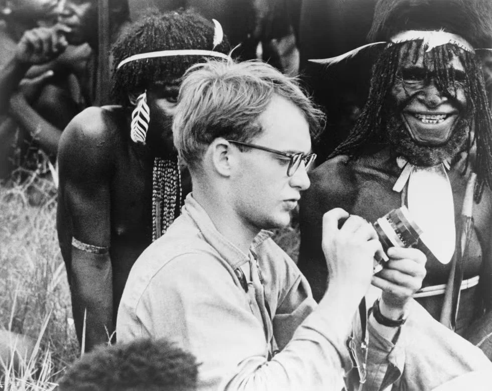
Michael C. Rockefeller with Papuan natives in New Guinea, 1961.
Published six years later, the journals speak of Michael’s harrowing infatuation with these cannibals. Facing the specter of his parents’ impending divorce, wishing to please his father, then the governor of New York, by contributing to his Museum of Primitive Art, Michael pursued the Asmat at his own peril. As he wrote in his journal:
What we saw were some imposing remnants of a marvelous past. I suppose not so marvelous from a Christian point of view, for the Asmats were a ferocious headhunting people constantly engaged in inter-village war and raids of varying degrees of deadliness. However, the sculpture that has been and (in some areas) is being produced by Asmat artists is unquestionably some of the greatest to come from a primitive culture . . . .
And equally as remarkable as the art is the fact that the culture which produces it is still intact; some remote areas are still headhunting; and only five years ago almost the whole area was headhunting.
Afinal Rockefeller in this tragedy is Mary Rockefeller Morgan, Michael’s fraternal twin sister. Now eighty-seven years old, she has been a vocal donor to the renovation. Her brother is now absent from the public side of the wing that bears his name—and most likely that’s the point. With new sightlines that connect Nelson’s Priest with Raised Arms with Michael’s bis poles beyond, this wing feels like a private family shrine as never before. While publicly drawing us into its purely expressive wonders, this primitive collection has a private side that tells a very different story.