Gallery chronicle (November 2010)

Page_37 
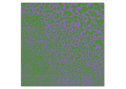
Robert Swain, Untitled (2007), All rights reserved © Robert Swain

THE NEW CRITERION
November 2010

Gallery chronicle
by James Panero

You can’t help but feel a little bad when visiting the Times Square Gallery and MFA studio building of Hunter College. There are physiological reasons for this. Sandwiched between Tenth Avenue and the appropriate-sounding Dyer Avenue on West 41st Street in Manhattan, this gallery space is off-off Broadway but very much on every major traffic artery leading into the Lincoln Tunnel. To get there requires the assistance of several traffic cops to hold back the cloud of soot barrelling towards Jersey. Then there is the greeting you receive once inside. When the Iron Curtain fell, the apparatchiks appear to have brought their vision of proletarian utopia to the City University of New York, the overlords of Hunter College. The dismal display of old turnstiles, “security desks,” and chipped industrial paint in the Hunter Times Square lobby recalls détente-era Leningrad.

But make a sharp right, pass through another door, and the surroundings suddenly change. Here the students, faculty, and private supporters of Hunter’s art department have carved out a remarkably pristine sanctuary for their exhibitions; seeing it made me feel lousy for a different reason. The Hunter department, part of it anyway, represents a last holdout for the study of pure color painting. A division of teachers here can trace their lineage through Josef Albers back to the German Bauhaus. Today they represent the Masada of color theory, pushed into a small settlement at the heart of Dumpsville. Now it has been reported that their godforsaken building, a holdout with its loft-like space, will soon be shuttered, thanks to the superior wisdom of the cuny hive-mind, and the department scattered to other sites.

If so, the Hunter Times Square gallery is going out with a bang. For the first time in memory, the sprawling space has been dedicated to a survey show of a single artist. “Visual Sensations: The Paintings of Robert Swain: 1967–2010” presents fifteen gallery rooms of color work by the longtime Hunter professor in an exhibition curated by his colleague Gabriele Evertz, a pure color painter I wrote about here in June 2009.[1]

While not a direct heir to Albers, Swain nevertheless landed his position in the Bauhaus-influenced Hunter department back in 1968 and has been teaching there since. Evertz earned her masters degree from Hunter in 1990 before rising to associate professor. Okay—so the curator, the artist, and the exhibition space are all part of the same institution. One might resent the incestuous relationship were the exhibition not so well done and so necessary. You would not see this show mounted anywhere else. The scale of the work alone is daunting. Few other spaces could accommodate it. Almost all of the paintings are six, seven, or eight feet tall. One painting is ten feet high by thirty feet long.

Beyond size, such a show must also contend with the unpopularity of its subject matter—color. Decorative, full of secrets, operating on its own terms, color has never had an easy go of it in the history of modernism, contrary to what one might assume. William Agee describes some of the reasons for color’s low caste in his excellent catalogue essay for the show. Despite a blip of popularity in the late 1960s during the rise and fall of Optical (Op) Art, pure color art, with its minimalist tendencies, has increasingly found itself at odds with the maximalizing tastes of the contemporary scene, where work is expected to refer to everything but itself. In our current climate, I doubt any other gallery would have cared to mount Swain’s expansive show. Their loss, our gain. “Visual Sensations” is one of those imperative exhibitions that no one wants to show but we still have the privilege to see.

In the mid-1960s, between studying with the American cubist Karl Knaths in Provincetown and at the American University in Washington, Swain worked as a guard in The Phillips Collection. Duncan Phillips had been attuned like few others to the color-rich artists of the modern movement, including Pierre Bonnard, Henri Matisse, and Milton Avery. Seeing the masterpieces of his collection sent Swain on a lifelong study of self-education into the nature of color.

The art that resulted from Swain’s studies conveys a didactic sensibility. Swain is a color artist but not an Op artist, at least not someone set on exploiting color’s destabilizing effects through the pairing of complementary colors and other techniques. Dispensing with the Op Art book of tricks, Swain set about exploring a color system of his own devising, made up of approximately 5,000 color components, which he applied to canvas in generously large grids of graded hues and values.

At his best, Swain is the process painter of color. Elsewhere this month, a exhibition at Minus Space in Brooklyn, an alternative private gallery venue dedicated to reductivist art, will focus on the process of Swain’s work by displaying his studio materials, color charts, samples from his paint library, plus mixing spoons and other ephemera. “Robert Swain, Primary Research” will run through December 4.

The conclusions of Swain’s paintings did not always live up to the processes that created them. A thirty-foot-long painting better be worth it, but one suspects the large scale of some of his work was an attempt to amplify the energy of a low-powered program. Today his tile-like paintings from the 1970s and early 1980s recall a benign computer screensaver or maybe the mosaic scrim of the Altria corporate logo. While one may pick up some interesting color effects up close, the overall compositions are too reserved, receding into bit-mapped space rather than coming forward in more active engagement. Several works from the late 1980s and 1990s, based on the proportions of the golden section and spiraling out from one corner of the canvas, are somewhat more present, in part through the rough texture of the paint built up through multiple layers of gesso.

A few years ago, Swain himself started to feel his paintings had become too passive. Working through a lifetime of color discoveries and a desire to push them forward, he changed up his program to stunning effect. His latest paintings are the revelation of this show. Several of them are here to make a visit worth it, and they would mean far less without the context of work leading up to them. Returning to the active brushstroke he first used in his earliest work in the 1960s, Swain merged the structure of his grids and spirals with a newly developed system of daubs of pure color that grow in size across the field of the canvases. The results are wild, organic growths of pure color painting, daring and contemporary while recalling Abstract Expressionism. Color art without the masking tape? For someone quarantined for much of his career into perfect squares and rectangles, Swain has a daring free touch, and the results are fantastic. The energy of his brushstrokes has supercharged his color program. The effects, still totally controlled, now seem to emerge organically out of the work itself.

In September, a profile of the hipster artist Dan Colen that appeared in The New York Times would have us believe a Gagosian prankster working in bubble gum is the heir apparent to Jackson Pollock. Jack Shainman Gallery, Mary Boone, are you listening? I am here to say that a very different story is now being told at the Hunter Art Gallery, and that Robert Swain has a better claim to that title.

The New York gallery scene has a way of offering up nice coincidences. Now on view at Danese gallery is a four-decade survey of grid paintings by Julian Stanczak, perhaps the canonical painter of Op Art (the term was coined for one of his shows in the 1960s).[2] Born in Poland in 1928, Stanczak now lives and works in Seven Hills, Ohio. There’s a move that has one of those only-in-America rings to it, especially when you consider that, in the interim, Stanczak passed through Iran, India, and Pakistan as a refugee with the Polish Army-in-Exile in 1939, was interned at a Soviet concentration camp in 1940, and lived in a Polish resettlement community in the jungles of British Uganda in 1942. He emigrated to the United States in the 1950s and earned a BA from the Cleveland Institute of Art and an mfa from Yale, where he studied with Albers and Conrad Marca-Relli, and became a citizen in 1956.

The Op of Stanczak’s art is as much alchemy as science. Even with their taped lines and checkerboard patterns, his compositions can be magically powerful—emotive rather than emotional work from an artist who lost the use of his right arm in Siberia. His grids, with layers of carefully graded squares and lines, are built up so that the optical effects are maximized while the mechanics are tucked from view. Stanczak is less interested in revealing the process of his art than in presenting a product with the greatest punch and sparkle.

Most of the paintings here are constructed around a central axis. The colors radiate and rotate out of the heart of the work, sometimes pushing out, sometimes drawing us into perceived space. The grids, meanwhile, stitch the work together, containing the pulsating colors in their weave and giving the compositions a classical order.

Now in his eighties, Stanczak offers up two new red paintings that are the best and most assured works in the Danese show. In Echo 1 and Echo 2 (both 2010), he dispenses with his more fussy pattern systems and creates two warm and glowing works with subtle touches. At a time when the art world seems to listen more than it looks, here are paintings that are unabashed in their high-definition glory.

A final word about one of our own. In October, at Jill Newhouse gallery, Karen Wilkin organized an exhibition of drawings from a number of contemporary artists.[3] The show will be down by the time this issue comes out, but the gallery will still offer its excellent online catalogue on its website, and a selection of work from each of the artists will remain available to view at the gallery.

Wilkin casts a wide net to assemble “a group of works by artists whose efforts I am engaged and stimulated by . . . born from a desire to reflect the breadth of what is happening in studios today.” Some of the works, like the luxe bathers in charcoal and ink by Graham Nickson, or Fulvio Testa’s misty landscapes in watercolor, may be familiar to readers. Several others will not be. Enrico Riley is a young artist who maps star constellations in graphite on graph paper. Louisa Waber spins intimate webs in watercolor and pen. From Kikuo Saito’s black oil smears on found paper to Wendy Mark’s monotypes of scumbled clouds, the power of these works comes from their ability to convey a sense of touch. Connected through the eyes, the artist’s hand starts to feel like the viewer’s own.

[1] “Visual Sensations: The Paintings of Robert Swain, 1967–2010” opened at the Hunter College Times Square Gallery, New York, on October 7 and remains on view through November 13, 2010.
[2] “Julian Stanczak: Color–Grid” opened at Danese Gallery, New York, on October 15 and remains on view through November 13, 2010.

[3] “On Paper: Painted, Printed, Drawn” was on view at Jill Newhouse Gallery, New York, from September 21 through October 23, 2010.

Gallery chronicle (October 2010)

Octgallery

Kim Uchiyama, Geo (2009), courtesy Lohin Geduld Gallery

THE NEW CRITERION
October 2010

Gallery chronicle
by James Panero

I first heard the term “classical abstraction” during a studio visit with the painter Tom Evans, one of those majestic wild birds still roosting in an artist-in-residence loft downtown. Evans used the term to distinguish his own gestural, romantic canvases from the restrained compositions of some of his contemporaries. Like him, these fellow artists came of age during the post-minimalist revival of oil on canvas in the 1970s. Unlike him, they have created work that tends to feature repetitions and variations of color and line, usually tucked into rigorous, self-imposed systems that can extend over multiple canvases.

For Kim Uchiyama, whose paintings are now on view at Lohin Geduld Gallery, “classical abstraction” is right.[1] The term indicates her admiration for the canon of abstract art and a contentment to work within abstraction’s established parameters. Rather than strive to create the next hit on the avant-garde hit parade, Uchiyama digs deep into the riches of a century-old tradition. The title of the show, “Archaeo,” reflects the approach.

“Classical abstraction” is also appropriate because it underscores a commitment to compositional order. Uchiyama’s recent body of work consists of horizontal bands of color in various arrangements over several canvases of uniform size. The program might sound unrewarding and look problematic in reproduction, but in person interesting things happen when the classical concerns of symmetry, proportion, and simplicity

are matched with the freedom of abstract painting.

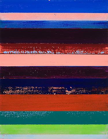
Uchiyama uses vertically oriented canvases, twenty by sixteen inches, to explore the abstracted horizon line. She arranges strata of colors, bottom to top, that mirror the layering of paint on the canvas itself. A band of blue might be stacked on top of a band of pink, just as the blue line is painted over an application of pink paint.

She focuses on the beauty of form by stripping away concern for content and expression. The systematic division of her canvases creates an additional spareness that allows the properties of the materials to become more apparent. As a reward for close viewing, her best work reveals the subtleties of paint on canvas—the opacity of the pigments, the texture of the brushstrokes.

The rhythm of her composition opens up nuances that one might otherwise miss, or that other artists might deliberately conceal, in more complex designs. Her work has certainly taught me to become a more attentive viewer. Uchiyama’s canvases are like classroom chalkboards spelling out the lessons of her generation, which often involve the mechanics of painting.

In her latest work, Uchiyama shows the archeology of her paintings through quiet, controlled gestures. Colors peek around other layers. Bright complementary colors leech out around the darker stripes on top of them, energizing the compositions with an aura of light while revealing the history of the work, showing the older paint below. Uchiyama even distresses some top stripes of paint, pulling away paint with adhesive to expose the depths.

Like all classical abstractionists, Uchiyama must balance order with variation. She sometimes imposes too much control, making her paintings seem like innocuous design. I worry that her program of stripes, carried so thoroughly through the work in this show and beyond, can itself become limiting. Mid-career artists often risk working too well in a certain mode. An overworked skill can spoil the freshness of an artist’s project. Uchiyama’s finest work is therefore her roughest, where she leaves more to chance. At Lohin, Geo (2009), the most distressed canvas of the series, also happens to be her best.

When I wrote about John Dubrow’s last show at Lori Bookstein Fine Art in May 2008, I praised him for his effortful canvases. Dubrow is an abstract artist painting representational scenes that expose the construction of pictorial space. Now back at Bookstein, his paintings can be battlegrounds, places where he might wrestle for years with a single composition—oil on canvas by way of hammer and forge.[2] The results reveal the drama of execution, where countless layers of paint muscle the images into place and still contend with an uneasy truce of surface treatment and depth.

This battle becomes particularly pitched in his cityscapes. I first saw the epic painting Prince and Broadway (2002–2010), of pedestrians at a crosswalk, back in 2003. Dubrow has been fighting with it ever since. Whether it was finished two, four, or even eight years ago is an unanswerable question. It certainly seemed good and done, but Dubrow is clearly not one to leave well enough alone.

And yes, this painting has improved through its latest reworking. The tonalities of reflected light are sharper. More significantly, the figures have come forward. A male pedestrian has lost his suit jacket, revealing a white shirt underneath that pulls him up and makes him a more haunting presence.

It is remarkable to realize how intimately Dubrow must know these canvases by now. He reaches in and ever so slightly tweaks his dioramas in paint. Each move, which he documents through photographs, becomes another frame in a stop-gap animation that gives the images their life.

When Dubrow turns to portraiture, the pressing issues of pictorial space are far less acute. Here the psychological presence of his sitters takes up its own space and lets Dubrow ride a little in the backseat, giving this body of work a relative ease. Without the aid of photographs or even preparatory drawings, Dubrow carries his large canvases with him to the subjects’ homes and offices for the sittings, then works on them more back in the studio.

The personalities of the subjects come through in their relationship to the space around them. The painter Tine Lundsfryd, with legs crossed on a swivel chair, spins out from the confining opening of a doorway. The poet Mark Strand glares out from his desk with arms folded, his expression reflected in his glass desk. A single flash of color often shines out of these muted spaces—the pink light in a window, the blue of a chair—assigning a dominant tone to each of the subjects.

This exhibition, which pairs the cityscapes with the portraits, shows how Dubrow is learning to borrow from each to inform the other. The figures in his cityscapes continue to come forward, while his portraits are settling into the space around them.

The exhibition “In the Light of Corot,” organized by Steven Harvey Fine Art Projects, considers how a selection of twentieth-century and contemporary painters has contended with this pillar of the Barbizon school.[3] “In the Light” not only considers Corot’s treatment of light, in particular during his early Italian sojourn, but also asks deeper questions about the continued relevance of landscape “in light of” Corot’s accomplishments.

For a few artists who came of age mid-century and passed through the push-pull lessons of Hans Hofmann, the calling of Corot sent them in a new direction. In the 1960s, Paul Resika traveled to Italy in the footsteps of Corot. In this exhibition, Harvey displays a large, warm Resika landscape of a hillside road, one of the few to survive a fire in the artist’s studio. Here the title Landscape Near Volterra (1967) is literal. Resika locates us near Volterra, but still several miles away from the hilltop town that Corot depicted in his iconic 1834 landscape. Unlike the Corot, Resika’s landscape also plants our feet firmly within the world in front of us, where the country road leads off to the tiny town dotting the horizon. The grand painting is a knowing homage of its source material, “near” but not altogether “in” the mode of the master.

Maybe “Near the light of Corot” would have been a better title for this show, with all of the paintings arrayed in a Venn diagram of various proximity to the plein-air master. An excellent Fairfield Porter from 1959, Wareham, Rt. 6, shares as much light with Corot as an overcast New England day shares with sun-kissed Umbria. Yet the distance gives it a visual honesty, something I found lacking in Lennart Anderson’s seascape The Terrace (1964). Here an Italianate balcony replete with marble statuary in South Dartmouth, Massachusetts should have been returned cod to Bellaggio. Seymour Remenick’s Corotesque renderings of the warehouses around Philadelphia likewise seem displaced, too plein-air sweet for down-and-out Philly. With Midday Sun (2008), the excellent young painter Sangram Majumdar seems to be working in the light of Dubrow more than Corot. The contemporary painter Israel Hershberg meanwhile turns a cool photorealist eye to the places of Corot’s Italy—here the grand tourist with an oil-on-canvas point and shoot.

David Kapp knows how to paint. I am less certain he knows what to paint. His cityscapes, now on view at Tibor de Nagy, display uncanny painterly skill.[4] Decisive brushwork fills his canvases with excitement. If only I could say the same for the images he chooses to represent.

Kapp takes on the city by looking down on the city. He depicts faceless crowds at crosswalks, the snarl of cars on their evening commute, and city streets stretching off into the distance. Whether he relies on photography or not, his compositions have more of a cinematic than a painter’s eye—not precisely photorealism, but rather photoimpressionism. His shots are hardboiled—the cockeyed angles and streaking headlights and long shadow lines of film noir—but finished with a dollop of Vaseline on the lens. The mixing of the styles does not work for me. The facelessness and sharp angles also seem like urban cliché—disengagement masquerading as attitude.

Oil on canvas should impose its own order on what it depicts, but, for the most part, the paint here merely glosses over the world within. A notable exception is Walker (2009–10). This painting has us again look down on a pedestrian, but here the figure is alone, not just a face in a faceless crowd. A curb cuts across the painting diagonally. We can see the roofs of two parked cars on top. What distinguishes this work is how the paint takes charge of the image. The compositional division of the curb line is striking. The work is relatively spare. The rendering of the pavement is particularly appealing—flattened out with a knife. Rather than the mere depiction of pavement with some flourishes on top, this feels like smooth pavement itself, equally present in our world and its own.

[1] “Kim Uchiyama: Archaeo” opened at Lohin Geduld Gallery, New York, on September 8 and remains on view through October 9, 2010.

[2] “John Dubrow: New Paintings” opened at Lori Bookstein Fine Art, New York, on September 15 and remains on view through October 30, 2010.

[3] “In the Light of Corot” opened at Steven Harvey Fine Art Projects, New York, on September 8 and remains on view through October 2, 2010.

[4] “David Kapp: Recent Paintings” opened at Tibor de Nagy Gallery, New York, on September 11 and remains on view through October 20, 2010.

Symbolic Ground Zero

WTC_LOBBY3-753x344
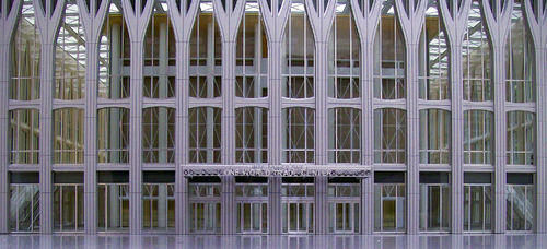
A model lobby from Twin Towers II

James writes:

As we mark the ninth anniversary of the September 11 attacks, the controversy of the Ground Zero Mosque has given rise to a conversation that should have occurred many years ago. Beyond question of the proposed Islamic community center’s proximity to Ground Zero, the debate has also brought to light several unanswered questions about the nature of Islam and its relation to terror: Given the radicalization of mosques and Islamic community centers in Europe, how do we know such meeting houses will not foment such behavior here? If the American Islamic community is immune to radicalization, what differentiates it from such communities in the Netherlands and France? How has the moderate American Muslim community reckoned with attacks carried out in the name of its faith? In sum: To what extent is Islam itself to blame in the extremism of the “Islamist” terrorists?

Following 9/11, a certain dogma of permissible rhetoric took hold that did not allow such questions to be answered or even to be asked. Criticize Islam and you recruit more terrorists. Have faith in moderate Islam and you destroy al-Qaeda. Maximal tolerance from us, it was thought, equals minimal hate from them.

A similar dogma took hold in the plans to rebuild Ground Zero itself. These beliefs quickly played out in the strong-arming of a sacred site by the ideologues of tolerance. Long before the attacks of 9/11, so-called enlightened urbanites bemoaned the outsize scale of the Twin Towers. They resented the superblock of the World Trade plaza for interrupting the street grid. The buildings, to them, were symbols of hubris. They objected to the same monumentality that the terrorists set out to destroy.

When an unelected claque of bureaucrats called the Lower Manhattan Development Corporation nominated itself to redesign the site immediately after the attacks, they sought to undo all of the wrongs of the people who had designed the original towers. They redrew and replaced the street grid, ensuring that the World Trade Center would not be reconstructed as it had been. They tapped a grief-mongering architect, Daniel Libeskind, to design the new buildings. They selected the falling water design of Michael Arad  for the 9/11 memorial--when completed, a monument of negation that will aestheticize the sight and sound of the falling towers into a permanent replay of the attacks.

I used to assume that the redesigners of Ground Zero were oblivious to the symbolism of the site. But of course they were fully engaged in replacing the Twin Towers with a symbolism of their own: that of maximal tolerance. Thanks to them, they believed, no longer would the sins of the Twin Towers attract the ire of terrorists.

The problem with this approach is that it began with a dangerously untested premise--that maximal tolerance does indeed lead to minimal hate. But does the radicalized Islamic world capitulate to tolerance? Or is tolerance perceived as our own form of capitulation, engendering further attacks? Do we defeat Islamic terrorists by defending Islam--the conventional wisdom? Or would questioning Islam as does Ayaan Hirsi Ali break a code of silence that engenders radicalization? We never got the opportunity to ask.

So too with the designs for Ground Zero. Polls taken after the attacks of 9/11 showed that a majority of Americans wanted the Twin Towers rebuilt as they once stood. Meanwhile a team of architects independently submitted plans for new Twin Towers that could withstand future attacks. I regret that in 2002 we could not have engaged in the conversations we are having today. Had we I believe that Twin Towers II would have been built through popular mandate--because a vast majority of Americans understand their greatest defense is a strong offense. To rebuild the offending Twin Towers, stronger and taller, would have left us with a monument to unflinching national character, rather than a washbasin of grief.

The defenders of the “Ground Zero Mosque” have relished taking up the arguments of tolerance in advancing the community center. At least one prominent writer I have read wants a mosque moved inside the new World Trade complex itself. But this time a vocal majority, uneasy with the symbolism, I believe, of Ground Zero’s general redevelopment, has started to ask the unanswered questions. I regret this process did not begin in time to rebuild the Twin Towers. Yet on a tragic anniversary, I am still thankful for the new national conversation.