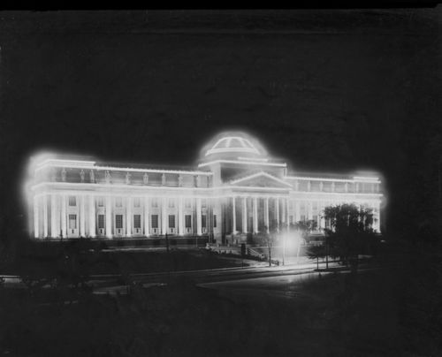
View from the Hudson River. Photographed by Karin Jobst, 2014.
THE NEW CRITERION
June 2015
Hard not to see
by James Panero
On the new Whitney Museum, designed by Renzo Piano.
Such a thought may come to mind when sitting on the bank of couches overlooking the Hudson River from the fifth floor of the new downtown home of the Whitney Museum of American Art. With uninterrupted panoramic views through eighteen-foot-high floor-to-ceiling windows, sixty feet above the West Side Highway, one cannot help but feel a sense of awe at watching the sun arch over the passing ships, illuminating the buildings on the opposite shore and sweeping across America unfurling to the west. But the greatest satisfaction of these front-row seats may come from the knowledge that, unlike those people on the streets and sidewalks and ships below, or the museum-goers behind us, from here we may look out and never see the new Whitney Museum of American Art.
The building viewed from its north side, May 2014. Photograph by Timothy Schenck.
What’s a museum? This is the question I asked in these pages some years ago, and one that museums now seem compelled to answer with ever more emphatic declarations. It is said that museums have gone from “being about something” to “being for somebody,” racing to shed their old skins and remaking themselves in our image. So all museums must now become revisions, articulated interventions and reinterpretations of their former selves and their place in the cultural world—a compulsion now embraced by the new Whitney.
We have heard the modern museum referred to as a “white box.” Here is the museum as sky-box, an institution built as much to be looked out of as looked in to, a place where see-and-be-seen has moved from the periphery to the main event. The difference between these two experiences, between the outside looking in and the inside looking out, defines the design. Indeed, the dichotomy reflects, reverses, and luxuriates in a quality of outsiderness that has always pervaded this particular institution.
The new Whitney Museum, designed by Renzo Piano and Renzo Piano Building Workshop, along with Cooper Robertson, at a cost of $422 million, opened to much fanfare on May 1. From the outside, it is a jumble of pipes, stairs, HVAC units, portholes, bending planes of enameled steel, and what look like a few stone corners hauled off as spoils from the old Whitney building, that crystalline fortress of solitude on Madison Avenue designed by Marcel Breuer in 1966, which the new Whitney now metaphorically explodes, reprocesses, and repackages. Beyond the mere display of art, this new cultural factory serves double duty as an incinerator of the museum’s own unwanted past. And unlike the waste-transfer facility next door, with its idling trucks and utilitarian sheds parked along the water, which will soon be renewed as parkland, the Whitney’s new exterior is not a holdover of industrial blight but the aggressive, purpose-built pastiche of blight. PaceMonsieur Eiffel, here is a tower that is all grit and little grace, an active challenge to the city skyline. “Architecture takes longer to be understood, like cities, like rivers, like forests—it takes time!,” Piano has said in interviews as justification for the appearance of his designs; “A building can take a long time to be understood and loved.” Forty years ago, “we were bad boys,” he added in his opening remarks at the Whitney, referring to the flayed carcass he and Richard Rogers designed in 1977 for the Centre Pompidou in Paris. “We are still bad boys.”
Architecturally, Piano is an abusive bad boy who has learned to flatter, a charmer who knows just when to refer to a lobby—which may feel like the underside of a cruise ship in dry dock—as a piazza, or a largo, or whatever, “because I am Italian” (insert hand gesture). Compared to the exterior, on the inside, especially the higher you go, his new Whitney is nothing if not ingratiating. By the numbers, it is not so much a new museum of art at all but a giddy, irrational space for spectacle. This may be one reason why the institution has been rechristened as, simply, WHITNEY, dropping the words “museum” “American” and “art” from its branding.
For the opening, a collection survey called “America Is Hard to See” serves as background to this spectacle and continues in the revisionist vein of the structure itself. According to Donna de Salvo, until last month the Whitney’s chief curator, the museum sought to challenge “established notions of art history, even if it meant certain works were excluded”—even important works of the museum’s collecting and exhibition history. Certainly in this exhibition of 400 artists and 600 works from a collection of 22,000 objects, there are genuine highlights, especially in the early rooms. The transition from darkness to light from the war years to the 1950s is also well done, but overall the curatorial selection does not so much reflect the history of the museum as make a point about it. Jeff Koons and Barbara Kruger are in; Milton Avery and Helen Frankenthaler are out. American art history begins in the abstraction of Marsden Hartley and ends in the perineum of Carroll Dunham, with much talk of 9/11 and “course of empire” at the denouement, again to distinguish between the supposed darkness of the country outside the museum and the enlightened vision within. “America is hard to see” when you don’t like what you see, one critic quipped. The Whitney has not only been freed from its former home on the Upper East Side. It also proclaims itself emancipated of those lingering, sober, elevating, and protective notions of how a museum is meant to interact with the art of the past and the debt to its own cultural history.
Marsden Hartley (1877-1943), Painting, Number 5, 1914-15. Oil on linen, 39 1/4 × 32 in. (99.7 × 81.3 cm). Whitney Museum of American Art, New York; gift of an anonymous donor 58.65.
The Whitney Museum was, after all, born from rejection, and it has always harbored an aggressive animus after this original slight. From the turn of the century until her death in 1942, Gertrude Vanderbilt Whitney was a champion of living American artists, in particular those, like the Ashcan painters, whose harsh realism put them at odds with the academies. For decades she exhibited and collected their work through the Whitney Studio Club. In 1929, she presented a collection of more than 500 works to the Metropolitan Museum of Art. Yet the Metropolitan rejected her gift, and the endowment that would have gone along with it. So Whitney founded her own museum in 1930 and opened it in 1931 at Eight West Eighth Street, in a building that today has changed remarkably little and continues to serve artists as the home of the New York Studio School.
Although the museum made successive moves uptown, eventually to Madison Avenue, the Whitney never quite arrived at the upper-most echelon of New York institutions, despite its many protestations. Although uptown, its location was still a block east of Fifth Avenue and the main artery of Museum Mile. It also suffered decades of setbacks and false starts as it sought to expand operations around its Madison Avenue home with some remarkably bad proposals, eventually purchasing and then selling the brownstones around it.
Writing in these pages in 1985, Hilton Kramer called out a design by Michael Graves, which would have engulfed the Breuer building in a carapace of postmodern kitsch, as the “indication that we would henceforth be dealing with an institution which cannot be trusted to serve the interests of either art or its public” and that revealed an “invincible preference for glitz and specious glamour at the expense of art itself.” Meanwhile a later proposal by Rem Koolhaas resembled not so much an expansion but the growth of end-stage cancer, signalling the Whitney’s pathological desire to kill off the old Breuer with its own isotopic poison pill. Seeing these proposals today should encourage anyone to consider the blindness that can surround the architecture of the moment and the Whitney’s history of succumbing to it.
View of an inside staircase. Photograph © Timothy Schenck 2015.
Some of these rash decisions could be explained away as symptoms of an inferiority complex the museum felt to other institutions, especially to the Museum of Modern Art. Both institutions claimed the purview of modern art, but the Whitney’s provincial American mandate often kept it adrift. Unlike the pure neutrality of international high modernism, which MOMA channeled, the Whitney was often left tapping the brackish tributaries of art. In some cases, at its best, this encouraged the Whitney to carry water for those worthy outsiders of art history who never quite flowed within the mainstreams of modernism. Until the rise of the New York School, American modernism was considered something of a backwater. To its credit, the Whitney did a better job than most at cultivating a historical understanding of the early generation of American modern artists. Thanks to curators such as Gail Levin, Barbara Haskell, and now Carter Foster, the museum featured exhibitions on Arthur Dove, Oscar Bluemner, Milton Avery, and Charles Burchfield, among others. As America went abstract, the museum also never lost its taste for the real, a fact reflected in the strengths and weaknesses of its permanent collection now on display. This explains its abundance of American Scene hokum and WPA art as well as the artists who have defined the museum’s self-image, in particular Edward Hopper.
But it also explains its appetite for art that is strident, narrow, and of the moment, demonstrating a taste that has only become more bitter with age. For its final exhibition in its Breuer building, the Whitney showed little hesitation in bestowing museum honors on the provocatively banal Jeff Koons. Its biennial exhibitions of contemporary art have also long been checkered as pandering affairs designed to shock. These groaners have often alternated between the trivial and the political, assembling a various coalition of self-identified grievance groups, both as failed bids to knock MOMA from the chairman’s seat and as mere fits of self-loathing.
A high dudgeon of identity politics was reached in its 1993 Biennial exhibition, when admission buttons by Daniel Joseph Martinez were given out to museum-goers that read “I Can’t Imagine Ever Wanting To Be White.” In a particularly questionable wall label in the current exhibition, the museum insinuates that this show’s negative reception some twenty years ago was due to “the unprecedented presence of art by women, ethnic minorities, and gays and lesbians,” rather than the quality of its curation. Another emblematic example from that era, included in the current survey, is Self-Portrait/Cutting by Catherine Opie. In this photograph of the artist, a wall label informs, “her bare skin functions as a makeshift canvas into which a scalpel-wielding friend has scratched a crude line drawing.” One can understand why this piece was left off the Whitney’s “America is Hard to See KIDS Activity Guide.”
Yet even with its shrill overtures, the Whitney never attracted New York’s cultural A-list. On its board were not Rockefellers, Morgans, Fricks, or Mellons, but Kozlowskis. For decades, the museum’s guiding hand has been Leonard Lauder, the cosmetics heir, the older but arguably second fiddle sibling to his powerful, political younger brother, Ronald, the honorary chairman of MOMA and the founder of the Neue Galerie, as well as the former US ambassador to Austria. Their filial rivalry is often at the heart of the city’s cultural politics.
The Whitney’s current president, Neil Bluhm, is a self-made real-estate and casino magnate whose suit jacket was stuck in his pants when he began his opening remarks during the museum’s press preview. As a prominent Obama campaign bundler, Bluhm’s political contributions, no doubt, did little to hinder the museum’s successful effort to get an inaugural blessing from the First Lady: “There are so many kids in this country who look at places like museums and concert halls and other cultural centers and they think to themselves, ‘well, that’s not a place for me, for someone who looks like me, for someone who comes from my neighborhood.’ ” Yet the new Whitney, she concluded, demonstrates “that their story is part of the American story, and that they deserve to be seen.” Just how this oddly formed museum, situated among some of the most expensive real estate in Manhattan, will attract the truly underserved and culturally deprived rather than our mere imagining of them is a question still to be answered.
Image courtesy Renzo Piano Building Workshop in collaboration with Cooper, Robertson & Partners.
Yet if museum expansion is a game of Stratego, it might be said that the Whitney has now captured the flag. Ten years ago, the Museum was pursuing another failed attempt at expanding uptown. This time the architect was none other than Renzo Piano; his initial 2004 sketches for his addition, a box of a building to be located to the south of the Breuer and connected by a long, thin spine, bears a striking resemblance to the vertical divisions of his current downtown site, with mechanicals and back-of-the-house operations kept to the north and his boxy open exhibition spaces to the south, separated by a thin glass-walled stairwell visible from the street.
When the city government under Mayor Bloomberg offered the Whitney a plot of land, discounted to $18 million, in a new downtown cultural zone, the museum took out an extended lease as it weighed its options, but it wasn’t long before it doubled down on the offer. The Whitney may not have had the prestige, but it had the resources, flexibility, and connections to take on the move. Lauder provided $131 million in seed capital for a campaign that has now raised $760 million to date, according to Bluhm. Lauder also made a pledge not to sell the Breuer building for the foreseeable future. Instead he arranged for the Metropolitan Museum to take out an eight-year lease on the Breuer, easing the strain of transition. In entirely unrelated news, the Metropolitan received a billion-dollar donation of Lauder’s collection of Cubist art soon thereafter.
The Whitney planned its move even before it knew that High Line park, the converted elevated railroad, would open to become a worldwide phenomenon, eventually depositing millions of people a year at the museum’s new front door. The Whitney also proceeded despite the market downturn of 2008, and at a time when MOMA was feeling the squeeze of its own midtown girdle. MOMA’s 53rd Street location, long ago the “uptown” home of the Rockefeller family, has clearly grown ill-suited to meet the demands of that international institution. Its 2004 expansion was a failure both of aesthetics and crowd control. Meanwhile its leadership is increasingly tone-deaf to the public concerns over its continued growth plans, which has included the construction of another luxury tower and the demolition of the critically praised American Folk Art Museum. Now that the Whitney has taken the southern terminus of the High Line, MOMA must regret not having secured the northern end at Hudson Yards, currently under development as an unaffiliated “cultural shed.”
The museum’s profile from the north, the only one visible at a distance, is particularly egregious. It may soften over time, as the museum is already looking to expand over another lot of low-slung meat-processing facilities. Still, Piano’s choice to surmount his building with finials of exposed air-conditioning units is a slap at the skyline. He even angled his sawtooth skylights so the HVAC units are visible from the top gallery floor. Stanford White’s example shows that even function can take on great form, and that the poor look of most industrial buildings is not born out of a maximum of efficiency but a minimum of care. Piano’s Whitney is not a reflection of the pure logic of art presentation but a case of form following social function and punk disregard.
View of the indoor gallery at the Whitney Museum. Photograph © Nic Lehoux.
Compared to the Breuer, Piano has cranked up the Whitney’s floorplan from 85,000 to 220,000 square feet. Yet just 50,000 of that is going to indoor galleries, up from 33,000 on Madison Avenue. Ten years ago, the Whitney’s director, Adam Weinberg, said the museum was abandoning its uptown expansion plans because, at $200 million, the museum would add only an additional 30,000 square feet of gallery space. Now downtown, the museum has half that at twice the price. So what has been gained through those other 170,000 square feet? The calculus is simple: $422-million-dollar river views, cascading tiers of 270-degree city-skyline patios, multiple dining options provided by Danny Meyer and his Union Square Hospitality Group, theaters, education centers, coveted access to the High Line and newly adjacent residential properties, and proximity to the many offerings of the Meatpacking District—until recently a district dedicated to the packaging of meat, now the pulsating heart of a trending downtown scene. Not to mention that greatest blessing of all in museumdom: the anointment of Renzo’s Oil.
Yet what is most surprising about the praise this design has so far generated, with reviews that can read like advertorials, is how poorly the building works if you are there to see the art. The problems begin even before entering, as the lobby is obstructed by the restaurant. To maximize views, the main galleries then do not begin until reaching the fifth floor, which is accessible by a central staircase or a bank of crowded elevators. This Kunsthalle will be the museum’s special exhibition gallery, its showpiece floor. Since the main staircase terminates on Five, to reach the permanent collection in the attic above requires finding the fire stairs hidden behind several blank white doors. (Take these fire stairs back down to the lobby, by the way, and you will be disgorged onto the West Side Highway.)
The reason the main stair terminates is that Piano wants you to climb up outside. Like the Pompidou, Piano has made circulation part of his spectacle by locating a major stairwell outside on the tiered patios, setting it in profile. This prominent feature, a fire escape turned on its side against the skyline, makes a theater out of the building. For the May opening, all of these outdoor spaces were undeniably sumptuous, populated with colorful chairs by the artist Mary Heilmann, heated up by the sun baking into the asphalt tiles (which may turn from bake to broil come summer). Considering the extremes of New York weather, these outdoors will be inhospitable six months of the year to all but those contemplating suicide. As they elide the museum experience into another form of leisure, they also raise a larger question: Has the Whitney become this entertainment center out of confidence or self-doubt?
The outdoor staircases at the Whitney Museum. Photograph © Nic Lehoux.
Then there is finally the question of whether any museum concerned with the custodianship of the art in its trust should have been built at this location at all. In 2012, Superstorm Sandy breached the banks of the Hudson River, flooding the museum, then under construction, with 6.5 million gallons of seawater, thirty feet deep. The storm sent museum planners scrambling, spending another $40 million on flood mitigation. Additional sump pumps and auxiliary fuel were brought in. The facility was also rigged with a hidden footing, only visible by the silver disks in the sidewalk, into which a temporary sea wall, stored offsite, can conceivably be trucked in and bolted down in the rush before a storm’s landfall. But these measures are only meant to lessen the extent of a surge, and Sandy-like floodwaters would still breach the building.
With its new facility, the Whitney Museum of American Art has indeed overturned its history, becoming the insider museum it has always wanted to be. But it has not turned the tides. One day those insiders may look out at the waters around them and understand that the Whitney remains adrift.


