Gallery chronicle (May 2011)

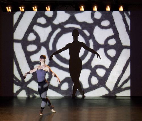
IN THE USE OF OTHERS - Photo Daniel G Hill
In the Use of Others, Daniel G. Hill, Courtesy Norte Maar

THE NEW CRITERION
May 2011

Gallery chronicle
by James Panero

On “In the Use of Others for the Change: A Program of New Ballets by Julia K. Gleich” at the Center for Performance Research, Brooklyn; “Kenneth Noland: Paintings 1958–1968” at Mitchell-Innes & Nash, New York; and “Structured Color” at D. Wigmore Fine Art, New York.

I know next to nothing about ballet, but that did not stop me from attending the first full-fledged ballet of Bushwick, the alternative arts neighborhood of Brooklyn, in mid-April. I am not ashamed to admit it: New York offers much of which I am ignorant. Fortunately, even if knowledge deepens one’s appreciation of art, good art of any kind does not require an advanced degree to enjoy. I have a rule of thumb I use to evaluate all forms of art I see for the first time. Simply put, if my mind can wander free of my next dental exam or that email I was supposed to send, I consider the art a success.

I did a lot of happy wandering on the night I saw “In the Use of Others for the Change,” the collaborative ballet of Bushwick artists and composers working with the choreographer Julia K. Gleich.[1] One thought was that I was seeing the reincarnation of Sergei Diaghilev’s Ballets Russes. Maybe that idea won’t excite everyone as much as it excited me. For a while I have harbored a belief that the groves of Bushwick grow the same special fruit and enjoy the same artistic climate that gave rise to Montparnasse a century ago. The reappearance of the ballet troupe of the Parisian avant-garde would seem to support my theory. And Gleich, as it happens, is only a generation removed from them. One of her teachers was Alexandra Danilova, a star of Diaghilev’s stage.

It is also worth noting that most of Paris in May 1917 did not make it to the opening of “Parade,” one of the most significant artistic collaborations put on by the Ballets Russes, written by Jean Cocteau with sets and costumes by Pablo Picasso, music by Erik Satie, and choreography by Léonide Massine. Likewise, it is safe to say that most of New York did not make it into the fifty-seat auditorium at the Center for Performance Research to see “In the Use of Others” over its three-night run either. Let’s hope this ballet can return for a much longer stay quite soon.

The title of the composition comes from a text by John C. Lilly, a new-ager best known for his development of the deprivation tank, which he used in conjunction with hallucinogenics, and his theories of inter-species communication between humans and dolphins. I often wonder where great art would be without the pseudo-scientists that inspire it. Charlatans either empty one’s wallets or leave one’s underwear atop one’s head. Yet the alchemy of crackpots and cranks, misused in the science of life, often gives life to art. One reason could be that art delivers on what the gurus can only promise: it unmasks and enlivens the senses.

Lilly’s text, from something called “Beliefs Unlimited Exercise,” is as turgid on paper as one might expect. It would be a bad overture if you were looking to kick off inter-species communication with good cocktail conversation and announce: “In the province of the mind, what one believes to be true either is true or becomes true within certain limits, to be found experientially and experimentally. These limits are beliefs to be transcended. Hidden from one’s self is a covert set of beliefs that control one’s thinking, one’s actions, and one’s feelings.” And so forth. If I went up to a dolphin and said that, I doubt that dolphin would want to talk, and I wouldn’t blame the dolphin.

But art is art. As a thematic centerpiece to this collaborative ballet, the text worked quite well. The aesthetics of Bushwick may be do-it-yourself, but I doubt much would get done without “the use of others” to support this self-sustaining, blissed-out artistic neighborhood, where artists regularly show one another’s work in their studios and galleries.

The ballet’s impresario, the curator and gallery owner Jason Andrew, is a dancer himself who has enjoyed a long professional collaboration with Gleich, his former teacher. At this performance, the two danced an opening piece, “Ghost (For Martin),” created a decade ago but now a requiem to Gleich’s brother, who died the weekend of its premiere. The other dances of the evening grew out of a retreat last summer called Camp Pocket U(topia) in Rouses Point, New York. Gleich came with her dancers Claire McKeveny and Mary Jane Ward, who developed the second piece of the evening, “Summer in RP,” a work that focused on the classical range of the troupe.

After intermission came “In the Use of Others,” a ballet in three movements. Austin Thomas along with the artists Kevin Regan and Andrew Hurst each supplied designs, and Audra Wolowiec added sound to Thomas’s program. Collaborations work when artists wander together, taken in by each other’s art. Perhaps Bushwick has a particular sensibility that tends to be less armored, less ironic than other scenes, and therefore more willing to give over one’s work to a collaborative end. For “Parade,” Cocteau said that his “dream was to hear the music of Picasso’s guitars.” Here, through the addition of each artist’s work, in the form of projections, readings, and mechanical and recorded sounds, the dancers became the art, with images projected on them and their silhouettes carved out of the projections on the back wall.

The collaborations exposed new depths of each of the artists’ practices: angular dances accentuated the “vectors” of Thomas’s stenciled works; dancers gradually entered the stage as Kevin Regan read, repeated, and echoed Lilly’s text in the mantra-like use of mirroring and repetition; dancers whipped up a frenzy for the cyclone of debris in Hurst’s collages and assemblages. For the culmination, or “decumulation” as it was called, Hurst himself performed a harmonica blues riff as he entered and exited the stage, with a lone dancer snapping alongside him.

Certainly there were shortcomings. Thomas had an idea to feature two of the dancers stenciling their own work at the corners of the stage, but this couldn’t be easily seen by the audience, and the activity was not very interesting to observe anyway. Hurst’s third of the ballet also took up two-thirds of the time. With five middle parts in his second of four parts, it grew long in the tooth. Still, for all of the rigor and labor and unrealized ideas packed into “In the Use of Others,” Hurst’s soulful harmonica finale was a favorite—a perfect unwinding and an open ending. He directed this sendoff at his colleagues on stage as well as to the audience, offering a sweet bridge to the next collaboration.

I found the lengthy catalogue essay to “Kenneth Noland: Paintings 1958–1968,” written by Paul Hayes Tucker, to be particularly illuminating.[2] Tucker occupies the Paul Hayes Tucker Distinguished Professor of Art chair at the University of Massachusetts Boston, and he credits a team of eight researchers in contributing to his twenty-four-page essay. Their singular aim, it seemed, was to liberate Noland from his close association with the critic Clement Greenberg: “Greenberg’s influence—as a brilliant but ultimately limiting formalist—is only one of many reasons why Noland’s art looked the way it did and why it assumed its deserved place at the forefront of America’s contemporary art production.”

I compliment Tucker for striving to uncover every possible alternative influence to Noland’s bull’s-eye confections: the military insignias Noland observed as a glider pilot training for combat in World War II; Sputnik and the space race and the threat of nuclear war; the circular shapes found in the work of Robert Delaunay, Marsden Hartley, Georgia O’Keeffe, and Arthur Dove; the branding of Tide detergent; and the logo of Black Mountain College. Tucker also suggests that Noland’s famous visit to see Helen Frankenthaler’s stain painting “Mountain and Sea,” facilitated through Greenberg, may have been less significant than we believe because he and his fellow artist Morris Louis did not immediately take up the technique themselves.

Perhaps the art market demands the exorcism of Clem, but I still find his singular influence to be an argument in support of Noland’s place in art history. Is it possible to think of Noland without recalling that iconic photograph of Greenberg observing one of the artist’s circles, with Greenberg’s head and torso cocked to the side as if being spun around by the design?

The other problem with removing Greenberg is that this elevates Noland’s other big influence, Wilhelm Reich. An Austrian protegé of Sigmund Freud, Reich believed in the unseen universal forces of “Orgones,” libidinal energies named after the orgasm that could be harnessed through “Orgone Boxes” and used to control the weather. Noland, who like many artists was in Reichian therapy for years, said he became “immersed in it” in 1958 and had Orgone Boxes built at his homes in suburban Washington and later in Vermont. Since Reich eventually was shut down by the government for operating a sex-based fraud, it says something about Greenberg’s current status that one’s association with a quack is better than being connected with modernism’s greatest American critic.

Greenberg was on to something with Noland. At Mitchell-Innes & Nash, the paintings remained inexplicable, delicate, glowing creations, deceptively simple. I found them to be especially intriguing large and up close, bending around the corners of the eye. The diamond-shaped striped painting Orange and Blue (circa 1966) seemed to compress like a spring when I walked around it. In its texture and detail, Earthen Bound (1960) demonstrated Noland’s singular command of the staining technique, cooler and more unreal than what Frankenthaler or Louis would do. Today Noland’s ethereal orbs would probably have little effect on the weather, but I bet they convey a lot more energy than anything Reich ever dreamed up, and Clement Greenberg deserves much of the credit for their creation.

Last month D. Wigmore Fine Art, the smart gallery located on 57th Street, offered up a survey of American Op Art that seemed to tie in to much of what is happening in contemporary Chelsea.[3] I have a feeling that art is getting more optical again, with work that is allowed to stimulate the eye rather than merely tickle the irony receptors. I am still waiting for the artist Lori Ellison to be given a big show of her obsessive little patterned drawings. The Pace Gallery has just featured its second exhibition of the wonderfully precise work of James Siena, now a fastidious family man, but one who came to Op through psychedelica, grotesque doodling, and the 1980s alternative art scene.

The artists at Wigmore meanwhile, those original Op technicians who mainly came through Josef Albers and the color theories of the Bauhaus, might have always been known to initiates, but they feel ready for a general rediscovery. This time around, Julian Stanczak and Richard Anuszkiewicz, the unpronounceable masters of the flickering color line, might take a cue from Tadasuke Kuwayama, which the artist simplified to Tadasky, and come up with better names. Is “Gilbert and George” taken? And Tadasky himself, who is still working at his own remarkable circular patterns, provides a counterpoint to the circles of Noland. Tadaskys are Nolands minus Orgones. Stripped bare of mid-century hocus-pocus, Tadasky’s circles seem more present, more current, than Noland’s epic creations half a century ago.

[1] “In the Use of Others for the Change: A Programof New Ballets by Julia K. Gleich” was on view at the Center for Performance Research, Brooklyn, from April 14 though April 16, 2011.

[2] “Kenneth Noland: Paintings 1958–1968” was on view at Mitchell-Innes & Nash, New York, from March 17 through April 30, 2011

[3] “Structured Color” was on view at D. Wigmore Fine Art, New York, from February 8 through April 22, 2011.
Gallery chronicle (April 2011)

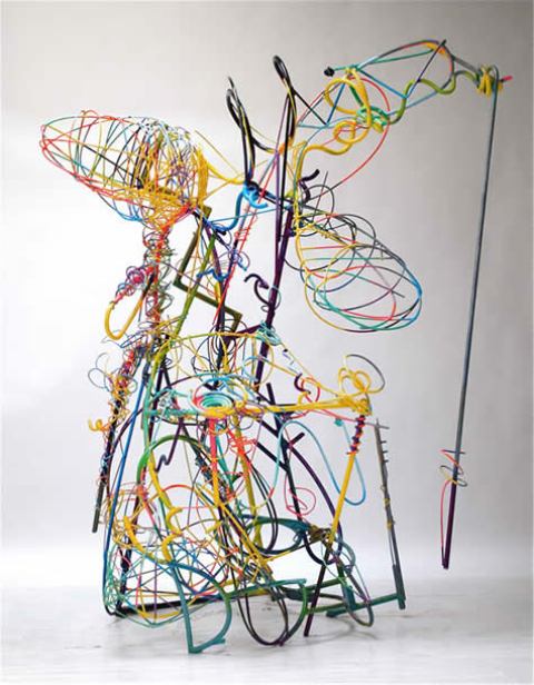
Drunken_angel4
Peter Reginato, Drunken Angel, courtesy of the artist

THE NEW CRITERION
April 2011

Gallery chronicle
by James Panero

On “Peter Reginato: Polychrome” at Heidi Cho Gallery, “Mel Kendrick: Works from 1995 to Now” at David Nolan Gallery & “Thornton Willis” at Elizabeth Harris Gallery.

Sculpture has a weight problem, and the laws of nature are rarely kind. Gravity never gives up trying to tug matter to the ground. How sculptors confront this force often determines the power of their work. Sometimes sculptors play up the heftiness. The minimalist Richard Serra built his career around work that menaces viewers with teetering sheets of metal. More often, sculptors aim to overcome gravity’s pull. Rather than pressing down, their work reaches up, with an energy that seems greater than the scale and materials might allow. Occasionally, sculptures soar without leaving the ground.

The sculptor Peter Reginato came to his practice by way of the hot rod, that energized American demotic craft. Born in Dallas, Texas in 1945, Reginato grew up outside Oakland, California in the heart of postwar car culture. He moved to New York in the mid-1960s, around the time he started making abstract sculpture. He never forgot the lessons of the Kustom Kar Kommandos, to borrow the title of Kenneth Anger’s 1965 cult film. Speed and invention, with a flash of machismo, became his hallmarks.

Starting out, Reginato dabbled in primary structures—another minimalist crystallizing the avant-garde into a weighty fortress of solitude. Yet he soon broke ranks, developing ever more whimsical, maximal composites of surrealistic planes, flattened metal sheets cut into amoebic shapes, fastened together, and painted in a riot of colors. Today he continues to work in the auto-body style of welded steel, a pyrotechnician with a helmet and a blow-torch building explosions in space, loud and indecorous, often with suggestions of leaves and figures, and titles like “Funk Happens."

In 2009 Reginato exhibited an iteration of his work at the Heidi Cho Gallery in Chelsea that was something of a breakthrough, a clearing out of the body shop and the start of something new. Here, instead of building works out of an assembly of steel planes, he “drew” the outlines of his recurring shapes with metal poles, polished rather than painted to a shine. The result lightened the load of the sculptures to a cloud-like state, with shapes now formed out of the negative space between the metal.

The work did more than shed pounds. It also took on a new energy in the way the eye ran over it. Rather than zero-in on the center of the cut forms, the eye observes the lines around it, following the bends and curves of the rods. The effect reminded me of Gjon Mili’s famous 1949 photographs of Picasso in his studio working with a “light pencil,” where he traces the outline of figures with a flashlight in the space between him and the camera, a process captured through the extended exposure of the film. In both cases, the eye looks over the long line from start to finish.

Since 2009 Reginato has been adding to his open forms, customizing and tricking out the factory models. Now again at Heidi Cho, we can see the conclusion, or rather the latest stopover, of the process.

Back is the color, lending this show its title of “Polychrome.” As in that Picasso picture, Reginato draws and paints in space, here captured in steel rather than photographic emulsion. An artist friend suggested that color makes Reginato’s work unmistakable. I agree. Even more than form, color is his signature. He shares a sensibility for the handling of color with his peers of the 1970s loft generation. Gestural brushwork humanizes the coldness of the steel. It’s not surprising that Ronnie Landfield, the great lyrical abstractionist, has been a friend of Reginato’s since his California days.

In the sculptures now at Heidi Cho, several of them more figure-like than usual, the blended colors appear like the lights reflecting off a figure on a stage, bright and flashy, and sometimes campy and garish.[1] In each sculpture, Reginato starts with an assembly of planes cut in whimsical shapes, much like his older work, but then adds the rods of bent metal. Hip Shaken Mama (2010) comes on like a 1 a.m. set performer out to grab attention at all costs. The piece also serves as a case study in the rhythm that Reginato can attach to form, with each part suggesting a different sort of movement. The zig-zag of a narrow strip of body is a tight jitter. The curve at the waist is more a sashay. The rounded bumps of the left leg is a toe tap. The curving metal poles of the right leg and arm are limbs circling around so quickly we detect the movements more than the forms.

The larger Drunken Angel (2010) steals the show. The work is almost all bent tube, and there’s a mess of it. Rather than merely outlining shape, the rods here trace out movement. The lower half never quite comes together. Too much armature gets used up in a base that seems needlessly clunky. The upper half is a different story. The wings of the figure are spiraling, circulating curves of wire. Just below is another vortex of wire, the air spinning beneath. The figure appears to arch back at the shoulders, chest out. An additional pole curves off the head and back down to the floor, a final flourish that I found distracting up close, if not a little dangerous. Once I backed away it made more sense. I no longer bothered to wonder about each strange, expressive part. After all, it’s unwise to question an angel too much, especially at liftoff, especially one that’s drunk.

Mel Kendrick is a sculptor of process, but his product was the big hit two years ago in Madison Square Park in Manhattan. In the center oval, the park conservancy temporarily installed five enormous new works, all of the same series called “Markers.” The forms were unmistakable Kendrick, shapes he had been working on in wood for several years.

A number of these, in much smaller scale, went on view at David Nolan’s former Soho gallery space in 2007. Each began with a cube of wood, which Kendrick cut and cored. Through this process, he extracted an internal section, a constructivist folly of interlocking cylinders. He left the outer cube intact enough to stay square. Kendrick then placed the core on top of the cube, a weighty figure held up on a hollow base of its former self. The pieces had strict internal logic, but I found them a little smug. They were more process than product, slightly too satisfied in their own art smarts.

For the park, Kendrick enlarged these shapes to over ten feet tall. The cube base became human-sized, like a sliced and diced version of Tony Smith’s six-foot Die. Kendrick also enlivened his surface by creating the work out of alternating layers of black and white poured concrete, like a modernist fantasy of thirteenth-century Siena. With this surface treatment, the works took on a new sense of play. But the real play came after installation. Throughout the run, kids were all over them. They crawled through the carved-up bases and peeked through the holes. They moved through the work the same ways our adult eyes looked it over—usually from a little more distance.

Now at David Nolan’s Chelsea space, a survey of earlier works reveals how Kendrick arrived at his monumental park accomplishment.[2] Much like the excellent arte povera artist Giuseppe Penone, Kendrick has a feel for the logic of wood. In Plug and Shell (2000), he carved up a section of tree trunk, here following the wood grain of the limbs and preserving the vestigial stumps. Rather than stacking the results, he positioned the two parts side by side, the denuded wood on the left and its knobbly bark to the right. He also placed them on alternating bases, one built of stacked cinder-blocks, the other of four metal poles—one solid, the other hollow.

Other pieces have a similar binary relationship, with Kendrick working through different finishes and the question of how precisely to connect the two parts. The two sides of Plug (2000) are both stained black, with the shape of the core now less connected to the wood grain of its shell. In BDF (1995), the two parts are identical forms of assembled sticks, one a rubber cast of the other.

I found the towering Black Trunk (1995), the largest work in the show, to be the most compelling. Here Kendrick took a nearly ten-foot section of large tree, sliced it in smaller pieces, and carved out the center. He then restacked the now hollow tree and carved out a series of dovetail joints. Left open, the joints afforded keyhole glimpses of the interior. They also hinted at a sense of instability, as if someone last minute forgot a very important structural component and a bump could send it toppling over. Yet despite the theater of its display, the dominant feeling was one of arboreal mystery. The sculpture felt like an old-growth giant somewhere deep in the woods. I liked its expressiveness. A large rubbing of the trunk that Kendrick made on paper, displayed on the gallery wall beside it, maintained the binary logic of the show. It also spoke to the more poetic desire to preserve a record of the tree, something to take back out of the forest.

The painter Thornton Willis is a friend. I mention that less in the interest of full disclosure and more just for bragging rights. Willis is the embodiment of true painterly feel—a feel that is actually felt. In his hands the School of Hofmann gets schooled in old-time religion and the healing touch of the primitive South, where Willis was born to an itinerant minister’s family in Pensacola in 1936. An evangelical for American abstraction, Willis is now working at his creative peak, quite an accomplishment for an artist who has been producing significant paintings since the 1960s.

One of the qualities I admire in Willis is his ability to change. When other artists would turn on the auto-pilot, he moves on to a new idiom. A few years ago it was prismatic triangles. Then in 2009 he left that for the lattice. His bright colors and dexterous paint-handling created an undulating sea of shallows and deeps, with parts coming forward and others receding in an energized surface. I contributed the catalogue essay for that exhibition.

Now at Elizabeth Harris Gallery for his third solo show there since 2006, Willis is on to his latest “primal, visionary, even shamanistic” accomplishment, as Lance Esplund writes in the catalogue essay.[3] A painter in the city, Willis translates the skyline into a Tetris-like puzzle, giving us cosmopolitan titles like Gotham Towers (2009) and Streetwise (2010). Yet as in his Homage to Mondrian (2009), Willis is more interested in the boogie-woogie of Broadway than in the literal streetscape.

Given the relative complexity of these recent shapes compared to the simpler squares and screens of the lattice series, the paintings with the most saturated, solid forms were the most successful. The more dissolving brushwork that made his earlier work so compelling couldn’t quite hold these newest shapes together. Juggernaut (2010) was therefore the standout. Not only were the shapes rich in color, but Willis also separated them with heavy black lines. For all the talk of color, Willis knows his black. Rather than lock things down, these heavy lines gave the work its lift, as if forming shadows cast by the colorful shapes, rooftops in the twilight of a summer afternoon. Out of a puzzle of interlocking planes, suddenly there was a mountainscape of the city’s vitality inviting us up and up and up.


[1] “Peter Reginato: Polychrome” opened at Heidi Cho Gallery, New York, on March 17 and remains on view through April 16, 2011.

[2] “Mel Kendrick: Works from 1995 to Now” opened at David Nolan Gallery, New York, on March 17 and remains on view through April 30, 2011.

[3] “Thornton Willis” opened at Elizabeth Harris Gallery, New York, on March 17 and remains on view through April 23, 2011

Behind the Veil: Questions About Art Authentication

Motherwell
Robert Motherwell in 1970 (Associated Press)

THE WALL STREET JOURNAL
March 23, 2011

Behind the Veil: Questions About Art Authentication
by James Panero

Shedding light on the closed world of artist foundations and the largely unregulated authority they have come to command.

On Feb. 1, Ireland-based Killala Fine Art Ltd. filed a lawsuit in the U.S. District Court for the Southern District of New York against The Dedalus Foundation. The New York-based private foundation, according to its website, is dedicated to preserving the artistic legacy of the Abstract Expressionist Robert Motherwell (1915-1991) while fostering the "public understanding of modern art and modernism." Dedalus subsidizes its operations, in part, from the sale of Motherwell works that it owns and from revenue earned from its control of the copyright on all of the artist's works in reproduction. In 2009, according to the latest publicly available tax returns, Dedalus generated more than $2.4 million from the sale of more than 100 Motherwell paintings, drawings and prints.

The suit claims that Dedalus made "false assurances" about the authenticity of "Spanish Elegy" (1953), a painting thought to be from Motherwell's signature series about the Spanish Civil War. A call to the Dedalus Foundation was returned by a lawyer, Peter R. Stern, who says that "there is absolutely no merit to [Killala's] claim" and that Dedalus "intends to make a motion to dismiss the complaint in its entirety." Marc Blondeau, an operator of Killala, did not return multiple requests for comment left at his offices in Geneva, but court records outline Killala's claims.

The lawsuit is not the first time that Dedalus, established in 1981 by Motherwell and now operated by art professionals and former Motherwell associates, has been challenged in court over its authentication practices. In court documents, Joan Banach, a former employee who has been in active litigation with the foundation since 2009—citing wrongful dismissal and gender discrimination—similarly questions the way Dedalus has been evaluating Motherwell works. Regardless of their legal outcomes, the two cases shed light on the closed world of artist foundations and the largely unregulated authority they have come to command in the world of art authentication and, by extension, the art market.

In 2007, Killala purchased "Spanish Elegy" from Julian Weissman, a New York-based dealer also named as a defendant in the suit, for $650,000. Killala claims it bought the painting believing it to be an authentic Motherwell. (A call placed to Julian Weissman Fine Art LLC in New York was answered by a representative who said the dealer was "unavailable for comment.") Killala claims in its court filing that prior to the sale, and as a prerequisite, Mr. Weissman asked Dedalus to authenticate the work. According to the lawsuit, in late January 2007 Jack Flam and Morgan Spangle, both employees of the foundation and members of the foundation's board of directors, examined the painting at the Weissman gallery.

In addition to serving as Dedalus's board president, Mr. Flam is the director of the foundation's continuing catalogue raisonné project, which Dedalus describes as a "systematic and comprehensive scholarly reference text in which each work known to have been executed by a particular artist is illustrated, thoroughly documented and described." The foundation outlines one of its main purposes as the establishment of "a reliable corpus of authentic works." A catalogue raisonné is a primary reference tool for scholars, art dealers and auction houses, and so plays a critical role in the market fortunes of a work of art. Inclusion in it assures buyer and seller that the work is authentic; exclusion renders the work suspect.

Soon after examining "Spanish Elegy," Dedalus sent a letter to Mr. Weissman stating that "The Dedalus Foundation, Inc. (the "Foundation") has caused the above-described Work to be examined by its representatives. It is the opinion of the Foundation that the Work is the work of Robert Motherwell." A copy of the letter is included as an exhibit to the lawsuit.

Mr. Spangle sent his own letter to Mr. Weissman. A former gallerist who joined the Dedalus board after Motherwell's death while his father-in-law, Richard Rubin, was the foundation's president, Mr. Spangle now serves as its executive director. On Feb. 15, 2007, he wrote to Mr. Weissman: "Here is the letter of authenticity which is issued by the Foundation. While it does not say directly that the painting, Spanish Elegy, 1953, will be included in the catalogue raisonné which is being prepared by the Foundation, I can assure you that the painting will be included." (This letter is also an exhibit to the lawsuit, with emphasis in the original.)

The lawsuit states that based on these assurances, Killala purchased the painting from Mr. Weissman. But two years after the sale, Dedalus "suddenly retracted its earlier representation and raised doubts about the painting's authenticity." On Feb. 17, 2009, according to Killala's filing, Dedalus sent a letter to Mr. Weissman stating that "based on new information," the project "has determined to withdraw" its letter of authenticity. In the same letter, Dedalus informed Mr. Weissman that "at present we do not plan to include [the painting] in the Catalogue Raisonné."

The exclusion, Killala writes in its lawsuit, means that "the art market will harbor very serious doubts about its authenticity. The work will lose all commercial value, and become unsaleable in the trade." In the case of its "Spanish Elegy," Killala now says, Dedalus made "false statements" in promising to include the work, since it "is in fact not an authentic Motherwell."

Killala is now seeking, among other claims, compensatory damages from Dedalus and the return of the purchase price from Mr. Weissman. "The Dedalus Foundation is not a for-profit entity," says Mr. Stern in response to the suit. "It is creating a catalogue raisonné as a public service to the art community. When it renders an opinion, it is an opinion, not a statement of fact. And in rendering an opinion, the foundation reserves the right to change its mind, as does every other catalogue raisonné in existence. . . . If anyone has liability to Killala, it is Mr. Weissman" as the seller of the work.

At no time did Dedalus offer any explanations, Killala claims, either of why it originally accepted the Motherwell as authentic, or what made it change its mind, or why it took two years to do so. Nor did it ever disclose how it arrived at its judgments, a claim Mr. Stern disputes in this particular case. Still, in general, this is the way many artist foundations work, a point with which Mr. Stern concurs: "As is the case with most catalogues raisonnés, the authors decline to give reasons to their decisions. It's standard."

Foundations might fear litigation, or risk tipping off forgers on what their evaluators are looking for, if they were more forthcoming in their deliberations. Yet such silence also gives artist foundations complete authority with little accountability.

'It's not that the process has to be open, but the results and methods do need to be made public," says the art historian E.A. Carmean. "That's the very definition of a catalogue raisonné—it's a reasoned catalog. With some exceptions, the modern catalogue raisonné is published without a discussion of the inclusion or exclusion of contending objects. The product should reveal the ways the decisions are reached."

This lack of transparency is all the more troubling in the case of Dedalus, since another lawsuit also suggests that the authentication process may be flawed.

When Dedalus first began its catalogue raisonné project in 2001, it employed an outside art historian, Joachim Pissarro, to serve as its director, with a committee of advisers set up to work alongside him. In 2006 Mr. Pissarro left the project and Mr. Flam, Dedalus's president, took over.

In court papers for her gender-discrimination and wrongful-termination lawsuit against Dedalus, Ms. Banach alleges that as director of the catalogue raisonné project, Mr. Flam made "repeated misjudgments about the authenticity of works attributed to Motherwell." She says she was "compelled to challenge these errors to protect the integrity of the artist's legacy" and alleges in court papers that this is why she was fired.

Ms. Banach further alleges in her complaint that Mr. Flam "flouted established procedure" in authenticating and then deauthenticating work himself, without consulting the other members of the committee. In particular, Ms. Banach says that Mr. Flam made his own determinations about two of Motherwell's "Spanish Elegy" paintings, which she claims he subsequently reversed. She also says that Mr. Flam authenticated a work on paper that Mr. Motherwell had himself claimed was a forgery when presented with it in the 1980s. Alarmed by his mistakes, Ms. Banach claims in her complaint, the foundation's board took out a $2 million insurance policy "to cover the costs of a potential lawsuit." A work that fits the description of one of the Elegy series cited in Ms. Banach's claim now appears to be at the heart of the Killala suit.

"There is no connection between the two cases," says Mr. Stern. Lee F. Bantle, Ms. Banach's lawyer, disagrees. "The 'Spanish Elegy' purchased by Killala is one of the paintings identified by Banach in her suit," Mr. Bantle said by email. "There was a breakdown in the Dedalus authentication process which she challenged prior to her ouster."

Dedalus's response to Ms. Banach's lawsuit is to countersue for more than $5 million, claiming "breach of fiduciary duty, self dealing, theft of corporate opportunities, conversion, replevin, and spoliation of computer evidence." And it states in court papers that "Banach's apparent hope to turn this action into a forum to dispute or prove the authenticity of Motherwell works (or Dedalus's views thereon) is improper and impermissible."

It may be some time before these cases are settled, but much is already clear. Artist foundations have come to serve as the art market's rating agencies, with catalogues raisonnés providing triple-A stamps of approval. As such, these foundations regularly make determinations that can have a significant monetary impact on the value of art, as the Killala lawsuit maintains. At the same time, because these same foundations derive income from the sale of work in their possession by the same artist, there is the potential for conflict of interest, in fact or appearance, in their evaluations of works submitted for authentication.

The American Association of Museums (AAM) and the Association of Art Museum Directors (AAMD) both have best-practice guidelines and enforceable standards of conduct for museums. Not so artist foundations. Despite their considerable influence, artist foundations follow no industry standards, are allowed to operate in complete secrecy, and are accountable to no outside individual or entity beyond the attorney general and the Internal Revenue Service, with only the courts offering glimpses of their operations. Surely it is time that changed.

Mr. Panero is the managing editor of the New Criterion.