THE NEW CRITERION
October 2015
Gallery Chronicle
by James Panero
On “Seeing Sound: New Works by Jane Harris, Alex Paik, Gelah Penn” at Odetta Gallery; “Printed Matter’s NY Art Book Fair” at MOMA PS1; "The Still Life Show” at Eleventh Street Arts; Jack Tworkov: Mark and Grid, 1931–1982” at Alexander Gray Associates; “Stephen Maine: New Paintings” at Hionas Gallery & “Gabriele Evertz: The Gray Question” at Minus Space.
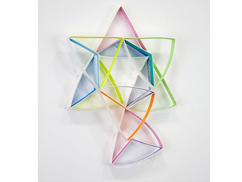
Alex Paik, Study #2 for Modular wall Installation: Equilateral Triangle (Thirds) (2015), gouache, colored pencil, paper, 8 x 6 x 1 inches, at Odetta Gallery
Modern art has long been interested in “seeing sound.” Kandinsky drew directly on the idea of “Thought Forms,” the title of the Theosophist tract by Annie Besant and C. W. Leadbeater, published in 1901, that visualized the music of Gounod, Mendelssohn, and Wagner as colorful clouds rising above a cathedral. Work such as Foghorns, the 1929 painting of radiating shapes by Arthur Dove, likewise helped open American ears to the sounds of color and form.
Seeing a depiction of sound is different from hearing sound itself. Like seeing a flash of lightning, sights anticipate sound and signal sonic potential, eliciting a feeling of sound against an aural silence. Such crossing-over of the senses can go to the heart of the modernist experiment in synesthesia, but the conditions must be right to appreciate it. Real-world distractions can quickly drown out the poetry of crossed sensations.
With “Seeing Sound,” Odetta Gallery offers up an opportunity to see sound for ourselves through the work of three artists whose quiet art shares a musical affinity.1 A Bushwick-based venue created and run by the artist Ellen Hackl Fagan, Odetta feels like a next-generation outer-borough gallery—clean, spacious, removed from the patterns of the street. This antiseptic and light-filled space lends itself to work that requires concentration—not only close viewing, but also close hearing.
Spread across the gallery wall, Alex Paik’s paper sculptures feel like visual chamber music. The director of the nearby artist-run space Tiger Strikes Asteroid, Paik came to art through classical music and the violin. He says he continues to be motivated by the contrapuntal music of Bach. At Odetta, his Modular Wall Installation: Right Triangle (Magenta) (2015) is made up of hand-colored strips of paper folded into triangles and balanced on nails. These units combine to form larger shapes that spin out across the wall like triangular dominos.
Paik’s paper gets more nuanced every time I see it. Lately he has been experimenting with the negative shapes created on the white gallery wall and the subtle pools of color that appear through the reflections of his paper. These illuminated spaces are ethereal—like music, filled with invisible matter. And Paik has found a way to modulate these forms even further. By pulling some of his paper strips away from the wall towards the nailheads, the triangular forms dissolve, turning down the volume on his volumes.
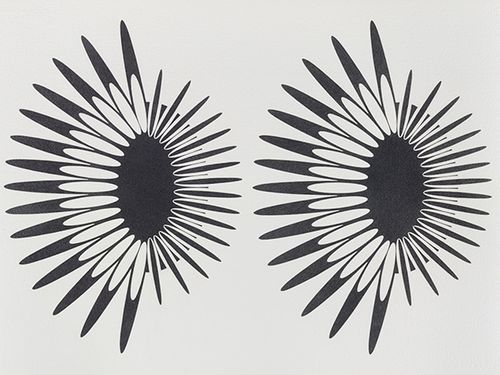
Jane Harris, Orbiters 6 (2015), Graphite on Arches paper, 22 x 30 inches, at Odetta Gallery.
Jane Harris completed her drawings in this exhibition during a summer residency at the Josef and Anni Albers Foundation in Bethany, Connecticut. In his teaching, Josef Albers sought to “cultivate vision” to seek out what he considered to be unseen visual reality. Much as Albers’s paintings relied on pattern and modulation, Harris has created meticulous works that she calls “Orbiters” of graphite on paper featuring two radiating shapes side by side. The forms interact, with one growing and the other contracting, or parts turning on and off in black and white, or rotating, or seeming to push from one side to the other. Their binary nature calls to mind our own eyes and ears. They also feel like bursts—not so much Bach counterpoint, but Strauss percussion.
Gelah Penn’s work may be the least appealing but ultimately most intriguing of the three in the show. Her Serial Polyglot Y (2014–15) is a series of six “drawings in space” where she “folds, smudges, and punctures planes.” In this process she uses a polyglot’s materials; to be precise: lenticular plastic, digital print, graphite monofilament, acrylic paint, and metal staples on Yupo paper. The results are as advertised: strips of paper are folded, smudged, and punctured. One by one, they could be mistaken for crumpled trash, but together we see how the smudges relate. Penn has a keen sense for the acoustics of her medium, in particular the cringe-worthy feeling that one can get from certain materials rubbing against paper. Here that goosebump-inducing smudge has taken on a life of its own, jumping from one paper to the next.
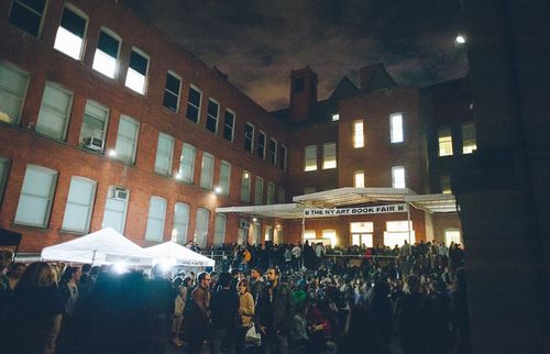
Opening Night of Printed Matter's NY Art Book Fair. Photo BJ Enright Photography.
To borrow a line from Mark Twain, the reports of the death of print have been greatly exaggerated. This might be the takeaway of anyone who attended the tenth annual “Printed Matter’s NY Art Book Fair” at PS1 in Long Island City, Queens over a weekend in September.2 “Attended” doesn’t quite do justice to what it meant to be present here. “Braved” would be more like it. The NY Art Book Fair is the Comic Con of hipsterdom, where Igloo coolers dispense negronis and packed exhibit halls smell of beard oil. Some 40,000 people paw their way among 370 booksellers and publishers on view to find just the ironic hand-Xeroxed zine that speaks to them. If you always wanted a picture book of unknown people taking selfies in parks, National Parks Service from Bad Looks Press at the 8 Ball Zines concession was for you. Rounding out a collection of vintage erotica? Vasta Images/Books had a display of “Sexpapers: Newsstand Smut 1970s–1980s” featuring copies of such publications as Love, Finger, Orgy, and Screw all preserved in archival glassine.
If this felt like the aboveground consumption of something that was formerly underground, you could also add to the mix a neo-fetish for the analogue technology of printed paper. The sponsor of the fair, the worthy nonprofit Printed Matter, has been preserving art books since before books were “books.”
Yet the circus-like atmosphere at PS1, which has become MOMA’s off-campus frat house, forced us to judge these books by their covers, with only silliness evidently contained therein. Maybe I missed the point—the event was so hot and overcrowded, I couldn’t even make it upstairs, and I had neglected to bring a cleverly printed fan to keep cool. Still, as MOMA’s own exhibition “Inventing Abstraction” recently made clear, art books have been a largely overlooked medium of modernism that has the potential to join artists, poets, and writers in unique collaboration. Too bad so much at the NY Art Book Fair wasn’t worth the paper it was printed on.
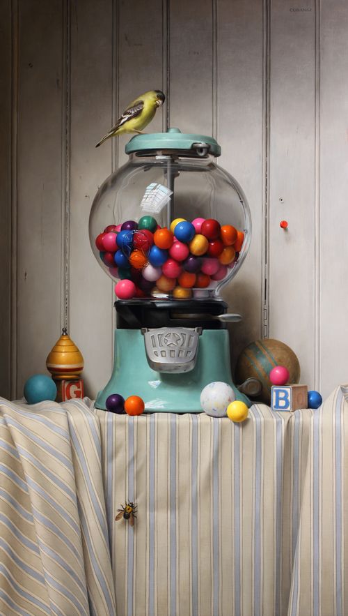
Tony Curanaj, The Gumball Incident (2015), oil on canvas, 28x15.5 in
Just a block away from PS1 in Long Island City, the Grand Central Atelier continues to stake its claim as the anti-MOMA. In a former warehouse, the classical revivalist teacher Jacob Collins runs his ever-expanding off-the-grid school for painters who want to study traditional technique. Like last year, the school has organized a fall “Still Life Show” of teachers and students in a space they call Eleventh Street Arts, carved out of the front rooms of the school.3
This year the standouts were examples of trompe l’oeil, where hyper-realistic objects appear to float above the surface of the canvas in the once-popular style of painters such as Victor Dubreuil, John Haberle, and William Harnett. The technique required to pull off such tricks of the eye is astonishing. Dubreuil used to paint images of paper money so realistically that the Secret Service confiscated and destroyed much of his work. Like those earlier examples, the results at Eleventh Street Arts are fun to see. Samuel Hung offers two examples of toys, cards, and candy apparently tacked to a cracking plaster wall in high relief. Tony Curanaj, meanwhile, is showing a breathtaking tour-de-force of table cloth and beadboard with a gumball machine so irresistible, it tempts the eyes of the viewer just as it does the birds and bees seeming to fly around it.
An “inconvenient artist” is what the gallery owner Alexander Gray calls the painter Jack Tworkov (1900–1982), whose estate Gray’s gallery now represents. “Jack Tworkov: Mark and Grid, 1931–1982,” curated by Jason Andrew, the archivist for the Tworkov estate, digs deep into the inconveniences of this Abstract Expressionist, a founding member of the Eighth Street Club, who turned away from Ab Ex’s “extreme portrayals” (in Tworkov’s words) and increasingly “let reason examine disorder” through systems and patterns.4
I have written in this space before about the interest of Tworkov, who abandoned a popular style to pursue a unique vision. Much like the knight in a game of chess—the movement of which he diagrams in a standout painting in the current exhibition—Tworkov made unexpected leaps in his career through gambits that continue to fascinate, and there are many examples here of his cool calculus. Like the agitated line of Cézanne, Tworkov never let his brush stop in one place. His career embodied the spirit of all-over abstraction with a style that truly went all over.
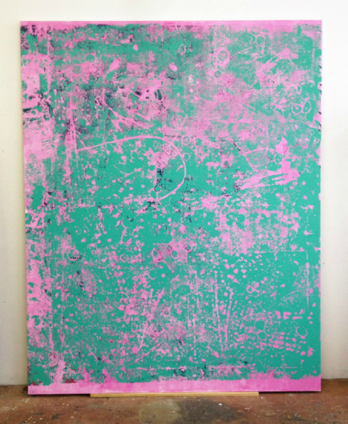
Stephen Maine, P15-0720 (2015); acrylic on canvas, 100 x 80 in. at Hionas Gallery
At Hionis on the Lower East Side, Stephen Maine continues his painting of “residue.”5 That’s the term he calls his process that I first assumed to be silkscreen. But in fact his ghost images are the result of a purely abstract method that stamps paint-covered carpeting and other materials onto canvas as monoprints. The “technique yields a flatfooted trace, a deposit of paint, the residue of a clumsy, imprecise operation,” Maine writes in his exhibition catalogue. I would argue he is far too modest in describing the skill he has developed in pulling off this effect. His bold use of acrylic colors plays off figure and ground. The texture he elicits is remarkable. At Hionis, his canvas format has expanded from previous work to become over eight feet tall. His compositions have likewise evolved, departing from his silkscreen-like grid—the product, I gather, of tufted carpeting—to more varied and irregular patterns that bubble and pop. Here the “technical means of making is incidental,” he writes. What matters is the energy of the paintings themselves—made, in a way, through the energy of their own forms.
Gabriele Evertz, RYBG (Agent) (2015), Acrylic on canvas over panel, 60 x 60 inches, #GE78, at Minus Space
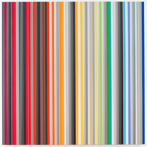
Uniquely dedicated to “contemporary reductive abstract art,” Minus Space has inaugurated its fall program in its new waterfront home in DUMBO, Brooklyn with “Gabriele Evertz: The Gray Question.”6 The question of gray is the unpredictable way it reacts to hue. “Blue recedes and red advances—but the way grays will react is less foreseeable,” writes Evertz in her catalogue introduction.
A professor of color theory at Hunter College, Evertz has long experimented with square-format paintings of sharp-edged vertical stripes of acrylic. Departing from a pure scientific method, she has become increasingly confident in deploying artistic intuition to break from her own color systems to test and push chromatic potential. Her paintings are not just dazzling. They have also become increasingly evocative, with subtitles like “Three Kings” and “Tikkun Olam.” Here she masters the manipulation of the eye, which can be drawn in or pushed down along her slippery edges of color, preventing an easy summation of her compositions. “By alternating between focusing and scanning, we are attempting to see the painting, but a complete mental image is rarely achieved,” she writes. Looking for a “felt, rapturous experience of the real,” her paintings open our eyes to the feeling of color and line—and the mysteries of gray.
1 “Seeing Sound: New Works by Jane Harris, Alex Paik, Gelah Penn” opened at Odetta Gallery, Brooklyn, on September 11 and remains on view through November 1, 2015.
2 “Printed Matter’s NY Art Book Fair” was on view at MOMA PS1, Queens, from September 18 through September 20, 2015.
3 “The Still Life Show” opened at Eleventh Street Arts, Queens, on September 18 and remains on view through October 16, 2015.
4 Jack Tworkov: Mark and Grid, 1931–1982” opened at Alexander Gray Associates, New York, on September 3 and remains on view through October 17, 2015.
5 “Stephen Maine: New Paintings” opened at Hionas Gallery, New York, on September 9 and remains on view through October 4, 2015.
6 “Gabriele Evertz: The Gray Question” opened at Minus Space, Brooklyn, on September 12 and remains on view through October 31, 2015.
