Viewing entries in
Upper West Side

New York History Goes Into Hiding

1 Comment

New York History Goes Into Hiding

WALL STREET JOURNAL, April 27, 2017

New York History Goes Into Hiding

After the New-York Historical Society’s latest renovation, informed by a mixture of ideological and commercial concerns, there are far fewer objects on display.

"Objects tell stories” is the message that flashes across the video monitors of the new permanent-collection galleries of the New-York Historical Society. The phrase might serve as a mantra for what the museum and library is describing as the “transformation” and “reimagined installation” of its fourth floor, which opens to the public this Saturday, April 29, after a $35 million overhaul.

Less discussed, however, is what has been transformed: A museum once defined by its singular holdings and their mode of display has now turned its collection into a sizzle reel of teachable moments.

For starters, tens of thousands of objects that had been on permanent view—treasures that have defined and described local history—have been taken down, with many of them shipped offsite to storage in New Jersey.

But there’s more: The society has chosen to destroy its fourth-floor display of “visible storage”—the unmediated assembly of its trove of objects—which had made a majority of its collection of 70,000 objects publicly available. Known as the Henry Luce III Center for the Study of American Culture, this award-winning, floor-wide installation, completed in 2000, was a place to become lost in the rich material of New York’s history. All this has been reduced to a single gallery, with only a fraction of the collection left on view.

The old Luce Center was a “sentence with a lot of nouns and no verbs,” Louise Mirrer, president and CEO, noted on a recent tour. In its place, the society has chosen curatorial interpretation through immersive and interactive technologies. Or as Ms. Mirrer, who has overseen many prior successes at the society, puts it, the new installation is designed “to dazzle our multiple and varied audiences” with the stories behind the objects.

And so, as the 4,800-square-foot centerpiece of the floor, the museum’s encyclopedic collection of 100 Tiffany lamps has been set in a new “dramatically lit jewel-like space.” The multilevel gallery has been curated by Margaret K. Hofer, the museum’s director, along with Rebecca Klassen, the assistant curator of material culture, and designed by the Czech architect Eva Jiřičná. Its curving cases and glass staircase—inspired by Ms. Jiricná’s work for the Victoria and Albert Museum and for high-end retail—make visiting the museum more like browsing a Mac store. The space includes a “hands-on ‘Design-a-Lamp’ experience,” where visitors can design a virtual Dragonfly shade and see the results on an illuminated model.

Despite the changes, the fourth floor retains the Luce name. It divides a small selection of objects from the permanent collection into 15 “themed niches” on topics ranging from infrastructure to slavery. Also included are 10 historical artifacts “that chart key moments in history,” all supplemented by interactive media. These range from the Civil War draft wheel that sparked the New York riots of 1863 to a graffiti-covered door from the 1970s.

The most radical—and political—transformation, however, is the new Center for Women’s History. “A lot of history is male-centric history,” explained Valerie Paley, the director of the center and the society’s chief historian, on another tour. “Infusing any narrative of the past with race, class and gender is important.”

This mandate now colors the entire floor. The new Tiffany gallery, for example, focuses on the “hidden history” of Clara Driscoll and her design team of “Tiffany Girls.” There is a section dedicated to tennis pioneer Billie Jean King. The new Joyce B. Cowin Women’s History Gallery hosts rotating exhibitions starting with “Saving Washington,” which focuses on Dolley Madison and the women of the early republic, with an immersive space featuring digital tables and life-size cutout photographs of historical re-enactors.

Meanwhile, an interactive video wall called “Women’s Voices” broadcasts at the entrance. These nine 50-inch touchscreens draw connections between Seneca Falls, the meeting of the landmark women’s rights convention of 1848, and such figures as Madonna and the “Women of SNL.”

“So many of our objects in our Luce Center looked like one big attic,” says Ms. Paley of the old installation. “We needed a narrative.”

But “attic” was the point. A truly radical approach to museum presentation, visible storage emerged in the 1970s as an effort to open museum collections to a broader public. The idea was championed by Henry Luce III, the heir to the Time Inc. fortune who, before his death at age 80 in 2005, had funded similar centers at the Metropolitan and Brooklyn museums, and the Smithsonian.

Its destruction here represents a signal event in museum culture. Since the 19th century, museums have been dedicated to preserving and presenting the objects of our cultural patrimony. Visual storage represents the apogee of this object-oriented approach. In its place we now have tutorials that “will challenge conventional wisdom,” in Ms. Mirrer’s words, “and inspire in us new thought and action.”

By contemporary standards, the new installation may be considered a great success—hectoring and seducing at once, with technologies that have the power to engage the public as never before. But such engagement, informed by a mixture of ideological and commercial concerns, also leads museums away from the primacy of art and artifacts. The society’s new floor certainly has a lot to say. It also has far fewer nouns through which to speak.
1 Comment

Old Museums, New Tricks

Comment

Old Museums, New Tricks

THE NEW CRITERION, February, 2017

Old Museums, New Tricks

On the Gilder Center at the American Museum of Natural History, the Wagner Free Institute of Science in Philadelphia, and the lessons we can learn from older museums.

The best museums are often museums of museums—institutions that put their own history on display alongside their collections. The museums that fascinate me are never the buzziest models off the shelf but those that have been allowed to age. Either through conscious efforts at preservation or through the preservative fluids of neglect, such institutions invite us to experience history as a part of history. Rather than attempting to exist outside of themselves by erasing their past, museums that seem antiquated or even “out of date” can reflect the highest values of their mandates to protect and present the objects in their collections, which must include themselves.

The Metropolitan Museum of Art is of course one example of a museum that has preserved its own history better than most, something I wrote about in these pages in December. Even as it has evolved into more contemporary forms, the museum has worked to reveal the ornamental details of its architectural past—from the Victorian Gothic heart of its initial 1880 building by Calvert Vaux and Jacob Wrey Mould (now its gallery of Medieval art), through its many later additions in the Romanesque, Beaux-Arts, and modern styles.

Such a presentation can be even more revelatory in museums of science. Here older buildings and displays serve a vital and often overlooked role in teaching us about the history of instruction and inquiry. By seeing what older halls get right and wrong (or what we now believe to be right and wrong), we gain perspective on our own scientific certainties and the charismatic methods through which museums now present themselves to the modern public.

The American Museum of Natural History, the grand institution just across Central Park from the Metropolitan, and with a similar history, has likewise developed as an accumulation of buildings in a wide variety of styles. The institution has also been blessed with generations of naturalists and craftsmen who were the best in their scientific fields. History has borne that out, and we can continue to see it in the wondrous animal dioramas that have become the hallmark of the institution and have fascinated patrons across the ages (including this reviewer, beginning with almost weekly visits as a child).

After the naturalist and taxidermist Carl Akeley died in 1926 on the slopes of Mount Mikeno in the Belgian Congo while developing his Hall of African Mammals—beneath the spot now represented in his gorilla diorama—background painters such as James Perry Wilson, foreground sculptors such as Raymond DeLucia, and taxidermists such as Robert Rockwell carried on his work though the Hall of North American Mammals, one floor directly below. A decade ago, Stephen Christopher Quinn, who has continued what is now a century-old legacy of dioramic design at the museum, published a history of their efforts in his book Windows on Nature.

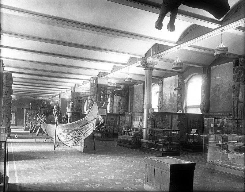
The Hall of Northwest Coast Indians at the American Museum of Natural History, c. 1920

The Hall of Northwest Coast Indians at the American Museum of Natural History, c. 1920

An equally interesting but less frequented area of the museum is the Hall of Northwest Coast Indians—in part because the room has been diminished over the years from its original brilliance. Directly off the museum’s Seventy-seventh Street entrance, now fully enveloped by later additions, the hall occupies the first floor of the museum’s first building.

This room is remarkable not only for its age but also for the work of the museum’s iconoclastic anthropologist, Franz Boas, who developed it at the turn of the last century. A curator and field worker, Boas was, in the final decades of the nineteenth century, one of the country’s primary Pacific Northwest explorers and personally responsible for acquiring many of the objects the museum now possesses from the region.

Anti-evolutionary, Boas was also anti-theoretical and argued for pragmatism and a high degree of intra-cultural observation in research. Departing with his day’s progressivist beliefs in the eugenic order of evolution, which grouped non-Western cultures together with primitive man, Boas displayed ethnographic objects on their own terms. He divided the large hall into sections and dedicated each to a certain tribe of the Northwest Coast: the Tlingit, the Haida, the Kwakiutl. Within these alcoves he further assembled the items of each group: ceremonial masks, pots and bowls, ceremonial ladles, the blankets and coppers of the potlatch. Extensive texts and descriptions were located with the objects, and additional pamphlets and monographs were available for museum patrons within the hall and in the museum bookstore. During his time at the museum, Boas himself even led tours of the collection in order to explain his advanced method of display.

Franz Boas with a ceremonial mask from the Northwest Coast

Franz Boas with a ceremonial mask from the Northwest Coast

The result was distinctly non-hierarchical, allowing each object to exist in tribal specificity. But more than just recognizing the value of his objects, Boas also acknowledged the intelligence of his patrons. Far from the feeble-headed immigrant masses envisioned by his trustees, Boas believed his museum-goers were able to take on the complexities of his own field experience and understanding. (He was, unfortunately, less charitable to a family of Greenland islanders dying in the museum basement).

The young Claude Lévi-Strauss happened to be one such new arrival to absorb Boas’s lessons. Boas’s displays served as a visual structure for Lévi-Strauss’s developing methodology when he visited the hall in the 1940s. The opening paragraphs of The Way of the Masks, Lévi-Strauss’s book on ceremonial masks in the Pacific Northwest, is dedicated to the museum and its “outmoded but singularly effective museographic methods.”

Boas feared that elisions and simplifications of ethnographic material would delude the museum public into believing they had mastered complex information. “There appears a multiplicity of converging and diverging lines which it is difficult to bring under one system,” he said against surface conclusions and quick assumptions. Yet Morris Ketchum Jesup, then president of the museum and an ally, nonetheless objected to what he saw as Boas’s cluttered display. He wanted a presentation that combined didactics with entertainment, and set about instituting these changes after Boas’s departure in 1905.

While Boas’s tribal enclaves were maintained, the number of objects on display was reduced, large totem poles were commissioned for the room, and wax mannequins were created to add an element of theater to the large Haida canoe in the center of the hall. Between 1910 and 1926, the artist Will S. Taylor painted theatrical murals along the inside walls while the windows were blacked out and the architectural ornamentation covered over. Each of these post-Boas additions raised the stakes of spectacle but retreated from the radicalism of the presentation. What has resulted today is a muddle of intentions in a hall that calls out for a return to his original design.

The totality of the museum’s rich history, its masterpieces and its missteps, must now inform its latest efforts at building and development. Since its founding in 1869, the American Museum of Natural History has always been a work in progress. With a wide range of buildings, the museum has gradually expanded over a quadrangle between Central Park West and Columbus Avenue that was, in fact, set aside in the Commissioners’ Plan of 1811, which established the original street grid.

This past month, the museum unveiled plans for a 194,000-square-foot, $340-million new wing known as the Richard Gilder Center for Science, Education, and Innovation, to be constructed facing Columbus Avenue in line with Seventy-ninth Street and set to open in 2020. In recent years, a pocket of local residents has objected to any additional encroachment by the museum onto what is now known as Theodore Roosevelt Park, yet the museum has every right to build there. Arguments for green space ring hollow considering the proximity to Central Park, and new construction will fit within the footprint outlined in the museum’s nineteenth-century master plan, which remains incomplete.

More pressing should be questions of how the building—costing as much as a stand-alone museum—relates to the values of the institution and reflects the culture in which it has been conceived. It might be said that every generation gets the museum wing it deserves. The fanciful rustication of J. Cleaveland Cady’s south façade gives way to the Beaux-Arts grandiloquence of John Russell Pope’s Roosevelt Rotunda on up through Polshek’s vitrine-like computer-age planetarium. Such organic expansion at the very least allows for the preservation of older buildings and halls.

Model for the American Museum of Natural History’s Gilder Center, facing Columbus Avenue and Seventy-ninth Street.

Model for the American Museum of Natural History’s Gilder Center, facing Columbus Avenue and Seventy-ninth Street.

The Gilder building, by Studio Gang Architects, will dispense with historicized style altogether in favor of sculptural concrete resembling “slot caverns, riverbank canyons, and hydrologic flow,” explains Jeanne Gang, who used water and blocks of ice to study the forms. The monumental effect will be post-diluvial—a natural history museum at the eschaton.

Inside, some of what is planned sounds very promising. A five-story “collection core” will line the interior with visible storage displaying 3.9 million specimens, or about 10 percent of the museum’s collection. Large areas will be dedicated to live butterflies and other insects as the museum continues to drift into a role traditionally taken up by zoos.

Still unknown remains the proper use of the building as a center for education—the same questions that dogged Boas’s original hall. With new “exhibition techniques for diverse audiences” offering an “authentic engagement with science,” here is a fully immersive diorama that promises seamless storytelling on the deleterious effects of humanity but one that may not fully consider the “multiplicity of converging and diverging lines,” as Boas put it, in the Malthusian shade. With a new building designed to “combat the post-truth era” and provide “wisdom for how to treat your environment,” according to museum leadership, it remains to be seen whether such mandates will also lay bare the history of science in the hands of progressivism. In this museum of natural history, the Gilder Center must not become a temple of doom.

The Wagner Free Institute of Science in Philadelphi

The Wagner Free Institute of Science in Philadelphi

It is taken as a given that museums must keep current with contemporary dictates and modern expectations. Yet just consider an exception to this rule, and a truly exceptional one at that. The Wagner Free Institute of Science, incorporated in 1855, has operated out of the same building in North Philadelphia since 1865. Much like Boas’s famous hall, but without a growing museum to envelop it, the institute and its displays remain nearly untouched since the late nineteenth century.

As a remarkable specimen of Victorian science, the institution deserves a visit by anyone interested in the history of museum culture. Yet more remarkably, even with its antiquated resources the Wagner continues to operate today as the oldest free education program in the country, teaching 18,000 low-income children annually while offering free access to its 100,000-object collection, mainly to an under-served local community. On the day I visited, while educators had organized a collection hunt upstairs, a paleontologist was unwrapping his findings for an enraptured assembly of children in an auditorium that still retains hat hooks beneath every seat.

With barely the resources to remain in operation, here is an institution that continues to instruct us on just what it takes—or doesn’t take—to learn from the objects of our fascinating world.

Comment

Comment

A Bushel & a Peck at City Ballet

Paz-de-la-jolla-key

Justin Peck's "Paz de la Jolla" at New York City Ballet

James writes:

If this is not turning into a golden age for classical choreography, it is at least becoming a silver age or a bronze. The recurring program of “21st Century Choreographers” at the New York City Ballet gives a welcome overview of this resurgence and highlights the company’s own role in nurturing this surprising turn of events—a surprise, given the uncertain state of contemporary composition in other performing arts.

This season’s “21st Century” program offered work by two of the brightest young stars, Christopher Wheeldon and Justin Peck, but began squarely in the late 20th Century with Ash, a ballet by Peter Martins that premiered in 1991 at the New York State Theater, along with his Infernal Machine from 2002. Some might begrudge a Martins double-header as a case of royal prerogative for the NYCB’s Ballet Master-in-Chief. Yet I appreciated the inclusion for the clear line these two works draw from the NYCB’s founding choreography of George Balanchine and Jerome Robbins—and their connections to and contradictions with more contemporary work.       

Ash feels like late twentieth-century ballet, and classic Martins: cerebral, technically demanding, and spare. In its lack of narrative and its appeal to abstraction, the dance is the most Balanchine-like of the program and also the most remote in its tense counterpoint. In the late 1980s, Michael Torke, the composer for Ash, wrote a series of orchestral pieces called “Color Music.” Ash works through a similar interest in Synesthesia—the mixing of the senses—through the use of colored lighting by Mark Stanley and primary shaded costumes by Steven Rubin, which also share an unfortunate affinity to the uniforms of Star Trek. A friend commented that such a dance can be inaccessible, overly taxing on the dancers while offering little to the audience, which is perhaps true. At the same time, I found it exhilarating to watch Ashley Laracey rise above the technical demands put to her and find this ballet’s inner grace.

The story of The Infernal Machine starts out similarly obtuse. In the program, its composer, Christopher Rouse, managed to refer to a play by Jean Cocteau, a connection (or lack thereof) to the Oedipus myth, a “Perpetuum mobile,” and an orchestral tryptich—which goes a long way in saying very little. Instead, this brief, furious pas de deux of Unity Phelan and Preston Chamblee mixes robotic motion and inappropriate groping to an uncertain, uncomfortable, and uncompromising end.             

Located between the two Martins was This Bitter Earth, a pas de deux with Sara Mearns and Tyler Angle, with music by Dinah Washington and choreography by Christopher Wheeldon, which premiered in 2012. The ballet has just about everything a contemporary audience might want from dance. Wheeldon is also everything Martins is not: deeply romantic, easily accessible, employing a narrative that is clearly discernable. Here the earth tones of the lighting by Mary Louise Geiger and the dustbowl blues of Dinah Washington—interposed with a techno-beat by Max Richter—gave us a couple dancing on the edge of desperation. I am not always drawn in by the popular emotiveness of Sara Mearns, whose sense for theatricality departs from the traditional coolness of classical ballet, where emotion is conveyed through movement over physiognomy. Some have also criticized Wheeldon for the gender politics of his pairings, which admittedly at moments can become strictly ballroom. But ballet is also ready for such an infusion of red-blooded romance, for a new affection not only between the dancers but also between the stage and the audience. With Mearns perfectly cast in this role, This Bitter Earth delivered its earthly bitterness in spades.

The NYCB may have thought that by including Jeux, a dance by the London-based Danish choreographer Kim Brandstrup that premiered last year, the company was giving a nod to greater gender inclusivity in its selection of choreographers. Unfortunately, this Kim is a man, and this ballet is a manly embarrassment. Drawing on the tropes of film noir, Jeux uses blindfolds and bare bulbs to affect an arch narrative about a woman betrayed. But with business casual costumes by Marc Happel, the dance rather feels like a Bear Stearns holiday party gone wrong, with coworker Craig Hall caught cheating on Sara Mearns with Lauren Lovette, and Mearns saved by the passionate embrace of Adrian Danchig-Waring as, what, the hunky janitor? Cliché piles upon cliché in this ensemble dance that ends with a giant novelty tennis ball (the “jeux”).  On my day, Mearns, blindfolded, even inadvertently knocked her head against another dancer’s leg at one point. Clearly she wished she had stuck around on that Bitter Earth rather than head to the big city.             

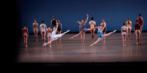
Finally it was time for Paz de la Jolla, the 2013 dance by NYCB dancer and resident choreographer Justin Peck, set to music by Bohuslav Martinu. I say “finally,” because here is the dance many of us had come to see: the subject of the documentary film Ballet 422 and the product of the NYCB’s astonishing wunderkind, who has already choreographed something like twenty-eight ballets—or a number equal to his current age. Peck’s humility in the face of the tradition of Balanchine and Robbins comes across palpably in Ballet 422,—and it is on display here again in his intuitive understanding for classical movement and form. Rather than fight the tide, Peck has a remarkable ability to channel a dancer’s flow, deployed in a sunny ballet inspired by his upbringing in Southern California. What begins in beachy bliss, with splendid Esther Williams-like swimsuit costumes by Reid Bartelme and Harriet Jung, supervised by Marc Happel, transforms into a eddying, swirling tide of abstract, fluid motion. The ensemble becomes the ocean, with arms and legs forming the patterns of rolling surf. Sterling Hyltin and Amar Ramasar become engulfed in the waves, while a third dancer—a lifeguard?—swims out for the rescue. On the day of my performance, Georgina Pazcoguin replaced Tiler Peck in this role, which drew noticeable (and regrettable) disapproval from the audience. Pazcoguin’s gymnastic style gave a different, and not altogether uninteresting, shape to the part, even as we missed Peck’s sinuous forms. But it was the other Peck who was still on full display here—the choreographer in residence who, one hopes, never leaves his home at the New York City Ballet.                         

Comment