Simone Dinnerstein

Dara writes:

Last night James and I had the privilege of experiencing the piano genius of new star Simone Dinnerstein, a 34-year-old pianist who lives in Brooklyn. Three magical elements marked the evening. One, of course, was Dinnerstein's playing. The second was the thing played: Bach's Goldberg Variations. James and I adore this piece and chose it as the music accompanying our wedding ceremony. Ms. Dinnerstein's love for the music is exceptionally personal as well as professional; she insisted that her doctor let her listen to it while she gave birth to her son during an emergency C section. She "thinks he was born during Variation 20."

Like most, I know Glenn Gould's iconic interpretation. Now there is another iconic moment in the piece's history. I'm not sophisticated about music, so all I can say is that her playing rocked. It was awesome. Certain things truly distinguish her mastery. Her rhythm and pacing are beyond reproach, in addition to being so unique and artistic. The way she trills and makes the piano sing is remarkable. Each variation and its repeat was so interesting, modulated, and fresh. Nothing by rote. Each note felt new.

The final element of the evening that will sear it in my memory was the setting in which we heard the Variations, the perfect setting, if you ask me: the sitting room in the Buckleys' maisonette on Park Avenue.

Our friend Larry Perelman, a pianist himself, organized the evening for Mr. Buckley. To listen to Bach in a plush room with red velvet sofas and silk tassels, reclining on a stuffed chair, intoxicated me. After she played, Ms. Dinnerstein was told by Bill Buckley that her playing represented one of the most exciting performances he had ever seen. He has lived quite a life, and that was an incredible compliment. She must be thrilled. Perhaps as much as we were listening to her!

'Mystical Mediator'

ART & ANTIQUES
critic's notebook

'Mystical Mediator'
Re-examining the legacy of Robert De Niro Sr.
By James Panero

September 2007

Modern art has tended to be divided into one of two categories. Visit Venice during this year's Biennale, for example, and you mostly encounter art of the dominant style-work based in tone, volume, depth, illusion, narrative and theater. This is art with a story to tell, art as a window, art that is loud, art with a point. The points may be radical, but the means are traditional, in that everything from academic painting to contemporary political art shares the common trait of using one medium to depict another. In the history of taste, this "public" style of extraverted, didactic art has always won out. But modernism has long nurtured a minority position. Mystical and idealist, often occult and certainly introverted, this secondary style is most easily recognized by its embrace of color.

On view in Venice through September 10, at the San Marco Casa D'Aste, the work of Robert De Niro Sr. serves as a counterpoint to the official art of the Biennale. This artist, who died in 1993, gracefully internalized art's color-based legacy.

Although little-known outside the world of art, De Niro Sr. remains just as famous as his celebrated actor-director son in the eyes of serious painters. Drawing on the sonorities of Bernard and Gauguin, the luxuriance of Bonnard, the anxieties of van Gogh, the moods of Munch and the textures of Matisse, De Niro
was spellbound by color's potential. A child prodigy, born in 1922 in Syracuse, New York to an Italian father and an Irish mother, De Niro at first studied with Josef Albers but then abandoned Albers' rigid color theories and went in for the push-pull compositional dynamics of Hans Hofmann, the celebrated painter and teacher of the New York School. Hofmann became De Niro's champion and godfather to the painter's only son.

De Niro's art, like the work of his colorist predecessors, finds its roots most directly in Symbolism, synesthesia and the metaphysical philosophies of the late 19th century (De Niro took an interest in the Christian Science of Mary Baker Eddy). Here the unity of painting predominates. The interlocking flatness and
harmonies of shape and color take precedence over subject matter. The painting itself is subject matter. In De Niro's case, the Passion of Christ, a recurring theme in his work, becomes passion itself. Writing in 1981 about Bonnard, De Niro echoed a similar sentiment: "His works are not about happiness. They are
happiness."

De Niro's indebtedness to Bonnard comes through most clearly in one of his early paintings-appropriately, a centerpiece of the Venice show. "Venice at Night is a Negress in Love" (1943-44) features a Bonnard bather awash in Gauguin-like colors, the palette more intense and atonal than anything the earlier artists
could have imagined.

Clement Greenberg made note of De Niro's early color combinations, not altogether approvingly: "Where De Niro usually goes wrong is in his hot, violent color, which, although he had digested the favorable influence of Matisse, often over asserts itself and distorts the drawing."

I disagree. This work is a masterpiece. Nevertheless, by the mid-1960s and through the 1970s and 1980s, De Niro cooled his colors into a glassy sea. His signature flourish came in the form of broad, brushy outlines that defined his figures. At their best these gestures foregrounded his murky depths with graceful sweeps. The success or failure of his paintings often hinged on how well these final applications tied his compositions together.

De Niro Jr. has a deep affinity for his father's work. At a press conference in Lisbon, he broke down in tears discussing it. In Venice, as I walked through the exhibition with him, and joined him at a press conference for the opening, he said, "I am so proud of my father. But as a kid I didn't want to go to the shows. I now consider my father the best painter of the century."

Artist and son share the hunched shoulders, the taciturn expression, the brooding intensity, the inward pressure. The father was a dandy, maintaining the personality of the bohemian artist. In New York he crossed paths with the greatest painters of his generation. But unlike the Abstract Expressionists, De
Niro was more a mystical mediator than an innovator. As financial success passed him by, he would hit up rich friends like de Kooning for cash.

The marriage between De Niro and Virginia Admiral, another esteemed painter (they met through Hofmann), did not last longer than a few years, yet the two remained close. In the late 1970s, as Admiral worked to convert SoHo lofts into artist studios, De Niro took up residence in one of her buildings on West Broadway.
Here he lived and worked for the rest of his life.

This beautiful, top-floor space, with skylights illuminating every corner, remains as De Niro left it: tubes of seeping oils haunt the palette board, books on art, theology and philosophy line the shelves, posters from the history of art cover the walls, clothes fill the closets. In one corner, an umbrella hangs on the handlebars of a bicycle. In another, the door of a built-in birdcage swings ajar (De Niro favored parrots). When I asked De Niro Jr. if he ever wanted to become a painter, he said he "never had an interest. My kids don't want to be actors. But I preserved the studio for the children." The studio remains in the private possession of the family, but fortunately, Salander-O'Reilly published a monograph in 2004 on De Niro's work
that is filled with images of this magical place.

In 1857, the poet Charles Baudelaire, drawing on the mystic Emanuel Swedenborg and the poet Heinrich Heine, laid the groundwork for colorist innovation in his sonnet "Correspondences," from part of Les Fleurs du mal. Here is how Richard Wilbur translated the second stanza of this famous poem, which became a manifesto for painters like De Niro: "Like dwindling echoes gathered far away/ Into a deep and thronging
unison/ Huge as the night or as the light of day,/ All scents and sounds and colors meet as one."

Like dwindling echoes gathered far away, the art of Robert De Niro Sr. remains a place where scents and sounds and colors meet as one. What a joy to see it in the city of Titian, where color was born.

'Tintoretto's Thunderbolt'

THE WALL STREET JOURNAL

MASTERPIECE
'Tintoretto's Thunderbolt'

His 'Crucifixion' of 1565 just may be the Italian Renaissance's single best work of religious art

By JAMES PANERO
September 22, 2007

The Venetian painter Tintoretto (c. 1518-1594) never commanded the sculptural vocabulary of Leonardo or Michelangelo. He did not luxuriate in the warmth of Giorgione or Titian. He displayed neither the draftsmanship (disegno) of Florentine art nor the affection for coloring (colorito) that was the legacy of his native city.

But through a synthesis of each tradition, "il disegno di Michelangelo e il colorito di Tiziano," as one Venetian writer identified it, Tintoretto may just have painted the single best work of religious art in the Italian Renaissance. His "Crucifixion" of 1565 comes as both a concluding statement to the art of the high Renaissance and also something wildly new.

To see it, you have to visit Venice. Tintoretto's "Crucifixion" continues to fill the back wall of the boardroom (albergo) of the Scuola Grande di San Rocco, where he left it. Tintoretto dedicated his artistic and spiritual life to this confraternity, a charitable organization of Christian laymen dedicated to the plague-healer St. Roch. Surrounded by over 50 other religious images that Tintoretto painted for the Scuola Grande for the cost of materials, the "Crucifixion" forms the centerpiece of one of the largest intact cycles of religious work by a single artist in history.

Unlike Michelangelo, who initially fled Rome rather than finish the ceiling of the Sistine Chapel, Tintoretto never hesitated to apply his vision to paint. He persevered even as he was rejected by the Venetian establishment -- a situation that may explain the manic, expressive urgency of his compositions.

Consider how he first made his way into the Scuola. Since Tintoretto was the son of a silk dyer (tintore), the profession of a quarter of the Scuola's membership, his acceptance by the confraternity might have been a given. But in 1564, when he entered the artistic competition to supply the first ceiling painting to the newly completed albergo, the odds were not on his side. A young man with an evangelical zeal, Tintoretto had already been rejected for membership. In the conservative Scuola, resentment ran high against his brash personality and unorthodox paint handling -- "the thunderbolt of his brush," as one 17th-century painter called it. One member of the Scuola even pledged to contribute 15 ducats if Tintoretto was not chosen for the commission.

Meanwhile Titian, the ruling monarch of Venetian painting, who supposedly once expelled Tintoretto from his workshop after recognizing the young student's great talent, backed his protégé Veronese as heir apparent to the colorito legacy. (Their three-way rivalry will be examined in a show at the Museum of Fine Arts, Boston, in spring 2009.)

Giorgio Vasari, the great Florentine chronicler of Renaissance art, recounts how "the little dyer" overcame the odds. (They had their differences, but Vasari still saw fit to call Tintoretto "swift, resolute, fantastic and extravagant, and the most extraordinary brain that the art of painting has ever produced.") Rather than submit a drawing of his ceiling plan, Tintoretto secretly measured the open space and "sketched a great canvas and painted it with his usual rapidity, without any one knowing about it, and then placed it where it was to stand."

When the confraternity protested, Tintoretto made an offer: "If they would not pay him for the work and for his labor, he would make them a present of it." It was a clever move. Since no donation to St. Roch may be turned away, through this gift "he so contrived that the work is still in the same place." (It didn't hurt that the painting's subject was the Scuola's patron saint.)

Within a year, Tintoretto overcame the Scuola's lingering resentment; he was accepted for membership and allowed to attempt his great "Crucifixion."

The layout of the room posed several challenges. Three different architects worked on the Scuola's design. When it was finished by Scarpagnino in 1549, the building's small, elevated windows provided only minimal interior light. The albergo was also wider than it was long, so that any painting covering the back wall would have to be viewed from close proximity and below.

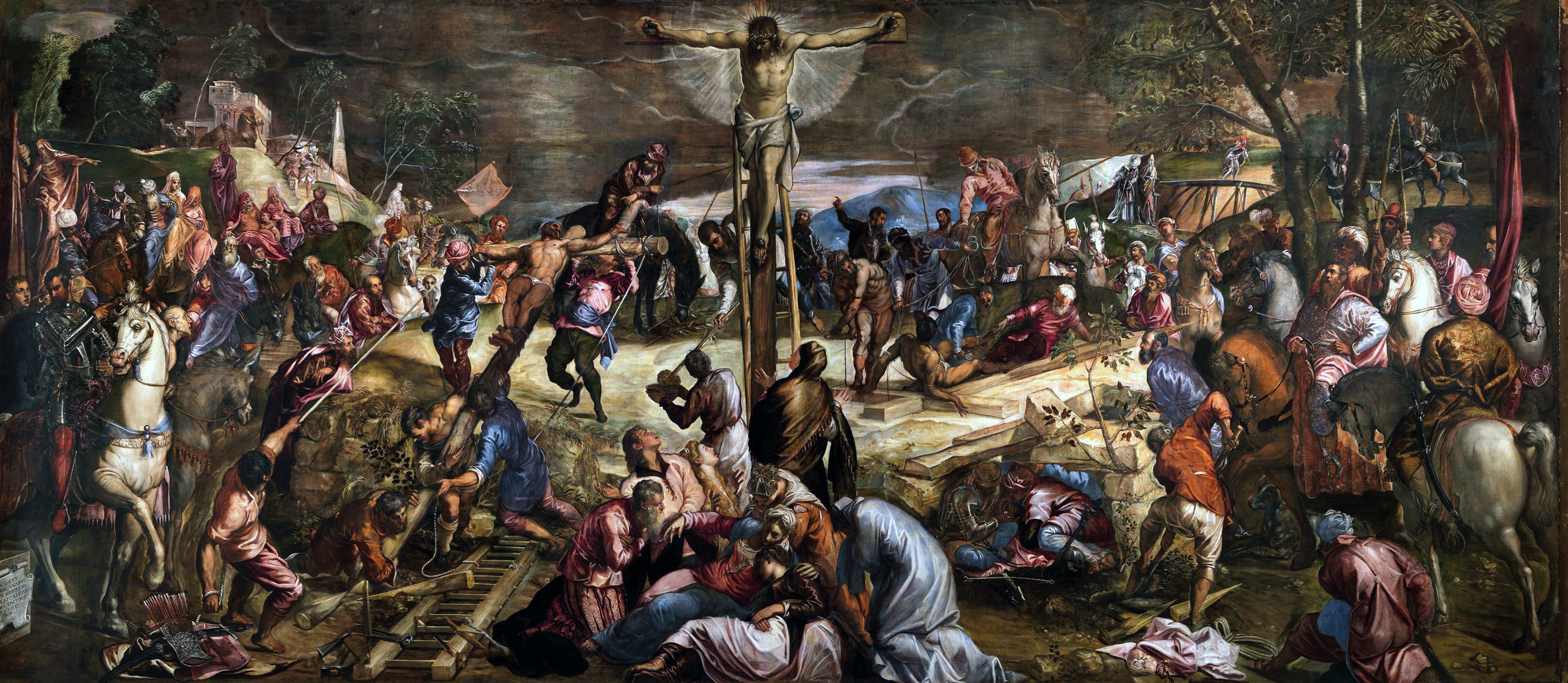
Tintoretto conceived of a revolutionary program. Rather than keep his design locked in strict perspective, which would have been distorted by the room's oblique points of view (think of the front row of a movie theater), Tintoretto folded his narrative around the central figure of Christ on the cross. He then depicted Christ bending down -- to address the good thief, the figures in mourning at the foot of the cross, and our gaze from below. The fixity of the cross provides an anchor within an undulating sea of dark details that seems to extend beyond the picture plane out into our own space. With blank faces, the mundane figures surrounding Christ stir up the awful scene. A crowd of onlookers, carpenters, soldiers and even a dog make up "a centrifugal energy that charges the entire picture," as the art historian David Rosand wrote in his survey of 16th-century Venetian painting.

The ominous tones, curved landscape and artistic urgency that underlie Tintoretto's color choice, composition and paint handling make this work a point of departure. Rather than look back to the neo-Platonic ideals of classical sculpture -- brilliantly embodied at the start of the 16th century in the ceiling frescoes of the Sistine Chapel -- Tintoretto's "Crucifixion" anticipates the fallen angels of our modern era.

Like a thunderbolt from the brush, Tintoretto's "Crucifixion" can stop you in your tracks. The Victorian writer and artist John Ruskin certainly thought so. "I have been quite overwhelmed today by a man I have never dreamed of -- Tintoret," he wrote to his father on his first visit to Venice. "I always thought of him a good and clever and forcible painter, but I had not the smallest notion of his enormous powers. . . . And then to see his touch of quiet thought in his awful crucifixion -- there is an ass in the distance, feeding on the remains of strewed palm leaves. If that isn't a master's stroke, I don't know what is."

From 1565 to 1588, Tintoretto expanded his swirling cycle of religious art in the Scuola out and down from the cross of the "Crucifixion": to canvases on the facing wall of the albergo ("Ecce Homo," "Christ Before Pilate" and "The Way to Calvary"); to a monumental series of images from the New and Old Testaments covering the walls and ceiling of the Scuola's central upper room (sala superiore); to episodes from the life of the Virgin Mary on the walls of the ground floor (sala terrena).

Tintoretto's work at the Scuola, executed over more than 20 years, became a perfect union of form, content, application and artistic intention. In Tintoretto's lifelong dedication to the Scuola, "the act of painting thus becomes a gesture of piety," writes the academic Rosand.

Earlier this year, the Prado Museum in Madrid hosted the first major survey since 1937 of Tintoretto's work. The museum also published an excellent catalog, in English, on the artist. No museum exhibition will ever do justice to Tintoretto, since his largest work never travels, but the Prado show came close, shedding light even on San Rocco: "the most personal and intensely felt of his works, conveying a powerful sense of the artist's own deeply held faith," writes Frederick Ilchman, a curator at the Museum of Fine Arts and an essayist for the catalog.

The Scuola Grande di San Rocco, which remains active as a confraternity, long ago opened its doors to the public. It now also maintains an excellent Web site, www.scuolagrandesanrocco.it, which includes interactive pictures of the rooms.

But there's no substitute for the real thing. The artist El Greco once called Tintoretto's "Crucifixion" the greatest painting in the world. Next time you are in Venice, make a visit to the Scuola your own act of piety, and experience a work of art that reaches across the centuries to our own time and place.

Mr. Panero is the managing editor of the New Criterion.