Viewing entries in
New York

Take Five

Comment

Take Five

“It’s got a great beat and you can dance to it.” You wouldn't necessarily think to apply the old chestnut from “American Bandstand” to the works of Igor Stravinsky. Yet in his swirling colors, counterposed in thrusting, angular relief, there is something obviously danceable to the modern master—and why his music has called out to such a wide range of dancers and choreographers over the last century.

Scènes de Ballet

Scènes de Ballet

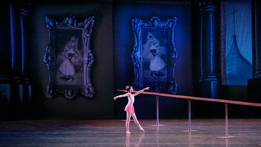
“Stravinsky x Five,” a program from the winter season of the New York City Ballet, brings together five dances by five choreographers interpreting the music of this one composer. It begins with Scènes de Ballet, Christopher Wheeldon’s second work for the company that premiered in 1999. The work calls for sixty-two students, all drawn from The School of American Ballet, who dance in the imaginary reflection of the mirror at the barre of a ballet studio. The conceit is simple but brilliant and one that is ripe for exploration (and the first reason I came to see this program). But it rises or falls in its execution by the students, who must dance with synchronized precision. So here the work is also a demonstration of the next generation of NYCB, made more poignant as these young dancers do rise to the challenge of this ballet.

With a fanciful set by Ian Falconer, who envisions a soaring dance studio overlooking onion domes as though illustrated in a children’s storybook, the work recalls the Imperial Russian origins of both its composer and this company through its founder, George Balanchine. The dancers, starting with two of the youngest ballerinas and building to greater complexities of older students, perform not only as reflections in the imaginary mirror but also as reflections of the legacies of dance they carry forward.

Wheeldon’s choreography exhausts every permutation of the setup and goes too long, finishing in an Esther Williams finale. What should be saved for the conclusion now occurs halfway through. The reflection of a young dancer suddenly breaks from formation. A pas de deux of older dancers enters the “mirror” in a dream sequence imagined by the student on the other side. The unexpected break is the most meaningful moment of the dance, truly breathtaking, as the aspirations of countless hours at the barre are made real.

The Cage

The Cage

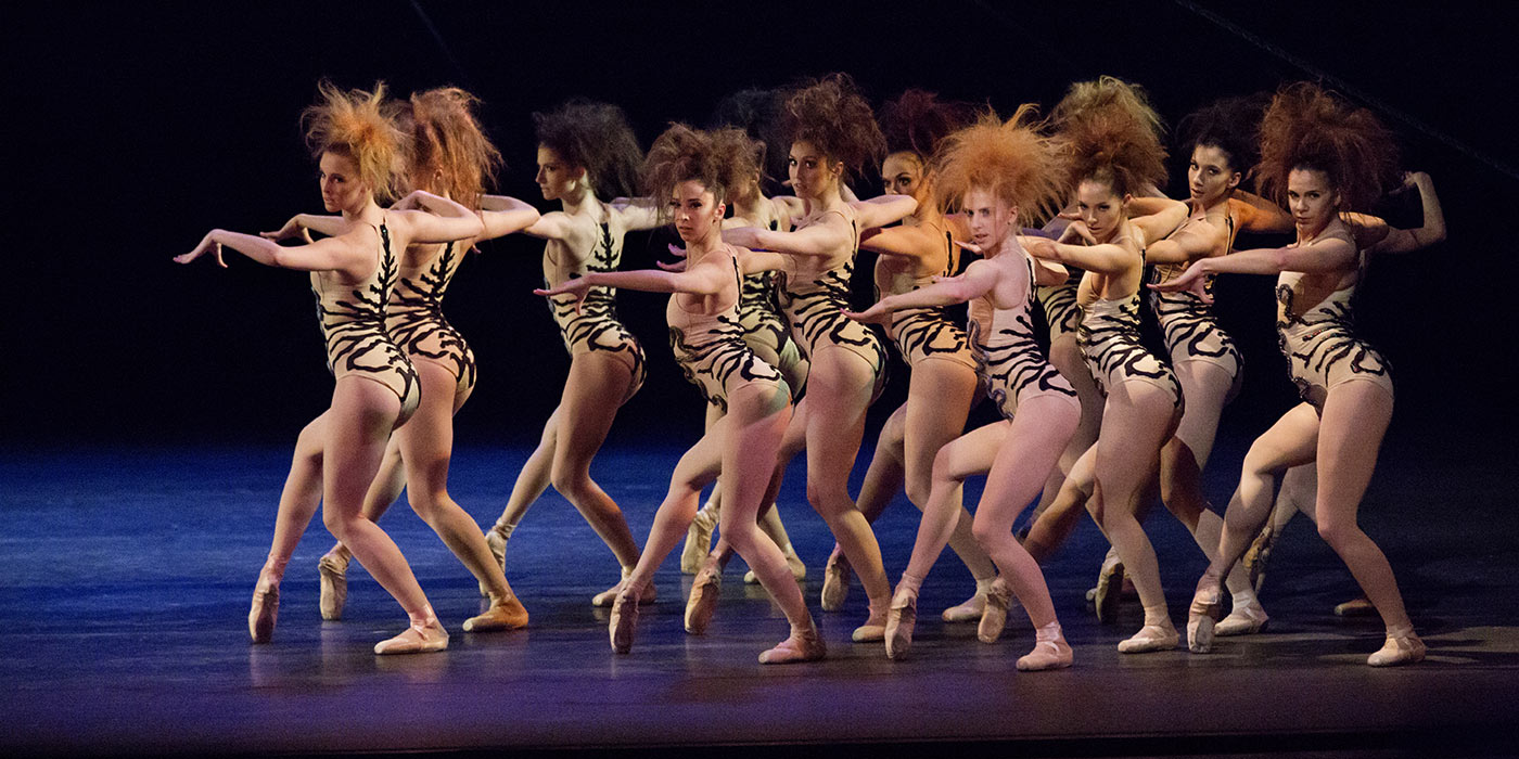
Next up is The Cage, Jerome Robbins’s 1951 ballet based on Stravinsky’s 1946 Concerto in D for String Orchestra. Unlike the Stravinsky of Scènes de Ballet, an old-world phantasia he composed for a Broadway review in 1944, this high-modernist work is all fits and starts. Robbins visualized this music in “insect and animal life” with “the female of the species considering the male as prey. This ballet concerns the rites of such a species.” The result is a Rubies feel, with many pigeon-toed struts executed in formation. The inhumanity of the spectacle is heightened by Jennifer Tipton’s stark lighting, teased tufts of hair, a rope web by Jean Rosenthal, and costumes by Ruth Sobotka that render the dancers as sun-deprived and subterranean. The story concerns a “Queen” (Savannah Lowery), a “Novice” (Lauren Lovette), and two male “Intruders” (Jare Angle and Sean Suozzi). But even when well danced, especially by Lovette, the result now comes across as mid-century burlesque, with a femme who is cartoonish fatale.

Eight Easy Pieces

Eight Easy Pieces

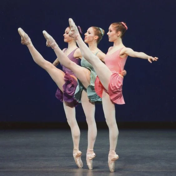
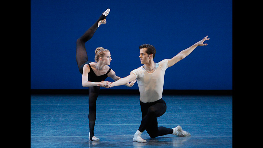
Eight Easy Pieces up next takes us from the 1950s to a work by Peter Martins that premiered in 1980. It also struck me as vintage PBS, a spare composition lighting up my Trinitron (which it just might have done). Through the dance Martins gives form to eight piano duets that Stravinsky wrote with easy left- or right-hand parts: three for the ballet impresario Sergei Diaghilev himself, and five for Stravinsky’s own young children. Here the piano and its shared players are brought right on stage. Martins’s minimalism can come across as fussy, but danced by Rachel Hutsell, Olivia MacKinnon, and Alex Maxwell, all new to their roles, the effect was a delight, with Stravinsky’s music distilled into pixels of color.

Scherzo Fantastique

Scherzo Fantastique

I hope the next dancer-choreographer commission holds up as well, but I doubt it will. Justin Peck is ballet’s millennial machine, a soloist and resident choreographer whose lack of affect (at least as seen in the documentary Ballet 422) is in contrast to the ebullience of his work. For Scherzo Fantastique, which premiered just this summer in Saratoga (and is this twenty-nine-year-old’s eleventh work for NYCB), Peck takes a right at spring and lands his Stravinsky in the full light of summer. With a stunning Fauvist backdrop by Jules de Balincourt, the Bushwick-based French painter, this dance should have everything going for it in its return to modernist animism. But here Peck is all sun and no shade, more MGM than NYCB, with a sensibility that harkens to a golden age when ours calls out for iron.

Stravinsky Violin Concerto

Stravinsky Violin Concerto

Finally it was time for the two masters together: Stravinsky and Balanchine. George Balanchine came to co-found the School of American Ballet and New York City Ballet through one of those grand twentieth-century odysseys. Trained in what was then the Imperial Ballet School of Saint Petersburg, he fled the Bolsheviks for Paris where he became Ballet Master in the final years of Diaghilev’s Ballets Russes. Finally, after a turn in Hollywood, he came to New York, where he set about teaching American dancers classical technique infused with Modernist sensibility, with his School of American Ballet training all of his dancers for New York City Ballet. In a program that begins at the barre in old Russia with Scènes, “Stravinsky x Five” concludes with the full fruits of Balanchine’s cultivation of ballet in new America.

Stravinsky Violin Concerto, first choreographed by Balanchine for the Ballets Russes in 1941 and reimagined three decades later for NYCB, is presented here front loaded with principals of the company. “The capabilities of his dancers to dance as he wanted came from his classes,” writes Suki Schorer in the new book Balanchine Teaching. Through the discipline of daily exercises at the barre, the execution of the plié, the tilt of the head in épaulement, and the importance of the fifth position to a body’s vertical center, Balanchine fine tuned the instruments of his company.

Even in the current principals of NYCB, we continue to see his resonance: the fluid flexibility of Maria Kowroski, the floating leaps of Amar Ramasar, the swift strength of Robert Fairchild, and the stunning precision of Sterling Hyltin. ”Balanchine’s choreography, he made clear, came from the music,” Schorer continues—and was arguably never better than from the music of Stravinsky.

Stravinsky x Five” continues with modified casting through this Friday, February 3, at the New York City Ballet.
 

Comment

The museum of the present

2 Comments

The museum of the present

THE NEW CRITERION

December 2016

The Museum of the Present

What’s a museum? This is a question I have asked more than once in The New Criterion. It’s one this magazine has been asking since its first issue. And it’s one that I wish museums would ask more frequently of themselves. Because the answers are changing—through assumptions that are often unannounced, unacknowledged, and unexplored.

Writing nearly twenty years ago on “the ongoing transformation of the American museum,” the late theorist Stephen E. Weil identified how museums were moving from “being about something to being for somebody.” This is a phrase that has been taken up by critics of contemporary museum culture, but for Weil it signaled a positive change, a momentous redirection he traced back to the cultural revolts of the 1960s. The museum of the past, he said, was content to care for the “oldfashioned satisfaction,” “aesthetic refreshment,” and “pleasure and delight” of its permanent collection—or what the museum director Barbara Franco derided as the “salvage and warehouse business.” Through new evaluation standards tied to continued tax-exempt status, Weil argued, the museum of today “is being told that to earn its keep requires that it be something more important than just an orderly warehouse.” In other words, through historical inevitability and government coercion, Weil concluded, the museum of tomorrow must come to see itself not as the steward of a collection of objects but as “an instrument for social change.”

Twenty years on, the prophecy is coming true—but with increasingly ominous and destructive results, especially for collecting museums. In 1997 the Brazilian museum director Maria de Lourdes Horta envisioned how “a museum without walls and without objects, a true virtual museum, is being born” to be “used in a new way, as tools for self-expression, self-recognition, and representation.” Or as Neal Benezra, the director of sfmoma, more recently observed, “times have changed. Back then, a museum’s fundamental role was about taking care of and protecting the art, but this century it’s much more about the visitor experience.”

Over the last few decades the American museum has only been too successful at turning this vision into reality. By the numbers, museums have become thriving enterprises, competing and ballooning into what we might call a museum industrial complex. Today there are 3,500 art museums in the United States, more than half of them founded after 1970, and 17,000 museums of all types in total, including science museums, children’s museums, and historical houses. Attendance at art museums is booming, rising from 22 million a year in 1962 to over 100 million in 2000. At the same time, and hand in hand with these numbers, billions of dollars have been spent on projects that have largely focused on expanding the social-service offerings at these institutions—restaurants, auditoriums, educational divisions, event spaces—rather than additional rooms for collections. At the present rate, the museum of the future will virtually be a museum without objects, as new non-collection spaces dwarf exhibition halls with the promise that no direct contact with the past will disturb your meal. As London’s Victoria and Albert Museum once advertised, the museum of the future will finally be a café with “art on the side.”

The museum of the past focused on its permanent collection. The museum of the present forsakes the visited, and its own cultural importance, to focus on the visitor. From offering an unmediated window onto the real and astonishing objects of history, the contemporary museum increasingly looks to reify our own socially mediated self-reflections. This it does not learn from history but to show the superiority of our present time over past relics. The result is a museum that succeeds, by every popular measure, in its own destruction—a museum that is no longer an ark of culture, but one where the artifact at greatest risk is the museum itself.

Executive Editor James Panero discusses the character and trends of contemporary art museums.

The American art museum was born in the nineteenth century, a century later than its European counterparts and largely as an answer to those institutions, but with a unique American quality tied to its permanent collection. Unlike in Europe, where museums were either created out of revolutionary turmoil or acts of government, almost all American institutions were founded and supported by the free will of private individuals. The treasures these benefactors bequeathed became not only public objects of secular devotion but also tokens of the idealism behind the institutions that maintained them. As manifestations of private wealth transferred to the public trust, American museums were founded, in part, to represent our civic virtues. The aesthetic education offered through their permanent collections was not just about history and connoisseurship. It was also about how hard work can become an expression of virtue by gifting objects to the public trust. It’s truly an astonishing American story: no other country has seen such private wealth, accumulated through industry, willingly transferred to the public good.

But it wasn’t long into the twentieth century before some American museums began to attack their own cellular structure, usually in the pursuit of progressive social change. These assaults were most manifest in the physical transformations and deformations of institutional buildings. Now, in many cases it should be said that the changing appearance of our museums was benign. Rather than malignant tumors, they signaled healthy growth through evolving architectural styles. The dozen or so buildings that make up the Metropolitan Museum of Art have created a unified whole out of an assembly that range from Gothic Revival to Beaux-Arts to modern. These diverse structures complement one another and work to complete the museum’s founding vision.

In contrast, consider the history of the Brooklyn Museum—born in 1823 nearly a half century before the Met and a manifestation of rising civic confidence in a borough that was once America’s third-largest independent city. In the 1930s, a progressive director by the name of Philip Newell Youtz launched an assault on his nineteenth-century museum from which this great unfinished institution has never recovered. Believing that the “museum of today must meet contemporary needs,” Youtz attacked the museum’s 1897 home designed by McKim, Mead & White on Eastern Parkway and vowed to “turn a useless Renaissance palace into a serviceable modern museum.” Praising the educational practices of the new Soviet museums, he undertook the transformation of the Brooklyn Museum from a temple of contemplation into a school of instruction, where the arts were put in the service of progressive ends and funding would derive from the state rather than private philanthropy. Youtz sought to transform his institution into a “socially oriented museum” with, as he stated, “a collection of people surrounded by objects, not a collection of objects surrounded by people.” He even hired department store window-dressers to arrange exhibitions and transform his collection into a parade of teachable moments.

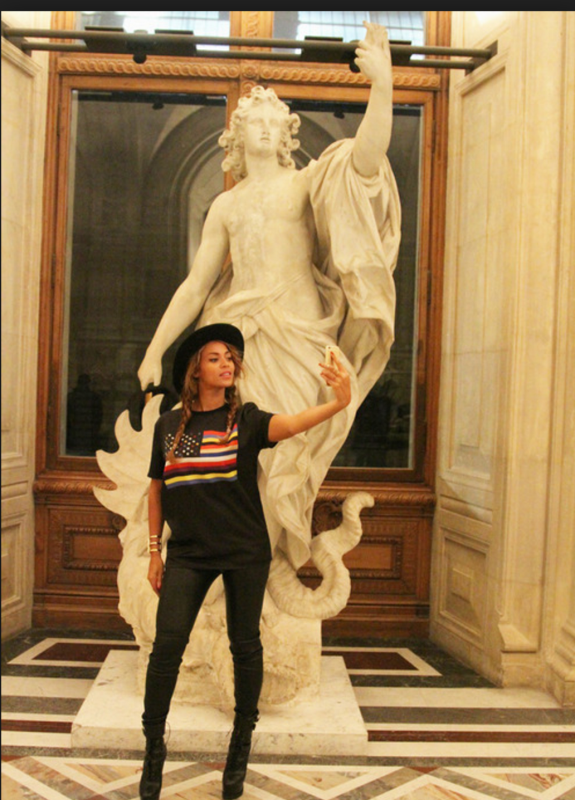
Beyoncé Knowles with Apollo killing the Python snake at the Louvre.

Beyoncé Knowles with Apollo killing the Python snake at the Louvre.

Youtz then turned his programmatic assault into a physical one. Historians may question the ultimate motivation behind his demolition of the Brooklyn Museum’s exterior Grand Staircase, which once resembled the entrance to the Metropolitan Museum of Art and was meant to elevate the museum-goer from Eastern Parkway into the refined precincts of the museum. What is not in doubt is Youtz’s belief that his iconoclasm, pushing the museum lobby down to street level, “improved” upon the McKim, Mead & White design. Continuing in this way, Youtz went about mutilating much of the museum’s ornamental interior.

In this example, we can see that a progressive strain agitating for a more “socially orientated museum” long predates the 1960s. But since the 1960s, such progressive ideology, combined with what I would call a non-profit profit motive that seeks ever larger crowds, greater publicity, expanding spaces, ballooning budgets, and bloated bureaucracy—a circular system that feeds on itself—has turned the American museum into a neoliberal juggernaut.

The expansion plans that museums now seem to announce by the day may appear to be the evidence of healthy organic growth. But their motivations are just as often closer in ideology to the removal of the Brooklyn Museum’s Grand Staircase—efforts at distancing the present from the past.

There are many examples. The 70,000-square-foot $114 million new wing of the Isabella Stewart Gardner Museum, which opened in 2012, is but one. Designed by Renzo Piano, the building, which required the demolition of Gardner’s historic carriage house, now serves as the only entrance to the institution and connects with the original museum through a glass-enclosed airlock. The addition offers a Kunsthalle for new art, eateries, shops, a greenhouse, a visitor “living room,” and apartments. All are attractive, but for what end? A greenhouse to cultivate new interest? A hundred-million-dollar engine to generate new donors—even as streaks of rust still stain the museum courtyard? I would argue that the expansion primarily serves to quarantine the original museum’s antiquity behind an architectural filtration system. With the anointment of “Renzo’s oil,” the museum shifts its focus from what is left of its collection onto the visitor experience. As the Gardner’s director explained to me at the time of the opening, finally those people in their cars on Fenway Park Drive will recognize the Gardner as a museum, because here is Renzo Piano. Nevermind that the Gardner’s fanciful palazzo has been a signature of the Boston streetscape since 1903.

Back in New York, the Whitney, a museum with a vastly different history, relocated in 2015 from the Upper East Side to a flood zone along the Hudson River with results that are surprisingly similar to the Gardner’s. We have heard the modern museum referred to as a “white box.” Designed, again, by Renzo Piano, here is the museum as sky-box, an institution built as much to be looked out of as looked into, a place where see-and-be-seen has moved from the periphery to the main event. As opposed to the Whitney’s former fortress of solitude on Madison Avenue, designed by Marcel Breuer in 1966, the new museum metaphorically explodes, reprocesses, and repackages its own history through a giddy, irrational space for spectacle and an incinerator for its dusty, unwanted past.

This may be one reason why the institution has been rechristened as, simply, whitney, dropping the words “museum,” “American,” and “art” from its branding. Yet while Piano increased the Whitney’s floorplan from 85,000 to 220,000 square feet, just 50,000 of that is going to indoor galleries, up from 33,000 on Madison Avenue. The rest goes to multi-million-dollar views and a circulation system that forces the museumgoer outside onto a fire escape turned against the skyline, which like Piano’s Pompidou treats the museum as an institutional theater.

Do all of these initiatives really turn museums into instruments of “social change”? Do they merely justify bigger budgets and higher ticket prices? I would argue that by mediating our experience through ever more gauzy filters they in fact blunt the true radicalism of our direct encounter with the objects of history. Rather than “decentering us at a radical moment of unselfing,” as the director James Cuno once observed, today’s institutions promote “museum selfie day” and roll out every trick at recentering the experience of the museum around you. What better way, after all, to reap the benefits of hashtag advertising while entertaining the egocentrism of your turnstile clientele.

But why not? What is so wrong about the Metropolitan Museum of Art’s recent promotion of “nail art sessions by Lady Fancy Nails” as it did around the show “Manus x Machina”?

Or what about a promotion by the Art Institute of Chicago that offered a “full-size replica of Van Gogh’s painting The Bedroom” available for nightly rental on AirBnB.

Or how about this season’s “Met Workout,” a museum-sponsored event that advertises: “Goodbye SoulCycle, hello Vermeer and Picasso. You thought just trying to stroll through The Met collection was a workout? Try doing stretches in the shadow of Diana or squats while pondering the shapely poise of John Singer Sargent’s Madame X.”

Maurizio Cattelan with his sculpture America t the Solomon R. Guggenheim Museum.

Maurizio Cattelan with his sculpture America t the Solomon R. Guggenheim Museum.

This fall the Guggenheim museum installed a working gold toilet designed by the neo-Dadaist Maurizio Cattelan in one of its bathrooms. The facility, which requires a special guard and janitor, attracts hour-long lines that snake up the rotunda. This interactive Duchampian sculpture, the most shared golden toilet on the internet, is called America (how original), but it might just as well be titled “the museum.” The provocation is presented as an inside joke, but it ultimately degrades the institution itself for one more social-media share. A golden toilet is an appropriate symbol for the museum fully dedicated to the visitor experience.

The problem is that such promotions, by converting the museum from a temple of culture into a cathedral of the self, spend down its reserves of virtue. The Instagram age has little need for more venues for “self-expression, self-recognition, and representation.” Our times yearn for a real, unmediated engagement with the objects of the past that only a traditional collection-based museum can offer. This may be one reason why we saw a widespread uproar over the recent rebranding of the Metropolitan Museum. It wasn’t so much over its lackluster typography and a spendthrift rollout at a time of operational shortfalls. It was that so many people deeply admired what the museum’s traditional brand had come to represent.

There are many counterexamples to this story—museums that resist progressive currents and reaffirm their original collection mandates. Increasingly I draw encouragement not from too-big-to-fail institutions but from those tributaries and backwaters of our museum mainstream—from New York’s Hispanic Society, for example, preserved in amber on 155th Street and Broadway, to house museums like the Morris-Jumel Mansion in Washington Heights, where Lin-Manuel Miranda wrote parts of Hamilton while sitting in Aaron Burr’s bedroom. Museum trustees still have the power to redirect their resources away from artless atriums and administrative bloat to true collection access through initiatives such as the visible storage centers sponsored by Henry R. Luce.

But I suspect we have only seen the proverbial tip of the iceberg now in the path of the museum at full speed. Museums may assume that new buildings and hashtag diplomacy will insulate them from the most destructive progressivist mandates, but these are just openings for a new generation of cultural leaders, contemptuous of the permanent collections of robber barons, to undermine their stewardship. Already, ill-adventuring museum directors such as Thomas Hoving have shown us what could be done through deaccessioning when, in the early 1970s, he began liquidating bequests over the objections of his curators to enhance his own discretionary spending. Now look for a further loosening of deacession standards.

For a generation, museums have chased after the numbers, with blockbuster exhibitions and amenities that have indirectly ceded curatorial control to the turnstile. The government now looks to accelerate this abdication of leadership through “reenvisioning our grant programs,” as the National Endowment for the Humanities announced this year.

If the museum visitor now expects to receive the keys to the collection, backed by government mandates, there may be little hope to save the museum from populist whim. In October an activist group called “Decolonize This Place” continued its targeting of museums by storming the rotunda of the American Museum of Natural History. Chanting “Respect! Remove! Rename,” they then covered the equestrian statue of Theodore Roosevelt and demanded “that City Council members vote to remove this monument to racial conquest.” At one time this might have seemed like an extreme suggestion, but given the current iconoclasm on university campuses, the protesters know they are part of a populist insurgency. This is the end result of the “museum for somebody”: a museum without objects that is ultimately objectless—a museum for nobody.

2 Comments

Gallery Chronicle (September 2016)

Comment

Gallery Chronicle (September 2016)

THE NEW CRITERION
September 2016

On “Stuart Davis: In Full Swing” at the Whitney Museum of American Art.

One of the many revelations to come out of “The New Spirit: American Art in the Armory Show, 1913,” the excellent exhibition organized three years ago by Gail Stavitsky at the Montclair Art Museum, was a small watercolor of a rowboat on a lake. A blond woman leans over the stern, nearly submerging it in water as she seemingly smiles back at us. Behind her, standing on the upturned bow, a man twists on one leg as he attempts to remove his trousers—startled, it would appear, at our arrival.

Immediate, part quick illustration, part louche intrusion, the work may have been as shocking for its content in 1912 as it would be to us, today, for its attribution. Titled Romance or The Doctor, this watercolor was one of five examples to be put on display in the 1913 Armory Show by none other than Stuart Davis (1892–1964), the American modernist whose work would soon take a bold turn away from such realistic scenes towards angular shapes, flattened colors, and the interweaving of text and imagery.

At the time the promising disciple of Robert Henri and “The Eight,” just twenty-one years old, Davis was among those American artists most affected by the radical examples of European modernism that came stateside for the Armory Show’s infamous three-city tour—a “masochistic reception,” he later recalled, “whereat the naïve hosts are trampled and stomped by the European guests at the buffet.”

Yet with his watercolors exhibited alongside eye-opening examples of modernist painting by Picasso, Matisse, Kandinsky, and Duchamp, Davis also saw the “vindication of the anti-academy position of the Henri School, with developments in undreamed of directions.” The awakening was pure Davis, telling us a great deal of how he saw through the surface of style and looked to deeper meaning, always staying independent of trends. At that time, Davis was one of the artists whose interest in saloon life and popular entertainment would earn him the label of “ash can,” a term meant as opprobrium for his focus on the underbelly of American culture and the one that came to define the movement of his older contemporaries.

The particular genius of Davis’s subsequent modernist direction was how he went on to integrate European stylistic innovation with his unique Ashcan vision. Through the flattening, flickering, fleeting perspectives of modernist composition, Davis did not so much abandon his Ashcan beginnings. Instead he found ways to electrify them, to broadcast the frenetic American century with the syncopation of jazz and to illuminate it with the glow of neon.

Just take his House and Street (1931), from the Whitney’s collection, where windows, fire escapes, garages, smoke stacks, scaffolding, advertising symbols, and campaign signs all come together like the colorful pieces of a jigsaw puzzle framed by the shadows of an elevated train. Or consider the frenzied cataract of Ultra-Marine(1943), a favorite of mine from the Pennsylvania Academy of the Fine Arts, where any lingering sense of single-point perspective is overtaken by Davis’s development of “serial centers” of focus. And then there is The Paris Bit (1959), also from the Whitney, a late masterstroke where colors, silhouettes, signs, and shadow lines seem to reassemble not as a single image but as a long-remembered impression—a deep feeling coming together out of forgotten sights.

So the fact that “Stuart Davis: In Full Swing,” a major, traveling exhibition now at the Whitney Museum of American Art, would omit Davis’s entire early Ashcan development, and instead start its show in the 1920s, would seem to do a curious disservice to both Davis’s own achievements and the understanding of the museum-going public.1

That this omission of “Davis’s decade of apprenticeship” turns out to be a deliberate “interpretive gambit” meant to “depart in significant ways from their predecessors,” as the co-directors of the Whitney and the National Gallery explain in their catalogue preface, is a startling revelation of curatorial intent that hints not only at Davis’s evolving place in the canon of American art but also at the shifting interests of the contemporary American museum.

We are therefore left with an exhibition that is both required viewing for what it reveals of Davis’s American vision but also a flawed, precariously off-balance presentation of that vision. With approximately one hundred works on display, there is, it should be said, much to be thankful for here. Despite the over half-century of Davis research that has followed the artist’s death in 1964, a complete chronology has only recently come to light with the publication of his catalogue raisonné by Ani Boyajian, Mark Rutkoski, William C. Agee, and Karen Wilkin in 2007, as well as—finally—the full access to his archives granted by the artist’s estate. Through her catalogue essay and wall texts, at least, the Whitney’s Barbara Haskell, our most dutiful curator of early American modernism and the co-curator of this exhibition, gives every indication of a deep interest in the full span of Davis’s development, including the early history. Her extensive catalogue chronology, starting with Davis’s childhood in Philadelphia, where his father was a graphic artist and art editor, on through his life and career at the center of bohemian New York, furthermore offers a singular addition to Davis scholarship.

At the same time, it must be increasingly difficult to propose a major museum survey of a canonical artist that relies on scholarship alone and does not attempt realignment and revisionism. Writing in 1965 at the time of Davis’s memorial exhibition, H. H. Arnason of The Solomon R. Guggenheim Museum summed up the then-established consensus: “Davis is almost the only American painter of the twentieth century whose works have transcended every change in style, movement, or fashion.” Such an appreciation only occurs when you consider Davis’s development in his own time. Yet in a reversal of priorities that is fast becoming the norm of museums today, rather than allowing history to challenge our present assumptions, the past must now conform to contemporary diktats. In Davis’s case, this means understanding the artist not on his own terms but for the movement he inadvertently foreshadowed—pop—the one art movement, it would seem, that is now unquestionably allowed to occupy our own time and place.

There is no other reason to start a Davis survey with his paintings of illusionistic flattened packaging of the 1920s than to frame him as a pop artist. And indeed, “framed” is right, since there is reason here to suspect that Davis has been framed. Calling these paintings of consumer products “Davis’s breakthrough,” the exhibition narrows Davis’s achievements to one that merely “merged the bold, hard-edge style of advertising with the conventions of European avant-garde painting.” Forget the fact that this particular imagery is part of an older tradition going back to the nineteenth century in American trompe l’oeil and might be considered something of a tributary in the main currents of his artistic development. Why not instead look to his more innovative cubist still lifes, also from the early 1920s, and now in the collection of the Vilcek Foundation?

Framing the far end of his career, the exhibition likewise gives disproportionate meaning to Davis’s interest in returning to older compositions. The observation that Davis revisited his earlier work is nothing new. In 1965 Arnason noted “how often he experimented with a theme or motif, put it aside, and then years later returned to it and developed it into a major painting or a series of paintings.” Yet here this is treated as divine revelation, of what? Pop seriality, and then some.

In creating this exhibition, Barbara Haskell was joined by Harry Cooper of the National Gallery, who gets equal billing. I suspect much of the pop obsession has originated with this co-curator whose credits include a role in the recent Roy Lichtenstein retrospective. Cooper’s catalogue essay, titled “Unfinished Business: Davis and the Dialect-X of Recursion,” is certainly guilty of blanketing Davis in theoretical cant and, simply put, offering one of the most overwrought examples of art writing I have ever seen—repeatedly exhorting his readers to “let us” join him in his leaps of incredulity. Just let us consider, for instance, Cooper’s take on the painting Memo, a mystical composition from 1956 of angular white lines, letters, and numbers folded into fields of red, green, and black:

Let us take the final step: Memo is a Marxist abstraction . . . the Marxism is present in its absence. (Canceled and preserved: such is Hegel’s mind-bending logic.) It has disappeared and keeps disappearing. Marx is a four-letter word beginning with m.

“Present in its absence” might describe much of the logic in this essay on Davis’s “recursive” imagery, which concludes by again choosing to see what is not there in Davis’s moving final painting:

Finally, the loop has a rapport with the spiral, that geometric figure often invoked to visualize Hegel’s dialectic in its back-and-forth winding ascent to the far-off goal (in The Phenomenology, 1807) of Spirit in possession of itself, outside of time, no longer divided. . . . His last painting, left on his easel at his death and still swaddled in masking tape, includes the word fin, possibly inspired by the last frame of a French movie he had been watching on TV. The word is often taken as a premonition of death, but who can say? Another possibility is that the word, like many of Davis’s, like the painting itself, is just incomplete, unFINished.

The great shame of this exhibition’s pop psychology, or more likely pop psychosis, is how its archival research has indirectly illuminated a more relevant understanding of Davis’s methodology. Far from the superficial coolness of pop, Davis was the hottest of artists. He incorporated the visual landscape of popular culture not as pop commentaries but as personal expressions. He deployed modernist innovations such as cubist simultaneity but, unlike European examples, he looked beneath the surface. Mere “visible phenomena,” as Barbara Haskell explains, “ignored what he believed was true about perception—that it involves the totality of one’s consciousness. He reasoned that if his art were to be truly realistic, it must include his ideas, emotions, and memories of other experiences.”

Davis’s recursions were part of these personal excavations that folded memory, sound, and feeling into ever-evolving compositions. This means that his Rapt at Rappaport’s (1951–52), a painting from middle age, could convey the polka-dot paper of the toy store on Third Avenue and Seventy-ninth Street where his parents once shopped—and where he, at one time, could have been “rapt” in its wrapping. The legacy of Stuart Davis is a similar gift, a feeling for the twentieth century wrapped in its own unique, wonderful packaging.


1 “Stuart Davis: In Full Swing” opened at the Whitney Museum of American Art, New York, on June 10 and remains on view through September 25, 2016. The exhibition will be on view at the National Gallery of Art, Washington, D.C. from November 20, 2016, through March 5, 2017; the De Young Museum, San Francisco, from April 8 through August 6, 2017; and the Crystal Bridges Museum of American Art, Bentonville, from September 16, 2017, through January 8, 2018.

Comment