Conservative Student Boxed out at Pratt

Liberalism in a Box
James writes:

You don’t have to be an art critic to see something tasteless going on at Pratt Institute. Since 1887, this venerable New York institution has been dedicated to educating “artists and creative professionals to be responsible contributors to society.” Yet teachers and administrators at Pratt have been nothing but irresponsible in their recent dealings with a fifth-year drawing student named Steve DeQuattro.

Mr. DeQuattro is a political artist. He uses his background in graphic design to illustrate the dominant political culture of his world. At Pratt, this means creating work that addresses, as he wrote to me, the “growing bureaucracy, higher tuition, new buildings for administration, new offices, and departments, and left-wing bias, all at the expense of the students.”

As part of his recent work, Mr. DeQuattro has designed a cereal-box-like sculpture that he calls, ironically, “Sustainable Liberalism in a Box” (the graphics are pictured above). He has developed a piece that takes the ubiquitous Apple iPod ad campaign to address abortion. He has designed a sobering five-foot-wide mural that tracks the Democratic Party’s record on race, from Jefferson’s slave-holding days up through the racially charged speeches of Senator Robert Byrd and Vice President Joe Biden.

As a senior in the school, Mr. DeQuattro has been working on this art in preparation for a group show for Pratt’s graduating students, which is scheduled to open on April 23. While his faculty advisor has been supporting him, his peers have not. Mr. DeQuattro says they recently wrote a letter to his professors, calling his work “offensive” and complaining about exhibiting alongside him. Last week, the chair of the fine arts department stepped in to prevent Mr. DeQuattro’s participation alongside the other students in the group show--an unprecedented move in the history of the department, says Mr. DeQuattro, despite the fact that none of his work is pornographic, libelous, or in violation of the laws of free speech. Mr. DeQuattro's advisor did not return a request for comment.

For the administrators and students at Pratt, the problem isn’t political art itself, says Mr. DeQuattro, but the nature of his politics, which are conservative. He says his school takes a liberal position on politicized discourse, just as long as that discourse does not deviate from a left-wing position. Pratt’s opposition to Mr. DeQuattro’s art only underscores the importance of his work. Mr. DeQuattro is asking for outside help in convincing the institution to support his exhibition.

Mr. DeQuattro's case illustrates the art world's double standard towards political art. From Jean-Louis David’s Death of Marat to the works of George Grosz to Picasso’s Guernica, political commentary has had a place in the history of art. Artistic expression can help us understand politics in ways that other forms of commentary cannot.

Yet the relationship of artist to audience often tells us much about the validity of political work. Art that preaches to a wholly agreeing public is little more than propaganda. Most self-described political art today falls short in this regard and is of limited value outside of its political utility, because it almost exclusively presents left-wing arguments to a left-wing public. Rather than standing apart from their audience, works like Shepard Fairey’s promotional designs for candidate Obama to Richard Serra’s visual denunciations of Abu Ghraib pander to existing assumptions and reaffirm the politics of their surroundings.

Audience resistance and censorship, by contrast, can sometimes illustrate the value of an artist’s political message. Such work may encourage the audience, however resistant, to see its politics in a new way. Sometimes this censorship is largely self-constructed, as in the case of David Wojnarowicz's “Fire in My Belly,” where a bad internal decision at the Smithsonian to remove the work from display was taken up by protesters as an opportunity to advance a political and monetary agenda. In that example, the work went from excluded to another form of propaganda, quickly landing in the permanent collection at MOMA. Other times the censorship is more serious, as now in China, where the state crackdown on Ai Weiwei speaks to the continued validity of his artistic project.

By these definitions, Mr. DeQuattro has the makings of a political artist, because as a conservative artist he currently stands outside of the politics of his own time and place. Regardless, student work deserves an especially generous standard for display. Mr. DeQuattro’s art should be supported by the same institution that invited him to hone his craft over the past five years. He should be afforded the same rights given to his classmates and allowed to exhibit in the group show. The fact that his politics are not shared by his peers does not render his art as irrelevant or “offensive.” Instead, it is a reason his political art is valid and deserves to be shown.

Beatnite: Bushwick

James writes:

You don't need a passport to cross the border into the vital arts scene of Bushwick, Brooklyn, but it can help to have a guide. That's why Jason Andrew, the co-owner of Storefront Gallery and the director of the Bushwick nonprofit Norte Maar, organizes Bushwick Beatnite. For these semi-annual events, usually on Fridays, Bushwick's galleries stay open late. Jason and his co-sponsor, Hyperallergic.com, issue maps listing all the venues. The gallery crawl then concludes at a bar starting around 10. In this case, the Cedar Tavern of Bushwick is a place called Bodega.

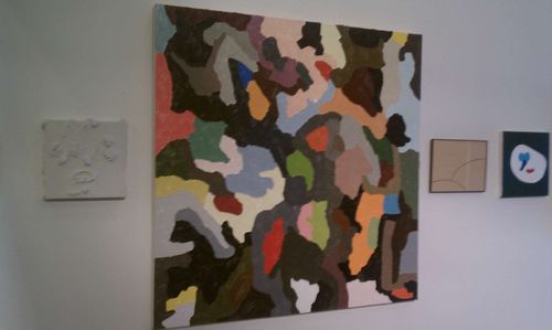
Here's what the scene looked like at Friday's event. Katarina Hybenova of Bushwick Daily has more. Most of these shows just opened, so there's still time to see the art over the next few weeks. 

508_BEATNITE_021811_LARGE

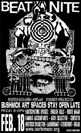
Beatnite poster by the singular Bushwick assemblage artist Andrew Hurst


BN-243926820 (1)

Jason Andrew (driving, in trucker's hat) took the VIPs around by minivan. In the flashbulb, Hrag Vartanian and Veken Gueyikian of Hyperallergic.com  Not pictured, Jason's dog Fern, sitting on my lap. 


BN-243896553

Some of the work on view at Fortress to Solitude, the gallery run by Guillermo Creus, who seeks out an eclectic range of artists. The center two pieces are by Jenna Bauer.  


BN-243902039

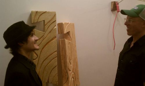
Paul D'Agostino of Centotto talks with Jason Andrew. Dove-tailed sculptures and rope made of styrofoam and acrylic by artist Zane Wilson.


BN-243910175

Artist Ashley Zelinskie is the co-founder of the ambitious new Bushwick collective Curbs and Stoops, an "art accessibility think-tank." On the wall is a painting by Angel Otero, whose inaugural New York show is now on view at Lehmann Maupin. I write about a studio visit with Otero in my next column for The New Criterion, out March 1.


BN-243919992

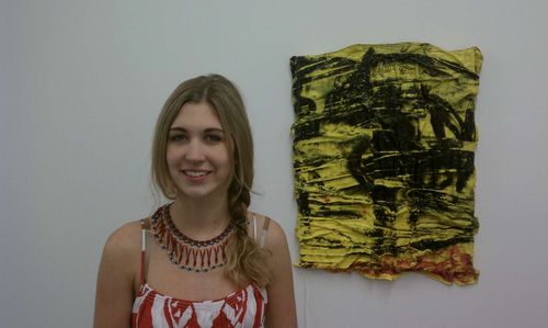
Gwen Skaggs of Sugar shows paint skins by the artist Erika Keck.


BN-243977014

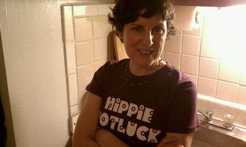
Much of the party centered around Norte Maar, Jason Andrew's home gallery. Here Austin Thomas has curated a group show in the living room. Austin's t-shirt references her newest venture, Hippie Potluck, a regular symposium of artists and writers hosted at the offices of Hyperallergic.   

Not pictured, but also on my rounds, was Meg Hitchcock's obsessive text work of Biblical proportions at Famous Accountants (check out this James Kalm Report for more), the closing party for Mary Judge at Storefront, and the gallery Laundromat in its new location across from Norte Maar. 

My thanks to Jason, and all of the participating artists and gallery owners, for keeping the lights on and allowing us to see a creative neighborhood in its prime.  

UPDATE: Hrag Vartanian has published a "personal beatnite in photos" at hyperallergic.com. Caught on film is the author (left) on assignment with Paul D'Agostino (right) and Fern Dog (center), the unofficial mascot of Beatnite. 

Beatnite-03
/ hv

A Beautiful Mind

Portraits of the mind

PROTO MAGAZINE
Winter 2011

A Beautiful Mind
by James Panero

It was the hippocampus as no one had ever seen it, illuminated in radiant hues. The image is called, aptly, a Brainbow, the colors serving a scientific purpose by highlighting specific neural structures. Yet their choice also reflects an artistic bent; scientists display the brain not the way it is (an undifferentiated gray) but the way we want to see it, “painted” with bursts of fluorescent color.

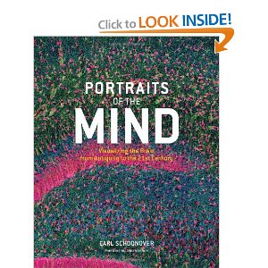
This image, created in 2005, is one of many that Carl Schoon­over, a doctoral candidate in neurobiology and behavior at Columbia University, has collected in his recent Portraits of the Mind: Visualizing the Brain From Antiquity to the 21st Century (Abrams). As science has probed the brain’s structure and function, scientists have had to rely on art to translate their discoveries to visual form.

Leonardo da Vinci created a notable example around 1500, borrowing the techniques of statue casting to inject wax into the ventricles of a freshly killed ox. After the wax cooled, he carved the brain away to create an impression of the cavity, then sketched this casting of the void, rendering it from multiple angles.

The arrival of powerful optics during the mid-nineteenth century enabled scientists to penetrate the brain’s microscopic dimensions. Soon another Italian, Camillo Golgi, inaugurated modern neuroscience by successfully staining individual neurons. In his 1875 drawing of a dog’s olfactory bulb, Golgi records his observations while also somewhat imagining the process of smell, with bulbs in the shape of root vegetables penetrating a layer of neural connections, depicted in fanciful wavy lines.

Whereas Golgi mistook the brain for an uninterrupted web of cells, the Spaniard Santiago Ramón y Cajal correctly saw it as a network of discrete neurons. Cajal had an interest in the Eastern practice of composing ink on paper in a way that stressed negative space. Using this spare approach in a 1903 sketch, Cajal took note of synaptic boutons, which are partly responsible for intercellular communication.

Even after micrographs came into use, artistic intervention continued. In portraying the brain’s vascular system, scientists chose minimal white to create an image as haunting as snowbound woods, with detail conveyed through contrast rather than color values.

“Orientation Columns” (2006), meanwhile, is ruled by overlapping primary colors, as in op art. The piece was created by tracking the activity in a monkey’s visual cortex as the primate observed lines at different angles, each color denoting the angle that certain neuron groups “preferred.” The very act of seeing has created a compelling image.