The English baroque architecture of New York

The Critic magazine, U.K., September-October 2022

Studio: The English baroque architecture of New York

Climbing around, looking up, and zooming in: the delights of Beaux-Arts architecture in New York

Just as Augustus found Rome a city of bricks and left it a city of marble, New York’s robber barons found a city of brownstones and left it a city gilded in gold. From 1870 to 1930, between the end of the Civil War and the start of the Great Depression, this Gilded Age defined the city in ways that continue to enrich its existence today. Amidst the forest of cookie-cutter high rises that now slice through the city skyline, it can be easy to miss the great Beaux-Arts architecture that resulted from these earlier aspirations. Still, most New Yorkers live for what remains of this age of exuberance, especially compared to the International Style of the last 70 years that has brutally tried to supplant it.

The lavish 412-page book with around 300 new colour photographs in large format folio

New York would be little more than another faceless glass-and-steel city were it not for its Gilded Age buildings and institutions —from the main branch of the New York Public Library and Grand Central Terminal to the many forgotten remnants we delight in rediscovering and now fight to preserve. An American Renaissance: Beaux-Arts Architecture in New York City, written by Phillip James Dodd with photography by Jonathan Wallen, is a gilded embrace of this legacy. Produced by Images Publishing, the lavish 412-page publication with some 300 new colour photographs in large format folio takes us up close and personal with 20 of the finest examples of Beaux-Arts architecture, arranged chronologically, that continue to enliven the city today.
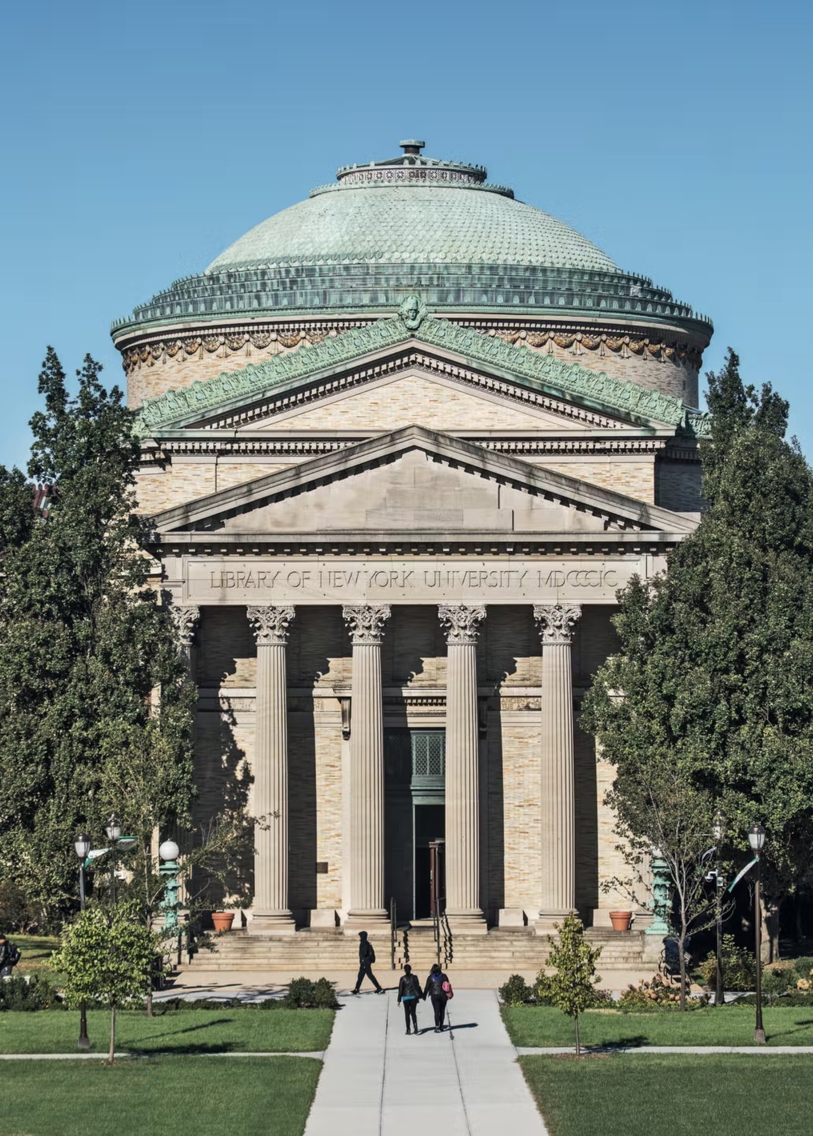
1 – Gould Memorial Library with its rotunda

The book reminds me of my own memorable moments of urban discovery, such as stepping up into the golden rotunda of the Gould Memorial Library [1] (Stanford White, 1899-1901) and walking in the falling snow around the mausoleums of Woodlawn Cemetery (built between 1884 and 1920). I will never forget that feeling of standing inside the small laureled chamber of the Soldiers & Sailors Monument (Charles and Arthur Stoughton, 1902) or looking up for the first time at the celestial vault of Grand Central (designed by Reed & Stem with Warren & Wetmore, 1913) after it was cleaned of decades of cigarette smoke in the 1990s. Or how about settling into a book in the main reading room of the Public Library [2] (Carrère & Hastings, 1911) or having a drink in what was originally the Samuel Tilden House (remodelled by Calvert Vaux in 1884)?

This book collects all of these Gilded Age impressions and suggests we have much more to see. Who knew about the polychromed classicism of the Williamsburgh Savings Bank (George B. Post, 1875) or the Byzantine splendour of the Cunard Building (Benjamin Wistar Morris, 1921)? Climbing around, looking up, and zooming in, Dodd and Wallen have done the job of revealing these delights, ones that might be new to those who live across the pond or even right next door.
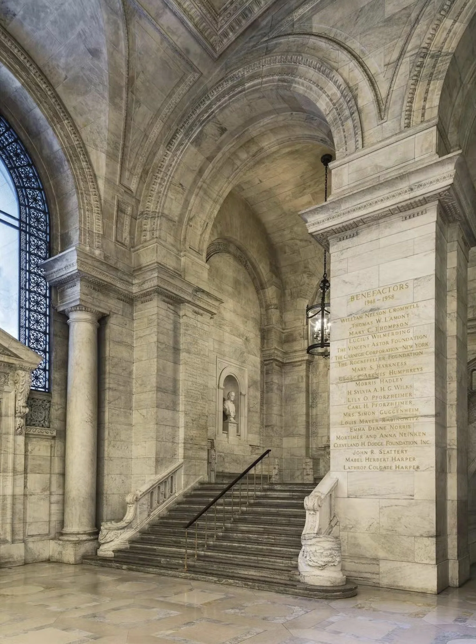
2 -New York Public Library’s Astor Hall

Despite living just down the block from the General Grant National Museum [3] (John H. Duncan, 1897), I am ashamed to say I have never set foot inside the building, based on the mausoleum at Halicarnassus, that illustrates the book’s cover. That means I have yet to answer, with absolute certainty, Groucho Marx’s famous question from the 1950s quiz show You Bet Your Life, “Who is buried in Grant’s Tomb?”

Julian Fellowes supplies a foreword for the book. It is clear that Gilded Age architecture has recently been on his mind. Rather than a mere costume drama, The Gilded Age, his new television series, is more like an architectural drama, as architecture and architects are the scene stealers of the show. “In the space of 70 years the city’s population exploded from 123,000 in 1820 to over two million in 1890,” he writes in the book. Reflecting the city’s burgeoning wealth and aspiration, “the Beaux-Arts style came to the United States, and in particular to New York, at precisely the right moment”.

The General Grant National Memorial, based on the mausoleum at Halicarnassus

The architecture was lavish and drew freely from eclectic sources, from Imperial Rome and the Italian Renaissance to the French baroque and farther afield.

“Stanford White based his design for the rooftop at Madison Square Garden II on the Giralda in Seville;” Fellowes writes, “his rotunda at Gould Memorial Library emulated the Reading Room at the British Museum in London; and the façade of the Metropolitan Club was heavily influenced by the Reform Club on London’s Pall Mall.”

Fellowes’s television series reminds us how the city’s great social tension was not so much between upstairs and downstairs as between old money and new—the old downtown Knickerbockers versus the new uptown Industrialists building palaces gilded with the riches (and even the walls) of Europe. To the old guard of Livingstons and Astors, the new regime of Huntingtons and Rockefellers were parvenus building their gaudy McMansions along Fifth Avenue—or make that MacMansions, as in the case of Andrew Carnegie, the son of a poor Scottish weaver who became the richest industrialist in America.

The Alexander Hamilton US Custom House

Such rags-to-riches stories were the norm in this Gilded Age. With an essay by Richard Guy Wilson and informative descriptions by Dodd, the book is full of gilded images and observations. Born in rural Pennsylvania, Henry Clay Frick learned to mine coal, and turn it into coke. He helped found U.S. Steel, and built an art-filled mansion on Fifth Avenue (now The Frick Collection; Thomas Hastings, 1914).

Frank W. Woolworth arrived from rural New York and got the idea of his “five-and-dime” variety store while working as a stock boy, and erected the tallest building in the world on lower Broadway (The Woolworth Building; Cass Gilbert, 1913). Americans “are instinctively in sympathy with the Renaissance,” observed Bernard Berenson, as New Yorkers in particular saw the flowering of classical civilisation in their own lush ascendancy. As Otto Kahn famously told the architect of his own Fifth Avenue Mansion (J. Armstrong Stenhouse with C.P.H Gilbert, 1918): “It’s a sin to keep money idle.”

Just as the old guard resented such exuberance, a corporate chastity took hold of the city following the Great Depression and belted it in steel cages. As new money became old, aging industries gave way to the abstractions of high finance and the poker face of a new ahistorical style. The Gilded Age has always had its enemies. “The golden gleam of the gilded surface hides the cheapness of the metal underneath,” Mark Twain lamented way back in the 1870s. It might have been superficial, but still it proved to be New York’s Golden Age, as these twenty glistening survivors attest.
Gallery chronicle (May 2022)

THE NEW CRITERION, May 2022

Gallery Chronicle

On “The Utopian Avant-Garde: Soviet Film Posters of the 1920s” at Poster House, New York and “Thornton Willis: A Painting Survey, Six Decades, 1967–2017” at David Richard Gallery, Chelsea and Harlem, New York.

Is this bad timing for a show on Russian art and design? “The Utopian Avant-Garde: Soviet Film Posters of the 1920s,” which opened at New York’s Poster House museum in late February, suggests otherwise.1 Here is an eye-opening exhibition of fifty works from a century ago that lays bare Russian aspiration in graphic form. Created during the first flush of enthusiasm for the new Bolshevik state, these innovative posters speak to the progressive spectacle of early Sovietism—and the hundred years of failure that has followed, with its aftershocks in devastating evidence today.

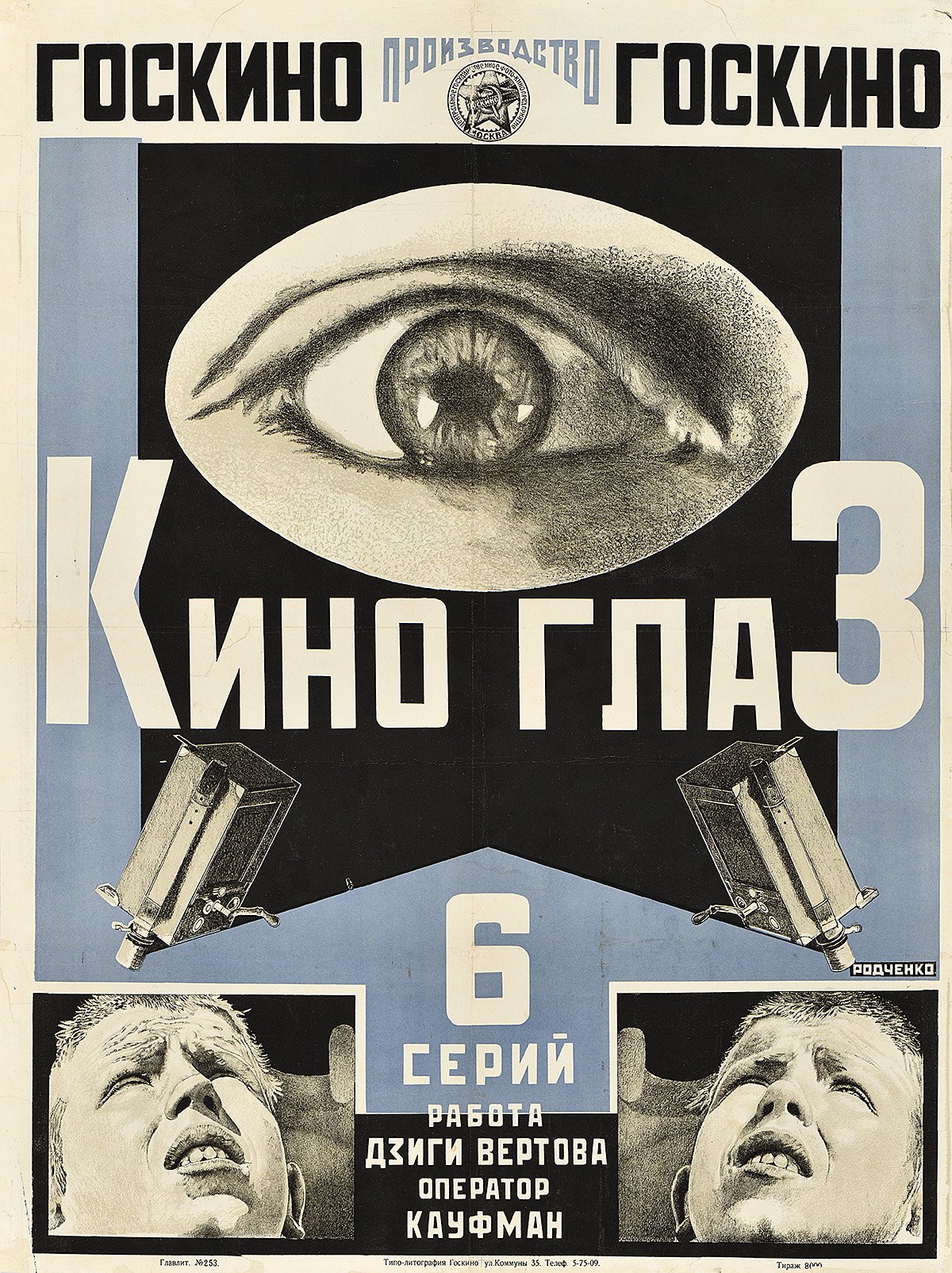
Alexander Rodchenko, Poster for Film-Eye, 1924, The Ralph DeLuca Collection. Photo: Poster House.

These works are also simply dazzling to see. The posters were designed to startle, bringing to the Russian street a taste of such cinematic innovations as montage, unexpected angles, stop-motion animation, and extreme closeups as they vied for popular attention. Informed by a new faith in utopian architecture and engineering, and drawing on tenets of Constructivism, Suprematism, and Productivism, these posters reflect the influence of early Soviet design over much of modern art.

Even before the Russian Revolution, Nicholas II, the modern world’s ill-fated tsar, was quick to grasp the potential of the motion picture. Just five months after their first picture show in Paris on December 28, 1895, the Lumière brothers sent their cameraman Camille Cerf to Saint Petersburg. Cerf filmed Nicholas’s coronation for a ninety-three-minute cinematic feature, among the first documentaries of its kind. Sensing the power of movies to reach his dispersed and largely illiterate population, the tsar ordered the importation of production supplies and initiated a Tsarist Chronicle newsreel series. Major French studios, such as Pathé and Gaumont, established offices in Moscow both to create and distribute film. With a burgeoning domestic appetite for movies, the Russian film industry was soon well underway.

As the First World War upended the supply chain of movies from the West, a domestic Russian cinema grew up around the country’s new movie palaces. The Russian Revolution and Civil War then placed their own extreme pressures on the production and distribution of film—theaters were nationalized, making the sale of raw celluloid illegal, and eventually all cinematic and artistic expression outside the supervision of the Soviet state was criminalized. By the early 1930s, the creative suppression was total. Still, for a brief period in the 1920s—under a more inchoate revolutionary state—Soviet movie culture prospered. Propagandistic domestic films and adulterated “bourgeois” foreign productions competed for screen time. The Russian audience was hungry, including for mass entertainment.

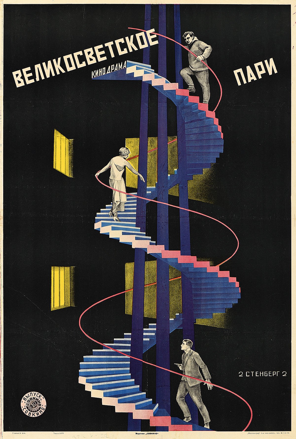
Vladimir Stenberg and Georgii Stenberg, Poster for High Society Wager, 1927, The Ralph DeLuca Collection. Photo: Poster House.

At the leading edge of this strange Soviet quasi-industry, the movie poster became the prime vehicle for selling these films. Fifty of these posters are now on display at Poster House, all on loan from the Ralph DeLuca Collection. It is remarkable that any have survived at all. They were almost all created with limited time, limited resources, and limited knowledge of the movies they were advertising. In the fast-paced climate of 1920s Russian cinema, they were designed, printed, and posted in a day and covered over in a week. Yet from what has remained, it is clear that these pressures combined with the visual idealism of the early Bolshevik state to encourage their graphic innovation. “In this chaos,” writes Angelina Lippert, the chief curator of Poster House, “a vibrant, idealistic group of young artists and intellectuals enjoyed a brief period during which they could use their talents to build a new Russian culture.”

What this exhibition lacks in an independent catalogue, it makes up for with wall labels that well describe the posters on display and the films they depict. If anything, the exhibition should send you home to look up these early Russian films. Out of copyright, they now reside on such YouTube channels as rvision. Be sure to pause on Dziga Vertov’s Man with a Camera, an astonishing silent documentary from 1929 that depicts the kinetic street life of Kyiv, Kharkiv, Moscow, and Odessa. In his opening credits, Vertov bills his film as an “experiment in cinematic communication of real events, without the help of intertitles, without the help of a story, without the help of theater, a truly international language.” Or consider the “Odessa staircase,” Sergei Eisenstein’s famous scene from Battleship Potemkin. Perhaps the finest example of propaganda ever put to celluloid, this famous story of a 1905 mutiny against tsarist overreach calls out for rescreening today. Alexander Rodchenko’s poster for the 1925 film, with Potemkin’s twin guns reaching out like the steel arms of an incipient Soviet man, is a visual highlight of the show.

Alexander Rodchenko, Poster for Battleship Potemkin, 1925, The Ralph DeLuca Collection. Photo: Poster House, New York.

For all of their appreciation by cinephiles today, such early Soviet films were often less popular with Russian audiences than the adulterated Western films from America, England, and Germany that made their way east. This, despite the fact that the West didn’t always send their best. Soviet authorities also changed up Western film plots to conform to the party line, inserting alternative intertitles. They might even include a live political speech or recording, bookending a movie with agitprop to justify the playing of a Western show. “In reality,” writes Lippert, “people—particularly the urban poor—just wanted to be entertained.” That meant that “almost anything of note, from factory openings to seasonal festivals, found its way into Soviet cinema, always accompanied by a dynamic poster.”

As she describes them, many of the films that circulated in 1920s Russia, from both East and West, sounded like they were lifted from an off week of the Moscow TV Guide:

A six-reel satire in which a British aristocrat poses as a butler in order to win affections of an American businessman’s saxophone-playing daughter. (The Business Man, 1929)

The young son of a revolutionary obsessively holds onto a pipe belonging to his father—but this gesture eventually results in his own death. (The Communard’s Pipe, 1929)

The plot follows a young Jewish couple escaping life in a shtetl by becoming actors in a traveling Yiddish theater. (Wandering Stars, 1928)

Based on the groundbreaking sociological work The Sacred Scarab (1909) by feminist writer Else Jerusalem, in which she documents the lives of Vienna’s fifty thousand prostitutes, The Green Alley . . . is reshaped into a tragic love story between a waitress at a brothel and a doctor’s son. (The Green Alley, 1928)

A documentary celebrating the triumphs of modern agricultural practices through mechanized farming. (Giant to the Virgin Soil, 1930)

It was just as well that Soviet poster designers often knew little about the movies they were promoting. Such ignorance gave them license to move away from the character-driven storytelling of Western design and its “bourgeois sentimentality.” Instead they experimented with the broader possibilities, and limitations, of color lithography. One of those limitations was the size to which they could print the image of a film still. Unable to enlarge them to the full size of a poster, they often employed a series of smaller, related images as a montage to animate the storyline, as Anton Lavinsky did for his poster of The Death Ray (1925). Or they might trace out a larger photographic projection in lithographic pencil, as Alexander Rodchenko did for Film-Eye (1924). Or they might resort to graphic abstractions, such as Nikolai Prusakov’s tetrahedron for The Second Exhibition of Film Posters (1926).

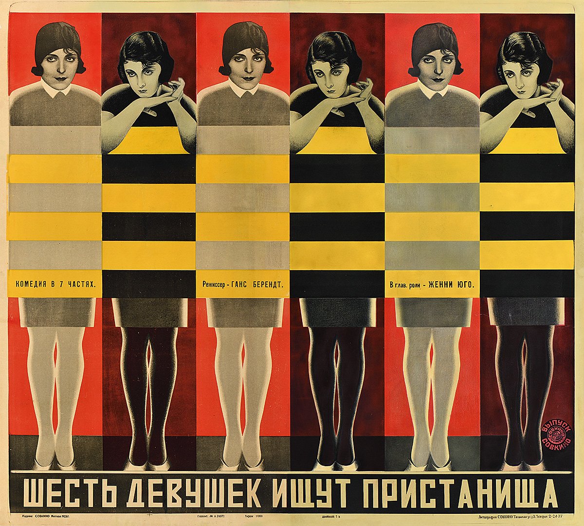
Vladimir Stenberg and Georgii Stenberg, Six Girls Seeking Shelter, 1928, The Ralph DeLuca Collection. Photo: Poster House.

The most successful posters often used a combination of these lithographic techniques. Vladimir and Georgii Stenberg’s High Society Wager (1927) finds its characters running up an abstracted spiral staircase. Semyon Semyonov’s Turksib (1929) grafts the solarized face, hands, and shoes of a shouting worker onto railway signals. The Stenbergs’ Six Girls Seeking Shelter (1928) turns a pattern of alternating rectangles, like the flicker of the movie projector, into a screen that covers the girls’ bodies. For The Great Tragedy of a Small Woman (1929), Nikolai Prusakov dismembers a pair of human figures and an automobile grille to create a visual chaos that even crashes into the typography.

For all of the intelligence throughout this exhibition, its finest movements come at the conclusion, in its explanation of the “death of the avant-garde poster.” In 1930, the directory body Soyuzkino was founded to centralize control of all cinematic production and distribution. Foreign films were banned a year later. In April 1932, the Soviet Central Committee banished independent artistic groups entirely. The golden age of Soviet art, film, and graphic design had lasted less than a decade. “Unlike his immediate predecessors,” writes Lippert, “Stalin did not share the view that art could be used as a means of transforming society. Instead, he believed that its sole purpose was propaganda.” She concludes:

While design historians celebrate the incredible posters in this exhibition, it is important to remember that they were produced during a time of social upheaval and terror. Millions of people were murdered under the Soviet regime; millions more were stripped of their property, separated from their families, and exiled to labor camps for the remainder of their lives. Today, these posters allow access to a period of Russian history in which chaos and political uncertainty were briefly outshone by the progressive idealism of some of the greatest graphic designers of the twentieth century.

A major survey of the paintings of Thornton Willis, now on view at David Richard Gallery across its two New York locations, serves to illustrate the long influence of Russian design, for one, on the history of modern painting.2 This ambitious exhibition also makes a case for the inclusion of Willis in the pantheon of American abstract art. With over twenty major works on view from the artist’s collection, some of them not shown outside the studio for several decades, “Thornton Willis: A Painting Survey, Six Decades, 1967–2017” brings together highlights from each of Willis’s series of abstract compositions. David Richard’s Chelsea location includes a tight arrangement of medium-size paintings, while the gallery’s Harlem venue gathers Willis’s largest works, topping out at over ten feet wide. The survey coincides with “Exploring Thornton Willis,” an exhibition at the Sarah Moody Gallery of Art at the University of Alabama, featuring a selection from Willis’s recent gift of over two dozen paintings to his alma mater.

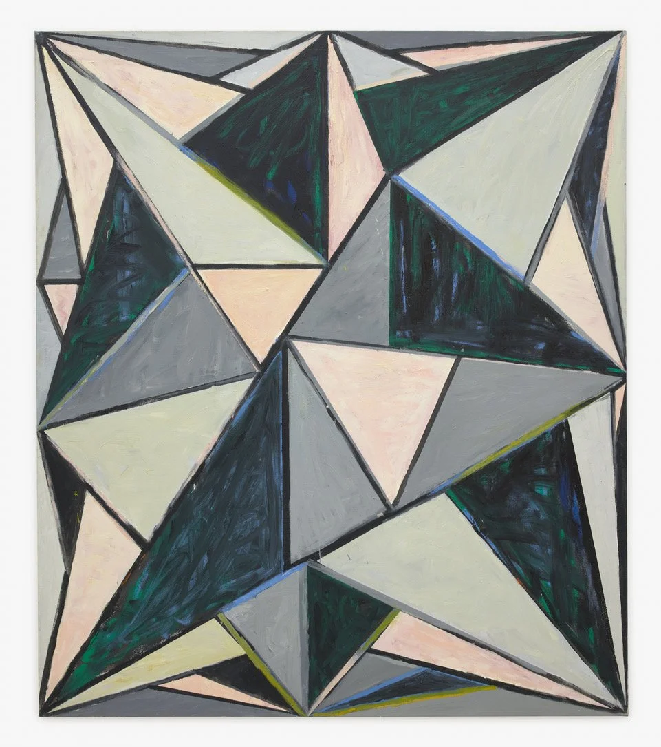
Thornton Willis, Starstrux, 2007, Oil on canvas, David Richard Gallery, New York.

Working across more than six decades, Willis has been consistent in his abstract exploration of the basic tensions between figure and ground, push and pull, color and contrast, and surface and depth—visiting and revisiting his visual language. Observing his work over twenty of those years, I have learned to look to his edges to appreciate how his fields of paint rub against each other to create their dynamic tension.

In their simplicity, Willis’s more basic abstractions, such as his wedges, lattices, and zig-zags, are approached as particular challenges of visual animation. Bold compositional decisions, from paint handling to color contrasts to the placement of a single corner or edge, are what set these works in motion. With Willis’s more complex abstractions, such as his cityscapes and kaleidoscopic prisms, the challenge is not to create tension but to maintain it. Underdrawing, pentimenti, and paint splatter all signal the energy of that final dynamic, of artist and object, as Willis folds his compositions together to await our own unpacking—ensuring his designs do not land too firmly on one thing or another. The suspension of Brooklyn Bridge (1993), the shock of Brown Zinger (1983), the portal of Full House (1981), the mechanics of Locomotive (1999), the radiance of Starstrux (2007)—the full energy of these paintings is now ready to be felt and seen.

  1. “The Utopian Avant-Garde: Soviet Film Posters of the 1920s” opened at Poster House, New York, on February 25 and remains on view through August 21, 2022.

  2. “Thornton Willis: A Painting Survey, Six Decades, 1967–2017” opened, in part, at David Richard Gallery, Chelsea, New York, on March 30 and remains on view through May 13, 2022. The second part of the exhibition opened at David Richard Gallery, Harlem, New York, on April 4 and remains on view through May 13, 2022.

Holbein at the Morgan

THE SPECTATOR WORLD EDITION, April 2022

Holbein at the Morgan

Holbein’s heroes have arrived in New York City

There’s a moment in portraiture when people started having a mind of their own. All of a sudden you see it in the faces: the eyes, the brow, the lip. We are no longer looking at a figure for all time — or even a sitter in a moment in time — but at something more like “me time.” The focus is not on outward appearances but inward looking. These people are lost in thought.

That’s just where Hans Holbein the Younger, the great portraitist of the early sixteenth century, found them. The German artist, born into a family of painters around 1497, could conjure the smallest details at his fingertips. He quickly became the most sought-after portraitist in Europe and, by 1536, the court painter of Henry VIII (at a time when Henry himself was courting).

What set Holbein apart was what he saw in his sitters and what he chose not to see. He radically edited down the background of his paintings and removed the trappings of possessions. Instead he captured his sitters, simply put, capturing themselves. Holbein: Capturing Character, an exhibition gathered from twenty lenders of more than thirty paintings and drawings by Holbein, as well as paintings, books and jewelry by his contemporaries, is now on view at New York’s Morgan Library & Museum.

Europe of the early 1500s was having a moment of its own. Technological revolutions, after all, can be even more life-altering than political revolutions. If you think today’s digital revolution has been something, consider the Gutenberg revolution of the later fifteenth century. While Johannes Gutenberg’s Bible came out in 1450, the German metalsmith from Mainz remained largely unknown in his lifetime. He died a financial failure. But his invention of movable type sent shockwaves through much of Europe. Thirty years after his Bible’s first revelatory run, there were 110 printing presses across Europe. Fifty of them were in Venice alone. By 1500, European presses had already produced over twenty million books.

All of a sudden, literature became personal. A new bumper crop of classics in translation brought the wisdom of antiquity to a wider public. Scholasticism and the oral tradition gave way to more direct intellectual engagement. Rather than scribes copying manuscripts generation after generation, book printing made authorship instantaneous and individual. The act of reading also became silent. At the same time, contemporary writers became the world’s first bestsellers as they overturned Europe’s religious and cultural order. Luther distributed 300,000 of his printed tracts. Meanwhile the humanist Erasmus — something of a centrist in a schismatic age — sold 750,000 copies of his books.

A former priest who popularized philosophy and attacked modern superstitions, Desiderius Erasmus of Rotterdam was the Jordan Peterson of his day — at least when it came to his reach and popularity. He was the “prince of the Humanists” for his book In Praise of Folly, written while he was visiting the English statesman Thomas More. He was also a champion of Holbein and sat for several portraits, both large and small, throughout his later life. It was Erasmus who introduced Holbein to More and the inner circle of the English crown. Whenever you think of Henry VIII looking like the King of Hearts, with his head a quarter turned in playing-card profile, recall that it was Holbein who painted that original portrait.

There is no Stout Harry at the Morgan, but Holbein’s More is here, the 1527 painting lent by the Frick Collection as the 70th Street museum undergoes a lamentable “renovation.” Removed from its Frick pairing with Holbein’s portrait of Thomas Cromwell, More now strikes us as, well, even a bit more. The painting is now hung close to eye level. You can just about make out every stubble of More’s five-o’clock shadow. With a mixture of focus and fatigue, England’s future Lord High Chancellor stares over our shoulder into space. A wrinkle of his furrowed brow connects between his eyes on the bridge of his nose. At its corner, his lip turns down in the hint of a frown. A luminous green curtain hangs behind him.

A humanist philosopher, More argued against the reformation of Martin Luther and John Calvin. When it came to acknowledging Henry’s own claim to be the supreme head of the Church of England after the annulment of his marriage to Catherine of Aragon, More also dissented. “I die the King’s good servant, and God’s first,” More said as he was executed for treason just five years after sitting for Holbein’s portrait.

You can already see the weight of history in More’s world-weary face. His expression contrasts with his sumptuous fur collar and the red-velvet sleeves of his doublet shimmering in the light. Holbein rendered the S-shaped links of his gold livery chain, a symbol of More’s royal service, with a jeweler’s detail. Originally trained in miniature, Holbein could decorate his portraits as though he were adorning their very surfaces with precious metalwork. (For those who caught Capturing Character at the Getty Museum, where this exhibition curated by Anne T. Woollett originated, it was the portrait of Cromwell, More’s rival, that got the all-expenses-paid trip from the Frick to Los Angeles.)

Be sure to bring your reading glasses when visiting the Morgan. There is an abundance of small detail here that calls out for close looking: roundel portraits, rings and coins, even a tiny portable portrait still with its original lid. Holbein could add just the right evocative detail, especially to his sensuous portraits of women. Books are never far from the mind in this exhibition. Holbein designed a suite of tiny woodcuts for a book on “The Dance of Death” (c. 1526, published 1538) — a memento mori of dancing skeletons. Figures are also shown reading, or writing, or at the very least holding the book that was occupying their attention until we walked in the room. “Mary, Lady Guildford” (1527) looks like she is about to whack us over the head with the small hardcover now clasped closed in her hands.

Books are not unique to Holbein’s paintings. We can see them in the work of contemporaries exhibited alongside him: Albrecht Dürer, Quentin Matsys and Jan Gossaert. But unlike these windows on the world, all packed with details and distractions, Holbein’s portraits reflect a more direct literary experience — of that inner voice, not just speaking, but reading and dictating thoughts in our heads.

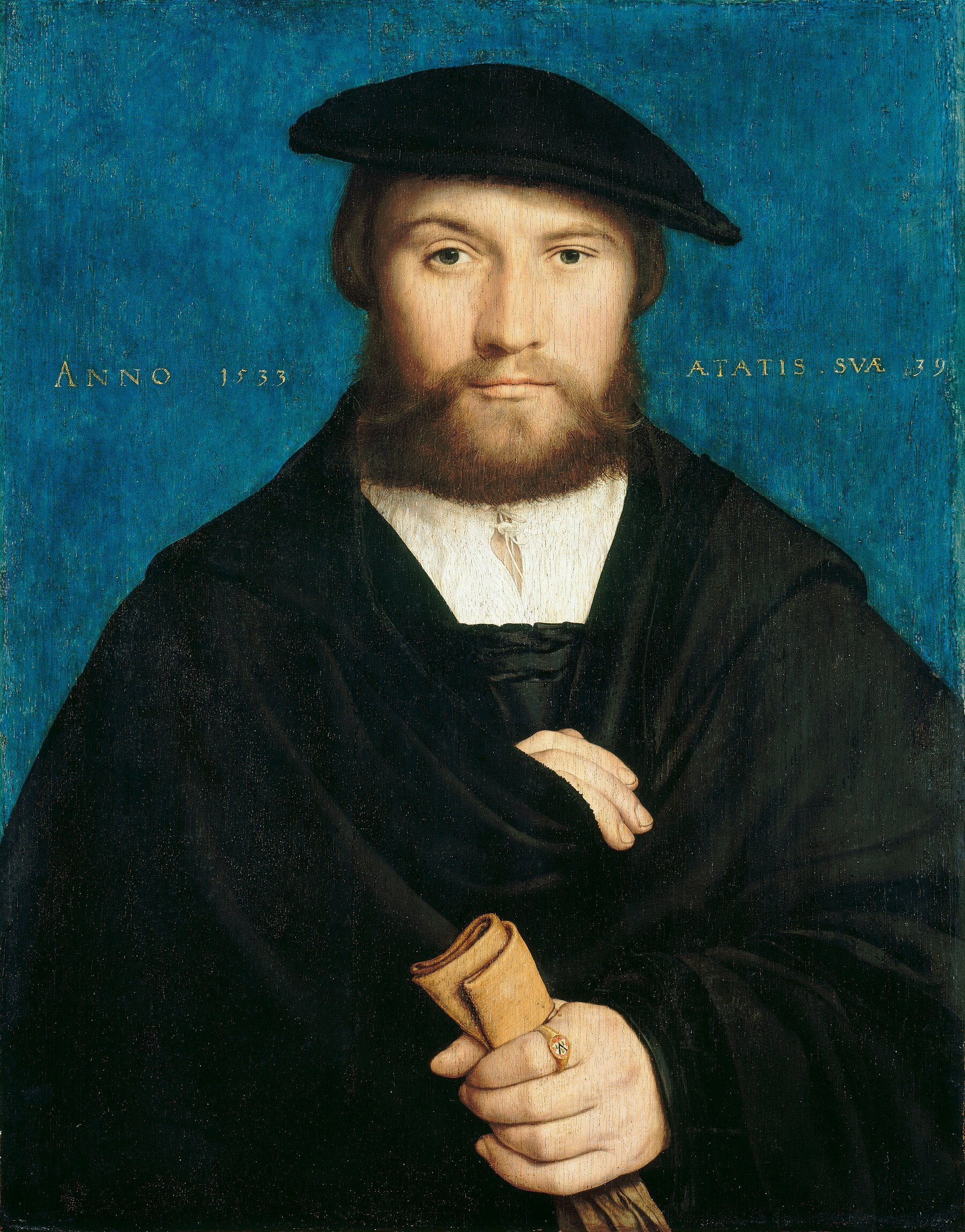
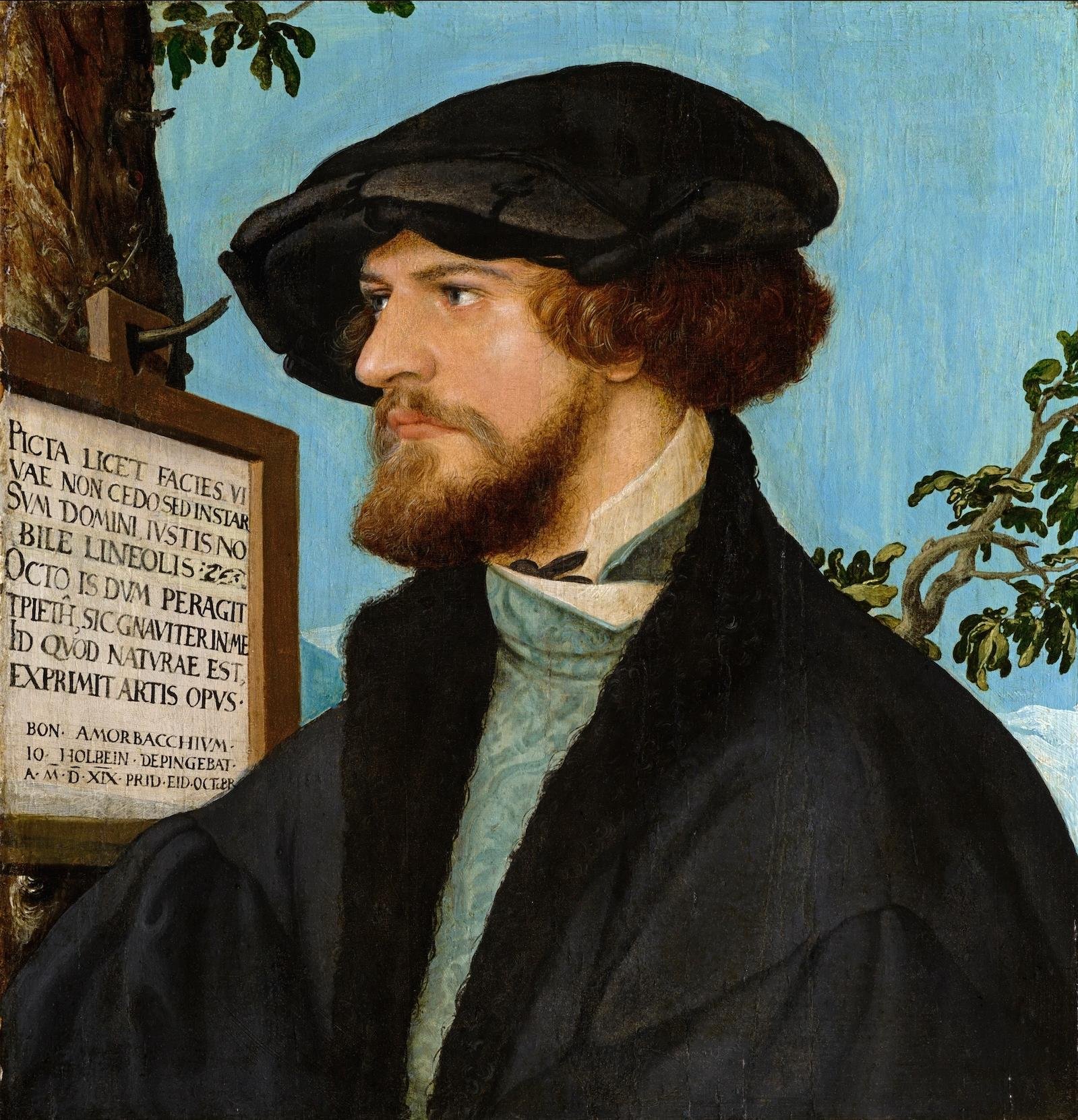
Sometimes these words illuminated the very portraits themselves. “The year 1533, at the age of 39” (ANNO 1533 AETATIS SVAE 39) reads the gold lettering seemingly tooled right into the surface of Holbein’s “A Member of the Wedigh Family.” Or how about the sign tacked to the tree on the portrait of “Bonifacius Amerbach” of 1519: “I am not inferior to the living face; I am instead the counterpart of my master, and distinguished by accurate lines. Just as he completes three intervals each lasting eight years, this work of art diligently renders his true character.” Below, the sign reads: “Jo[hannes] Holbein painting Bon[ifacius] Amerbach on 14 October 1519.”

In other words, Holbein is the painter of the portrait. The young man depicted is the author and master of the twenty-four-year- old life therein. For those sitting for a portrait by Holbein in the turbulent early years of the sixteenth century, it must have seemed like they were all the authors of their fates, probably more than ever before. Henry VIII certainly thought so, as did Erasmus. In the thoughtful depth of his arresting portraits, Holbein painted the dust-jacket images for all their books of life.