Gallery Chronicle (May 2015)

Jp1
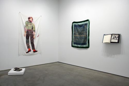
Exhibition view of “Keith A. Smith: The Fabric Works: 1964–1980” at Bruce Silverstein. 

THE NEW CRITERION
May 2015

Gallery Chronicle
by James Panero

On “Keith A. Smith: The Fabric Works: 1964–1980” at Bruce Silverstein; “Karen Schwartz: Down the Rabbit Hole” at Life on Mars Gallery; “Mel Bernstine” at McKenzie Fine Art; “Graham Nickson: Spectrum” at Betty Cuningham Gallery; “Louise P. Sloane: Recent Paintings” at Andre Zarre Gallery & “Arts in Bushwick: Making History” at Storefront Ten Eyck

What is a photograph? A book? A collage? A textile? A sculpture? We think we know the answer. Each is a separate medium, with separate training, even separate museum departments. Then we see the work of Keith A. Smith. Art needs no taxonomy. This is certainly true of Smith, a cult artist who might combine photography, collage, and fabric in a single sculptural book, and whose work is now on view at Bruce Silverstein.1

Book Number 28: Stitches (1972) is a perfect example. Here is a book in an edition of one. Smith has made over two hundred such individual books, and few have been shown or seen, although Smith self-published an annotated bibliography (in multiple) as his 200th book in 2000. So why isBook Number 28 even here, in an exhibition dedicated to Smith’s “fabric works”? Because the subject of the book is, in part, the thread that has been ingeniously woven within it, and which moves through holes punched in the pages as you flip through it. “The paper and thread used for binding were also the means of ‘imaging the book,’ ” Smith explains in his bibliography. But that’s not even why it’s called “Stitches”: “The title did not come from the thread which stitched the book and imaged the pages. Rather, making the book and turning the pages kept me in stitches. I was laughing so much from this strange book experience that I had to be careful that tears did not hit the page.”

Born in 1938, Smith studied photography at the Art Institute of Chicago. “When I walked into that school,” explains this son of a seamstress, “I had never been inside a museum before, never heard a symphony, live or a recording.” He moved to Rochester, New York in 1974 to work and teach at the Visual Studies Workshop and never lost his anarchic outsiderness. So he kept drawing connections that others wouldn’t, or couldn’t, such as between the serial quality of multiple camera clicks and the turning of a page, where “Time could be introduced as an element,” or between the shirt on his back and the fabric used to wrap a hard-bound book, or the sheet on his bed and the thread to bind page signatures together. (Smith is now best known for publishing his own book-making manuals. One popular title is Volume I,Non-Adhesive Binding: Books Without Paste or Glue.)

As Smith explains, “the combination of media was only the means to a statement.” His work is personal, esoteric, at times uncomfortably intimate, and deeply tied to his materials. In the current show, the most memorable are his self-portraits printed onto bedsheets, all from the early 1970s. Using the latest in photostatic technology at the time, hoisting himself up and pressing his body in sequence against the platen, Smith used a 3M Color-in-Color machine and later an inferior Color Xerox (after, he explains, Xerox sued 3M over patents) to transfer his body scans to mylar, which he then ironed on to fabric. The nudes resemble the Shroud of Turin. (Smith was, for a time, a seminarian.) A clothed portrait with red socks, a banana peel, and oddly turned-out feet at first looks like a steamroller mishap. Held up, hanging in the breeze, the work shows how Smith infused himself in everyday things, and gave them all great import.
Jp7
Karen Schwartz, 
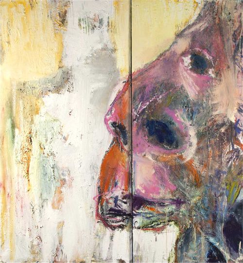
Shadow of His Former Self (2014), Mixed Media Wood Panel and Linen, 72 x 66

The Life on Mars Gallery, in Bushwick’s 56 Bogart Street building, promises to be “about painters and painting” and “painting’s continued relevance in the age of digital media.” Many galleries make such a claim. Michael David, the founder of Life on Mars, delivers on it, putting himself in harm’s way. As a painter who used to exhibit his own encaustic abstractions at Sidney Janis Gallery and Knoedler, David was poisoned by the gases of his own wax medium. His legs remain partially paralyzed by the exposure.

The specter of painting to the extreme reflects on David’s other history, as a bassist for New York punk bands. Most notably this included an early version of the Plasmatics, an extreme act later headlined by the late Wendy O. Williams, a frontwoman known for chain-sawing guitars on stage, blowing up cars, and inviting charges of public indecency. At Life on Mars, David continues to play backup for such female leads, as several expressionistic women have been part of recent group and solo shows, including Katherine Bradford, Joyce Pensato, Amy Sillman, Brenda Goodman, and Fran O’Neill, whose exhibition I wrote about earlier this year.

Now on view at Life on Mars is Karen Schwartz, a painter based in Atlanta and Long Island presenting her first solo New York exhibition.2 I was only able to see the paintings scheduled for this exhibition as they were being prepared to go on view, so I missed the works on paper and Margrit Lewczuk’s abstractions scheduled for the project room.

Schwartz does not back down from a fight. She wrestles with oils and acrylics. Abstract forms turn into human figures only to become effaced. Layers of paint react against resisting agents. Colors drip and run. Scraped-up pigment ends up stuck to surfaces. Shadow of His Former Self (2014) may be the most successful. Here even the painting surface is uneven, with a canvas stuck to a deeper panel of wood. On the left, a ghost-like form fades in the background. On the right, a fleshy nose enters the frame. The psychological weight of Schwartz’s figures can be heavy, at times overbearing, so I appreciate her lighter colors and shots of humor. Another example: Pink Lady (2014), where a scrawl of red lipstick finishes off a figure in a flourish of punk acidity.

Jp2

Mel Bernstine, Everything the Number Four Could Mean (2011), Acrylic on linen, 24 x 20 inches

Mel Bernstine is another refugee from the downtown New York scene. After studying international relations at Columbia University, Bernstine landed in the intoxicating East Village of the 1980s. More recently he has been drifting across Europe and North Africa, producing some of the most arresting patterned compositions around. While a few examples have made their way stateside, most have only circulated on social media, where, despite their range, they are immediately recognizable for their singular, self-schooled hand.

Now at McKenzie is Bernstine’s solo return to New York.3 Constrained by limited space, Bernstine mainly works small, developing hand-made patterns in acrylic, ink, posca, and pencil that flicker and pulse. The arabesques of Marrakesh mix with the patterns of Optical Art and the rough-hewn feel of East Village diy. At McKenzie all these influences crash together in one four-by-five-foot ink, acrylic, and collage on paper, where a chaos of doodles wraps around hidden names and a 2010 Bonanza Bus Lines ticket from Waterbury, Connecticut. The piece is called A Form of Confusion (2013), and somehow through the confusion the forms make sense.

Jp3
Graham Nickson, 
Tree of Birds (2014), Acrylic on canvas, 108 x 144 inches

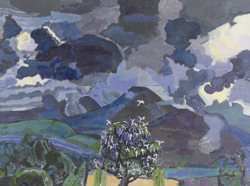
Over forty years ago, the moment Graham Nickson arrived in Italy to paint as a recipient of the Rome Prize, his car was burglarized of his supplies and preparatory work. With nothing to go on, he climbed on to the roof of the American Academy and began to paint the sunset. Nickson has been painting this way ever since, daring to capture nature’s chroma in watercolor and oil. Now for his first exhibition at Betty Cuningham Gallery, recently relocated from Chelsea to the Lower East Side, twenty-four watercolors of his “experience of coming dawn or falling dusk” are matched with a single, monumental oil on canvas, nine by twelve feet, called Tree of Birds (2014).4 In this latest large work depicting a mountain in Australia, rain clouds blot out the sun. The weather presses down. Birds gather and flap around a tree. As I wrote in 2011, Nickson is “heir apparent to the early American modernists Charles Burchfield and Arthur Dove, with synesthetic work that manages to both radiate and rumble.” This latest painting shows nature guiding his brush with an increasing animistic force. For a painter of the sun, Nickson’s greatest power may be in the shadows.

Jp5

Louise P. Sloane, 4CBS (2014), Acrylic on Aluminum panel, 50 x 46 inches

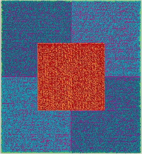
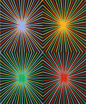
Louise P. Sloane’s recent abstractions are unmistakable. All are squares, divided into quadrants, with another quarter-size square in the center. All are comprised of high-chroma complementary colors. And all are filled with dense lines of what resembles cursive writing, arranged horizontally on the outer squares and vertically on the inner ones. That’s a busy program. Repeated over multiple canvases, it might sound mannered, or overly cautious, with the suggestion that an artist has fallen into doing one thing too well.

Then again, such a series done right can explore the nuances of repetition, pattern, and variation. Such was the case for Josef Albers’s squares, and it is again true for Sloane’s squares now on view at Andre Zarre.5 For these acrylics on aluminum panel, Sloane has become expert at modulating the colors of her squares and her writing. Just the right halo of color radiates around the edges of the compositions and beneath the text. She also contrasts the hard edges of her grid with the hand softness of the writing, which is laid down in three dimensions like pastry piping on top of her grids. Best appreciated in person, the writing shows variation one painting to the next, which have coded titles such as “4cbs” and “Bintel Blues.” What becomes clear is that these are not mechanical repetitions but personal memoirs written out longhand. In fact, her father’s own writing is a source material. Would it be better if this text was more legible, or said something more public (I had to ask if it referenced anything at all)? Perhaps not, as what’s private here gets subsumed into personal abstraction.
Jp6
Loren Munk, 
Map of Bushwick (2009)

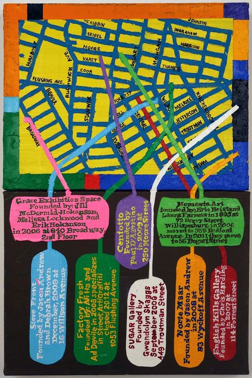
A final word, about “Making History”:6 Arts in Bushwick is the all-volunteer nonprofit most well known for channeling the neighborhood’s collaborative energy into Bushwick Open Studios. That sprawling open-door festival, which I wrote about last year, takes place every year during the first weekend in June. Through its own initiative, without celebrity sightings or big-money publicity, bos has earned its place on the art-world calendar. Leading up to Open Studios this year, Arts in Bushwick has organized its first benefit exhibition called “Making History.” The title comes from “History by Exclusion,” an essay by the participating artist Loren Munk. This do-it-yourself manifesto argues for shedding new light on the marginalized “dark matter” of the art world: “Perhaps now we may begin to question what is art, who gets to decide and what’s the artist’s place within society? As self-selected members of the art world it is time we declared, ‘we are our own art history.’ ”

Over four hundred local artists have donated work for the show, which offers an unparalleled survey of the Bushwick scene. The photographer Meryl Meisler and the artist Rico Gatson, both of whose work deals with the inequalities of history, have donated benefit prints. Curated by Krista Saunders Scenna and Dexter Wimberly, the full exhibition remains on view at Storefront Ten Eyck gallery through May 10, at which time all the work will be raffled off at a benefit event. Here the rules are simple: See show. Buy ticket. Win art. Make history.

1 “Keith A. Smith: The Fabric Works: 1964–1980” opened at Bruce Silverstein on April 23 and remains on view through June 6, 2015.

2 “Karen Schwartz: Down the Rabbit Hole” opened at Life on Mars Gallery, Brooklyn, on April 24 and remains on view through May 31, 2015.

3 “Mel Bernstine” opened at McKenzie Fine Art, New York, on March 27 and remains on view through May 3, 2015.

4 “Graham Nickson: Spectrum” opened at Betty Cuningham Gallery, New York, on April 11 and remains on view through May 22, 2015.

5 “Louise P. Sloane: Recent Paintings” opened at Andre Zarre Gallery, New York, on April 7 and remains on view through May 9, 2015.

6 “Arts in Bushwick: Making History” opened at Storefront Ten Eyck, Brooklyn, on April 19 and remains on view through May 10, 2015.
A Modernist in Paris

3547


James writes:

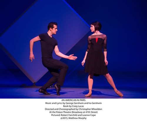
The phrase “Inspired by the Motion Picture” does not generally inspire confidence on Broadway. More often than not, we’re talking about a popular movie repackaged for the discount crowd. But what if your inspiration is “An American in Paris,” the 1951 Academy Award-winning MGM musical starring Gene Kelly? And what if you are the English choreographer Christopher Wheeldon, one time dancer and resident artist at New York City Ballet? 

In the case of “An American in Paris,” the new musical that opened this week at the Palace Theatre, we are talking about something truly inspiring. In his Cast Notes, Wheeldon says he “honors the artists whose film inspired this new stage version.” That film, directed by Vincente Minnelli from a script by Alan Jay Lerner, was a lightweight romance between an American painter Jerry Mulligan, who stayed in Paris after the liberation, and a French girl, Lise Bouvier. The plot revolves around a cast of supporting characters that includes Jerry’s society patron Milo Roberts (who is interested in more than his paintings), a successful French singer named Henri Baurel (who is engaged to Lise), and a composer friend named Adam Cook (who helps sort it all out).

What set the movie apart was its final fifteen minutes. In what has been called the greatest dance number on film, and with a production that cost of half a million dollars, the painter Jerry Mulligan, played by Kelly, dances with Lise, played by Leslie Caron, through a dream sequence of Paris as imagined through his artwork. The score for the number is George Gershwin’s 1928 symphonic poem, “An American in Paris,” which gives the film and the musical its name.      

Wheeldon began here and built out his musical from this balletic denouement. A new book by Craig Lucas also adds some true grit to the story. The 1951 musical did little to acknowledge the war. For that matter, it barely acknowledged the twentieth century: Jerry still lives in the Paris of La bohème. On Broadway we are now clearly contending with the hangover of war, with characters with new backstories and new last names: Lise Dassin (Leanne Cope) is a Jewish refugee hidden by Henri’s family, who fought for the Resistance; Adam Hockberg (Brandon Uranowitz) is an injured Jewish American GI, Jerry is suffering from shell shock. Sometimes Lucas overly burdens the story: it was smart to recast Henri (Max von Essen) as a struggling singer, but an insinuation that he “does not fancy women” and therefore hides his own secret muddies the plot; Hockberg also overly plays up his own impotence. 

Yet overall these additions give the musical a modern urgency that propels the performance. It starts in a swirl, with the Nazi flag of the occupation pulled down and turned back to the colors of the Republic, all in one flowing movement. With costumes and sets by Bob Crowley, the scene changes are seamlessly handled by the performers, who wheel out and dance around the mobile set pieces. Backdrop projections imagine Paris as a sketchbook that gets redrawn through each scene.

Robert Fairchild, the NYCB principal who, like his sister, has (temporarily?) traded Balanchine for Broadway, fills out Kelly’s shoes as Mulligan. Those are fast, muscular, and multitalented shoes to fill. While Kelly could perform equally well as singer, dancer, and actor, Fairchild is a dancer first and foremost, arguably one of the best ballet dancers of our day. His voice, however, is only serviceable as a soloist. The decision to add additional Gershwin songs for him to lead, such as “Fidgety Feet,” was a mistake. Additionally, no one else could ever have Kelly’s megawatt presence, and Fairchild’s theatrical range is limited, even compared to the other actors on stage.  

Fortunately the musical is driven by its forceful choreography. For this the production looks much more closely than the film to the history of Parisian modernism. Here Mulligan is something of a Sunday painter until Milo Davenport (Jill Paice) convinces him to work in abstraction. A comical dance within the dance called “The Eclipse of Uranus” gives a nod to dance’s early avant-garde. As the play progresses, the sets also become more abstract, leading to a minimalist pas de deux between Jerry and Lise danced to Gershwin’s eponymous number. In this way the musical pays ultimate tribute to Gershwin’s radical 1928 tone poem. As Gershwin said of his composition, “My purpose here is to portray the impression of an American visitor in Paris as he strolls about the city and listens to various street noises and absorbs the French atmosphere.” Here is a musical that makes it new all over again. 

Gallery Chronicle (April 2015)

James1 copy

Robert Zakanitch, Hanging Gardens Series (By the Sea) (2011-2) at 1285 Avenue of the Americas Art Gallery. 
 

THE NEW CRITERION
April 2015

Gallery Chronicle
by James Panero

On “between a place and candy: new works in pattern + repetition + motif” at 1285 Avenue of the Americas Art Gallery; “Tadasky: Control and Invention, 1964–2008” at D. Wigmore Fine Art & “Breaking Pattern” at Minus Space.

If the genealogy of modern art contains both dominant and recessive traits, the expression of the latter can be rare and rewarding. Such was the case for Pattern and Decoration, a movement of the 1970s. Against the predominant, reductivist urge of Minimalism and Pop, P&D looked to the broader traditions of ornament, craft, and cross-cultural motif. It also engaged the legacy of “women’s work” with an interest in textile, quilting, and other domestic arts.

The dynamic out of which P&D emerged shares much with our cultural landscape today. This goes to explain why we see many of our most enriching artists again exploring decorative themes. As Minimalism and Pop have merged into a hybrid, factory-made consumable to dominate the auctions and art fairs, an alternative, underground scene has developed around work that is often small, hand-made, and dedicated to a devotional and craft-like repetition.

Now on view at 1285 Avenue of the Americas Art Gallery, otherwise known as the lobby of the UBS building on 52nd and Sixth, the curator Jason Andrew of the Bushwick nonprofit Norte Maar has assembled thirty artists offering many of the best examples of these developments in “between a place and candy: new works in pattern + repetition + motif.”1

Andrew’s title comes from a sentence by Gertrude Stein: “In between a place and candy is a narrow foot-path that shows more mounting than anything, so much really that a calling meaning a bolster measured a whole thing with that.” In other words, pace Stein, don’t expect an easy explanation as to what this title means.

“Words to Stein were used like elements of collage,” Andrew said to me, “fragments of meaning that when pieced together sang songs, offered impressions, and relayed ideas. I am a huge fan of Stein’s poetry and relate much of my curatorial approach to her early modernist view—finding a theme and then selecting artists that drive the theme, enhanced by their diverse approaches.”

The title of this exhibition is a puzzle, which may just be the point. Repetition can be beautiful, but it can also be illogical, tedious, and obsessive. The representation of a single thing gives us an answer—a spot to focus on. The repetition of many things poses a question. Why so many when one will do? In this questioning, we may find the comfort of pattern. Lost in the beauty of repetition, we drop the urge to understand.

There is no set beginning or end to the UBS show, which has evolved from an exhibition Andrew put together a year ago at the Matteawan Gallery in Beacon, New York. You can enter from anywhere in the building’s lobby, and in fact the rows of walls in this modernist space add their own pattern to the program, which Andrew has considered as you look down one row to the next. And a word needs to be said about this building’s receptiveness to smart exhibition programing. Andrew’s exhibition “To be a Lady,” reviewed in this column in November 2012, took place here, and the building has a long history of artistic association through the UBS Art Collection. If every midtown office building gave their public space over to arts programing, such corporate “apartment galleries” could provide herd-immunity to the further spread of MOMA-nucleosis.

One place to start when entering the current show is Hanging Gardens Series (By the Sea) (2011–2). This eight-foot-tall gouache and colored pencil on paper by Robert Zakanitch, who was one of the leading artists of Pattern and Decoration, is a new, standout piece and a connection to that earlier movement. With its height, the large lower register is the first to come into focus—an assembly of red dots contained in pulsating blue bursts. Their arrangement has, one might say, an irregular regularity. Shapes are organic and aqueous. Some pick up a yellow halo. Others either turn into stalks of bluebell flowers or cover them over. Looking up, we see that the top of the work contains stylized white swirls. The all-over composition resembles a ceremonial illustration, but the reference is not immediately clear. Are those waves on top washing over blue sea-life, or clouds watering a flowery field? Are the blue shapes water droplets raining down from above, or flowers from below turning up? The exact meaning matters less than the comforting feel conveyed through the patterns.

Natural imagery, flowering patterns, and the channeling of traditional craft recur throughout the exhibition. In Medium (2015), Colin Thomson layers thick lines in meso-American forms. In Bacio (2015), Mary Judge references Renaissance tile-work in a pattern of circles and squares that becomes petals of blue and white shimmering between figure and ground. In Fly-by (1995–2015), Hermine Ford used oil on shaped panel to recall archeological fragments, in particular the pottery sherds and painted ceramics of Italy.

Textile work is also prevalent and often deployed in innovative ways, reflecting a renewed interest in the medium—or what the gallery Outlet Brooklyn recently called “loominosity.” Robin Kang, in Two Birds with Diamonds (2015), uses hand Jacquard-woven cotton and tinsel to illustrate the patterns of microchips and motherboards. John Silvis, in CrashcourseVI (2015), uses thread and felt to depict damaged cars. Tamara Gonzalez, insleep beside me (2015), takes lace and other woven materials as spraypaint stencils. Samantha Bittman uses acrylic on handwoven textile to soften the black-and-white striped moire patterns of hard-edge optical art.

Repetitive, hard-edge abstractions are balanced against the feel of the hand-made. In Massai (P-158) (2012), Joan Witek uses black stripes of oil stick with pencil on white canvas to dazzling effect. The same goes for Libby Hartle, whose collage of graphite dashes on paper resembles the wood grain of a herringbone floor. With his crisscrossing lines, Rob de Oude looks to the shapes that emerge in the intersection of patterns. In her devotional small gouaches on wood panels, Lori Ellison finds the forms that emerge from a pattern’s hand-drawn idiosyncrasies.

Kerry Law, finally, has the last word on Pop seriality. In Empire State Building Series (2013–5), Law depicts the spire on the Empire State Building on foot-square canvases, just as he sees it in the distance on different evenings from his studio in Ridgewood, Queens. I was taken with this series when I caught it at Storefront Bushwick some years ago. The work references “Empire,” Warhol’s tedious eight-hour 1964 film of the building, as well as those ubiquitous silkscreens, but here the hand has been restored to the icon. Law finds infinite nuance in the scene’s changing light and atmosphere, which is often obscured by clouds, all perfectly rendered in the subtleties of paint. The series evokes the passage of time as well as the artist’s personal routine, a pattern of looking out the window every evening and capturing what he sees.

James2 copy

Tadasky, C-200 (Multicolor with White) (1965) at D. Wigmore Fine Art.

Nearby, in the Crown Building, D. Wigmore Fine Art has brought together a comprehensive survey of Tadasuke Kuwayama, the great artist of the circle known to us as Tadasky.2

Born in 1935 in Nagoya, Japan, the youngest of eleven children, Tadasky came to New York to paint some fifty years ago and has been at work ever since. As explained by Joe Houston in his informative catalogue essay, Tadasky’s father was a prominent builder of Shinto shrines, with designs that were marked by symmetry and spareness. When control of the company went to a sibling, Tadasky was free to explore painting, but he never diverged far from his devotional beginnings. His body of work consists almost exclusively of concentric circles composed in a square canvas, which he says he fully envisions in advance before putting oil to canvas.

To make his paintings, all by hand, Tadasky developed a turntable easel that allows him to sit above his compositions and brace his fine Japanese brushes as the canvases rotate beneath him. What’s remarkable is both the precision he can create through this system and the variation he can discover with his circular motif over time. Tadasky describes Josef Albers as an early influence, and it’s possible to see this body of work as one great homage to Homage to the Square, with equally rewarding results.

D. Wigmore has assembled examples of Tadasky’s evolving series through the decades, which he assigns with a letter followed by a number. While the B series from the early 1960s are regular rings of alternating color, the lines of the C series become more multifaceted. In the D series from the later 1960s, Tadasky reduces the color variation but introduces black lines of alternating thickness to produce a gradient, giving his rings a topographical curve. From the E series on, Tadasky has used sprays to produce even finer gradients and textures so his circles come to resemble spheres. Along the way his compositions have become increasingly celestial, so that M-282 (Black Center with White Rings) from 2006 resembles a blue star in eclipse or perhaps the iris of a divine eye.

Here, in Tadasky, we can see the results of a career devoted to a single motif. “I have learned that when you polish something over and over, it shines in its own way,” he recently explained in an interview with the online magazineGeoform. “You are creating your own world. For many years, I have polished the forms that I use to brilliance.”

James3 copy

Gilbert Hsiao, Dual (2008), at Minus Space. Acrylic on shaped panel, 36 x 80 inches.

A gallery that has long been devoted to “reductive abstract art” is Minus Space, founded in 2003 by the artists Matthew Deleget and Rossana Martinez. “Breaking Pattern,” its current exhibition, features Gabriele Evertz, Anoka Faruqee, Gilbert Hsiao, Douglas Melini, and Michael Scott—five New York-area artists focused around “pattern, optical, and perceptual abstract painting.”3

In Hsiao’s Dual (2008), the action in this shaped canvas, something like a skewed lozenge, starts from points on either end. Sharp, symmetrical ripples of white, black, and silver lines radiate to one another, with extra patterns coming forward in the intersections. As they crash together, the effect speaks to the “breaking” of the exhibition’s title. Anoka Faruqee similarly runs a large-toothed trowel over sanded-down canvases to produce twisted taffy lines. Douglas Melini layers free-hand splatters of acrylic over taped patterns. Gabriele Evertz cuts the luminosity of metallic paint against the shifting values of her vertical and diagonal lines. Untitled (#98), the black and white enamel on aluminum by Michael Scott, carries this breakage the furthest. Using tape with a thinned black medium on a bright white polished surface, Scott lets his moire lines seep and run like an Op Art ruin. Even the recent history of modern art has now entered the pattern book, open for artists to copy and repeat in new ways.

1 “between a place and candy: new works in pattern + repetition + motif” opened at 1285 Avenue of the Americas Art Gallery, New York, on March 16 and remains on view through June 12, 2015.

2 “Tadasky: Control and Invention, 1964–2008” opened at D. Wigmore Fine Art, New York, on February 7 and remains on view through April 27, 2015.

3 “Breaking Pattern” opened at Minus Space, Brooklyn, on February 28 and remains on view through April 18, 2015.