Viewing entries in
Art

1 Comment

Gallery Chronicle (November 2012)

Passlof_Hawthorne_1999_oc_87x75inhighres
Pat Passlof, Hawthorne (1999, Oil on linen, 87 x 75 inches). Courtesy of Elizabeth Harris Gallery and The Resnick/Passlof Foundation, New York

THE NEW CRITERION
November 2012

Gallery Chronicle
by James Panero

On "To be a Lady: forty-five women in the arts" at the 1285 Avenue of the Americas Art Gallery, New York.

I can pretty much imagine how the show “To be a Lady: forty-five women in the arts” took shape.1 Jason Andrew, the curator of this exhibition of female artists that spans a century and focuses significantly—but not exclusively—on abstract painting and sculpture, has one of the most observant eyes in art. As the director of Norte Maar, a non-profit apartment gallery in Bushwick, Brooklyn, he has probably surveyed more of the outer-borough art scene than any other curator. As something of a neighborhood impresario, he has most likely seen more Bushwick-based art than anyone else, period. According to one challenge he issued to himself on Twitter, he recently tried to visit every open studio during Bushwick Open Studios weekend. (An impossible task that would have left little more than a minute per venue, including travel time; he still far outpaced the rest of us.)

Andrew has an inclusive eye but also a discerning one, and it has taken him far beyond Bushwick. He is the manager of the estate of Jack Tworkov, the first-generation Abstract Expressionist, and has curated landmark shows of the artist. He has produced art-infused dance performances choreographed by Julia K. Gleich. He has mounted historical exhibitions about the arts of Black Mountain College, and of the artists who passed through the Wells Street Gallery, an avant-garde gallery in late-1950s Chicago. He has hosted a series of events around the centenary of John Cage. Several of these projects have been covered in this column.

Andrew has a gift for seeing the essential qualities of art. He can look past what’s marketable to uncover what shines. He unearths art that projects a personal, often mystical, light. He sees connections between art works that cut across geography and time, adding his own energetic voice to the resonances that exist between the 1950s vanguard and what we see on the vital periphery of art today. This is a vision Andrew has been generous enough to share, and one that has influenced my own view of art.

I said I could imagine how his current show came together, because it probably started with an observation I have similarly made while surveying this artistic landscape: much, maybe most, of the art that interests me these days is by women.

MoyseBrooke_Mount_2010

Brooke Moyse (b.1978), Mount (2011, Oil on canvas, 72 x 80 inches) Courtesy of the artist. Photo: Jason Mandella

For me, I must say, this kind of thought sets off neither a light bulb nor an alarm bell but instead the klaxon voice of my mother, a 1970s-era feminist. What do you mean? Why would you notice? Why shouldn’t it be? And on it goes until the thought shuts down in ear-splitting mental agony.

It is regrettable that our culture today does not seem any better equipped to discuss such sexual distinctions. Even when elicited, such talk often devolves into giggles or indignation. So Andrew should be applauded for taking this observation and making something big of it. “It is not the intention of this exhibition to be a comprehensive survey of women in the arts,” he writes. “It’s a selection of artists I know, have come to respect, and whose aesthetic I admire.”

ThomasAustin_Untitled_2010

Austin Thomas (b.1969), Round Place Square, (2010, Collage with ink and graphite, 42 x 42 inches) Private Collection, Brooklyn. Photo: Jason Mandella

To be a Lady” is not a scholarly exhibition or one that makes a single explicit claim. It mainly comes across as a show of Andrew’s personal taste, telling the story of his own wandering eye—just one that separates the ladies from the gentlemen. It circles through the Tworkov era, with several works by artists born, like Tworkov, at or near the turn of the last century. This includes Alma Thomas (1891–1978), Charmion von Wiegand (1896–1983), Louise Nevelson (1899–1988), Alice Neel (1900–1984), Barbara Morgan (1900–1992), Irene Rice Pereira (1902–1971), Janice Biala (1903–2000), May Wilson (1905–1986), Lenore Tawney (1907–2007), and Louise Bourgeois (1911–2010). The Wells Street group is also represented, here by Judith Dolnick (born 1934).

Dolnick_Untitled_20121

Judith Dolnick (b.1934), Untitled (2012, 52 x 108 inches, Acrylic on canvas) Courtesy of the artist.

Then there are many familiar names from Andrew’s Bushwick—artists who either live, work, or exhibit in the neighborhood. A partial list, which includes Mira Schor (b. 1950), Mary Judge (b. 1953), Tamara Gonzales (b. 1959), Brece Honeycutt (b. 1960), Julia K. Gleich (b. 1965), Austin Thomas (b. 1969), Ellen Letcher (b. 1972), and Brooke Moyse (b. 1978), signals the wide range of artists who are now associated with this scene. All told, the works on display, which fill both sides of the bustling and often distracting lobby of the UBS Building in midtown, come from personal loans, Andrew’s own collection, and two dozen or so galleries and estates that are within Andrew’s orbit.

Bontecou-Untitled-c1960

Lee Bontecou (b.1931), Untitled (c.1960, canvas, blue jeans, wire, and welded metal, 20 ½ x 60 x 8 ½ inches) Collection of halley k harrisburg and Michael Rosenfeld, New York, NY; Courtesy of Michael Rosenfeld Gallery LLC, New York, NY.

More than just mounting a personal show, however, Andrew recognizes that the distinction at the heart of “To be a Lady” says something, even if he is not altogether sure quite what. Is this an exhibition of women, a show about women, or a survey that happens to be made up of women? Are women artists the overlooked equals of men, or do they have their own separate story to tell? In trying to answer, Andrew gets lost in the weeds, perhaps understandably so, because the answer to all of these questions is yes.

In his catalogue essay, Andrew explains how the title, “To be a Lady,” is meant to be taken ironically, deriding how artists like Joan Mitchell were once brushed aside, so to speak, as “lady painters.” Yet at the same time, the title seems to suggest that there might, in fact, be something decorous and “lady-like” in what these artists do. Through their art, these women define what it means to be a lady, and maybe that’s not such a bad thing after all. As someone who has gotten to know many of the younger artists in this exhibition, I can say that they are indeed upstanding ladies—far superior to the drunks, deadbeats, and louts that have made up much of the male art mafia over the past hundred years. (I hasten to add that, contrary to this historical group, the male artists I know are almost all perfect gentlemen.)

Andrew further writes how “gender rarely factors into my curatorial criteria,” yet “these women have problematized and played with gender identifications and characterizations, from lady to woman to other in some form, consciously or unconsciously.” He writes that his exhibition brings together artists “who happen to be women.” He quotes Lee Krasner, who said, “I’m an artist not a woman artist.” It’s a sentiment that seems to be shared by many of the artists here on view. Yet Andrew also says that these happen-to-be-women artists burst open “the once taboo subjects of politics, societal roles, sex, and gender with their work.”

Part of the confusion here may lie in the way political feminism has controlled our sex-based dialogue, all while trailblazing women into an artistic ghetto. Feminist art might now take pride of place in the Elizabeth A. Sackler Center at the Brooklyn Museum, where Judy Chicago’s The Dinner Party, a feminist Seder table with vagina-themed place settings, takes up the museum’s attic. But this arch work only extended the most hyperbolic qualities of over-sexed macho art. It sent Picasso’s dentata to the orthodontist and felt satisfied with newly straightened teeth.

And just as the meteoric rise of the New York School at mid-century obscured, rather than illuminated, the great abstract artists who both preceded and came after, so too has the era of feminist art, centered in the 1970s, done little to highlight artists who happen to be women but never happened to be feminists. (Here I am reminded of a story the legendarily tough critic Dore Ashton recently told me about receiving a delegation of feminists, “a very unattractive group of ladies in leather jackets and what-have-you. And I said very sweetly, ‘I’m not going to join you. The day you start advocating for working-class women, I’ll join you,’ and they never did.”)

The fact is that feminism has largely been the sideshow, rather than the main event, for women in the arts. That’s why Andrew’s handful of political inclusions in “To be a Lady” largely seem like distractions from the main event. Cod Variations: Hoop Dreams (Large) (2009), by Michelle Jaffé (b. 1956), claims to evince the “hubris of a nation, suggesting the Logo, Branded Identity, and caricature of the Cartoon Action Hero.” Yet this sculpture of plastic mesh suspended from a basketball hoop in the shape of a protective cup is more a rim shot than a slam-dunk. So too is Amnion Folds (2003), a photo collage of rolled skin by Genesis Breyer (b. 1950), a professional (ahem, male) gender-bender whose one-time project was to have extensive plastic surgery so he could resemble his wife.

These examples aside, what “To be a Lady” mainly suggests is that sexual difference means more than nothing and less than everything in art. That’s a wide area to operate in, and it should be, because being a lady (or being a gentleman, for that matter) is one of the great assets informing an artist’s individuality.

It’s too bad that the language of music cannot apply to visual art. We all know there’s a difference between a tenor and a soprano, yet we value them equally. In fact, opera is rather dull without both. The same holds true for the voices of painters or sculptors. With its concentration of abstract artists, “To be a Lady” suggests, in particular, why women’s voices have been essential to the evolution of modernism. Even without pivotal figures on display like Helen Frankenthaler, the lady who made the men look like boys, “To be a Lady” suggests how women have advanced an abstract language that is thankfully free of distracting male quavers. Without macho bluster, the works here can settle into contemplative, often symmetrical compositions.

That’s why we can see connections back and forth across generations between Red Scarlet Sage (1976), Alma Thomas’s tessellated, terrazzo patterns in paint, and Round Place Square (2010), Austin Thomas’s intricate, magical collage. The mystical radiance of Invocation to the Adi Buddha (1968–70), by Charmion von Wiegand, reappears in the prismatic topography of Mount (2011), by Brooke Moyse, which further reflects the sculptural light of Hawk (2012), by Rachel Beach. Soft Star Series, No. 6(2007), Mary Judge’s delicate mandala of powdered pigment, speaks toUntitled (220-09) (2009), Hermine Ford’s Byzantine tile fragment in oil.Untitled (c. 1960), Lee Bontecou’s haunting wall sculpture, reacts toHawthorne (1999), Pat Passlof’s forceful testament to how a painting can bend and fold (my favorite single work in the show).

For every example here, there are ten others that could be included and would be equally worthy, from Dee Shapiro to Judith Braun, Lori Ellison to Julie Torres. One issue is that the UBS lobby is something of a corporate—dare I say, masculine—space, and so much of the art by women that I see these days is of a more intimate—dare I say, domestic—scale.

“For women in the arts,” writes Andrew, “as in many other fields, a special fortitude and commitment can be seen in the work and lives of those who succeed.” He’s right, but this statement could also apply to almost all artists, ladies and gentlemen alike, who work against convention to make art of significance. It’s just that the women who succeed in art have worked against more, and their art has often been better and more nuanced than the boys’ because of it.

1 “To be a Lady: forty-five women in the arts” opened at the 1285 Avenue of the Americas Art Gallery, New York, on September 24, 2012 and remains on view through January 18, 2013.

Von-Wiegand_To-The-Adi-Buddha

Charmion von Wiegand (1896-1983), To The Adi Buddha, (c.1968-70, Oil on canvas, 50 x 27 inches.) Courtesy of Michael Rosenfeld Gallery LLC, New York

1 Comment

1 Comment

From Driehaus to Our House

Richard_H._Driehaus,_seated_portrait_520_320_c1_center_top
PHILANTHROPY MAGAZINE
Fall 2012

From Driehaus to Our House
by James Panero

A Chicago donor reintroduces timeless principles of proportion, harmony, and visual delight into America’s public spaces.

Chicago

Money magazine has described Richard H. Driehaus as a “master of momentum investing.” Barron’s calls him “one of the most influential individuals within the mutual fund industry in the past century.” Yet this self-made money manager is now best known for applying the skills of a champion stock picker to his ever-growing philanthropy. Today, Driehaus is energetically reshaping the world of American art and design. Over the past decade, he has founded a museum dedicated to the Gilded Age, underwritten a flagship architectural prize, and supported numerous arts organizations across his native Chicago. When the architectural establishment cheered the selection of Frank Gehry to design a new Dwight D. Eisenhower Memorial on the National Mall, Driehaus saw the plans as ugly and confused—and led the so-far successful effort to oppose their going forward. 

The link between Driehaus’ business success and his philanthropic pursuits becomes clear even before you step foot in the offices of his company, Driehaus Capital Management. Two blocks west of Michigan Avenue on East Erie Street, the company’s headquarters are hard to miss. Surrounded by bland skyscrapers, the offices are tucked in a fanciful building known as the Ransom Cable House, one of the last reminders of the area’s rich residential past and now a Chicago landmark. Designed by Henry Ives Cobb of Cobb and Frost in 1886, the Richardsonian mansion in peach Kasota stone features a colonnaded Romanesque entryway, gabled roof, and extensive ornamentation. The building is the very opposite of the faceless monolith one might expect to contain a hyper-modern trading organization with $8 billion under management.

Inside, it’s no different. Buzzed in the garden gate, up past an antique car parked beside a fountain, and escorted through a second door, you arrive at a floor-to-ceiling poster by the Czech Art Nouveau artist Alphonse Mucha. Behind the receptionist’s desk, another mysterious work: a life-size canvas replica of The Lady of Shalott. This sorrowful 1888 painting by the pre-Raphaelite artist J. W. Waterhouse, based on a poem by Alfred, Lord Tennyson, features a cursed young woman who sails toward her love, only to die before reaching him.

Richard H. Drihaus Museum

Driehaus recently celebrated his birthday by hosting a performance by Bernadette Peters at his estate on Wisconsin’s Lake Geneva. He has the eye of a collector—whether he’s selecting torch singers, Tiffany lamps, Symbolist artwork, or promising stocks. On the afternoon I met him, the trim 70-year-old with a crown of light blond curls and an infectious, puckish laugh announced that a tech stock in which he had a large position was up 40 percent for the day—and bound to climb even further.

As one business article described him, Driehaus prefers emerging companies over established market leaders; he bought Southwest Airlines in 1975 and Home Depot at its IPO. He has pursued his philanthropy in a similar way: opting to buy into the penny stocks of cultural nonprofits, which he helps with direct operating support, rather than working through the well-funded boards of blue-chip assets like the Art Institute of Chicago.

“Giving was part of my lessons in grammar school,” he says in an energized cadence. “The nuns had three instructions for us: continue to learn; be responsible for your own actions; give back. I’m not a country-club guy. I can’t play golf. I don’t need nice plaques.” But he likes to immerse himself deeply in arts organizations. “I don’t like control for the sake of control, but I sometimes want control so that the money will be effective.”

So the founder of the Richard H. Driehaus Foundation has been asking questions about art, preservation, and beauty that few others are posing. While these questions “cannot always be answered,” as he wrote in a recent report, “they are important to ask. They animate the creative process, a blend of craft and faith, by which we seek to strengthen communities and enrich lives through our grants.”

With a foundation that “seeks to improve the built environment, to enhance the city through the arts, to use investigative reporting to strengthen our democracy, and to ameliorate the effects of low wages,” Driehaus now oversees $2–4 million in annual grants to 250 recipients—primarily a wide swath of arts organizations, museum exhibitions, small theater companies, and dance ensembles that seed Chicago’s cultural landscape. Through the same fund he also supports anti-poverty programs and funds investigative journalism. So successful are Driehaus’ picks that, since 2003, the John D. and Catherine T. MacArthur Foundation has provided its own funds for the Driehaus Foundation to administer, earmarked to supplement the general operating support of Chicago-area arts and cultural organizations that have annual budgets of $500,000 or less.

“What distinguishes the Driehaus Foundation and Richard’s philanthropy,” says Sunny Fischer, his foundation’s executive director, “is that he really is invested in the smaller organizations and newer ideas. He really believes he can make something happen, and he does not like bureaucracy. So the culture of the foundation is open and responsive. His mantra is that everyone deserves good design. It has an impact on quality of life. He can look at anything from a logo to a building to lighting and immediately see what needs to be done to improve it.”

Through his charitable trust, Driehaus now supports a number of cultural and educational initiatives. This year, he donated more than $30 million to the business school at DePaul, his alma mater, and has generously supported the other Catholic schools he attended, Ignatius College Prep High School and St. Margaret of Scotland Grammar School. In 2008, he opened the Driehaus Museum in the Samuel Nickerson House, one of Chicago’s last existing Gilded Age mansions and among the most important examples of such architecture in the country. Driehaus had it painstakingly restored and filled it with his own treasured collections of Tiffany glass, period furniture, and other decorative objects.

Since 2003, he has also sponsored the Richard H. Driehaus Prize, an annual award given to a living architect “whose work embodies the principles of traditional and classical architecture and urbanism in contemporary society, and creates a positive, long-lasting cultural, environmental and artistic impact.” Administered through the University of Notre Dame, the prize promotes the “the quality of our shared environment” through the “beauty, harmony, and context” of classical architecture. The award is often compared to the $100,000 Pritzker Architecture Prize encouraging modernist design, sponsored by the Chicago-based Hyatt Foundation. With its $200,000 purse, Driehaus banked that his newer prize celebrating older forms would be twice as good.

Its first recipient was Leon Krier, the advocate for New Urbanism who designed the Prince of Wales’ model town of Poundbury in Dorset, England. Subsequent winners have included neo-traditionalists like the husband and wife team of Andres Duany and Elizabeth Plater-Zyberk, Allen Greenberg, England’s Quinlan Terry, and Egypt’s Abdel-Wahed El-Wakil. Well-known postmodern architects Robert A. M. Stern and Michael Graves, who have demonstrated fluency in classical motifs, have also won the award. The prize thus represents a partial counterbalance to the rejection of classical forms by elite architecture that prevailed for much of the last century.

Prince of Wales (right) with Driehaus (center) and Michael Lykoudis (left)

 “We Americans deserve better buildings,” Driehaus said in an interview with Michael Lykoudis, dean of the school of architecture at the University of Notre Dame, earlier this year. “I believe architecture should be of human scale, representational form, and individual expression that reflects a community’s architectural heritage. There is a delight, proportion, and harmony in classical architecture that I wasn’t finding in the contemporary buildings coming up around me in Chicago.”

Driehaus wants his architectural outreach to touch many walks of life. He is currently helping to found a museum in Chicago dedicated to the history of public housing. Opposed to the cement bunkers favored by 20th-century modernists such as Le Corbusier, Driehaus believes that better design will lead to better living. “Public housing stigmatized a group that was already at the very bottom,” he says. “I saw that it could be done more beautifully, with betters colors, higher ceilings, a tree, for not much more money.”

The Driehaus Dream House

Housing has been a concern of Driehaus since he was a boy growing up in the southwestern Chicago neighborhood of Brainerd. “I delivered newspapers in the neighborhood. I had a big route, 120 papers, walking while pulling a wagon. And I noticed that some buildings had more interesting architecture than others. We lived in a bungalow, which was very functional, but it looked a little drab, the roof was low, like a tugboat. It didn’t really have a lot of style.”

When Driehaus was 10 years old, his father, who shared his son’s interest in design and materials, wanted a nicer home for his family. “We owned a 20-foot lot on Beverly,” remembers Driehaus, “a fine neighborhood, and my dad came in with a really beautiful design for a new house. It was a Queen Anne, stone and brick, with a pointed roof. It had a lot of detail. Dad was enthusiastic. The plans were not just one page, but 12, and I liked the elevations! I was really hooked. This was terrific.”

It wasn’t much later when “I could hear my mom and dad talking about the building’s plan. My dad wanted to do it. But my mom said we didn’t have the money.”

The Driehauses were never able to build their dream house. The unrealized plan became an early life lesson for Richard. “I knew I would never work as hard as my dad and not be able to afford a house like he wanted for us. What my dad couldn’t do, I wanted to do.”

Driehaus determined that the gap between his family’s reach and their grasp wasn’t for lack of trying. The problem was that his father’s career was wrapped up in a dying industry. An engineer at a firm that designed and manufactured coal-mining equipment, Driehaus’ father had several patents to his name. But they couldn’t stop oil and gas from pushing coal to the side among energy resources. “The company was in the wrong industry,” Driehaus says. “It was too late for him to move. He was stuck.”

Driehaus determined to find a career that was “more open. I didn’t want to be trapped. I wanted to get out and make money in a more unfettered way. I couldn’t do acting or writing. I couldn’t be a doctor since I hate blood. I couldn’t be an accountant, because I didn’t want to find people ways to reduce their taxes. I couldn’t be a lawyer: the money is all in getting the bad guys off. I couldn’t do any of the normal things.”

Soon after, Driehaus discovered he had a knack for coin collecting. The same aesthetic sensibility that guided his appreciation of architecture now informed his eye for coin value. “By nature I was visual. The grading system was subjective. I learned the difference between Fine, Very Fine, Extremely Fine, Almost Uncirculated, Uncirculated; they were all very subtle differences. I learned how to be a collector.”

At the same time, he “learned about prices and speculation. I would get proof sets from the British mint, from all over the world, Rhodesia, Bermuda, limited production sets in the hundreds, not thousands. Once they sold out, they didn’t replace them. The numismatic dealerships in the big chain markets, I would write to them and buy those sets up. I bought as much as I could. I had about one-third of my wealth in the market. I think they knew I was a kid, since I was writing letters on a transparent cover-sheet over lined paper in my bedroom. I was about twelve at the time I started. By the time I graduated, I had $2,000 in liquid assets, and $3,000 to $4,000 in coins. And that was as a newspaper boy earning $20 a month.”

From the coin world, it wasn’t a long jump to Wall Street. “I was flipping through an article in the paper about the New York Stock Exchange,” he explains. “That was the beginning. I saw all the fluctuations, and thought that it wasn’t just random, and it wasn’t just manipulated. There was something going on there.” Driehaus’ investment interests took him from junior college to undergraduate and master’s degrees in business from DePaul. When his job prospects after graduation appeared bleak—he says he maintained a B average at school—he took out a classified ad in the Wall Street Journal looking for work. The ad cost $52.50, “a lot of money for just four lines,” but “through this ad, a recruiter contacted me.” Upon receiving an honorary doctorate from DePaul in 2002, he confessed to graduates that “I was probably the last person hired from my business school class.”

But he didn’t stay last in the real world. Starting in 1968, Driehaus rose through a variety of roles at financial firms, until in 1980 he set up his own shop, eventually expanding into securities, capital management, and mutual funds. Even as his businesses grew, he remained interested in architecture and design. After he turned the Ransom Cable Building into the company’s headquarters, he set his sights on an even greater prize, one that happened to be catty-corner to his office window: the 24,000-square-foot mansion built in 1883 for Samuel Nickerson, founder of the First National Bank of Chicago.

The first time Driehaus entered this remarkably intact structure, owned for most of the 20th century by the American College of Surgeons, it was leased by R. H. Love Galleries, a dealership in antiques. Rather than buying the work of art he was considering—a bust of Abraham Lincoln—he decided to purchase the building and restore it in impeccable detail. “My marching orders were to take it back to 1883,” says M. Kirby Talley Jr., the author and art historian who oversaw the restoration. “It’s remarkable to find a situation like that where you can honestly say that no expenses were denied to do the job the right way.” Stocked with Driehaus’ own collection of period antiques, the Nickerson House became the Driehaus Museum. It transports visitors with an environment that is part Henry James and part Oscar Wilde.

Along with his estate at Lake Geneva, the Driehaus Museum represents Richard’s model home—the ultimate fulfillment of his father’s unrealized dream. Yet the same beauty he found underneath the once-dingy facade of this buff limestone palace he also sees in many of America’s old neighborhoods.

One of Driehaus’ most far-reaching endeavors may be his work in neighborhood zoning. “He has been a primary benefactor for the form-based code institute,” says Carol Wyant, a consultant to Driehaus on projects related to urban design, architecture, and historic preservation. Traditional zoning “says what you cannot do.” Form-based coding says “here are the things you must do.” The new approach looks “at the DNA of the neighborhood,” rather than traditional use-based zoning, with its red-line divisions separating residential, retail, and manufacturing. The new zoning system has already been taken up by municipalities across the country. It also appeals to Driehaus’ own sense of aesthetics. “He’s always had a great eye to the built environment, not just buildings but context and landscape and structure.”

Monumental Undertakings

Not everyone is happy with codes built on respect for the existing texture of a neighborhood. Most notably, architects who have drawn attention to themselves through perpetual revolutions of building design don’t want to be encumbered by a surrounding social and visual fabric. In the past year, Driehaus has butted hard up against one of them—Frank Gehry—the “starchitect” most famous for the Guggenheim Museum in Bilbao, Spain, and Disney Hall in Los Angeles. When Gehry was hand-selected by government insiders to design a memorial for Dwight D. Eisenhower on the National Mall, Driehaus rejected the closed selection process and backed those opposing the plan. The memorial organizers mistakenly asked, “What are your credentials?” says Wyant of the selection process, rather than “What is your concept?”

Gehry model of Eisenhower Memorial

 That concept turned out to be something critics have called “appalling” and “monstrous.” Gehry’s proposal was for a four-acre site on Independence Avenue, between the National Air and Space Museum and the Department of Education, in the sight line of the U.S. Capitol. Its signature feature was a perimeter of unadorned 80-foot concrete columns with wire-mesh “tapestries” suspended between them depicting Midwestern scenes. Eisenhower would have been depicted in statuary not as president or general, but as a young boy. As Gehry put it, “He wasn’t as important as that space is. Why does he have a space that’s bigger than somebody else? He doesn’t. He’s going to have a little plank, for a little boy.”

The resulting monument design was not about “President Eisenhower or Washington, D.C., but Mr. Gehry and the values he promulgates,” writes Driehaus Prize winner Leon Krier. “Mr. Gehry is a great but greatly confused artist, who was appointed by a commission who shares his intellectual confusion and distaste of a classical Washington, D.C. . . . The centerless monument effectively amounts to an open-air cinema overtaken by a wild-growth of sycamore. An anti-monument if there can be such a thing.”

The architecture establishment quickly closed ranks behind Gehry. “It was the right choice, and a daring one,” wrote Philip Kennicott, an art and architecture critic for the Washington Post, in language praising the radicalism of the plan. “Gehry’s design, which uses large-scale metal tapestries to memorialize the 34th president, is the first serious innovation in the history of memorial design since the bold and abstract geometries of Maya Lin’s Vietnam Veterans Memorial. . . . Gehry has produced a design that inverts several of the sacred hierarchies of the classical memorial, emphasizing ideas of domesticity and interiority rather than masculine power and external display. He has ‘re-gendered’ the vocabulary of memorialization, giving it new life and vitality just at the moment when the old, exhausted ‘masculine’ memorial threatened to make the entire project of remembering great people in the public square seem obsolete.”

“I didn’t think it was proper,” replies Driehaus. “I just want an open competition, to let the people decide.” Through targeted advocacy, he has pushed the controversy surrounding Gehry’s selection into the spotlight. Driehaus launched a coalition called Right by Ike to oppose the Gehry design, urging that the competition be re-opened and that entries be judged irrespective of the designer’s reputation—and working to withhold further funding for the Gehry plan. Driehaus is also the principal funder of a scrappy, Washington-based educational organization known as the National Civic Art Society (NCAS). Headed by Justin Shubow, a young lawyer, and a cadre of mostly young design professionals and interested citizens, NCAS is an entirely volunteer-run organization with a budget under $30,000. In taking on Gehry, it punched well above its weight class.

NCAS began publicizing the Gehry memorial plan in 2011. Its voice, along with the outspoken opposition of Eisenhower’s descendants, attracted the attention of Congress and the media. After the NCAS-spurred hearings—and the threat of withheld federal funding—Gehry slightly modified the design concept to replace the seated boy statue with one of a “young man,” a spokeswoman said. He also added two full-size statues of the adult Eisenhower. Whether these changes will alleviate the memorial’s critics remains to be seen; as this magazine went to press, the National Capital Planning Commission (which oversees the Mall) had postponed its review of the Gehry proposal for a second time, and Interior Secretary Ken Salazar had called for a design that “appropriately honors the legacy of President Eisenhower and reflects the shared vision of his family, the Commission, and the American people.”

Meanwhile, Gehry’s centerless sprawl of confused and pedestrian elements remains. That has been the problem with nearly every D.C. memorial built in recent years—from the anti-heroic Korean War jumble, to the banal FDR theme park, to the crude sequence of manipulative elements at the Martin Luther King Memorial. In all these cases there is no unity or focus, little dignity, and as much cynicism as celebration.

Winning entry for the Eisenhower memorial counter-competition, Daniel Cook

Rather than tweaking what they thought was a fundamentally flawed design, NCAS wanted an open competition. To encourage that, the group held its own minicounter-competition, which generated dozens of submissions, in various styles and with various degrees of fidelity to classicism. All of them demonstrated greater respect for their surroundings, for Washington’s design traditions, and for Eisenhower himself.

With much of the D.C. bureaucracy and architectural elite circling the wagons, it won’t be easy. But Driehaus has a tolerance for battling stiff odds. A line from Molière—“The greater the obstacle, the more glory in overcoming it”—is a regular saying around his office.

In any case, Richard Driehaus won’t stint on what he considers a noble cause. Winston Churchill may offer Driehaus his favorite expression of all: “We make a living by what we get, but we make a life by what we give.” In focusing on the future shapes of our houses, our neighborhoods, and our civic culture, Driehaus is making his life, while offering other Americans handsomer ways to live.

1 Comment

Comment

"Future Tense" Now Available in Hardcover

Screen Shot 2012-10-11 at 12.42.51 PM


James writes:

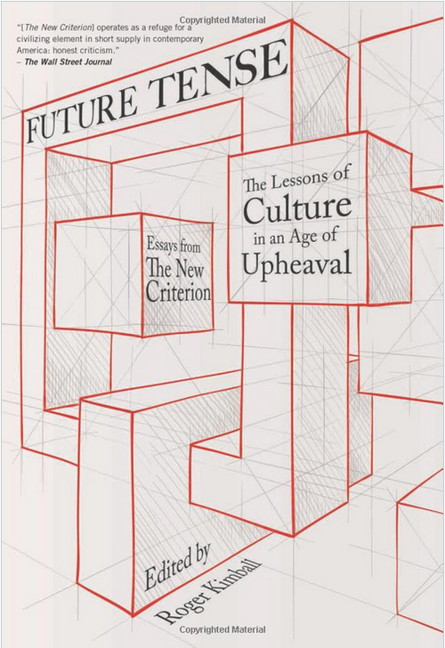
I am excited to say that Future Tense: The Lessons of Culture in an Age of Upheaval, Essays from The New Criterion is now available in hardcover from Encounter Books.

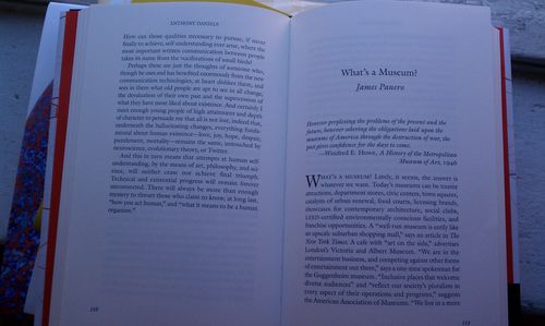
Future Tense examines our pivotal era through a variety of lenses and includes "What's a Museum?" my essay on the cultural capital of art.

IMAG0996

Beginning with a meditation on memorials after the 9/11 attacks (Michael J. Lewis), the essays also address patriotism in relation to Pericles (Victor Davis Hanson), twenty-first century American pride and leadership (Andrew Roberts), the future of religion in America (David Bentley Hart), and the unwinding of the welfare state (Kevin D. Williamson). Continuing this arc, pieces examine self-knowledge and modern technology (Anthony Daniels), and the difficulties of making law in the modern world (Andrew C. McCarthy). In its penultimate essay, the book explores the possibility of a forthcoming political revolution (James Piereson), then closes with a reflection of culture’s role in the economy of life and the fragility of civilization (Roger Kimball).

Future Tense is now in stock and on sale at Amazon.

UPDATE: Tom Carson at The American Prospect offers an early review. Spoiler: he's a fan, (but calls my contribution "fun and smart").  

Comment