THE WALL STREET JOURNAL, May 29, 2019
A review of “The Story Box: Franz Boas, George Hunt and the Making of Anthropology” at the Bard Graduate Center Gallery , Through July 7
New York
Cultural anthropology has lately been buried in politics. Critics have blasted its study of non-Western societies as patronizing if not far worse. But anthropology’s record of cross-cultural exchange deserves to be dusted off and put on display. Its history can be deeply humanizing, offering groundbreaking ways of understanding a people’s art and customs on their own terms.
This point is vividly made in “The Story Box: Franz Boas, George Hunt and the Making of Anthropology,” an exhibition now at the Bard Graduate Center Gallery. George Hunt and Franz Boas were the odd couple of American anthropology. Hunt (1854-1933) was an English-Tlingit guide who married into the Kwakwaka’wakw (pronounced KWOK-wok-ya-wokw) people of British Columbia. Boas (1858-1942) was a German-Jewish scholar living among the university people of New York. Over 40 years their collaboration and friendship faced down Canadian injustice toward the Kwakwaka’wakw to lay the foundations of a modern anthropology, one that truly valued the richness of indigenous cultures and societies.
Before founding the anthropology department at Columbia University, Boas headed field studies among the peoples of the Pacific Northwest that not only collected objects but also recorded intricate social customs. This research went on to advance a new understanding of indigenous cultures. While the reigning theory of social evolution mistook non-Western cultures as mere examples of primitive development, Boas argued for the equality of indigenous art and practice. This novel approach informed the creation of the American Museum of Natural History’s Northwest Coast Hall, which Boas opened in 1899. The institution’s oldest surviving gallery, now closed for renovation, was radical for first considering tribal art on its own terms.
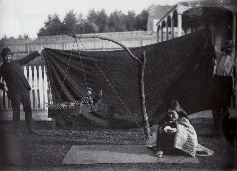
Franz Boas and George Hunt holding a cloth background while a Kwakiutl woman is photographed.
Known as the father of American anthropology, Boas went on to shape his discipline the world over. The structural anthropologist Claude Lévi-Strauss credited an early visit to Boas’s hall with inspiring his own methodology. Zora Neale Hurston was a disciple of Boas whose groundbreaking work preserved key figures and folkways of the black South.
In his own fieldwork, Boas was never alone. Hunt was an equal partner in both writing and research. Their work culminated in “The Social Organization and the Secret Societies of the Kwakiutl Indians,” their extensive 1897 monograph of Kwakwaka’wakw culture that remains a case study in its thorough documentation of ceremonies, songs, language, stories and artifacts.
The Kwakwaka’wakw, meaning those who speak the language of Kwak’wala, comprise 18 independent village groups residing on the central coast of British Columbia, one among several nations that developed along the resource-rich coastline of the Pacific Northwest. “The Story Box” takes its title from a letter that Boas wrote to Kwakwaka’wakw chiefs in 1897. “It is good that you should have a box in which your laws and stories are kept,” he said of the cedar boxes used to store ceremonial regalia, which he considered akin to his book. “My friend, George Hunt, will show you a box in which some of your stories will be kept…. Now they will not be forgotten.”
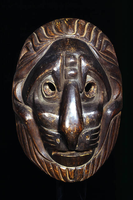
Lion-type mask by an unknown Kwakwaka’wakw (1820) PHOTO: ©TRUSTEES OF THE BRITISH MUSEUM
Several examples of the artifacts, notes, recordings and photographs the two used in their research are gathered in this exhibition, enhanced with superb descriptions and digital displays. These include Hunt’s personally annotated edition of “The Social Organization,” comparisons of book illustrations with Boas’s own source photography of initiation dances, artifacts such as the serpent-decorated settee that Boas first documented in the field, and digitized sound recordings originally created on wax cylinders that feature the voice of Hunt himself.
The importance of such remembering is more than just academic. The Kwakwaka’wakw practices that Boas and Hunt recorded were already illegal at the time of their fieldwork under Canada’s 1884 “potlatch ban,” which sought to force assimilation by depriving indigenous peoples of their ritual artifacts and cultural legacy. This infamous law wasn’t overturned until 1951.
As a consequence of the potlatch ban, much of Boas’s fieldwork actually took place during the seven months in 1893 that Hunt and his extended family lived in an ethnographic display organized by Boas as part of the World’s Columbian Exposition in Chicago. This unusual stateside residency allowed Hunt to perform his rituals in safety outside of Canadian jurisdiction.
Among the Kwakwaka’wakw of today, Hunt is a revered ancestor. His work with Boas preserved objects and customs that would otherwise have been lost to the potlatch ban. Their research has allowed contemporary Kwakwaka’wakw to reclaim cultural practices and artistic forms by reconnecting heraldic symbols with ancestral lines. This task of reconstruction began under Hunt and Boas themselves. The two spent decades after the publication of “The Social Organization” correcting and updating their field observations. The work continues today, as Aaron Glass, the curator of “The Story Box,” is developing an annotated digital edition of the book that will bring its documentation up to the present day.
On a morning I visited the show, the multimedia artist Corrine Hunt, a great-granddaughter of George Hunt and an exhibition consultant, was on hand to put the finishing touches on her re-creation of a “Transformation Mask,” a ritual headdress in the form of a killer whale that she made with Kwakwaka’wakw carver David Mungo Knox based on Hunt and Boas’s research. Such contemporary connections to Hunt, Boas and the people they documented over a century ago add poignancy to this small but compelling show, which will next go on view at the U’mista Cultural Centre in Alert Bay, British Columbia. “The Story Box” tells a story across time and cultures that is out of the box and urgent.