THE NEW CRITERION, December 2018
On the renovation of Dartmouth’s Hood Museum of Art.
If the architecture of the American university is said to have a common style, it surely must be the style of aspiration. With no native vernacular academic form, there is little that is organic in the creation of American campuses. The appearance of our universities varies widely, and in recent times schizophrenically, not just school to school but building to building. What unites them all, for better or worse, is the desire to convey their mission in solid form.
Through the nineteenth century and into the first decades of the twentieth, such aspiration drove an extraordinary program of campus design. Today we still consider this era to have produced the quintessence of American academic architecture along with its most affecting structures. As campus buildings were grafted onto older Western roots, Georgian, Gothic, Classical, and other motifs elided the European past with the American present. Where more than one such style coexisted on campus, as they often did, the buildings engaged in quiet conversation. Such forms not only gave shape to external appearances, but also spoke to the coherent internal values of the institutions they housed and contained.
Education of the new nation, they said, derived from the inherited values of the Old World. Here the campus library took architectural precedence. As both the containers and conveyors of knowledge, these libraries became the focus of campus plans. Meanwhile, structures for administration, faculty, and students deferred in their appearance and ambition, often crystallizing in quadrangles arrayed around a central library.
Over the last half century, the increasing architectural incoherence of the American university has foretold changing academic fortunes. In the rush to declare the latest accommodations, auditoriums and gymnasiums, science labs and food halls have clamored for architectural attention. A cacophony of economic interests, fractious politics, and ever-changing priorities has turned the tone of college campuses from study halls into shouting matches. Today’s campuses have become sprawling noisemakers that echo their own educational discordance.
Architectural aspiration, once focused outward, has turned inward against the university’s existing motifs. Building has gone against building as campus architecture has become a blood sport. A competition of progressive forms has not only given shape to new appearances but also spoken to new values. Through rapid cycles of construction and demolition—heralded through never-ending campaigns for capital donations—campuses today aspire to be something smarter than their historical selves. As each new generation of college leadership turns against its predecessor, older buildings go down and new ones go up in the hopes that the ideas they contain will be of the moment. Replacing the timeless with the timely, aspiring to be in the fleeting present, a permanent evanescence has become the academic architectural norm.

The Dartmouth College green. Photo: Dartmouth College.
The campus of Dartmouth College, where I was an undergraduate, has long been exclamatory in its architectural aspirations. This fall I had occasion to revisit it during the $50 million renovation of the school’s Hood Museum of Art by Tod Williams Billie Tsien Architects. Even before breaking ground, this renovation, set to open in early 2019, drew public scrutiny, since it includes the partial demolition of the award-winning 1985 museum building by Charles Willard Moore and Chad Floyd. Replacing Moore’s postmodern concoction with the lyrical brutalism of Williams-Tsien, this ostentatious enactment of burial and renewal speaks to the head-spinning shifts of the mercurial contemporary campus.
“The College on the Hill” of Hanover, New Hampshire, sited on a high plain along the Upper Valley of the Connecticut River, Dartmouth has evolved from a missionary outpost chartered in 1769 “to Christianize the heathen” into an elite but removed member of the laureled Ivy League. The college motto, Vox Clamantis in Deserto—“a voice crying out in the wilderness”—has likewise evolved from a passage from the Book of Isaiah, later recalled by John the Baptist, into an expression of the college’s own remote longings, which can be celebratory at times and resentful at others over its academic remove.
Throughout its long history, the architecture of the Dartmouth campus has pivoted around a five-acre open plot known as the Green, which was at one time the grazing land for the remote academic settlement. With the Federal-style Dartmouth Hall of 1784 on College Street to the east, the campus originally faced west, looking back over the Green and the Connecticut River. In 1839, Reed Hall, a neighboring Federal building designed in the dimensions of the Parthenon, housed the college’s first central library. Starting in 1884, Wilson Hall, a fanciful Romanesque pile south of the Green on Wheelock Street, began serving as a new and larger library facility as well as the college’s picture gallery. Finally, in 1928, the campus’s orientation pivoted again, this time to the north, with the completion of Baker Library.
With each of these turns around the Green, the college’s architecture added to the forms of what came before as it tracked the school’s rising stature. What was once an educational redoubt—“a small college, and yet there are those who love it,” as Daniel Webster said in defense of his alma mater in the Supreme Court case of Trustees of Dartmouth College v. Woodward of 1819—evolved into a venerable American institution.
Modeled on the Georgian design of Philadelphia’s Independence Hall, Baker Library, along with Dartmouth Hall, continues to serve as the architectural standard-bearer of the school. With its four-sided clock and bell tower, Baker represents the brains and heart of the institution, topping off at two hundred feet with a six-hundred-pound copper weather vane depicting the college’s founder, Eleazar Wheelock, with the Mohegan Samson Occom and a barrel of rum beneath the “Old Pine.” Just below, during trustee weekends, the elevated facets of Baker Tower are illuminated in green—a beacon in the color of the school now known during fundraising drives as the “money light.”
It is worthwhile here to note that the many traditional motifs brought to campus during this long period were revivalist forms incorporated by some of the leading architects of the day, such as Lamb & Rich and John Russell Pope. Their employment was supported by philanthropists with a deep engagement in art and architecture such as George Fisher Baker, a board member of the Metropolitan Museum, who dedicated his library as a memorial to his uncle Fisher Ames Baker. These commissions endured well into the age of the skyscraper. Beneath its traditional forms, Baker Library was built with the steel frame structure of a modern building.

Dartmouth’s Hopkins Center with the Hanover Inn in the background.
In the post-war years, college planners have challenged the school’s cherished architectural vocabulary not despite but because of its high standing among students and alumni. An appeal for the new has cut against old ideas, old men, and old forms. In the late 1950s, the Choate Cluster of dormitories, designed to be an experiment in student living, landed on campus like a value-engineered lunar base connected through elevated air locks. Stripped of ornament, the River Cluster of dormitories, constructed between 1958 and 1982 and originally known as “The Wigwams,” had all the architectural ambition of a low-rise urban redevelopment scheme.
Dartmouth’s greatest architectural challenge came with the construction of the Hopkins Center in 1962. Championed by Nelson Rockefeller, Dartmouth class of 1930, the campus’s arts complex next to Wilson Hall on the southern side of the Green was designed by Wallace K. Harrison to be a beacon for what was thought to be a culturally impoverished student body. Harrison used “The Hop” as a prototype for New York’s Metropolitan Opera House, which opened four years later. The similarities here are both obvious and unfortunate. The Met’s older sibling has never settled into the look or life of the New Hampshire college. The shock and schlock it introduced to the Green, facing down Baker Library, continue to disrupt the school’s primary architectural fabric.
When Charles Moore took on the design of the Hood Museum for a back corner space left between the Hopkins Center and Wilson Hall, he confronted the challenge of uniting modern and pre-modern with a postmodern confection of the two. Named after the milk magnate Harvey P. Hood, Dartmouth class of 1918, the museum, when it opened in 1985, became Moore’s most notable institutional building and a reflection of the school’s own evolving architectural rhetoric.
Moore’s mode of postmodernism drew on traditional idioms for progressive ends. For the traditionalists, his style made amends for modernism’s campus follies, yet it did so with fingers crossed and tongue in cheek. Writing of the museum’s opening in these pages in November 1985, Roger Kimball took note of Moore’s “self-consciously historicizing architecture” that drew on the campus’s colonial and Georgian forms, but with an “underlying current of architectural trickiness and free play.” Treating tradition as a “more or less neutral storehouse full of stylistic tricks,” the building “exhibits an arbitrariness and frivolity that excludes it from any genuine tradition.”
Apparent in retrospect, the frivolity of the Hood was largely lost on me as an undergraduate. I am not sure I ever found the museum’s front door. Moore was known for oversized piazzas that went nowhere. His Hood began with a “triumphal arch” connecting Wilson and The Hop followed by an open courtyard of uncertain egress. Buzz Yudell, Moore’s architectural partner, applauded the building’s “wonderful sequence of invitation, of discovery unfolding . . . a choreography of experience that works all the way from the outside through the courtyard and inside the building.” Such balletic sensibility was supposedly conveyed through a sculpture of a dancing figure by Joel Shapiro commissioned for the site.
Nevertheless, this college dance always ended in heartbreak. Follow one path and you were spit out the back of the building. Follow another and you were clobbered by the snowdrifts that had built up on Moore’s rooflines. Taking classical orders and tangling them into an irrational knot, Moore disrupted the visitor’s wayfinding at every turn. Anyone looking for art would be stood up at the door. And if you made it inside, Moore placed a guard on an elevated perch at the front desk to frown on the frivolity. These obstacles to entry were a shame, since the college’s collection includes such treasures as Assyrian relief panels from the Palace of Ashurnasirpal II on through an impressive survey of work by the college’s artists in residence.

The old Hood Museum of Art. Photo: Timothy Hursley.
Like Jesus and Alexander the Great, it seems that the life of an architectural style now lasts thirty-three years, give or take. What starts in infancy praised by wise men ends in premature death. Moore’s Hood Museum was the height of sophistication in 1985. In 2018, his architectural references and games have been replaced by new demands for access and transparency, all against a backdrop of renewed suspicions of cultural inheritance along with a joyless sobriety that can be puritanical in its enforcement. Moore’s fall from grace reflects the decline of postmodern architecture in general, where even Philip Johnson’s landmark at&t Building now faces down brutalist intervention.
With such buildings as the “new” Barnes Foundation in Philadelphia, Tod Williams and Billie Tsien have distinguished themselves through designs that impose brutalist order onto historical motifs, tempering their own anti-historicist forms with sumptuous materials. At the Hood, they have stripped off Moore’s archway and north façade and half covered over his courtyard with a pillbox bunker of Flemish bond brick. A solitary square fourteen-foot window faces Baker Library like a vitrine and gun emplacement to shoot the art collection onto the Green. With the right object in view during their somnambulating passage to class, not even a preliterate undergraduate may mistake this new building for anything other than an art museum.
Preservationists have been quick to point out the irony, if not the hypocrisy, of the partial destruction of Moore’s museum by Williams and Tsien. In 2014, these architects objected vociferously to the destruction of their own American Folk Art Museum building of 2001 after its takeover by the Museum of Modern Art. When MOMA floated the idea of salvaging parts of their building, Williams and Tsien maintained their museum was “a whole” and rejected such “façadism.” “The idea of installing a few panels somewhere doesn’t interest me,” Williams said at the time.
Of course, this is precisely what these two have done at Dartmouth—salvaging, modifying, and demolishing various parts of Moore’s design. “I don’t care about the criticism,” Williams said when I asked him about preservationist concerns, including those voiced by the Charles Moore Foundation. “We do everything we can, absolutely, to try to respect the Moore work, to respect Dartmouth, to respect the Hood as it grows and grows into the future. I am completely and utterly convinced that we have done everything we can. It was all entangled.”
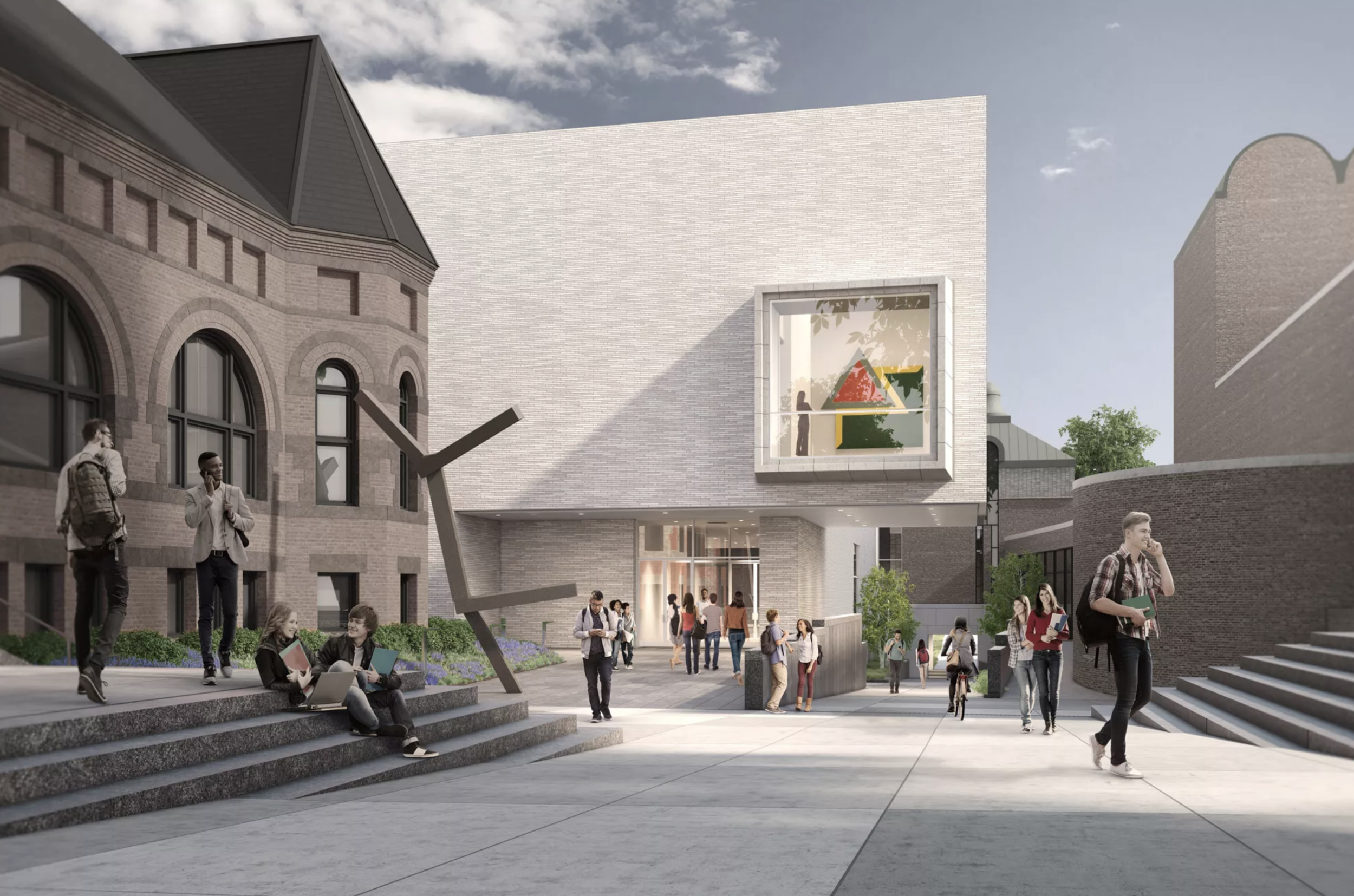
The planned north façade of the new Hood Museum. Rendering: MARCH.
Undoubtedly the new Hood will solve many of the problems of the 1985 museum, which Moore entangled quite deliberately. Sight lines have been straightened. New rooms for collection study and “experiential learning” have been established. New white-box spaces will display the school’s modern and contemporary collections to greater effect. Much expense has even gone into preserving parts of Moore’s waterlogged building, including the addition of new mechanisms to melt the snow that accumulates on his copper roof. After the mysterious departure of his predecessor, the Hood’s current director, John Stomberg, continues to manage the museum ably even through the construction, maintaining an interim gallery in a storefront on Main Street.
The most prominent change will be the addition of a new social space recovered from Moore’s courtyard. This cavernous lobby, performance hanger, and student lounge will also serve as a space for donor cultivation, much as the Barnes foyer by day converts into an entertainment venue by night.
Here ultimately is the latest priority for campus architecture. Institutions are now competing for increasingly concentrated and demanding donor dollars, along with wall space for their prized contemporary collections. Funded during the “quiet phase” of the plan, the new Hood is the leading edge of the school’s new $3 billion comprehensive capital campaign, titled “The Call to Lead”—in which, presumably, old ideas, old men, and old forms should not be followed.
Through rationalism richly appointed, the new museum breaks from the past by offering insiders first-class passage into the future. A lot less could have been imposed to preserve Moore in its entirety while still adding to the exhibition space of the museum. A one-time proposal to turn the romanesque arch of Wilson Hall into the museum entrance would have restored the primacy and original intent of this overlooked campus building. No less than Robert Frost credits Wilson Hall with inspiring him to become a poet when he walked through its arch as a freshman in 1892 and came upon a poem by Richard Hovey published in the November 17 edition of The Independent.
But such preservation is never the true aspiration of the contemporary university. Quite the opposite: the public destruction of old forms has become as important as the erection of new ones. The question is not what has been, but what could be created to “effect change and improve lives around the world,” in the words of Dartmouth’s new capital campaign. The American college of the present must be focused on the future. The results may be good for college architects but bad for college architecture. Once the shovel hits the ground, a building is already a thing of the past.


